![]()
It is Tuesday and that means it is time for my Creative Squad to show you a fun project. The theme for March is Opposites Attract and the team will use my new Bird Foam Stamp, Rubber Stamp and Stencil Set. Just as opposite colors on a color wheel highlight one another, or yin and yang fit together so comfortably, sometimes the best is brought out when we celebrate extreme differences!
This week we’re happy to show you an art journal page by Michelle Rydell, which has us singing along with her! Take a look at her musically inspired interpretation of our theme.
—————————————————————————————————–
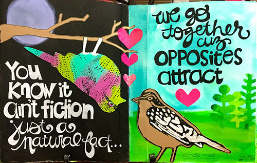
The first thing I thought of when I heard this month’s theme, was the song “Opposites Attract,” by Paula Abdul. I thought it would be fun to use that as inspiration for my journal spread!
Here’s how I made the spread (the song running thru my head the whole time)…
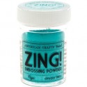
I used the cling stamp bird first, and stamped her with versamark ink, so I could emboss her in a variety of bright colors. I poured each color of embossing powder on separately, so that I could shake the extra off and back into the jar, without the colors getting mixed up.
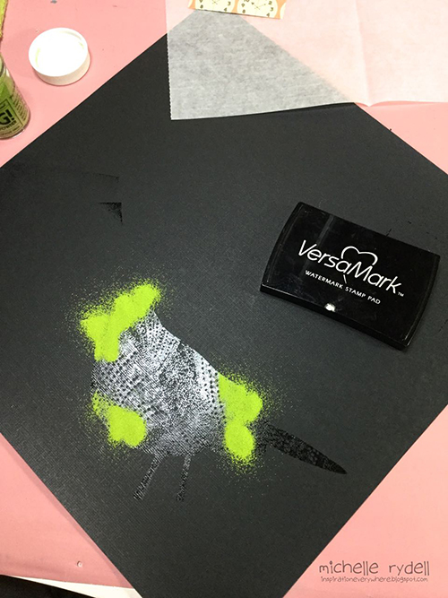
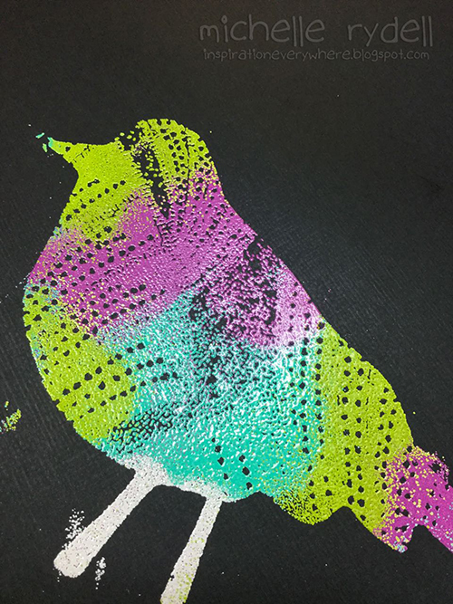
When I was done, this is how my bird looked. The stray bits of color don’t matter because I will be cutting her out.
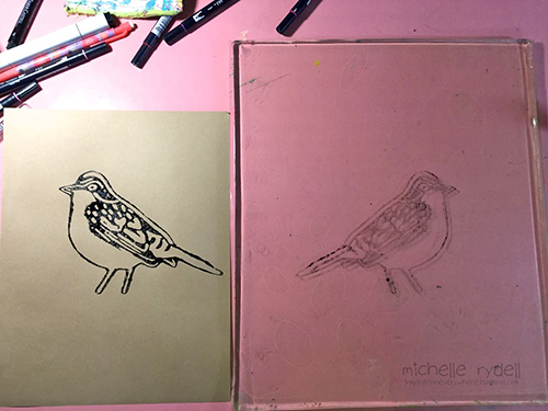
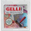
Next I used the foam stamp bird. For my vision to come to life, I needed this guy to be facing left, instead of right. In order to accomplish this, I stamped him onto my gelli plate, and then pressed my kraft paper onto the plate, and voila, a left facing bird! (Just a note: If you don’t have a gelli plate, you could probably accomplish the same thing by substituting any non-porous surface, such as a piece of acetate or a plastic placemat.)
Once I had my two birds cut out, the rest of the page came together quickly. I painted a simple nighttime background on the left, with a paper-pieced tree branch. On the right side of the spread, I used the stencil that comes with the set to create some bushes in the background for my daytime bird. The hearts were cut from some underpaper on my desk that had pink paints and sprays on it. The lyric from the song was written with markers for a finishing touch.
I just loved working with this fun set! The birds are adorable and I love how you can mix and match them to create all kinds of different looks!


And maybe you will even play along -we would love to see how you interpret the theme – email me how you used my stencils and stamps with the theme and email me an image – I would love to share what you did at the beginning of next month!
See you next Tuesday for project inspiration from around the globe.
Comments (17)
Dee Ann O'Brien
| #
Fun use of the birds to cleverly send a message!
Reply
Karen Petitt
| #
I have to play in my journal tomorrow now! All these gorgeous journal pages have made me want to get covered in paint or ink and play with my stamps and stencils. Just awesome inspiration and awesome art! Many thanks for the blog hop, the fabulous inspiration and for sharing your art with us Karen x
Reply
gwenlafleur
| #
Really beautiful page! Love the colors and lettering, really love the way that you used the different colors of embossing powder. So cool!
Reply
Joi@RR
| #
Ahhh so darling Michelle – and so true – opposites attract!!! Love your upside down bird – eheheheheh!! And all the bright colors on black and on white – you thought of everything!! SUCH a fun page. Nat’s stamps look FABULOUS once again!!! Happy Easter! j.
Reply
Sharon Fritchman
| #
I LOVED this song so much and Michelle’s creativity really shines here! Awesome!!!!!
Reply
Jenny Petricek
| #
Wonderful spread! (And a great old song from my 1990’s childhood!)
Reply
Michelle LaPoint Rydell
| #
Thanks so much Jenny!
Reply
Sue Clarke
| #
LOVE it. The phrase, the colors and the birds being opposite each other (plus day and night). Nice job!
Reply
Michelle LaPoint Rydell
| #
Thank you Sue! I appreciate your kind words!
Reply
marsha.
| #
Love it Michelle! Love the colours, the night and day contrast, the bird upside down and your lettering <3! And the lyrics… I had totally forgotten about that song!!
Reply
Michelle LaPoint Rydell
| #
Thanks Marsha! It was such a fun set to work with! I love what you did with it too!
Reply
Gayle
| #
Exquisite! What a clever interpretation of the theme!
Reply
Michelle LaPoint Rydell
| #
Thank you so much Gayle!
Reply
phinner
| #
This is super Michelle!!! Its all very cool, I especially like how you formatted the lyrics with the cursive and block lettering! Now I’m off to find my Paula Abdul cassette, LOL!
Reply
Michelle LaPoint Rydell
| #
thank you Phin! I appreciate you noticing that about the lettering! Have fun looking thru your cassettes!
Reply
Michelle LaPoint Rydell
| #
Thanks Julie! and LOL about the song!!!
Reply
Julie Tucker
| #
Love love love this! LOVING what you did with the bird .. and now I have that song in my head! LOL!!!!
Reply