Art Journal

Not in this Century – Art Journal

“She knew the world was hers….She also knew not in this century”

My great-grandmother as a cut out image transfer. She was a city girl all her life hence the city background.

I layered my Grove Street Stamp in pink over the Circle Drive Stamp – – I like the outcome- I need to play a bit more with layering the different circle designs on top of each other and will make sure to share.

I masked her off with post its to stamp the buildings around her and I like the look of combining the bold Midtown Foam stamps with the finer building stamps with my rubber stamps.

Do you use vintage photos in your art journals?

Here are some of the supplies I used:


Leave a comment

Love is in the Air – Art Journal Page

I was playing with some transfers and used the engagement photo of my great-aunt Margot and my great-uncle Hans. I love this photo.

She turned all pink layered over this ares :) All in all a bit too pink for me- so you can see I needed to grunge this all up a bit with some stamping but it was fun!

Love stamping with manufactured stamps but also with lids and other bits and pieces I find on my work bench to break it up a bit.

It was fun to try some different colors – and go crazy pink- LOL . Valentine’s Day is not a huge thing in Germany to be honest so the whole concept around this is kind of fascinating for me, but of course I do enjoy the wonderful flowers and gifts from my US-born husband ;)

Hope your day is filled with Love!

Here are some of the supplies I used for this spread


Comments (2)

  • pam hansen

    |

    ❤️❤️?

    Reply

  • Sue Clarke

    |

    Always nice to see Margot on a layout or art journal page.
    My favorite items to use on paint are lids from plastic jars I have at home.

    Reply

Leave a comment

Buzz of the City

I am taking a Drypoint Etching Class and I am so loving the whole process! The powerhouse etching on the right was an experiment and it did come out not as I wished but I still liked it so I wanted to add it to my art journal.

I will share some photos of the class and samples soon. For the print above I experimented printing on a monotyped piece of paper. As some of you might now I love the Powerhouse here in Jersey City so it is a repeating theme in my artwork and I even made a stamp with it :)

I like the idea of adding prints into my art journal – I am still exploring this. I am also thinking of buying a small printing press that is not costing a fortune but I am careful and still investigating.

Does anyone of you have experiences with small converted die cut machines or small letter press to use with drypoint or lino cuts? I would love to hear your thoughts and experiences!


Comments (4)

  • andrene

    |

    I had to look up drypoint etching :) It looks fascinating and fun. Cant wait to see more posts on it!

    Reply

    • nathalie-kalbach

      |

      Will post about it this week Andrene- it was a really cool class!

      Reply

  • Sue Clarke

    |

    I am thinking that you can add architect to your list of artist and paralegal.
    Enjoy your weekend Nat!

    Reply

    • nathalie-kalbach

      |

      LOL- not quite- but I sure do love old industrial or urban buildings…actually anything old …sometimes new…oh whatever- I like architecture- LOL

      Reply

Leave a comment

The Small Things in Life – Art Journal

I created this Art Journal spread on a snowy day last week – as you can probably guess :)

The lady is drawn on deli paper, stamped and pasted into the journal. I stamped with different of my ArtFoamies Designs and then painted with grey and white. I like how it came out.

For the journaling I used a bamboo sketching pen and ink – I love using a bamboo sketching pen – have you ever seen my video I once made of the match made in heaven? It is a bit older but you might still find it interesting to see how I use those pens with the ink

Liquitex Ink and Bamboo Sketching Pen from Nathalie Kalbach on Vimeo.

Here are some of the supplies I used with the art journal spread


Leave a comment

Too Many Thoughts – Art Journal

“I am too little butter on too much bread. I am too many thoughts in too little head”  – Tyler Knott Gregson

This started actually out as many different approaches to a background and thinks just didn’t work out the way I wanted and once I just started covering it up with the gold I fell in love with the antique- streak look and left it. There -problem solved ;)

The girl is mainly on deli paper with I stamped and painted and layered Neopastels on top. Her eyes are a bit off but I can live with that …Moving on is the motto ;)

Love how the foam stamped pattern shows is slightly visible through the gold layer.

Here are some of the supplies I used for this spread:


Leave a comment

For All I Know – Art Journal

I have been working on a big assignment and some personal tasks lately which have me stressed out a bit …so a little art journaling mantra is keeping me sane ;)

some stamping with my RubberMoon stamp sets and I used Neopastels to paint inside the ink transferred figure. I also traced with a pink Neopastel inside the opening of my Manhattan stencil and while I like the outcome, there was a lot of the Neopastel sticking to the stencil which wasn’t easily to get off or transfer to a different spot – so this was probably a one time adventure LOL.

Here are the supplies I used for this spread.


Comments (4)

  • Lois Moore

    |

    I read somewhere that a soak in water with dishwasher “liquid” soap would remove dried on paint from stencils. Maybe it will work with your neopastels too.

    Reply

    • nathalie-kalbach

      |

      I will try that Lois. My best experience so far is with Murphy’s Oil- but I usually do not remove paint as long as it is acrylic paint. I will give it a try :)Thank you

      Reply

  • Sue Clarke

    |

    Do you put something over the neopastels so that they don’t smudge on the opposite page when the journal is closed?

    Reply

    • nathalie-kalbach

      |

      Sue, if the layer of neopastels is not too thick it is not a problem, but in this case where it is very thick I put half a sheet of delipaper in between the pages to keep it from transferring to the other side.

      Reply

Leave a comment

Sometimes you are the window…sometimes you are the rock

Loved Michelle Ward’s video at Creative JumpStart 2018 and used her technique with my Amsterdam and Versailles Stencil creating a grungy background.

Just love the outcome – Michelle does the technique a bit different when I usually do- so it was fun to do it with a different approach. What Technique you ask ? WElllllll…LOL- yes- I am doing this to you right now…you gotta sign up to and see yourself- it is so much fun and the videos are so awesome. You still have time to join us for Creative JumpStart and play along!

Loved creating the girl with some ink sketching and stamping- ….I kinda want her coat- LOL.

Here are some of the supplies I used for this spread:


Comments (1)

  • Dee Spillane

    |

    Love this so much!

    Reply

Leave a comment

Fire – Art Journal

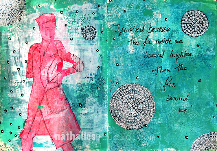
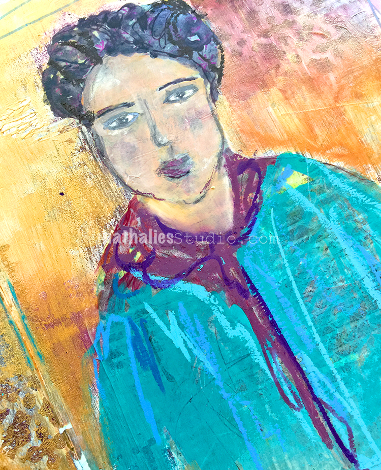
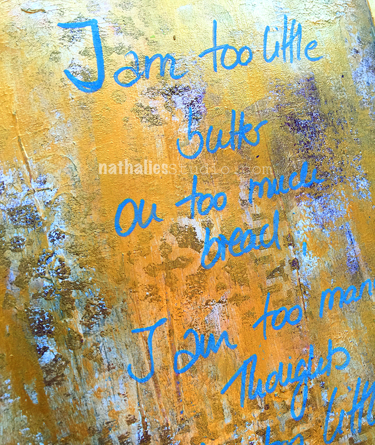
“I survived because the fire inside me burned brighter than the fire around me!”

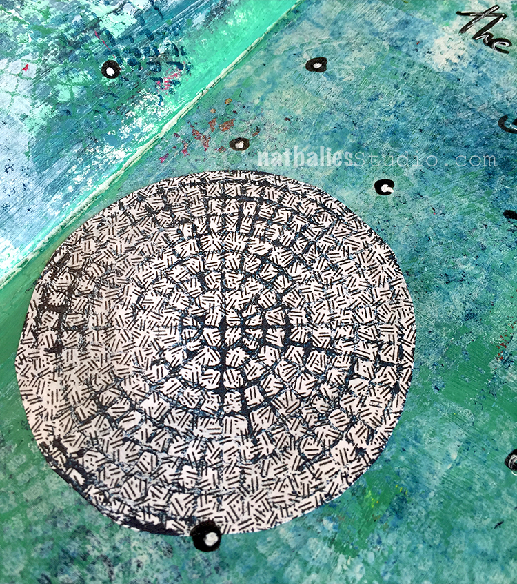
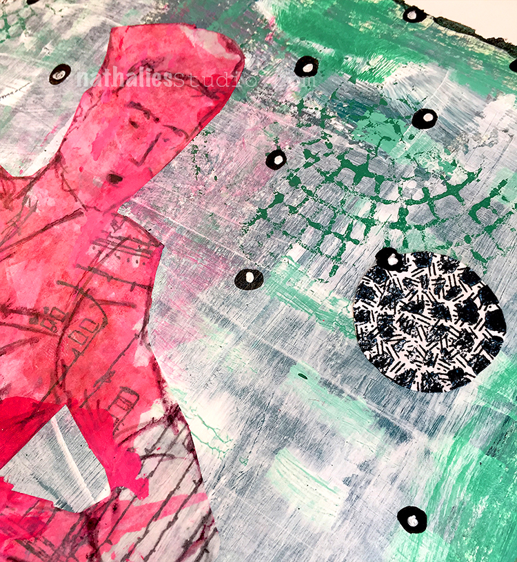
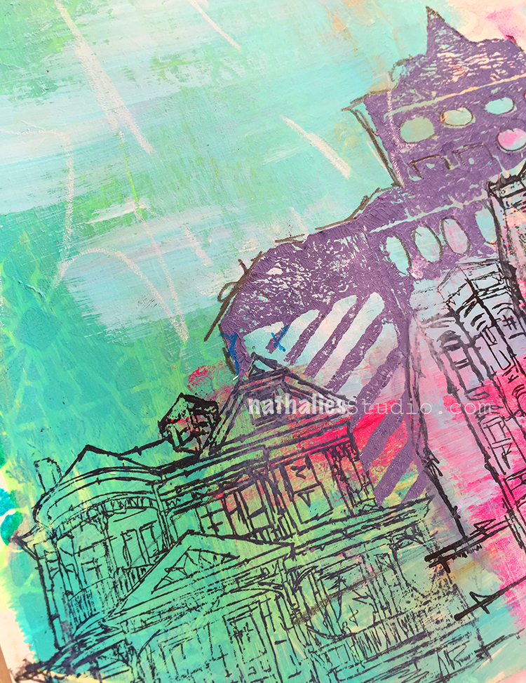
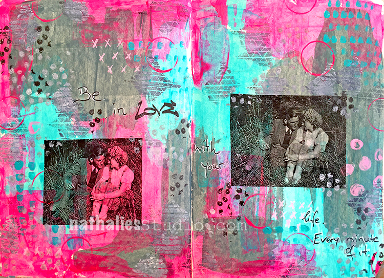
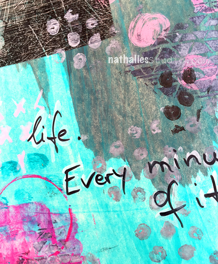
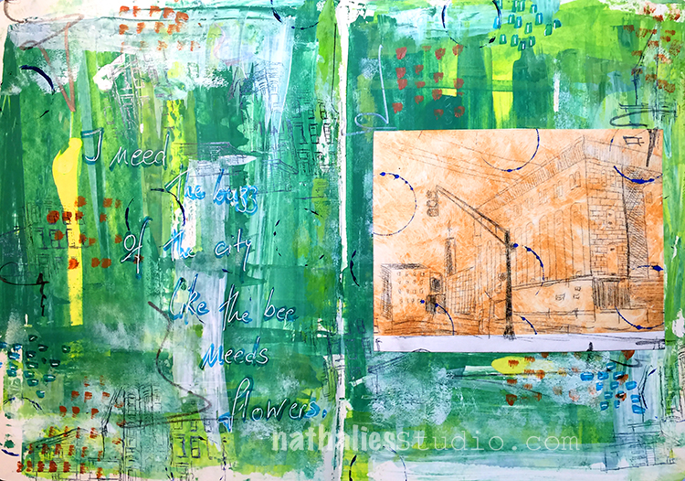
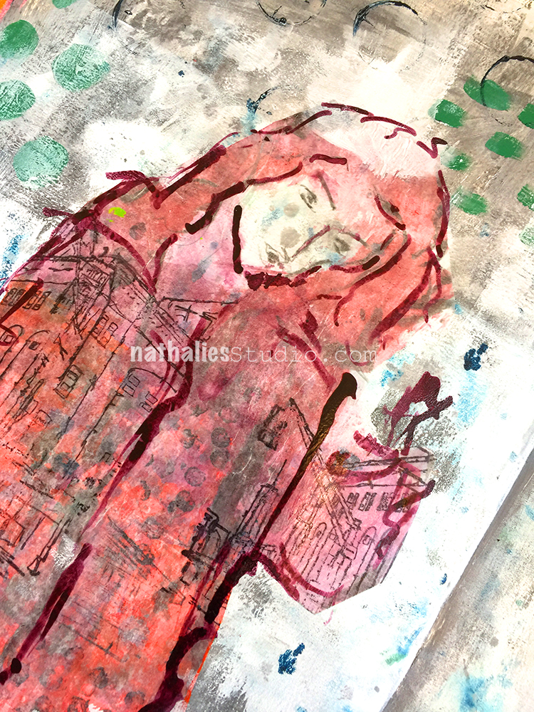
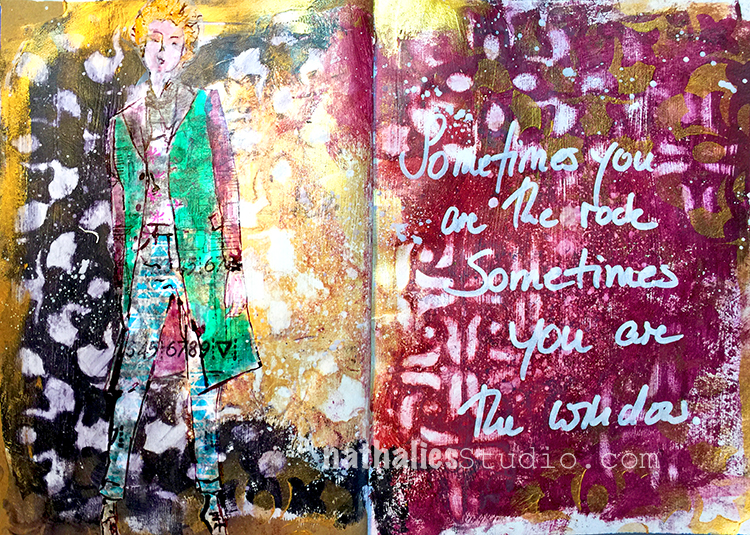
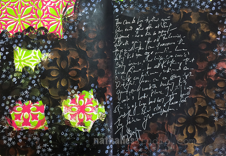
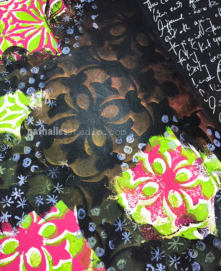
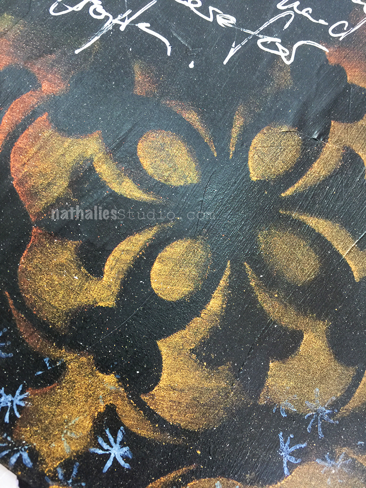
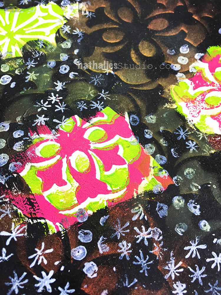
I started this art journal spread a while ago but Carolyn Dube used in her Creative JumpStart Video junk envelopes which inspired me to add some collage elements from the inside of junk envelopes as well. I stamped with my Central Avenue Foam Stamps and acrylic paint on top of the envelope pattern and then cut out circles in different sizes – the lines of the stamp providing perfect cutting guidance.

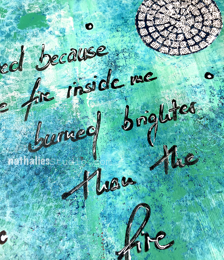
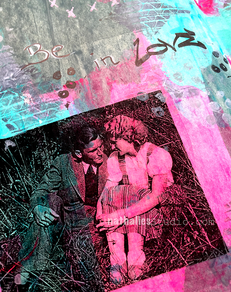
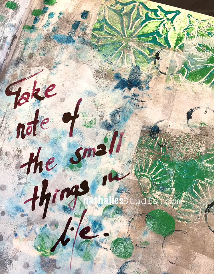
I used a black Fude pen for the journaling and to add some dots here and there and then added some white highlights with a white Signo pen. It basically repeats the color scheme and the circles theme of the collaged envelope circles.

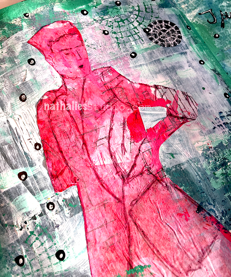
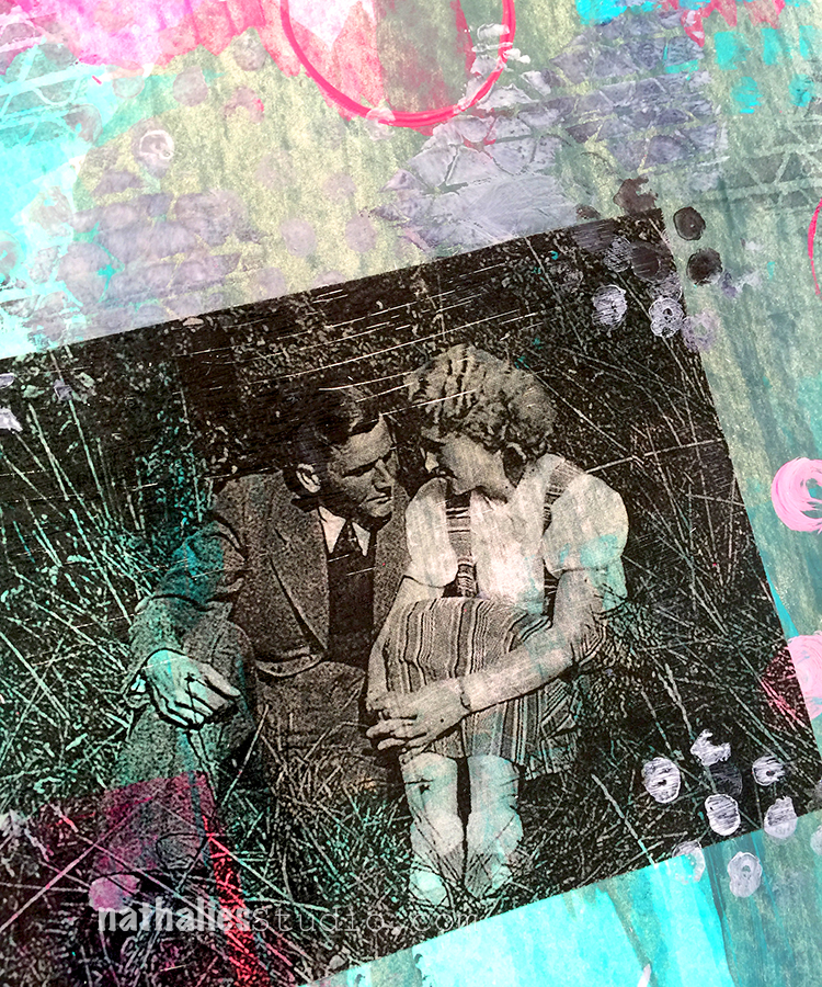
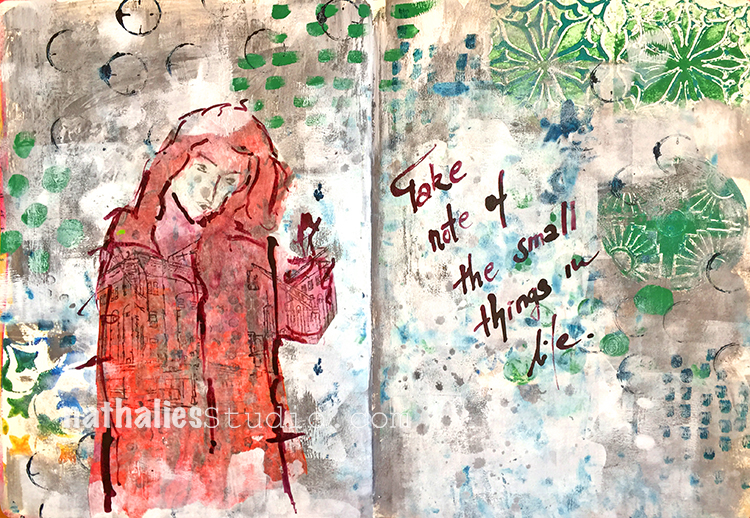
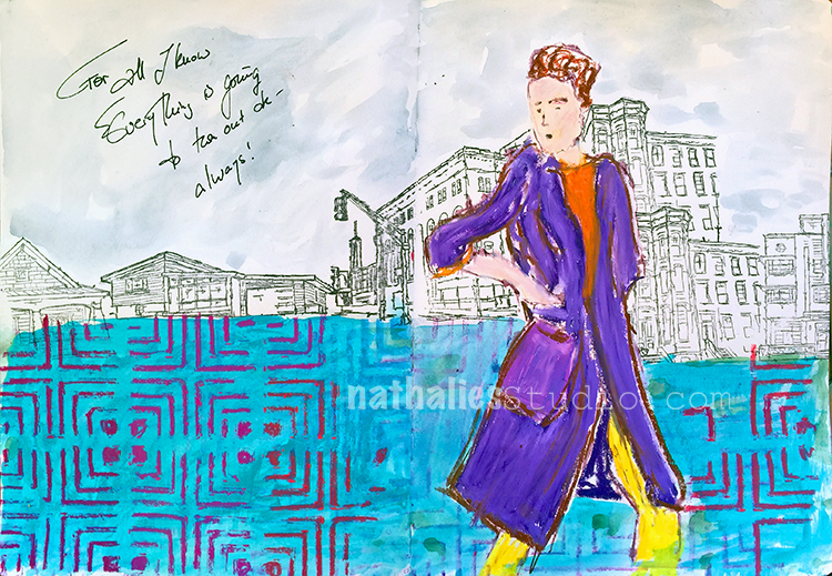
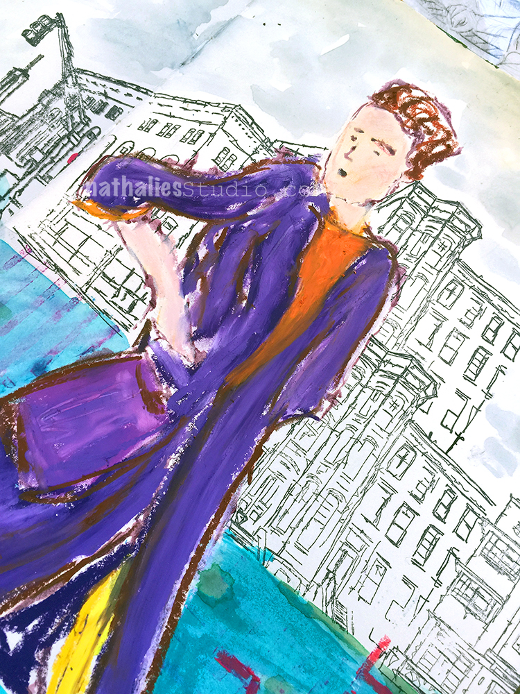
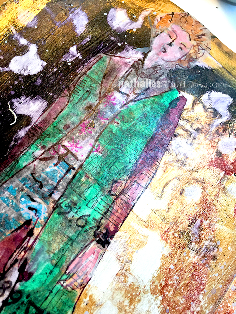
The figure was from a demo in a class in Oregon – Ink drawing on deli paper and then pasted into the art journal with gel medium.

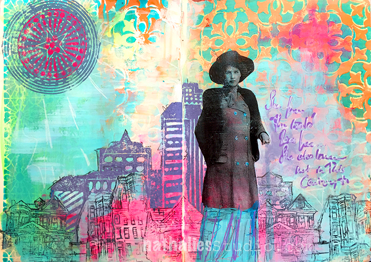
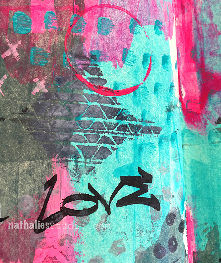
The red and green are giving a great contrast and impact – it is a not so simple but kind a simple looking page  – I like it. Here is what I discovered with this page:

  • I always forget that in the US a lot of the bank statements have security envelopes with cool pattern inside – great collage material
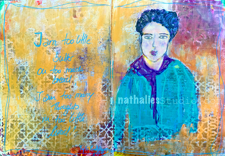
  • I mostly use women when using figures in my journal  – it was fun to change that up for this one :)
  • I am still in love with the subtle texture scraped gesso over an acrylic painted background provides – It makes me happy :)

There are so many ways you can get something out of Creative JumpStart – wether you are a beginner, an intermediate or advanced Mixed Media Artist. You can take the videos “literally” and do the same project, you can get inspired by the theme, certain materials, use the same techniques, try to substitute materials to see what happens in comparison …the ways are different…but they all have something in common – YOU HAVE TO WALK!

I hope you walk with us :)

Comments (12)

  • Ben Gill

    |

    Looking great! Some nice textures and patterns going on here. The colors are great also.

    Been reading your blog for a while but first time commenting here :)

    Reply

  • sue-sharp

    |

    I love your texture and colours! I keep forgetting what a great impact white scraped over colour makes!

    Reply

    • nathalie-kalbach

      |

      thank you Sue, yeah I love the grungy white scraped look over color.

      Reply

  • gloz

    |

    This is fabulous, Nathalie! I too have started saving the insides of security envelopes for collage. I never noticed them before Carolyns’ jumpstart project!

    Reply

    • nathalie-kalbach

      |

      thank you so much Gloria- yes those security envelopes are so cool!

      Reply

  • florenceturnour

    |

    Love your background, Nathalie. Lots of details in there. Your Art Foamies are very cool as well.

    Reply

  • cathsheard

    |

    Love what you created and great to see you jumping too :-)

    Reply

  • dcnewman52

    |

    Glad to see you playing along with us and enjoying the fun of Creative Jumpstart that you created for all of us!

    Reply

Leave a comment

Thoughts on Paper – Art Journal

After watching Tina Walker’s Creative JumpStart Video I was inspired to pull out my PanPastels. Her video wasn’t about using PanPastels but she had used them in a little part of her video and that made me pay extra attention. I used to use them all the time and also teach with them and then somehow I really neglected those little pans full of pigment joy! So it was time to dust the pans off and get them out.

I had covered up some of the background with black gesso which I had stamped with my Versailles Positive & Negative Foam Stamp Set and my Van Vorst Positive and Negative Foam Stamp Set.

I used gold and bronze PanPastel over black gesso using my Versailles Stencil. I always love how black gesso makes the pastels really pop.

I also stamped with the white side of RubberMoon’s new awesome Moonlight Duo Ink Pads. Each ink pad has a white pad next to the initial color for creating tints and I just love the white by itself. It dries permanent – yeahhhh!!! I used my Embroidery Stamp Rubber Stamp set. This page was really more a bit of a play but I had fun and I put some thoughts down as well – and it served a couple of really good purposes:

  • I pulled out my PanPastels again and I realized I need to use them more again!
  • I tried the white ink pad side of my RubberMoon ink pads and know this will be a staple in my mixed media art
  • I actually did something creative on a day which was filled with computer work and non creative to-do’s and that prevented grumpiness
  • I once more realized that I do not like the look of light green and metallic color next to each other – yeah – sometimes even that is a thing to discover- LOL

I hope you are part of Creative JumpStart as well – it is such a great and supporting community and looking at everyone’s project based on the daily videos is another wonderful source of inspiration. If you haven’t joined yet- you can still do it – sign up for Creative JumpStart 2018 !

Here are some of the supplies I used for this spread:


Comments (7)

  • florenceturnour

    |

    Lol hairspray. Does it smell perfumed? I guess workable fixative doesn’t smell all that nice. I love that you are writing white on black. I’m going to have to give that a try too!

    Reply

    • nathalie-kalbach

      |

      LOL- all I head. Fixative is actually smelling worse and most you have to apply. That wasn’t an option with the cold here anyway- LOL

      Reply

  • cathsheard

    |

    Oooh, those metallic PanPastels – wow! They look fab….

    Reply

  • Catherine

    |

    Nathalie, I really like these journal pages! I love using Pan Pastels, but never quite know how to affix them to the page! Did you use anything so they won’t rub off? Thanks!

    Reply

    • nathalie-kalbach

      |

      thank you Catherine. yes they def. need to be fixative either with a fixative or in this case just with hairspray.. hairspray might change the color but i can live with this in my art journal

      Reply

      • Catherine

        |

        Thanks, Nathalie! I think that would be the easiest! Will try it!

        Reply

Leave a comment