It has become a tradition of mine and other blogger friends to wind down the year with some Top “insert number”- Lists of work , posts and photos, before the year ends. It makes me go back and look at what I have done and accomplished and it also makes me dwell in memories. Too often we forget about the things we did and accomplished throughout the year- often just bashing ourselves for not fulfilling all the wonderful new year’s resolutions from last year. Maybe this makes you wanna do it too – if so – share 
In no particular order here my personal faves of my art journal pages and paintings:
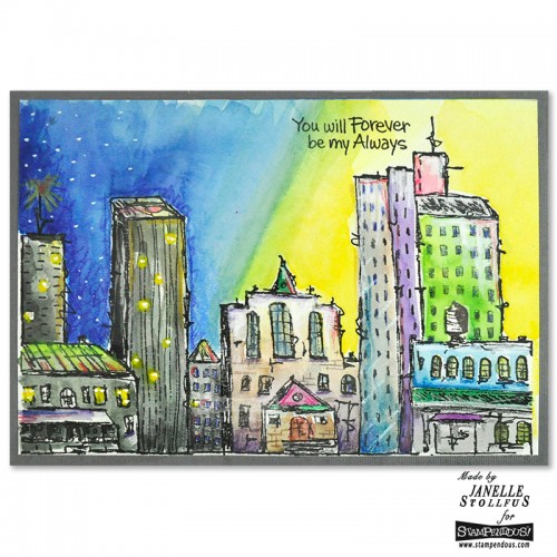
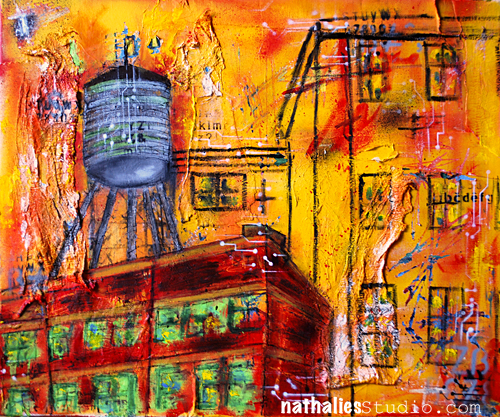
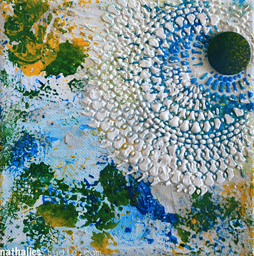
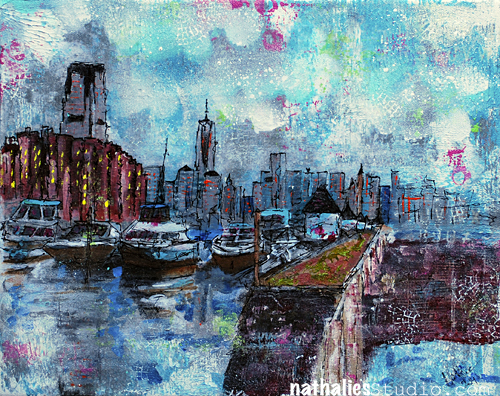
1. High Line – Mixed Media Painting
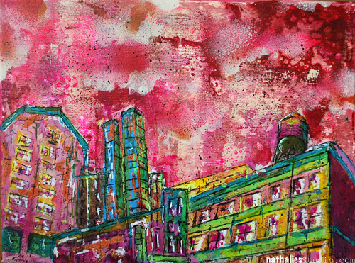
I fell in Love with the background a soon as I had it laid down, causing quite some struggle to let go and go ahead- but that is why I like it the more :) Not my usual color scheme, but one that I am glad I plaid with.
2. Good Bye – Art Journal Spread
I love the grungy yet romantic feeling of this page and I had a good time getting some journaling out in an obscured way.
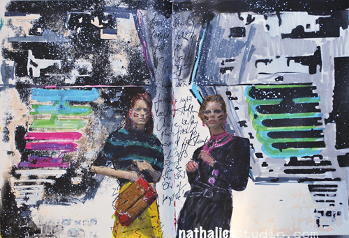
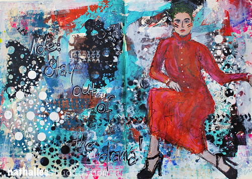
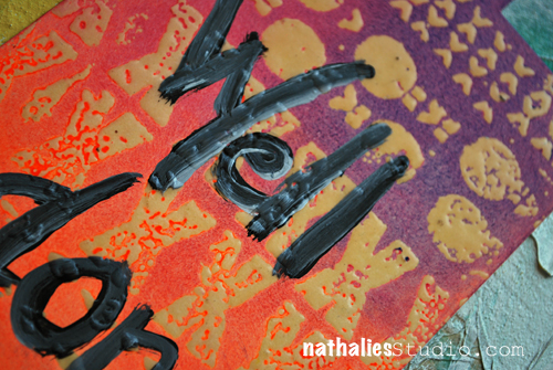
3. Stay Out of The Drama – Art Journal Spread

I loved playing with different media and my Stampendous Stamps and Stencils and the drama of the red dress…the only drama which you might wanna get into ;)
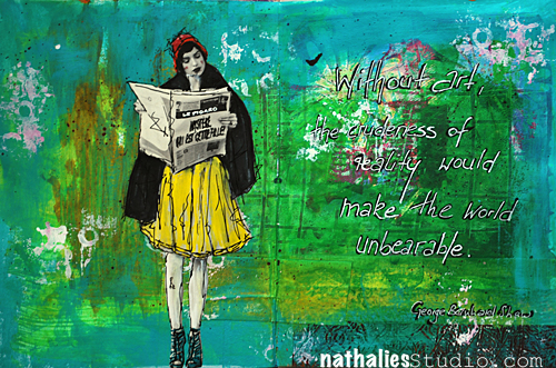
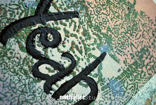
4. Reality – Art Journaling Spread
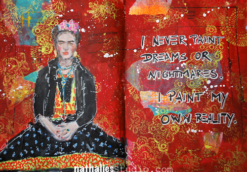
Speaking of Red …This one is also one of my favorites, I did a lot of collaging in the background and I just love how this one came together.
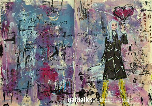
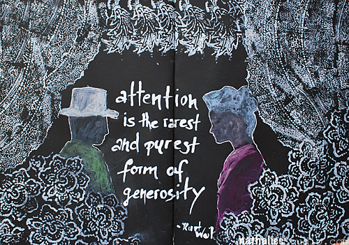
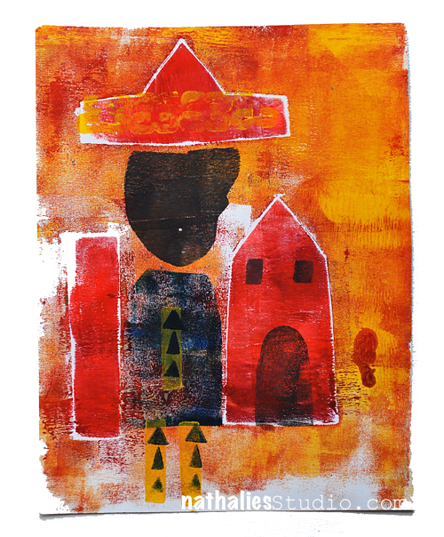
5. The Real Weird Magical Person – Art Journaling Spread
I made my own building stencil and layered it and did positive and negative imagery with it – I love the bold black and the almost translucent magical person ;)
6. Girlfriends – Art Journal Spread
This is another page that I really like- I like the journaling in the middle of the spine – and the difference yet similarity of the pages. Also some white space…which I know, is unusual for me.
7. On My Way Home – Art Journal Spread
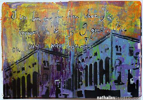
HA- I guess I really liked my building stencil…which btw is based on the Jersey City Powerhouse. I do love the background and how the building really is prominent in here.
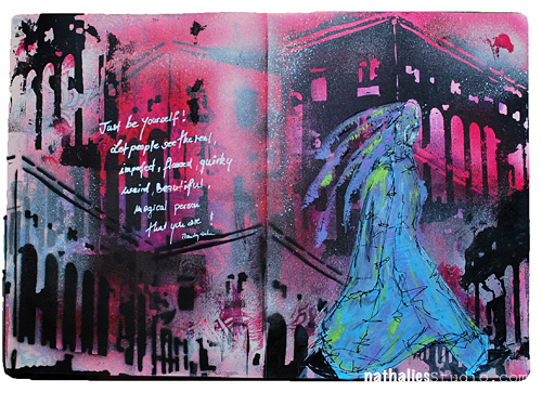
8. Finally Be You – Art Journal Spread
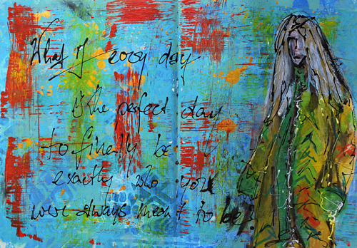
It is kinda scary but kinda cool – and I love the texture and layers.
9. State of Mind – Art Journal Spread
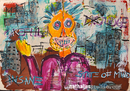
hahaha- I know I am a weirdo, but this one just makes me laugh every time I see it. I guess…the title is fitting ;)
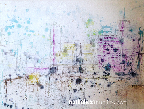
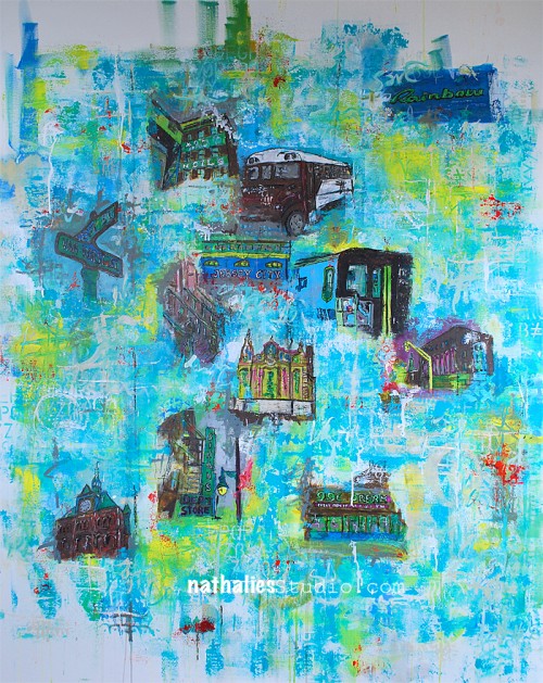
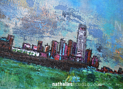
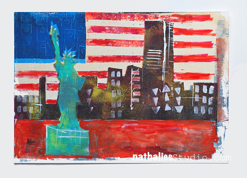
10. 2 Tallest – Mixed Media Painting
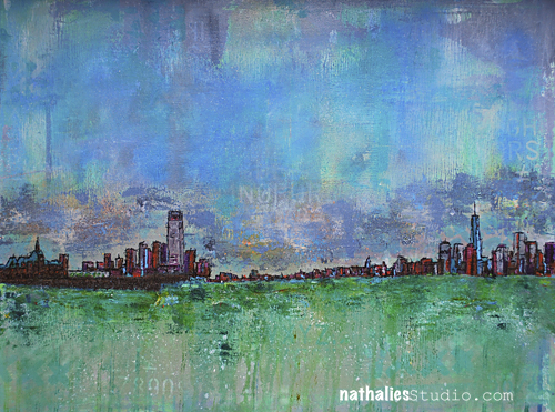
This is a bigger painting, so it doesn’t translate well as a photo on a blog. I like the colors and I achieved what I had in mind when I was going for only a small city skyline. I had a good time creating it.
What I learned:
I definitely took more of the things that I explored in my art journal onto a canvas. I also did more hidden or obscured journaling which I find a great exercise in the morning to start the day and also do something creative. I also learned that starting off with playing in the art journal before continuing painting on canvas, freed me up and made me ready to start. A good habit to keep.
My goal for 2016:
My goal for 2015 was working in general on way bigger surfaces- but that didn’t work out too well. I really want to make an effort to do that in 2016 …a bit hard in a small studio space, but I will figure it out. I also just want to paint more …when I looked at my work in 2015 I realized that I did pay less when I actually thought I had, not a big surprise given that I was traveling madly for workshops this year and an art journal is bit more handy to lug around ;) Cross fingers 2016 will be the year of bigger paintings
Hope you had fun joining me in winding down the year. If you did it too- share with me- I would love to see your best of list!
I hope I see you at Creative Jumpstart– starting tomorrow and wish you all a
HAPPY NEW YEAR 2016!!!!!
love&hug


Comments (5)
Jean Goza
| #
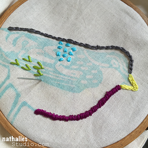
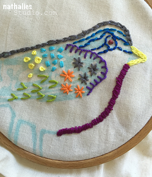
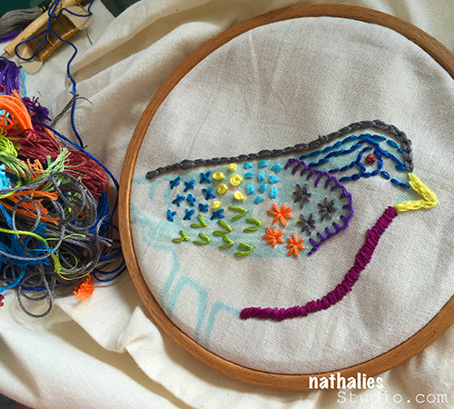
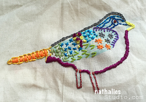
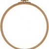
Love the bird. Inspires me to drag out my embroidery goodies and work on a new project. You are so inspirational. Thanks for sharing…
Reply
Joi @RR
| #
Heheheh – LOVE THIS Nat! I used to have so much fun embroidering. You have inspired me to play with it again. I still have a bag with thread and hoops!!! Your bird looks SPECTACULAR!!! What a great idea! SUPER FINE! Xj.
Reply
Karen D
| #
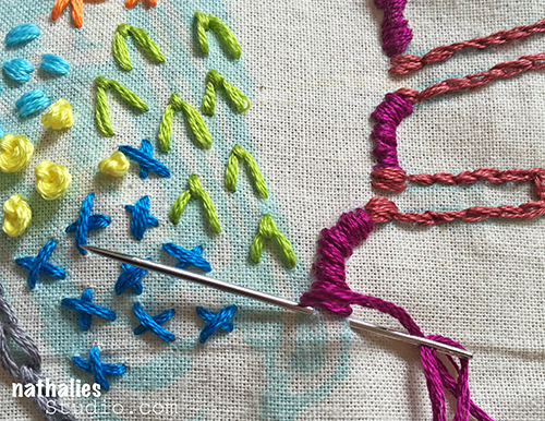
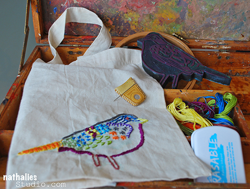
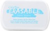
I love this idea of embroidering over the stamped image. I have used erasable marking pens before, but did not know about the erasable stamp pad. I used to do quite a lot of embroidery and have incorporated it with a painted background on some fabric. But lately I am working on an artwork and have embroidered over some of my daughter’s handwriting. Embroidery adds another dimension to your artwork and it can be very relaxing.
Reply
judi kauffman
| #
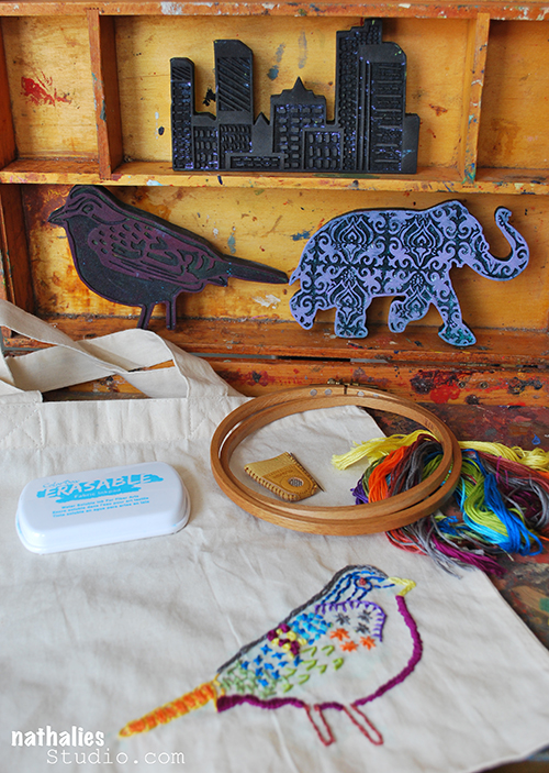
I knew you’d have fun with that ink, Nathalie, and I’m so glad you embroidered the bird. Is the bag big enough for a whole flock???
Reply
Sue Clarke
| #
It’s been a number of years since I’ve embroidered but this looks great and I never would have thought of using stamps as a guide this way. Thanks for sharing Nat.
Reply