Blog: Acrylic paint

Hands-On Acrylics at Kremer Pigments, NYC

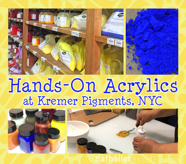
A couple weeks ago I took a 1 day class on how to make acrylic paints at Kremer Pigments in NYC.

They usually only held classes so far on how to make watercolor and oil paints, and I found out about the acrylic making class a day before it took place and had to jump right on it.

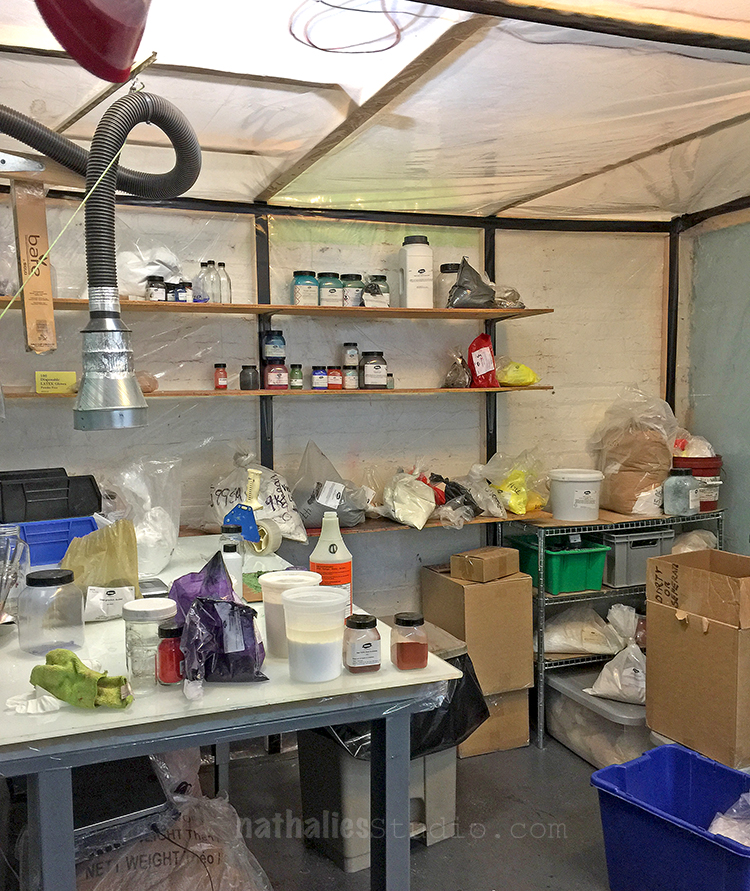
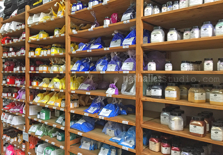
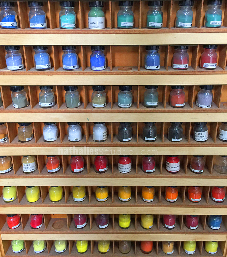
The class was held in the basement – it has a little closed off area where they make their Kremer paints.

Below my workspace :)

Roger, who held the class, explained that this was the first time teaching it, as acrylic paint is one of the hardest paints to make.

It all starts with making a color paste out of pigments and water , sometimes also alcohol is needed to break the water tension.

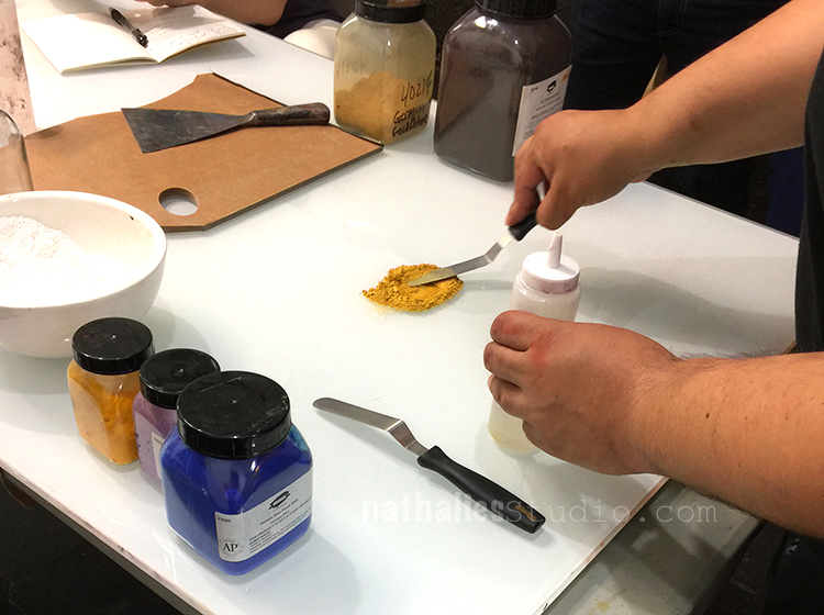
Roger showed us how to mix the color paste and how the consistency of the paste should look like.

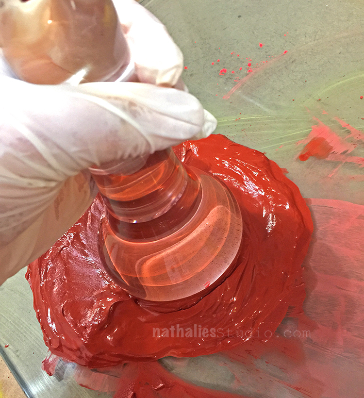
and here I am mixing orange

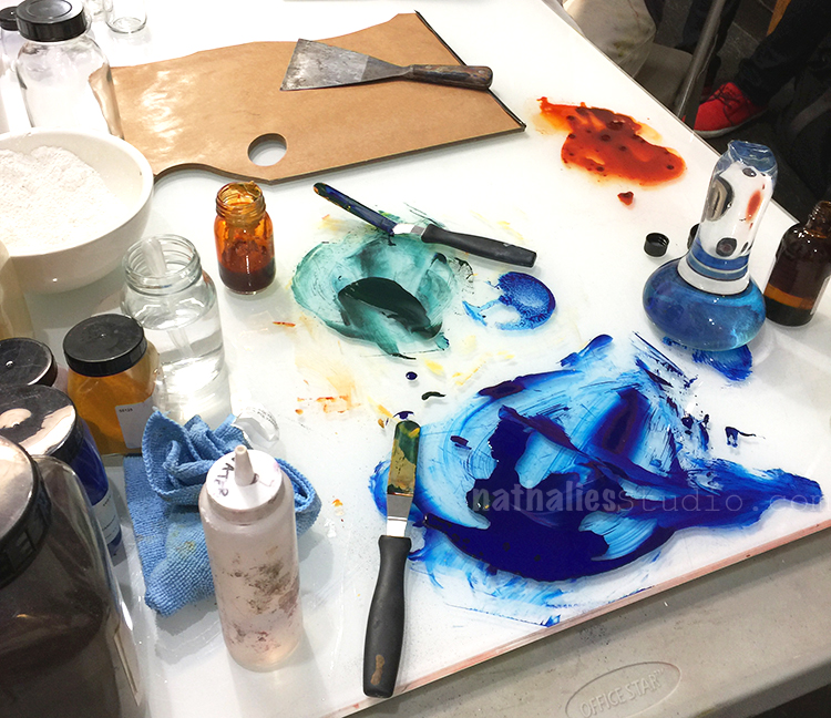
using a muler for another color to grind out the last lumps

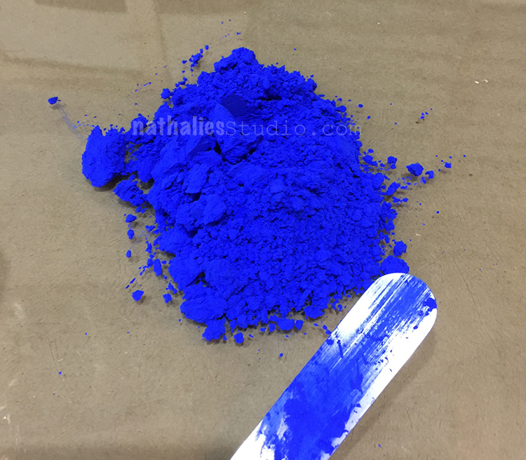
look at this luscious ultramarine blue

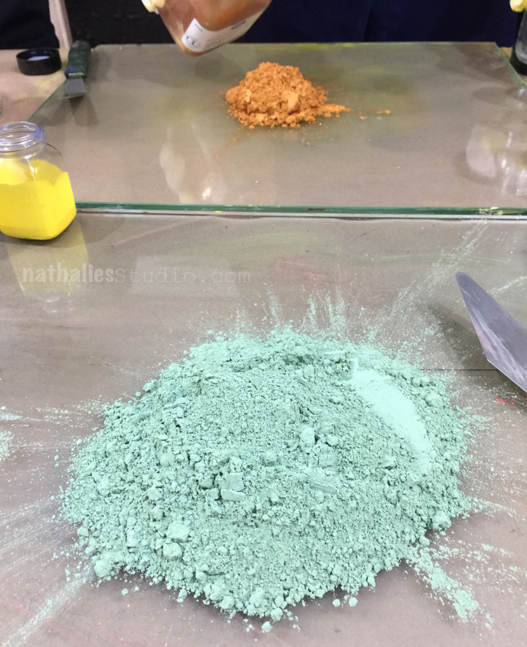
the green pigment below was accidentally in the pile- it turned out this wasn’t suitable for acrylics – but it was for sure pretty (bummer)

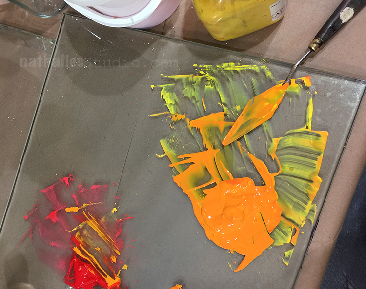
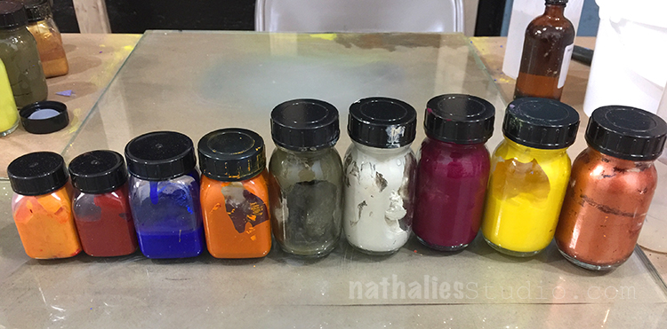
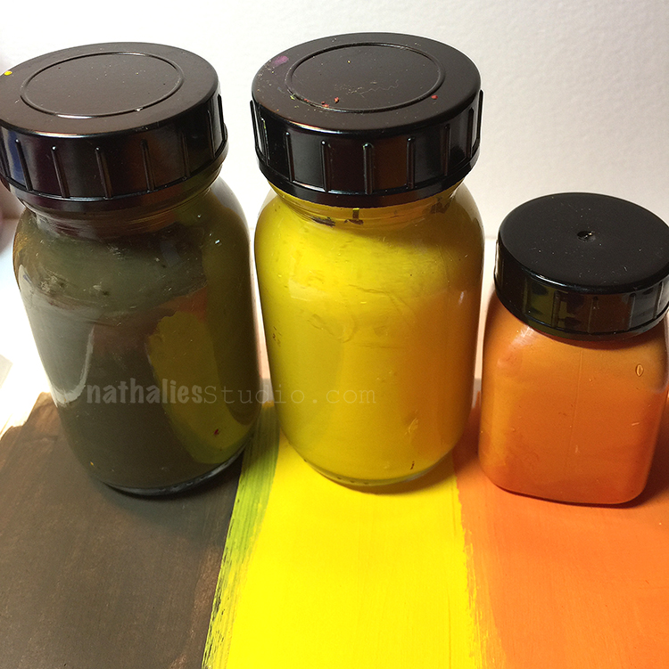
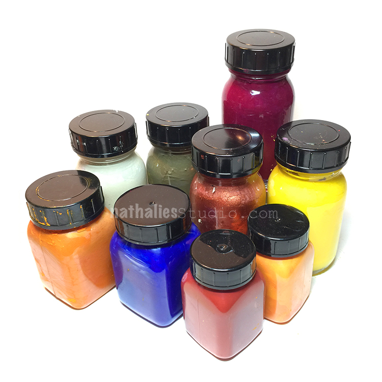
Here are my color pastes

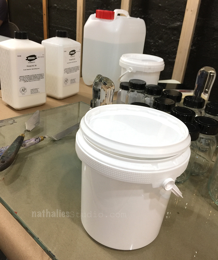
After making the colors pastes in the first half of the class it was time to make acrylic medium in the viscosity and sheen of our liking.

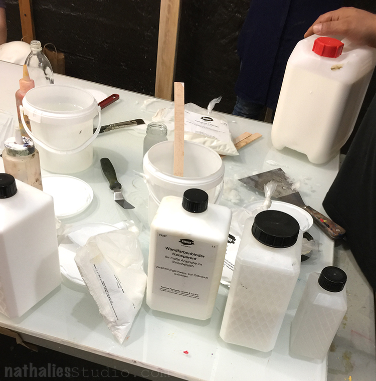
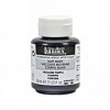
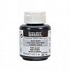
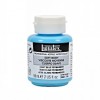
If you wonder about some German labels, Kremer Pigments is actually a German company :) The medium making part was harder for me than the color paste as there are so many different ways to make it.

The next step was to combine the color paste and the acrylic medium

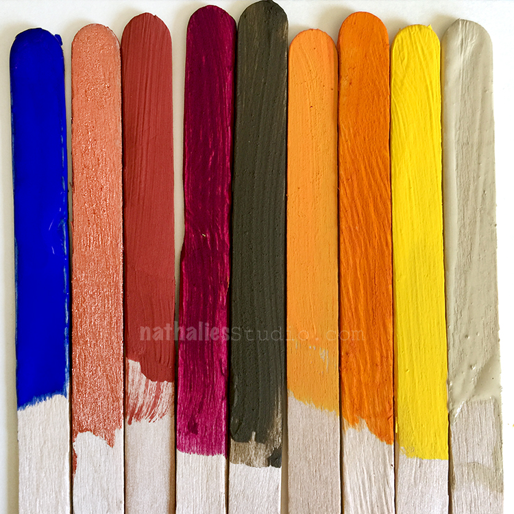
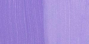
and voila – I got acrylic paint. I mostly strived to make thick and soft bodied matte paint. Some of them turned out pretty cool – some of them I think were a bit weak in their consistency of the color paste and one of my mediums was really off and changed a bit later (guess I didn’t do it the right way- LOL)

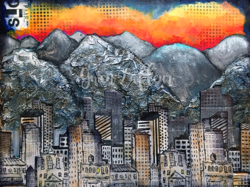
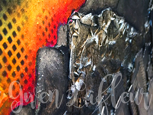
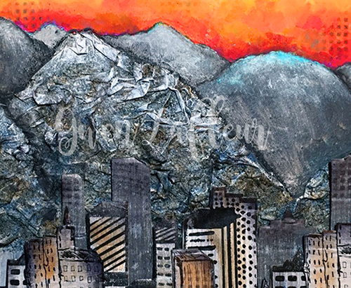
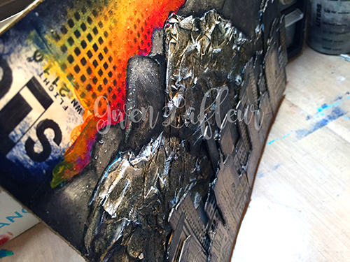
But all in all I love my new acrylic paints and I definitely will do this again by just using pre-made mediums to get the colors and the consistency of my needs. It was a really awesome class, Roger was incredibly knowledgable and so patient – answering a hundred million questions from us (we were all there for different reasons – to make paints for different needs). If you are in NYC and you feel you would like to learn about making paints check out their class schedule. And …the store is worth a visit in any event for some color therapy :)

Comments (8)

  • Tracy Krueger

    |

    Wow! That looks like SO much fun!

    Reply

  • Jackie P Neal

    |

    OMgosh! How fun and interesting Nat! you must have been in color heaven!!
    Wish we had cool places like this near us! “(
    Thanks for sharing- great post!
    hugs,Jackie

    Reply

    • nathalie-kalbach

      |

      Jackie, I was in color heaven indeed …I never saw a place like that before either- it is really unique!

      Reply

  • Jean Goza

    |

    Wow, what a great class! It must have been so fun. Love the colors you “manufactured”. :-)

    Reply

    • nathalie-kalbach

      |

      Yeah- it was fun — and thank you about the colors. Some of them turned out really great!

      Reply

  • stephanie

    |

    How fun!

    Reply

Leave a comment

Back for Workshops at My Heart’s Fancy in Oklahoma

Wohooo- so stoked to be back again at My Heart’s Fancy in Oklahoma for three workshops

June 16, 20172:30 pm – 6:00 pmStroll Through the Hood – Mixed Media Wall Hanging

Let’s create a beautiful little wall hanging for your home, office, or beyond! We will begin by creating a colorful, patterned background. Then we’ll take it further by adding scenery using stamps, graphite, paints and other supplies. Finally we will add detail and highlights to pull the landscape together. We will be working on Ampersand Clayboard which offers a special and exciting surface to create your Mixed Media work on.

Register here


June 17, 201710:00 am – 5:00 pmThe Magic of Acrylics – Technique & Abstract Painting Class

Join me for a full-day class exploring all kinds of different Acrylic Media – from Dumbledore to Merlin, from Acrylic Paints to Acrylic Inks, from String Gel to Pouring Medium, from Modeling Past to Black Lava and other fun stuff!

Learn their magic – and put an end to the mystery of how to use these amazing helpers in your Mixed Media and/or Art Journaling projects. The first half of the class will be technique based and in the second half you will put your own spell onto 3 abstract canvas paintings. After this class you will have a lot of fun waving your new magic acrylic wand whenever you create!

Register here


June 18, 201710:00 am – 5:00 pmWhat’s Cooking – Art Journal Class

What makes an Art Journal spread, or for that matter a work of art, work?

Let’s explore in a playful and creative way the Principles and Elements of Art, using Mixed Media tools and supplies. Think of the principles as you might think of a recipe: a starting point to which we add the right ingredients – the elements – to make your art journal pages more interesting. Develop your individual recipes, which will result in your very own style. – LET’S GET COOKING!

Register here


I hope to see you there! And if you cannot come- check out where I am teaching in the next couple weeks

Leave a comment

Art Journal: The Wand Chooses The Wizard

kalbachthewandaj01

“Honey, just remember: the wand chooses the wizard” – what a fun quote.

kalbachthewandaj02

I painted the background in different purple tones and shades with acrylic paint and then used the Santiago 9×12 Stencil on top with some grey and also some purple.

kalbachthewandaj03

I used acrylic markers on top of a magazine image and added some detail with a black pen and a pencil.

kalbachthewandaj04

Love the worn painted look and the stencil gave it a lot of dimension.

Here are the supplies I used for this art journal spread- some are affiliate links:

supplies


Hope you are wearing a great wand this week :)

Leave a comment

You Are At The Right Place or… In My Art Journal Today

artjournalrightplace01

“you are at the right place, when you travel and have a splendid time and come home and fall over in love again with your home”

artjournalrightplace02

Loved making this grungy spage using a handcarved stamp as well as my Urban Scribble and Grunge Stamp Set.

artjournalrightplace03

I added some marks and painted details to blend the elements together and I like the overall feel of this page.

artjournalrightplace04

This art journal spread reminds me how excited I am every time I come home from traveling and how happy it makes me to see the statue of liberty and the skyline of Jersey City and New Jersey and sometimes even my house from the airplane. I guess I am home here now *wink

Here are some of the supplies I used for this art journal spread – some are affiliate links:

SuppliesCJS

Wishing you a beautiful day!

Comments (1)

  • Joi@RR

    |

    Oh wow – these pages are just amazing Nat. There is so much to see and so much dimension – the buildings go in and out and up and down and it’s just sooooo awesome. Seems like THIS needs to be a painting SOON. It’s really splendid. Xj.

    Reply

Leave a comment

Don’t Want it Back or … In My Art Journal Today

dontwantitback01

I think it’s important to realize you can miss something, but not want it back. – HT Paul Coelho

What a great and true quote!

dontwantitback4

I limited my self for the background to Red painted over some collaged areas, titanium white and black and added some swatches of teal here and there. I stamped with the Urban Scribble, the Mish Mesh and the Mark Maker Stampset and also used the stencil in the Urban Scribble set, adding paint and taking it off with black and titanium white too.


dontwantitback02

For the journaling I used a brown acrylic marker and overwrote with a white signo pen to make it pop a bit more. The image was also overpainted with markers.

dontwantitback03

Fun – I love the teal and red – now I want to wear it :)


SuppliesCJS


Have a wonderful day!

Comments (2)

  • Jenny Petricek

    |

    Luscious colors and textures! Love the quote, too!!

    Reply

  • Joi@RR

    |

    You are so right Nat – the red and teal are luscious together! What an interesting quote – I like it. This is a super journal creation. What I love the most is that you used your stamps in such an artistic way. They are not ‘obvious’ – they are just part of the art. I love using stamps that way but I have had some folks be a bit offended because it “alters” the stamp so to speak! You know that your Urban Scribble is my fav so I am just thrilled to see it on this project but not really SEE it in it’s full beauty! The Mish Mash is there and looks great but it’s not intact – love that. You cannot image how often I use your Fiesta stamps in my backgrounds and they are perfect… but many times they are not totally there!!! Anyway – I’m rambling but just wanted to say… as always… I LOVE YOUR ART – in whatever form it displays itself :) XXj.

    Reply

Leave a comment

My new Acrylic Painting Workshop DVD’s and Downloads are out!

KalbachDVD Collage

My new Acrylic Painting Workshop Videos: Colorful Backgrounds, Acrylics Demystified, Raw Canvas Staining and Creating Canvas Texture are out now and I am super excited. It was so  much fun to make them and I love how they came out. They are loaded with techniques, tips and fun things. Here is a preview for all four videos:

You can purchase the videos as DVD’s but also download them. Here are the links:


Which one sounds the most interesting to you?

Have a wonderful day!

Comments (2)

  • Joi@RR

    |

    ALL OF THEM sound the most interesting Nat because YOU are teaching them! Perhaps the colorful backgrounds would be my first choice but not sure that’s right either!!!!!!!!!!!!!!!! SUPER choice of topics. So excited that you did these. I know they will be a great resource for us all. XXj.

    Reply

Leave a comment

My City Speaks to Me – Gwen Lafleur

CS April My City Speaks to Me Blue

It’s Tuesday so it’s once again time for my Creative Squad to show you a fun project, and we are at the start of April now, so we have a new theme too!  The theme for April is “My City Speaks to Me” and throughout the month, the team will be using my new Urban Scribble Foam Stamp, Rubber Stamp and Stencil Set. This month’s theme is all about expressing what your hometown or city is all about.  What makes it special, vibrant, and important to you?  This month, our Creative Squad will take us on a trip to their city!

So without further ado, here is the uber creative Gwen Lafleur with her gorgeous interpretation of the theme!

—————————————————————————————————–

Gwen April Headshot

I live in a suburb of Salt Lake City, Utah, but I work downtown and one of my favorite views is when I’m driving in and the city comes into view up against the mountains. I especially love it when the sun is coming up in the background (or the sunset behind the mountains on the other side of the valley when I’m driving home at night!) There are frequently spectacular colors and I never get tired of the view; the contrast of the man-made city with the rugged mountains really draws me. It also influences a lot of the culture here – my office mates are frequently off doing morning ski tours before work and lunchtime discussion usually centers around outdoor activities. I’m not particularly outdoorsy, but I love the views and the openness of this area, and after recently moving back here from Chicago, I’m especially loving the more laid back and less crowded lifestyle!

500 Salt Lake City Mixed Media Painting - Gwen Lafleur - WM

With those thoughts in mind, when I got this month’s challenge I immediately knew that I needed to use the Urban Scribble stamps backed by mountains of some kind. I started by taking an 11″x14″ sheet of heavy weight mixed media paper and I sketched out where I wanted the mountains to be. I used pages torn from a telephone book along with Mod Podge mixed with water and put crumpled paper within the outline of the mountains in the foreground.

detail Salt Lake City Mixed Media Painting Close-up 2 - Gwen Lafleur - WM

Once they were dry, I used Montana Granit Effect spray paint and gave them a good coat – it really helps them look like rock! I used a few washes of acrylic paint on top to add a little shading and dry brushed some white on the tops (since the mountains still have their snow caps right now.)

detail Salt Lake City Mixed Media Painting - Gwen Lafleur - WM

Next, I gesso’d the area above my mountains and painted in some more in the background, then I added a sunrise with lots of fluorescent paints. For the city, I took a few sheets of drawing paper and gesso’d them, then painted them with different shades of gray and silver. When they were dry, I stamped on them twice with both the detailed side of the foam stamp and the rubber stamp. I also stamped in gray with the solid side of the foam stamp. I cut out each individual stamped image and mounted them all on a thin sheet of cardboard, then cut them out again. I lined them up in front of the mountains on my piece and started adhering them in layers, using stacked cardboard on the back of each piece to add dimension. I cut some of the cityscapes into smaller pieces so I could arrange them the way I wanted.

500 Salt Lake City Mixed Media Painting Close-up 2 - Gwen Lafleur - WM

Once that was done, I added a wash of color here and there. I used a black Stabilo All pencil to add some definition to the mountains, then I finished the piece by using the stencil that comes in this set in the sky and in the bottom corners and on some of the buildings and outlined the whole piece with a gold paint marker.

I really love the contrast of the texture from the mountains with the stamped buildings, as well as the colorless early morning city against the beautiful colors of the sunrise. I think it even looks a bit like Salt Lake!

———————————————————————————————————-
I hope you enjoyed Gwen’s project! I think we’re all wishing we had a scenic commute like hers :) I love how she created really dimensional texture with layers upon layers of stamped cityscape and the crumbled paper mountains in the background.  And that orange sunrise!  It literally glows.
Besides the supplies listed below, Gwen also used cardboard, phone book pages, and pieces from a luggage tag with SLC on it:
SuppliesCJS


And maybe you will even play along -we would love to see how you interpret the theme – email me how you used my stencils and stamps with the theme and email me an image – I would love to share what you did at the beginning of next month!

See you next Tuesday for the another project with the theme ‘My City Speaks to Me’.

Comments (18)

  • Dee Ann O'Brien

    |

    Amazing mountains that really enhance the city!

    Reply

    • gwenlafleur

      |

      Thanks so much! I just wish I could capture a fraction of how beautiful it is in real life, but it’s sure fun to try!

      Reply

  • Karen Petitt

    |

    I have no words to express how wonderful this is. I get it completely because we lived in central London for a long time and the one thing I love about coming home was the city behind and the country ahead. Its beautiful, gorgeous, wonderful, awesome – not enough words to express how great it is. Thank you for sharing some of your process too. As I recent convert to mixed media I would not have had a clue how you created those mountains – it’s genius! Many thanks for the fabulous inspiration and for sharing your art with us Karen x

    Reply

    • gwenlafleur

      |

      Thank you Karen! There’s just something about the contrast of city and nature that really speaks to you, isn’t there? You’re also making me want to go back and visit London again :D

      Reply

  • Joi@RR

    |

    Oh my gracious – THIS is a FABULOUS creation Gwen. I am just blown away by the dimension and texture of this piece. YOU – dear girl – totally GLORIFIED Nat’s Urban Scribble. And since it’s my very fav one – I am just THRILLED to see this. HIGH FIVE!!!! Your entire piece is SPLENDID – your mountains are beyond GORGEOUS. LOVE love love this. j.

    Reply

    • gwenlafleur

      |

      Aw, thank you so very much! I really love this set too and it was so much fun to use. So glad you liked it!

      Reply

  • cheiron

    |

    This is one amazing page Gwen! I love the texture…what a beautiful city.

    Reply

    • gwenlafleur

      |

      Thanks Cherion! The texture is definitely my favorite part :)

      Reply

  • Karenliz Henderson

    |

    WOW amazing piece. Just gorgeous! I love the way you created the mountains plus the sky is gorgeous.

    Reply

    • gwenlafleur

      |

      Thank you so much! It was lots of fun to put together :)

      Reply

  • Lynn Reed

    |

    Wonderful artwork! Love the buildings and the mountains and the bright accent color of the sky.

    Reply

  • Sue Clarke

    |

    I LOVE the texture in the mountains Gwen. Nice piece for sure!

    Reply

    • gwenlafleur

      |

      Thanks Sue! The mountains are my favorite part as well… it was a bit of an experiment, but I love how it came out!

      Reply

  • Michelle LaPoint Rydell

    |

    Wow! Gwen, your page is StUNNING!!! The dimension is fabulous, and that sunrise is breathtaking!

    Reply

    • gwenlafleur

      |

      Thanks so much Michelle! I had a lot of fun putting this one together :)

      Reply

  • Laurie Hunt

    |

    Gwen this is beautiful! I totally get how you feel about those mountains. I recently moved from Detroit to Phoenix and I love every time I go out seeing those mountains over the valley — and our mountains are nothing compared to yours! I tell my husband all the time I hope I never lose that awe inspiring feeling as I look around this beautiful southwest. Great work. Loved the step outs and the commentary.

    Reply

    • gwenlafleur

      |

      Thanks so much Laurie! Yeah, I can imagine that going from Detroit to Arizona would be very similar… that’s a beautiful area too :) I’m with you… I never want to lose that sense of awe!

      Reply

Leave a comment

Rule of Three #1 – Three Ways to Ink up Foam Stamps

Let me introduce you to my new series of mini-videos: “Rule of Three”. As we all know all good things come in three and these mini-tutorial-videos will show you all kinds of fun and practical things and techniques in coming in three.

+ Expand this article
5comments

Comments (5)

  • Joi@RR

    |

    YES Nat – loved seeing your ‘rule of 3’! And you are so right – the fun of foam is that it’s not a perfect imprint – which is what I love best about your foam stamps. But then, I have always been weird that way – never wanted to do anything the same as anyone else!!!! I think your foam stamps are INCREDIBLE…. just like YOU!!!! XXj.

    Reply

  • Tommy McDonell

    |

    Thanks. I bought your bird and it and I can tell you ways that it doesn’t work well! Looking forward to trying it again!

    Reply

    • nathalie-kalbach

      |

      Tommy, glad you liked the video and yes give it another try. Just keep in mind that a foam stamp is not providing a perfect image as a rubber stamp and that is the wonderful thing about it. You can create texture with it – visual and actual texture and there are many more ways than the three I showed in the videos to apply paint – I will share some other tricks and tricks in the coming months. Hope you have fun with the bird stamp! Nat

      Reply

  • Sue Clarke

    |

    I’m glad that you showed how to store the cut and foam with paint on it. I would not have thought of that. Thanks for the tips.

    Reply

Leave a comment

What’s Right or … In My Art Journal Today

WhatsRight01

“Stand for what is right even if it means standing alone!”

For this art journal spread I used my new DecoArt Media Acrylic Paints which the wonderful people of DecoArt sent me to try out. They are fluid and most of the colors in this range are transparent or translucent which makes for some nice and interesting layering effects as you can see where I played with a hand cut diamond stencil in the background.


WhatsRight02

I used my new Fashion Dame Stamp Set

Fashion Dame Stamp Set

and layered the three included stamps – the dame, her skirt and her jacket on top of each other – stamping with archival ink and then painted it in with  DecoArt Media Acrylic Paint and some Derwent ArtBars.

WhatsRight04

I also used the stencil in the stamp set and mixed white DecoArt Crackle Paste with some Primary Yellow Acrylic Paint and scraped it with a palette knife over through the stencil. I might have squealed a little bit …after a short drying time these tiny little perfect cracks started to appear and oh boy…I think this Crackle Paste and I just became buddies!

WhatsRight03

It was fun playing with new paints and a new medium! Not knowing a art medium a hundred percent frees you up to experiment and give new things a shot, it made for a great journey for this spread :)

What was the last new art medium you tried out?


SuppliesCJS


Comments (2)

  • Joi@RR

    |

    I too am playing with various DecoArt products!

    You are right – there is so much dimension on this page – just from the paints – it’s amazing. The crackle looks super too. So glad you got some time to experiment and play Nat. It’s a lovey page – especially that great looking gal you created!!! XX j.

    Reply

  • Sue Clarke

    |

    I really like how the stamp and stencil go together with such style.
    Reminds me of the dresses that you’ve shared with us over the years (that you’ve worn). I’ve actually re-discovered fine magic markers again.

    Reply

Leave a comment