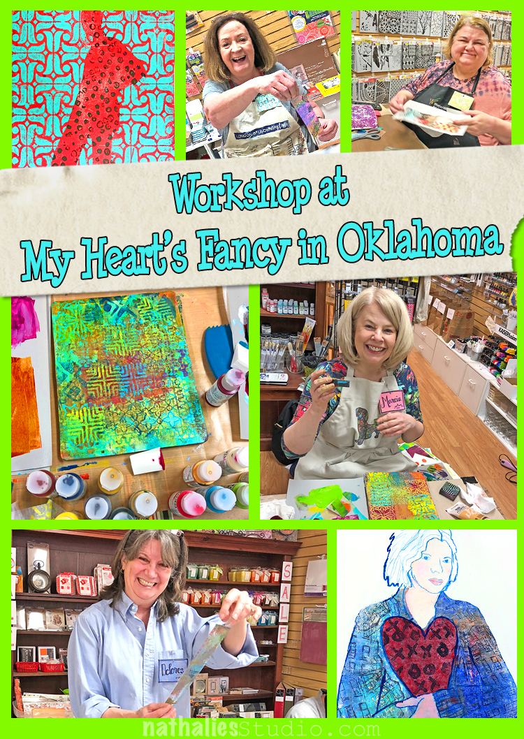
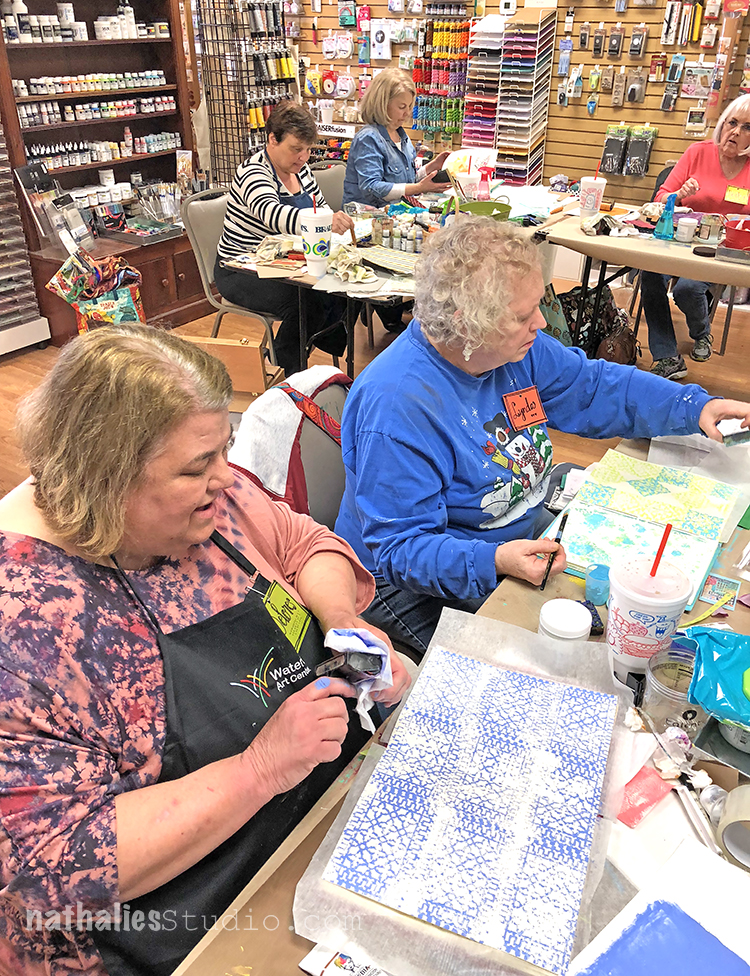
Last weekend I taught my 3-Day Splash of Color Workshop at My Heart’s Fancy in Oklahoma. We started out with blank papers, filled them with lot’s of pattern, and imagery and then bound them into art journals.
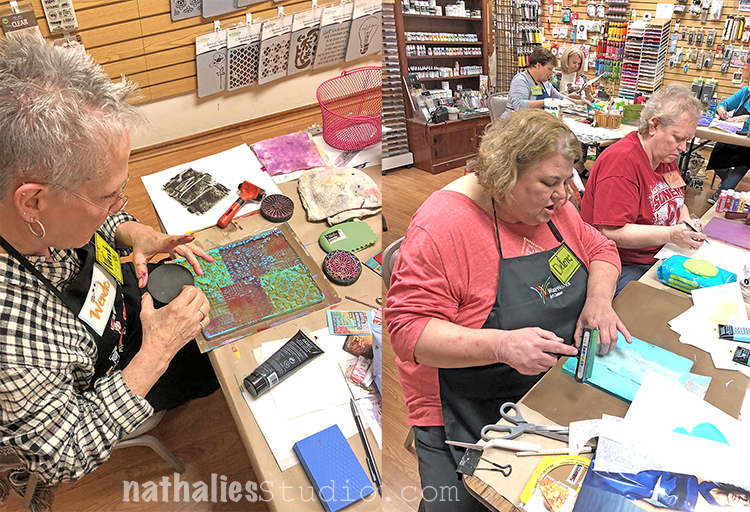
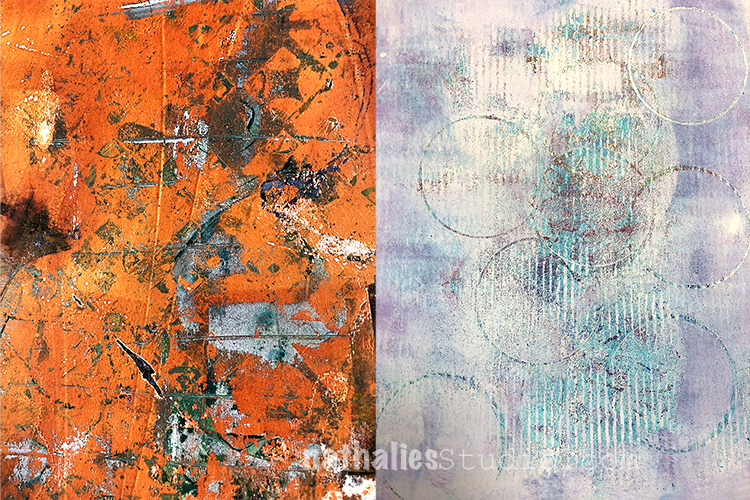
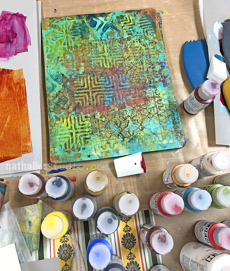
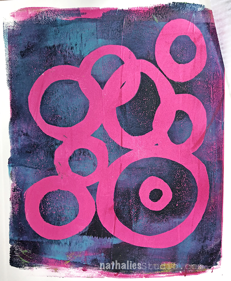
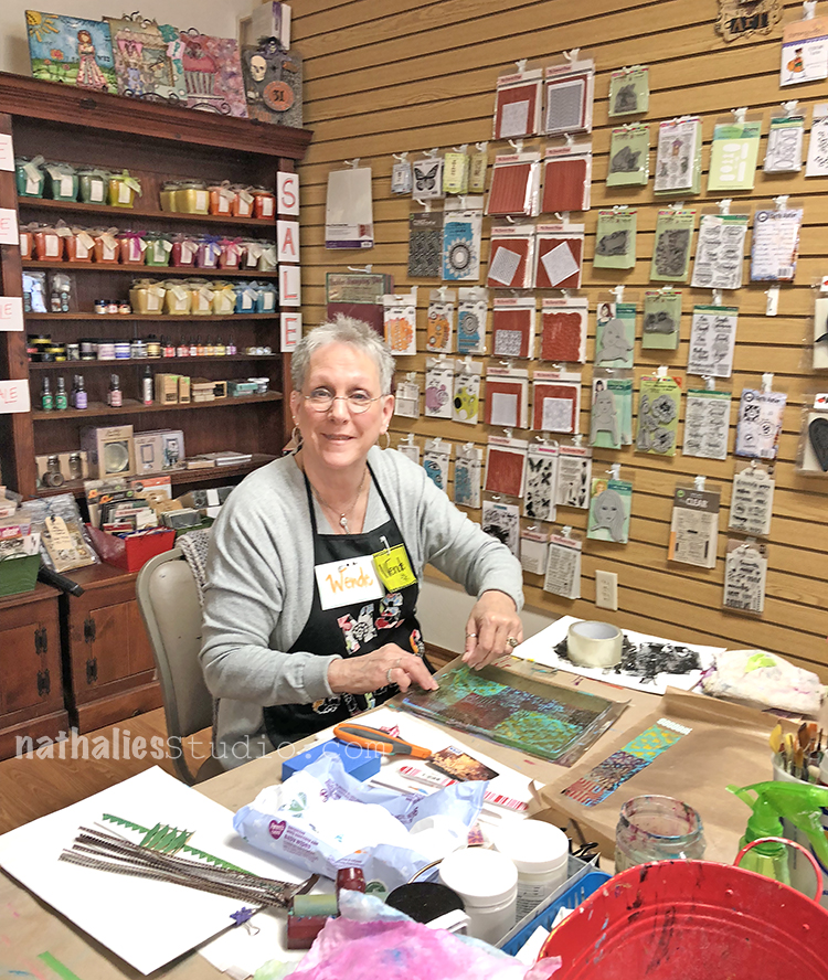
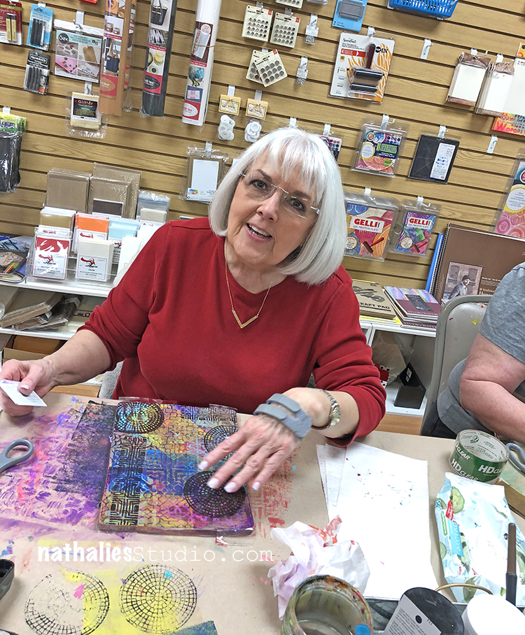
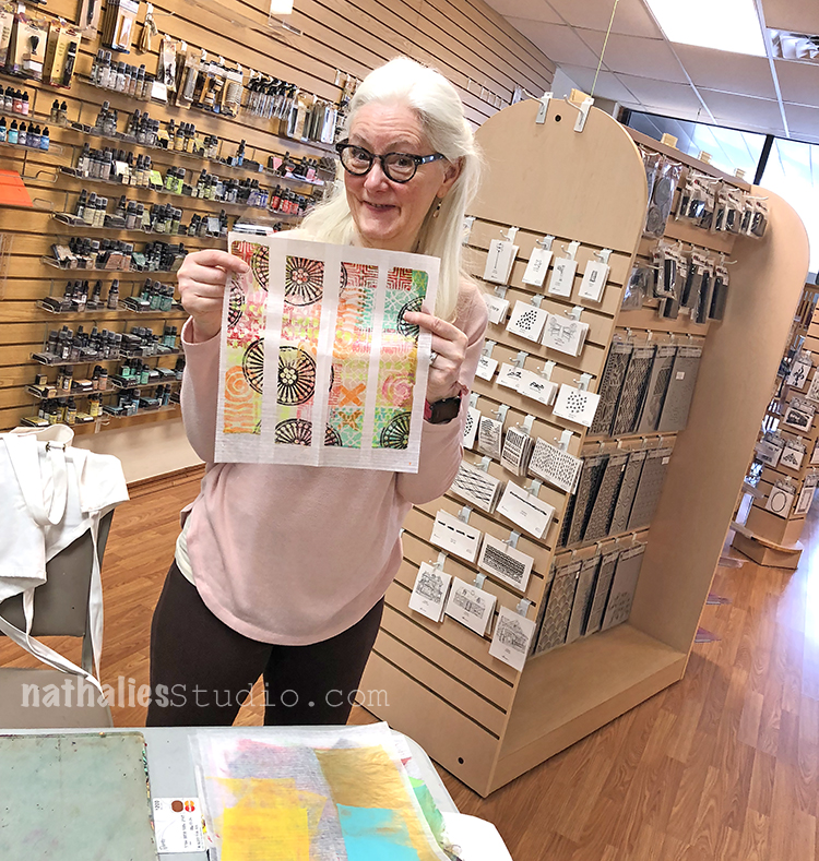
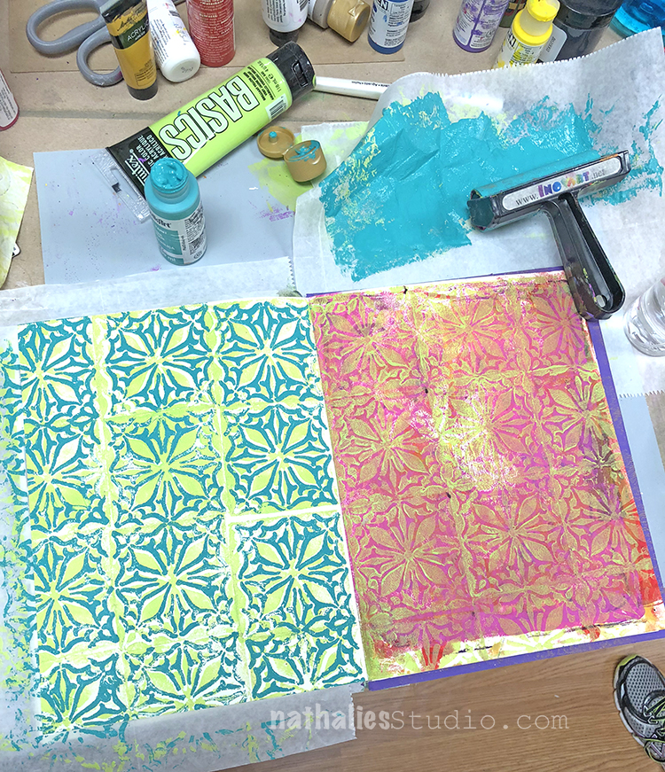
We did a lot of gelli printing/mono printing the first day- look at those colorful pages
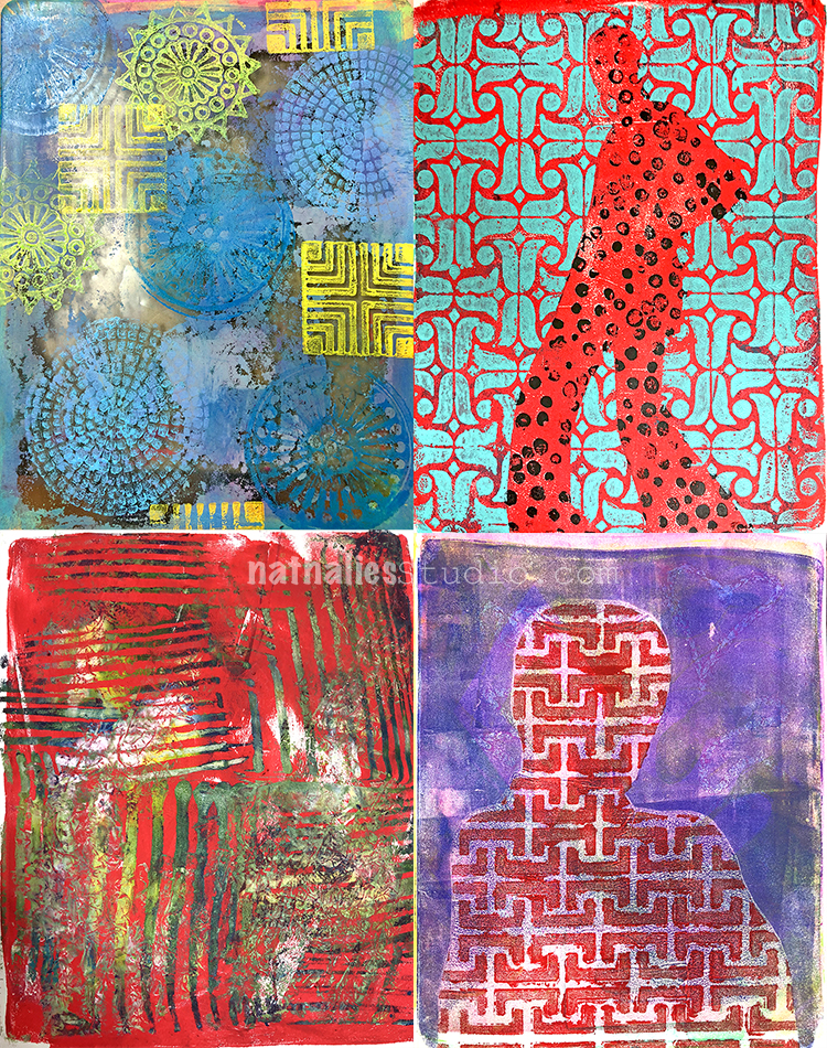
Love all the texture – yummie!
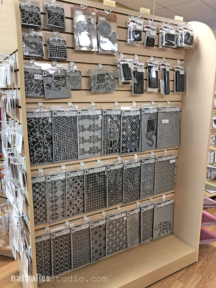
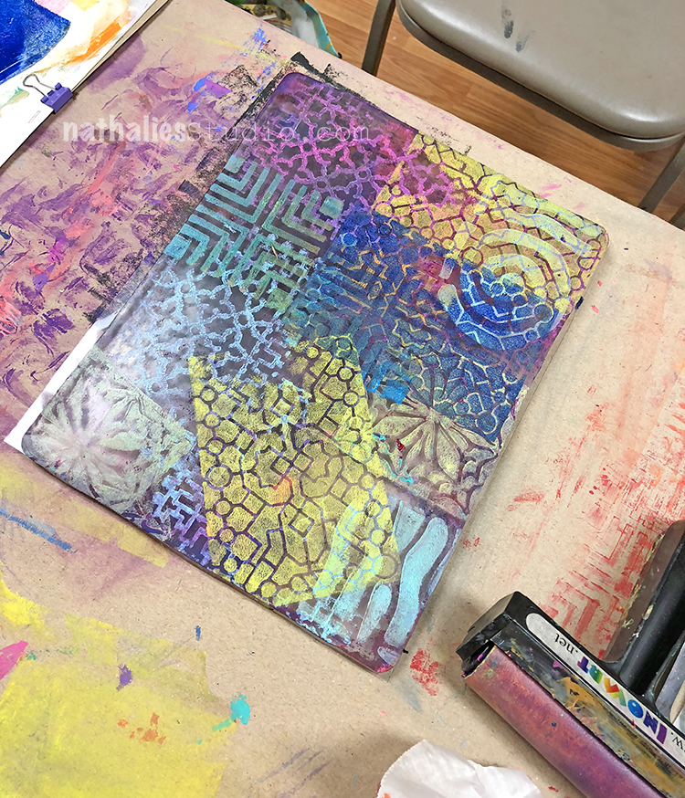
We used tons of my stencils and stamps- always tickles me to see a wall of my designs :)
And we had a ton of fun – I love spending a whole weekend with a group of sweet talented students!
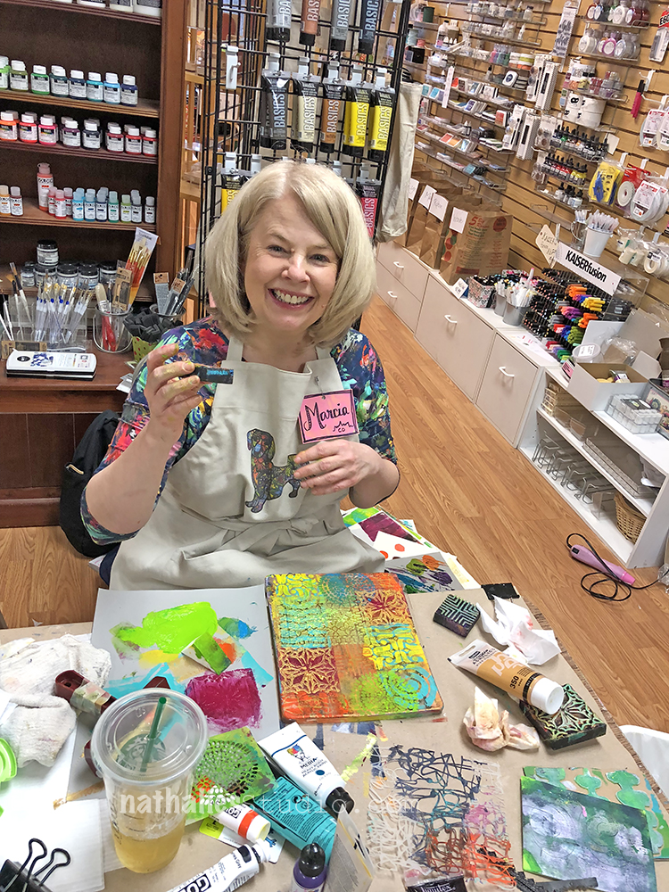
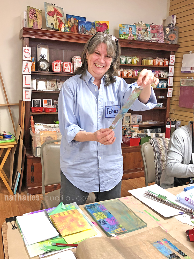
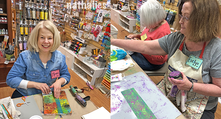
Look at Marcia colorful gelli plate :)
Time flies when you play with paint and colors – the three days went by in a breeze
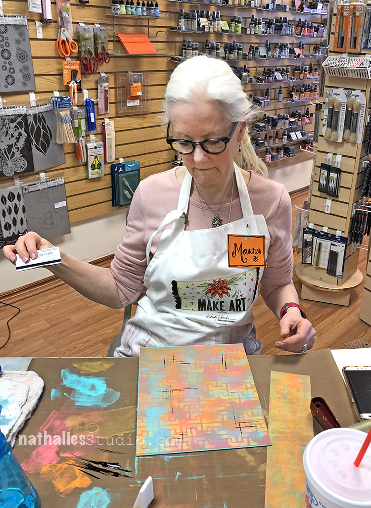
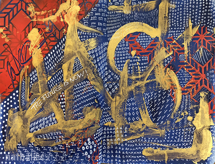
Creating the covers was a big hit too – happy faces
and thinking faces ;)
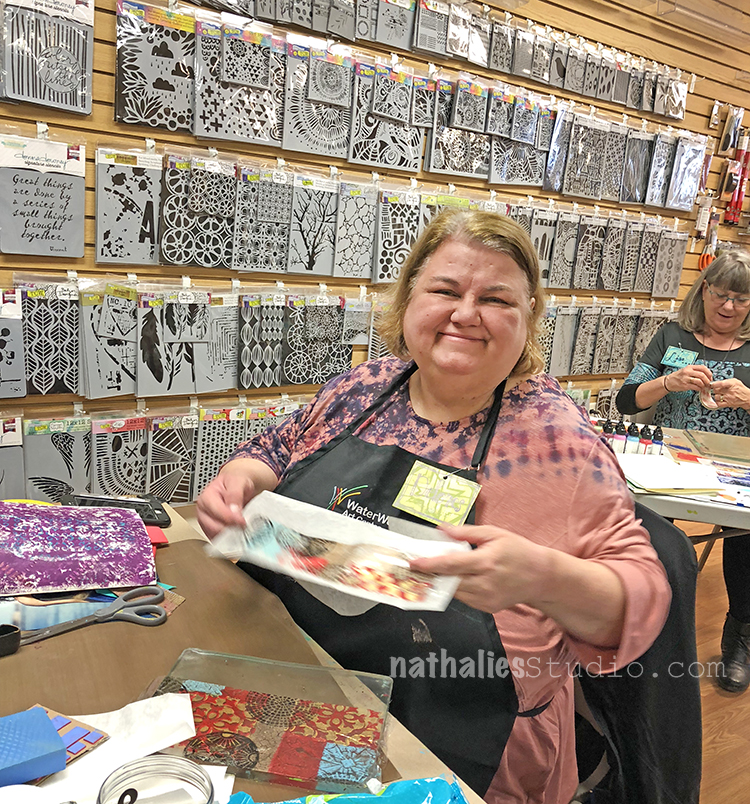
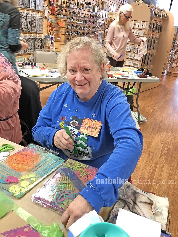
Now how can you not enjoy a weekend with all those smiling peeps :)
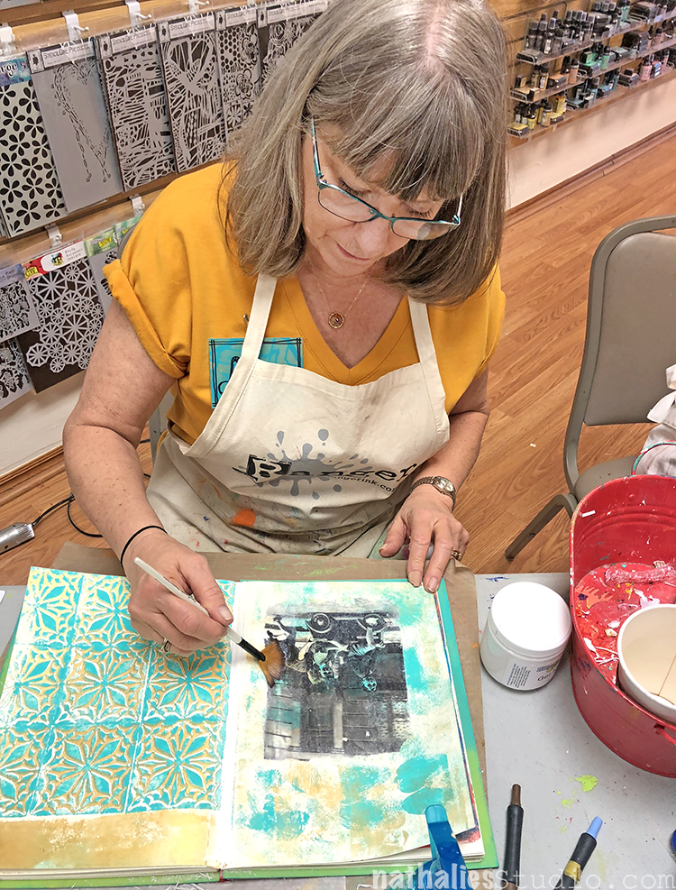
And it was so much fun to see how everyone loved their newly bound book on the second day and working in it.
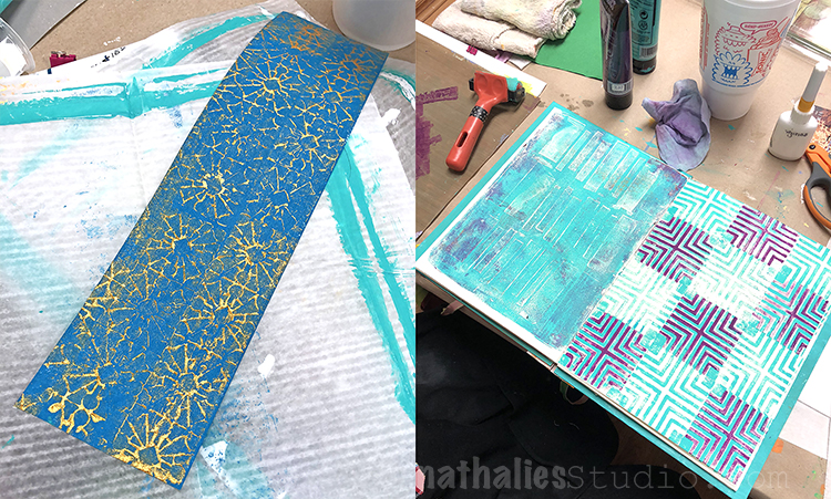
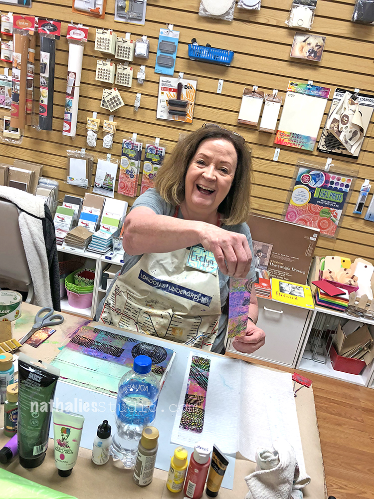
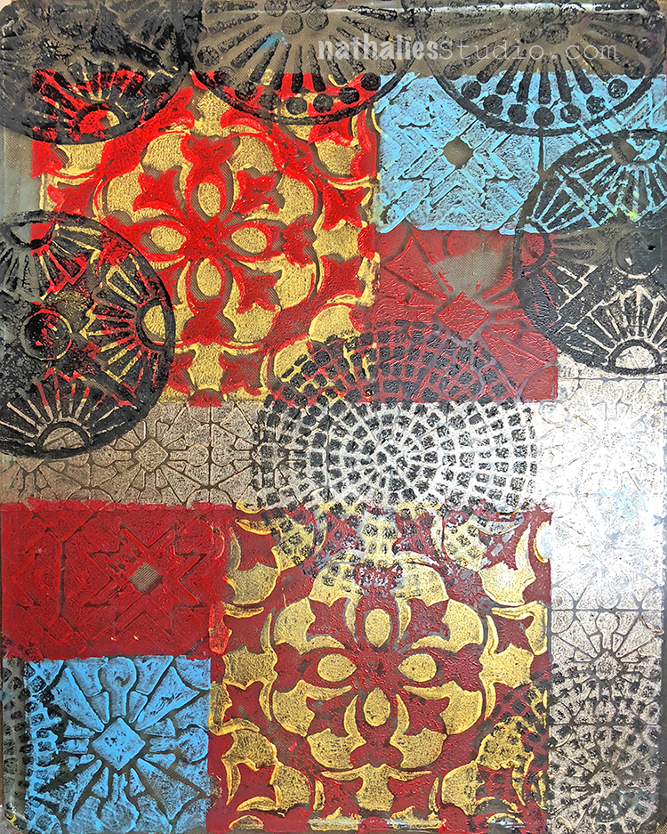
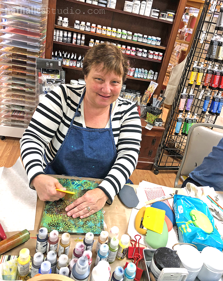
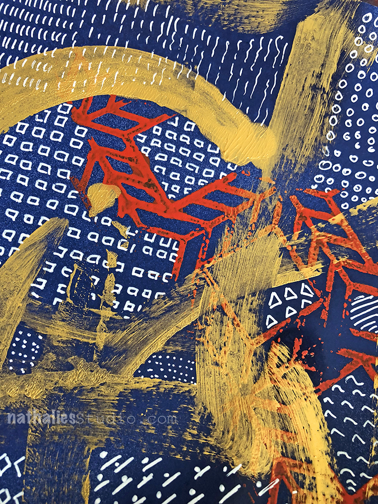
yummie patterns with my ArtFoamies – I always love seeing the color combinations my students choose. So inspiring.
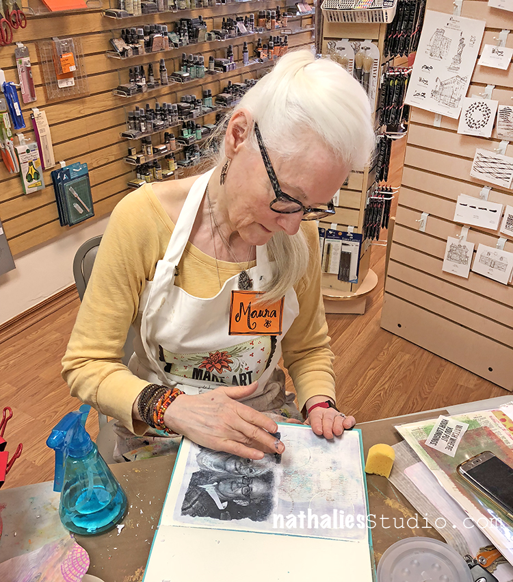
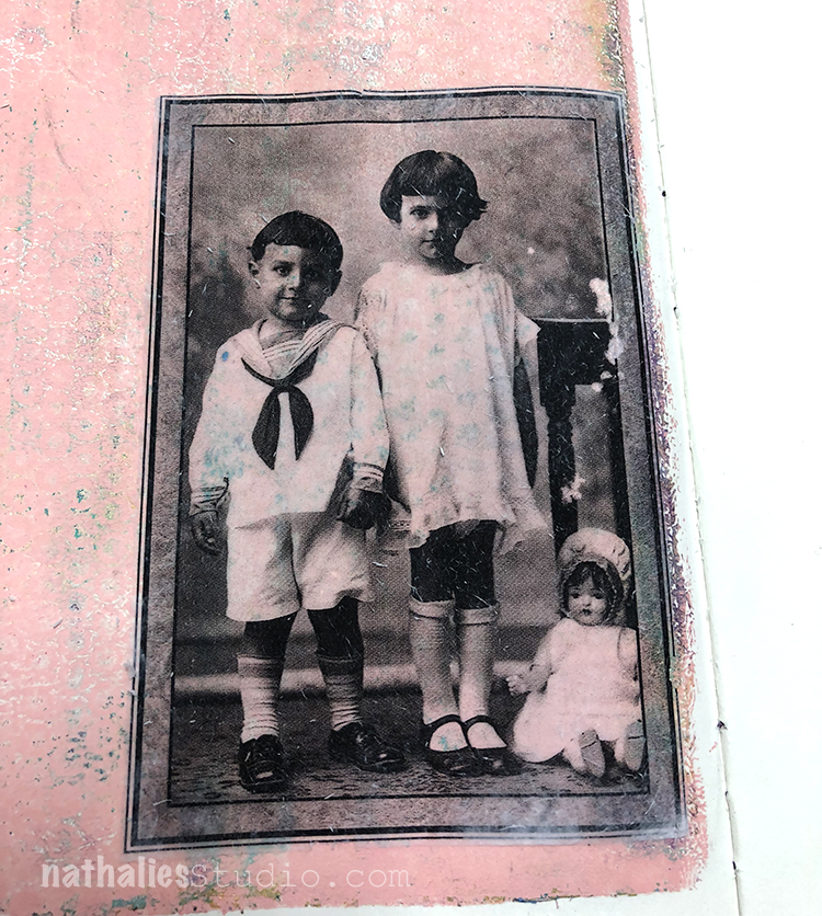
We also did some transfers and they looked fabulous!!!
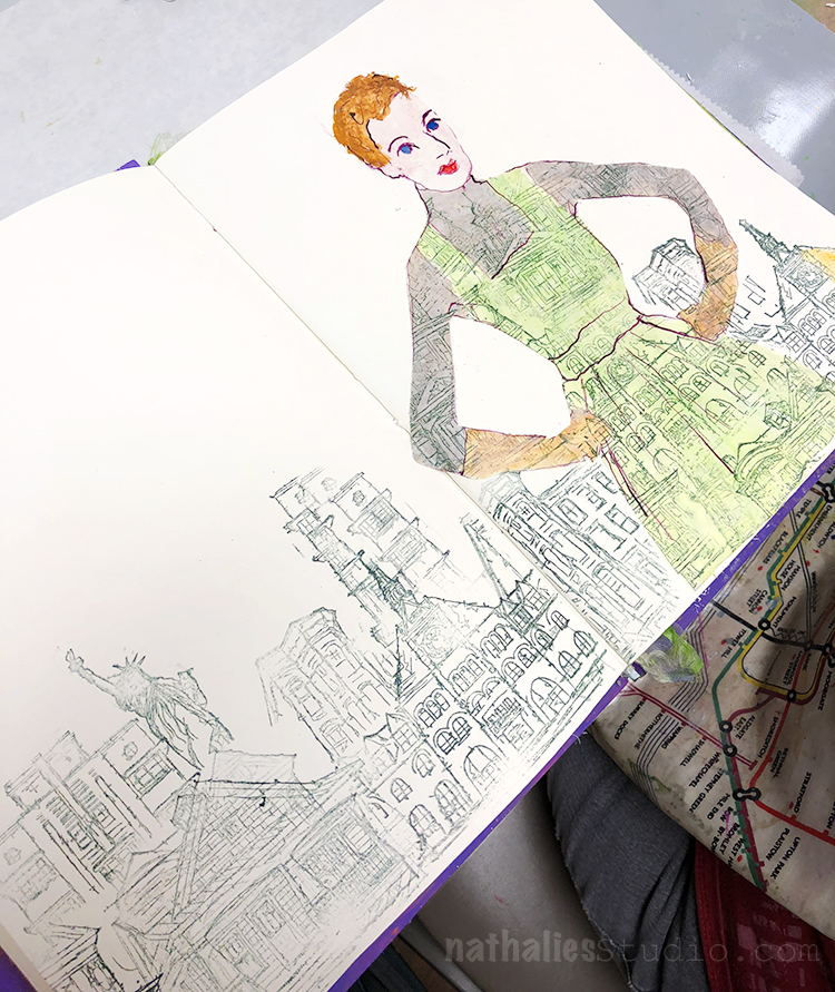
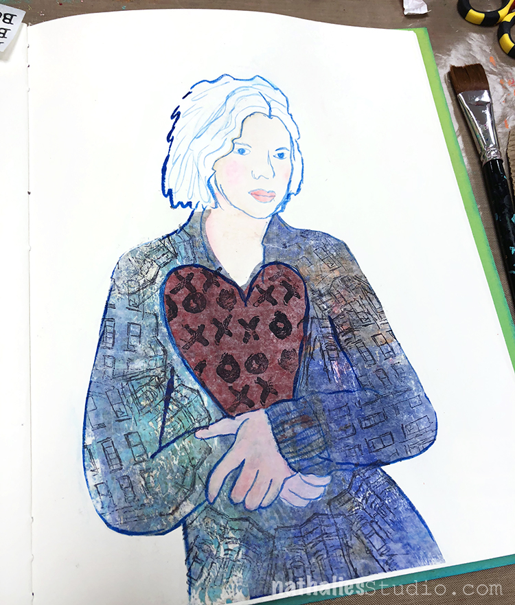
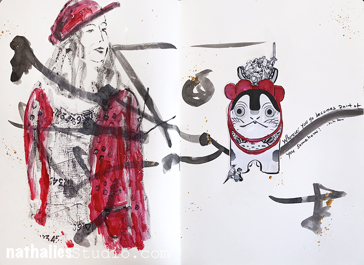
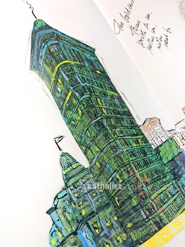
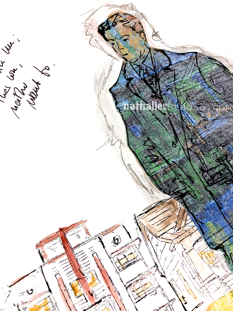
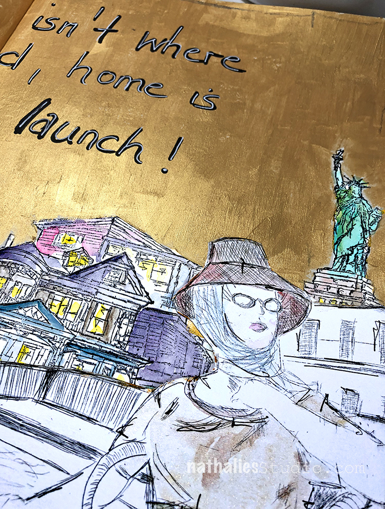
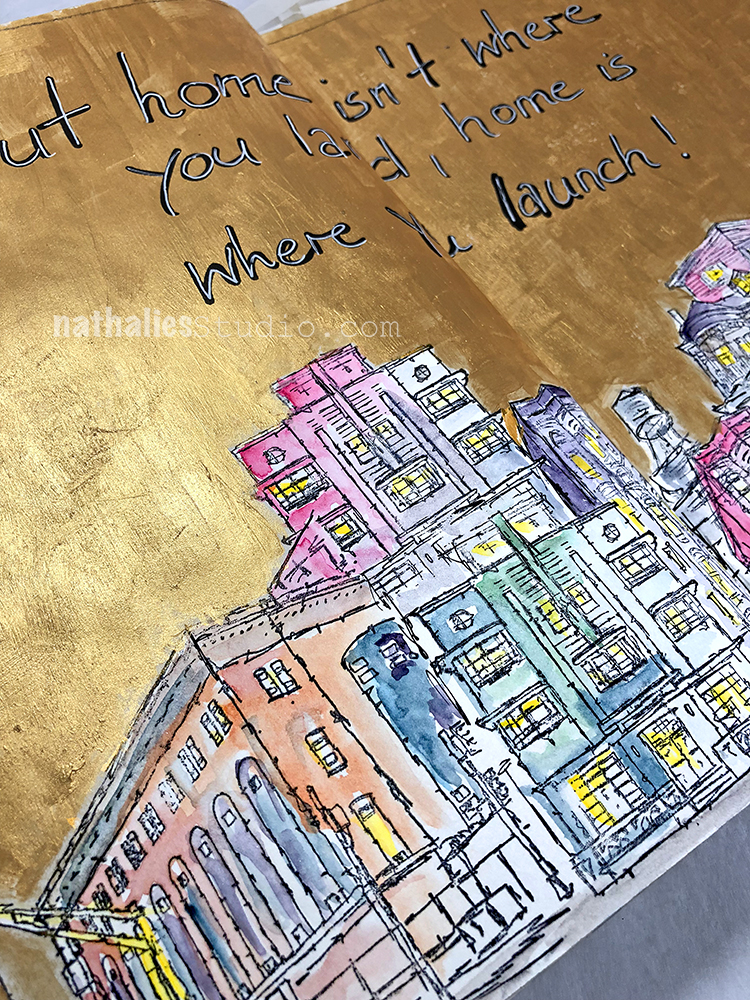
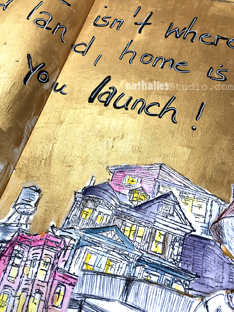
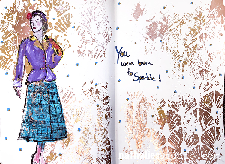
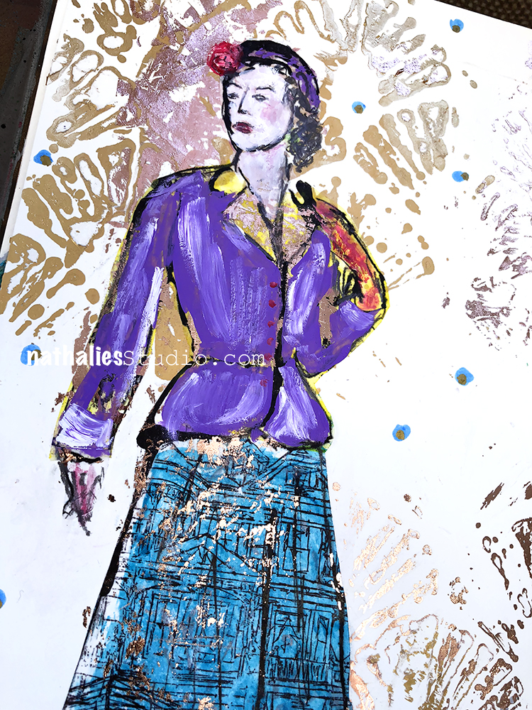
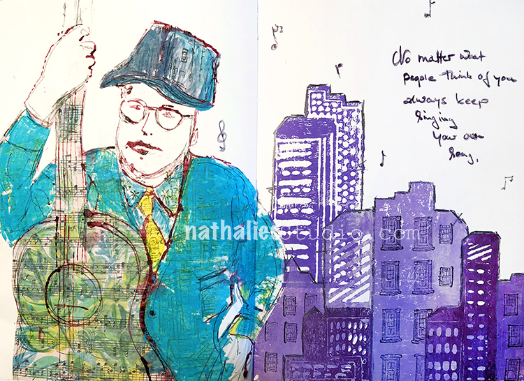
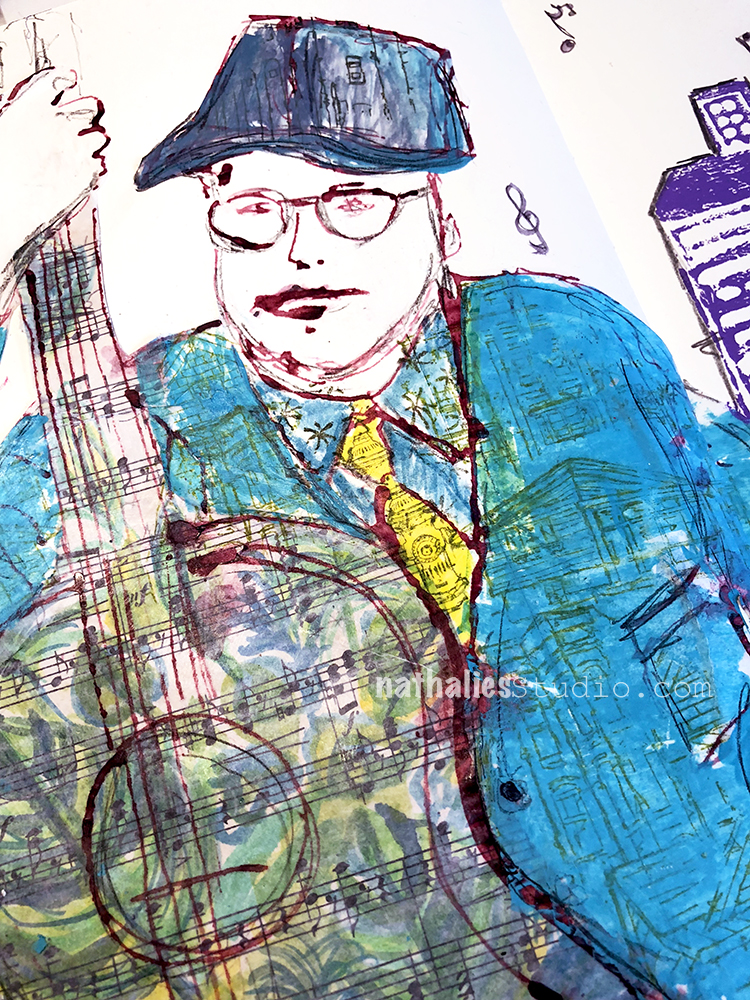
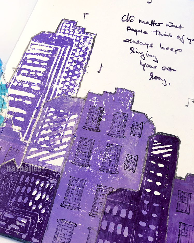
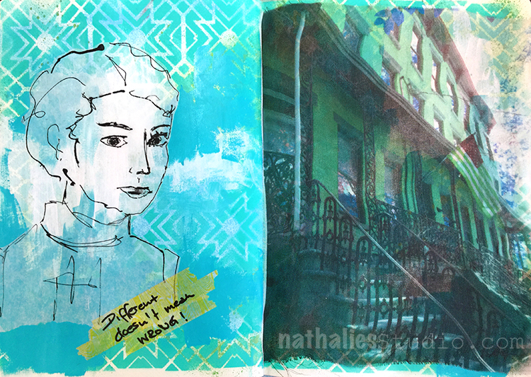
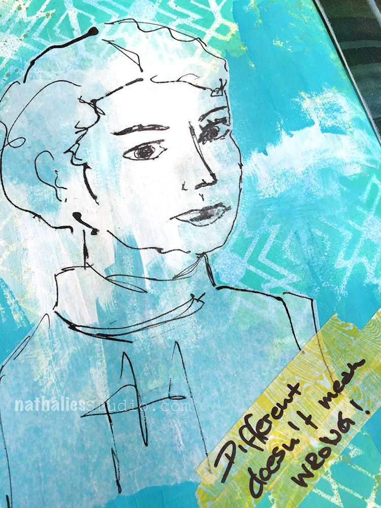
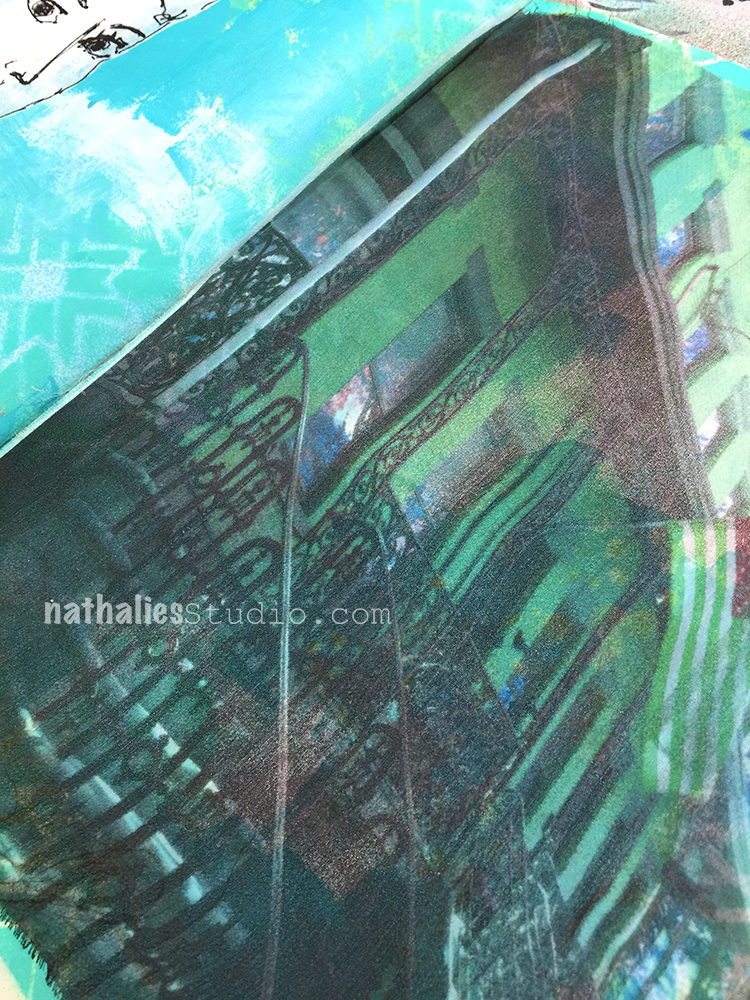
And we created some funky clothing and city scapes with my RubberMoon stamps.
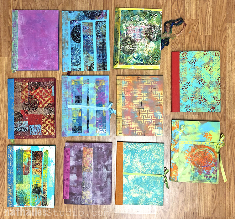
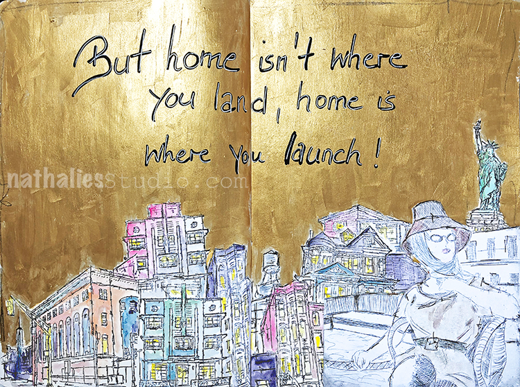
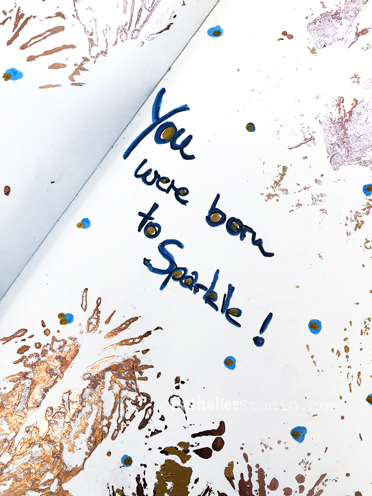
And here are all the beautiful bound art journals – 78 pages thick- such a happy colorful sight!
Thank you to all the wonderful students – I loved spending time with you, creating, laughing, chatting, eating …and eating delicious homemade cake (thank you Lynda!) and sharing supplies and ideas. Thank you also to Maura and Lisa for having me once again – I always love coming back.
If you would like to take an in-person class with me, I am teaching in May two classes in Kentucky at Ephemera Paducah which will be super fun. I will also teach in Toronto (Canada), San Jose (CA), Boltenhagen (Germany) and Coventry (UK) this year. For more information check my In-Person Workshop page I would love to see you.

Comments (2)
Deb
| #
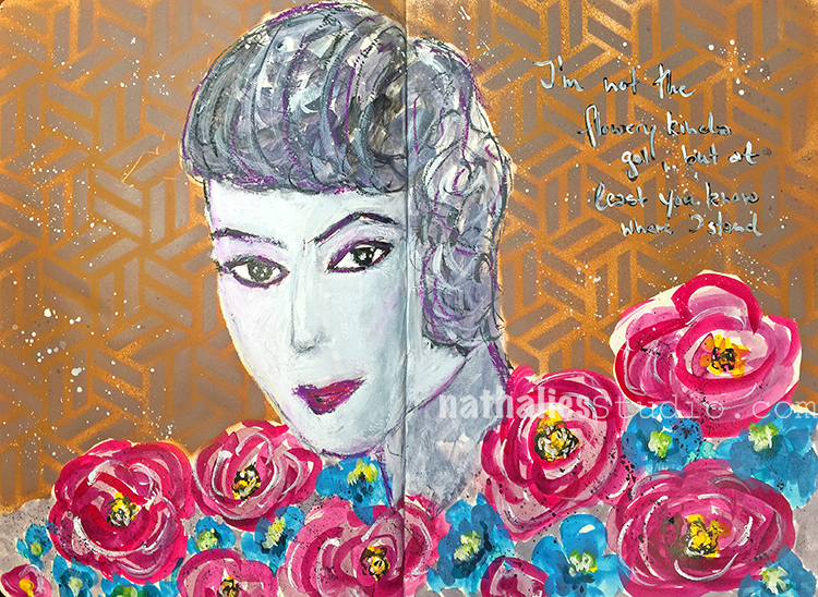
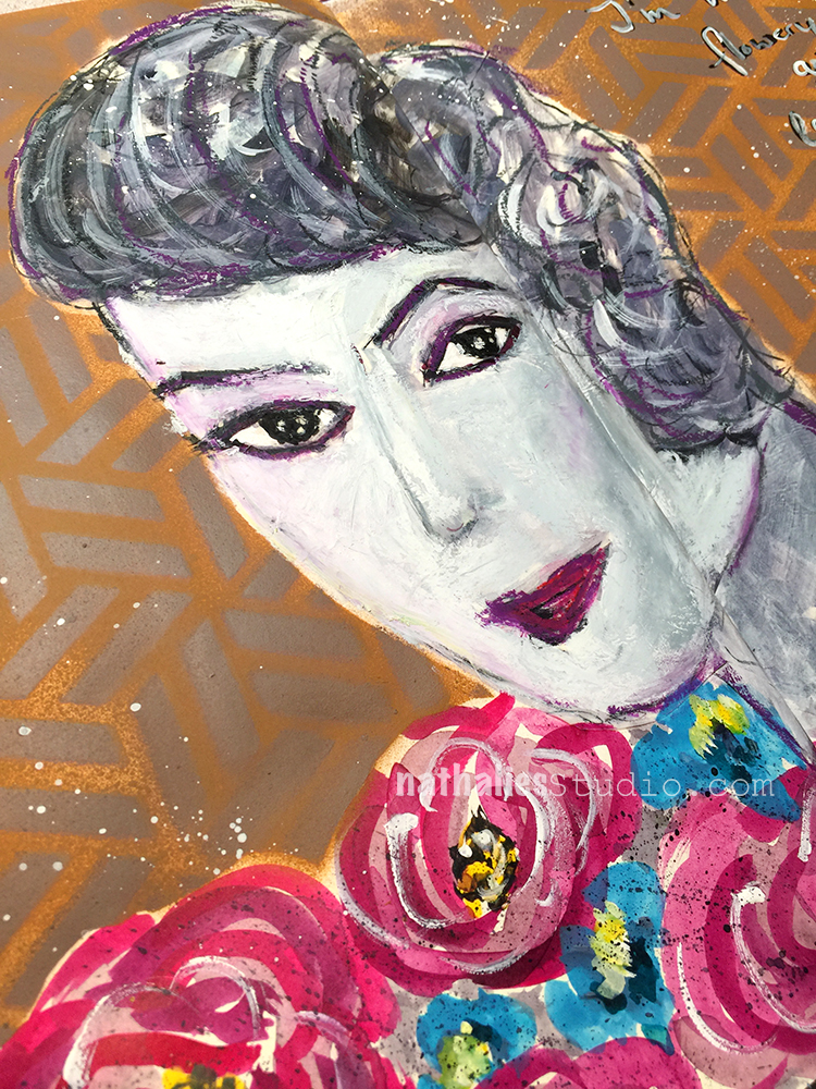
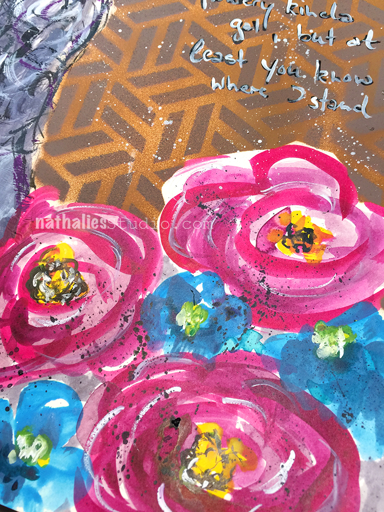
Striking composition. Love the colors and the addition of the gold gesso. Different look for you to using block printing instead of cursive. Overall great art journal pages! Agree how meditative mark making can be. Inspired to go do some! Thanks.
Deb
Reply
nathalie-kalbach
| #
Thank you Deb! Yeah I rarely do use block printing but I actually like it …good reminder to use it more often :)
Reply