Blog: Art

Mario Robinson speaks the “Truth”

Some of you might remember my friend Mario A. Robinson who was part of Creative JumpStart in 2016.

This 10 min video of him by Jesse Brass is just beautiful:

Truth from Jesse Brass on Vimeo.

“The real power of art, is the ability to galvanize and organize all those pigments and materials, and pour a soul into it.” Mario A. Robinson

What a wonderful human being and super talented person he is!

If you are into Watercolor – check out his great book “Realistic Watercolor”:

Hope this inspired you – have a gorgeous day!

Comments (2)

  • Bethany

    |

    There are some artists who totally blow me away and Mario is one of them!

    Reply

  • JoAnn

    |

    Wow!!! Beautiful – I love his work.

    Reply

Leave a comment

Scenes from the n*Studio & New Class at The Ink Pad, NYC

ScenesNatStudioAug

A little peek into my studio this month:

top row: Close up of Texture for a project for my book, Filming Rule of 3, Favorite color combination at the moment in my art journal

middle row: Playing with new things to come *wink, Underpainting done for a new piece

bottom row: Remains of a Day- Palette pull-off, RIP my trusted Video Camera


I am super excited to teach

October 8-9, 2016 in NYC at The Ink Pad  in NYC, NY

ArtRulesWorkshopNat

Let’s explore several master artists and get inspired by their artwork and techniques to create wonderful and unique art journal pages. Whether it be the Impressionist’s amazing color combinations or some of the Surrealist’s fun collage techniques, there are many different Master Artists whose skills can serve as a starting point for your own artwork. Find out what you like and what works for you. Learn about opacity and layering, colors, troubleshooting, mixing materials, making your own tools, creating backgrounds and patterns. We will work with acrylic paints, inks, markers, wax bars and other paint media to create dimension and texture. We will make the most of stencils, stamps, mono printing plates and generic tools to make our own mark. Get ready to Rule Your Art Journal!

Registration open now


Hope you enjoyed the peek – wishing you an amazing day!

Comments (2)

  • sherri scott

    |

    I was the first person to sign for your class at the Ink Pad!

    Reply

Leave a comment

Art Stroll: Grayson Perry at MAC in Sydney, Australia

KalbachPerryCollage

A couple of months ago, I was in Australia and visited a couple museums but I wanted to spread out the posts for you a bit- so finally I would like to take you on an art stroll through Grayson Perry’s exhibition at MAC in Sydney.

“Grayson Perry is one of the best known British artists of his generation, acclaimed for his ceramics, sculptures, drawings, prints and tapestries. With a keen eye for detail and a love of the popular and vernacular, Perry infuses his artworks with a sly humour and reflection on society past and present.” (MCA)

KalbachPerry02

I love how Grayson Perry celebrates craft and wants to get rid of the idea of high art and low art.

In this ceramic he combines heraldic images with important names and dealers in the art world.


KalbachPerry05

For Perry Art and Craft are very firmly linked.

KalbachPerry06

X92, 1999

KalbachPerry08

Woman of Ideas 1990, glazed ceramic

KalbachPerry12

KalbachPerry13

KalbachPerry14

Britain is Best, 2014 – hand embroidery, silk, glass beads, sequins, cotton thread.

Insanely amazing and again – a message on a wall tapestry.

KalbachPerry15

KalbachPerry16

Comfort Blanket 2014- tapestry

KalbachPerry17

KalbachPerry18

KalbachPerry19

Map of Truths and Beliefs 2011 – acrylic  wool and cotton tapestry

As you can see the scale of the work was massive!

KalbachPerry20

KalbachPerry21

Perry says “It is not about being perfect, it is about a give and take between the maker and the material, and the imagery they are using. It is a conversation. Often the most interesting thing happens, is when you allow the material to fight back.” This really speaks to me!

KalbachPerry22

KalbachPerry23

Part of the exhibition was also a great range of Perry’s sketchbooks. He says that drawing in his sketchbook is an almost daily activity and when he puts an idea down he takes it very seriously. No idea is wasted and there will come a point when he will make a work from the drawing. He has a backlog of categories of objects he wants to make.

KalbachPerry10

I loved seeing his sketchbook above and then the actual tapestry that came out of it!

KalbachPerry26

KalbachPerry27

KalbachPerry28

KalbachPerry29

This was truly a treat – I hope some day Perry makes it to the U.S. as I could have spent hours at the exhibition looking at the messages, the imagery – the connection of craft and art. His artwork is inspiring and amazing and his thoughts on society, art and craft are very interesting and appealing to me.

And on this note ….one last goof ball pic from Australia :)


KalbachPerry32

I hope you enjoyed this art stroll!

Comments (3)

  • Joi@RR

    |

    Heheheh – you two gals ALWAYS make me giggle when you are together!!! This was so interesting to see Nat. Amazing creative thinking – wow. Just kept looking and looking!! Thanks bunches for such great photos and post. Xj.

    Reply

  • Sue Clarke

    |

    Love the tapestries! Especially fun to see the leap from the page to the wall. I enjoyed this stroll.

    Reply

  • Kim

    |

    One of my favorite Art Strolls – such a thought-provoking artist! I’m with you – I would love to see more of his work and to really spend time taking it all in. Seems like he also has a sense of humor :) Thank you for sharing both the imagery and some of the big themes behind the work!

    Reply

Leave a comment

Art Stroll – Lucy Dodd at Whitney, NYC

Art Stroll Dodd Collage

A couple weeks ago I went to the Whitney for it’s open plan exhibition featuring Lucy Dodd. I stumbled across this exhibition through the Whitney’s Instagram feed and decided to take a short trip to the museum and have a late work start.

KalbachDodd01

It was located on the fifth floor which stretches out without any walls in between and offers some amazing views.

KalbachDodd02

I loved the shapes of the canvases, reminding of sails.

KalbachDodd03

Lucy used fermented walnuts, kombucha scoby, hematite, yerba mate, and pigments which she all collected while traveling to paint on raw canvas.

KalbachDodd04

The big canvases were painted on the terrace of the Whitney and the progress photo of this work was what I had seen on Instagram and made me investigate what was going on :)  You can spot and see the grid of the underlaying tiles of the terrace on the canvases. Dodd seems to use this method of creating a grid this way a lot.

KalbachDodd05

KalbachDodd06

KalbachDodd07

I loved the scale of the work and the movement visible in it.

KalbachDodd08

KalbachDodd09

KalbachDodd10

It makes me want to work big.

KalbachDodd11

Her use of different natural materials and the texture and marks they leave is also very intriguing. I enjoyed this exhibition and learning about Lucy Dodd’s work- she is now definitely on my radar. A well worth trip to the museum, I am so glad I discovered this on social media.

What is the most uncommon material you painted with? It would be branches and leaves for me but more as mark making tools.

Comments (2)

  • Sue Clarke

    |

    That 7th photo down from the top really catches my eye!!!
    Most unusual item used was a dog marrow bone (with the marrow eaten out already and washed of course).

    Reply

    • nathalie-kalbach

      |

      Hi Sue – a dog marrow bone- wow :) I wanna know what you did with it :) Thanks for visiting – hope you have a wonderful day! Nat

      Reply

Leave a comment

Art Stroll – Garcia Torres at MoMA

Art Stroll Garcia Collage

A couple months ago I went to MoMA with my friend Julie Fei-Fan Balzer and I was excited to see the Joaquin Torres-Garcia exhibition since I fell in love with his work a couple months before in Argentina at Malba. Torres-Garcia was an Uruguayan painter and sculptor. He lived in Barcelona with his family in 1891, traveled a lot in his life and was friends with Picasso, Duchamp and other important artists. What I love about his work is how versatile and symbolic it is.

Kalbach Garcia 01

Fourteenth Street, 1920 – Oil on board

Kalbach Garcia 02

I love his New York City Scenes- they are so lively and I love that he put more detail on signs and writing than on faces – yet you totally get the vibe of the city.

Kalbach Garcia 24

Kalbach Garcia 25

Kalbach Garcia 03

Aren’t those the coolest? I want them all!

Kalbach Garcia 04

I love his very limited color palette.

Kalbach Garcia 05

Construction with triangle, 1929 – Oil on canvas

Kalbach Garcia 06


Kalbach Garcia 07


Kalbach Garcia 15

Structure with struck forms, 1933 – Tempera on board.

Kalbach Garcia 08

Kalbach Garcia 09

His use of wood pieces – It makes me want to find old pieces of wood and paint on them.

Kalbach Garcia 10

Kalbach Garcia 13


Kalbach Garcia 18

And working in black, white and grey…even though I am such a bright color nerd, this makes me want to do it.

Kalbach Garcia 11

Kalbach Garcia 12

Kalbach Garcia 16


Kalbach Garcia 14

Constructive composition,1931 -Oil on canvas

Kalbach Garcia 17

Composition, 1932 – oil on canvas


Oh looksie…there is Julie :) I miss her and our MoMA strolls.

Kalbach Garcia 20

The one below is one of my favorite. The collage elements, the flags, the ephemera, symbols- I just love it!

Kalbach Garcia 21

It was a great art stroll and I really enjoyed seeing more of Garcia Torres after my visit to Malba. I am sure I will refer to his artwork in one of my future works – stay tuned :)

Do you find his work inspiring?

Comments (8)

  • Joi@RR

    |

    I’m like Gayle – love traveling with you Nat. And yes – this was definitely inspiring. I am really thankful to learn about these different artists and I enjoyed seeing all of these very much. You know… you already do his type of city art… it reminds me of you a lot. Thanks bunches for such a great post. XX j.

    Reply

  • Gayle

    |

    Again, thank you SO MUCH for expanding my art-appreciation horizons. These works have a neolithic flavor mixed in with primitive hieroglyphics and brings one back to the universality of images and symbols — before language started creating barriers. I can definitely see how this style can be incorporated into mixed media and am anxious to experiment with this concept. I love travelling with you via your blogs!

    Reply

    • nathalie-kalbach

      |

      Gayle, So glad you like the work and inspiration by Torres. And yes – I agree- images and symbols- what a wonderful way to communicate in art. Thank you for traveling along!

      Reply

  • Sue Clarke

    |

    I like the wooden sculptures but not much inspiration for me sorry to say.
    You and Julie give me plenty of inspiration (especially with all your new products)!

    Reply

    • nathalie-kalbach

      |

      sorry to hear you didn’t find inspiration in his work but so happy you are here :) hugs, nat

      Reply

  • Joyce

    |

    I enjoyed this presentation of the artist. Food for thought.

    Reply

Leave a comment

Art Stroll: Malba – The Latin American Art Museum of Buenos Aires

Art Stroll Malba Collage

It’s been a couple months after coming back from Buenos Aires, but I still would love to show you one the highlights of my trip, which was my Art Stroll through Malba the Latin American Art Museum of Buenos Aires.

Kalbach MalbaBA 23

The Malba is actually a really funky building…and someone laid an egg in the basement too ;) It is a beautiful museum – the permanent collection is small but wonderful – the running exhibitions were amazing, but are not part of this post. Let’s stroll through the permanent collection:

Kalbach MalbaBA 01

Emilio Pettoruti, La cancion del Pueblo (The Song of the People), 1927 – Oil on wood

Kalbach MalbaBA 03

I love this one – it reminds me a lot of Picasso’s Three Musicians which is from 1921- and I wonder if he saw Picasso’s painting while he was in Europe. I love the patterns and the colors -it makes me want to create my own version :)

Kalbach MalbaBA 02

Joaquin Torres-Garcia, Calle de Nueva York (Street of New York) , 1920

MoMA has an exhibition with Torres-Garcia right now- which I will post about later – but I was happy to see more of his work after seeing these pieces in Buenos Aires.

Kalbach MalbaBA 05

Joaquin Torres-Garcia, Compositon symetrique universelle en blanc et noir (Universal Symmetric Composition in Black and White), 1931

Isn’t this gorgeous? I love it – and it would be so much fun to do an art journal page in this style.

Kalbach MalbaBA 04

Luis Ortiz Monasterio, El espiritu de la rey, 1933 – this bronze sculpture reminds me a bit of Fernand Leger’s Paintings –  I love it!


Kalbach MalbaBA 06

Frida Kahlo, Self Portrait with Monkey and Parrot, 1942

Kalbach MalbaBA 07

Maria Martins, O Impossivel (The Impossible9, 1945 “It is nearly impossible to make people understand each other,”

I found this one a bit disturbing and yes aggressive but also faszinating and for some reason it made me think of Magritte’s “The Lovers” – just evoking different feelings.

Kalbach MalbaBA 08

Antonio Berni, Manifestacion (Public Demonstration), 1934 – Egg Tempera on Burlap

In the thirties art and politics were often a topic by artists. Artists engaged in collective work, political activism and debates. Images of rural and urban workers, as well as figures protesting or engaged in traditional celebrations, began to appear in often monumental pictorial works. The artwork made use of materials that gave artistic expression a social  dimension. Burlap from a potato sack or tempera paint of the sort used murals were often chosen by politicized artist.

Kalbach MalbaBA 09

Maria Freire, Sudamerica N10, 1958

I love those polygonal forms – pretty amazing pattern.

Kalbach MalbaBA 10

Lidy Prati, Serial Composition, 1948 (1946)

Kalbach MalbaBA 11

Franz Krajcberg, Sin Titulo (Untitled), 1961 – burnt colored paper pulp on canvas

Kalbach MalbaBA 12

I could not stop looking at this- I wanted to touch it..but I didn’t ;) – the texture – swoon!!!

Kalbach MalbaBA 13

Kenneth Kemble, Suburban Landscape in Memoriam B.N., 1958  – Rusty metal sheet, oil and misc. on hardboard.

Kalbach MalbaBA 14

I loved seeing all the artwork with supplies that were around and on hand.

Kalbach MalbaBA 15

Luis Felipe Noe, Dos mujeres (Two Women) 1963 – Oil and Collage on Canvas

NatKalbachmalba

Kalbach MalbaBA 16

Jorge De La Vega, Pruebe de nuevo (Try Again), 1963 – Oil, paper, glued fabric, and glass on canvas

Kalbach MalbaBA 17

this is a rub off from the face on the right – so fascinating.

Kalbach MalbaBA 18

Jorge De La Vega, El dia ilustrisimo (The Illustrious Day), 1965 – Oil, glued canvases, frottage with charcoal on cut-out canvas, synthetic plaster, jewelry, mirrors, glass and plastic on canvas.

Kalbach MalbaBA 20

Nicolas Garcia Uriburu, Pastel on 4 Photographs, 1970

Beautiful Photo Alteration – I love to alter photos and of course the urban theme is dear to my heart.

Kalbach MalbaBA 19

And now- I had to include this although it wasn’t in the permanent collection. Hello giant rubber stamp!!!!!

Kalbach MalbaBA 21

Eduardo Navarro, The Mechanics of  the Alphabet, 2015

Kalbach MalbaBA 22

It was a great museums visit- and if you ever go to Buenos Aires, definitely put Malba on your list.

What caught my attention was that there was actually quite some artwork by women- making it yet the more prominent how very few women are present in a lot of Museums throughout the world- naming MoMA for example – and it is not as if women in the 20s, 30s, 40s or 50s of the last century didn’t do wonderful and unique artwork.

The other fact that caught my eye was the variety of supplies that were used – my Mixed Media heart was beating a couple beats faster …in a happy way.

I hope you enjoyed this little art stroll! Which of the pieces I showed did you find most inspiring?

Comments (8)

  • Laura

    |

    Love it Nat, thanks for sharing!

    Reply

  • Susan Schultheis

    |

    Wow, what fantastic art!! Thank you for sharing your visit to the museum. Since I wll probably never get there, this is the next best thing. I truly enjoyed.

    Reply

  • Angie Winkler

    |

    Hey Nat- thank you for sharing!!! I loved so many styles you captured, but Emilio Pettoruti’s was fab to me today! (I also thought of Picasso due to CJS16!!! -I am still in progress – maybe done when I see you in a few weeks!?!????) Buenos Aires is on my list of destinations now!

    Reply

    • nathalie-kalbach

      |

      Yeah that one is amazing, isn’t it? I cannot wait to see you in Oklahoma, it is going to be super fun!!!

      Reply

  • cheryltoo

    |

    Hi Nat,
    Thank you for this. I am so loving the two pieces by Joaquin Torres-Garcia. I want to do one for my city Toronto.
    Thanks again,
    Cheryl

    Reply

    • nathalie-kalbach

      |

      that sounds wonderful cheryl – I hope you share when you are done!

      Reply

Leave a comment

Art Stroll: Picasso Sculpture at MoMA

Picasso-Collage-01

Disclaimer: This post includes artwork with abstract or not so abstract nudity – it is not called Sodom and Gomorrah – it is called ART . If you have a problem with art, all I can say ” so sorry for you!” . Don’t email me to complain, don’t visit my blog anymore because I might post things like this again and, farewell!

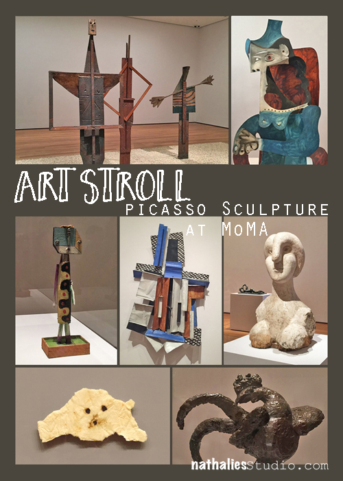
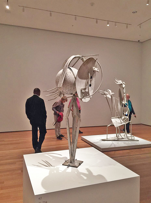
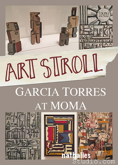
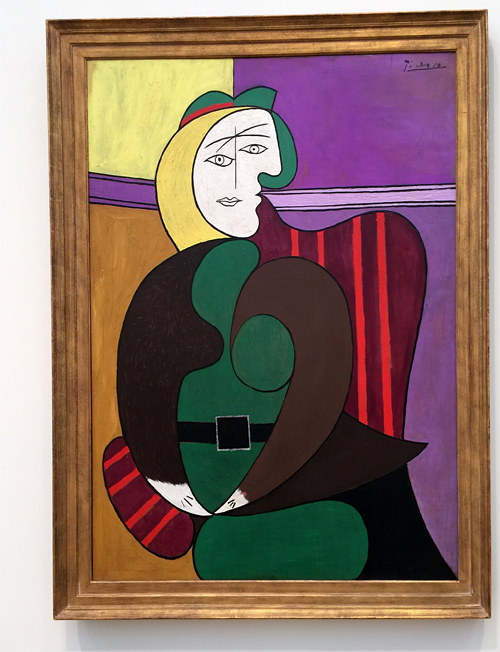
For a couple weeks now Picasso Sculpture is on view at MoMA (until February 7th, 2016). It is AMAZING! I have been there four times and I really hope I can sneak in a fifth time. The work shown was created between 1902 and 1964. Every time I go, I am entranced by something else. The scope of Picasso’s work and the range of materials he used in his sculptures is just mind-blowing.


Kalbach Picasso 06

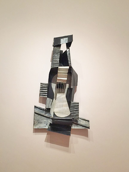
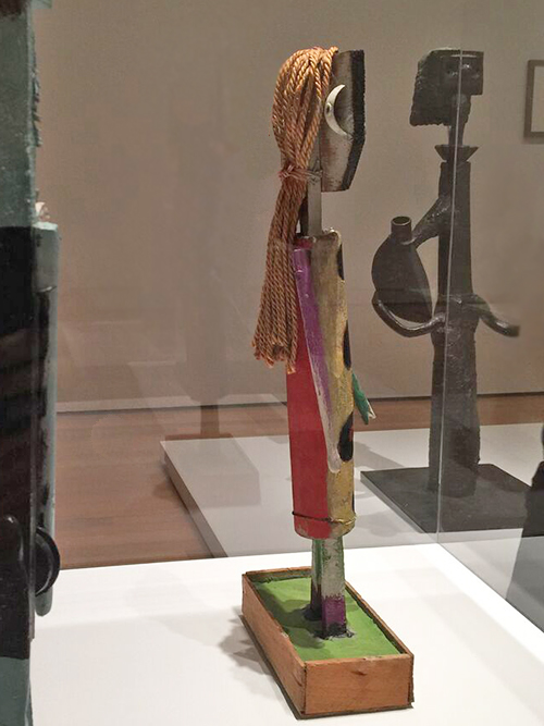
– Guitar, Paris, 1924. Painted sheet metal, painted tin box, and iron wire. –

Kalbach Picasso 05

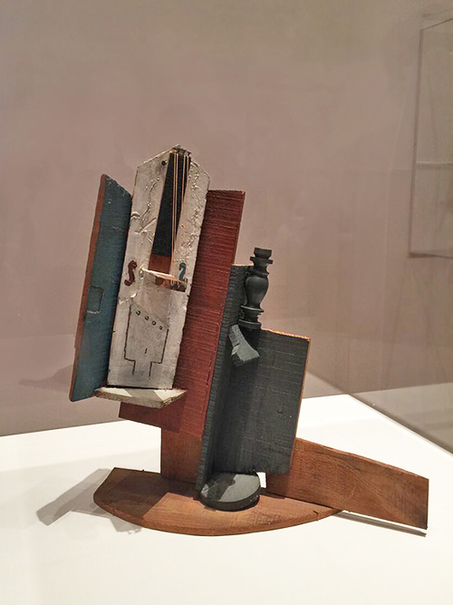
– Violin and Bottle on a Table, Paris 1915 –

Kalbach Picasso 07

– Violin Paris 1915 – Painted sheet metal and iron wire.

All those sculptures make me feel as if Picasso Paintings came alive in a 3D installation  – so brilliant!

Kalbach Picasso 10

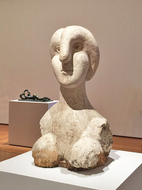
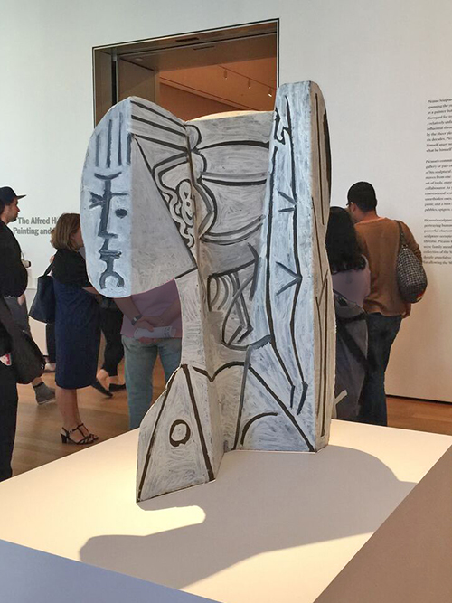
Bust of a Woman, Boisgeloup 1931 . Plaster.

Kalbach Picasso 11

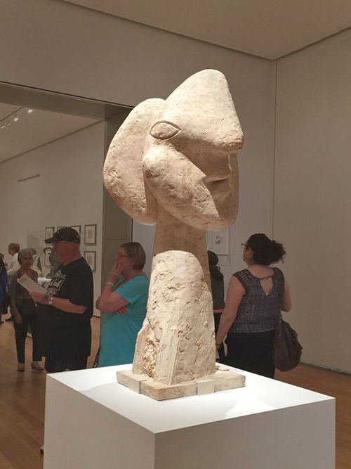
Head of a Woman, Boisgeloup 1932. Plaster

Kalbach Picasso 26

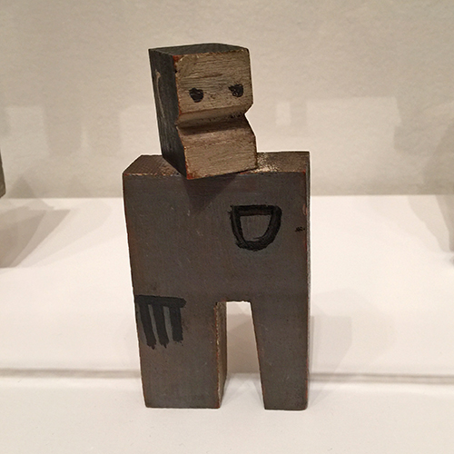
Head of a Warrior, Boisgeloup 1933 . Plaster, metal and wood.

This somehow made me think of a cartoon and smile- there is so much fun and joy and many puns in Picasso’s sculptures.

Kalbach Picasso 16

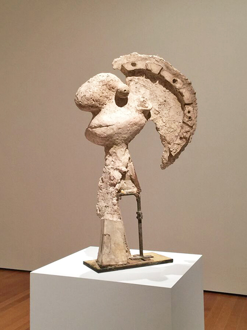
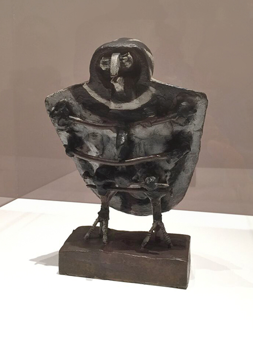
The Orator, 1933-34, Plaster, stone, and metal dowel

Kalbach Picasso 08

Head of a Woman. Paris 1929-30. Iron, sheet metal, spring and metal colanders.

Again this and the one below made me think of a Bugs Bunny Cartoon . Loving it!

Kalbach Picasso 09

Woman in the Garden, Paris 1929-30. Welded and pained iron.

Kalbach Picasso 14

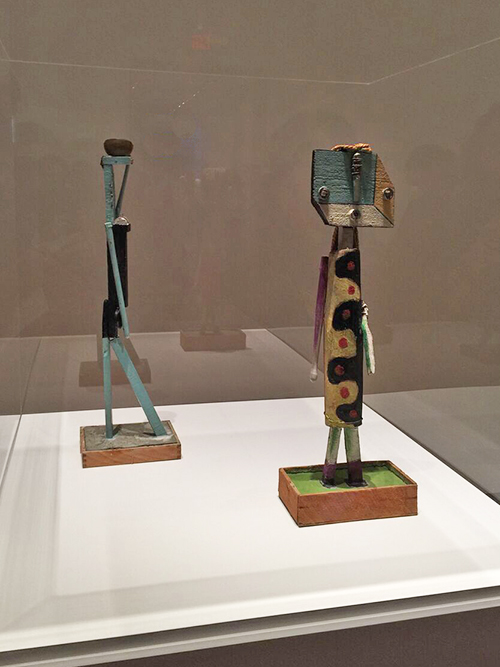
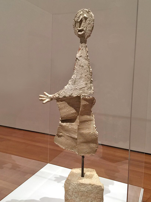
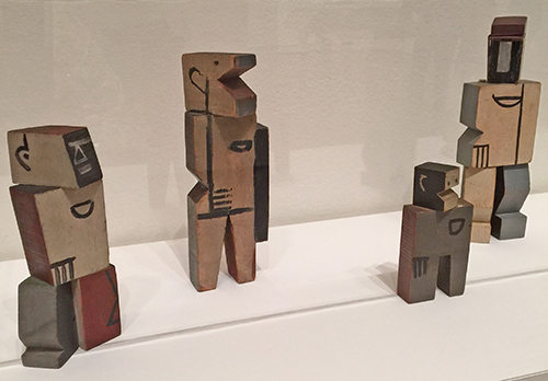
left: Woman Carrying a Vessel, 1935. Painted pieces of wood, objects, and nails in a cement and wood base.

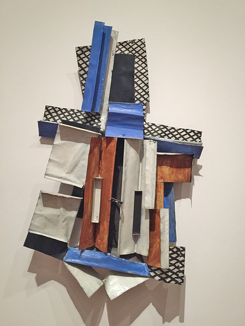
right: Figure, Mougins, 1938. Painted wood, nails, and screws with string, wire, paintbrush fragments, and push bell hardware on an unfired clay and wood base.

These were probably my favorites in the exhibition. I love the colors, and the materials and how they were put together – and look at the back of the figure!

Kalbach Picasso 15

Again these made me smile. You can almost see how someone who is so creative can never stop playing and transforming anything close by.

Kalbach Picasso 28

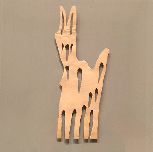
Goat. Paris, 1943 – Torn Paper

Kalbach Picasso 29

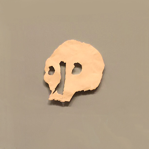
Death’s Head, Paris, 1943 . Torn and scratched paper.

Kalbach Picasso 18

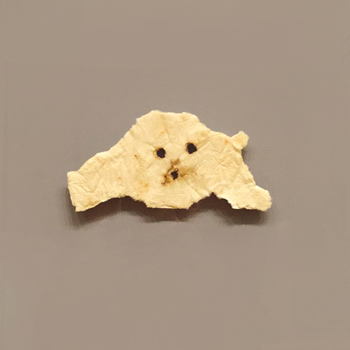
Head of a Dog, Paris 1943, Torn and burnt napkin

Kalbach Picasso 20

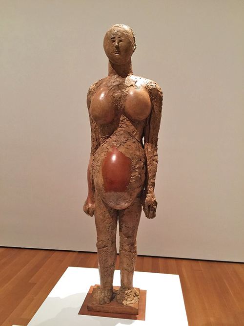
Pregnant Woman, Vallauris, 1950. Plaster with metal armature, wood, ceramic vessel, and pottery jars.


Kalbach Picasso 30

Little Owl, Vallauris, 1951-52. Painted Bronze

Kalbach Picasso 19

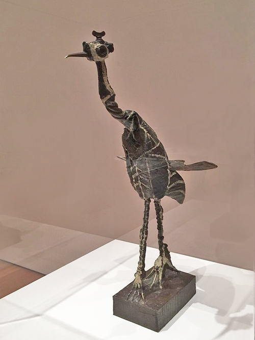
Crane, Vallauris, 1951-52. Painted Bronze

Kalbach Picasso 21

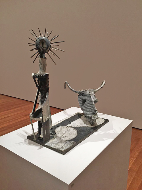
Goat Skull and Bottle, Vallauris, 1951. Painted Bronze


Kalbach Picasso 13

Cock, Boisgeloup, 1932, Bronze

Kalbach Picasso 31

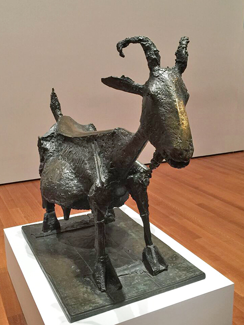
She-Goat, Vallauris, 1950, Bronze


Kalbach Picasso 22

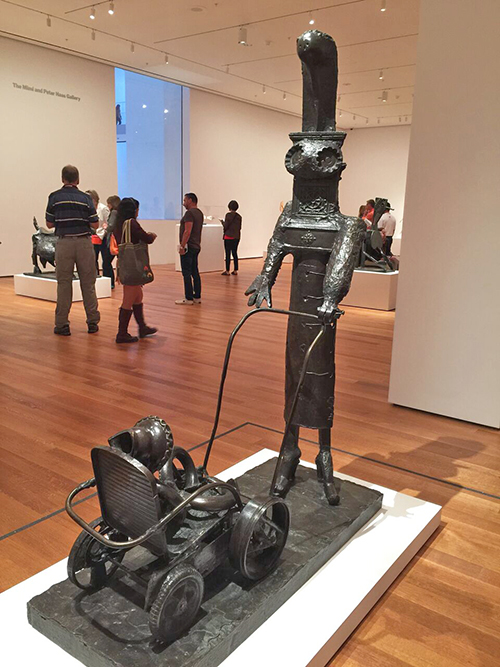
Woman with a Baby Carriage, Vallauris, 1950-54 . Bronze

Kalbach Picasso 23

The Bathers – two times I was there, I saw a group of kids. They loved loved loved this – they recognized the faces and arms right away and they were totally entranced by the installation.

Kalbach Picasso 24

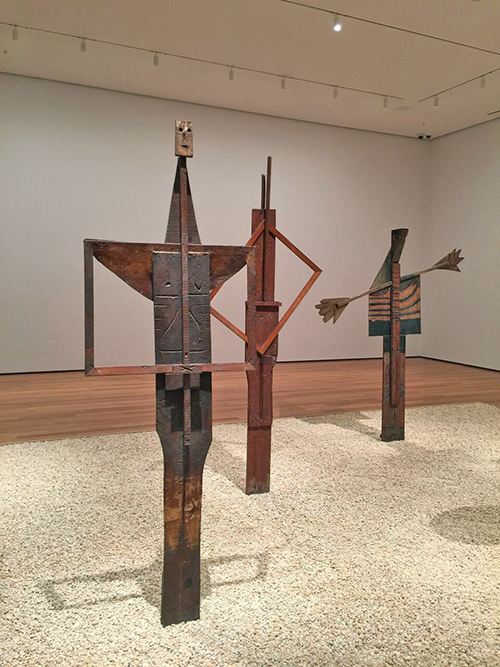
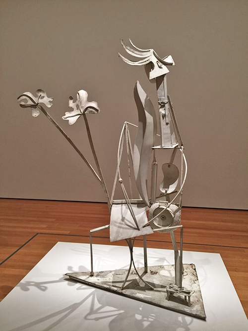
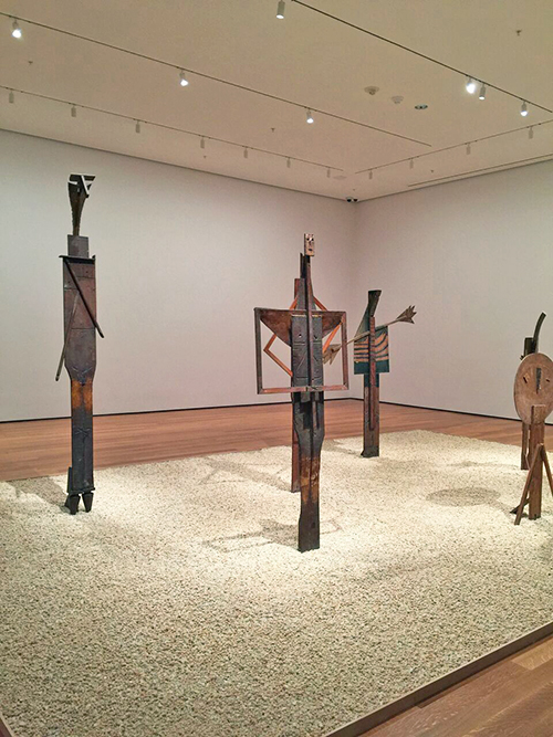
The Bathers: Man with Folded Hands ; Fountain Man; Woman with Outstretched Arms – Cannes 1956 – Wood

Kalbach Picasso 27

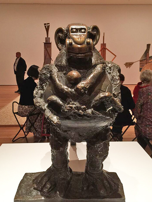
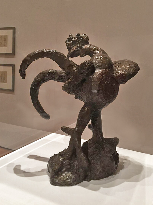
Baboon and Young, Vallauris, 1951, Bronze

Come on …this makes me laugh – this is awesome!!!! a car as the monkey head? I will never be able to look at a toy car again and not think of this!

Kalbach Picasso 25

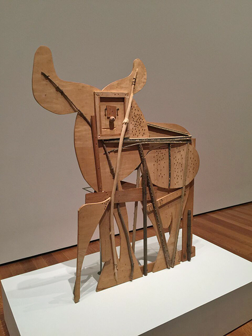
Bull, Cannes 1958 – Block board, palm frond, and various other tree branches, eyebolt, nails and screws, with drips of alkyd and pencil markings.

Kalbach Picasso 32

Maquette for Richard J. Daley Center Sculpture, 1964. Simulated and oxidized welded steel

Kalbach Picasso 01

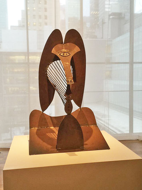
Woman with Hat,Cannes 1961. Painted sheet metal

Kalbach Picasso 02

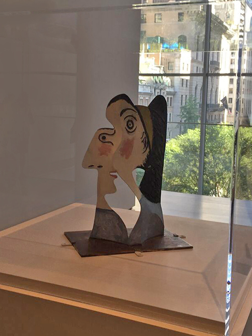
Head of a Woman, Mougins, 1962. Painted sheet metal and iron wire.

Kalbach Picasso 03

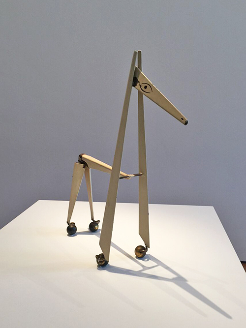
Little Horse, Vallauris, 1961. Painted metal with wheels.

Kalbach Picasso 04

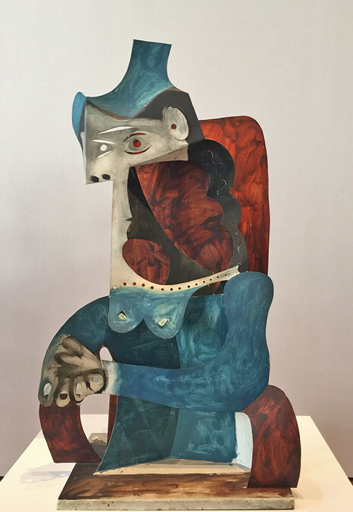
Sylvette, Vallauris 1954. Painted sheet metal.

What struck me the most was really how Picasso constantly changed his medium, his style and just totally indulged into the next and explored it, made it new and exciting! Looking at all the different work I felt super inspired and couldn’t wait to go home into my studio. Furthermore, I told people I took to the exhibition that this is exhibition feels like a therapy – it makes you happy and smile and just leaving in a very good mood. Yes- not the most art criticy en vogue thing to say, but you know…I think Pablo would have approved ;)

If you are anywhere near NYC and can make it before February 7th, 2016 to MoMA – RUN! Do it – don’t wait!

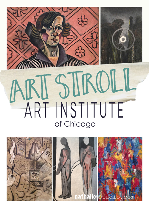
Hope you enjoyed the little art stroll!


Comments (14)

  • michelleward

    |

    Wow! What a great show! Thanks for sharing all the details. I feel like I’ve been there. Love those first few….1915. Amazing. What a visionary. Love your enthusiasm for Picasso – thanks for taking us along.

    Reply

    • nathalie-kalbach

      |

      Michelle, you would love to go- come and go with me before it closes :)
      I take you in! My treat!

      Reply

  • Mary W

    |

    Thank you for the guided tour. It was fun to walk through with you and your ideas! That is the best part of art – sharing and evolving. Also, I won’t be able to look at my grandson’s cars without laughing now. Fun stroll.

    Reply

    • nathalie-kalbach

      |

      I am glad you enjoyed it Mary! I agree sharing and evolving is the best part- how fortunate we are to live in a time like this where the internet can bring us all together and make it possible to share.

      Reply

  • Jane LaFazio

    |

    Thank you for the fascinating visit to the exhibition. I recently saw an exhibit of Picassco’s lithographs and block prints that was also fabulous. What a rich original imaginative body of work. I feel I have much more to learn about his work. Thanks Nat!

    Reply

    • nathalie-kalbach

      |

      thank you Jane, glad you liked it. I wish I could have seen the exhibition you saw, that sounds so interesting!

      Reply

  • sunmoongal

    |

    I love love love this post. Your descriptions, photos, discussion right on spot. I could not agree more. I love the car face too. I kept looking at it before I read your comments. Just like your walks through the hood. I love reading your thoughts. Also loved your disclaimers! So glad to follow you and attend jump start. I am always smiling, learning and inspired. I am leaving this post with a big smile.

    Reply

    • nathalie-kalbach

      |

      so glad to have you Denise! Happy I made you smile! huge hugs,Nat

      Reply

  • Sue Clarke

    |

    Pregnant Woman and Woman with a Carriage jumped out at me for some reason and NO I am not planning to have another baby.
    Thanks for posting these delightful photos!

    Reply

    • nathalie-kalbach

      |

      fun, right? I love those too. Thanks for coming by Sue!

      Reply

  • roncasw002

    |

    Thank you for sharing. Very fun and interesting.

    Reply

Leave a comment

Art Stroll: The Art Institute of Chicago

ArtStrollAIChicago

Disclaimer: This post includes artwork with abstract or not so abstract nudity – it is not called Sodom and Gomorrah – it is called ART . If you have a problem with art, all I can say ” so sorry for you!” . Don’t email me to complain, don’t visit my blog anymore because I might post things like this again and, farewell!

A couple of weeks ago I met two of my old friends in Chicago for a girl’s weekend. It was wonderful and a long due time together. And not only did I get to spend time with good friends …we also sneaked an Art Stroll in and went to the Art Institute of Chicago. I had visited the Art Institute a couple years ago but somehow forgot that the museum is mooohasive. So here is just a couple of the things that I was able to see and that caught my eyes :)

Artstroll_NK01

Roy Lichtenstein, George Washington- 1962 – an early Lichtenstein  – I love seeing how he developed from there.

Artstroll_NK02

Jasper Johns, Numbers – 2005 – the texture makes me swoon – and I love that Jasper Johns repeated his known design in white bronze. He says “I like to repeat an image in another medium to observe the play between the two”

Artstroll_NK03

Another Jasper Johns – False Start – 1959 – which I have only seen in books so far – stunning!

Artstroll_NK06

Joan Miró, The Kerosine Lamp – 1924 – love the lines and the little clues and marks

Artstroll_NK07

This Miró – Two Personages in Love with a Woman – 1936 – made me smile !

Artstroll_NK15

And another Miró – Portrait of Juanita Obrador – 1918 – all three paintings not in chronological order here- are so different and it is interesting to see how Miró changed his style throughout the years.

Artstroll_NK08

Ohhh Jean Dubuffet – you make me happy! It is as if his visual idea of “Supervielle, Large Banner Portrait” – 1945 – was processed through his body and then came unrefined through his hands onto this canvas !

Artstroll_NK09

Georges Braque, Ajax – 1949-1954 – I love the int of color, the line work and the figure. It is a painting I would have not associated with him.

Artstroll_NK11

I am always excited when I see a Max Ernst Painting- his texture work is just unreal ! This appears 3 dimensional but is all painted – The Blue Forest , 1925.

Artstroll_NK12

And this painting by Max Ernst made me smile  – well more the title actually – Human Figure with Two Birds – 1925 and 1929 .

Artstroll_NK13

Max Beckmann – Self Portrait – 1937 – I am always fascinated by Max Beckmann’s hands.

Artstroll_NK14

Pablo Picasso – The Red Armchair – 1931 – Love the colors and it totally reminded me of his “Girl before a Mirror” painting at MoMA – alas – no wonder – it is the same mistress Marie Therese in both paintings.

I also took a peak at the Hiratsuka Un’ichi Print Exhibition

HiratsukuUnichi01_natKalbach

Girl with Calico Patterned Background -1948 – Woodblock Print. The details-the patterns – swoon!

HiratsukuUnichi02_natKalbach

Angel Dreaming Room – 1971 – Woodblock Print.

HiratsukuUnichi03_natKalbach

Kingfisher – 1928 – Woodcut Print

HiratsukuUnichi04_natKalbach

I did not take note of the name of this one -but I love it so much – I had to include it.

HiratsukuUnichi05_natKalbach

Mount Aso in Kyushu, 1935 – Color woodblock print – amazing – look a the cloud- it has texture and all those different colors – beautiful!

That was it from the Art Institute in Chicago Art Stroll. I really enjoyed being there – I saw so much more but it was such an overload – I hope to come back soon and revisit some areas more leisurely. Hope you enjoyed the stroll! More coming soon :)

Comments (4)

  • Barb J

    |

    Thanks for sharing these priceless pieces of art.

    Reply

  • Gayle

    |

    I absolutely love your disclaimer!

    Reply

    • nathalie-kalbach

      |

      :) Thanks Gayle- unfortunately it has become necessary due to emails or comments regarding showing art containing nudity or swear words

      Reply

Leave a comment

I could do that …Or An Art Curator Explains Why You Couldn’t

natkalbachIcoulddothat

A couple weeks ago I posted on my n*Studio Facebook page this video by the Art Assignment/PBS about an art curator explaining why she thinks, saying “I could do that” when standing in front of some art work, is actually not right. This caused a lively discussion on my page which I really enjoyed and therefore I thought I should share it on my blog again and see what you are thinking about this:

What do you think? Is Art simply the merit of “the artist thought about it first”? or do you agree what this topic is so much more complex?

I never liked hearing “I could Do That” even though I sometimes do not understand a piece of art in an exhibition and is maybe only getting a shoulder shrug from me. For me the art work needs to provoke emotions, wether they are good or bad and yes…I can be a silly person just being insanely happy by seeing beautiful colors and texture – a Pollock might make me smile senseless while others cannot understand why this is called art ;) . What I often times don’t get are contemporary installations – …but I have never said “Oh, I could do that”. The more I learn about the background of the art work or the artist or the context in which the piece was created – the time, the material etc, the more I might be able to appreciate the work, even if it doesn’t speak to me. I thought the Curators’ example of Felix Gonzalez-Torres “Perfect Lovers” was a wonderful way to explain her point.  I find it often inspiring for my own work to find more information about art work or the artist and sometimes art work that I couldn’t appreciate years earlier does becomes way more interesting or even speaks to me later, while other artwork I loved earlier just becomes boring or not that important to me anymore.  As I change, my taste for art work changes. I know some people got really upset about this topic and I think it is because art is often times forced on us in such an elitist way. I always think- Screw you – Art is for the masses and not for just a handful of folks ;) Anyway, I could ramble on- but I would love to hear your thoughts :)

Comments (7)

  • Rebecca Buchanan

    |

    Nathalie, I am just getting around to reading this post and watching the video and am really glad I did. This video has made me want to be more curious about any art I view in the future, especially if I’m perhaps having trouble appreciating it. The only time I’ve ever entertained the thought, “I could do that,” is when it is something I want to do. Of course there are many things I want to do that I don’t believe I could do or even want to try myself, but if I really love a work and it is in a medium that I work in or want to work in, the thought is more of an inspirational type thought, like ‘I could try that.’ I too bristle when I overhear or have someone with me who makes that statement in a way that is dismissive of the work. After watching this video, I can now see that I may have been too quick in assuming I don’t appreciate something when perhaps there is more of a story behind it that I would find interesting if I took the time to find out about it. Very though provoking–thanks so much for sharing!

    Reply

  • Cindy Connell

    |

    Hey Nat!
    I watched this video when you first posted it and again now. I gave me a lot to think about. I am not formally trained in art and could not connect famous names and their work to save my life. I do have an appreciation for many different styles of art though. I did learn though about the detail in pieces like Piet Mondrian’s Composition Red Yellow and Blue. Like other I may have been tempted to reproduce it… but not with acrylic paint on canvas. Understanding how something is made usually gets my appreciation over anything else. Like you and others though… I like what I like!
    Cindy Connell

    Reply

    • nathalie-kalbach

      |

      I totally can see how the “how it is made” point gets you intrigued- I am the same way :) For example a year ago or so there was an exhibition at MoMA – Robert Gobert – https://www.moma.org/visit/calendar/exhibitions/1495  – it was interesting but I do have to admit it wasn’t really for me – although it provoked feelings- if sometimes negative. – but I could totally appreciate his way of creating is art – that was actually pretty compelling. I wouldn’t have know that if I hadn’t had a class that was connected with this exhibition and it made me see it in a different light – and maybe some time I can appreciate it even more.

      Reply

  • Deborah A. Pierro

    |

    Thanks for the video, Nat. I learned a lot from it about how each of us, as an artist, brings something to our work that is uniquely ours. I now have an understanding, and more perspective, about other artists’ motivations and ideas that go into their works.

    Reply

  • Sue Clarke

    |

    I enjoyed that video and love the questions that she poses.
    I have heard folks saying “I could do that” and my response (in my head), is so do it.
    I do find that if I know more about the artist I often appreciate the piece more.

    Reply

    • nathalie-kalbach

      |

      That is so true Sue, I feel the same- the more I can connect or understand the artist the more I can connect or appreciate the artwork.

      Reply

Leave a comment