Blog: Brooklyn

Inspired By: Coney Island & Brighton Beach

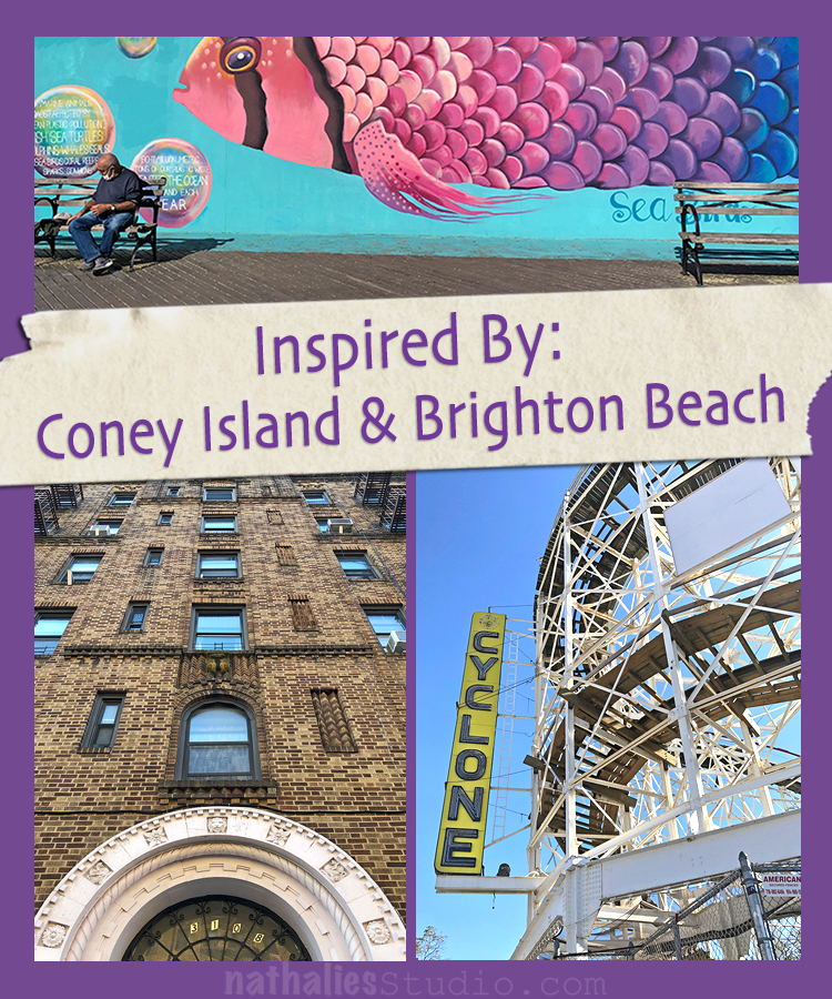
A couple of weeks ago we spontaneously decided to head out to Coney Island. Guess what …never been there – which is ridiculous given that it is a short ride from here (well longer by subway). But we finally did it and it was fun even though after season.

Love all the colors and dorky vantage signs and I love this color combo of navy blue, light blue, pink and orange. Def. a good color combo in my book to keep in mind.

As you can see not many people there at this time of the year but it was sunny and beautiful.

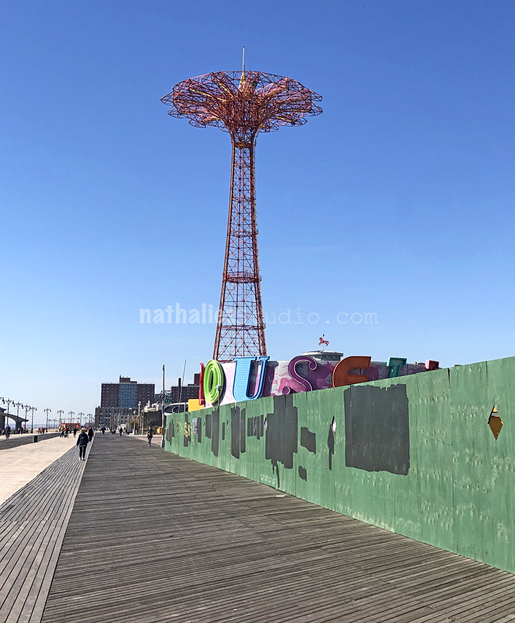
I do love a good boardwalk for sure.

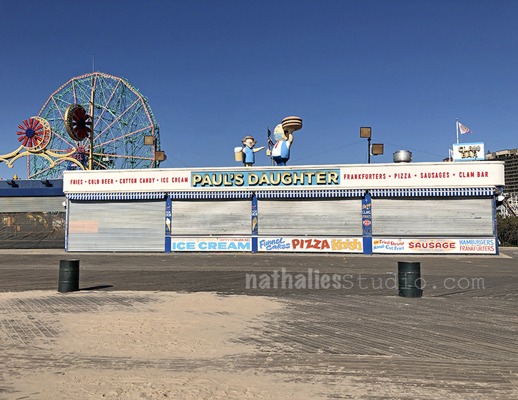
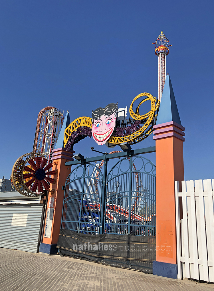
Super fun building and not sure if you can spy it but the two figures on the top are wearing masks. Coney Island may seem a bit vintage-y but has its finger on the pulse of time LOL

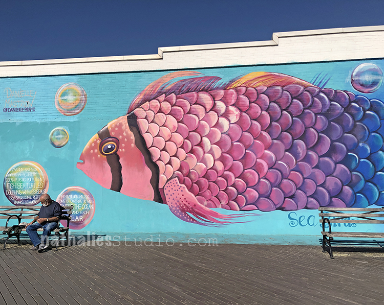
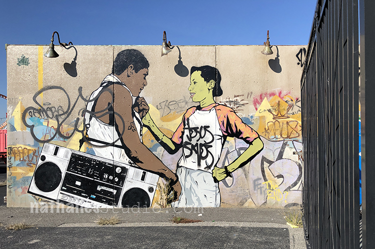
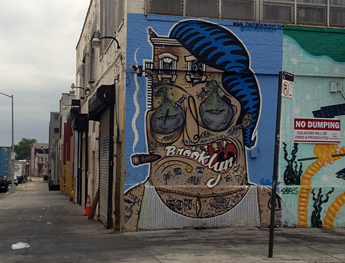
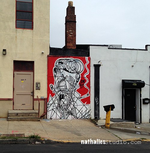
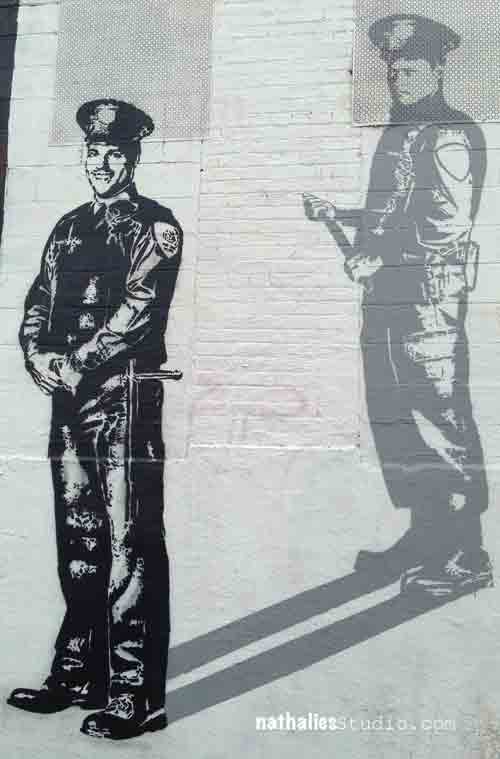
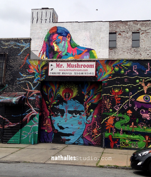
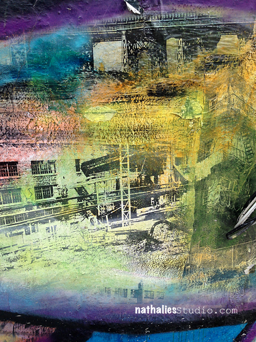
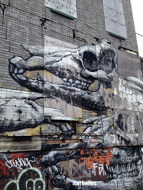
Love the murals on the side of the – I think aquarium but I might be mistaken.

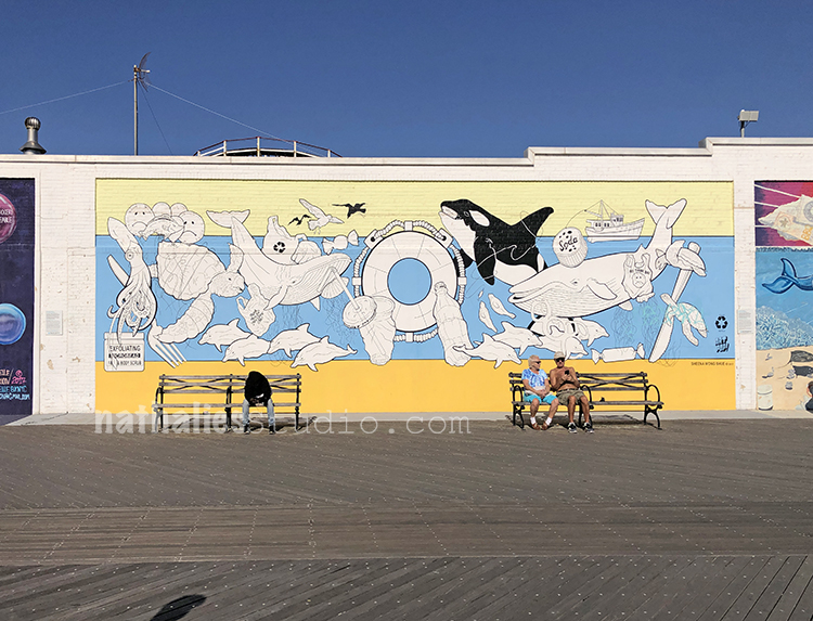
Another nice color combo with the different yellows and blue and some black.

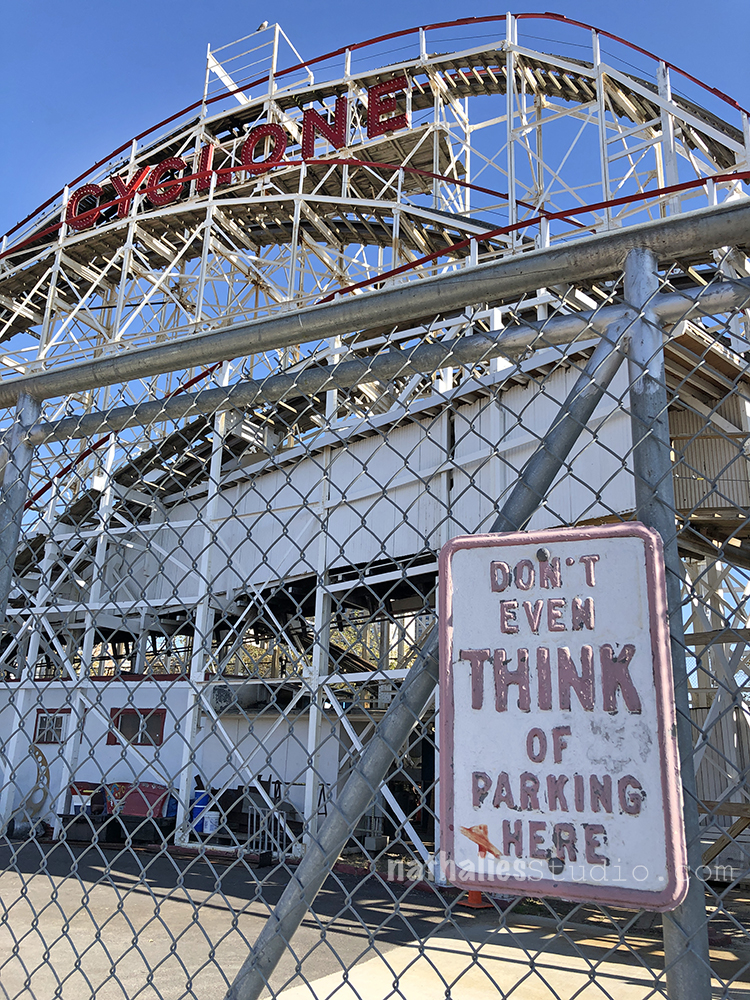
Hahah- you gotta love New Yorkers and their signs …I mean …why sugar coat

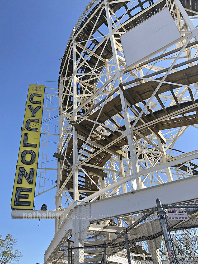
Loved all the lines and the Cyclone sign is awesome. The Cyclone is a wooden roller coaster from 1927 and still runs during the season. I have had many friends telling me it comes with serious back problems – LOL. but I think one day I want to try it. Have you been on it yet? Let me know how it is.
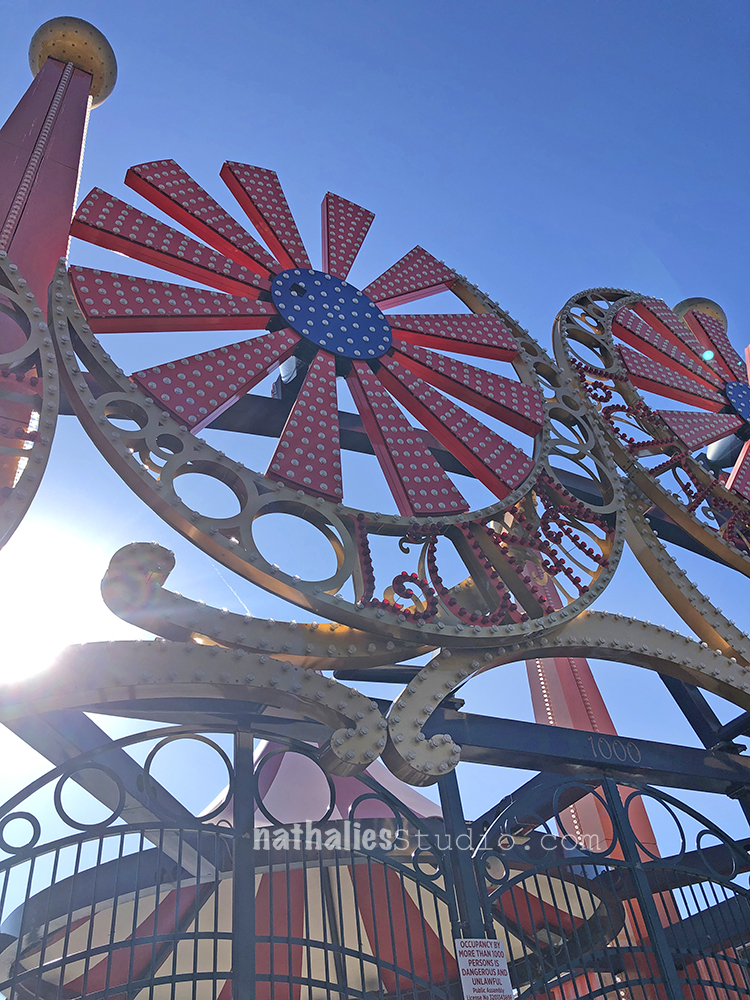
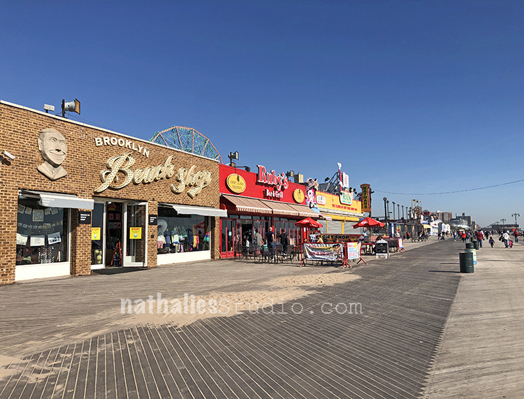
Also a fun view.

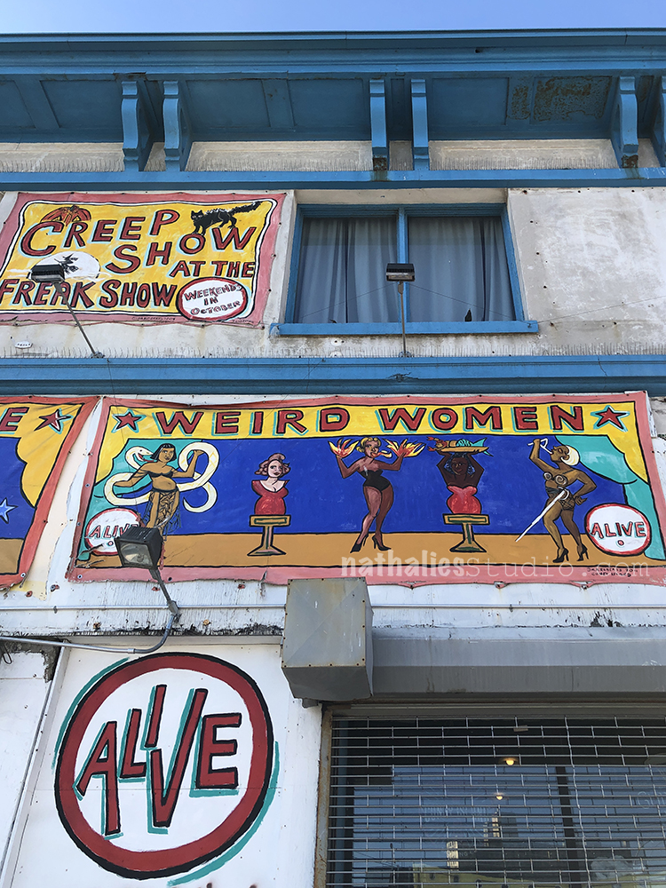
And those fake vintage signs were fun on the side of a building. Love the very saturated colors.

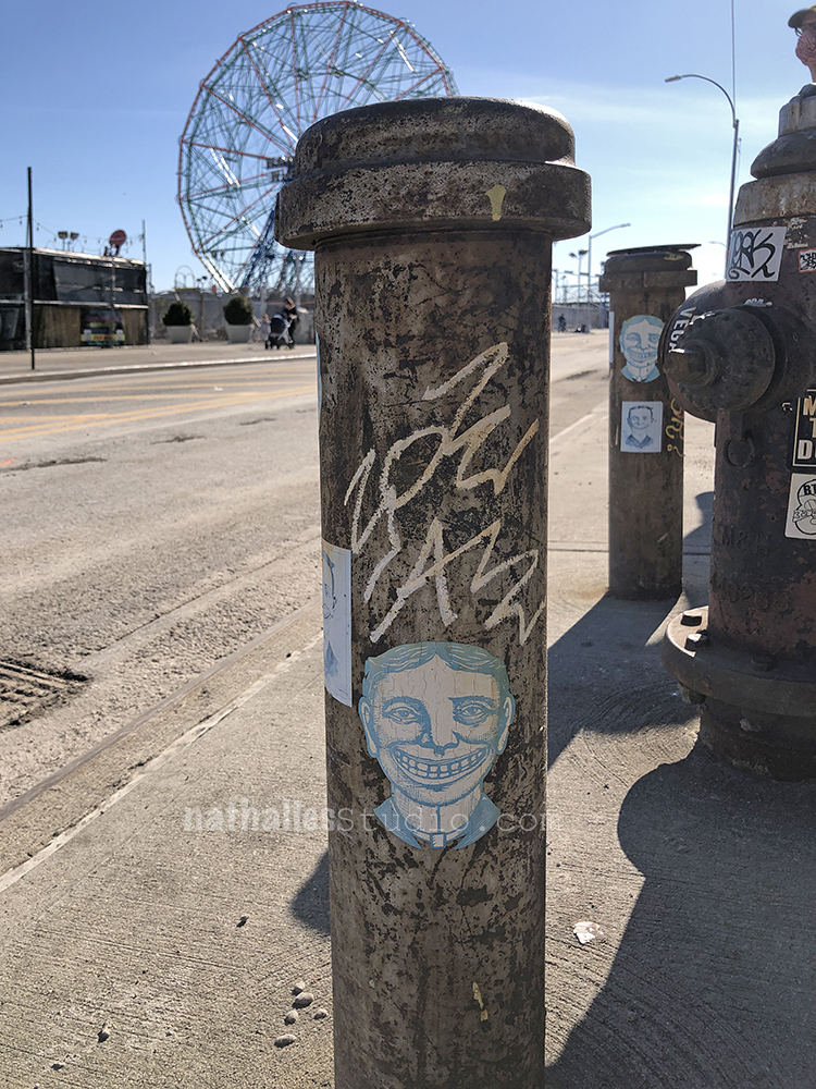
Stickers everywhere.

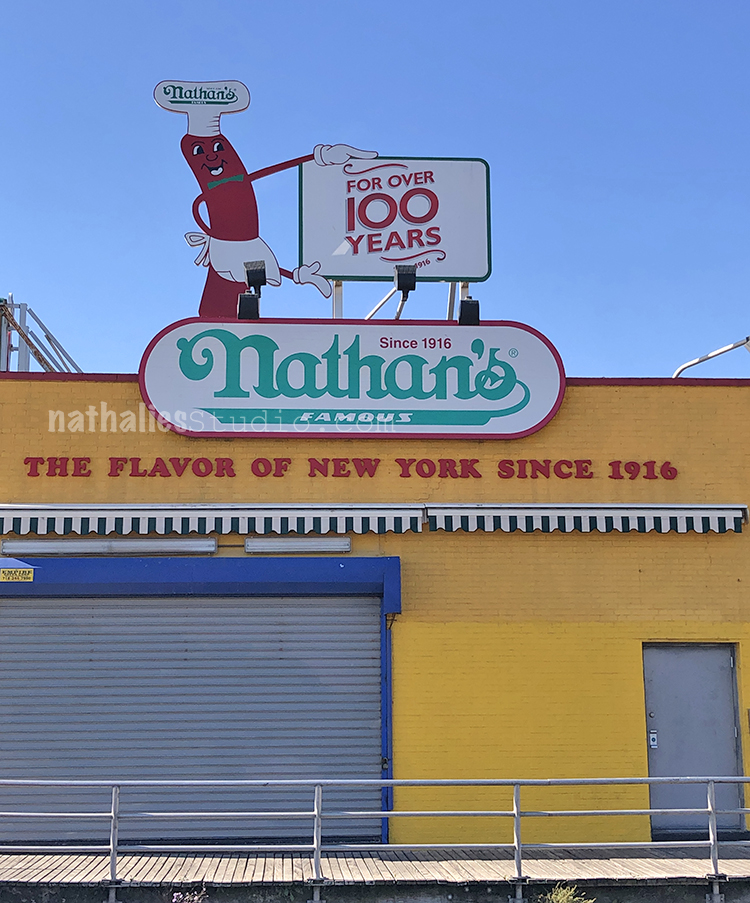
Nathan’s was unfortunately closed but the sign still brought me lots of joy. I mean I am German after all and we do like places that sell sausage ;)

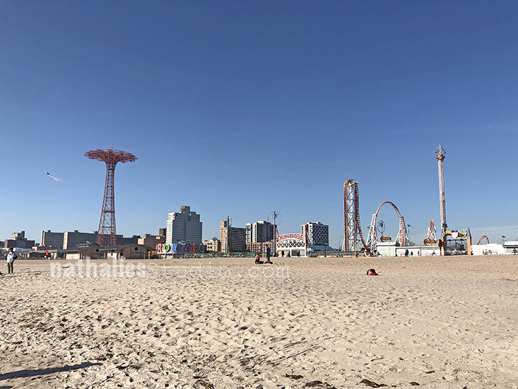
It was wonderful to walk at the beach a little bit.

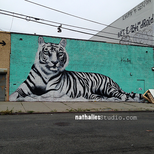
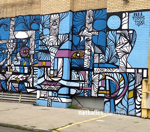
Couldn’t explore this area further where a lot of free standing walls with murals were standing- since it was fenced off. But maybe next time.

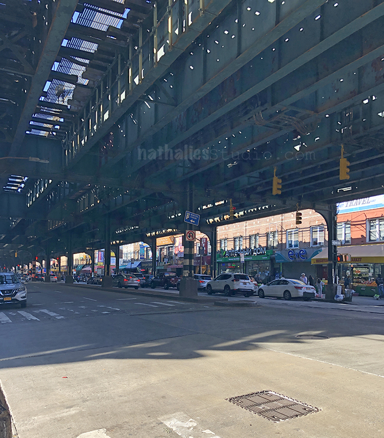
A couple minutes from Coney Island is Brighton Beach also known as “Little Odessa” due its tight-knit Russian and Eastern European communities which is reflected by the stores and signs.

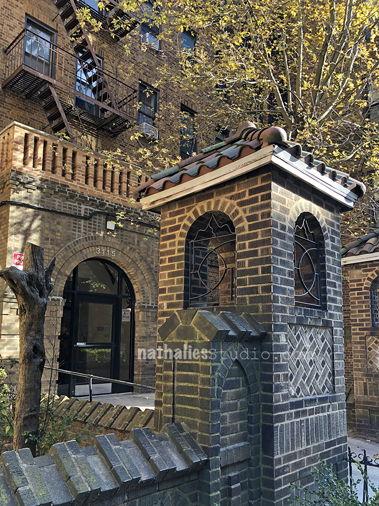
I wanted to go there because of it’s interesting architecture in terms of apartments buildings build around 1900- 1930s

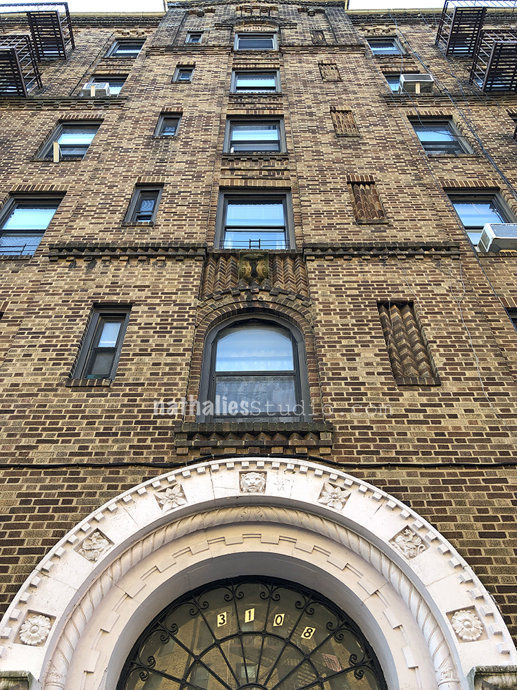
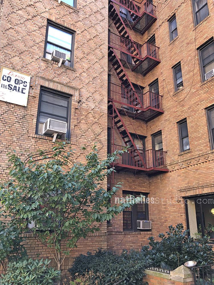
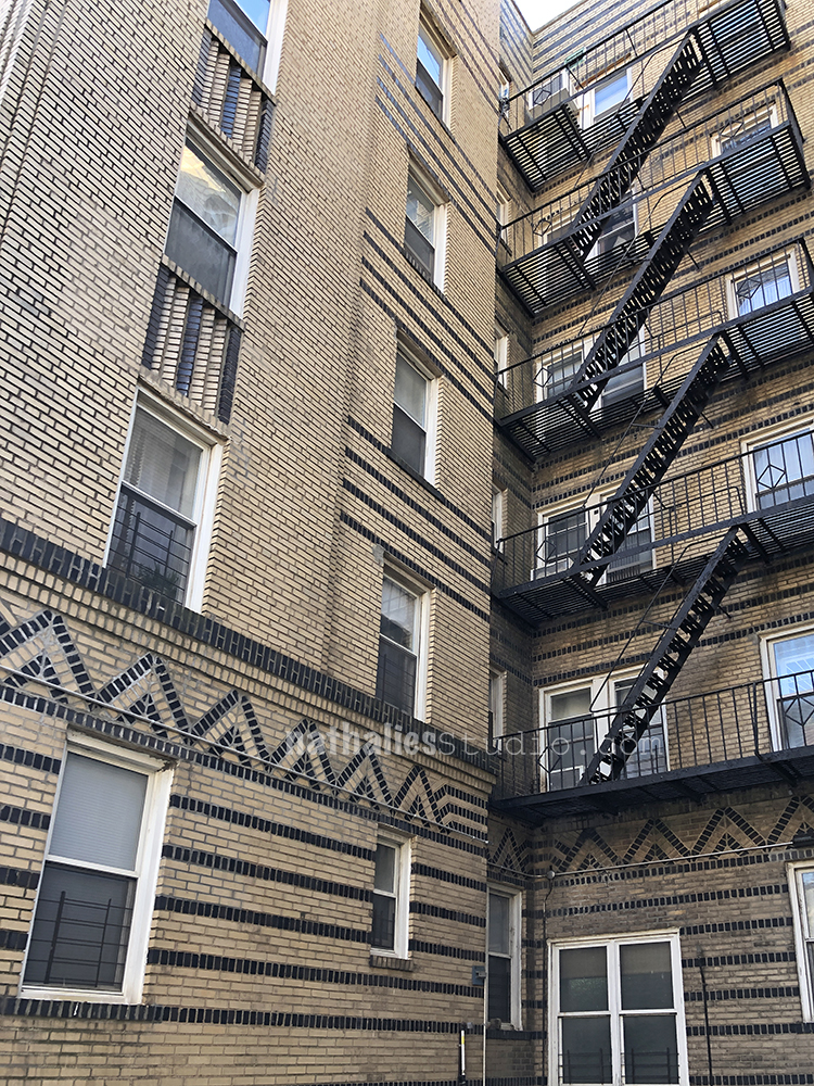
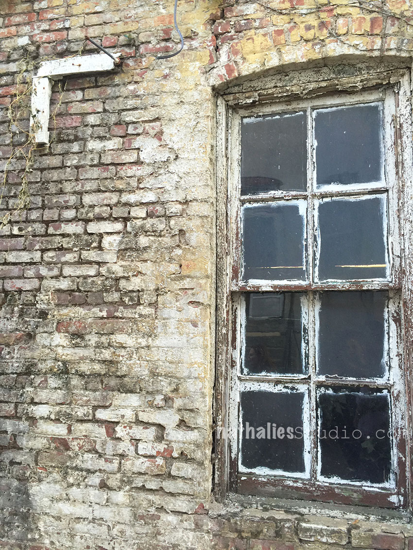
The brick work on some of those buildings is just amazing – alternating colored bricks making patterns and adding interest

Raised bricks forming patterns. And those are huge buildings. Amazing!

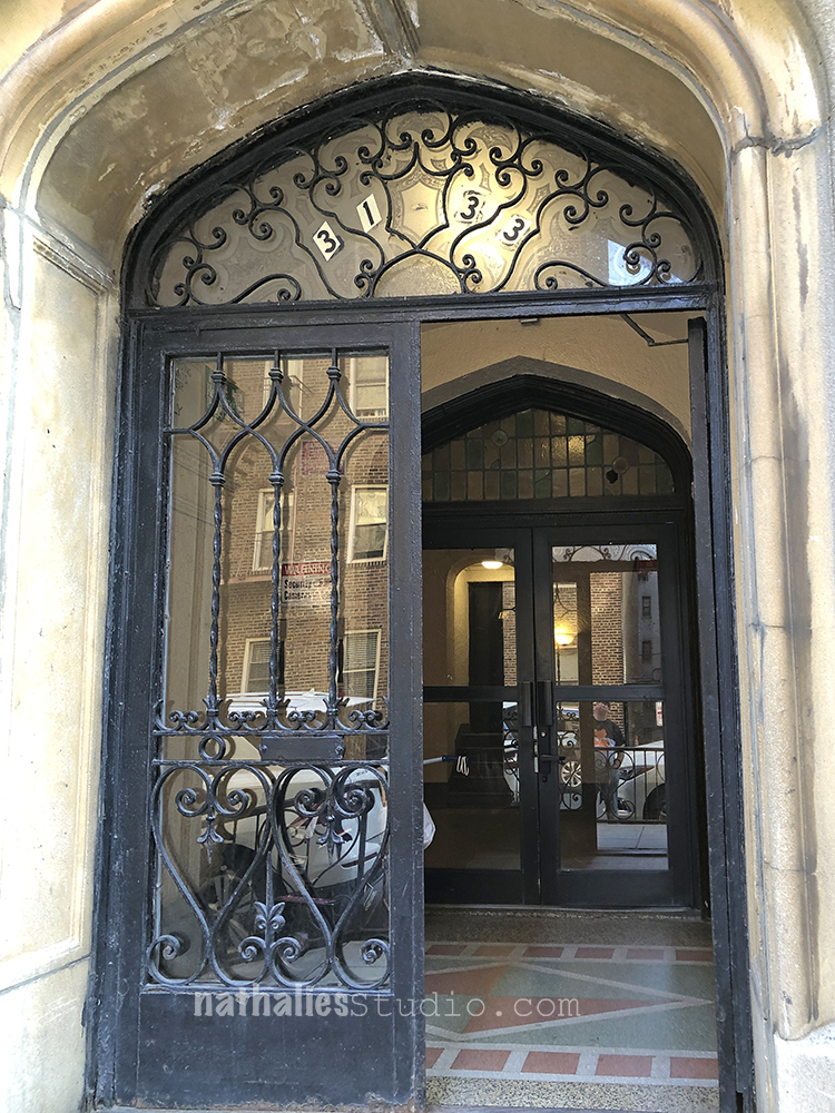
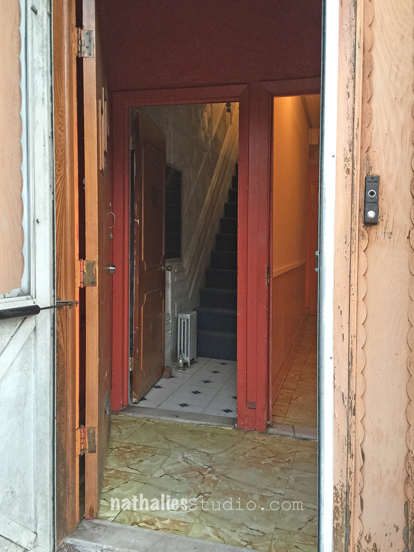
Loved the wonderful iron door and also the entrance tiles.

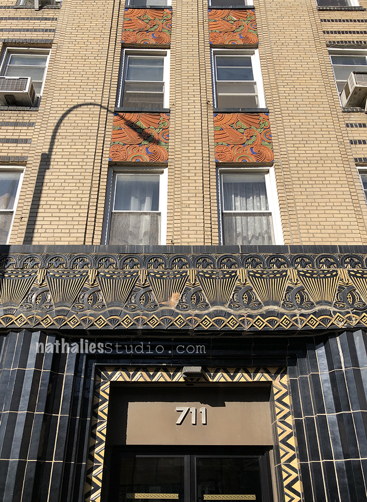
An wonderful art deco apartment facade with chevron and speed lines. You know I have an art deco crush, no?

Be still my heart – look at this magnificent entrance and the wonderful colored terra cotta tiles. I could not stop swooning in front of this building.

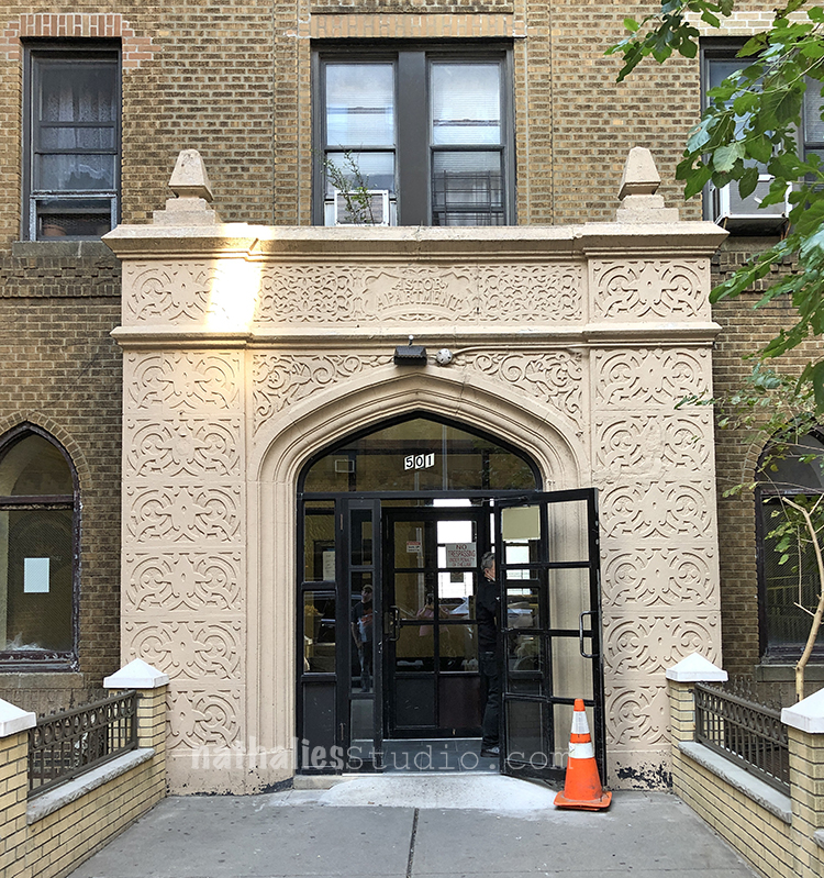
Another incredible entrance. Sometimes the building itself was built pretty simple but the entrance was always done in a grand way.

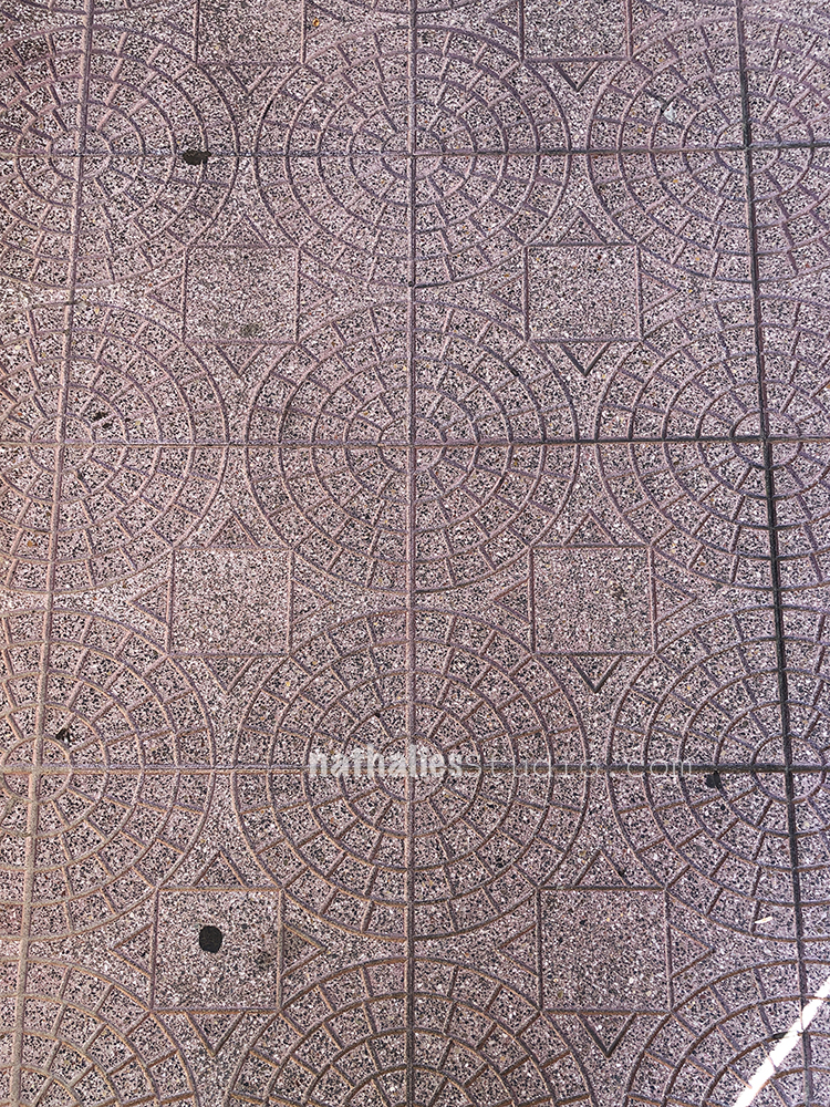
Loved the paving in a front yard towards the entrance- great pattern! I actually took the photo because I have three stamps that could make this pattern up :) Maybe you see something soon that resembles this pattern in my art journal ;)

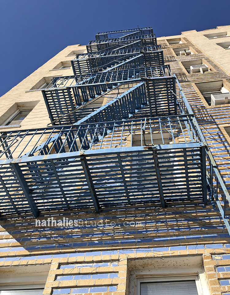
Loved the blue painted bricks in the facade and the blue fire escape. 

It was a great day – we had fun exploring a different area of Brooklyn . I cannot wait to explore more. 

Comments (3)

  • Lani

    |

    Such a fun trip down memory lane.
    My parents were dating when they went to Coney Island, as I did later with my husband. I still have a knife left from the set we won at the “bowling machine”.
    I went to kindergarten with Nathan’s grandson (Handworker) @1951.
    For years, my parent’s would wake me up in the middle of the night because they wanted a Nathan’s hot dog and couldn’t leave me alone in bed on Ocean Pkwy & Ave. K.
    When I was 18 I “ran away” from home and became a nanny in Brighton Beach Towers. I often shopped under “The El” in B.B.and at the “Shlock” shop owned by Neil Diamond’s parents. This was all before the Russians (rumored to be “The Mob”) took over. I baby-sat Lieba & Neil Sedaka’s kids also; friends of the people I worked for. My husband’s grandmother lived in one of those buildings. And his parents lived in a co-op 1 train stop before Coney Island.
    That was before we left to live in our VW van for 3 months, ending up here at the beach in Hermosa Beach in 1970.
    It has been a strange and winding road!
    ?Thanks for the memories…?

    Reply

  • vivian

    |

    Your ‘eye for photos’ is awesome!! Not the usual ‘eye’ but SO creative! I love the ART DECO
    also, a very special time in architecture and architects.

    I also want to say this was also a study of ‘fireescapes’ against the lovely patterned brick walls.

    SO MUCH INSPIRATION!!

    Reply

  • Marge

    |

    Thanks for the great pictures, they bring back many memories for me. Marge

    Reply

Leave a comment

Art Stroll: Interventions 3 in Brooklyn

kalbachinterventionscollage

When two of your artist friends invite you to a group show they are participating in and you have to sign a waiver before you enter the house, you know it must be good :)

kalbachinterventions23

Artist Isidro Blasco purchased a home in pretty bad shape but with loads of potential in Brooklyn and invited 16 artists to apply their ideas and practices to the structure before he begins a renovation that will allow his family to reside in the townhouse. The artists were encouraged to intervene into the hard structure of the house, incorporating the structural elements and interior fixtures into their pieces that are all made on site.

kalbachinterventions01

This was such a unique experience. The photos cannot reflect the feeling of the artwork and the house. The installation incorporated in a door frame by my friend Julia Carbonetta was so amazing, I wish I could have taken the whole door with me.

kalbachinterventions02

Adam Cvijanovic who some of you might remember from my Studio Stroll Post here, is a master of Trompe-l’œil and this upwards bent corner …which is actually painted – was so real it made everyone stop in the room and take a moment to get it.

kalbachinterventions03

A tree branch growing through the wall and a framed painting. kalbachinterventions05

Colored Shapes – I am not sure – but I am assuming from material in the house.

kalbachinterventions06  kalbachinterventions08

A beautiful window- with a new outlook on the bottom.

kalbachinterventions09

An eerie scene of a door of the house on the top …it had a bit of a Shining feeling to it.

kalbachinterventions10

A bar in the living room for a performance piece where on outside later you could see the top of the bodies of the peoplekalbachinterventions12

and with the blinds closed – you could only see the legs of the people form the inside.

kalbachinterventions13

The house was beautiful in it’s state and made you wonder who lived here before and what stories were lived in this house. It looked as if it was a Jewish Boarding house. The upper floor had all pink doors and the kitchen was pink , while the bottom floor had all blue doors with a blue kitchen and a mezuzah was attached on every door frame.

kalbachinterventions20

kalbachinterventions14 kalbachinterventions21

A light installation downstairs

kalbachinterventions16

And my friend Lori going all stripey in the stripe room ;)kalbachinterventions18

Outside the house the most awesome shed – probably later art studio to be. kalbachinterventions24

I loved the concept of this show. Every room was a discovery, either of art, or the untold story of the room or of both.

I hope you enjoyed this Art Stroll and hey…you didn’t even had to sign a waiver ;)

Comments (1)

  • Joi@RR

    |

    For sure.. never have seen anything like this Nat. Well – old houses – yes… remade those myself!! But not artwork like this. I am blown away – almost in disbelief – so crazy unique and out of the box incredible. So glad you got to go view it all in person. What an experience. Thanks bunches for sharing. You always enlarge my universe and my artful thoughts! Xj.

    Reply

Leave a comment

Studio Stroll – Adam Cvijanovic in Brooklyn, New York

StudioStroll Cvijanovic Collage

A couple weeks ago my friends and I took a day off to visit our friend Adam Cvijanovic in his studio in Brooklyn, New York.

KalbachCvijanovic01

Adam is a noted painter working mostly large-scale, often on tyvek with flashe paint (vinyl-based professional grade of matte permanent colors). He calls these tyvek paintings wallpapers or portable murals. Adam dropped out of high school when he was 17 because he wanted to be an artist and cut himself off a Plan B or the possibility to do anything else but art. His work has been on view amongst many other places at the Kemper Museum of Contemporary Art in Kansas City, MI, Blindarte Contemporary in Naples, Italy , Pennsylvania Academy of the Fine Arts, Philadelphia, PA, Shanghai Museum of Contemporary Art, Shanghai, China; Pushkin State Museum of Fine Arts, Moscow, Russia, The Royal Academy of Arts, London, England. He has been an adjunct professor of the Rhode Island School of Design. Adam is represented by Postmasters Gallery in New York.

Pretty impressive and something to tell someone who says to you “you have to go to art school to be an artist”.

KalbachCvijanovic02

I have seen Adam’s work at galleries and I couldn’t wait to see his working space and spend some time with him while he was working. His studio is located in the Brooklyn Navy Yard offering quite some cool views from different spots of the building.

KalbachCvijanovic03

Adam is telling stories with his fascinating, fractured, layered and detailed work. He often adds 3-D elements like painted wood panels and oil painted acrylic panels on top. The perspective in his artwork changes constantly making the viewer linger for a long time to get a grab of the subject matter and the narrative behind it.

KalbachCvijanovic04

He often cuts up his artwork, fracturing it or using elements of it as collage objects in other work.

KalbachCvijanovic05

KalbachCvijanovic06

He also works small – like here – in oil on canvas.

KalbachCvijanovic07

Here is an acrylic panel painted with oil paint.

KalbachCvijanovic08

I loved Adam’s studio – the light was amazing and it was like a treasure box – full of creative chaos but only to us visitors, he pretty much knows where everything is located in his studio.

KalbachCvijanovic09

KalbachCvijanovic10

KalbachCvijanovic11

KalbachCvijanovic12

He was working on a new piece, auditioning fragments and adhering it to differently painted backgrounds. The detail work of his paintings is just insane, and he sources images for his ideas from photographs and movies and puts them together in his paintings into new images- reflecting something known but also non existing.

KalbachCvijanovic13

KalbachCvijanovic14

KalbachCvijanovic15

KalbachCvijanovic16

KalbachCvijanovic17

KalbachCvijanovic18

It was such a great experience to see him work and change things, audition those changes and then start over again, with sometimes just tiny little adjustments. I hope I will get to see the finished piece soon!

KalbachCvijanovic19

This visit also made me  interested in trying out to paint on tyvek – I can see the advantages AND – canvas is super expensive here in the States- so large scale has just become a bit more into reach for me …unless…I put my small studio into account ;)

This was a super inspiring studio stroll, I hope you enjoyed it too and I hope this is the beginning of a new series. Thank you Adam for letting us peek into your studio!!!

Comments (8)

  • Ann Arnold

    |

    Thank you so much for the tour of Adam’s studio.He is a masterful painter. I knew him as a child when he roamed about Boston painting old brick buildings and used his tee shirt as a paint rag.
    Please give him my best wishes. He knew me as Arno.

    Reply

  • Branko Miokovic

    |

    Hi, I like your review of Adam’s work process and his studio. If you have a chance self my regards to Adam. I am his uncle from Canada.

    Reply

    • nathalie-kalbach

      |

      Hi Branko – how fun! i just passed it on to him and Julia!!!

      Reply

  • Joi@RR

    |

    I have looked at these photos three time Nat…. thank you so much for sharing. Sooooooooooooooooo interesting. I HOPE you DO go BIG with the tyvek – for sure. What a wonderful experience it must have been to be there in his studio – wow. Even hubby was totally awed by your photos. What a HUGE TREAT. XXj.

    Reply

  • Sandy

    |

    Natalie
    I hear about tyvek all the time but not how to locate it or prep it for painting. The stuff I see builders use has the name boldly printed on it so it would need to be coated so the word tyvek does not bleed through. A subject for your next video hummmmm.

    Reply

  • Carolyn

    |

    So interesting! Thanks for the tour and insight into his work.

    Reply

  • Jane LaFazio

    |

    This was great! Thanks Nat for the tour. Looking forward to more in this new series.

    Reply

Leave a comment

Inspired by Brooklyn – Street Art

NatKalbach_Brooklyn01


A couple weeks ago I headed out to Brooklyn and strolled mostly around in Williamsburg. From my place it is a 45 min ride with public transportation- so not a biggie- and  what an inspirational stroll :

NatKalbach_Brooklyn02

Besides the warehouses ….did I tell you, I have a big heart for old ware houses- I want one- LOL – this is such a cool and funny one – and I love it on the rusty brown background too.

NatKalbach_Brooklyn03

These colors just popped and I love all the different details

NatKalbach_Brooklyn04

Tehehe- that one made me smile by Goodandshiddy – as well as this one

NatKalbach_Brooklyn08

I love how it is framed by the two houses and with the chimney in the background.

NatKalbach_Brooklyn05

Love this “good cop- bad cop” stencil play very cool!

NatKalbach_Brooklyn06

So many details- so much to look at – love the black background and the different surfaces giving texture – like the garage door and the brick wall…I also love the Mr Mushroom sign ;)

NatKalbach_Brooklyn07

LOVE  – obviously because it is a close hit to home regarding my work – and I do love the colors, brushstrokes and paper textures coming through

NatKalbach_Brooklyn09

Gotta love a cat on a mint green wall!

NatKalbach_Brooklyn10


very cool doodle work and love the color combination with the different black line sizes.

NatKalbach_Brooklyn12

So real and you get lost looking into this eye looking at the details – so much depth!

NatKalbach_Brooklyn13

I saved my favorite for last- just the texture behind it made me gasp – the whole vanishing piece of art- the different building materials and the all in all very muted but dramatic feel – Don’t you want to touch that one? Well, you can – but you better hurry up before it is totally vanished!

This stroll itself was pretty inspiring but I did continue on to the Brooklyn Museum -which will be a different blog post :) Which one of the images inspires you the most?

Have a gorgeous and creative day


Comments (3)

  • Peggy Oliver

    |

    Very inspiring walk you had! Great photos and amazing art!

    Reply

  • Sue Clarke

    |

    Just delightful Nat! Thanks for bringing us with you on your stroll.
    I so enjoy finding street art and take pics when I can.
    The eye really caught my eye (ha ha ha).
    Hope you have a colorful weekend.

    Reply

  • Jackie P Neal

    |

    I want to go on your jaunts with you!! Such incredible pieces of art- out there for everyone to admire!! Glad you found them and share them here with us Nat! Thanks! xo

    Reply

Leave a comment