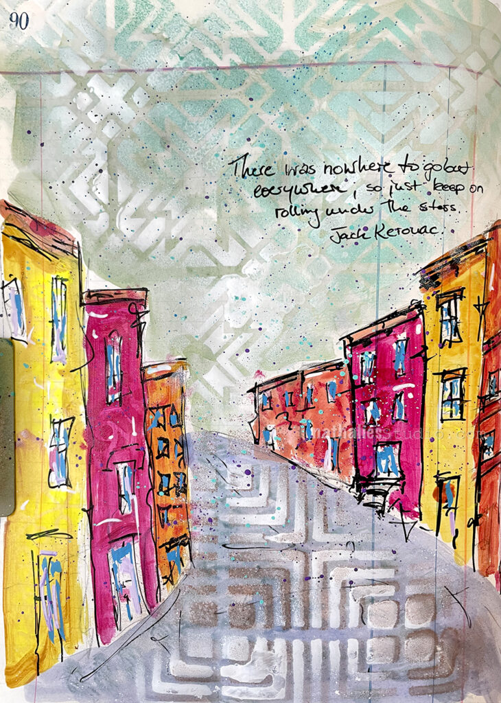
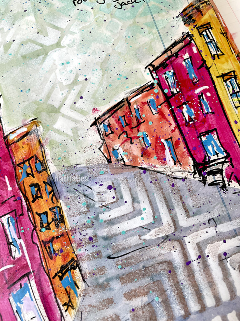
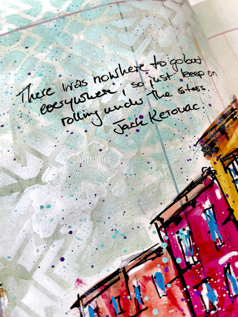
I painted a loose street scene with acrylic paints in this art journal spread. I added some details and definition with markers and used stencils and spray paint over the “sky” (my Toledo stencil) and the “street” (my Manhattan stencil).
To add a little bit of pattern into the house I reached for my ATC Mixup stencil. It’s very subtle – basically in the same color as the house where it was painted, just to give some texture and oomph to the colors.
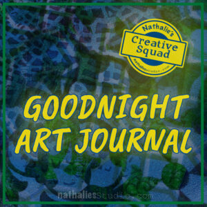
Hello from my Creative Squad! Today we have a post and video from Riikka Kovasin who is sharing an art journal page using my ATC Mixup and Manhattan stencils and our theme: Goodnight, Art Journal – Create an art journal page inspired by nighttime. Think about the colors, sounds, rituals of night – any aspect of it – and use that as your catalyst to create!
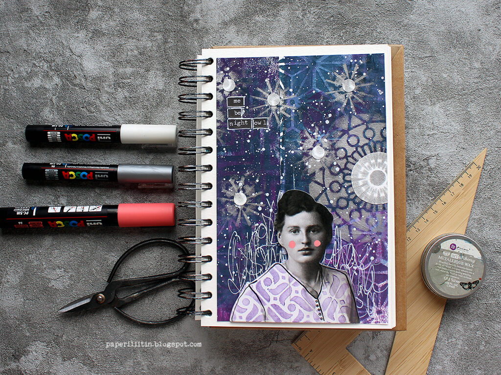
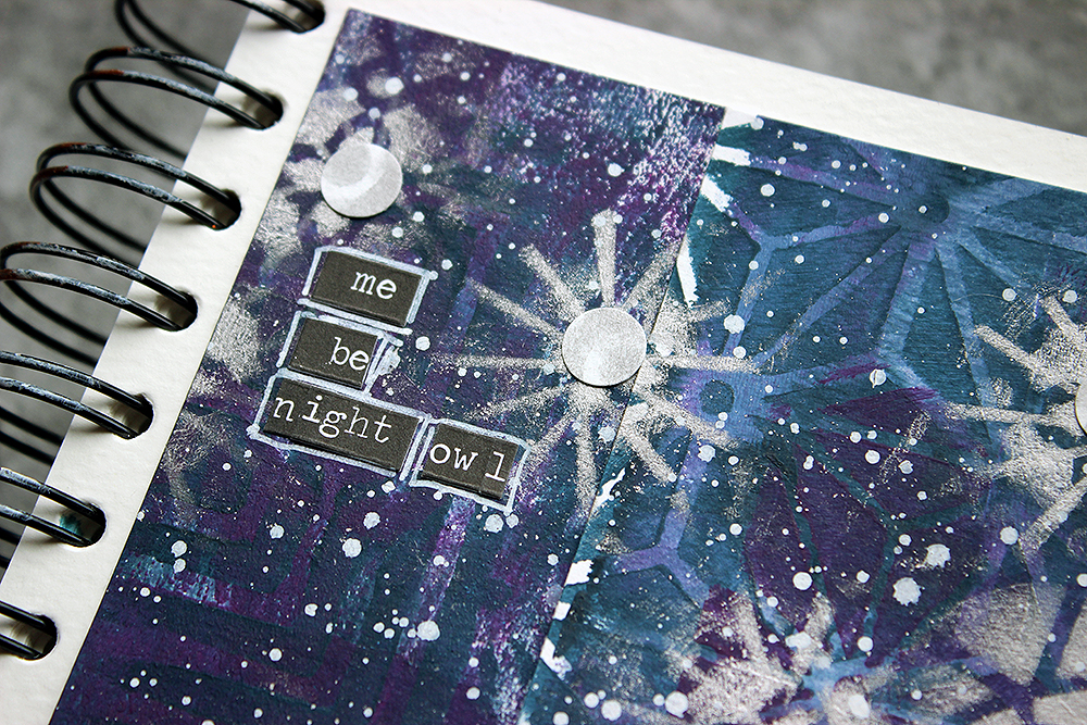
Me be night owl
Hi there! It’s Riikka Kovasin here today to share my take on the month’s theme! Like I say in the process video, first I got a bit puzzled as not so long ago I did a nighttime inspired art journal page for the team. I say, “not so long”, but actually it was almost a year ago! Time does fly. You can see that page here.
Why I’m bringing this up was that I didn’t want to repeat myself! Although there’s similar elements in my page now, there’s also something new, so I call that mission accomplished! Because like I say in the earlier post, I would love to be a night owl. In everyday life my current work and family life doesn’t allow me to follow my natural rhythm, but if I had the possibility I’d work until midnight and then sleep in. I seem to have a new productive sequence in between 9-11 pm!
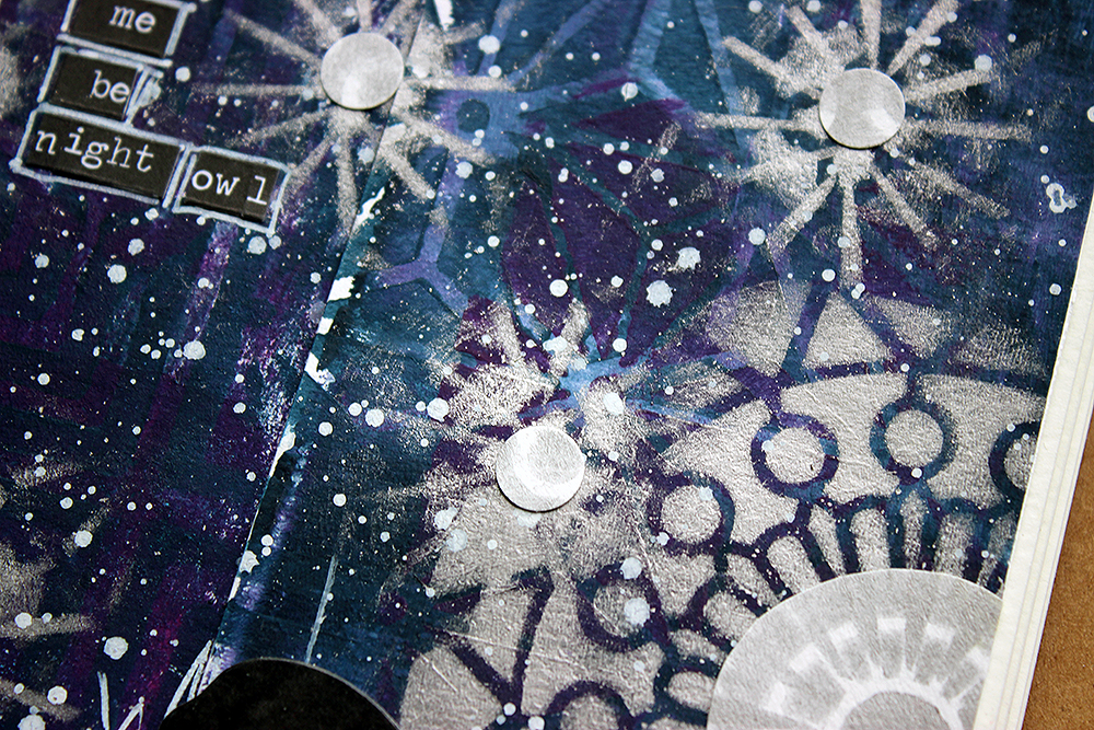
I first tried to think what to do, but then gave in and just started doing, going with the flow. And I really like how the page turned out! I first colored two strips of paper using gel printing, then added patterns on top using stencils and lastly a flurry of stars and a moon. Why two strips of paper, you might ask. Well, they just happened to be there when I was reaching out to get a background piece. I thought it would be fun to start with those, to use “left-overs”. If you want to see how the page came into being, please see the video below:
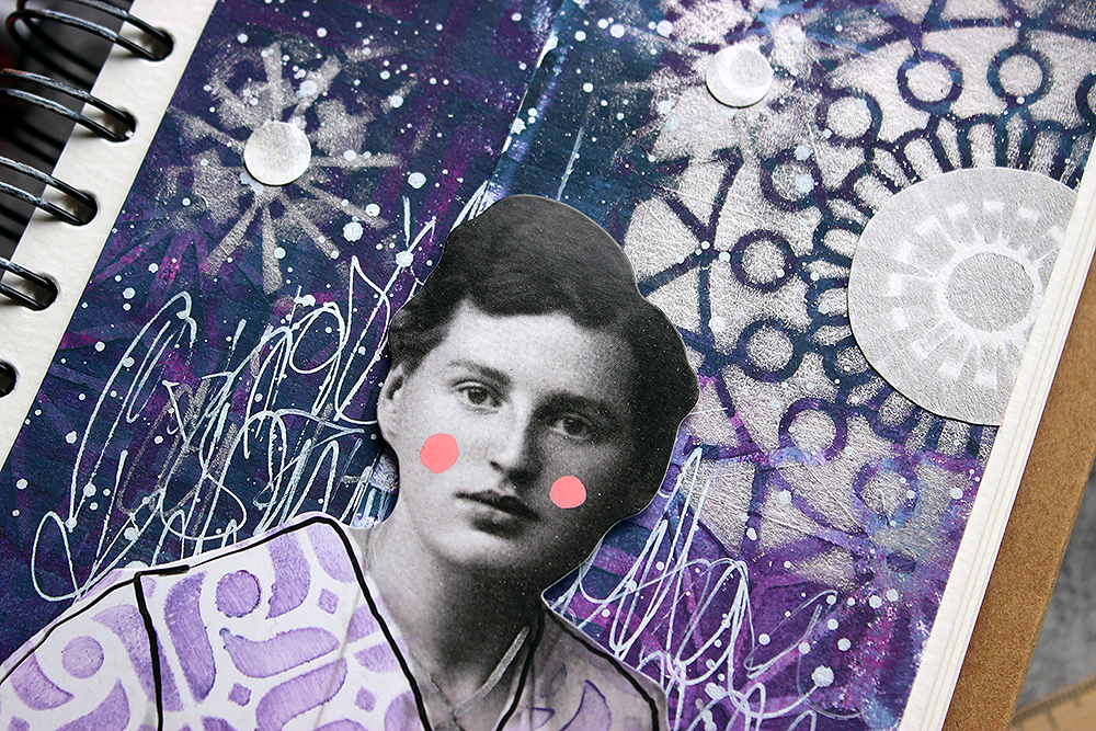
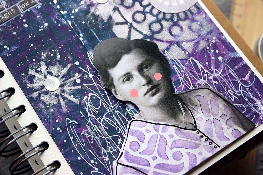
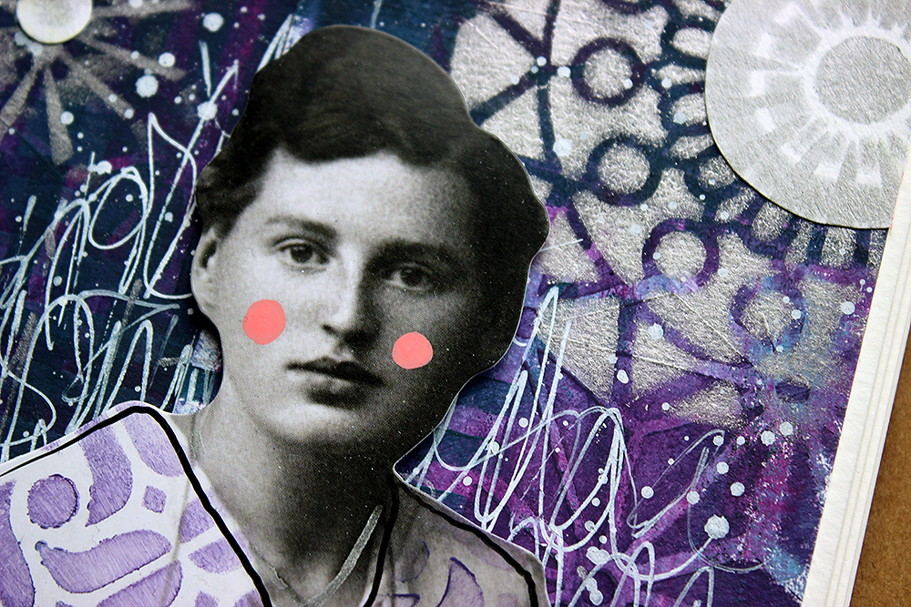
As you could see from the video, I used two Nathalie’s stencils in my make. Why I chose these two? Well, the reason for the ATC Mixup is kind of obvious, I think. It’s because of the multitude of patterns in one stencil! I didn’t have to settle to just one or two patterns but could use an abundance! And as you can move the stencil and continue the pattern, the smaller size doesn’t matter, either. I did want to add another stencil to the mix, to have a bigger pattern. For that I chose Manhattan. Its angular design complimented the curvier, softer patterns of the ATC Mixup nicely.
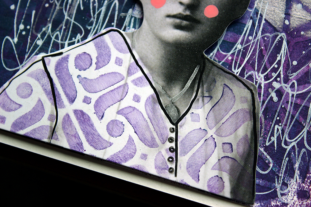
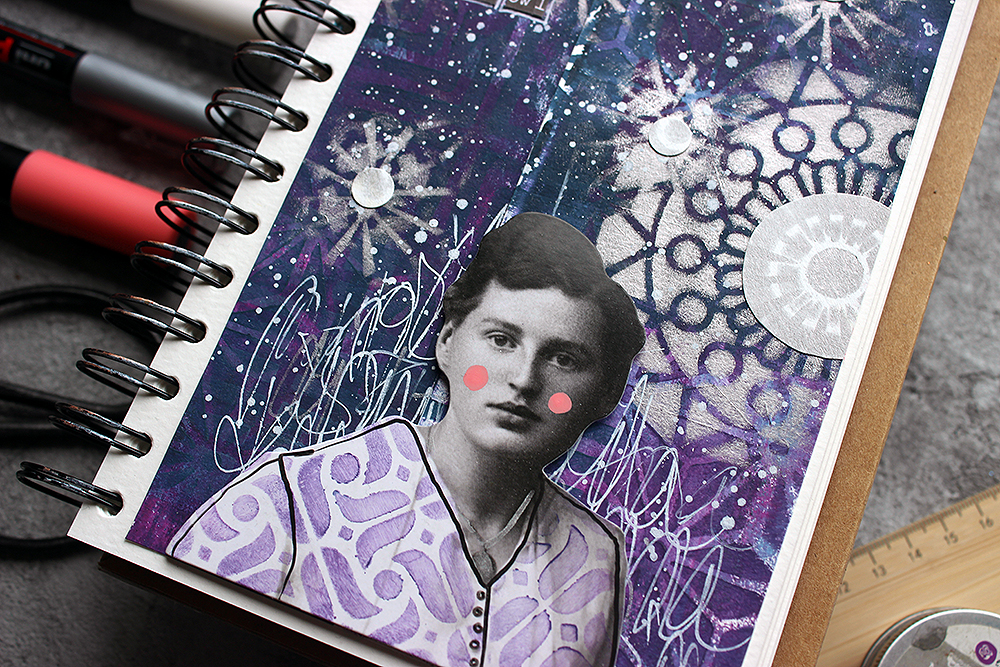
I went through several Tim Holtz paper dolls when searching for the right one. This lady had the right air about her, and she somehow reminded me about Edith Södergran, a Finnish poet. One of the first poems I read from her was titled “Stars”. But when I was checking the placement, her white shirt looked too pale, and it had such a big contrast between the inky blue background it was stealing the attention too much. Luckily, I had an easy solution! You could see that from the video, too, I just added a pattern on top.
To keep the project cohesive color-wise, I used one of the colors I had used in the background as well. The patterning hid some of the details of the garment, so I then drew those in. You can probably see my hesitation in the video. I was afraid that the black Posca marker might be too much, but luckily it was just what the doctor ordered! Her hair balances the dark marks nicely.
Thank you for stopping by today! I can’t wait to see what the teamies have made for this topic!
Xoxo Riikka
Thank you Riikka – love the night sky you’ve created with the layered stencils and splatters – great sense of depth in there!
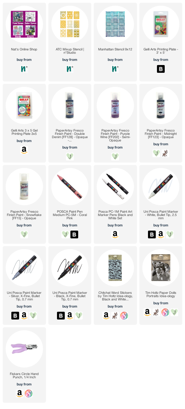
Give it a try: you can find all my Stencils in my Online Shop and here are some of the supplies Riikka used:
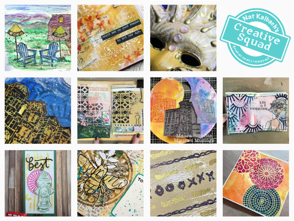
Looking for more projects? Follow the Creative Squad on Instagram here.
I love the page from a year ago and I also like this one! I especially like how you stamped the pattern on her blouse.
Thanks for the inspiration Riikka!
A Look Back – Today I’m looking at art journal spreads, projects, and even an old layout from 2009 where specific songs inspired me to create. I have always been a big fan of alternative and punk music but lots of times a song from an entirely different genre will inspire me. Poetic lyrics definitely catch my… ear lol
A Look Back is a blog series to show you some projects and posts that you may have missed – sometimes going WAY back in the archive. I think it will be fun to revisit a few ideas that we haven’t seen for a while. I’m excited to see how a little look back might inspire something new in the future :)
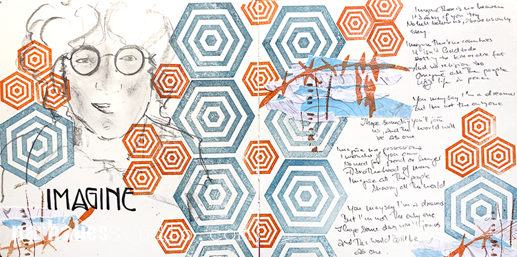
I created this art journal spread in 2019 after watching a doc on John Lennon and Yoko Ono. I think this song (“Imagine”) in particular always resonates when we are going through a period of strife. I felt the need to copy down a lot of the lyrics (maybe all of them), filling in the empty space I created using my Hex Set Small and Hex Set Large stamps.
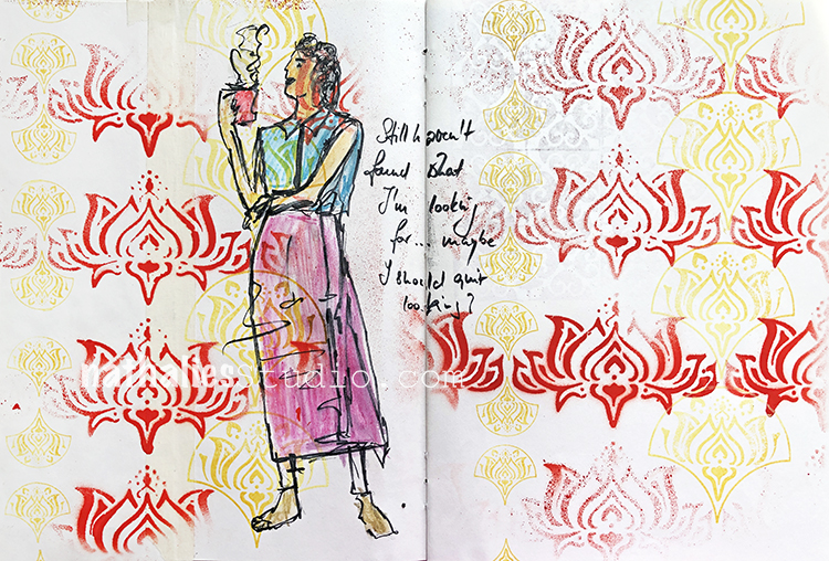
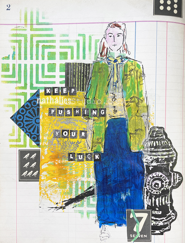
Also in 2019 I joined a challenge by my friend Tina Walker called The Stencilfied Journal and it was a series of about 25 song prompts to get inspired by. The above one was U2’s “I Still Haven’t Found What I’m Looking For” – and as a U2 fan I had no trouble finding inspo in that. I created a background with my Lily Wallpaper stencil and my Fan-tastic Large and Fan-tastic Small stamp sets and then put in my contemplative figure who is wondering, “maybe I should quit looking?”
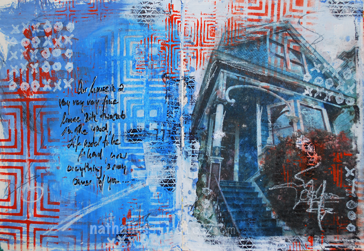
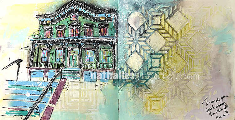
As you know, I always have my eyes open for architecture and one time in San Francisco I saw this great house, snapped a pic of it, and later put it in this art journal spread as a transfer. The Crosby, Stills, Nash, and Young song “Our House” often comes to mind when I see a lovely home so it all came together in this spread in 2017. I added my Manhattan stencil, Love Knots rubber stamp, and my Tread rubber stamp too. Now where are those two cats…?
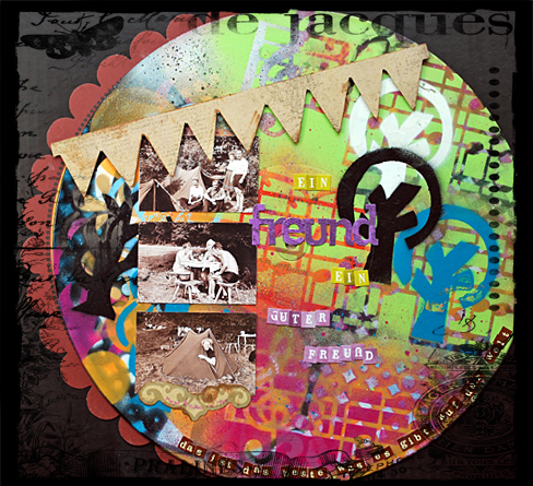
Time to go back in time to 2012 and this collage I created on an old record, inspired by the German song “Ein Freund, ein guter Freund” – a song that came to my mind when I was going through old photos of my Aunt Margo and her friends on a camping trip in 1949. She had shared some of the funny stories of that trip with me and I loved thinking about her and her good friends going on a rather madcap adventure when they were young :)
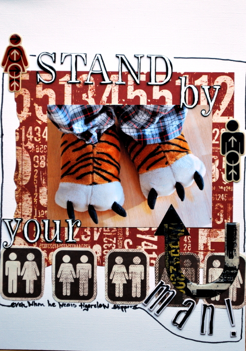
And now I take you alllll the way back to 2009 and this layout inspired by “Stand By Your Man” (as performed by the incomparable Blues Brothers) and featuring some ridiculous slippers that my husband had back then. I don’t know about those slippers but I still dig some of the collage elements I brought into this.
I hope you enjoyed this look back on some artwork inspired by songs. Here are some of the supplies I used:
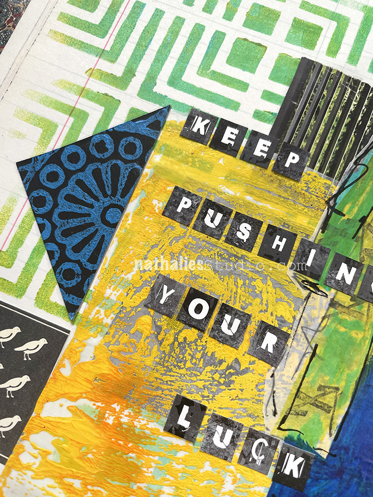
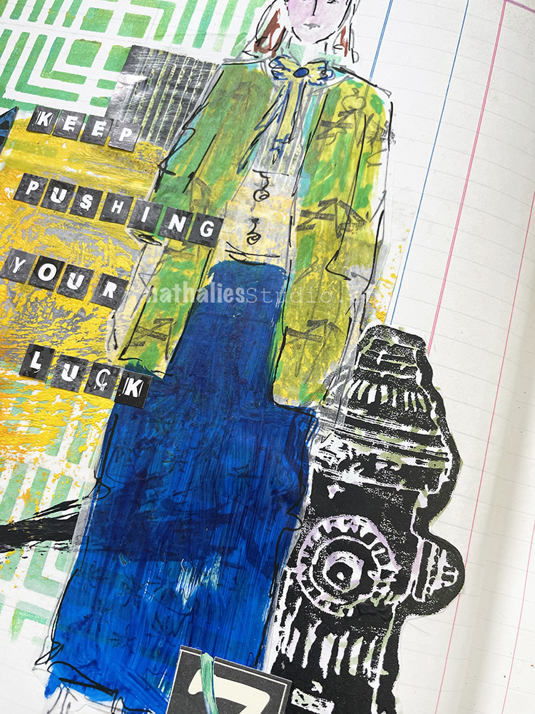
I am challenging myself to use up the collage pile I have collected in my one of my letterpress drawers over the years – it is fun to go through the bits and pieces and finally use them for some art journal pages.
I stenciled with acrylic paints through my Manhattan stencil and I also cut a triangle from black paper where I had used my Valley Road stencil. I added a magazine image (the green and black fencing behind the lady) and used some leftover deli paper with yellow and black paint as I loved the texture on it.
I sketched my figure and even gave her jacket a little pattern using my Art Tag rubber stamp. Then I used my Hydrant foam stamp which I had previously stamped with acrylic paint on paper.
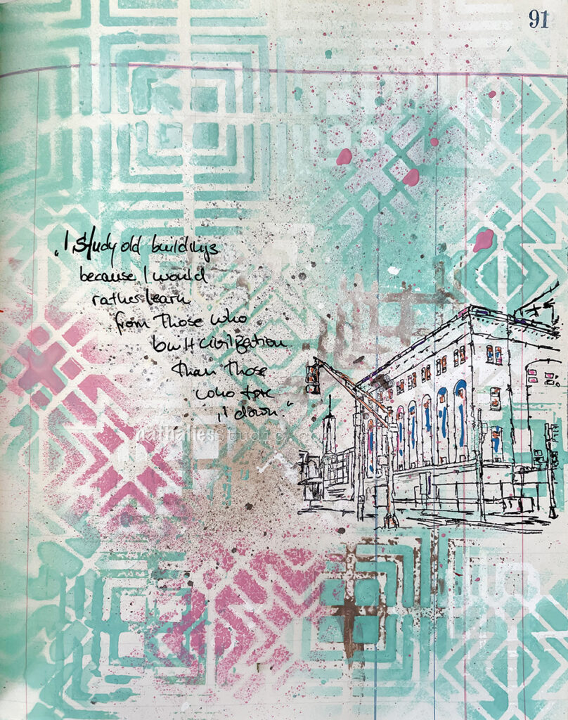
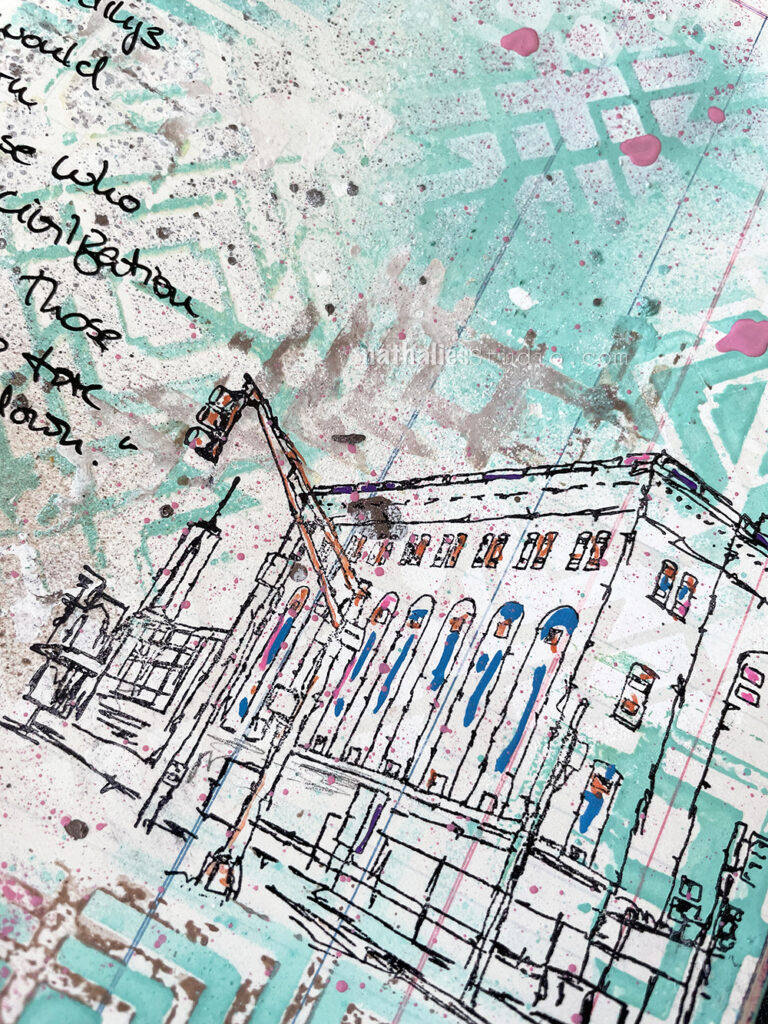
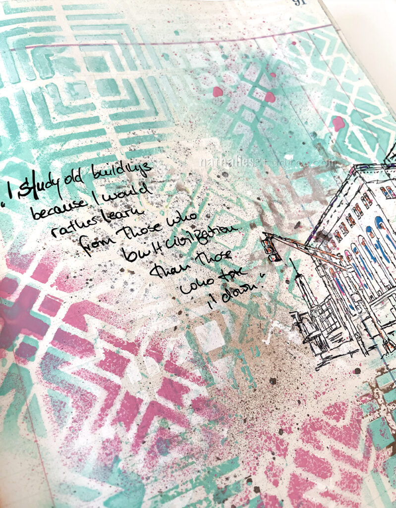
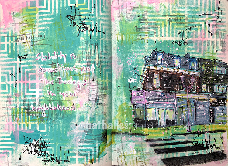
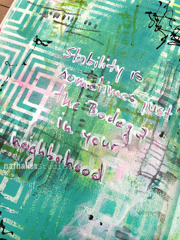
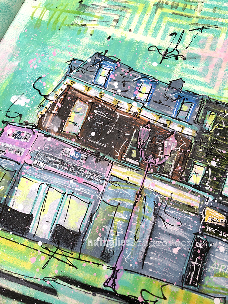
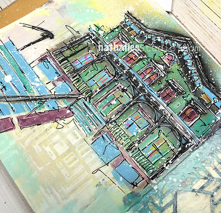
“Stability is sometimes just the bodega in your neighborhood” . I played around in my art journal for a painting of this building on canvas.
I built up my background with my Manhattan stencil and acrylic spray paint. I also used my Gnarly and Far Out foam stamps along with ink and acrylic paint.
I also used various acrylic markers for my sketch and journaling.
Does your hood have a bodega or corner store that has all those little things you need?
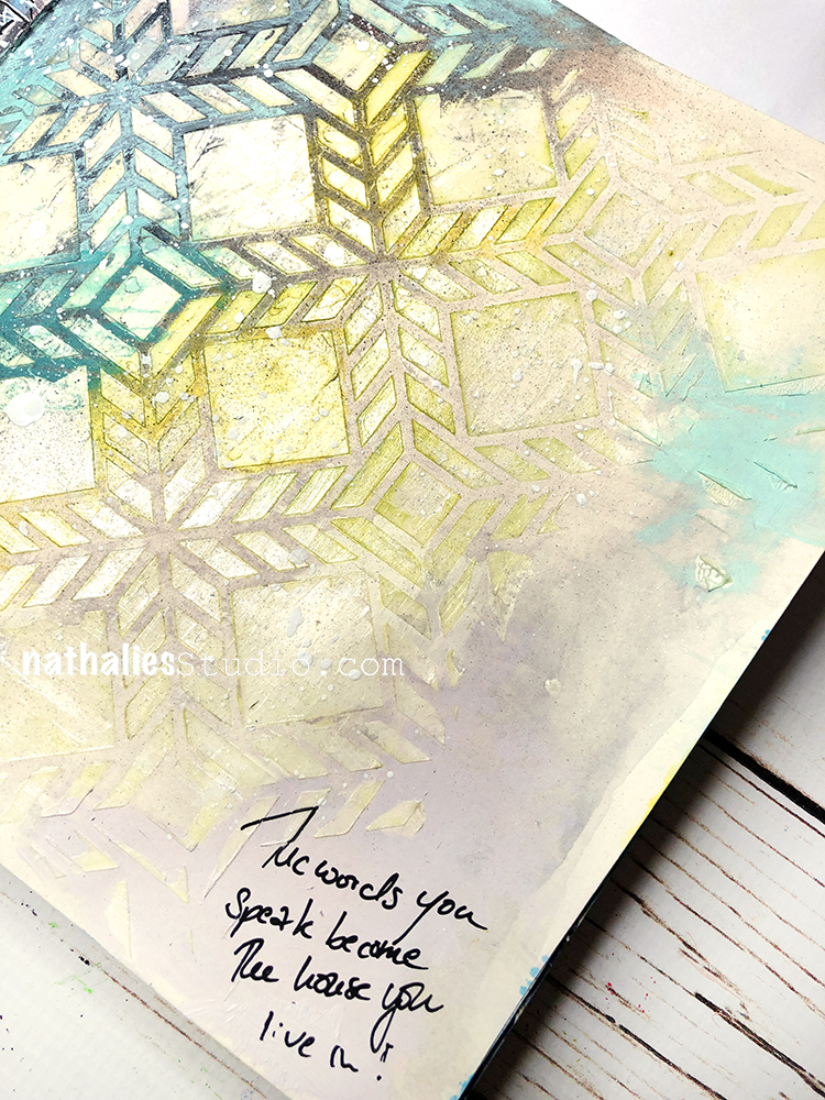
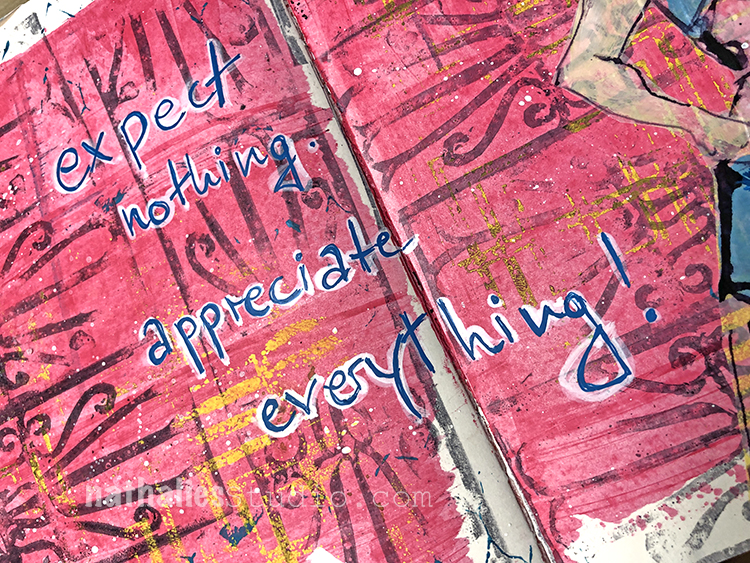
“The words you speak become the house you live in!” In other words, speak carefully – a good motto but definitely a tricky one to always follow :)
This was another study for a new painting. On the left I spread gesso through the Manhattan stencil and on the right I spread gel medium through the Santiago stencil. I wanted to play a bit with stencil texture underneath the painting or around it to see how it would look.
Once the gesso and gel medium dried I added thin paint over both sides and then wiped it off the surfaces before it totally dried – as the gesso and the gel medium resist the paint longer. I am not sure if I like it as a surface to draw on though – it really makes it hard. Better to think first of where I want the image to go and then spread out that area for the background… but that is why I love an art journal to play with such things!
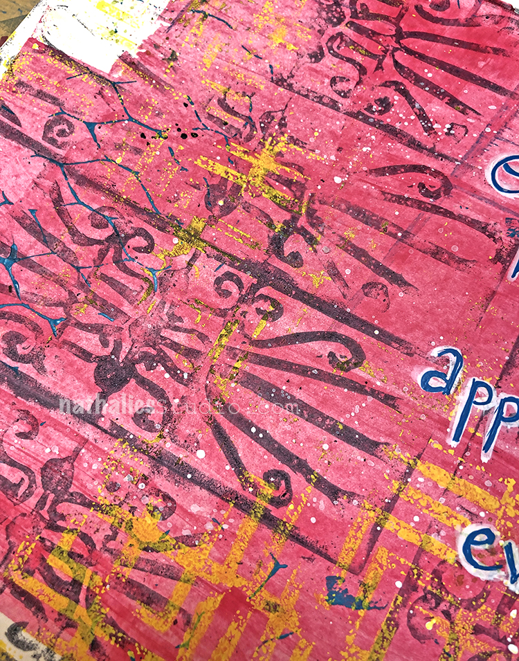
For the background I used a hand carved stamp inspired by a door I saw on one of my strolls through the hood. I stamped with Archival inkk over some acrylic paint, and then layered up my Manhattan stencil with spray paint.
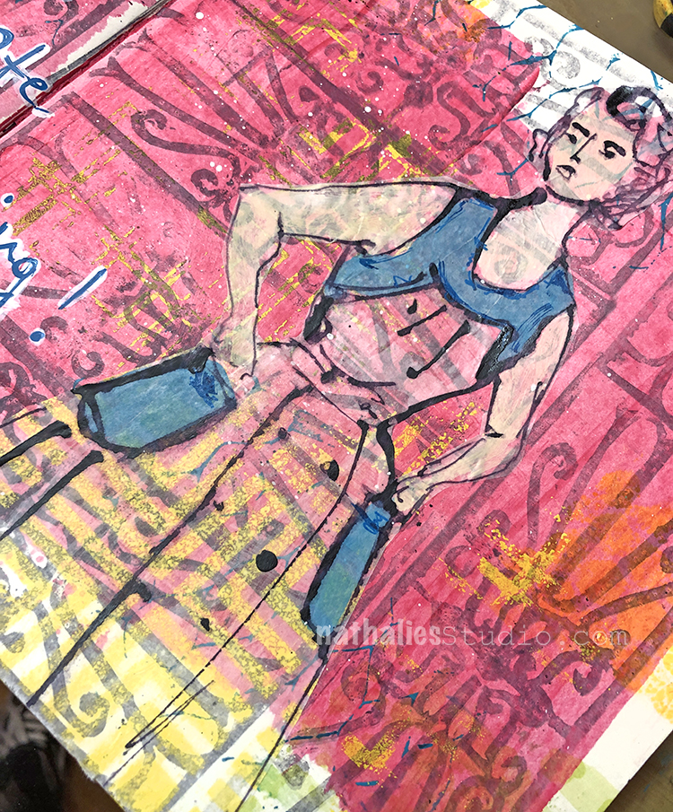
I sketched in a figure with acrylic markers on deli paper so the background still peeks through.
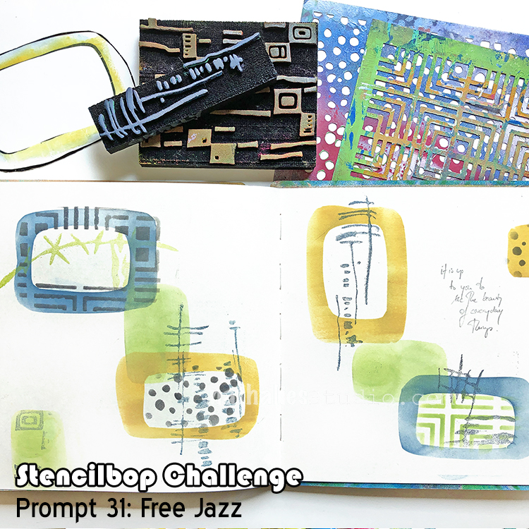
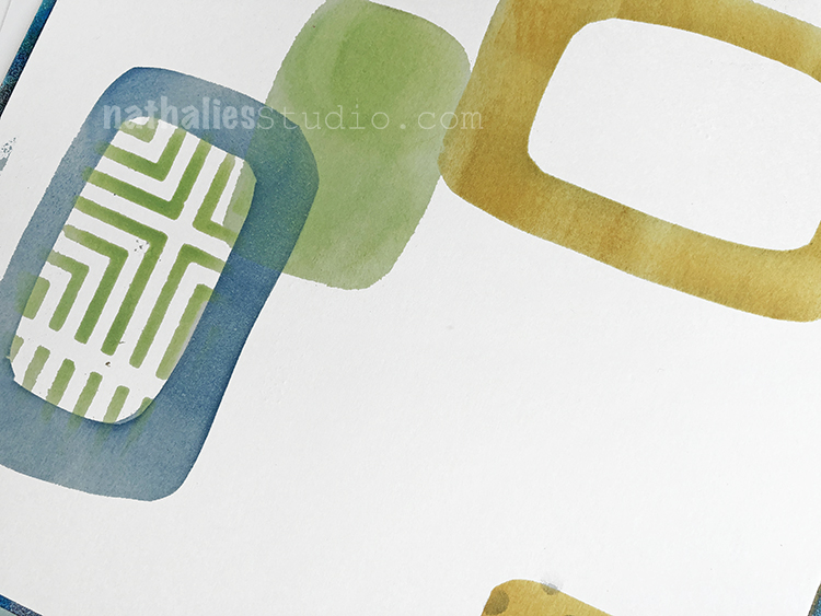
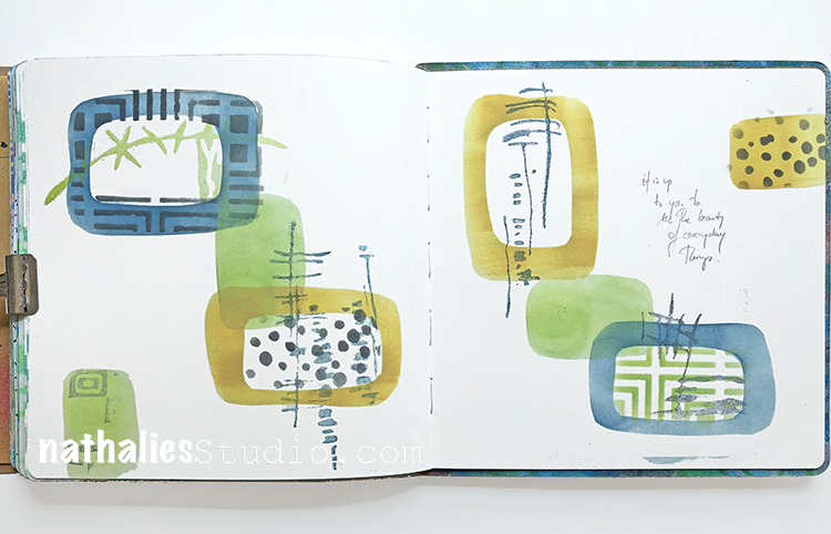
Wow – this is our last day of the Stencilbop Challenge, August 31, and I thought Free Jazz would be a good prompt- I cannot wait to see what you came up with. I chose to mix my manufactured stencil design with some hand cut free form stencils and masks.
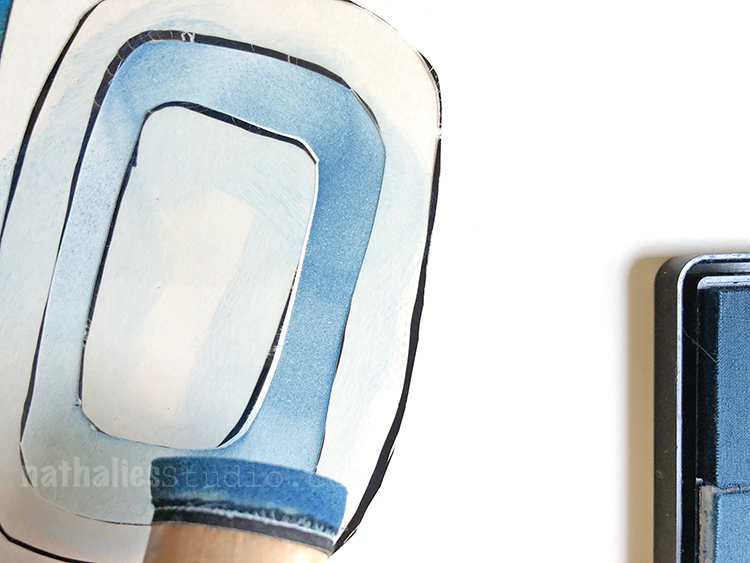
I used an acetate sheet and just created some oval shaped forms and cut those out. I used a blending tool and some stamping inks to transfer and stencil into my artjournal.
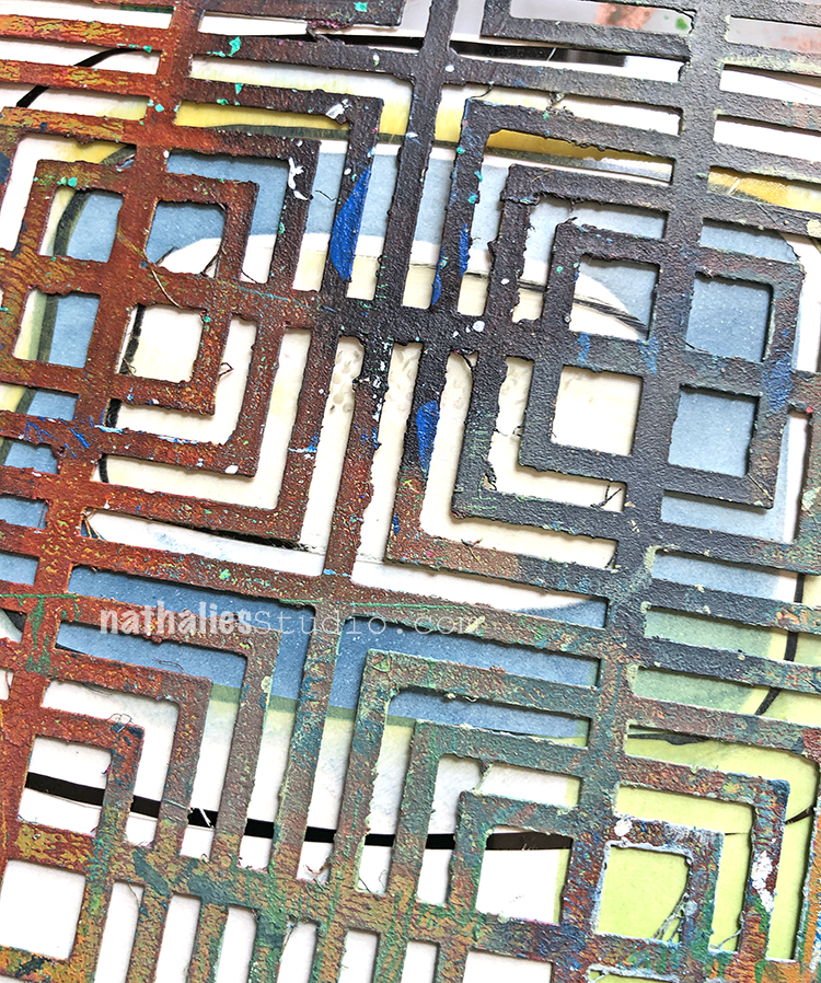
I used some of the stencils and masks to determine the area to stencil over with my Stencil Girl Products stencils. Here I am applying the Manhattan stencil.
I also added some of my foam stamps as I thought they would go really well with it overall.
Free cutting some stencils is a great way to personalize your art journal pages and give them that extra oomph.
I hope you enjoyed this Stencilbop challenge- thank you so much for being part of it- that was super fun!
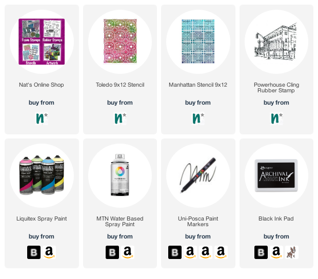
Here are some of the supplies I used in this final prompt:

Nat, I just love how the street came out!
Reply