Blog: stamp

A Look Back – Hand Carved Stamps

A Look Back… at hand carved stamps! I love using my rubber and foam stamp designs in my art journal pages. They add pattern and detail and another element of my style into what I’m creating. Sometimes though, I don’t have the motif that I’m looking for in a ready made stamp so… I carve my own! It’s a fun process and it can give you that look and ease of use that is so great about stamps, but it usually also has a slightly imperfect look that makes it special. Here is a Look Back at some pages where I mix up hand carved stamps with my other favorite art making materials:

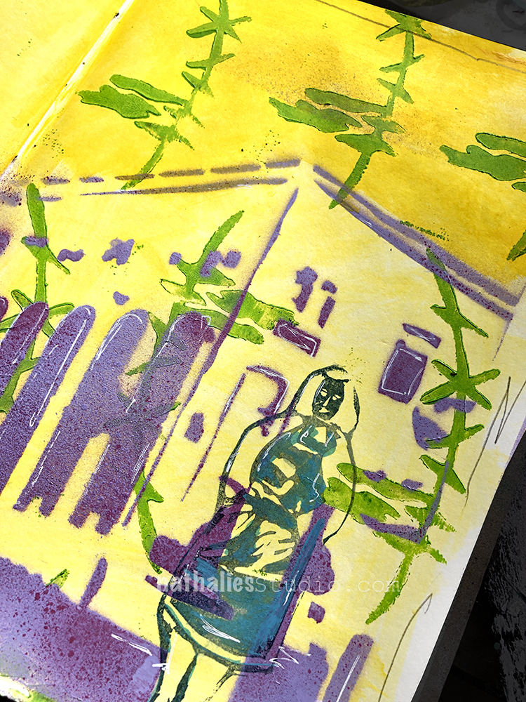
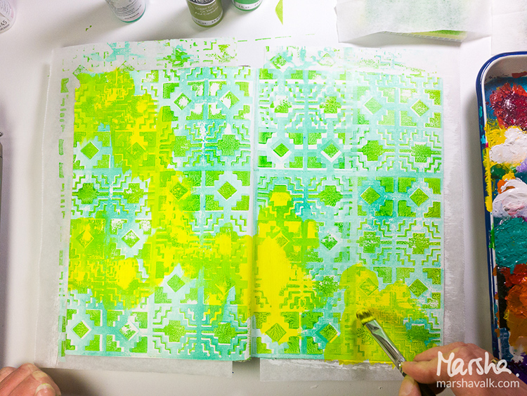
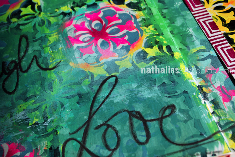
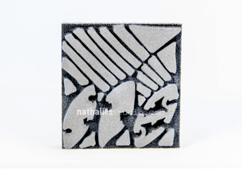
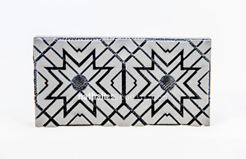
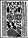
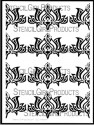
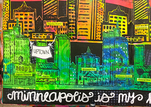
Here in this art journal page, the sinuous design in the background is a hand carved stamp. It looks like iron work or an architectural detail and was perfect for creating a background. I mixed in a little of my Manhattan stencil to soften things and blend the foreground and background elements.

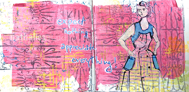
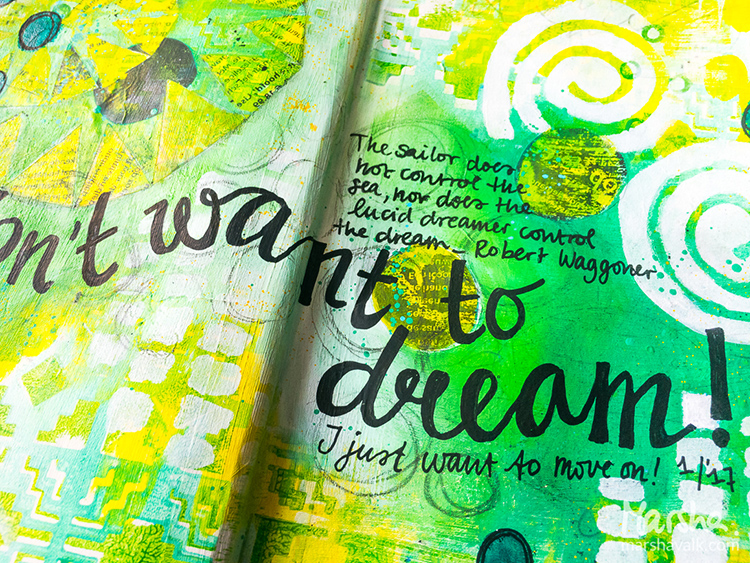
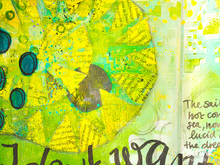
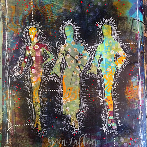
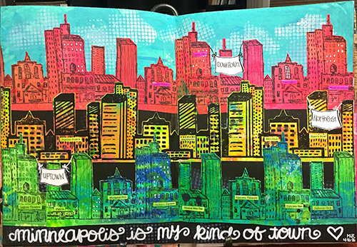
Just like any stamp, a hand carved stamp doesn’t need to be a single use tool. As you can see I used that guy again in the background of this art journal spread. The double impression reminds me of a gate or doors behind the figure. I stamped it in yellow and then gave the design some more oomph (but not too much) with a fine white acrylic marker.

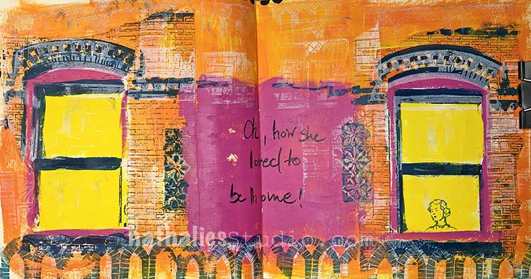
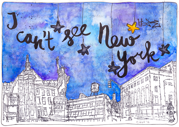
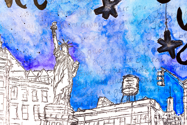
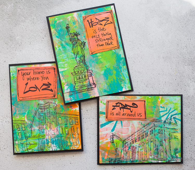
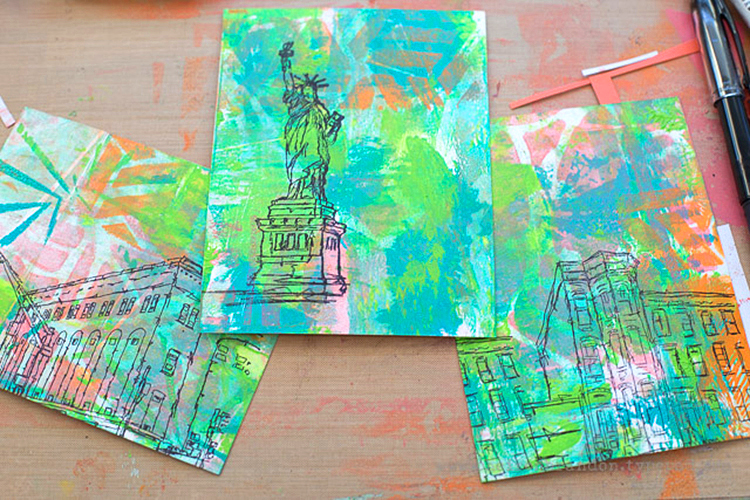
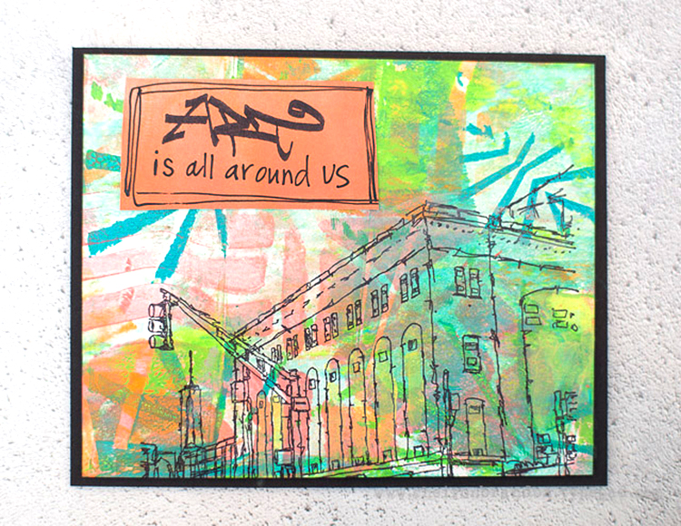
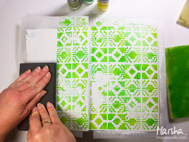
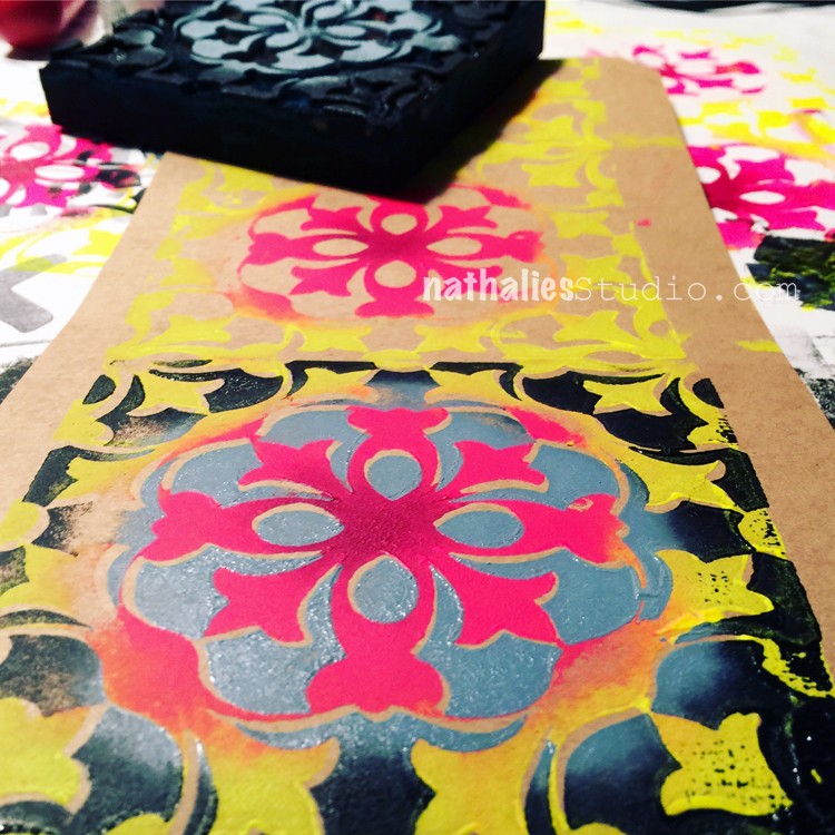
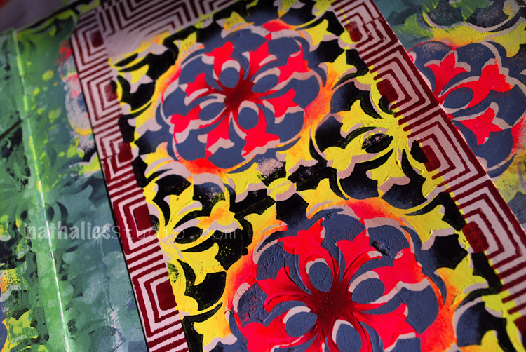
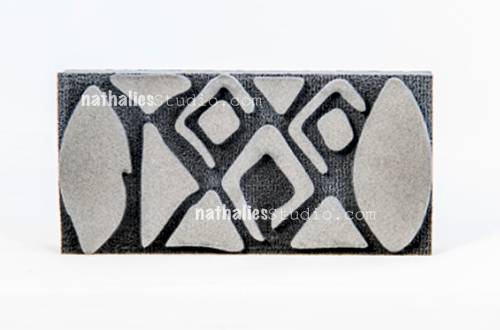
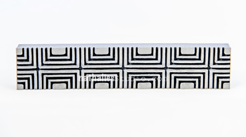
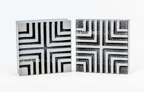
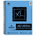
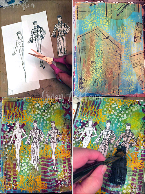
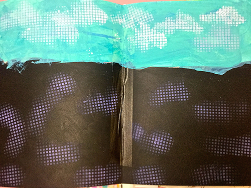
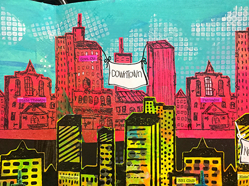
Speaking of architectural elements, that’s how I made them in this art journal page: hand carved stamps! You can go quite big if you use a product like Speedy-Carve that comes in sheets. It’s almost like linoleum printing but the material is so soft and easy to work with.

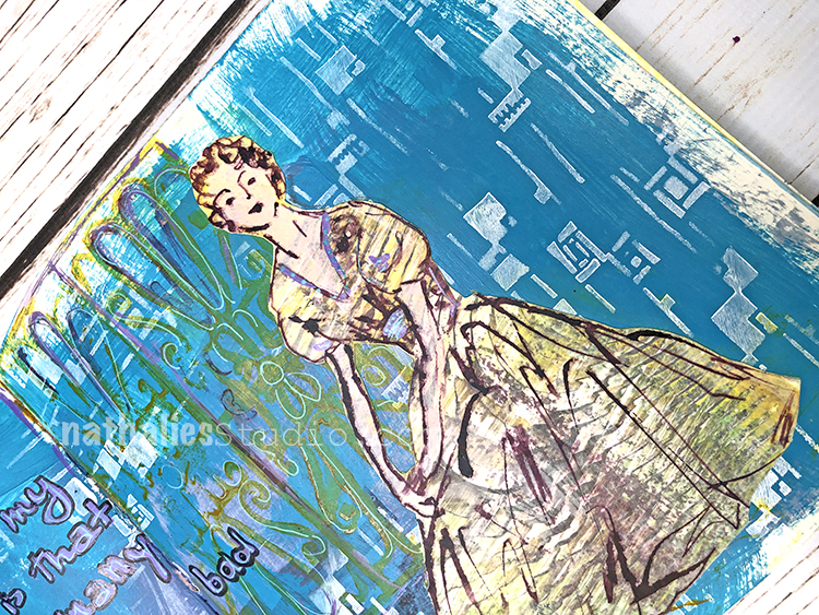
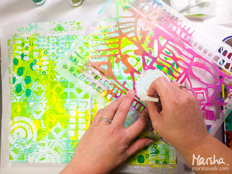
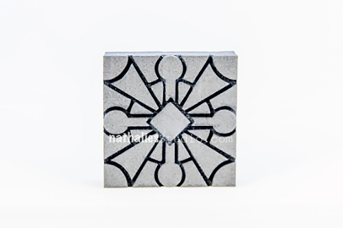
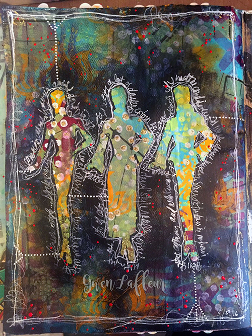
The figure above is a hand carved stamp, along with a hand cut stencil, and my Groovy foam stamp. I like how they all work together in this art journal spread, with similar line weights, curves, and scale. Don’t be afraid to mix up and layer your hand carved stamps with other stamps and stencils. They can be the focal point or a supporting actor on the page ;)

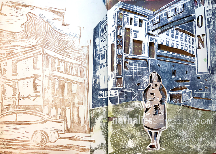
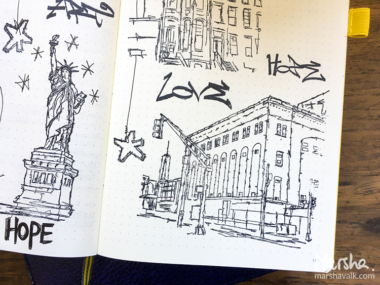
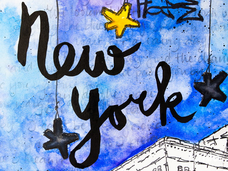
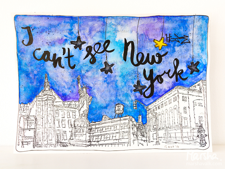
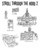
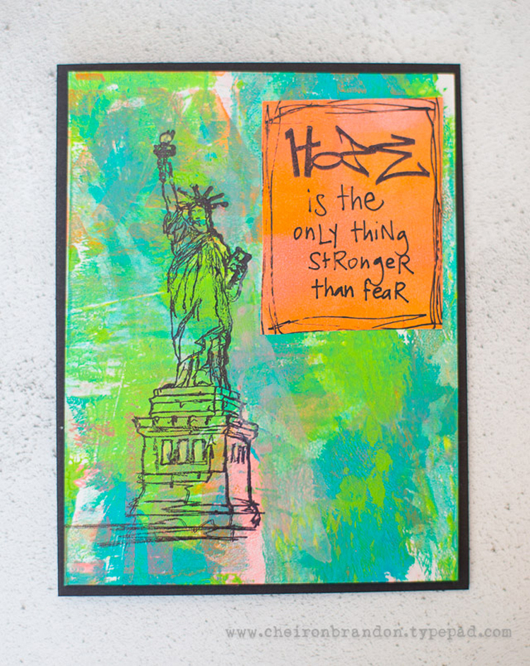
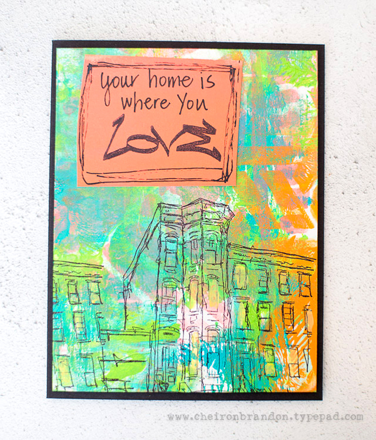
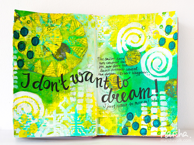
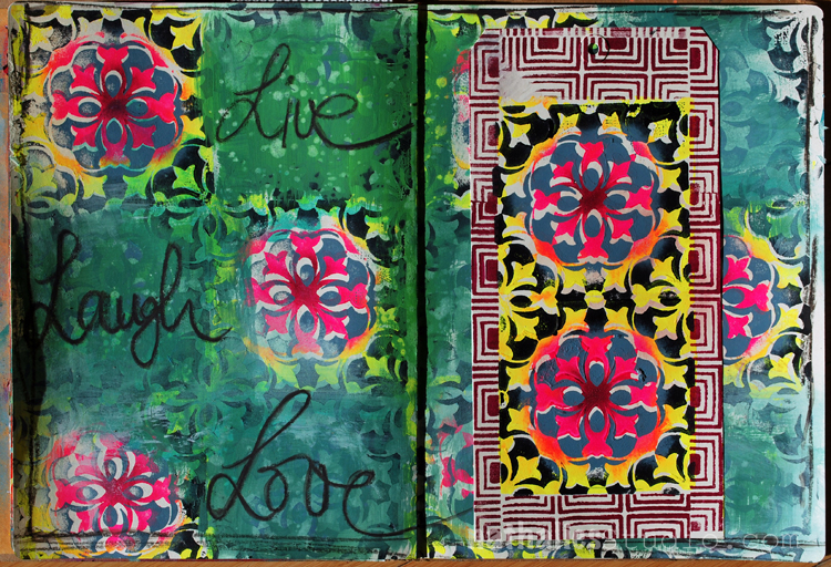
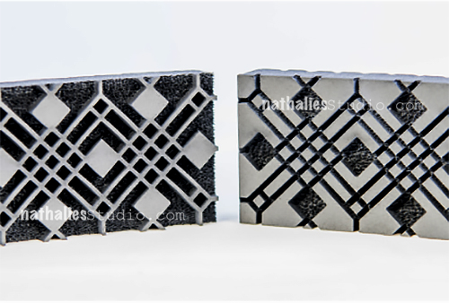
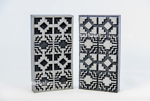
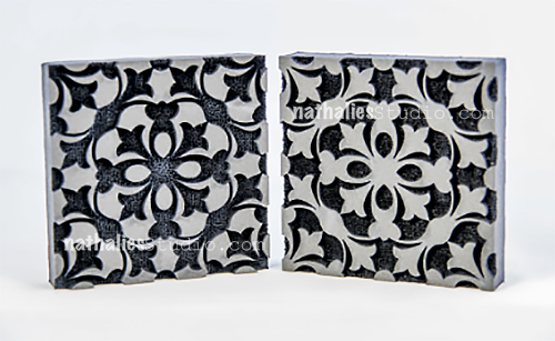
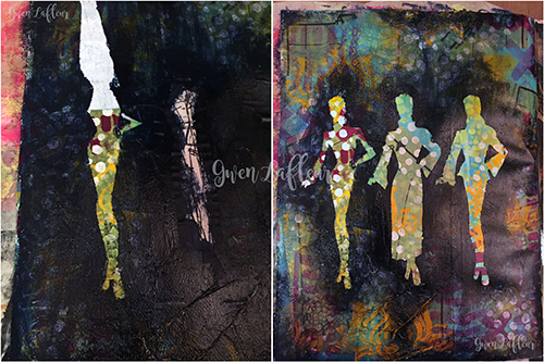
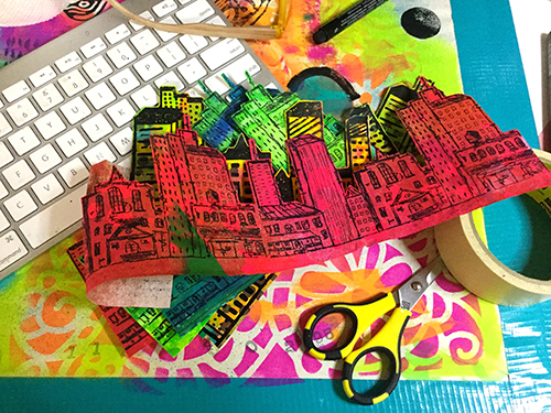
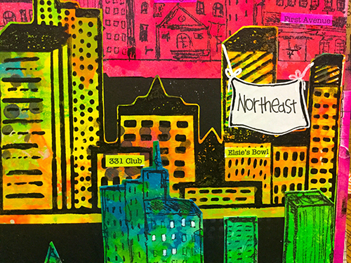
I’m finishing up with a double-header of an art journal spread: two pages that are celebrating hand carved stamps. The one on the left is a straight up impression and the right has cut outs and layering (and hey, recognize that figure from before?). Like I said, it’s fun to go big. These are both scenes from my hood and subjects that I definitely wanted to explore as stamps.

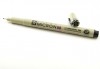
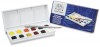
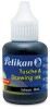
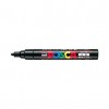
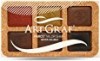
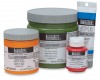
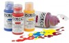
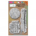
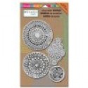
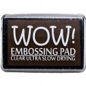
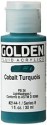
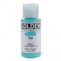
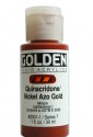
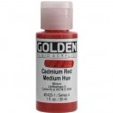
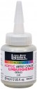
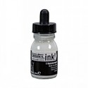
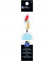
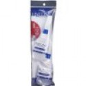
Ready to try making and using hand carved stamps? Here are some of the supplies I used in the above posts:

Look Back is a blog series to show you some projects and posts that you may have missed – sometimes going WAY back in the archive. I think it will be fun to revisit a few ideas that we haven’t seen for a while. I’m excited to see how a little look back might inspire something new in the future :)

Leave a comment

Say It Like You Mean It – Marsha Valk


Welcome to another post from my Creative Squad! Today we have a beautiful piece from Marsha Valk who used my Stroll Through the Hood #1 and #2 cling stamp sets to give her personal take on this month’s theme Say it like you Mean it – Let your unique voice be heard and tell us what’s on your mind. Be bold. Be yourself. We all have something to say and sometimes we need to shout it!


There are a lot of things on my mind: work and business, national politics, environmental and sustainability issues and even something as mundane as interior design. At this moment, as I’m typing this, current affairs in the US just aren’t in the forefront of my mind. But the Stroll Through the Hood #1 set is about a stroll through urban America. Not urban the Netherlands… So what was I going to do? I didn’t want to make another ‘I don’t want to’ spread. So I decided to turn off my mind and let the theme and the stamps do the talking.

Each time I read the theme ‘Say it like you Mean it’, I have a bad case of ear worm: the song ‘Sewn’ by The Feeling instantly starts playing in my head. But… I wasn’t sure what to do with it and I started thinking about songs that fitted the New York City feel of the stamps. And because I’m not currently in an empire state of mind, I thought of ‘I can’t see New York’ by Tori Amos. Also not sure about that song, I decided to go with both songs. They certainly were on my mind now!

I stamped some of the images in a notebook whilst I was working out what to do and that’s where the idea for the stars hanging from the sky came from. Then I stamped an urban scene at the bottom of the page.

Whilst I watercoloured the sky, I thought: you can’t see the city if there is no light. So that’s when I coloured the stars black. But the brief was to use one of the tag stamps and I chose ‘Hope’, so I felt that at least one star should shine its light.

In the end I needed to decide whether I wanted to colour the urban scene. I didn’t want to make it a black cityscape and colouring it would make it too visible, so I only added light grey lines and kept the rest bare.

The penciled and smudged words are the lyrics of ‘Sewn’ and the title in india ink refers to the Tori Amos song.


Thank you Marsha! We can always count on you to take the theme and really pull it apart to see what it means to you :) And the results are a gorgeously composed scene with beautiful colors and a couple surprises – like that cute suspended Star Tag lighting up the night sky. Marsha used these supplies – some links are affiliate links:


Play along with us! I love to see how you interpret our monthly themes. Email me how you used my stencils and stamps with the theme and email me an image – I would love to share your projects in my “n*Spiration From Around the Globe“.

Comments (1)

  • Sue Clarke

    |

    Nice take on the guidelines Marsha. I can’t help but hear the Billy Joel song I’m in a New York State of Mind while reading your words. Now I’ve dated myself for sure. The stars are a nice addition.

    Reply

Leave a comment

Say It Like You Mean It – Cheiron Brandon


Happy Tuesday! This week Cheiron Brandon from my Creative Squad is sharing 3 gorgeous cards that use my Stroll Through the Hood #1 cling stamp set, and my Beacon and Kassel stencils. Cheiron took a more subtle, but also uplifting, approach to this month’s theme Say it like you Mean it – Let your unique voice be heard and tell us what’s on your mind. Be bold. Be yourself. We all have something to say and sometimes we need to shout it!


Hi there! Cheiron here with my post for the March theme… Say it Like You Mean it. I know it is great to be big and bold and say what you mean, which is what I do almost all of the time. Today I thought I’d go a bit smaller with some subtle messages that can be sent in the mail. I love Nat’s new stamps, especially the graffiti words from Stroll Through the Hood #1 and I have incorporated them all into a set of gelli printed cards for you today.

I gelli printed a few panels using the Beacon and Kassel stencils to serve as my background:

Then I stamped the Powerhouse, Lady Liberty, and Brownstone stamps onto each:

I painted some printed paper with a brayer then stamped it with the different tag stamps: Art, Hope, and Love, and added some handwritten words and outlining to make little quotes for my cards.

I then mounted each gelli printed panel onto a black card base, then adhered the quote to each. Such a simple way to send a thoughtful message.


Thank you Cheiron for sharing such lovely designs with us – those colors are absolutely gorgeous. And I couldn’t agree more with your quotes. In addition to various papers, adhesive, and a black pen, Cheiron used these supplies – some links are affiliate links:


Play along with us! I love to see how you interpret our monthly themes. Email me how you used my stencils and stamps with the theme and email me an image – I would love to share your projects in my “n*Spiration From Around the Globe“.

Comments (1)

  • Michelle Rydell

    |

    These are beautiful Cheiron! and so do-able! Thank you!

    Reply

Leave a comment

Dream a New Dream – Marsha Valk


Happy Creative Squad Tuesday! Today Marsha Valk is sharing a beautiful and bright art journal spread using my Santa Fe Positive and Negative Foam Stamp set, my Batik Stencil, and her unique take on this month’s theme: Dream a New Dream. This January, let’s focus on all the possibilities of a fresh start.  What are your dreams for this year?  Whether it’s art-making, family, travel, or work related, January is a great time to dream about what the future could hold.


I am not a dreamer. I mean: I definitely am a dreamer… but the zone-out, lost-in-thoughts kind, not a big-plans-for-the-future one!


I do plan for the year ahead, but I do that at the end of December and I’m usually all set and ready to go in January. This year I’m not quite that organised, but… January is already well on the way now and whilst I was creating my journal page, I kept thinking ‘dream’, but… my gut kept saying ‘no’. So even though I wanted the page to be about dreaming, it ended up about ‘not dreaming’.


I am excited about what the new year holds though and I chose to work with greens, because I’m super stoked about the Pantone colour for 2017: Greenery!


Thank you Marsha! I love Marsha’s honest take on our theme and wow those are some great colors! Marsha used these supplies – some links are affiliate links:


Play along with us! I love to see how you interpret our monthly themes. Email me how you used my stencils and stamps with the theme and email me an image – I would love to share your projects in my “n*Spiration From Around the Globe“.


Comments (4)

  • susan debourguignon

    |

    Marsha,
    i, too, am a daydreamer as opposed to a goal setter. the future is too much for my head to wrap itself around. i am not a fan of green, but your page really speaks to me. thank you for sharing!!!

    Reply

    • marshavalk

      |

      Thanks so much Susan! Glad to hear I’m not the only one! ;-)

      Reply

  • nathalie-kalbach

    |

    Such a wonderful take on the theme Marsha, and I love how you mixed the patterns of the Batik Stencil with the Santa Fe Foam Stamp – so gorgeous. Now I just want to move on to Spring ;)

    Reply

Leave a comment

Live, Laugh, Love – Art Journal Pattern Play

versaillesstampset_natkalbach

For this art journal spread I played with my ArtFoamies Versailles Positive and Negative as well as with my Manhattan Border Stamp.

versaillesstampset_natkalbach04

I added different acrylic paint colors to each of the ArtFoamies StampBuddies included in the Versailles stamp set and then stamped first with the one stamp and then filled in with the other stamp . I love how you can use the stamps each just as they are or layer them on top of each other to get really intricate designs. I stamped around the border of the tag with the Manhattan border stamp.

versaillesstampset_natkalbach01

For the art journal background I used the same colors on top and stamped right into the journal- then added some green acrylic paint here and took some areas off again, while the paint was still wet. I wanted to have the stamped images show through the paint at places to give it a more layered and dimensional look.

versaillesstampset_natkalbach03

I adhered the tag to the background of the right side of the journal with some double sided adhesive and then used my new Varco ArtGraph to write out the words. I went over them again with a small wet brush.

versaillesstampset_natkalbach02

I love the result- it is a bit wild and yet cohesive as the pattern and colors get repeated. That was a lot of fun.

Here are the supplies I used- some of them are affiliate links:

supplies


Hope you have a wonderful day today filled with Live, Laugh and Love

Leave a comment

N*Studio ArtFoamies Stamps Release

kalbachartfoamiesstampspreorder

This is BIG NEWS!!!  I am so stoked that ArtFoamies and I teamed up together for a stamp release. I had so much fun working on these brand new foam stamps – all of them inspired by my travels around the world.  Here they are!

Batik Pattern 1

batik-pattern-1

Batik Pattern 2

batik-pattern-2

Batik Pattern 3

batik-pattern-3

Batik Pattern 4

batik-pattern-4

Buenos Aires Tiles

buenos-aires-tile

Chicago – comes with two stamps a positive and a negative pattern

chicago

Manhattan Boarder

manhattan-border

Manhattan comes with two stamps a positive and a negative pattern

manhattan

Santa Fe comes with two stamps a positive and a negative pattern

santa-fe

Toledo comes with two stamps a positive and a negative pattern

toledo

Versailles comes with two stamps a positive and a negative pattern

Versailles

I cannot wait to show you loads of fun and creative projects with them! If you want to get your hands on these- you can PREORDER them in my store NOW – they will ship out at the latest the week of October 17th – but probably earlier though as I should get them next week!

Comments (6)

  • Bec Miller

    |

    Wow!wow!wow! Congrats Nat!!
    I love foamies and all of these have to make it in my stash!!

    Reply

  • Sue Clarke

    |

    Batik Pattern 4, 1, and 2 are my favs.
    Congrats on the new line Nat!

    Reply

    • nathalie-kalbach

      |

      thank you Sue – glad you like those – they are also a favorite for me!

      Reply

  • Seth

    |

    Congrats Nat. These are very cool. Kind of like taking a trip around the world!

    Reply

    • nathalie-kalbach

      |

      thank you so much Seth :) Yes they have been inspired by many wonderful places around the world.

      Reply

Leave a comment

From Small Beginnings – Marsha Valk

CS September Theme 2

Happy Tuesday!  It’s time for my Creative Squad to share a project with you with this month’s theme: “From Small Beginnings”. Throughout the month of September, the team will be using my n*Studio Stamps to interpret the theme. The change in seasons and the childhood ritual of Back to School in September has me thinking about starting new things – new projects, learning new things, and meeting new people, and all the excitement and challenges that come with all of these “new”s. For this theme, From Small Beginnings, my Squad will think about the process of starting something new and the very first steps they took. I’ll ask them, how did you experience a Beginning?

So this week we have a gorgeous scrapbook page from Marsha Valk, where she reminisces about her start in mixed media with stamping, embossing powders, and scrapbooking.

—————————————————————————————————

Marsha September Headshot

This theme made me think about how I started stamping. I can’t remember which stamps I bought first. I’m guessing it was a small wood mounted alphabet set.

I do know that some of the first inks I had were little Colorbox Cat’s Eyes and the first time I used embossing powder was in an Ali Edwards class. It was sooo scary and soooo amazing at the same time!!! And then, of course I had to buy the stuff for myself.

Anyway, I started to look for the mini I made in that class and I ended up looking through some of the other minis I’ve made over the years. One of the minis featured a photo of my scrapcorner in the attic in 2006 and that sparked my plan for this theme:

I wanted to scrapbook, I wanted to heat emboss and I wanted to use materials I would (or could) have had 10 or more years ago.

marshavalk_nscs_fromsmallbeginnings_details2

I started stamping on a smooth watercolour paper with embossing ink. I heat-embossed with white embossing powder.

marshavalk_nscs_fromsmallbeginnings_step1

Then I played around with Ecoline and… forgot to take further photos… Oops.

Once the Ecoline was dry I added the cardstock cluster and my photo. My title was made with two of my Dymo Label Makers. One of them is actually visible on the desk in the photos!

marshavalk_nscs_fromsmallbeginnings_details1

marshavalk_nscs_fromsmallbeginnings_details3

I also added some Scrappers Floss to the cluster with a stapler and because I used to print most of my journaling, I adhered my text in strips to the page. I finished the page with some paint marker splatters and the date.

marshavalk_nscs_fromsmallbeginnings

—————————————————————————————————

I love how Marsha took us both back in time AND behind-the-scenes with her super fun page.  And those Kaffee Klatsch and Mish Mesh stamps look amazing embossed in white against those gorgeous colors!

In addition to paper floss, a stapler, and personal photographs , Marsha used the supplies listed below (some are affiliate links):

SuppliesCJS

Maybe you will even play along with us -I would love to see how you interpret our monthly themes. Email me how you used my stencils and stamps with the theme and email me an image – I would love to share your projects in my next “n*Spiration From Around the Globe“.

See you next Tuesday for another project from the Creative Squad!

Comments (2)

  • Joi@RR

    |

    This was a fun story of your beginnings Marsha and your project is fun too! Really awesome background with the stamps. My very first stamp was Nathalie’s Fiesta stamp and would you believe I WON it – from her???!!!! I treasure it still!!! Thanks bunches for sharing. j.

    Reply

  • Mary

    |

    Beautiful. Love the technique. Thanks for sharing.
    On my list to do.

    Reply

Leave a comment

My Own Drum – Gwen Lafleur

CS June My Own Drum

Happy Tuesday! It’s time for my Creative Squad to share a project with you with this month’s new theme: “My Own Drum”. Throughout the month of June, the team will use my new Fashion Dame Rubber Stamp Set to interpret the theme. This theme is all about inspiration, creativity, and personal expression. I asked my squad to create something that celebrates the power of individuality. March to the beat of your own Mixed Media drum this month!

We are kicking off with an art journal page from Gwen Lafleur. This is a super inspiring reminder to us all to do what we love, even if it means covering stuff up :)

—————————————————————————————————

Gwen June Headshot

This month’s theme, “my own drum” was perfect for me, and lots of fun to work with! I tend to be a bit of a loner – I’ll go off on my own or join up with tour groups where I don’t know anyone else and go on crazy, exotic adventures. I’m also usually one that follows what I like rather than what’s trendy in clothes (even as an 80s child in elementary school, I knew parachute pants weren’t a good idea for me. LOL.) I’m the same with music, food, and especially with my art! Don’t get me wrong… I love to see what new things other people are doing and what tools and techniques are cool. That’s how we learn, right? But more and more, it’s important for me to take whatever I learn and go in my own direction as much as possible; to be true to myself in my work, even if no one else likes it.

My-Own-Drum-Art-Journal-Page---Final---Gwen-Lafleur

For this month’s project I took those thoughts and used them to create this art journal page. I used the Fashion Dame stamp set and created three silhouettes as my focal point – in my mind, they’re three different aspects of me. There’s a bit of a double meaning to the color and pattern on this page… first, something I like to do a lot in my work that really bothers some people is to cover things up. Second, I love the idea of the inside of the silhouettes being full of pattern and bright colors while the outside is extremely subdued. I think that speaks a lot to my own personality (and the rich inner life of an introvert. Ha!)

My-Own-Drum-Art-Journal-Page---Steps-1-4---Gwen-Lafleur

To make this page, I started out by stamping with the Fashion Dame stamp set – I did different combinations of the body and clothes to get the three silhouettes. I just stamped them on copy paper and then cut them out. Next, I prepared my background. I gesso’d and painted, then I collaged on pieces from a sewing pattern (I couldn’t resist the tie to fashion!) I did some stenciling on top with some of Nathalie’s StencilGirl stencils. Once I had a nice hot mess of color and pattern, I took my three silhouettes and adhered them securely with repositionable adhesive. Next is the part that upsets some people… I took some Payne’s Gray paint and mixed it with satin glazing medium, then proceeded to paint over the entire page.

My-Own-Drum-Art-Journal-Page---Steps-5-6---Gwen-Lafleur

For the next step, I use baby wipes to push back a little of the wet paint. I wanted most of the page to be at least somewhat veiled with the darker color, especially near the silhouettes. Then I peeled off the masks / silhouettes (do this while the paint is still wet so it doesn’t seal down the edges of the mask.) I love the contrast of the areas that were masked off versus the dark background with just hints of pattern and color showing through.

My Own Drum Art Journal Page - Final 800x800 - Gwen Lafleur

To finish it off, I took a fine line painting pen and filled the well with white acrylic ink. I used this to add the journaling around the silhouettes and to put a border on the page. I added the dots with a white paint pen, then used red fluid acrylic paint mixed with airbrush medium in a fine line applicator to sprinkle some dots around the page. Voila! A finished art journal page that shows how I like to march to my own drum both in my art and in life.

—————————————————————————————————

I think it is so cool that Gwen followed her instincts with the dark overlay – this is what the  theme is all about and the results are gorgeous.

Besides the supplies listed below (some are affiliate links), Gwen also used a vintage sewing pattern and Hermafix temporary dot adhesive:

SuppliesCJS

Maybe you will even play along with us -I would love to see how you interpret our monthly themes. Email me how you used my stencils and stamps with the theme and email me an image – I would love to share your projects in my next “n*Spiration From Around the Globe“!

See you next Tuesday for another project from the Creative Squad!

Comments (10)

  • Sarah P.

    |

    Love your unique style. Coloring outside the lines is awesome.

    Reply

    • gwenlafleur

      |

      Thanks Sarah! It’s good to color outside the lines once and a while, isn’t it? :D

      Reply

  • Joi @RR

    |

    LOVE that you are so unique and your own person with quirks Gwen. That’s the kind of art I love. Today – your art reminds me of something Nat would create and I love that too. You are both so FREE and FUN – completely BODACIOUS in your creativity – LOVE that so much. Your creativity today is just so SUPER. Your ladies are all splendid – the same – yet so different. Such a great message! Thanks bunches for sharing such fab inspiration. j.

    Reply

    • gwenlafleur

      |

      Aw, thanks! Isn’t it wonderful how we can all be so different? I really love that. Also love that you used the word bodacious in your comment :D Thanks so much!

      Reply

  • stephanie

    |

    I love the contrast of the dark and the bright patterns showing! Stunning

    Reply

  • Michelle Rydell

    |

    Gwen, your page is beautiful! I love the way the bright colors peek out from the dark background! What an awesome way to use the stamp set!

    Reply

    • gwenlafleur

      |

      Thanks so much! It took me a while to figure out how to interpret this month’s theme, but once it hit me I really had a lot of fun :)

      Reply

  • Gayle

    |

    Loved this demo! I was stuck on a mixed media piece and after reading Gwen’s process, I decided that covering it up and wiping off a few areas is exactly what it needs because I too am an introvert – Thank you both for this “eureka” moment!

    Reply

    • gwenlafleur

      |

      Thanks Gayle – so glad it inspired you! I don’t know if my love of covering things up is directly linked to being an introvert, but it’s certainly symbolic… lol.

      Reply

Leave a comment

My City Speaks to Me – Michelle Rydell

CS April My City Speaks to Me Blue

It’s Tuesday, so it’s time for my Creative Squad to share a project with you with this month’s theme: “My City Speaks to Me”.  Throughout the month, the team has been using my new Urban Scribble Foam Stamp, Rubber Stamp and Stencil Set to interpret the theme and to share with us what their hometown or city is all about.  We want to know what makes it special, vibrant, and important! This month, our Creative Squad has taken us on a trip to their city!

Today we have a really fun art journal page from Michelle Rydell. Her colorful interpretation of the theme is like an insider’s travel guide to Minneapolis :)  Thanks for sharing all the good spots, Michelle!
—————————————————————————————————

Michelle April Headshot

Up until a few years ago, I lived in the city of Minneapolis my whole adult life.  Now, I live in the country, just outside of the city, but Minneapolis will always have a piece of my heart.  I love this month’s theme because it gave me a chance to document that!

First I created a background in my art journal, using black on the bottom to represent city streets, and blue on top to represent sky.  I used white paint with the Urban Scribble stencil to create texture on the streets, and clouds in the sky.

RydellMyCity1

The city is broken up into neighborhoods, so I decided to represent that with a variety of colors and patterns, using painting underpapers as my substrate.  I stamped the cling stamp on two different color schemes, and the foam stamp on a third. Then I cut them out…

RydellMyCity2

I pasted them onto my page in overlapping rows, and drew little banners on sticker paper to label the neighborhoods.  I also typed up the names of some of my favorite places in each neighborhood, printed them onto sticker paper and stuck them on to corresponding buildings.  I colored over the building names with tombow markers to blend them in a bit.

Here’s my finished piece:

RydellMyCity3

And a few closeups…

RydellMyCity4

RydellMyCity5

RydellMyCity6

—————————————————————————————————

I absolutely love how Michelle used the Urban Scribble stamp to create rows for different neighborhoods, and her colors are so vibrant against the black stamping, the whole design really pops.  The overall idea is a super clever way to share with us the hotspots in Minneapolis!

Besides the supplies listed below, Michelle also used newsprint underpapers with a variety of paints and sprays on them:

SuppliesCJS


And maybe you will even play along -we would love to see how you interpret the theme – email me how you used my stencils and stamps with the theme and email me an image – I would love to share what you did at the end of the month!

See you next Tuesday for the another project from the Creative Squad, with a brand new theme for the month of May.

BLOG TEMPLATE[20]

P.S. Stampendous is doing a blog hop this week and you can win one of the stamp sets. Simply comment on this post or their blog post in order to be eligible to win!

Check in with their blog all week long to see some fun projects with my foam stamp sets – my creative squad is posting a lot of new projects this Friday- so stay tuned :)


STM_NatNfriendsHop_prize[8]

Comments (39)

  • Tracy Moloney

    |

    FABULOUS pages Michelle!!!
    LOVE the colours and dimension of your “old town”
    THANK YOU for sharing :)
    Tracy from Australia

    Reply

  • Kate B

    |

    This is fantastic – so creative and colorful!

    Reply

  • nancy L

    |

    Awesome, love the cityscape

    Reply

  • Sarah P.

    |

    This looked like a lot of fun. The talent is awesome.

    Reply

  • Jade Sutton

    |

    Your page is beautiful. I love how you have layered the city to create the different areas.

    Reply

  • myriam Le Blanc

    |

    Wow! I love it! The colors are so vibrant!

    Reply

  • Miriam Prantner

    |

    Really love these pages and the different layers of the buildings and the colors, so fun!

    Reply

  • Joela

    |

    That is incredible

    Reply

  • Teresa Godines #6857

    |

    Wonderful project

    Reply

  • Rachel Alexander

    |

    Love the colours, such a fun page. Rachel

    Reply

  • kirsty vittetoe

    |

    I have a soft spot for city scene, lived in and visited many, LOVE this!
    (Las Vegas)

    Reply

  • Greta H

    |

    Very creative–just beautiful!

    Reply

Leave a comment