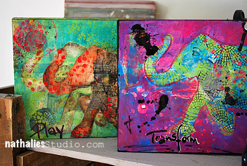
One of the things that make me really giddy is when I spy someone using my new stamps by Stampendous or also my Stencils with StencilGirl Products  So I thought once in a while I would feature the work of those wonderful talented people with a new Series called: designed by n*Studio features:…..
And today I feature: Cheiron Brandon

Cheiron has been stamping and making cards since she took her first card making class in 2004. She has been published in Paper Crafts Magazine and teaches card making classes at The Ink Pad in NYC and One Little Spark in Little Egg Harbor, NJ . Recently she has started art journaling and loves mixing those techniques into her cards. By day, she works in the financial district and loves coming home at night to relax at her craft table. She lives in New Jersey with her husband Paul and their adorable rescue dog Big Boy.
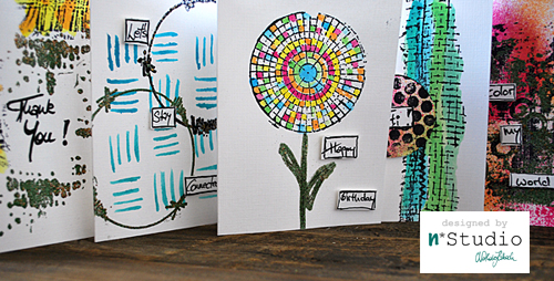
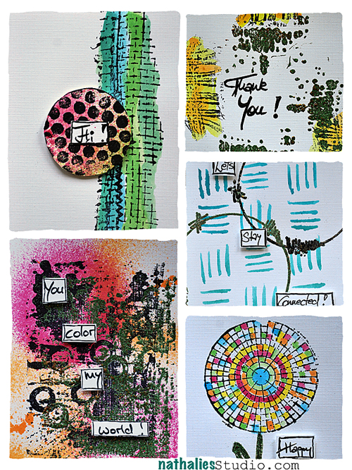
And here are Cheiron’s amazing cards using my stamps and what she wrote about them:
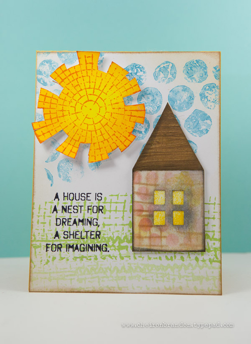
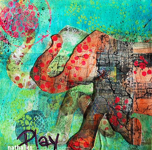
I am always looking for different ways to use my stamps and I thought it would be fun to use them on cards. For the first one, I used the shapes to create a landscape to fit my tiny house. The circle became a “sun”, the dots “clouds” and the mesh type stamp was stamped in two different greens to create the “grass”. I used the stencils that come with the stamp sets to create the patterned paper that I cut the house out of.
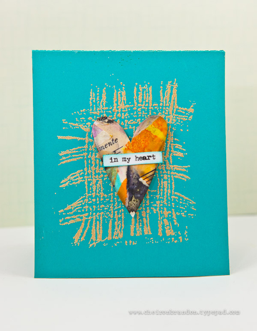
For the second card I used the burlap stamp and embossed it with some tan embossing powder. It is the perfect stamp to ground an object on a card without adding a lot of bulk. The little heart was cut out of some scraps that I had made into a collage.
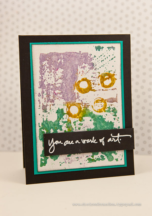
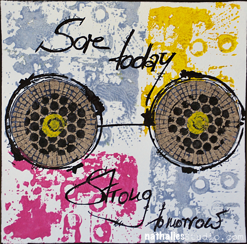
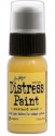
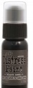
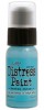
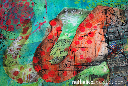
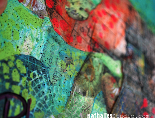
For the last card, I created “a work of art” by using Distress paints in dusty concord, evergreen bough and tarnished brass to paint directly on the stamp. A simple greeting makes it complete.
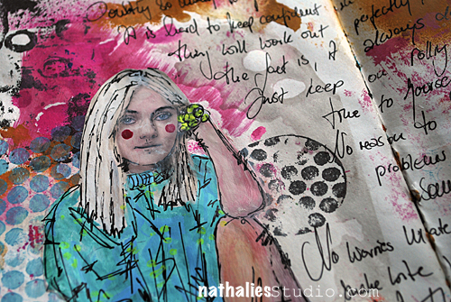
I love using these stamps in my art journaling, but am also glad that they are so versatile that card makers can use them as well.
—–
Thank You Cheiron for sharing your wonderful cards with me. I so love how you used the in so many different ways, creating backgrounds, whimsical landscapes and grounding totally related to the sentiments on the cards. LOVE!
Please check out
Cheiron’s Blog– she posts heaps of inspiring projects there and I am sure you will enjoy it!
If you have done something with my stamps or stencils I would sure love to see
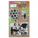
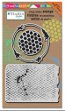
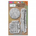
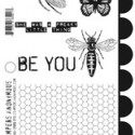
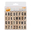
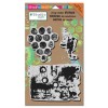
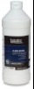
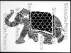
Here are the n*Studio Product Cheiron used:

Have a wonderful day!
hugs
Nat


Comments (2)
Amante del Papel
| #
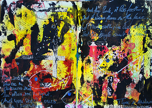
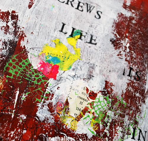
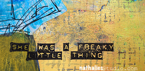
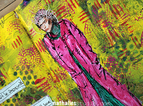
I love black and yellow, this combo is awesome!
Reply
Sue Clarke
| #
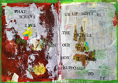
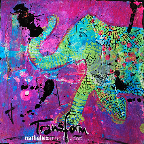
I don’t usually like that much black but this is great and of course goes with the quote. I would have to say that you took a “bite” out of this art journal page. Have a relaxing weekend Nat.
Reply