
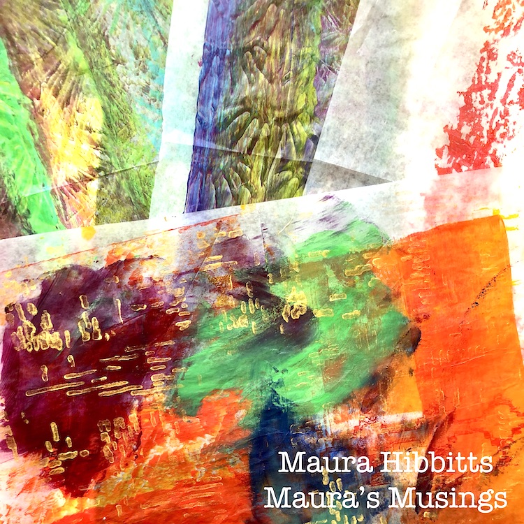
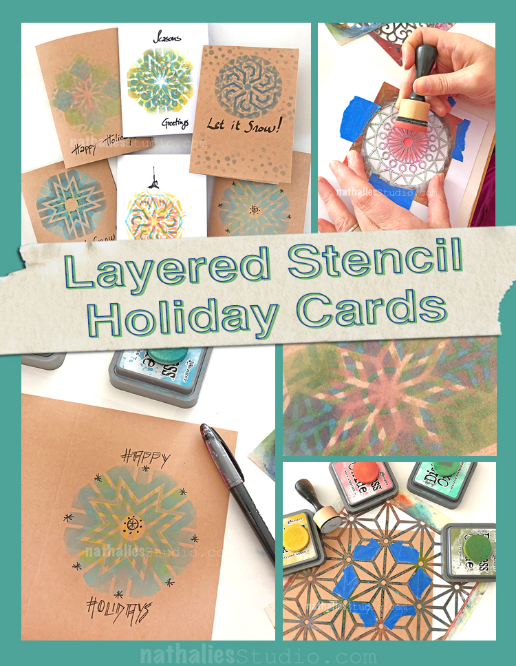
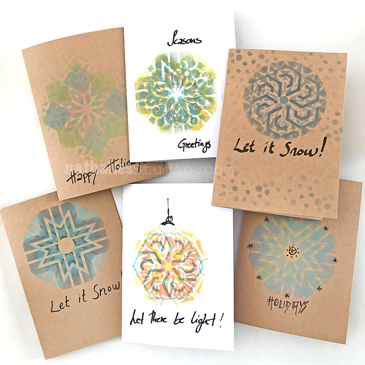
A Look Back – This time I’m looking at a color family that maybe has a bit of a bad reputation… but that can be so fun to use and definitely has the power to POP: Fluorescents! Love em or hate em, you can’t deny their ability to grab your attention. Below are some old posts and projects that use fluorescent colors in small amounts and large, creating different moods and effects.
A Look Back is a blog series to show you some projects and posts that you may have missed – sometimes going WAY back in the archive. I think it will be fun to revisit a few ideas that we haven’t seen for a while. I’m excited to see how a little look back might inspire something new in the future :)
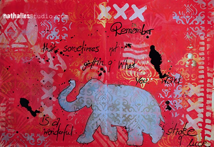
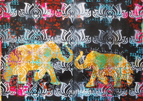
First up is an art journal page from this post way back in 2014. I used an array of super hot reds for this one, including Liquitex Fluorescent Red soft body paint to create an intense backdrop for my Elephant Parade stencil.
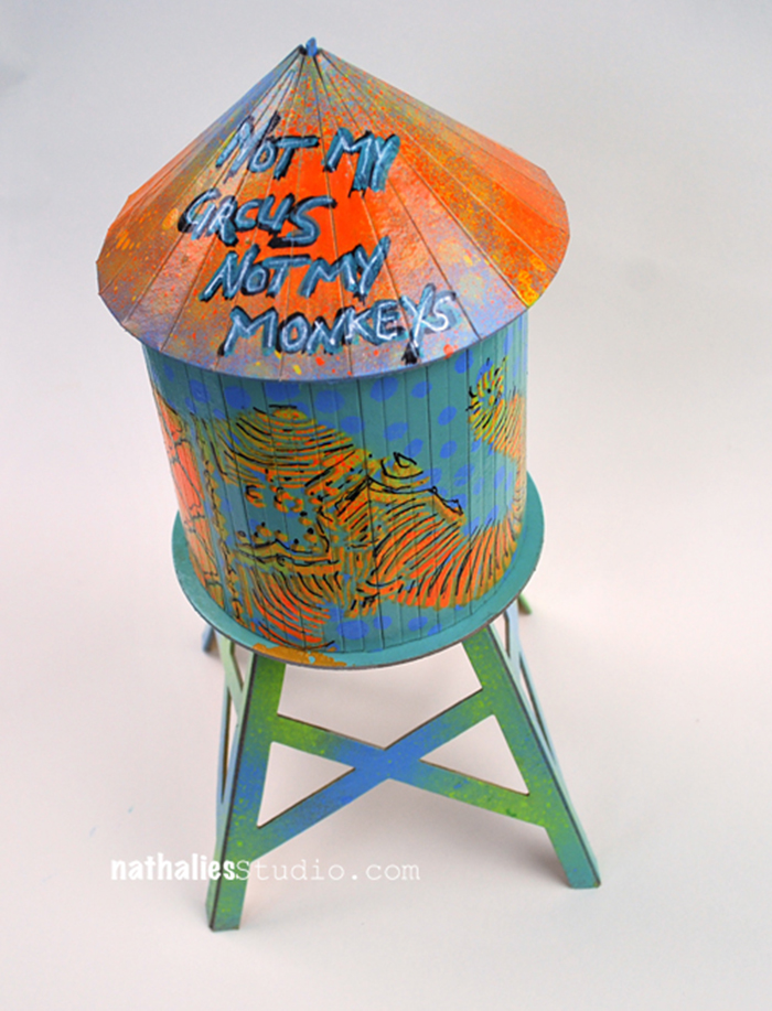
Next up is a super fun project I did back in 2015 with this nifty cardboard water tower I found from a maker in Brooklyn. I just love the form of these old water towers that you see all over the place in NYC. They make me very happy lol. I used fluorescent orange spray paint along with my Elephant March and What’s the Point stencils to give this charming little object even more personality.
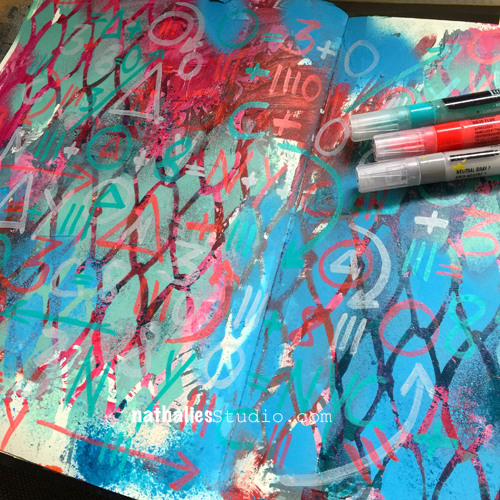
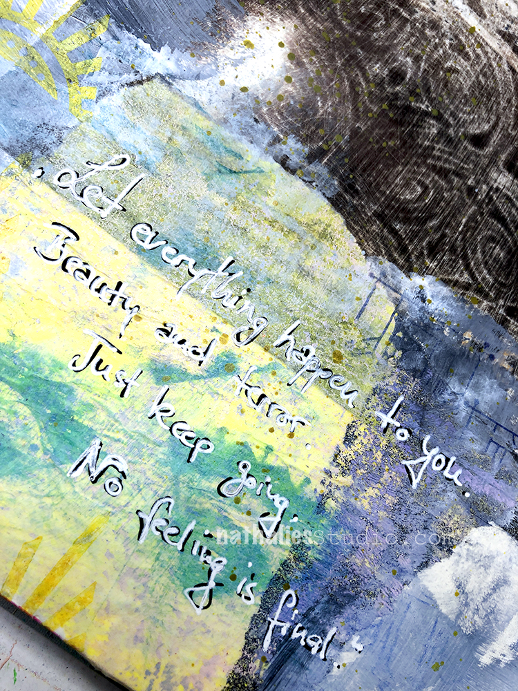
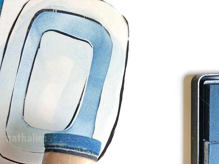
Sometimes you just need a touch of fluorescent as I’ve done here in this 2016 art journal spread. I used a Liquitex Fluorescent Red marker to draw on some marks and symbols. Just some energy coming through a busy background.
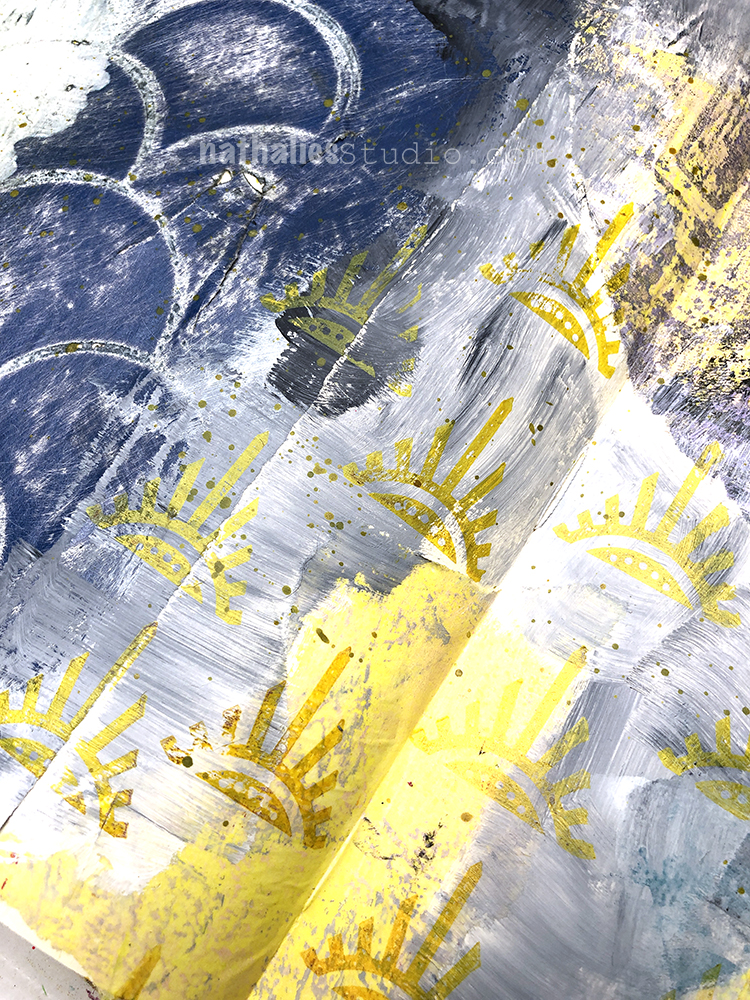
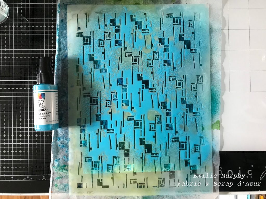
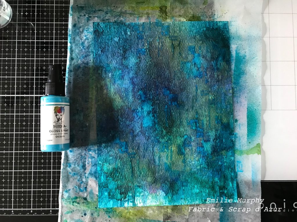
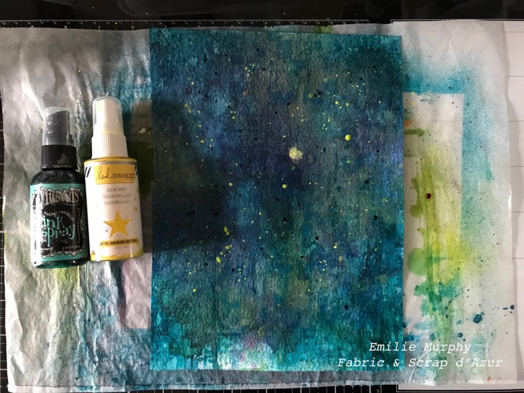
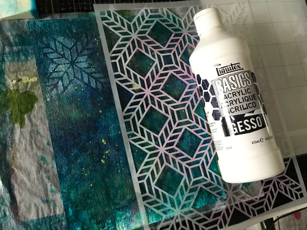
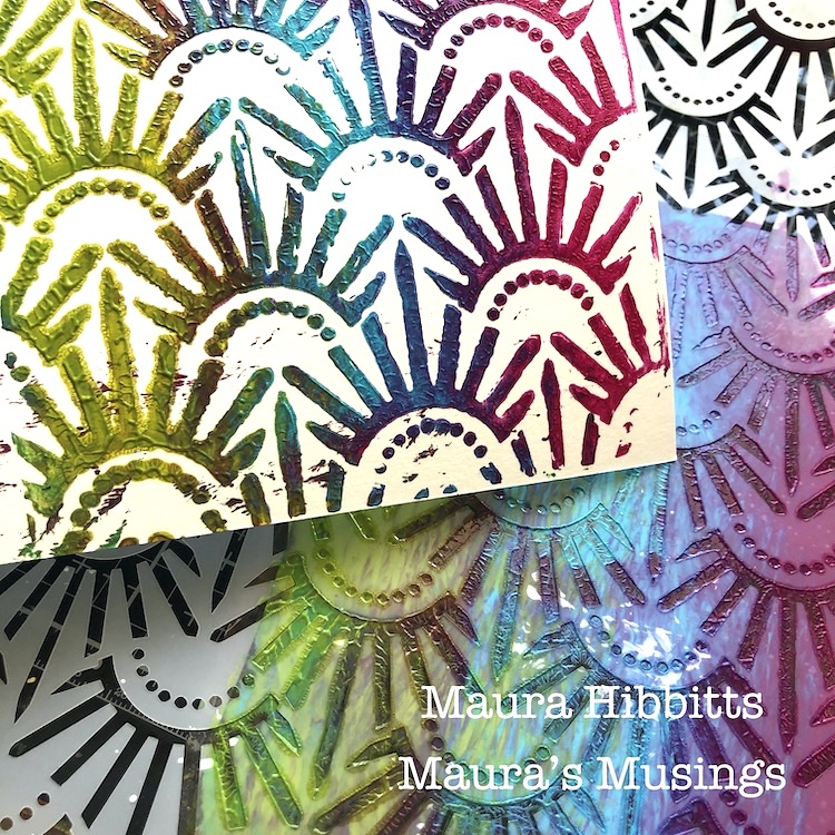
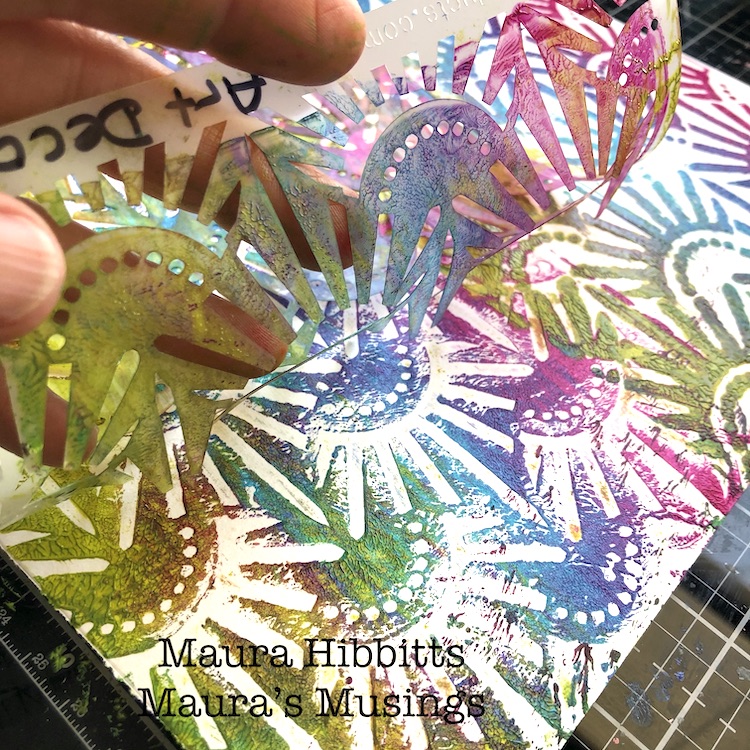
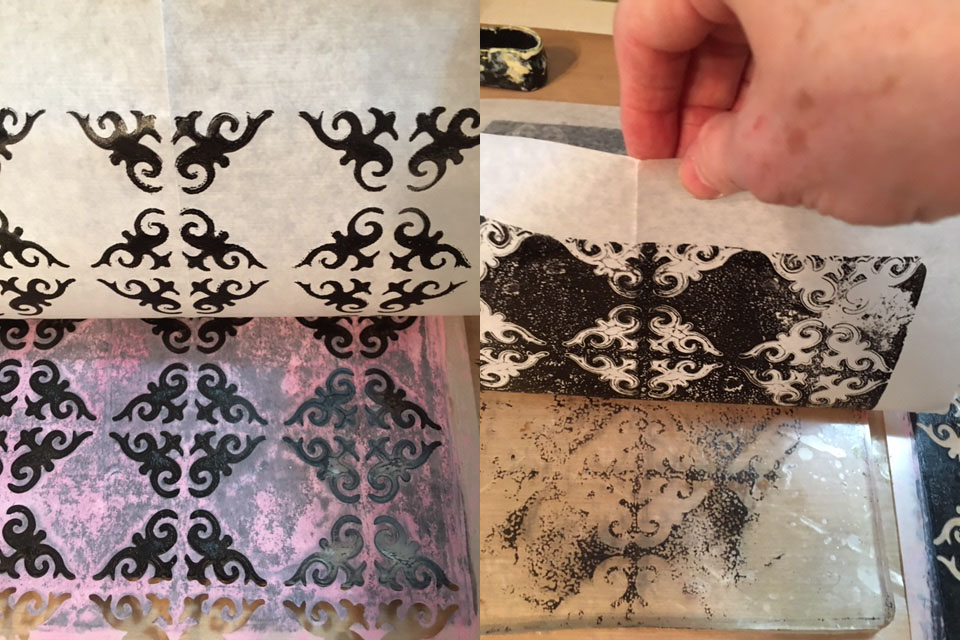
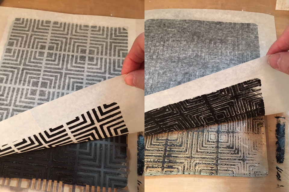
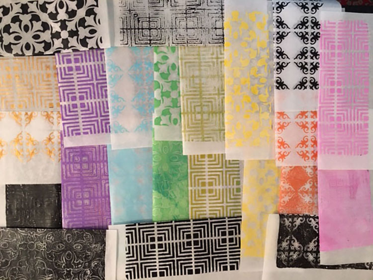
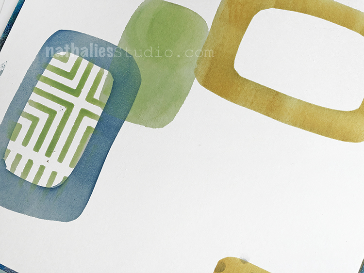
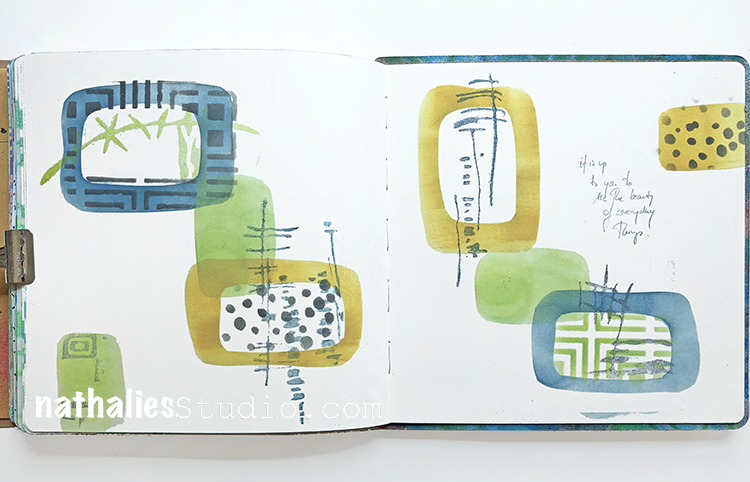
How bold can you go? I went super bold in this art journal page back in 2016 when I used fluorescent spray paints and my Art Deco Wallpaper and Circuit stencils for my background. Sometimes you have to go all in with fluorescents and just see what happens.
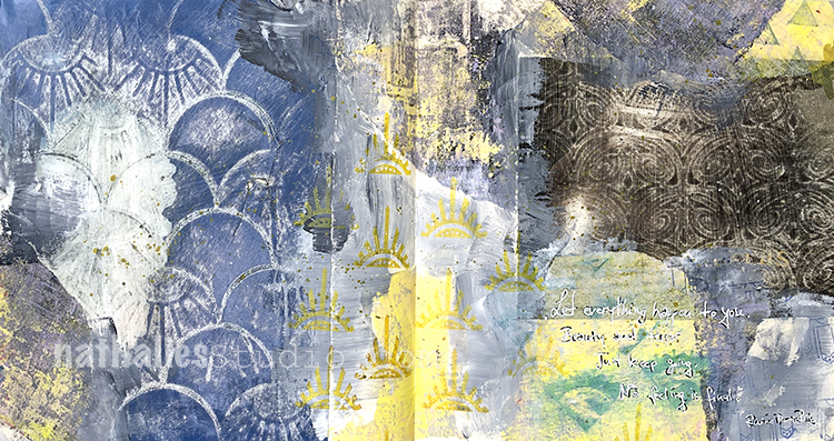
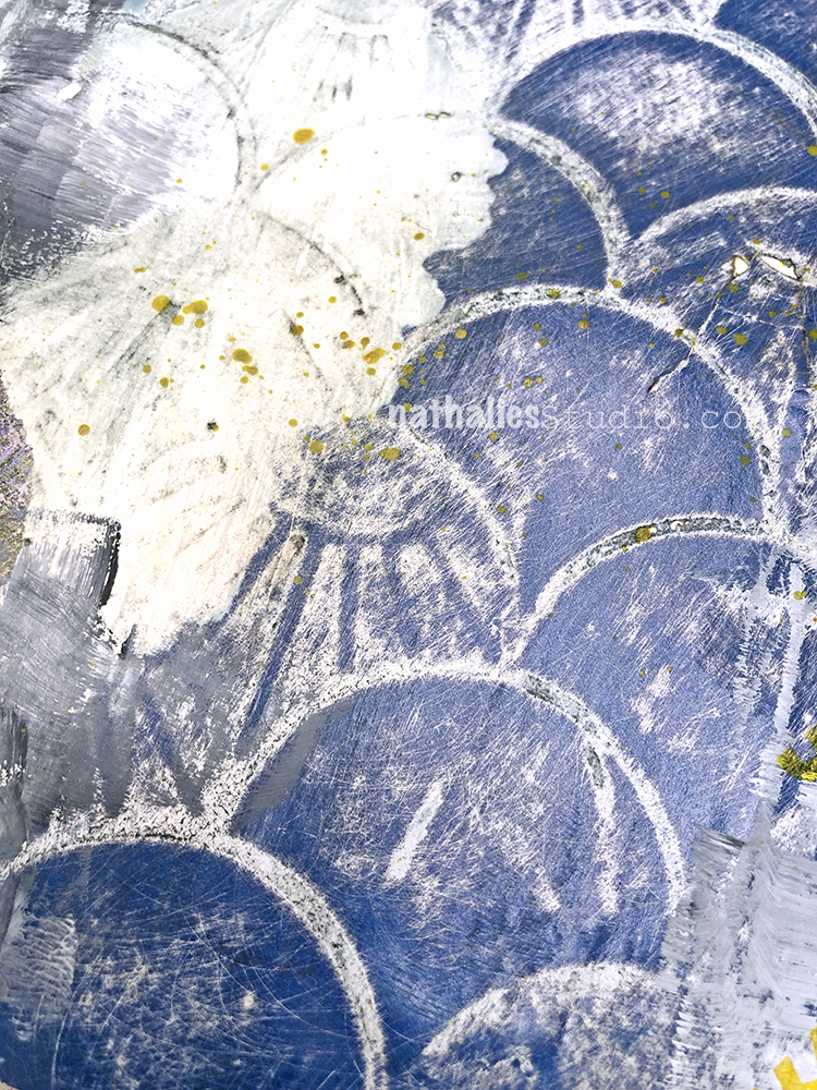
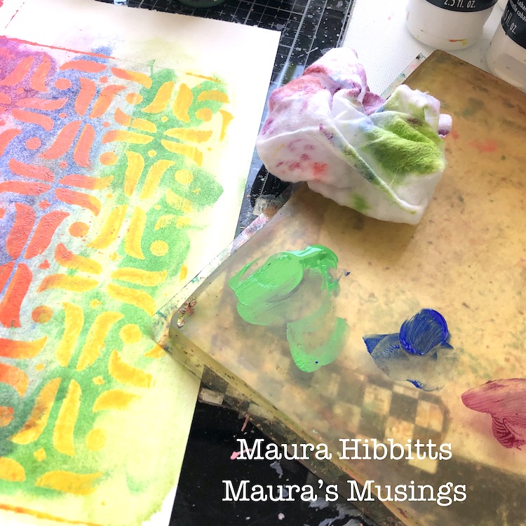
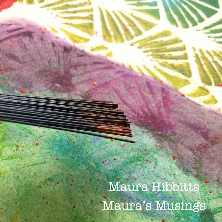
A hint of pink may be the answer… Fluorescent Pink of course! In this Creative Ice Breaker video from 2016 I use just a little Golden Fluorescent Pink paint with my Amsterdam stencil for a very active page. You can almost feel the elephants running around in this spread.
I hope you enjoyed this look back at… fluorescent colors and are maybe inspired to try adding some to your artwork.
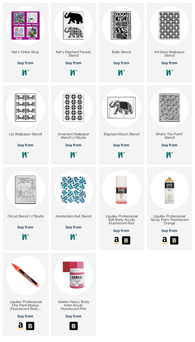
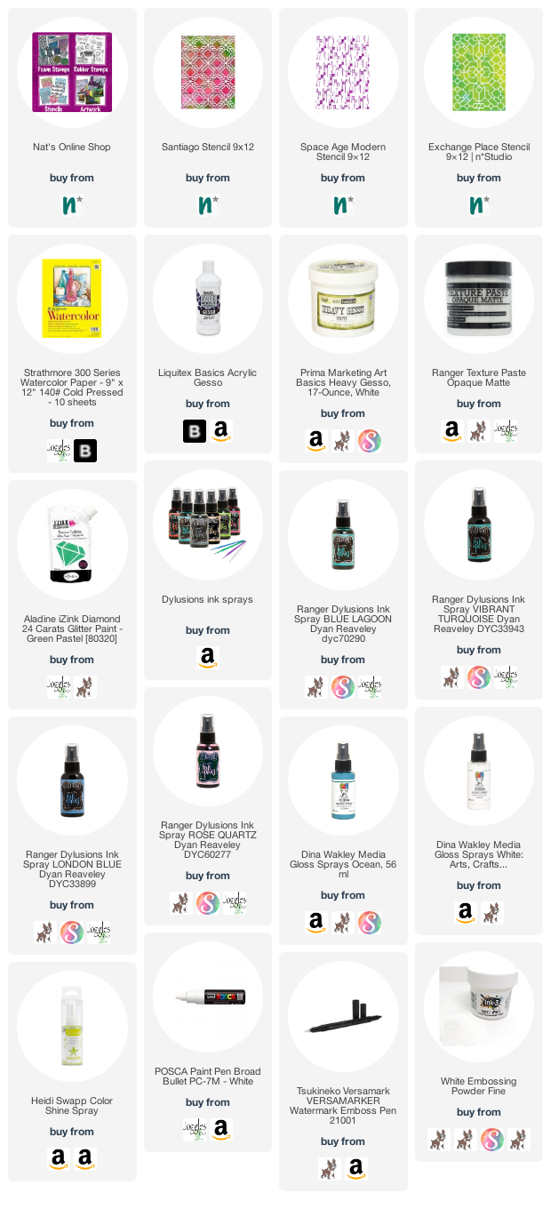
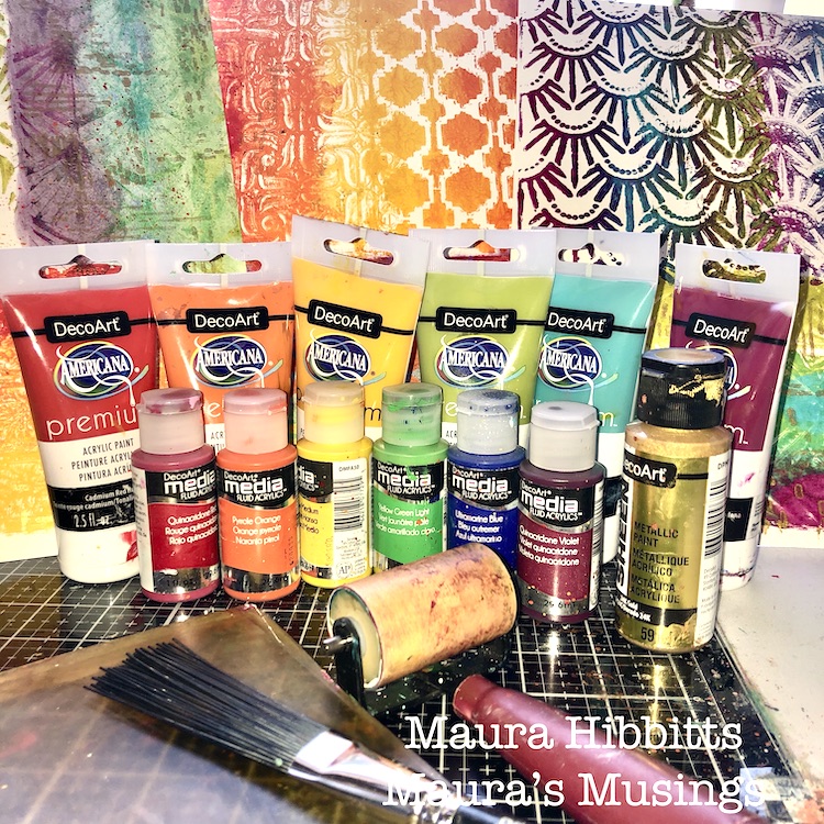
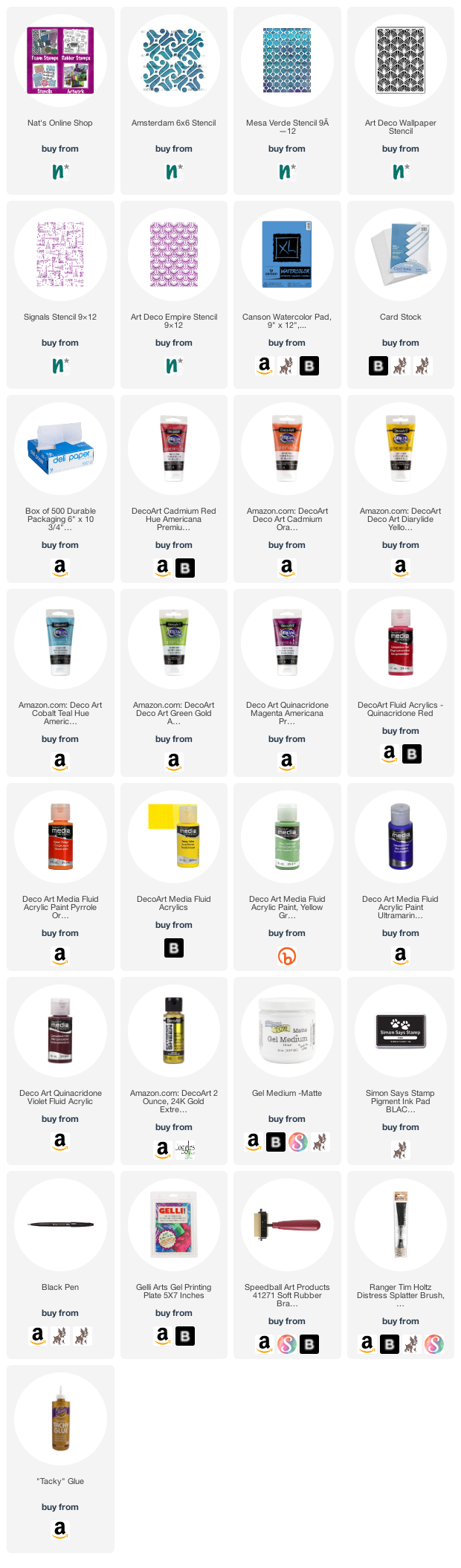
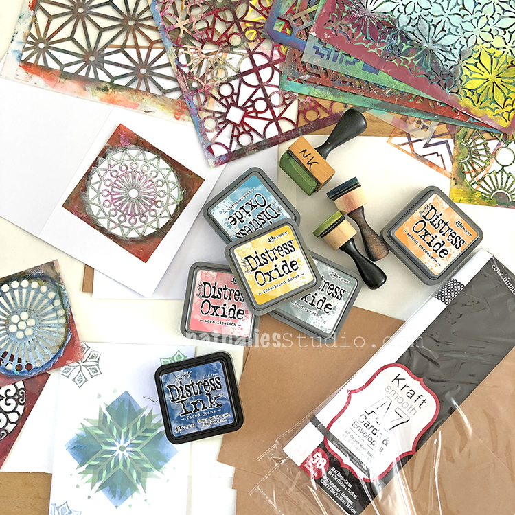
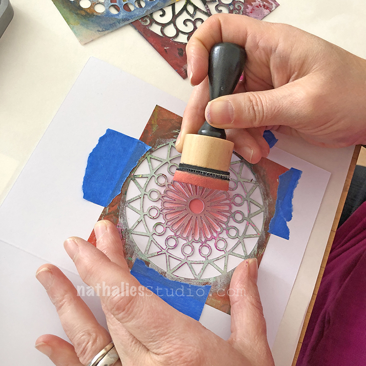
Here are some of the supplies I used:


What a beautiful background you have made. I like this.
Reply