Blog: Versailles Foam Stamp

April ArtFoamies Challenge – Day 05, 06, 07

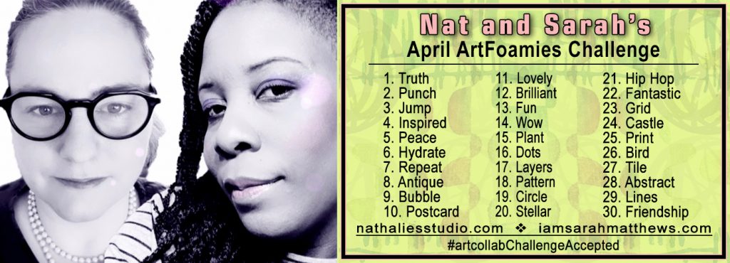
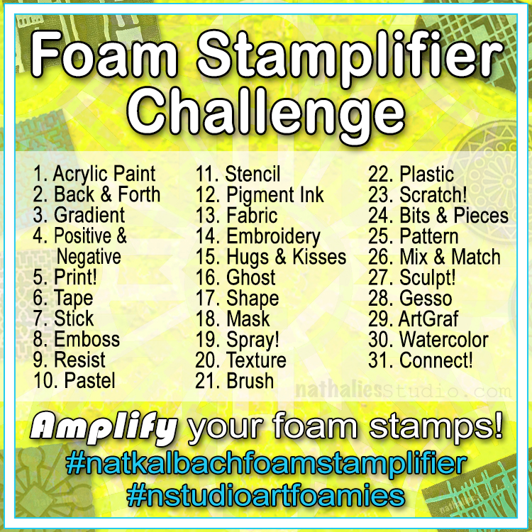
We’re recapping Day 05, 06, and 07 of Nat and Sarah’s April ArtFoamies Challenge today! You can follow along on my Instagram daily with videos and photos, and I will post updates here on the blog too from time to time throughout the month. 

Let’s get started!

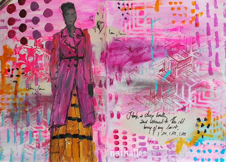
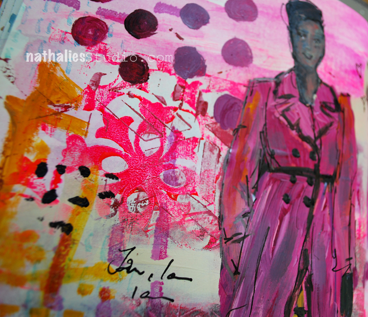
April 5: Peace – Flowers always give me peace and this stamp with its tulips is called Amsterdam – very fitting no? This stamp called to be inked up with two different colors alternating and while it was a fast and quick spread, it was fun and a good reminder to do this more often, the ink pads give a good chance to do a multicolor print quick.


Here is a look at the April 05 page:


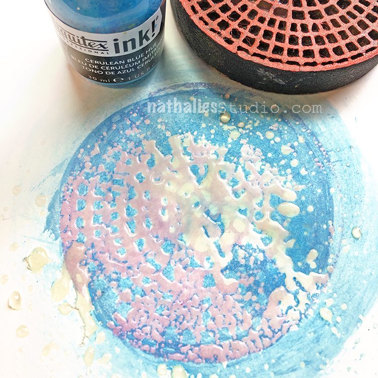
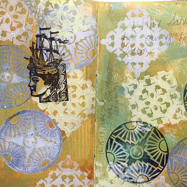
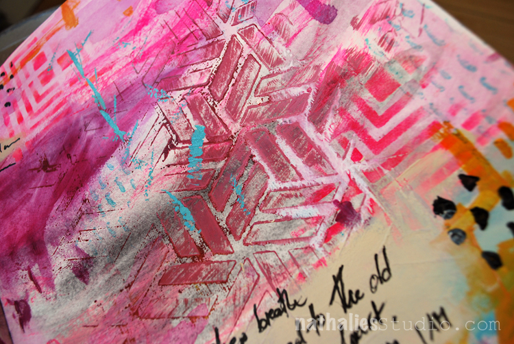
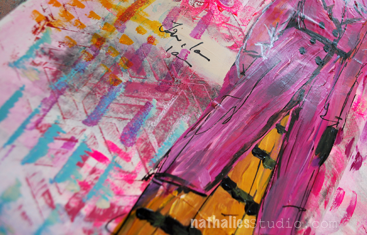
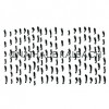
April 06: Hydrate – I used my Weave stamp because the pattern looks a bit like waves and as Sarah and I are meeting today to talk about Challenges and also about this Challenge I thought I should rock it out and do it like Sarah the Queen of Layers does. Oh boy …it worked well until I added the third color, crooked, not inked up well. What was I thinking? But then I kept going and I like part of it. I learned my lesson and I apologized to my ledger. So I am keeping up, the ledger is 125 years old, no way I am stopping now in this book.


Here is a look at the April 06 page:


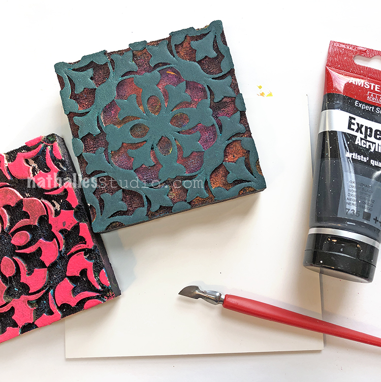
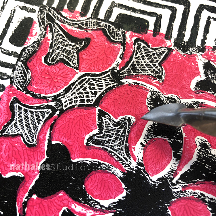
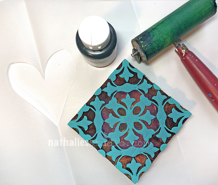
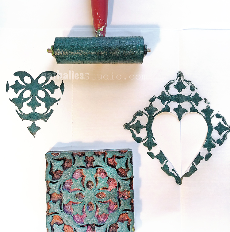
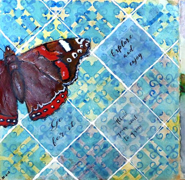
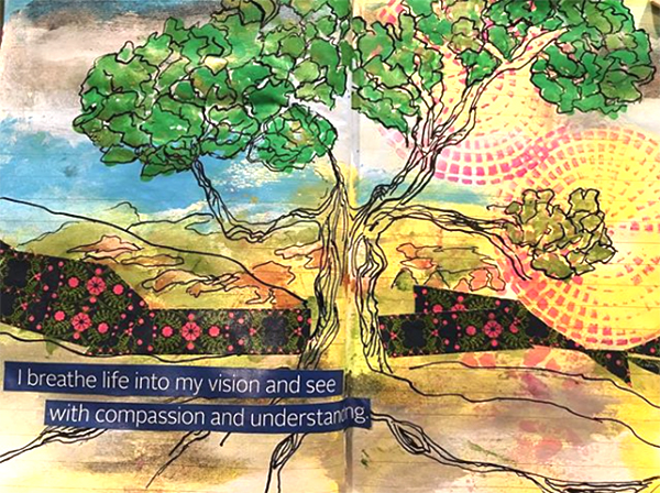
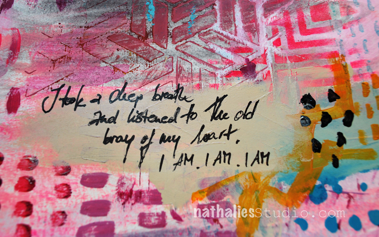
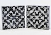
April 07: Repeat – Definitely repeating what I know with my Versailles positive and negative stamp. I love the faint stamping on the ledger as it lets the ledger peek out more but to be honest it is a good reminder for everyone that you should absolutely clean your foam stamps – especially when you use them with acrylic paint. If you do not they harden up with a thin layer of plastic – acrylic paint is essentially plastic – on top and it makes it hard with a non absorbent slick surface to use other paint media for example ink pads. So while in my workshops it is sometimes just not possible to have every student scrub their foam stamps, I really urge you to do this with the ones you purchase …unless you want to repeat your purchase with me ;) which I wouldn’t mind but I’d rather have you happy :)


Here is a look at the April 07 page:

Follow along with the challenge on instagram  and post your artwork too with the hashtag #artcollabChallengeAccepted

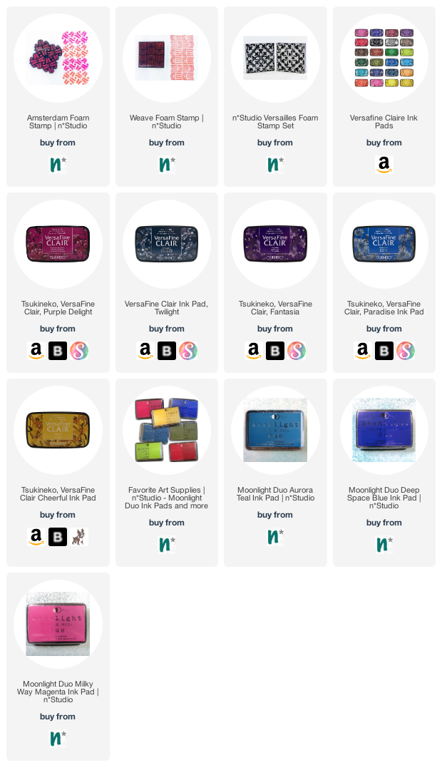
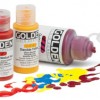
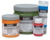
Here are some of the supplies I used:

Leave a comment

Foam Stamplifier Challenge Prompts 22-24

Day 22 – Plastic

Printing on top of plastic sheets or overhead foils is a fun way to create transparent elements for your work or nice dividers for your art journal but my favorite of all must be using Shrink Plastic. From wine charms, to embellishments to earrings. Using the foam stamps with inkpads of your choice, stamp your desired images.

Then heat the shrink film up as the manufacturer recommends and you will get a tiny version of your stamped image. Too cute! Here is a sample where I used the shrink film to create myself some new fancy earrings.

Day 23 – Scratch!

Another fun way to use Foam Stamps is to stamp onto some Ampersand Clayboard to create some great textured designs.


Stamp on top of the clay board with acrylic paint or spray ink or inks and then start scratching into the design. It is like doodling by scratching- better then coloring books- trust me!

Day 24 – Bits & Pieces

How about using bits and pieces of foam stamped paper to create something new?

You could create a tangram which is a puzzle which consists of 7 flat geographic shapes which put together can create a new shape.


Simply google tangram, print out the template, glue it on some white or black paper, start stamping with your foam stamps and cut it.

And then go and play …

Here are the different foam stamps I used for these prompts


In case you missed the prompt list  here you go:

Leave a comment

Foam Stamplifier Challenge Prompts 16-21

Day 16 – Ghost

No, no, don’t be scared- this is a friendly Ghost prompt. I love to apply paint on top of a dried paint layer and while the second layer is still wet, I take my slightly wet foam stamp and press it into the paint and lift it.

This will remove the second layer paint partly and create texture making for a subtle and nice imprint and revealing the color underneath. My favorite second color for this is white- it just gives a nice antique plaster effect.

Day 17 – Shape

Happy St. Patrick’s Day. I thought this would be a great day to amplifier your stamps using them to stamp out a shape…like a shamrock. Although …I guess I messed it up since a shamrock is a three-leaf clover ….oh well…you can tell I am not Irish- LOL – but hey, I tried.

Anyway you can use any shape of course and  you can cut it out of a piece of paper or like I do out of a piece of deli paper. Basically you are creating a stencil.

Then just fill in the opening with either one or more foam stamp patterns, and lift the stencil- the filled in area defining the actual shape.

Day 18 – Mask

Now of course you can also mask an area off and then define that area by stamping over the mask. Here I used one of my beloved Elephant Masks and my Downtown positive and negative Foam stamps.

You can easily cut out your own mask of course. And voila …there you have a it – love the background. So many options with this.

Day 19 – Spray

Another one of my super favorite foam stamplifier techniques is to use dye or ink sprays with my foam stamps.

Spray onto the stamps and print – I love the super vibrant watercolor effect this gives. So easy and yet so effective!

Day 20 – Texture

Another one of my old foam stamplify favorites. Use the spray paint we used yesterday as an embossing agent and create some nice grungy texture.

Spray your foam stamp with dye ink and stamp and while the ink is still wet sprinkle some UTEE or ultra thick embossing powder on top and then heat emboss it.

I love the raised water drop like texture this creates.

Day 21 – Brush

Using a brush to color in certain areas of a foam stamp is also a cool way to amplify the stamps.

When working with acrylic paint  you either have to work fairly quick in order to prevent the paints from drying to fast or you can use a little bit of retarder with your paints to extend the drying time a bit.

I hope you enjoyed this round of prompts. Here are the stamps I used for those:

Have you missed the prompt list? Here you go

See you tomorrow for a little Kaffeeklatsch! I’m showing off my new Rubber Stamps and chatting with you on Facebook. See you at 12noon EST :)

Leave a comment

Inspiration from Around the Globe

Ready for some inspiration? Today we have some projects from around the globe. It’s always fun to see how you’re using my stamps and stencils and I am so happy to share some examples today. So let me know if you’re doing something cool with my products, and you might see yours on the next Inspiration from Around the Globe!


First is Ellen Captijn from the Netherlands and a stunning art journal spread using my Chicago stencil for that patterned background. Definitely follow the link to see the entire thing!

Debi Adams from the US found a great way to add texture with my Crackle stencil in this gorgeous mixed media piece.

Here is a bright piece from Kate Crane in the UK that uses my Marks stamps for those red and black hash marks. So fun!

Here is Barbaree King from the US with my Central Ave ArtFoamies for those circular patterns in the background – such a beautiful art journal spread!

And finally here is Linda Edkins Wyatt from the US using my Broadway and my Versailles foam stamps for an active background in this art journal page. Love all the patterns mixing together :)


I feel pretty inspired after that lineup! If you’d like to give some of these ideas a try, here are the stamps and stencils that these talented artists used:


Don’t forget to tag my when you post your projects! I’d love to include your work in my next Inspiration FromAround the Globe post!

SaveSave

Leave a comment

Taking a deep Breath – Art Journal Spread

“I took a deep breath and listened to the old bray of my heart. I AM I AM I AM” – Sylvia Plath

I love this quote so much – it made me somehow happy and silly pink ;)

For this spread I wanted to play with visual juxtaposition a bit:

For the background I added to some areas a wash with watercolors in a grey tone and pink. I love how the watercolor has a soft look, while the later applied acrylic paint is more textured.

I used different stamps and stencils- mainly my Kassel stencil with some left over paint from a different spread on top dabbed onto the page, as well as the Manhattan Stencil through which I applied some pink paint with a cosmetic sponge.

I stamped with the Versailles Foam Stamps here and there to give it a bit of  a feminine touch – also to break with the very linear and geometric patterns of the Kassel and Manhattan stencil.

I added some marks with the Satin Doll and Running  Stamps and Archival Ink. I added also some hand made marks – I always love the play with “perfectly” repeating marks and handmade marks.

To make sure the journaling doesn’t get lost in the background I applied some Unbleached Titanium acrylic paint with my finger – big enough to write with the Fude pen on top.

I really like how this page turned out – I think I will play a bit more with this concept.

Here is a list of the supplies I used – some links are affliliate links


Have a gorgeous day !!!

Comments (6)

  • Sherry Canino

    |

    I love it !!! And the quote ❤❤❤

    Reply

  • sherri scott

    |

    Nat, nice girly, gilrly page with all that texture and pink

    Reply

    • nathalie-kalbach

      |

      LOL- yeah isn’t it ;) Have a wonderful weekend Sherri!

      Reply

  • Torsa Saha

    |

    Stunning!! Can’t wait to meet you ?

    Reply

    • nathalie-kalbach

      |

      Thank you so much Torsa! Looking forward meeting you too! :)

      Reply

Leave a comment