Blog: Watercolor

A Look Back – Cool Stuff You May Have Missed 12

A Look Back – This time I’m looking at Watercolors – a fun and versatile medium to work with that can be intimidating at first, but I know you will get some good mixed media ideas for using watercolors in this post that you will want to try.

Enjoy this Look Back – a blog series to show you some projects and posts that you may have missed – sometimes going WAY back in the archive. I think it will be fun to revisit a few ideas that we haven’t seen for a while. I’m excited to see how a little look back might inspire something new in the future :)


First is an art journal page from 2017 where I played with creating a whole cityscape using my Stroll Through the Hood 1 and 2 stamps and then I used watercolor to bring them to life. I love using watercolors to color rubber stamped images – you can get really wild with the colors too.

Next up is a page from 2019 where I used my Mid Century Squared foam stamp with watercolor paint (on the left in this closeup pic) – yes, foam stamps can be inked up with watercolor… and it looks awesome!

In the above post from 2018 I played with watercoloring through a stencil – here my Valley Road stencil to make a card. I think it almost looks like a stained glass rose window.

Once you get comfortable using watercolors with your stamps and stencils, I also recommend you try coloring in your own pen and ink drawings with it. Here is an art journal page I did in 2018 where just a little watercolor makes the figure so much more interesting.

And finally, how about collage? For this page from 2018 I had some practice watercolor paintings I did of flowers that I wasn’t crazy about on their own… but wow do they work great as collage papers! I used it as the dress pattern under a deli paper sketch, added some rubber stamps, and there you go: instant dress :)


I hope you enjoyed A Look Back through my archive and maybe you are inspired to try some different things now too.

Here are some of the supplies I used in these posts:

Leave a comment

Watercolor Stenciled Thank You Card

I am really enjoying playing with watercolor and stencils – I love the way a stencil helps you for the design but I love the loose look of watercolor.

I taped down the Valley Road Stencil and then started coloring in the pattern with different colors. The trick is to be less generous with water which seems to be a bit counter intuitive when using watercolors :)

Lift the stencil and there you go –

So much fun!


Leave a comment

Don’t stand still – Art Journal Spread

We cannot become what we want if we remain to be what we are.

Using the new Star Struck stencil I dabbed a cosmetic sponge in different colors of acrylic paint and then pounced them through the stencil.

I sketched the lady and painted her using watercolor and gouache.

I really like how this turned out – I really have to do more with watercolor and gouache.

Here are some of the supplies I used:


Comments (2)

  • Shasta Matova

    |

    That is a beautiful and thought provoking quote, and you have showcased it so well.

    Reply

Leave a comment

Back to School: Watercolor Class at JCAS

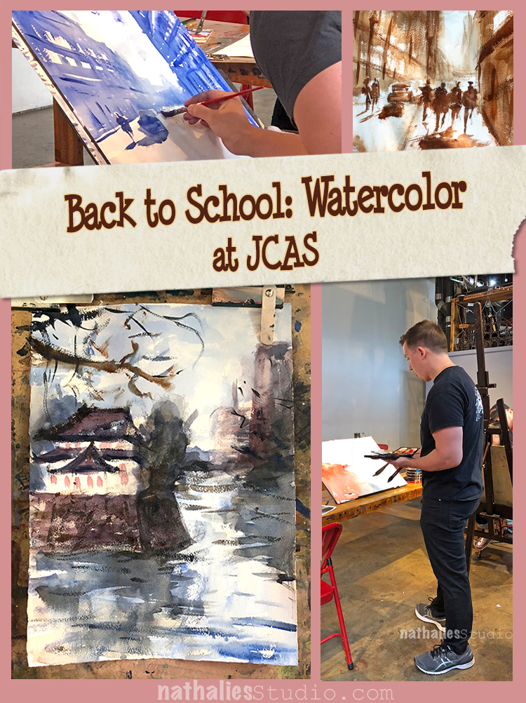
Last Sunday was the last lesson of six in a Watercolor class with John Duval at the Jersey City Art School. As some of you might know I have taken two printmaking classes already there and I really love being able to do something different over several weeks, and just being able to walk there.

This was the first time I took a Sunday morning class and I have to say, despite my first hesitance of getting up early on a Sunday it was really awesome – having my friend Mary join helped ;)

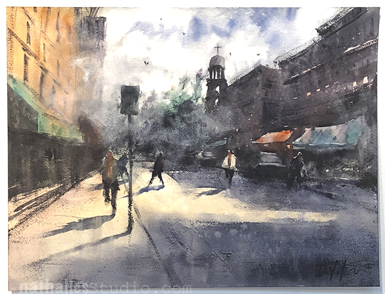
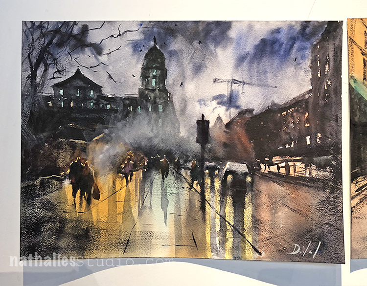
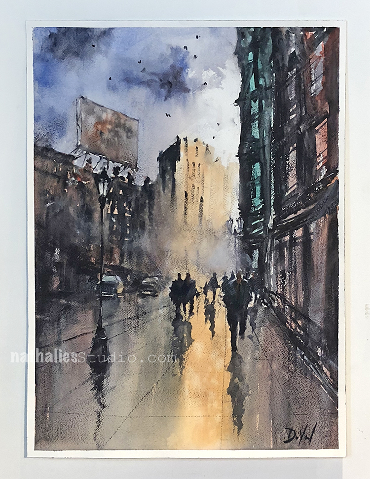
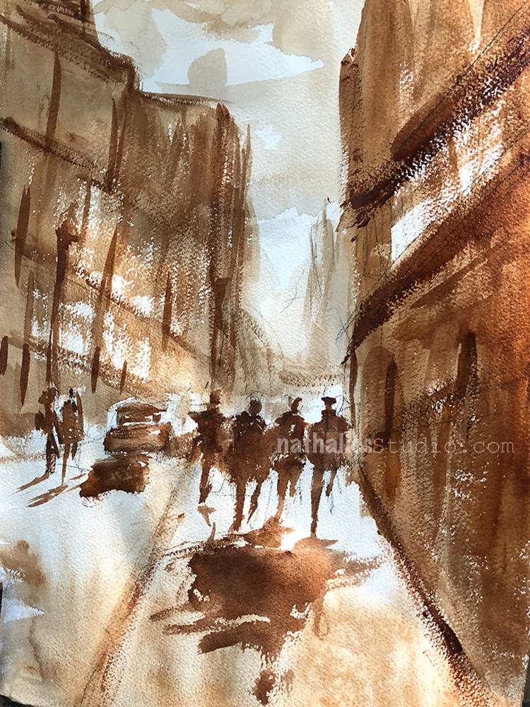
What drew me in taking the class were several factors – I really suck in painting with watercolors and I love John’s loose expressionistic style depicting urban landscapes. Here are three gorgeous samples of John’s work- check out his website for more or follow him on instagram!

John started with explaining and showing the different applications of watercolor he uses for his watercolor paintings- from very wet application (wash), to medium wet and sticky watercolor application, to dry brush application.

He talked about the importance of planning a painting and how to not shift your plan. You can imagine that was a tough one for me ;)

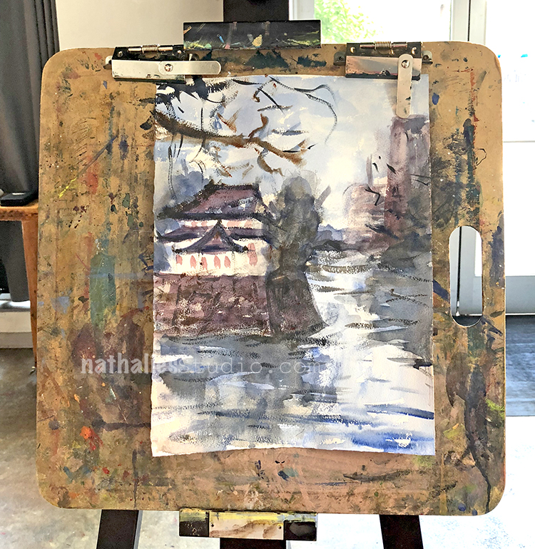
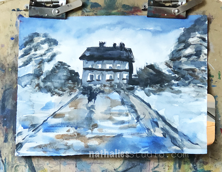
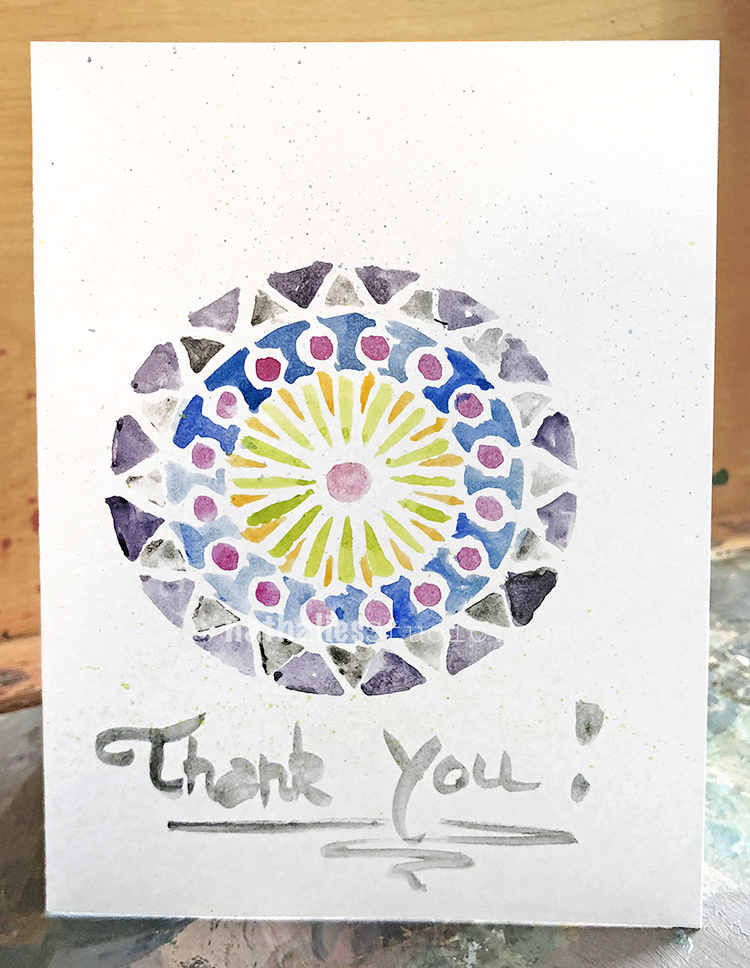
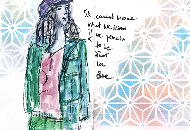
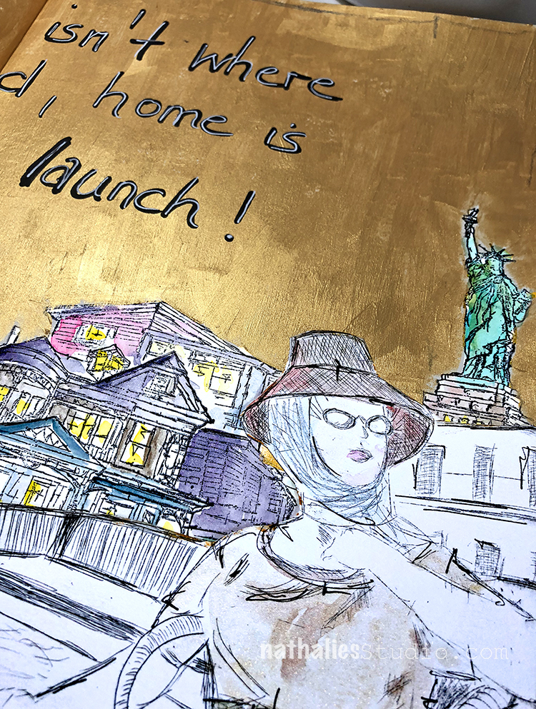
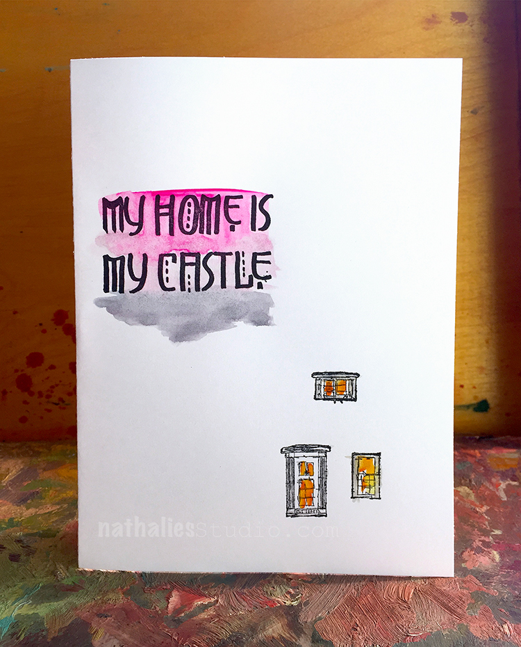
Above one of my first attempts …gosh …sigh …but hey- it was fun and I learned a lot

One of my favorite aspects of the class was his usage of a limited color palette (yeah I know guys- awkward right?) and how to play with alternating warm and then cool colors and vice versa in the layers.

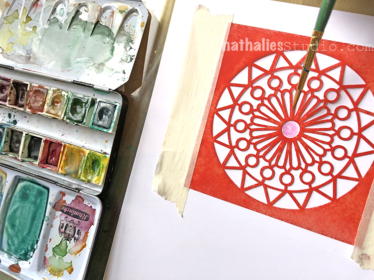
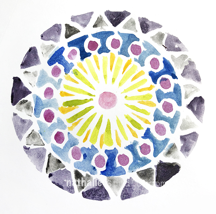
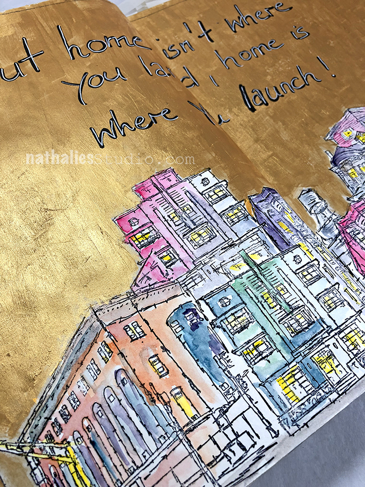
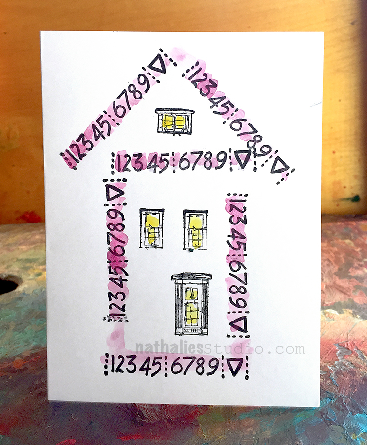
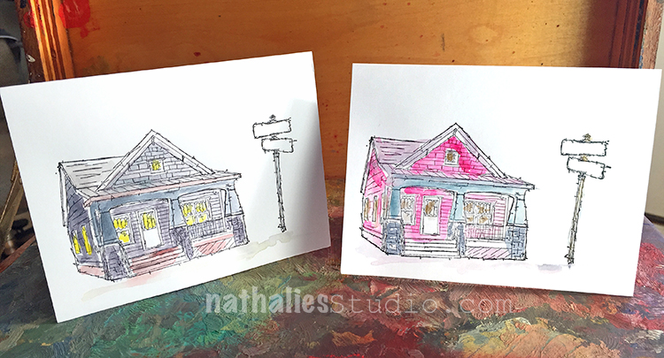
Me trying out the one tone approach – there are areas that I like and some I am like “WTH”?

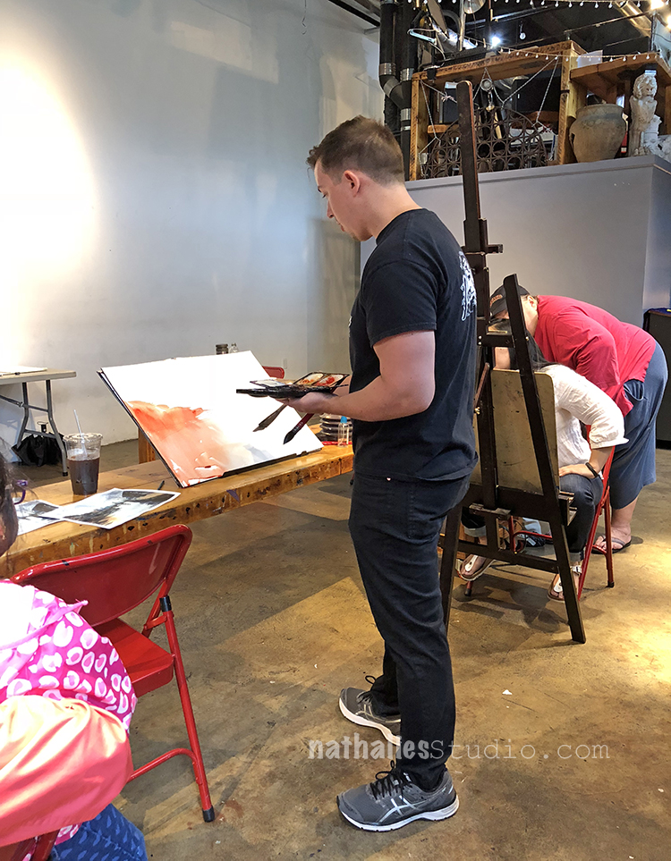
I loved seeing his demos of painting from start to finish and talking through his process as well as how he chooses a subject to paint. At first I was really itchy to get back to the easel and paint myself, but I realized very soon that a lot of what he talked about and went through sticked in my head and was helpful for my own process. Very dear to my heart was his approach of not being afraid of changing up the scene so that it looks interesting or reflects how you feel rather than the actual depiction of the place.

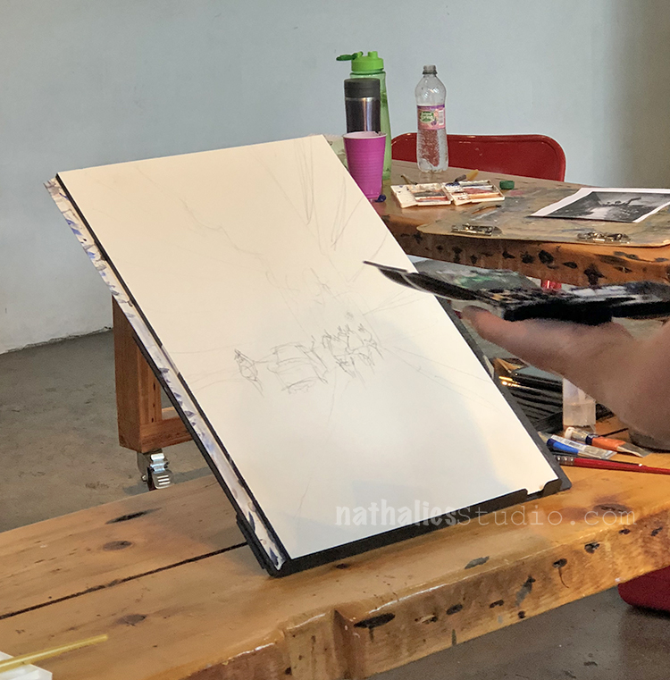
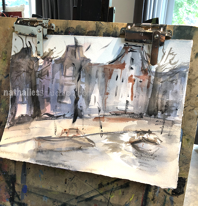
John about to start after sketching a rough scene from a photo.

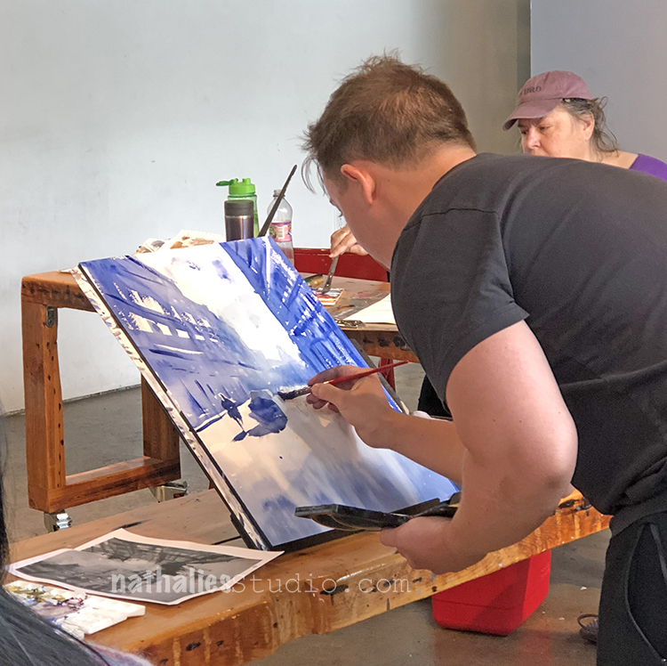
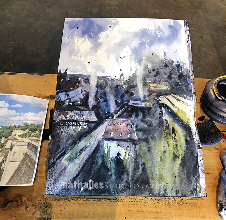
John’s finished piece piece from one of the demos- you can actually see a bit of the original photo on the left.

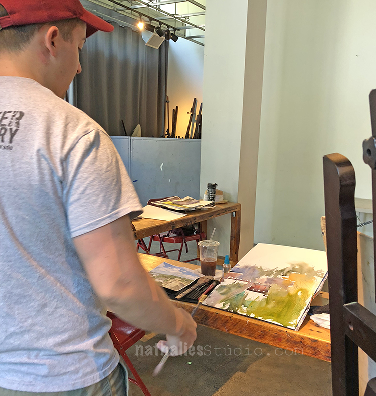
As we progressed in the class we picked our own images and I loved seeing what everyone was doing and talk through it.

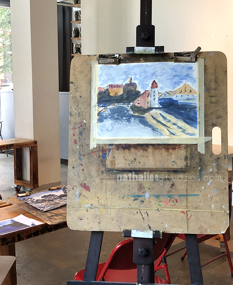
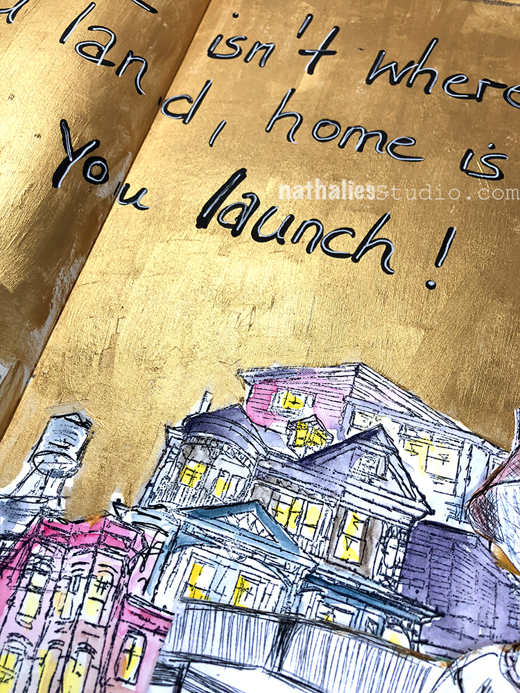
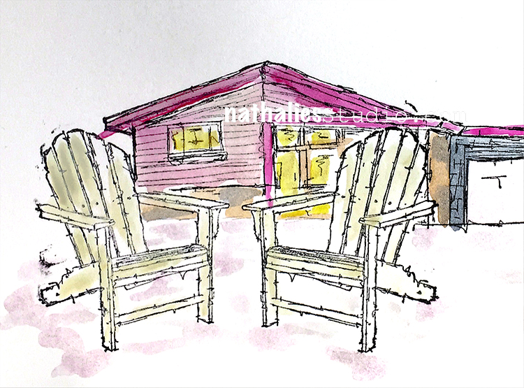
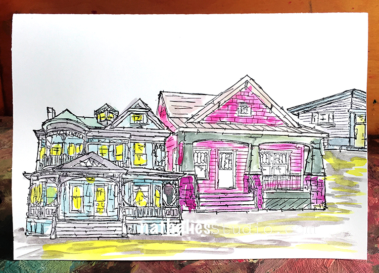
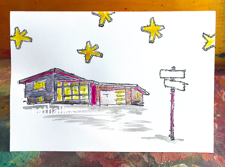
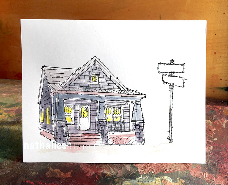
I focused on the house and the water …as you can tell trees and foliage …not so much ;)

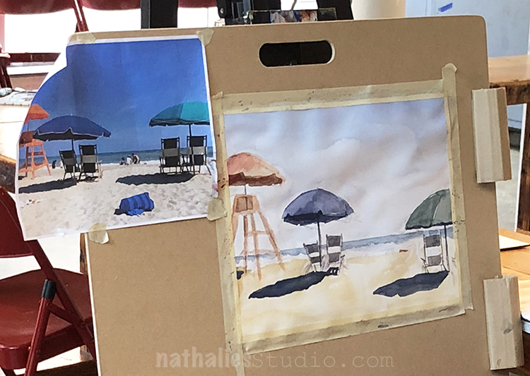
Love the beach scene of one of the fellow students- especially her shadows.

Such a great water texture here and I love the color scheme.

And I really loved the mood in this one- so gorgeous!

John is a great teacher, he is very good in explaining what he does and why he does it and he is good showing students why and where things work and where not. I loved taking a class from him and I will def. do so again …yes in watercolor —gasp ;)

If you are in the Jersey City – NYC area- take a class with John Duval – I am sure he sends out class informations through his newsletter !

What I learned in this class:

  • Watercolor is fun and sometimes you just need it to let it do it’s own thing
  • “Never say die until it’s dry” – John Duval – meaning once it is dry you cannot fix things so be quick
  • think about warm and cool colors more and how this can create visual interest and contrast
  • The watercolor consistency is defined by the water in the brush not on the palette – so don’t dip your paint brush all the time into the water (I only learned this so far in theory- still working on it)
  • Don’t give too much visual information – our little brains do a lot to fill in the gaps

What I take away for the future:

  • Why not add some “people” into a painting to make the scene more lively
  • Change scenes up – you can take a photo if you are going for reality
  • Have the wash or underpainting in my acrylic paintings look through a bit more often
  • Work with a limited color palette or even just one color and play with the tones, tints and shades for a study
  • Why not paint a bit more in watercolor – it is quick and it is just paper and I can actually only improve ;)

Comments (2)

  • Sue Clarke

    |

    What a fun post! I love the limited colors that you used in that first piece that you did (I do bet that it killed you to use limited colors).
    The beach piece is delightful.
    He really is talented and I just don’t know how artists can do so much with watercolors.

    Reply

    • nathalie-kalbach

      |

      ha. you know me well -yes it was really challenging to only use a limited palate but it was really good to do so . :)

      Reply

Leave a comment

Home is Where you Launch – Art Journal

“But home isn’t where you land, home is where you launch!” (from An American Marriage by Tayari Jones) Even though I love living in the States and call it my home and I do not see myself going back to Germany and even though I do feel more like a European than being German…I guess home is still a city in Germany called Hamburg :) I think this is a feeling I share with a lot of immigrants and when I read this quote it really resonated with me and I knew I had to use it for an art journal spread.

I used one of my drypoint prints with the lady as a collage element – you can read more about the drypoint etching class I took here.

I stamped and layered my Stroll Through the Hood and Stroll Around the Block stamps and then colored them in with watercolor.

I painted the top of the background with golden gesso – and I really love how the gold and the watercolor play together.

Here are some of the supplies I used for the spread:


Comments (4)

  • Janene

    |

    I understand what you’re saying. I grew up in Southern California and still consider it my “home” even though I haven’t lived there in over 40 years (and I’ve lived in a couple of other places in between then and where I live now). When I visit California, I’m flooded with good memories of my early life there. But my new home is fantastic in an entirely different way. Kinda like the difference between chocolate and vanilla – both are delicious, but I’d never mistake one flavor for the other!

    Reply

    • nathalie-kalbach

      |

      I love your comparison with the flavors – that is beautifully put! thank you for sharing Janene!

      Reply

    • Donna B.

      |

      I feel the same way. I’d never thought about it before, but I also have strong feelings about the place where I grew up. In my case, I don’t even know anyone who lives back in my old home town or the surrounding area anymore, but if I were to go back there, I suspect it would still feel like my home.

      Reply

      • nathalie-kalbach

        |

        Thank you for sharing Donna- I totally understand what you mean about that it would be different but still feel like home.

        Reply

Leave a comment

Not Flowery – Art Journal

For not being a flowery girl, I did an awful lot of flowery stuff lately, huh? LOL.

This spread was inspired by a mural I saw in Birmingham, UK last year- can you spot which one in the post about it?

The background was spray painted over my Kassel stencil, and the flowers are painted with acrylic paints and gouache. For the face I used neopastels.

I like how all the different paint mediums look together and play with them.


Leave a comment

It’s All in My Mind – Art Journal

I love how this page turned out. I had seen a page by my sweet friend Birgit Koopsen where she had used a black art journal and then doodled in white on top of it and that set off this page. I painted my art journal page with black gesso, let it dry and then added some white watercolor ground into the the middle area.

I then used different stencils of mine and used a white Signo Pen to outline some patterns on the black gesso

I stamped the different houses from my Stroll Around The Block Set with archival ink and then added watercolor and the journaling.

The watercolor ground gives a lot of tooth- so the watercolor looks a bit different on it when on normal watercolor paper- but I love the texture.

It was fun playing with different media and a different ground

Here are some of the supplies I used for this spread:


Comments (2)

  • Sue Clarke

    |

    I love how the white pattern on black sets the background for the rest of the page.
    I must try this soon in my new art journal!

    Reply

Leave a comment

Happy Anniversary Card

A wonderful friend of mine lives in a mid century house and she and her husband were celebrating their anniversary and I thought I would send them a handmade card using my new My Home is my Castle and  Stroll Around The Block Stamps.

I stamped the Adirondack Chairs first, then masked them off and stamped with my Mid-Century Stamp on top of a blank card. I added the Street Sign and wrote “Happy Anniversary” into the two blank street plates.  I then colored everything with watercolors. I think my friend liked the card very much.

Here are the supplies I used to create the card:


Wishing you a wonderful day!

Comments (2)

Leave a comment

My new RubberMoon Stamp Sets are out!

So stoked for my new RubberMoon Cling Rubber Stamp sets – I just have so much fun with those stamps:

Here is the first one –Stroll Around The Block:

The Stroll Around the Block stamps are inspired by iconic American architectural styles that I saw during my travels around the US. This set includes 5 cling rubber stamps. These original hand sketched stamp designs may remind you of your childhood home, Grandma’s place, or even the house you live in today.

And the second set is called My Home Is MY Castle:

The My Home is My Castle stamps are inspired by the iconic details of American neighborhoods in the US. This set includes 8 cling rubber stamps. It is amazing how some things just never change. Do you remember what street you grew up on? What about the excitement when the mailman came? Or gazing out the window to see who might be at the front door?

Here are some sample cards that I made with both stamp sets- I will show more projects using them,  in the next couple weeks :)

A row of the Queen Anne, Craftsman and the Mid Century. I stamped with some black archival ink and then colored the stamped images in with watercolor. I just loved doing that.

Here is the Midcentury Modern from the Stroll Around the Block Set paired with the Street Sign from the My Home is My Castle set . I also added my Star Tag stamp. I left the street sign empty on purpose so that it can be filled with whatever words or names you would like to use in it.

So much fun with the little door and windows of the My Home is My Castle Set

And another one using the stamps from the My Home is My Castle Set

The Craftsman – I think I will fill the street sign in with Happy Holidays and and send it out as a Holiday Card.

You can get them now in my n*Studio Store here.

I so hope you like the sets! Which of the stamps in the set is your favorite?

Comments (4)

  • Sue Clarke

    |

    Stroll Around The Block!!!
    The craftsman is a great style.
    This set is on my wish list for sure.

    Reply

    • nathalie-kalbach

      |

      YEahh- so glad you like it Sue! I would move into the Craftsman if I could right away- LOL

      Reply

  • Sherry Canino

    |

    They are all soo gorgeous!!❤️❤️❤️

    Reply

Leave a comment