Hello from my Creative Squad! Today we have Maura Hibbitts sharing with us an art journal spread that makes me want to go to the beach RIGHT NOW :) Maura is using my Far Out, Batik 1, Batik 2, and Fairview Fan foam stamps along with this month’s theme: Under the Sea – There is something so fascinating about water. We love being in it, floating on it, relaxing next to it, and it remains one of the last frontiers here on the planet. Create something that is an ode to the sea.
I love the sea! I look forward to journeys to the ocean, and the time to sit on the beach and just contemplate, listening to the sound of the waves ebb and flow. I am always curious about what life is like in the ocean for the amazing creatures who call it home. What is under the sea, in the deep depths? And yes, my imagination runs to the likes of 20,000 Leagues Under the Sea by Jules Verne, the lost city of Atlantis, giant Kraken…to me the mysteries of the sea are definitely waiting.
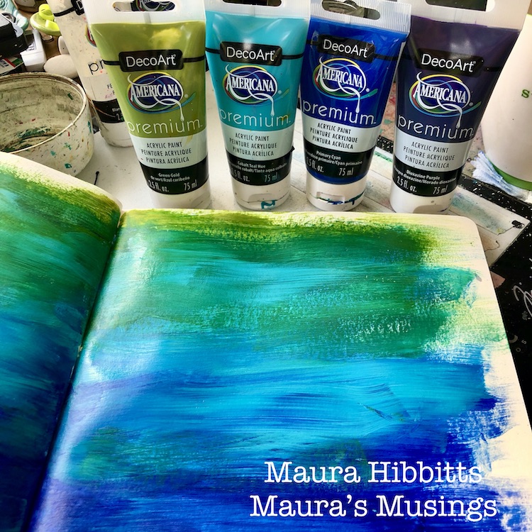
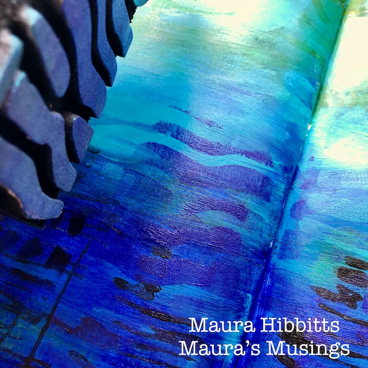
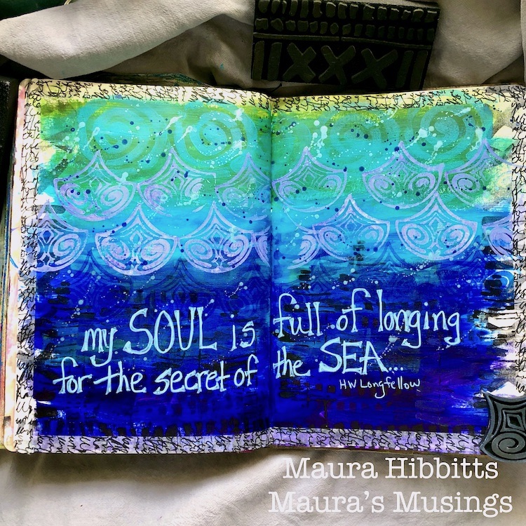
I headed to my large Dylusions art journal, and swiped on paint across the pages, from purple to blues to green, working my way up from darker to lighter. I blended a bit between color layers, trying to recreate ocean layers from the depths to the surface.
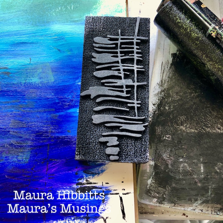
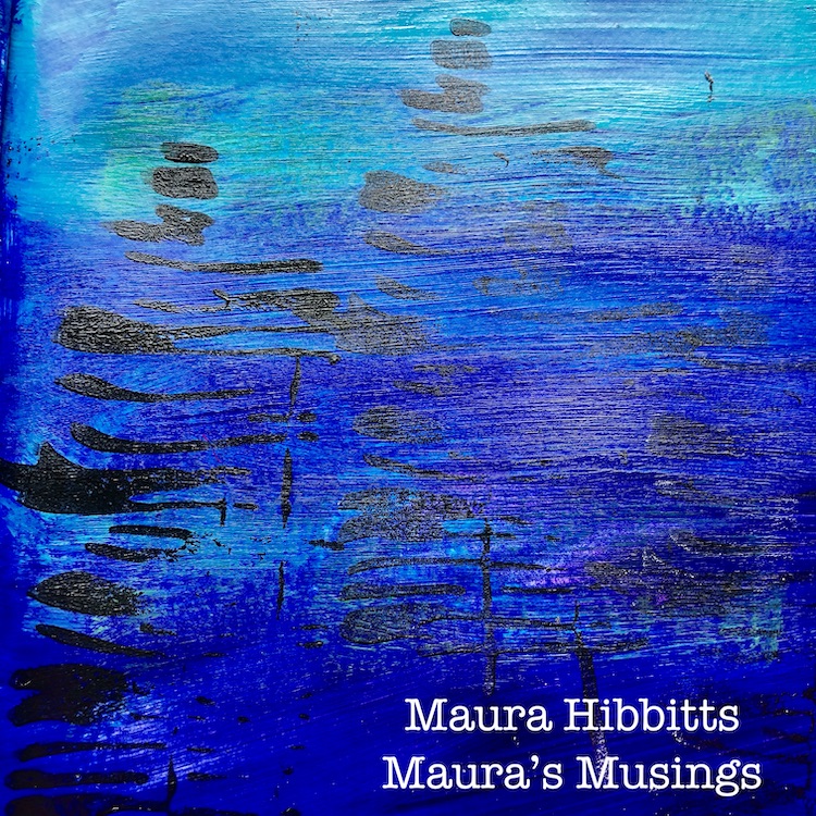
I am using the Far Out stamp and black paint to add some texture to the deep waters. I like to use a gel plate to stamp off of when I am using paint. I can push the stamp onto the paint, or apply it directly with the brayer.
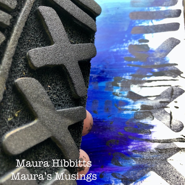
I decided to stamp a bit around the edges with the Batik 1 stamp and black ink.
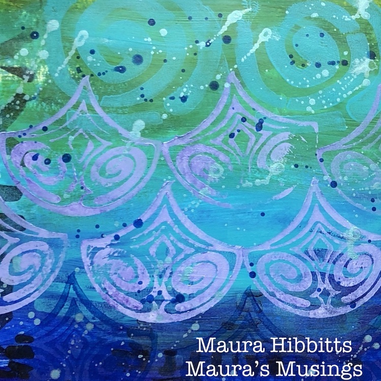
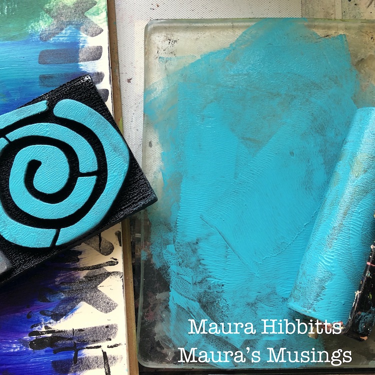
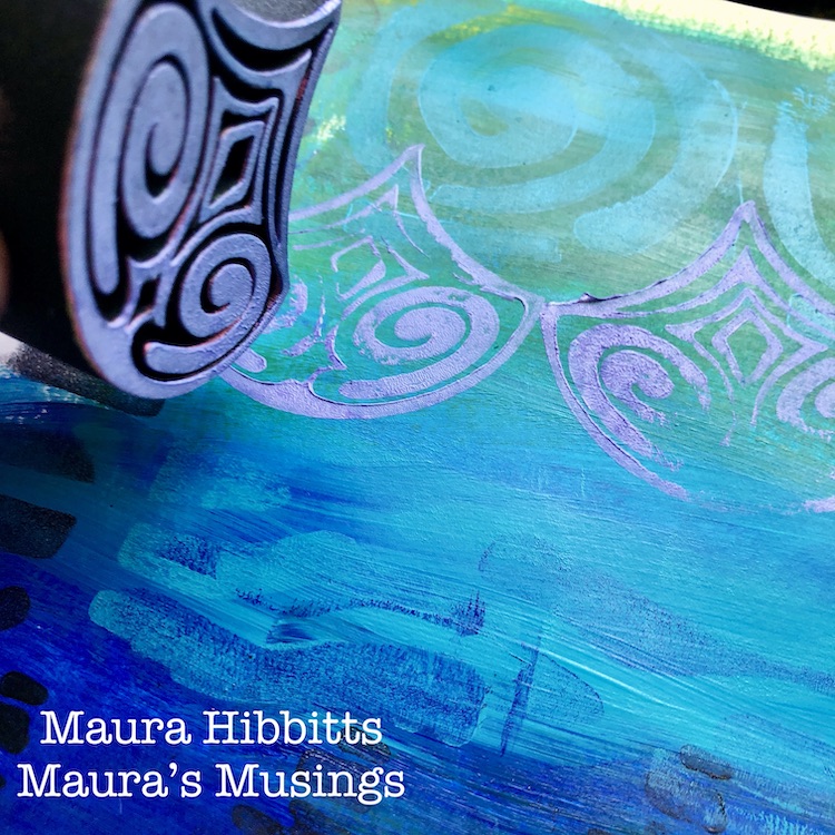
Now it is time to create the waves in the upper waters. I started with the swirl on Batik 2, and using the Cobalt Teal, I made a series of swirls across the top of the pages. Then, I mixed some teal with the purple, and used the lower part of the stamp to add a bit of a wave pattern in the darker area. I feel like this gives the water a feel of flow.
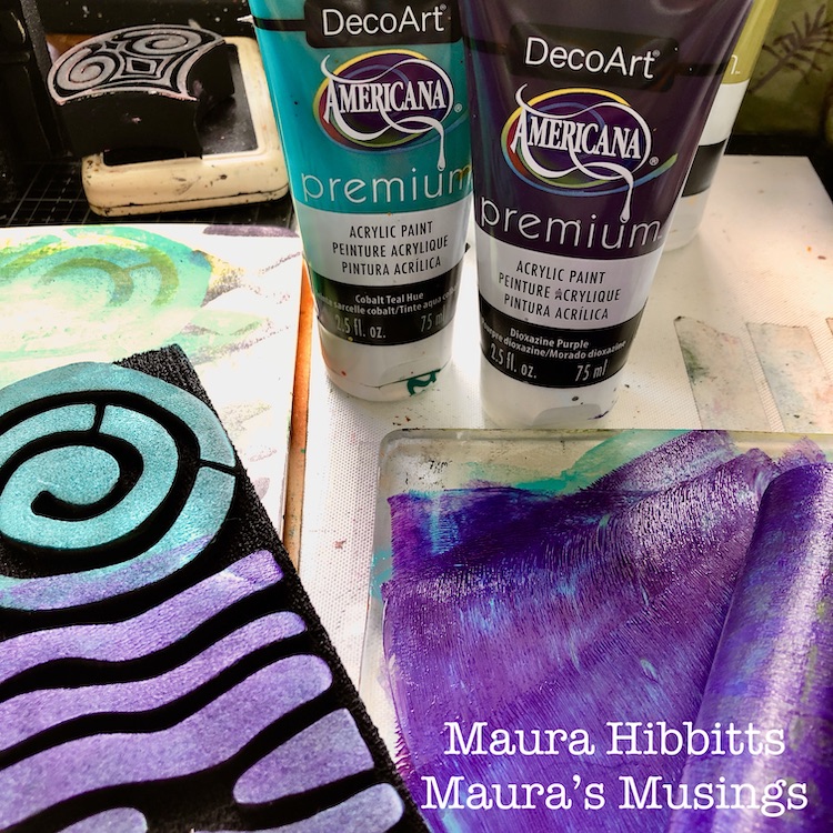
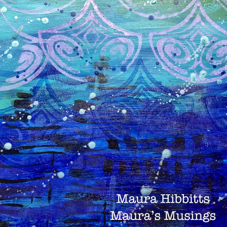
I used the Fairview Fan stamp to continue with my wave theme. I mixed some white and purple to get this gorgeous lavender, and stamped this under the teal swirls. I stamped two rows horizontally, then did a row with the Cyan.
I mixed a bit of Cyan with water, and splattered some drops on the pages with a brush. Once that dried, I flicked a mix of Peacock Pearl (metallic paint) across the pages. I think they look like bubbles rising.
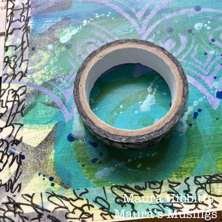
I edged the pages with washi tape to finish it off.
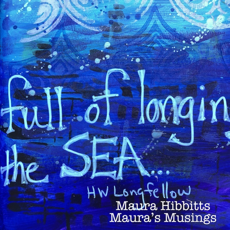
For the final step, I hand lettered a quote about the ocean with a paint pen.
When you are next at the ocean, will you just look out at the waves and the horizon, or will you stop and wonder at what is under the surface?
I know I will continue to be amazed at the diversity and complexity of ocean life and the many moods of the seas. I have a feeling, there is still so much of the deep ocean we have yet to discover, and maybe, just maybe, the ocean should be allowed to hold on to some of that mystery. Let’s continue to protect our oceans and the wonderful life it holds. – Maura
Thank you Maura! I love how you used the different stamps to capture the motion and beauty of the sea :)
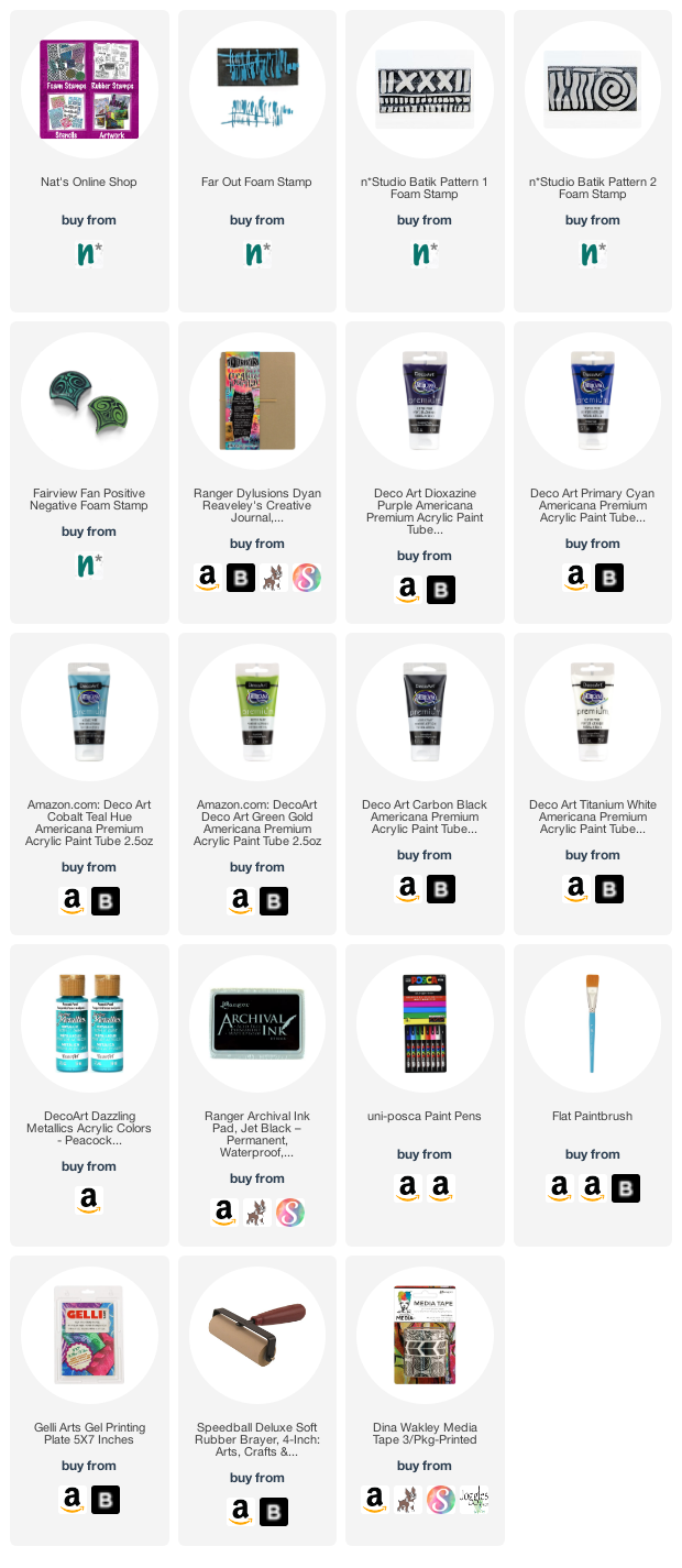
Give it a try: you can find all my Foam Stamps in my Online Shop and here are some of the other supplies Maura used:
Feel inspired? Working on something yourself that you’d like to share? I love to see how you interpret our monthly themes. Email me how you used my stencils and stamps with the theme and email me an image – I would love to share your projects in my next “n*Spiration From Around the Globe“.
Comments (1)
Sue Clarke
| #
Bravo Maura!
Yes, I long for the sea this time of year especially.
Love the layers and the ocean colors you used.
Reply