I started a new urban painting and wanted to change things up in how I start my paintings . So instead of the normal procedure I forced myself to do it a bit differently.
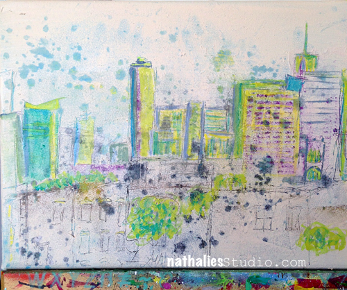
I was inspired by some sgraffito in paintings by Paul Klee and Jean Dubuffets – which I have just shown in my Post here. Here is how my painting looked for a couple days when I was undecided if I should leave it like this or not. I actually really liked it.
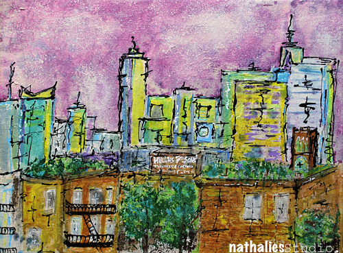
I love taking photos of my work in progress to see in hindsight what I did and sometimes also …where I should have not taken the next step. As in this. Now that I look back …I almost ;) wish I would have just stopped. But I didn’t …a weird “this cannot be it” – feeling kicked in …and so I continued. And I went a bit overboard with it … kind of like when you hand me a jar of Ben and Jerry’s “Chunky Monkey” Ice Cream …nothings gonna stop me there either ;) although I know pretty much after two scoops that should be it.
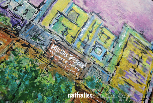
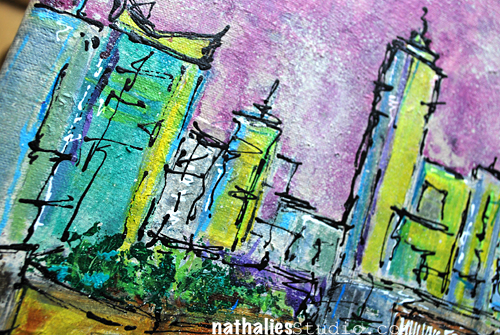
Pretty soon I realized that it is not going into the right direction, but then I just wanted to see how far I could push it and I painted a lot with palette knifes -which I usually only use for texture. That was cool. And then I also got totally addicted to sketching with a mixture of Soft Body Paint and Ink (Titanium White and Carbon Black) filled into a Fineline bottle. I know now exactly the consistency of the mixture of those two paint media I need to make it work. I just loved the way the lines came out and the erased dimensional look.
Do I regret going further although I am not loving the outcome? Nope …absolutely not. I learned a lot by doing this and I found some new things I definitely want to incorporate more into new paintings. I also learned that less is sometimes more and not boring …although overall more is more for me… I might just sulk and eat some Chunky Monkey now ;)
I think it is important to do things in our creative process that we are not loving in order to stretch ourselves and learn . I really enjoyed the process and keeping track of this, so the time was not wasted. And you know what …I can always make a new painting … maybe I even just gesso over this one …the texture underneath will probably already define the city skyline …what do you think? Now that makes me excited about this again … LOL – maybe it will be the continuing City Spring Canvas Saga.
Are you a less is more or more is more person?


Comments (10)
Cheryl
| #
I really like it, for it looks quite professional. I loved all the colors you used, and it looks and feels like an inner city. I hope you will keep it, frame it, a d. E pleased with the results of pushing yourself. I would hang it in my home!
Reply
nathalie-kalbach
| #
Thank you Cheryl for your sweet words!
Reply
JanJ
| #
Wow! I like both. In the original the colors are soft and light. I struggle trying to keep in pastel colors. To me, your completed one is more dynamic and powerful. I just can’t choose. Thumbs Up!
Reply
nathalie-kalbach
| #
yeah- the pastel was my problem too – it is just not me – mmmh mhhh – LOL
Reply
Joi@RR
| #
Good morning Nat. I like the first one – the more pastel one BUT… here’s the thing… if I went in a gallery looking for your paintings – I would never have picked the first one as YOURS. Sooooooooo…. my fav is the second one. PLEASE don’t gesso over it!!! It’s really Wonderful. Totally love the brown building especially the staircase and the sign on top. To me… it just is so you and also – to me – it’s a work of art. The first one is lovely – and it could be a new side of you – but the second one is FABULOUS… I love it. j.
Reply
nathalie-kalbach
| #
Thank you for your feedback Joi! I agree- the first one was just not feeling me – but I liked it :)
Reply
Deborah A. Pierro
| #
Nat, I like the soft look of your new urban painting. I also like your previous urban paintings.
Reply
nathalie-kalbach
| #
Thank you Deborah! it is good to see you!!!
Reply
Bea
| #
sorry, i like it…b
Reply
nathalie-kalbach
| #
Thank you Bea :)
Reply