Hello from the Creative Squad! The monthly theme is Live Like it’s Spring – Springtime is when Mother Nature kicks it into high gear. It’s the time to wake up and approach life with renewed energy. Let’s join Mother Nature in this reawakening and create some things in the Spirit of Spring! Today Michelle Rydell is playing with different parts of my stencils to celebrate spring with a gorgeous mandala. Check out her nifty beautiful idea to use stencils!
When I heard that the theme for this month was about springtime, the first thing I thought of was flowers! Then I took out my Wanderlust stencils to see what I could see. I love looking deeply into Nat’s stencil patterns, because you can see so many patterns within patterns. This time, what I saw was a cute little tulip within the Santa Fe Stencil. Do you see it too?
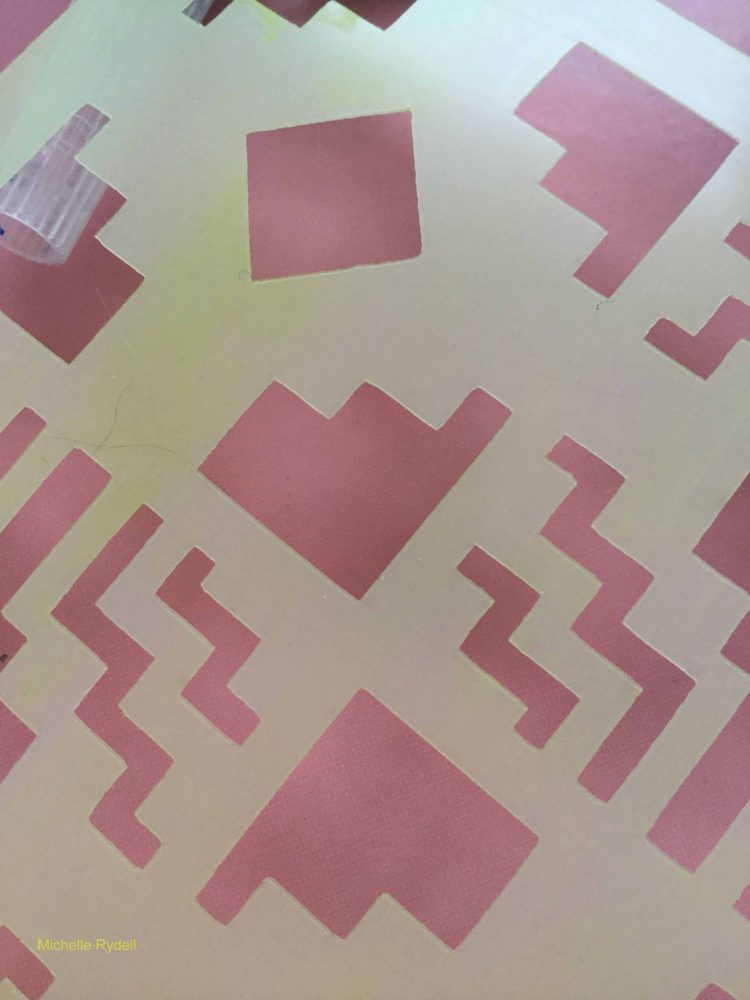
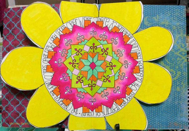
That gave me the idea to create a springtime mandala with the little tulips as a starting point. I’m creating this spread on watercolor paper in a 9” x 12” journal. The guideline I’m setting for myself is to only use bits and pieces from the following Wanderlust stencils: Santa Fe, New Orleans, and Manhattan. Here’s the step-by-step…
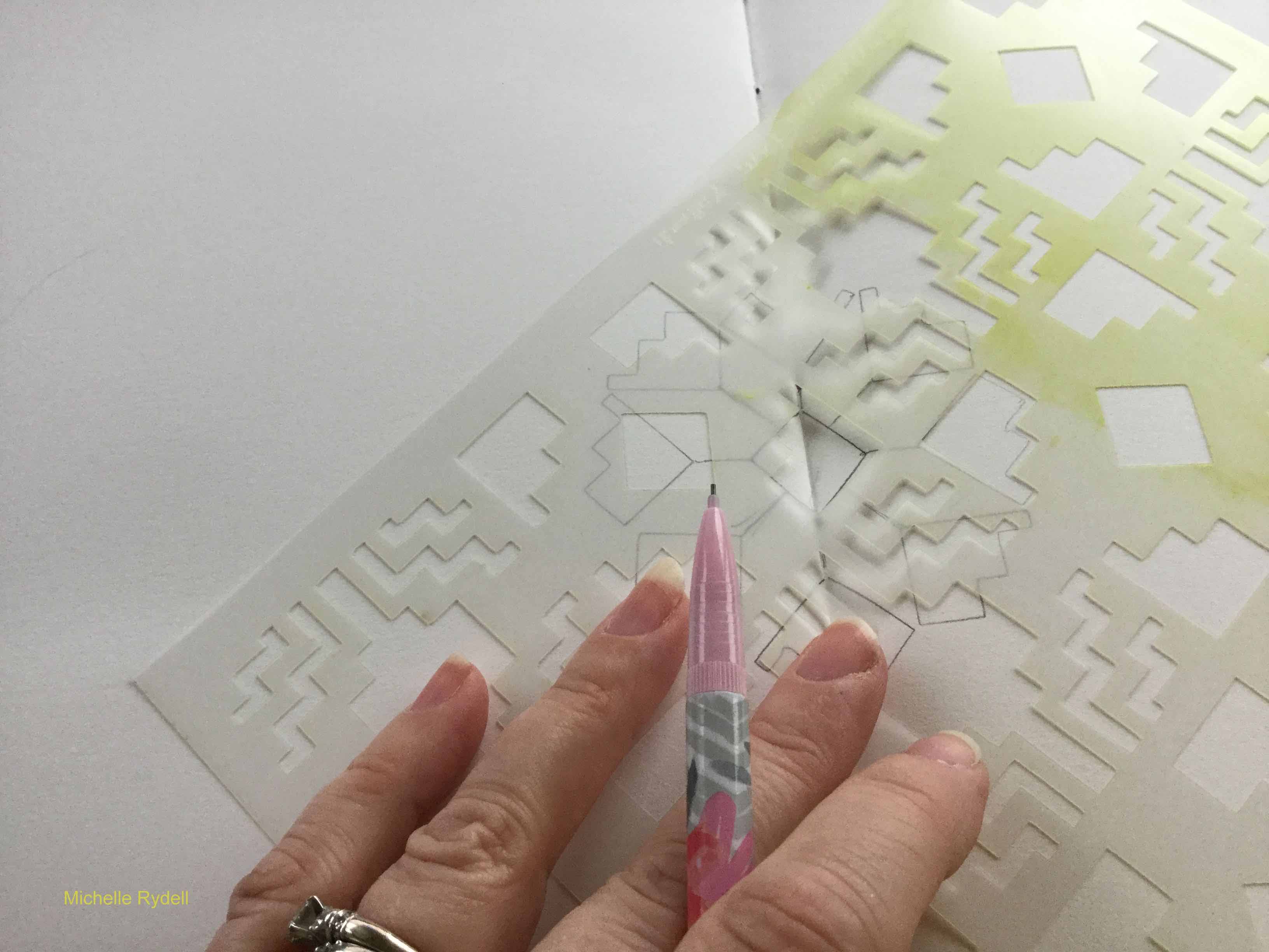
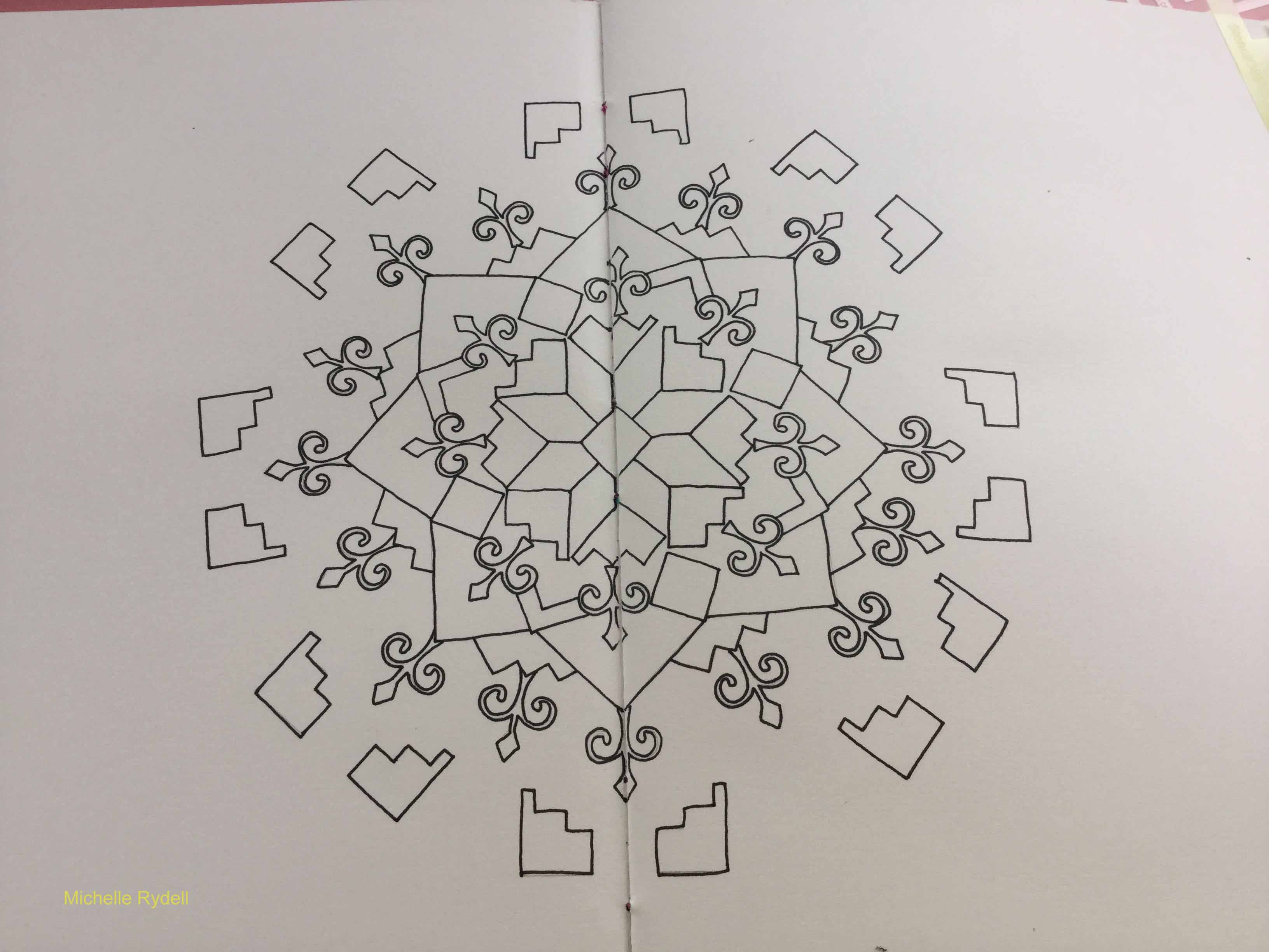
I started with the basic diamond shape (from the Santa Fe) in the middle, tracing it with pencil in the middle of the page. Then I drew a line straight out from each point and side of the diamond. Then added a “tulip” at the end of each line…
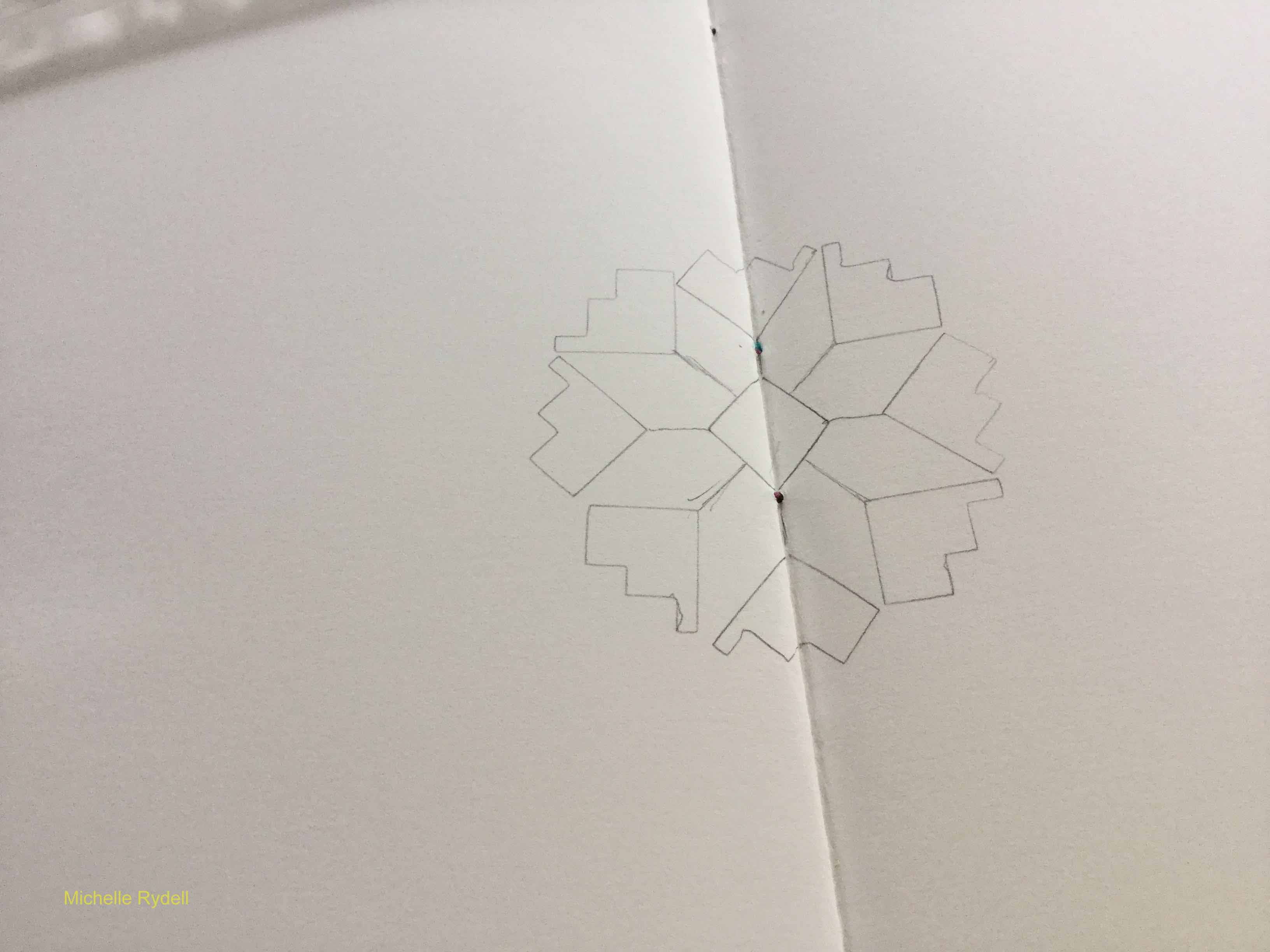
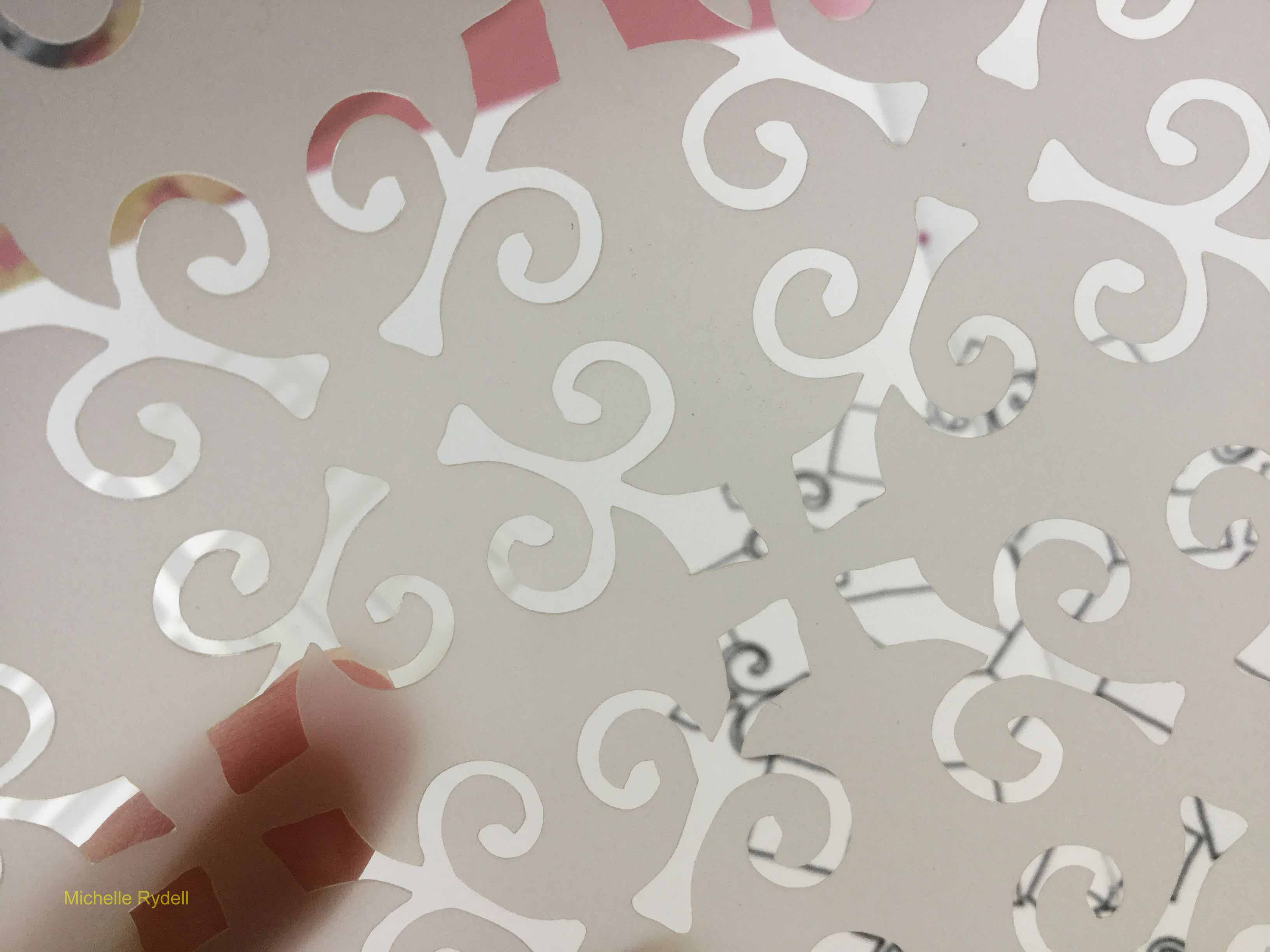
From there I just started building outward with various shapes from the stencils; first tracing with pencil, then going over it with pen, once I knew I liked the way it looked.
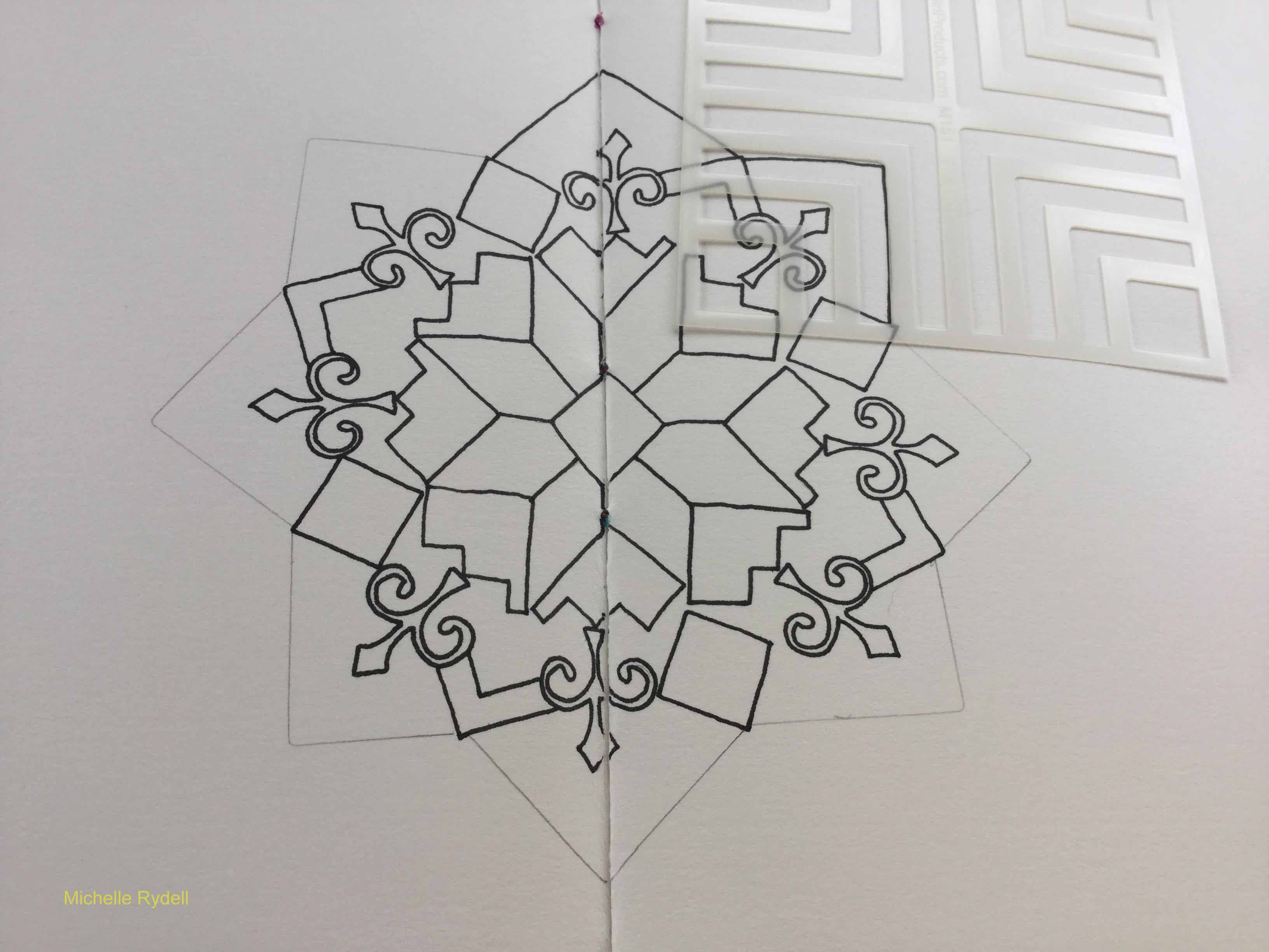
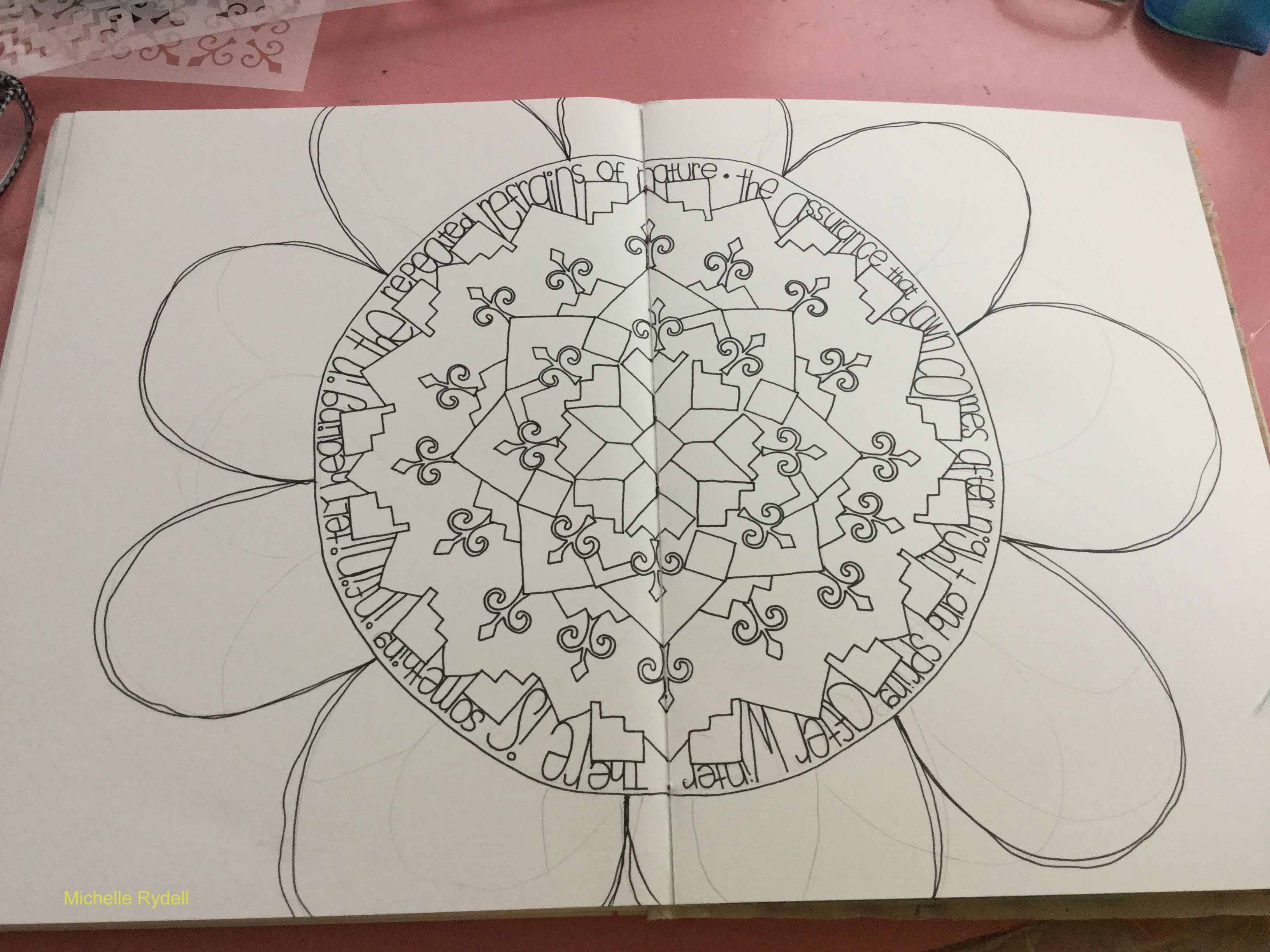
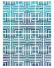
When I reached this point, I started to see the center of a giant daisy emerging! I found a quote that felt perfect to tie the mandala in with springtime. I drew a circle around the mandala, leaving a little room to add the quote to the inside of the circle. In case it’s hard to read, here’s what it says…
“There is something infinitely healing in the repeated refrains of nature – the assurance that dawn comes after night, and spring after winter.” ~ Rachel Carson
Then I drew the petals, to complete the flower…
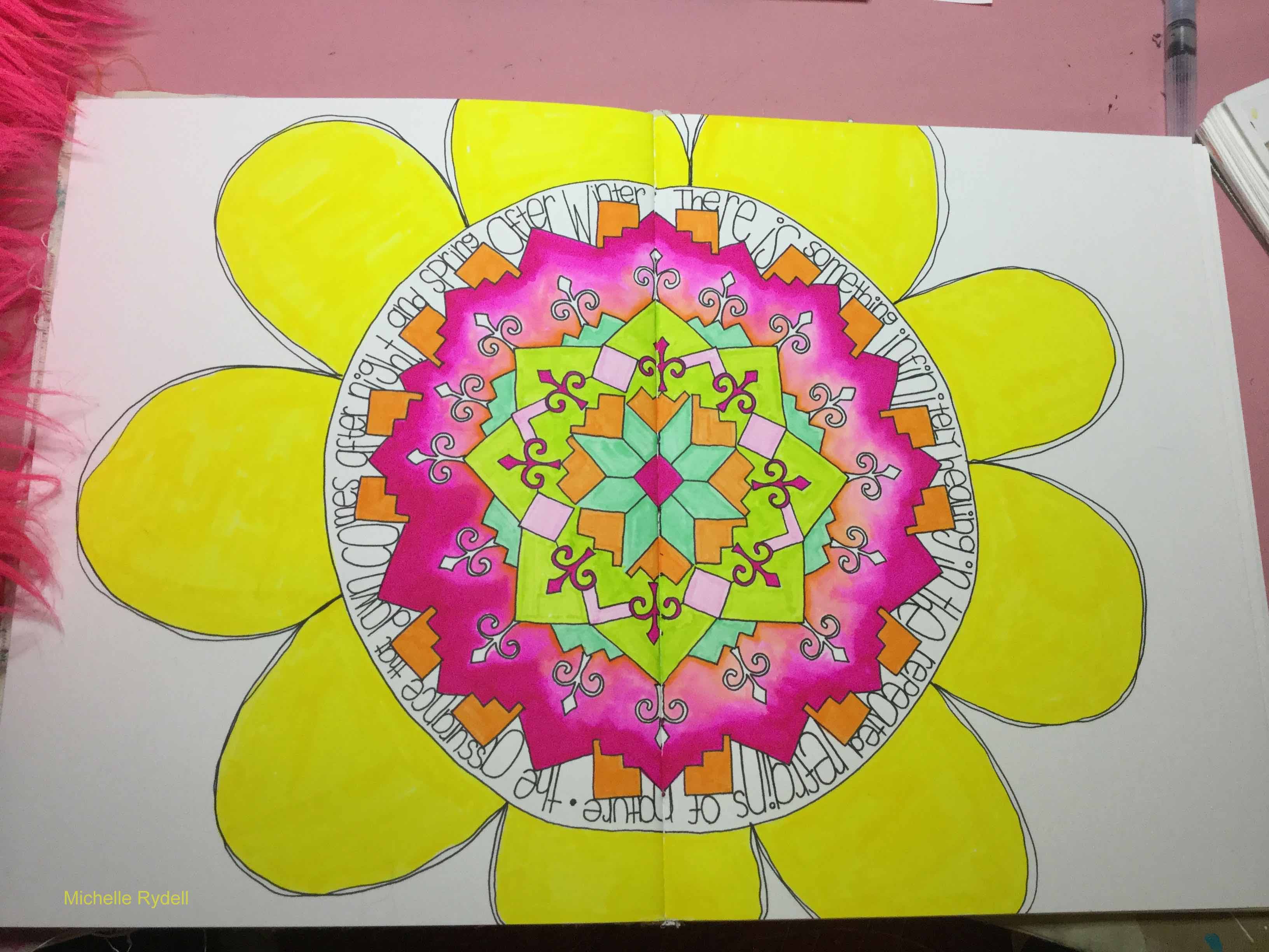
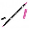
Colored it in with tombow markers…
And cut the shape of the flower out, so you can see the journal page before and after behind it.

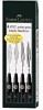
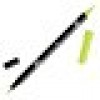
Wow – I love how all those different parts of the stencils created something new and beautiful – stunning, Michelle! She used these supplies – some links are affiliate links:


Play along with us! I love to see how you interpret our monthly themes. Email me how you used my stencils and stamps with the theme and email me an image – I would love to share your projects in my “n*Spiration From Around the Globe“.


Comments (2)
Sue Clarke
| #
It’s amazing how a crafty person can create such beauty while using different pieces of this stencil.
Thanks for the ideas Michelle as I tend to create “in the box”.
Reply
Julie Tucker
| #
This is gorgeous! LOVING how you assembled that flower!!!!!!!!!!!
Reply