Art Stroll

Art Stroll: Max Ernst at MoMA

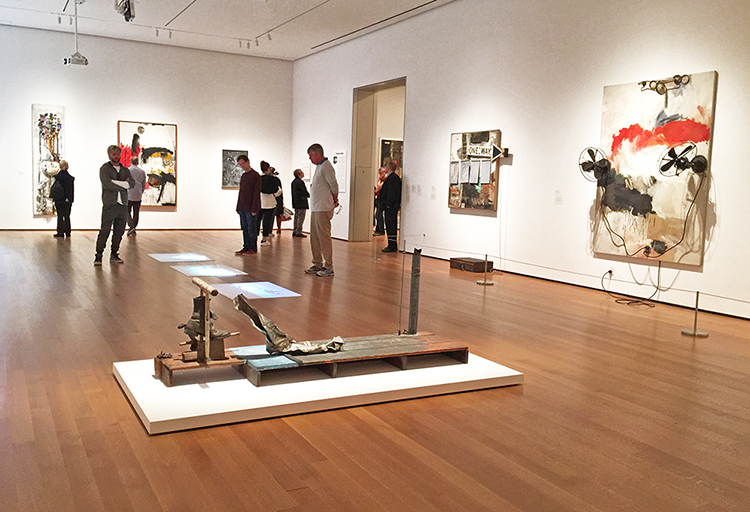
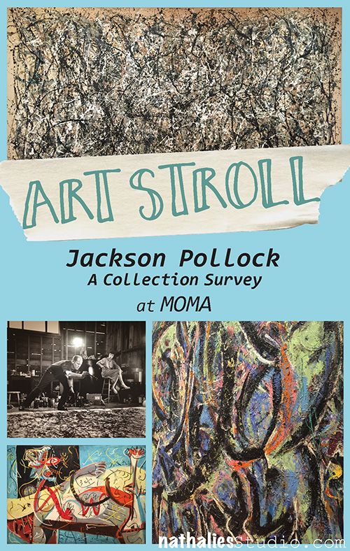
The week after Christmas or as we Germans say “in the week in between the years” my friend Kim and I finally made it to the Max Ernst Beyond Painting exhibition at MoMA. It was on my bucket list ever since it opened and we just made it as it closed at the end of the year.

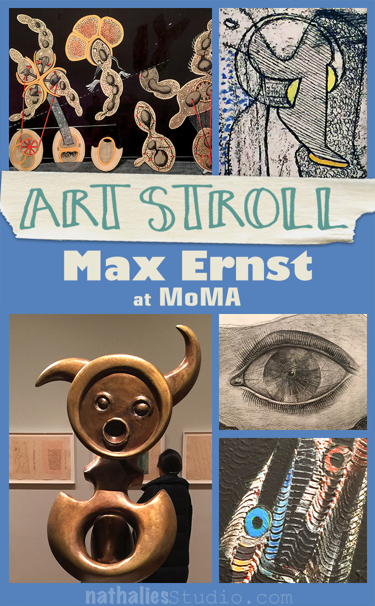
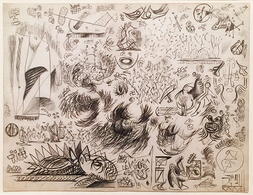
The Gramineous Bicycle Garnished with bells the Dappled Fire Damps and the Echinoderms Bending the Spine to Look for Caresses, 1921 – Gouache, ink, and pencil on printed paper

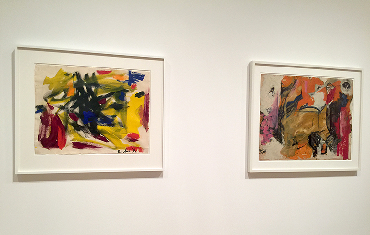
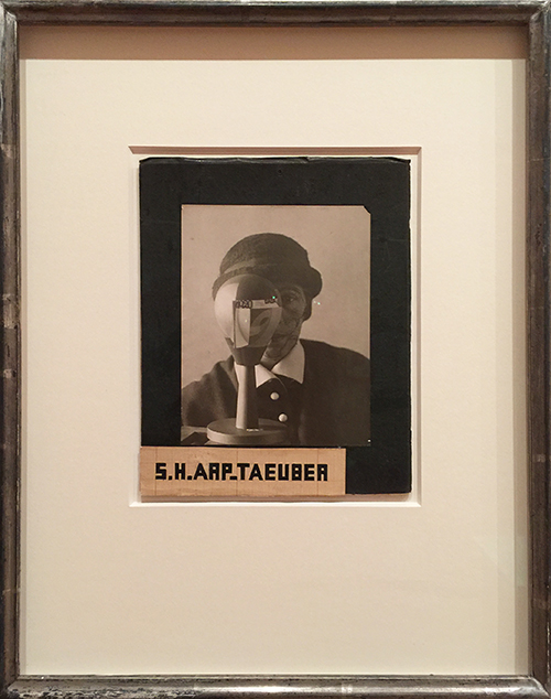
Max Ernst (1891-1976) is a huge inspiration – his art is funny (just read the title for the painting on the top)  and above all- a huge amount of Mixed Media techniques we know are coming from his genius experimentations. Ernst was a key member of the Surrealist movement

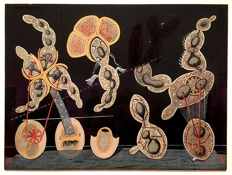
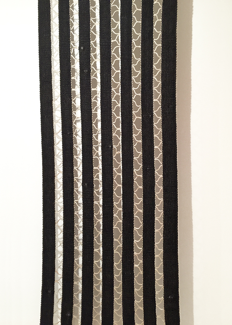
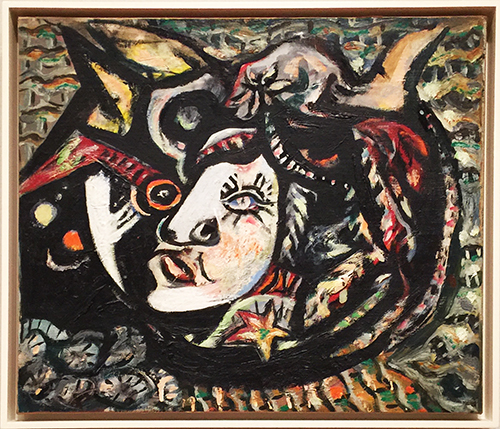
The Hat Makes the Man, 1920 – Gouache, pencil, oil and ink on cut-and-pasted printed paper

Here Ernst overpainted a page from a millinery catalogue showing women’s hats

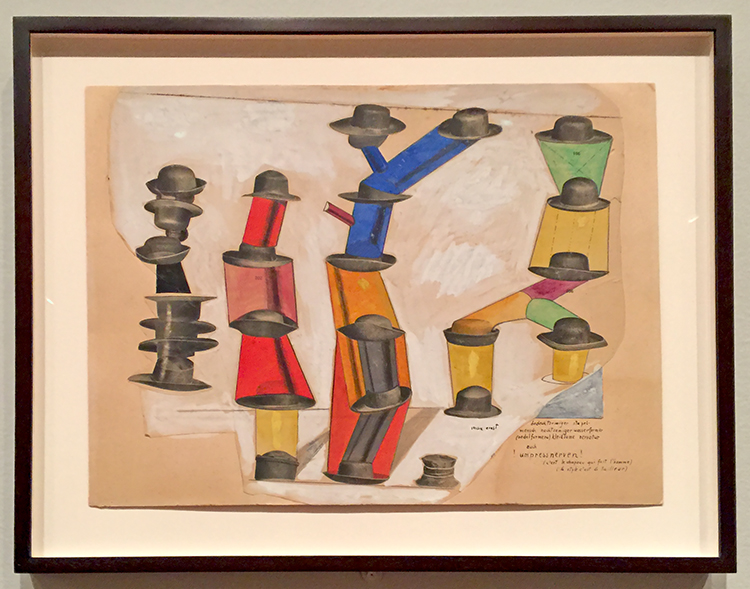
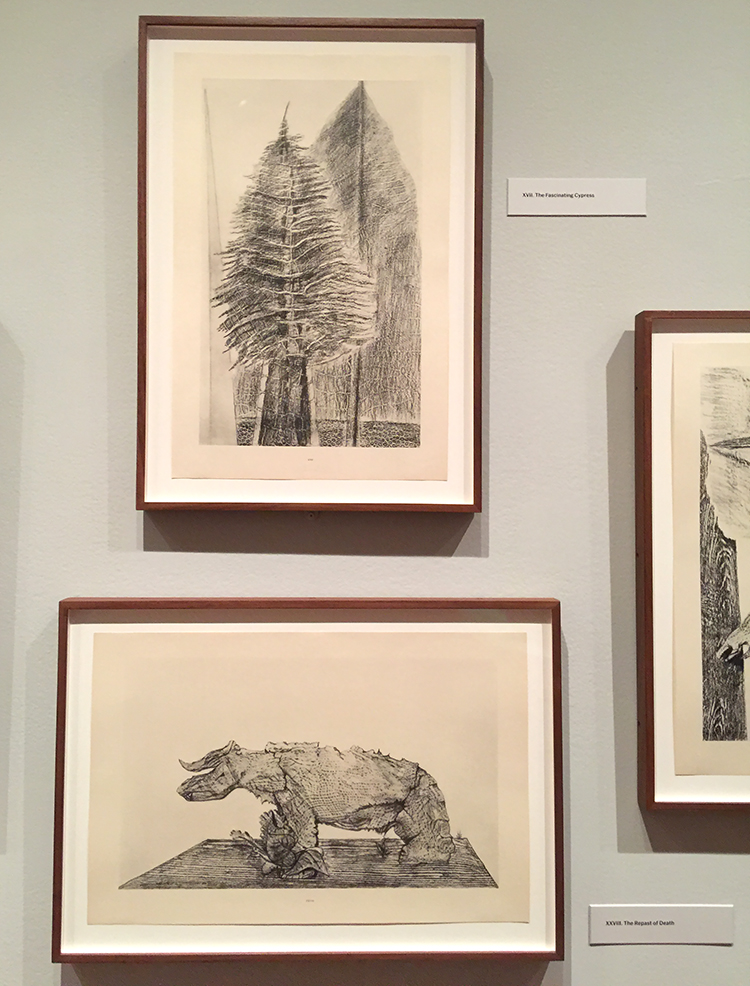
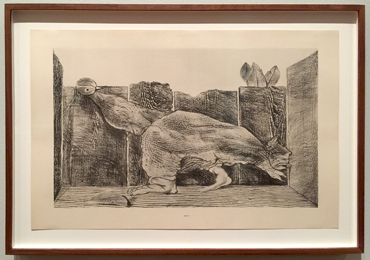
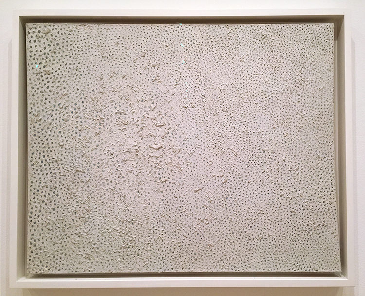
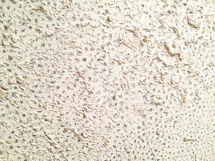
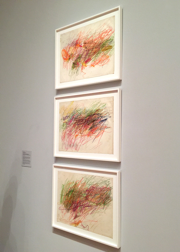
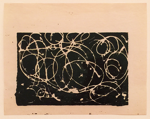
Below are some of Max Ernst’s Frottages

These images are created by placing paper atop of various materials, e.g., wood floorboards, twine, leaves, wire mesh, crumpled paper, crusts of bread, and rubbing the surface with a pencil or crayon.

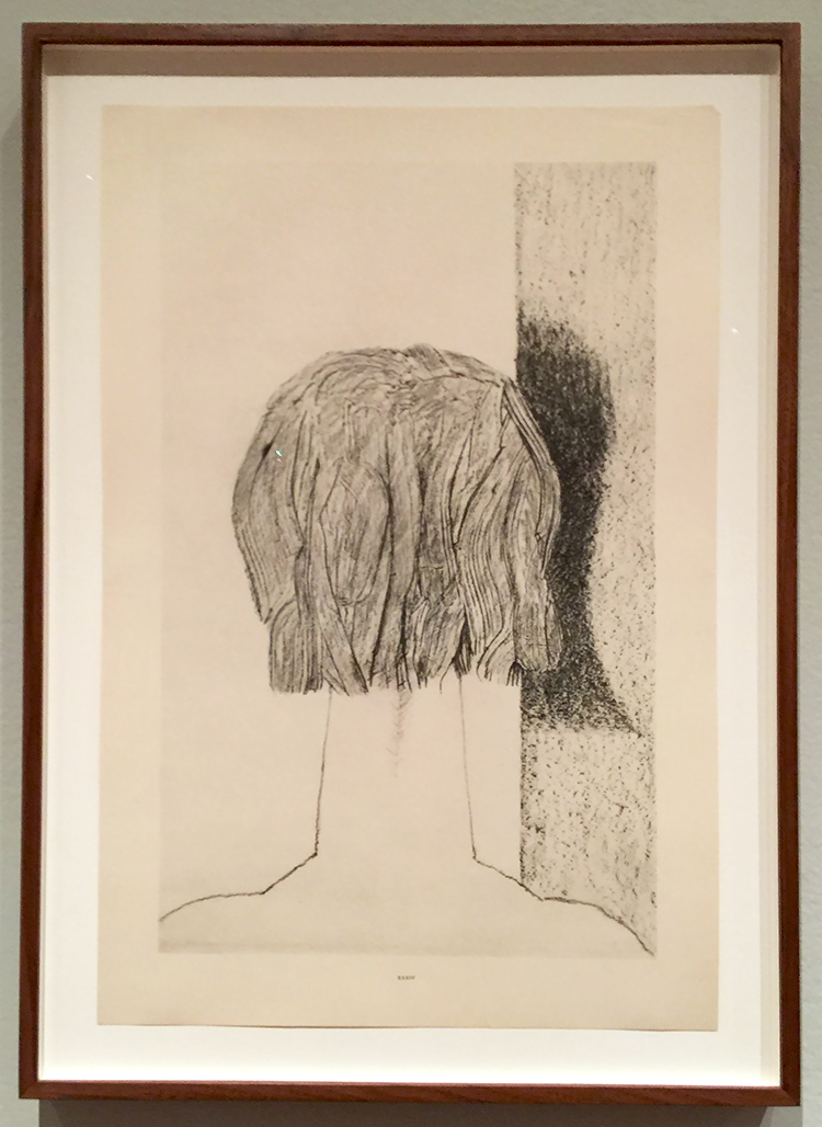
Inspired by the resulting textures, he added details to transform them into fantastical landscapes, objects and creatures.

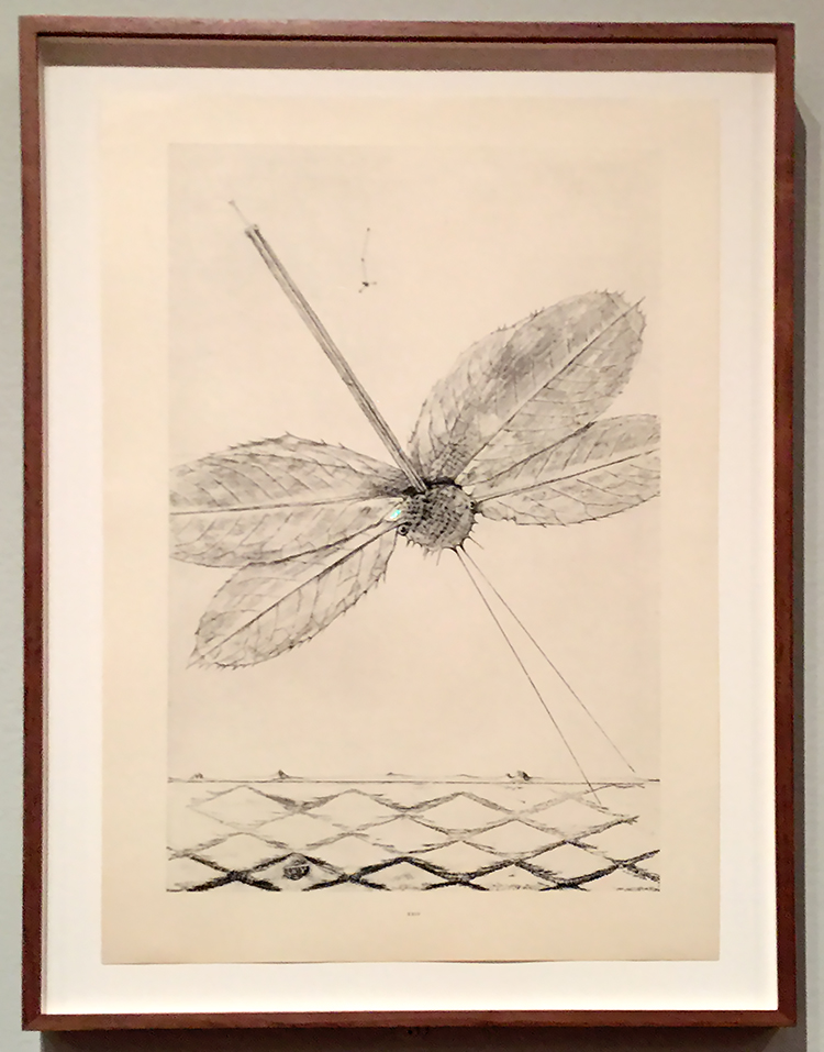
Frottage is the french word for rubbing.

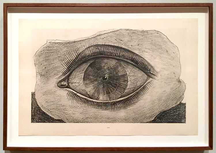
Can you see the leave rubbing in the eye?

What an amazing idea to create something new or just start from a blank page.

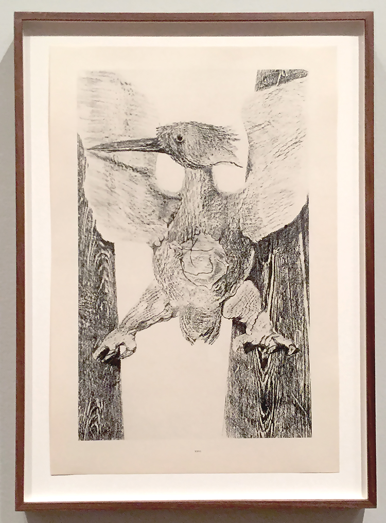
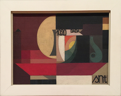
Max Ernst art work shows over and over again birds.

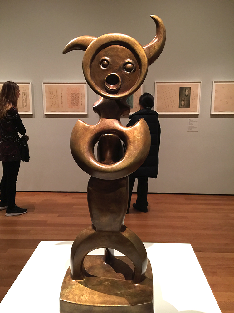
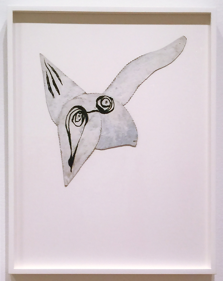
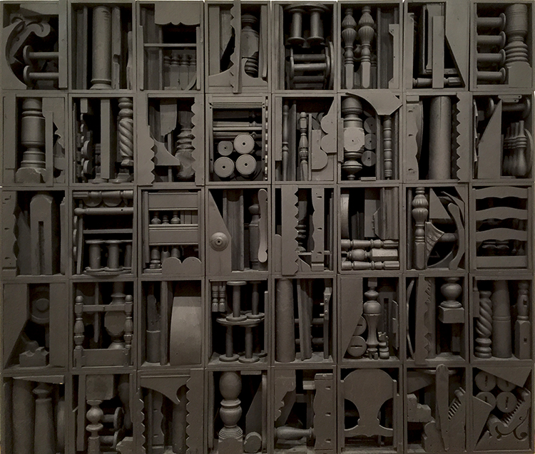
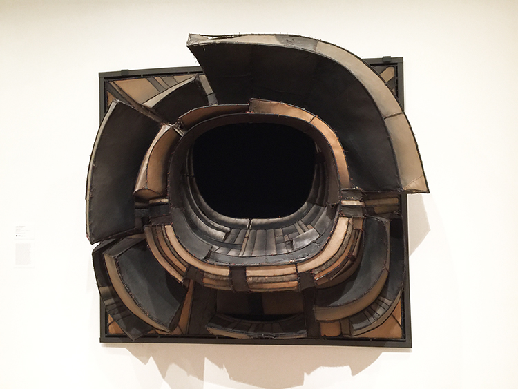
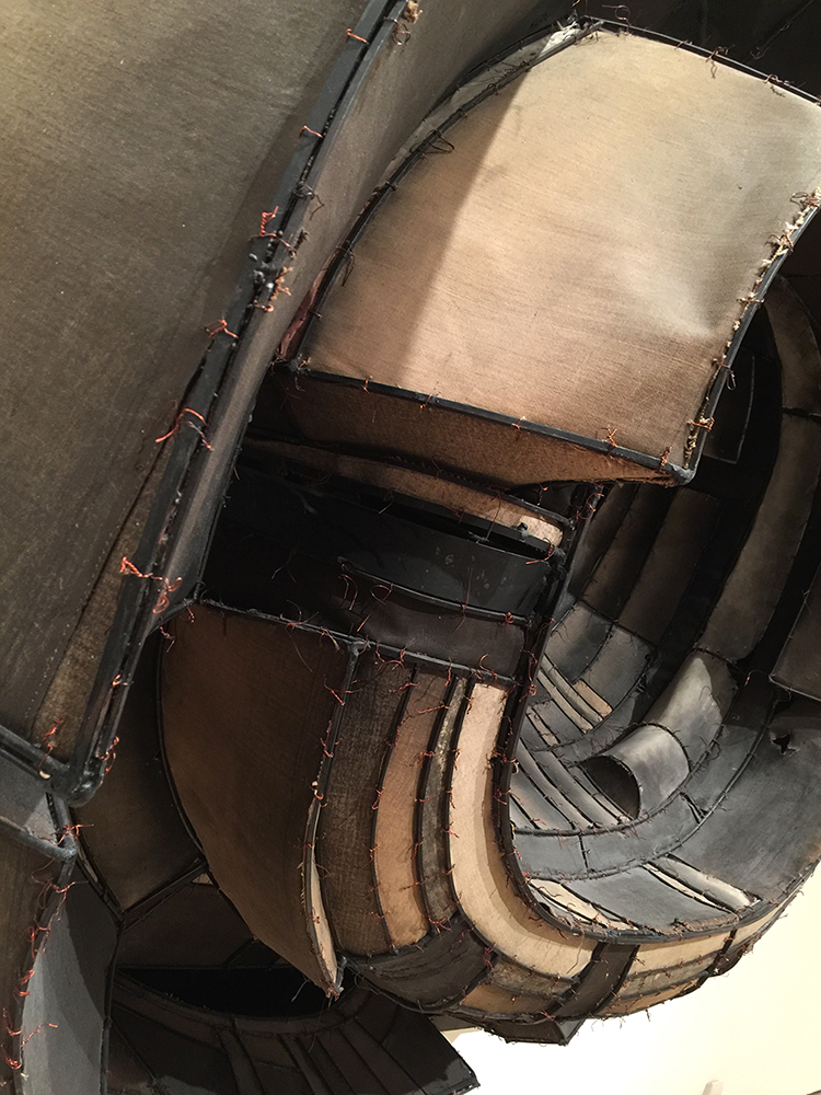
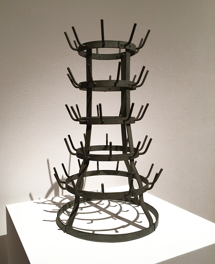
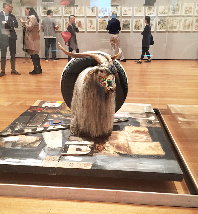
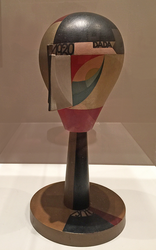
He also did sculptures- I loved this one so much:


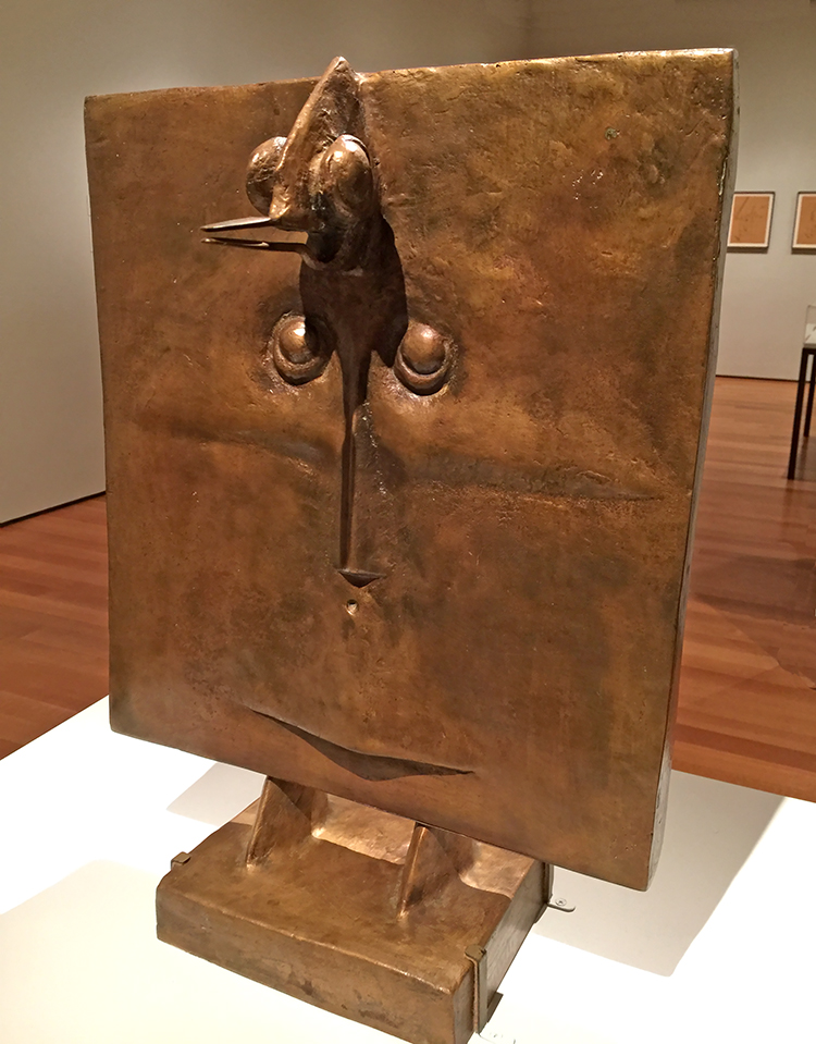
Bird Head – 1934-1935  – Bronze


Birds above the Forest, 1929 – Oil on Canvas.

Ernst began this painting by scraping pigments across the surface with a toothed plasterer’s comb. This technique is also called Grattage.

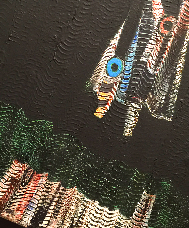
There is a similar painting using this technique by Max Ernst in the Kunsthalle in Hamburg – showing flowers made with those grated heads- I just love it so much.

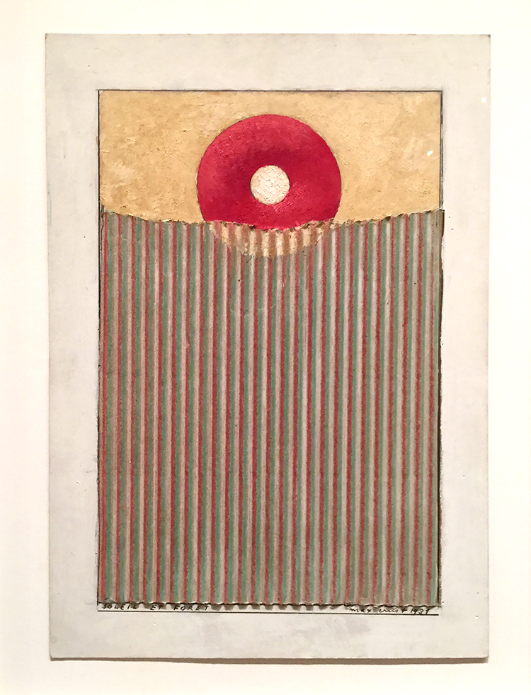
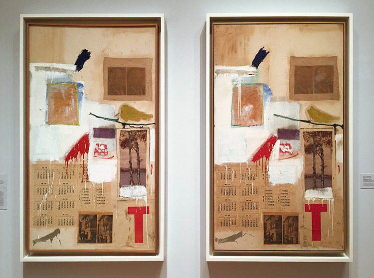
Sun and Forest, 1931 – cut-and-pasted cardboard with oil, gouache, and pencil on paper.

Kim and I called this one donut in a bag.

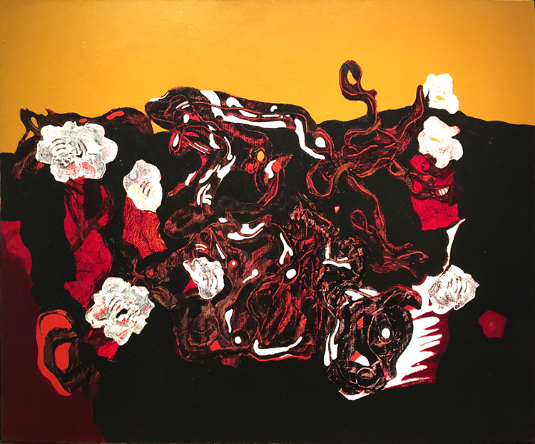
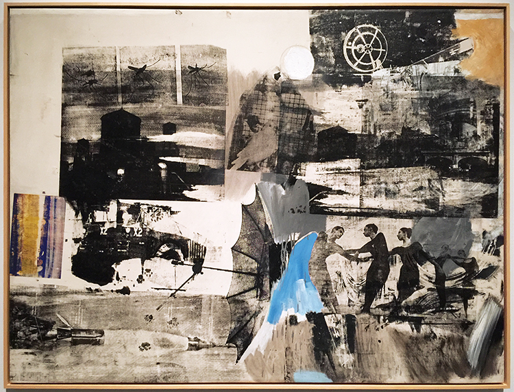
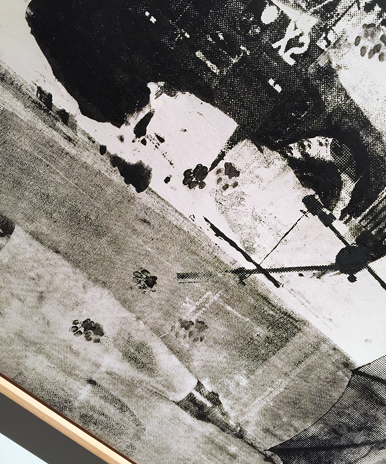
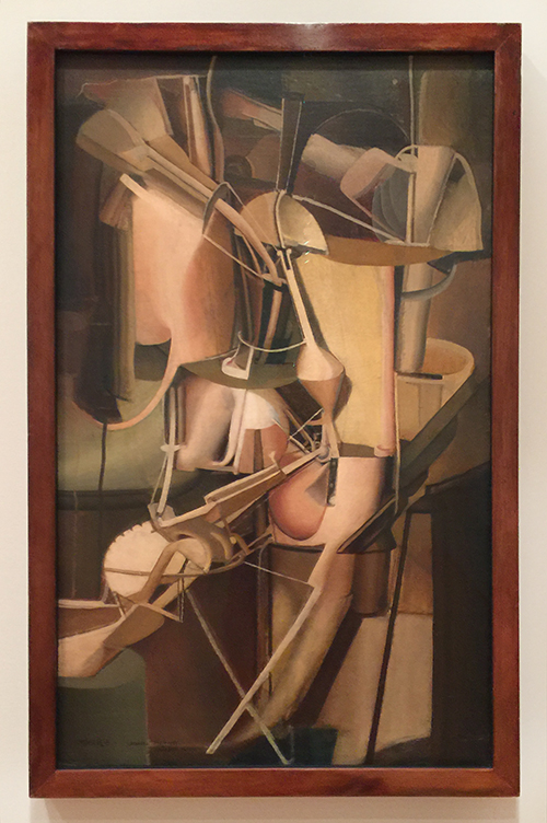
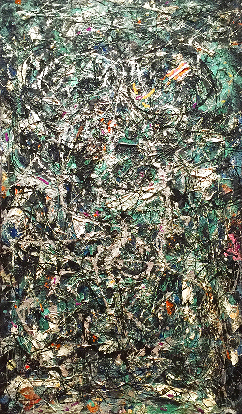
To the Rendezvous of Friends (The Friends become Flowers, Snakes, and Frogs), 1928 – oil

For this painting, Ernst built up paint in stages, then used grattage or scraping with hard-edged tools like spatulas and palette knives to expose the underlayers and create surface textures where exceptionally fluid paint is pushed to he tool’s edge.

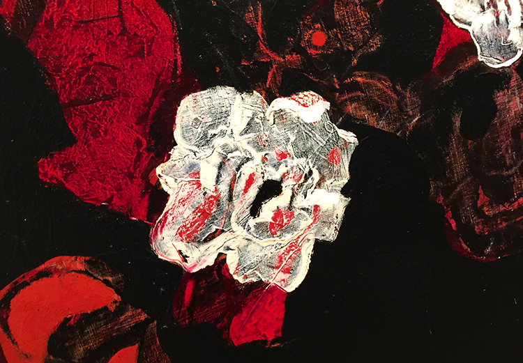
I love this – it is something I sometimes do in my art as well but of course working with acrylic paints, limits the time and amount of layers due to the fast drying time of acrylic paint.

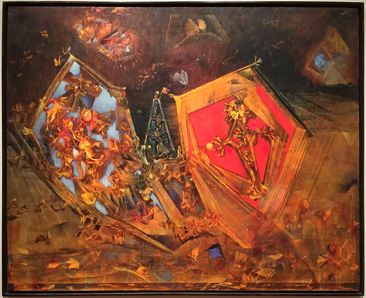
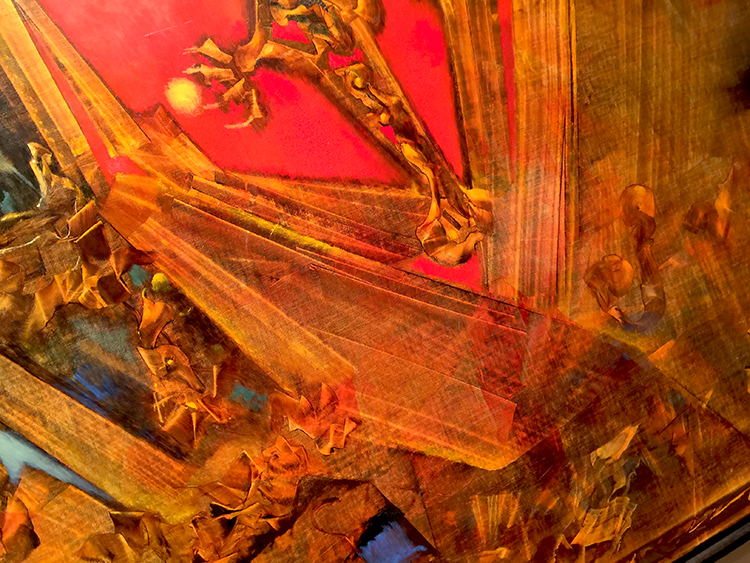
Mundus est Fabula (the world is a story), 1959 – oil on canvas

look at the amazing dimension and depth he created by using a squeege to scrape off the paint – soooo beautiful.

It made me so happy to see it!

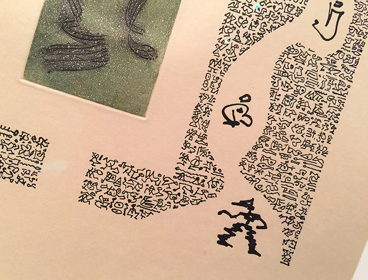
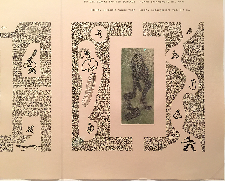
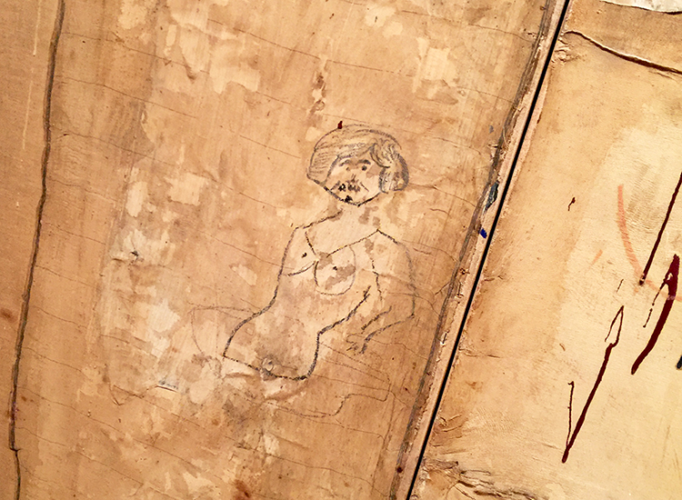
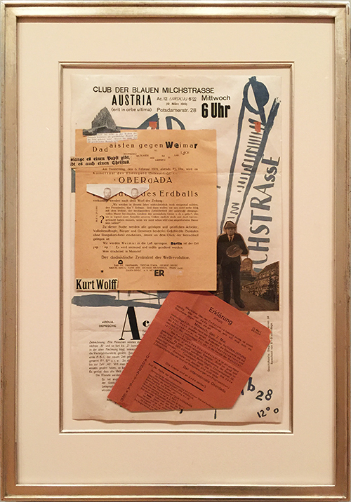
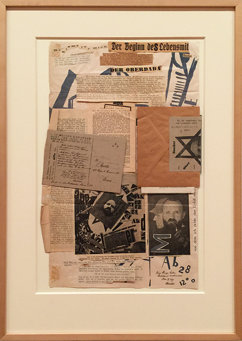
Erst also did a lot of book illustrations and I was especially mesmerized by his self invented hieroglyphic script. Isn’t that the coolest?

Another wonderful bronze!

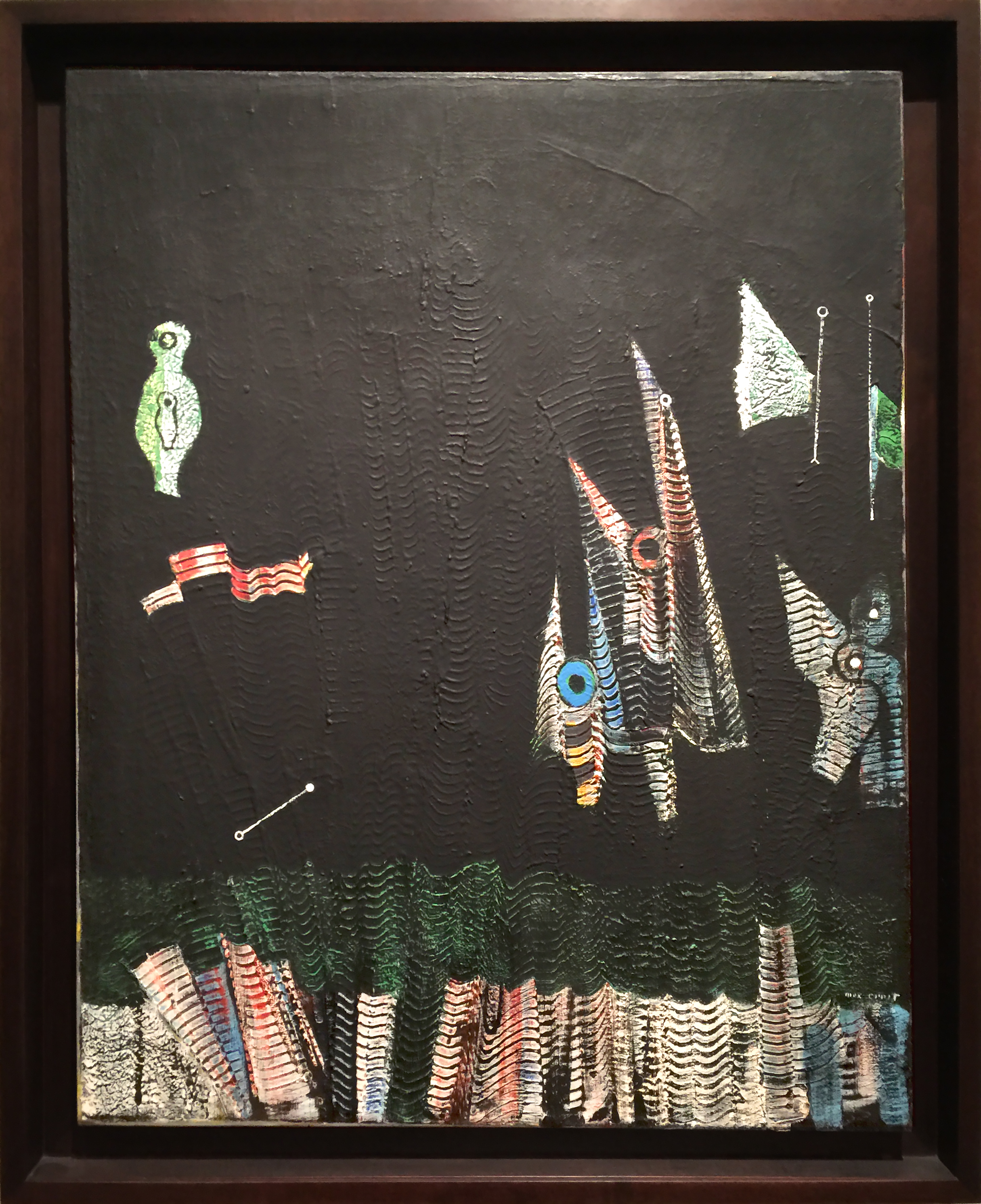
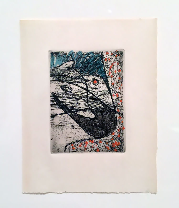
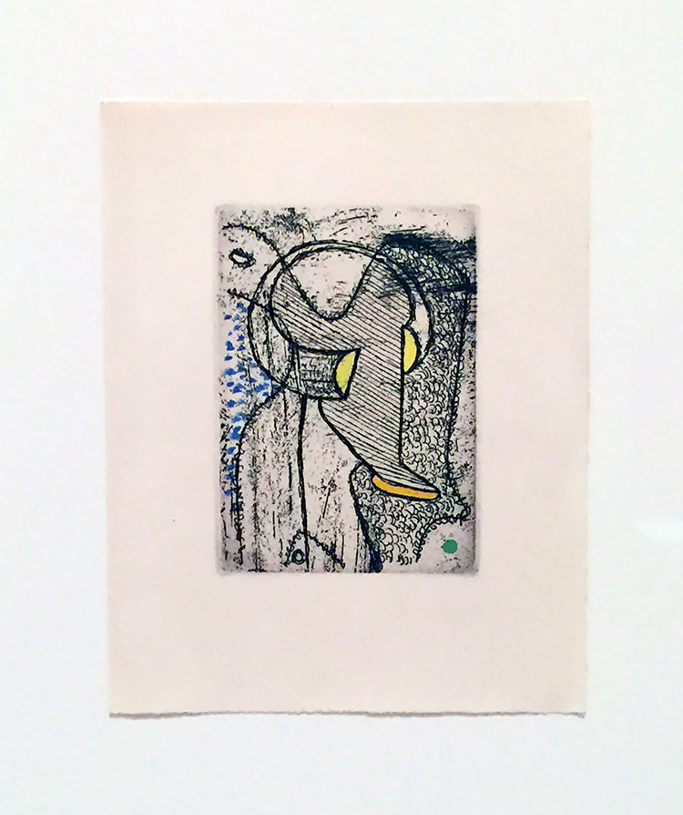
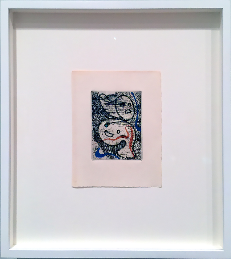
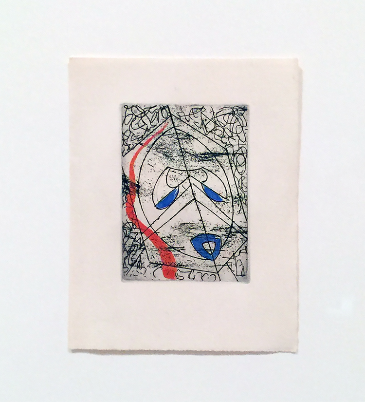
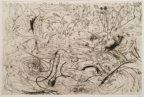
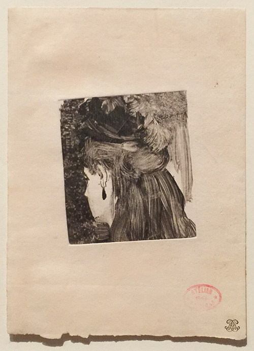
And last but not least those super tiny etchings (about ATC size) with watercolor and ink additions

A wonderful and inspiring Art Stroll for sure. I cannot wait to play with some of the ideas that popped up in my head while looking at his artwork. I hope you enjoyed it as well :)

Comments (2)

  • Sue Clarke

    |

    The World Is A Story…WOW!
    The “bagel in a bag”…LOL.
    I would love to have that last sculpture in my living room. 0000…so cute.

    Reply

    • nathalie-kalbach

      |

      I love that sculpture too – glad I made you smile Sue :)

      Reply

Leave a comment

Art Stroll: Making Space at MoMA

A couple weeks ago Natalya Aikens and I visited Making Space: Women Artists and Postwar Abstraction is the title of a MoMA Exhibition open until August 2017. It features the work of female artists from 1945 to 1968 and shows artwork from MoMA’s collection from over 50 artists. Paintings, sculptures, photographs, drawings, prints, textiles and ceramics.

Helen Frankenthaler “Trojan Gates” (1955) Oil and Enamel on Canvas

Frankenthaler thinned her pigments with turpentine so that they would soak directly into the canvas and stain it.

Louise Bourgeois “Self Portrait as Bird” (1945) Oil and Ink on cut board with rivets

Louise Nevelson “Big Black” (1963), Painted Wood

To create this sculpture, Nevelson stacked boxes against a wall and filled each compartment with found wooden scraps. She then covered the entire assemblage with black paint.

Bela Kolarova “Five by Four” (1967) Wood, paint, and metal paper fasteners

I loved this piece!


Left- Elaine de Kooning “Bullfight” (1960) Acrylic on Paper

Yayoi Kusama “No F” (1959)

Look at the detail of the piece – makes you want to touch it.

Anni Albers “Tapestry” (1948) Handwoven linen and cotton

Sarah Grilo “Add” (1965) Oil on Canvas

First time on view at MoMA. It was one of my favorite pieces and it made me sad to think that this would vanish again after the show in a storage space.

Lee Bonticou “Untitled” (1961)

Lee Bonticou lived in NY above a laundry and found the conveyer belt there. I love the organic yet mechanical piece and you cannot help yourself but look into the dark void.

Amazing!

Carol Rama “Spurting Out ” (1967) – Ink, Gouache, shellac  and plastic doll eyes on paper

This was interesting …and eerie at the same time.

Several thoughts :

  • It was so prominent that a lot of the female artists were spouses of  “famous” and permanently displayed male artists – in a way it must have been an exciting time to be a female artist- but also so hard to break through and be heard.
  • Who inspired whom btw?
  • Mostly only one piece of artwork was displayed by the artists making it seem as that is all the space there is for their amazing work to be displayed
  • MoMA, why not making real space for those artists instead of just a temporary exhibition space. Just display more of this artwork in your permanent collection galleries.
  • More Female Solo Exhibitions would be great – a lot of those artists have quite some scope of work – “Where Are All the Women” by Jerry Saltz is still good and valid read.

I will definitely go back and see it more in depth but I had a great time with Natalya and enjoyed looking at some of the artwork with different eyes, given the different medium she works with .

Making Space: Women Artists and Postwar Abstraction is on show until August 13, 2017 at MoMA


Comments (8)

  • Sue Clarke

    |

    I just love “Add”…such a delightful piece. Maybe it can hang in my living room in between being out in the gallery?

    Reply

    • nathalie-kalbach

      |

      Wouldn’t that be awesome to have? It should rather hang in our living rooms when vanish in the museum storage again.

      Reply

  • Stephanie

    |

    I heard about the exhibit on NPR. Looks like it was fab!

    Reply

    • nathalie-kalbach

      |

      Oh I bet that was interesting -might have to see if I can still find it on NPR

      Reply

  • Seth

    |

    Thanks for taking us along on the ride!

    Reply

  • Diane

    |

    Thank you for this post. Most interesting. Also like your observations about women artists.

    Reply

Leave a comment

Art Stroll: Rauschenberg Among Friends Part 2

As promised Part 2 of my visit of the Rauschenberg Among Friends Exhibition – you can read about Part 1 here. When you are reading this I have been already back to the show and have scheduled another visit next week …I am obsessed- HELP – LOL

“Ace”(1962) , Oil, paper, cardboard, paint-can label, umbrella, doorknob, fabric, wood, nails, and metal on canvas – on five panels

I love how reading the signage becomes the start of a scavenger hunt trying to find all elements mentioned on the panels.

“Black Market” (1961), Oil, watercolor, pencil, paper, fabric, newspaper, printed paper, printed reproductions, wood, metal, tin, street sign, license plate and four metal clipboards on canvas with rope, chain and wood suitcase containing rubber stamps, ink pad and typed instructions regarding objects to be given and taken by viewers

Black Market was first on view in Amsterdam in 1961 and viewers were invited to take out an object from the suitcase and replace it with their own and then make a drawing of their contribution on one of the clipboards. Unfortunately people were mostly just stealing the objects in the suitcase and so Rauschenberg withdrew his invitation. – I just love the concept and thought -so sad it didn’t work out!

“Pilgrim” (1960), Oil, graphite, printed paper and fabric on canvas with painted wood chair.

If you look closely you can see that Rauschenberg actually used the chair as a painting tool to drag down the paint in the canvas and then attached the chair as an collage element. It looks as if you are invited to take a seat to be part of the painting- but Natalya and I refrained from doing so – LOL.

Marcel Duchamp “Bottle Rack” 1960

Rauschenberg purchased this work for three dollars after he saw it in an exhibition, and then asked Duchamp to sign the work. Duchamp agreed and signed and left an inscription saying “Impossible for me to recall the original phrase” . Jokesters- LOL- I wonder how much this readymade art piece is worth nowadays.

I loved how the exhibition was laid out – and of course early morning hours are the best to ensure a more empty space.

“scanning” (1963) Oil and silkscreen -ink print on canvas

the canvas includes a photo of the Merce Cunningham Dance Company with Steve Paxton how lived with Rauschenberg when the piece was made.

The paw prints here were added by Sweetie, Rauschenberg’s pet kinkajou who strolled across the canvas while Rauschenberg was making it on the floor of his studio. He simply embraced the accident as part of the work. HA YES!

“Overdrive” (1963) Oil and silkscreen -ink print on canvas

I am so in love with this piece and the one below

“Estate” (1963) Oil and silkscreen -ink print on canvas

Rauschenberg started in the early 60s to use more and more readymade images into his paintings and visited Andy Warhol in the studio in 1962 to get an intro into the silkscreen technique. He had a friend destroy his stock of screens to avoid the pressure of repeating himself in his artwork.

I could look at them forever- and as you can see below the paintings are actually quite big.

“Volon” (1971)

Come on- admit…this makes you look at your boxes in a whole different way, no?

Untitled (1972) – Tape and cardboard boxes with rubber hose.

and so something that some people call trash becomes a piece of artwork – I love it!

“Sor Aqua” (1973) Wood and metal suspended with rope over water-filled bathtub with glass jug.

Rauschenberg found the inspiration for this piece in Venice – where he gathered found materials for a series of assemblages. The water- filled bathtub evokes the Venetian canals, the suspended tangle of rusted metal refers to aging, deteriorated surfaces throughout the city.

“Mirthday Man” (1997) Water-soluble inkjet dye and pigment transfer on plylaminate

You can find an x-ray of Rauschenberg which he called “self-portrait of inner man” and surrounded it with photographs he had taken over the year. Rauschenberg created this piece in one day on his 72nd birthday.

“Bible Bike” (1991) Tarnishes on brass, bronze and copper

The imagery and coloration in the metal painting series, Borealis, was produced through chemical reactions (which Rauschenberg called “corrosions”), sometimes with the addition of acrylic paint. Tarnishing agents, such as acetic acid and ammonium salts, are brushed or silkscreened onto brass, copper, or bronze surfaces, resulting in a muted range of colors: green, brown, or black, depending on the type of metal support. By painting or drawing with a tarnish-resistant medium before applying the tarnishing agent, the artist could create coloristic variations by contrasting the tarnished and untarnished metal.

I hope you enjoyed the Art Stroll- you can find all Art Strolls here on my website. But seriously if you are in NYC visit this exhibition – it is open until September 17, 2017.

Comments (1)

  • Sue Clarke

    |

    I just love “scanning” and the pet paw prints!
    Thanks for all the photos.

    Reply

Leave a comment

Art Stroll: Rauschenberg Among Friends Part 1

Last week Natalya Aikens, who is a wonderful artist, and I met at MoMA to see the Rauschenberg exhibition in the early hours. I have been looking forward to this exhibition for a couple months now since I am a huge admirer of Robert Rauschenberg’s work. That is also noticeable when you read my book Artful Adventures in Mixed Media as I have used some of his work in on of the chapters.

“Grand Black Tie Sperm Glut” (1987)

What I loved particularly about this exhibition was that it reflected the fact that Rauschenberg was a very social person and many of the people he met, artists, friends, lovers shaped his work and he fed off their company.

“Sue” (c. 1950), Exposed blueprint paper

The exhibition starts with blueprints created by and with artist Sue Weil, who was for a short while Robert Rauschenberg’s wife. One of them would lie down on a sheet of photo-sensitive paper and the other one would hold the bright lamp for a while to expose the image on the paper.

“Short Circuit” (1955), Combine: oil, fabric and paper on wood supports and cabinet with two hinged doors containing a painting by Susan Weil and a reproduction of a Jasper Johns Flag painting by Elaine Sturtevant

Rauschenberg was highly influenced by his teacher Josef Albers and the Bauhaus mentality to consider and focus on readily accessible and ordinary materials and to combine them.

“Charlene”(1954), Combine: oil, charcoal, paper, fabric, newspaper, wood, plastic, mirror, and metal on four Homasote panels, mounted on wood with electric light

Rauschenberg called those readily materials “real objects” – he included a letter from his mother and a man’s undershirt.

“Bed” (1955), Combine: oil and pencil on pillow, toothpaste, fingernail polish, quilt, and sheet, mounted on wood support
Rauschenberg recalled once that he could not afford to buy a canvas and so he decided to make a painting on a patchwork quilt given to him by the artist Dorothea Rockburne (she btw once said that when she was doing laundry she realized her quilt was missing and saw it later on again in this Piece :) ) . The pencil strokes on top of the pillow are very likely by Cy Twombly. Rauschenberg and Twombly were in a relationship and traveled together, making art.

“Rebus” (1955), Combine: oil, synthetic polymer paint, pencil, crayon, pastel, cut-and-pasted printed and painted papers, including a drawing by Cy Twombly, and fabric on canvas mounted and stapled to fabric
Rauschenberg gathered many of the materials in Rebus from and near his studio in Lower Manhattan. He used commercial paint samples, included a piece of a painting by Cy Twombly

and three of the drawings this series were also included in the exhibition

Cy Twombly

I loved seeing all the different materials and you really get a sense of a highly humorous person in Rauschenberg

a person who doesn’t take himself too serious- what a wonderful streak.

“Factum I ”  and “Factum II” 1957, Combine: oil, ink, pencil, crayon, paper, fabric, newspaper, printed reproductions, and printed paper on canvas
Rauschenberg created these two paintings, repeating the same falsely spontaneous brush strokes in both. Rauschenberg wanted to show that neither impulsive painting or planned painting alone make an artwork, but that it rather is a mix of intention and chance, impulsive gestures and thought.

“Monogram” (1957-59), Combine: oil, paper, fabric, printed paper, printed reproductions, metal, wood, rubber shoe heel, and tennis ball on canvas with oil and rubber tire on Angora goat on wood platform mounted on four casters
This mixture of a painting, sculpture and assemblage is probably one of the best known works by Rauschenberg, seeing it in person was definitely a treat as a picture is not really capturing it.

“Summerstorm” (1959) Combine: oil, graphite, paper, printed reproductions, wood, fabric, necktie, and metal zipper on canvas
I loved going to this exhibition with Natalya as she uses a lot of plastic and fabric in her artwork she was looking at all pieces in different ways then I did – and pointed out that the tie was not attached, she wondered if it was meant to be to flap in the wind – and once we saw a tie in this Combine – we saw ties in Rauschenberg’s work everywhere :)

“Painting with Grey Wing” (1959), Combine: oil, printed reproductions, unpainted paint-by-number board, typed print on paper, photographs, fabric, stuffed bird wing, and dime on canvas
This was one of my favorite pieces in the exhibition.

Niki de Saint Phalle “Shooting Painting American Embassy” 1961, Paint plaster, wood, plastic bags, shoe, twine, metal seat, axe, metal can, toy gun, wire mesh, shot pellets and other objects on wood.

“Each of the colours appears to have dripped down the canvas from a hole, which exposes a dark surface beneath the white. Saint Phalle made this work by shooting with a gun at bags of paint that were placed on the canvas. Before the shooting began, the surface was covered with white plaster and pigment to resemble a blank canvas. As the shooting commenced, the bags would be punctured and the coloured paints released to flow and splash.” The piece is part of a series and in which artist would shoot at the pieces as a performance. Robert Rauschenberg as well as Jasper Johns took aim at this painting.

And what is Natalya laughing about here? At a framed letter and the work is called “This Is a Portrait of Iris Clert if I Say So” (1961) Telegram

This telegram was Rauschenberg’s submission to a show of portraits of the Parisian gallerist Iris Clert in 1961. Rauschenberg realized about two works before the show, that he forgot to make the work. And so…he made a conceptual portrait via telegram sending it to Iris Clert, one whose maker shifts depending on the “I” who reads it. – CLEVER guy- LOL. I guess he got away with it ;)

Now there was so much more in the Art Stroll and since I am such a big fan of Rauschenberg I decided to show it in two parts- so another one on this is coming in a week. Hope you enjoyed the Art Stroll so far. If you are anywhere close to NYC go and see this exhibition – seriously! It is open until September 17, 2017.

Comments (2)

  • Sue Clarke

    |

    I of course like “Sue” and have used that paper for flowers and shells but not people (too small).
    I love the story of the quilt. LOL

    Reply

    • nathalie-kalbach

      |

      LOL- of course Sue ;) Oh how cool you used it before- I want to – I need to get this. Yeah the story of the quilt was hilarious – there were several of those stories that made me really laugh -he must have been such a funny- also the good kind of prankster :)

      Reply

Leave a comment

Art Stroll: A Revolutionary Impulse – MoMA

A couple weeks ago my friend Julie Fei -Fan Balzer was in town and we had an awesome day filled with good food, chats, laughter and of course…Art. We went to MoMA to see A Revolutionary Impulse – The Rise of the Russian Avant-Garde – a title that couldn’t make it in it’s entirety into my blog title- LOL.

“During the early 1910’s under the tsarist autocracy (in Russia) that had ruled for three centuries, avant-garde artists sought to overthrow entrenched academic conventions by experimenting with complex ideas that would transform the course of modernist visual culture. In 1915 as World War I raged, an abstract mode of painting called Suprematism abandoned all concrete pictorial references….With the October Revolution of 1917, Lenin’s party took command. Avant-Garde artists put individual expression aside and developed a structured abstract language called Constructivism which they hoped could be embraced by the masses. Constructivists rejected easel painting in favor of practical objects like ceramics, posters and logos. …By the late 1920s, the government, now headed by Stalin, had placed restrictions on all aspects of life, including the arts, and was commissioning artists to produce propagandistic books, posters and magazines touting Soviet achievement….This exhibition spans the years 1912 to 1935…Conceived in response to changing socio-political and artistic conditions, these works probe the many ways and object can be revolutionary.” From MoMA’s wall text about the exhibition

Olga Rozanova, War, 1916 – Linoleum cut illustrations out of a a book with ten illustrations.

The imagery for those lino-cuts is influenced by the abstracted forms of Cubism and Futurism but also by traditional Russian motifs. I was intrigued by the very simplistic way she created figures with crosshatching and just some hints of form here and there which your eye completes yourself as a person or else.

Lyubov Popova, 1914, Subject from a Dyer’s Shop – Oil on Canvas.

Note that Lyubov is another woman …

Kazimir Malevich, Samovar, 1913, Oil on Canvas. “A year later Malevich was painting cubes and lines and circles and balancing them in ways that had no relation to anything but geometry and the will to make something new. Malevich called his art “Suprematist,” hoping that it would have supremacy over forms found in nature.”

Vasily Kandinsky, Improvisation, c. 1915 – Watercolor and pencil on paper

Various artist: Natalia Goncharova, Mikhail Larionov, Nikolai Rogovin, Vladimir Tatlin -Mirskontsa (Worldbackwards)-1912

These books were made with wall paper and I really love the shapes  too.

Natalia Goncharova Spanish Dancer –(c. 1914) . Isn’t this beautiful?

And then things changed…


Jean Pougny, Suprematist Relief-Sculptures, 1920s – Painted wood, metal and cardboard, mounted on wood panel. I did love this one – I wish it wasn’t behind a glass

Lyubov Popova, Six Prints ca. 1917-19 – linoleum cuts with watercolor and gouache additions

A pioneer of the avant-garde, Popova developed a style in the late 1910s that combined floating forms inspired by Cubist collage and by Suprematism. She called this print series – there are four more- “painterly architectonics” . She wanted to depict layered shapes, so that they seem to be continually shifting and rotating.

Varvara Stepanova, Figure, 1921 – This is in MoMA’s permanent collection and I always loved this one. BTW …another woman :)

Aleksandr Rodchenko, Non-Objective-Painting 1919, Oil on Canvas


I love the crosshatching and the expanding lines.

Naum Gabo, Head of a Woman, 1917-20 – Celluloid and Metal

Nikolai Suetin – 1923

In 1917 the Bolsheviks seized control of the government and took over the State Porcelain Factory which used to manufacture porcelain for tsars in Petrograd (now St. Petersburg). Suetin a Suprematist artist was invited to make decorative designs for existing porcelain found in the factory. These ceramics, once meant for imperial tables, were now reimagined for the proletariat.

I would totally wanna have this set and use it – and I find it so interesting how the forms and shapes painted on canvas speak so much more to me on this tea set.

How cool is this pop-up parachute ? The reflection of it is also a bit funny – guess I made Julie a new outfit ;)

I enjoyed this exhibition. The most eye catching fact for me was just how many women were in this exhibition since modern women artists are very underrepresented at MoMA. I regret that the exhibition is coming to an end, as I feel there is so much about this that I didn’t quite grasp and I more or less just floated around in this exhibition with a semi knowledge of the political time the art was created in Russia and a lacking mind for the ideas behind Suprematism and Constructivism. But you know what…I will be ok …I was still inspired ;)

Comments (2)

  • Sue Clarke

    |

    That tea set is great and Julie’s new outfit is interesting. Glad to see that you two had fun with art again!

    Reply

Leave a comment

Art Stroll: Francis Picabia at MoMA

Last month I went with some of my friends to the opening of Francis Picabia “Our Heads Are Round so Our Thoughts Can Change Direction” at MoMA

Dances at the Spring II

I had seen a couple of Picabia’s paintings before and love them a lot but to be honest, I didn’t know much of him. My friend Adam, was totally excited because he is a huge Picabia fan and told us, he was waiting for this exhibition for a long time.

I was pleasantly surprised and loved loved loved the exhibition. Every single one of the rooms in the exhibition offered something different in style and was often challenging.

Francis Picabia, 1913, Udnie (Young American Girl, The Dance), oil on canvas

The exhibition covered Picabia’s entire career. He was born to wealth in 1879 and apparently all he did was painting…and partying. He had a lot of humor and was by many, including himself called a Prankster.

Arriving in the next room all the artwork became very industrial, mechanical and added different materials to the flat canvas. He was also a big part of the Dada-Movement.

Très rare tableau sur la terre (Very Rare Picture on the Earth) (1915) Oil and metallic paint on board, and silver and gold leaf on wood, including artist’s painted frame

Amorous Parade, Francis Picabia, 1917- Oil, gesso, metallic pigment, ink, gold leaf, pencil and crayon on board.

And then just as you got used to it …everything changes once again

and again

Animal Trainer, Francis Picabia

The above painting is seen as one of Picabia’s typical jokes and mocking fine craftsman ship. The hand of the figure shows prominently bridges – a typical sign of using stencils – and the dogs as well are created with the use of stencils. This was frowned upon on when he painted this – which was in 1923 and not as he also placed as a joke onto the canvas in 1937. Also check out what the yellow dog is doing in the background.

I loved his playful use of unusual materials in the next gallery -like matches and canvas wedges, brushes, coins. It’s been all done before – it is fun – it is humorous and amazing.

Flowerpot , Francis Picabia, 1924-25. Enamel paint, Ripolin paint-can lids, brushes, wooden stretcher wedges, string and quill toothpicks on canvas.

One gallery was dedicated to his Transparencies 1927 – 1930. I also loved all the different frames- a topic I have talked about in many other posts . They are probably still original because museums weren’t that interested in his artwork up and until the 50s – and so fortunately they did not get destroyed to go with the “museum style frames”

Working in his large new studio in Mougins, Picabia painted his Transparencies by alternating layers of paint with layers of resinous varnish. This process allowed him to lay linear motifs atop one another while keeping them distinct. These richly layered, multi referential compositions interweave an often dizzying array of con tour images drawn from such diverse sources s Renaissance painting, Catalan frescoes, and the popular culture of the day.


Mélibée

Picabia’s unorthodox application of unusual materials sometimes resulted in surfaces that could be interpreted as damaged or in need for restoration. In fact, these effects were often deliberately induced by him. In Portrait of a Woman- shown below, Picabia enhanced some of the bumps with dark paint, purposefully amplifying the paints’s already pronounced topography.

Portrait of a Woman, Francis Picabia, 1935-37 -Oil on Canvas

Isn’t that amazing? And then…it changes again

Spring, Francis Picabia, 1937-38/c.1943 . Oil on wood

And again

The Adoration of the Calf, Francis Picabia, 1941-42, oil on board.

Although Picabia was a resolutely apolitical artist, it is difficult not to read this painting and its cynical vision of the worship of false idols as an engagement with contemporary politics.

Symbol, Francis Picabia, 1950, Oil on canvas

“If you want to have clean ideas, change them as often as you change your shirts.” (Francis Picabia). Our life changes, in that I guess we are consistent and so was Francis Picabia in his art.

If you are in the area make sure to visit this exhibition before it closes in March. I will definitely be back to see it once more :) I hope you enjoyed this little Art Stroll.


Comments (2)

  • Linda Faber

    |

    Thanks, again, Nathalie, for a great tour of an intriguing exhibit. I love his abstract pieces! This artist is new to me and I wish I could get up to NYC (oh but it’s too cold for me now) to see it. And….last year you introduced me to Anselm Kiefer….whose name has been popping up in so many places, and is now on exhibit in Miami! As a retired teacher myself, I love getting these inspirations and knowledge from you….and I know it must be a kick for you as well.
    Linda

    Reply

    • nathalie-kalbach

      |

      thank you Linda, for joining me :) Ha- it is cold here right now …not my favorite thing about NYC ;) Ohhh I have to come to Miami for the Kiefer Show- he is one of my very very favorites!!! Have a gorgeous week, Nat

      Reply

Leave a comment

Art Stroll: Dadaglobe Reconstructed at MoMA

KalbachDadaglobeCollage

A couple weeks ago Andrew Borloz (check his amazing new stencils out!) and I met in the City for a an extended Art Stroll, to be precise – three art strolls and this is the first of them.

KalbachDadaglobe01

Our first stop was the Dadaglobe Reconstructed exhibition at MoMA. Dada is an Anti-Art Movement founded in 1916 in Zurich which spread all over the world. Dada embraced the idea of art as protest and rejected the idea of art as commodity. The world had changed after WWI and artists were ready to break down hierarchy, breaking rules and thinking about what was going on in the world. Usual themes of Dada were politics of the time, new technology, ideas of authority – striving to equalize, turning everyday objects into art. Dada revolutionized Modern Art, anything was possible, mixing ideas, embracing everyday objects as potential art materials, using collage etc.

Dadaglobe was planned by Tristan Tzara, one of the founders of the Dada Movement. He wanted to create a book to be published in 1921 and invited 50 artists from 10 different countries to submit artworks for the book. The work was to be mailed and usually in the size of the later book pages. Reaching out this way was in itself revolutionary as it was a collaboration of international exchange in a time of Nationalism where many resentments against other nations existed and some countries weren’t allowed to travel everywhere. Unfortunately for financial and other reasons the book was never published, but what remained were some of the artwork that was sent in, and the cataloging how Tzara envisioned the layout of the book and the order of the artwork.

KalbachDadaglobe02

In his solicitation letters Tzara instructed his fellow artists to provide 2-3 reproductions of their work, drawings, a book page with text and a photograph of themselves which they could alter freely. The last part of the instructions was the one that the artists seemed to have the most fun with and went wild.

KalbachDadaglobe03

Rastada Painting, 1920 by Francis Piciabia, cut-and-pasted printed paper on paper with ink

In Picabia’s self portrait he describes himself as a failure, a wag and a gigolo and represents himself as a clown .

KalbachDadaglobe04

Francis Picabia, 1920 Ink and watercolor on paper

In this drawing Picabia created an calligraphic signature and then signs it , mocking conventions of authorship and authenticity.

I had to keep in mind that all the artwork in this exhibition was not made for the wall, they were made for reproduction in book form and the exhibition shows more or less the Making of a Book.

KalbachDadaglobe05

Portrait of Sophie Taeuber with her Dada Head by Nic. Aluf, ca. 1920 –

I love that the self portrait shows her with the artwork below – it was wonderful to see the original work

KalbachDadaglobe07

Dada Head by Sophie Taeuber, 1920 Oil onturned wood

which she then also had painted. Again I loved that they included the original artwork which she submitted as a photograph for the book.

KalbachDadaglobe06

Dada Composition (Flat Head) by Sophie Taeuber, 1920, Oil on Canvas

Compressing her sculpture onto the plane of a canvas – flatten three dimensions into two.


KalbachDadaglobe09

Bride by Marcel Duchamp, 1912, oil on canvas

Submitted was a photograph of Duchamp’s painting.

I really loved the pieces below- one of the reasons is that the german text is actually quite funny – I know… unfair ;)

KalbachDadaglobe11

Dada Milky Way (Dada Milchstrasse) by Johannes Bader, ca. 1919-1920, cut- and-pasted printed paper sand cut-and-pasted gelatin silver print on printed paper

KalbachDadaglobe12

Advertisement for Myself: Dada Milky Way by Johannes Baader, 1920, cut-and-pasted printed paper and ink on printed paper

Baader wrote Hannah Höch after he received the invitation by Tzara that he was very excited about this clever and good idea for a collaboration. How cool is that?

KalbachDadaglobe13

Manifesto W5 by Max Ernst, 1920, cut-and-pasted printed papers on colored paper

This is my favorite- I love Max Ernst and his humor – he is one of my favorite artists and a lot of the techniques that we as Mixed Media Artist use were actually invented by him. The above work says “Speak loud! Be brave!”

KalbachDadaglobe16

The Human Eye and a Fish, The Latter Petrified by Johannes Theodor Baargeld, , 1920, cut-and-patered paper, ink and pencil on paper

It was a fun exhibition and I loved that the movement of Dada and the projects for Dadaglobe got many later very famous artists inspired and trying new things and approaches to their art. That is why collaborating with other artists can be such an rewarding and inspiring thing to do!


KalbachDadaglobe17

And then Andrew and I continued our Art Stroll uptown to the Guggenheim Museum…but that is a different post :)

Hope you enjoyed the stroll.

Comments (2)

  • nurse-ratchet

    |

    Imagine, an art lesson relaxing in bed on a Saturday morning! Awesome, as always my FLGL❤ And thank you for introducing me to Andrew’s stunning art and stencils?

    Reply

    • nathalie-kalbach

      |

      oh that sounds like a great saturday morning my sweet Canadian lady :))) Glad you liked it and yes- Andrew’s stencils are amazing!!!

      Reply

Leave a comment

Art Stroll: Jackson Pollock – A Collection Survey at MoMA

KalbachPollock Collage

A couple months ago I went to MoMA and saw this wonderful exhibition of Jackson Pollock’s work tracking his artistic development from the 1930s, when he made loosely figurative images , to the early 1950s, when he pioneered the radical abstractions for which he is best known by pouring and dripping paint onto canvas or paper. It was a wonderful exhibition and I loved seeing the evolution but also getting an insight of how he took certain things further and further and how some of his early elements morphed into something more abstract or vanished in the end.

KalbachPollock01

Jackson Pollock, Untitled (Sheet of Studies), c. 1939-42, Black colored pencil on paper

KalbachPollock02

Jackson Pollock, Mask, 1941, oil on canvas

KalbachPollock08

Jackson Pollock, Untitled (Animals and Figures, 1942, Gouache and ink on paper

Drawing was an independent medium for Pollock – so his sheets were never studies for paintings. Yet you can see similarities to his paintings – like in the one below – The She Wolf . Vibrantly colored lines that are laid on top. Fusing two different layers was a strategy Pollock would continue to develop over the next several years.

KalbachPollock07

Jackson Pollock, The She-Wolf, 1943, oil, casein and gouache on canvas

He began covering the canvas with a layer of multicolored splatters, washes and drips and then superimposed the black outline of the wolf, whose head faces left. Finally he added thick white lines to highlight her shape and dense areas of gray-blue at the edges to bring further relief.

KalbachPollock09

Jackson Pollock, Stenographic Figure, ca 1942, oil on linen

KalbachPollock05

KalbachPollock04

Screen prints 1943-1944 – Pollock experimented with screen printing in this time and worked briefly at a commercial silkscreen workshop in 1943. These screen prints above predate his first abstract “drip” paintings at least 2 years. Apparently Pollock and his wife artist Lee Krasner used those screen prints as greeting cards!

KalbachPollock03

Painting, ca. 1944, Gouache on plywood

KalbachPollock10

Full Fathom Five, 1947, oil on canvas with nails, tacks, buttons, key, coins, cigarettes, matches, etc.

This is one of Pollock’s first “drip” paintings. While its top layers consist of poured lines of black and shiny silver house paint, a large part of the paint’s crust was applied by brush and palette knife.

The nails, tacks, buttons etc. are all encrusted in the paint and add to the texture.

KalbachPollock11

Untitled, c. 1944-45, engraving and drypoint

KalbachPollock12

Gothic, 1944, oil on canvas

Pollock told a critic that this composition was based on Pablo Picasso’s 1907 masterpiece, Le Demoiselles d’Avignon. Just a whisper of this inspiration piece, yet …if you know it you can see it …and still it is something totally new and Pollock!

KalbachPollock13

KalbachPollock14

Number 1A, 1948, oil and enamel paint on canvas

KalbachPollock15

I love how you can see his fingers on the left – the hand of the artist- it makes you look for these things in all of his drip paintings.


KalbachPollock17

One: Number 31, 1950, Oil and enamel paint on canvas

KalbachPollock18

Untitled, c. 1950, ink on paper

this makes me want to fling some ink :)

KalbachPollock19

White Light, 1954, Oil, enamel and aluminum paint on canvas

This is one of Pollock’s last paintings and the only one he completed in 1954- he squeezed paint directly from a tube on the canvas – also used a brush to create subtle marbling effects by manipulating wet paint in certain areas.

It was so inspiring and wonderful – the texture and the vibrancy of the colors – and of course – do not forget the scale.

I hope you enjoyed this little stroll – until the next one.


Comments (3)

  • Sue Clarke

    |

    One of my favorite art pieces that my son has made is a Pollack-like painting that he did in elementary school. Delightful texture.

    Reply

  • Joi @RR

    |

    Such incredible texture…. loved seeing these Nat. Thank you.X j.

    Reply

  • stephanie

    |

    great images to see his early work

    Reply

Leave a comment

Art Stroll: Edgar Degas – A Strange New Beauty at MoMA

KalbachDegas Collage

In March, I went to the opening of Edgar Degas – A Strange New Beauty at MoMA . Honestly I am not the biggest Degas fan – I mean – I like his paintings but not in a geeky “ohhhh I looooovveee” kinda-way. But …I was really surprised how much I loved the exhibition because it showed Degas experimenting phase with monotypes in the late 1870s and how that lead to his later so famous signature painting style.

A monotype is a hybrid between a drawing and a print. It is a drawing that is printed – Degas painted on copper plates with ink, or covered a copper plate with ink and painted into it, put paper on it and run it through a press.

KalbachDegas14

The Jet Earring – 1876-77 – Monotype on paper

But furthermore, Degas would often make a second pull –  a so called ghost print and then enhance that one with pastel.

KalbachDegas02

KalbachDegas03

KalbachDegas04

Now one of the coolest things of the exhibition was that the curators pointed out where to look even closer and provided a magnifying glass to do so.

KalbachDegas05a

“Make a drawing, begin it again, trace it, begin it again, and retrace it” – Edgar Degas

KalbachDegas01

Degas also experimented using oil instead of ink for his monotypes and then enhancing again the ghost prints with pastels.

KalbachDegas06

River Banks, 1890 – Pastel over monotype in oil in paper

KalbachDegas12

Wheatfield and Line of Trees, 1890 – Pastel over monotype in oil on paper

KalbachDegas07

Two Dancers,1905 – Charcoal and pastel on tracing paper

KalbachDegas09

Here is the monotype – the first print .

KalbachDegas08

And the ghost print enhanced with pastels.

Three Ballet Dancers, c. 1878

KalbachDegas10

At the Theater: The Duet – 1877-79 – Pastel over monotype on paper

KalbachDegas11

The Café-Concert Singer, c. 1876 – Pastel over monotype on paper

KalbachDegas13

I was fascinated by Degas’ way of seeing the monotypes as a process opening up so many more possibilities – what a great exhibition to explore his process and his grab for the shiny object. If you are near NYC – go and visit it- it is still open until July 24th, 2016  and I will for sure stroll through it again before it closes.

Comments (6)

  • CarolynB

    |

    Fascinating! Thanks for the exhibit tour and insights into the artist’s processes.

    Reply

    • nathalie-kalbach

      |

      So glad you enjoyed it Carolyn! have a wonderful weekend!

      Reply

  • JoAnn

    |

    Thank you for sharing – love being able to visit a museum through your eyes.

    Reply

  • Gayle

    |

    Thank you Nathalie for this informative museum tour – I didn’t know the extent to which Degas produced and modified his monotype prints. Whenever I saw the black and white works in articles about this artist, I presumed they were simply charcoal studies for his paintings. I’ve learned so much art history from reading your blogs and of course, can’t say enough about all your mixed media tutorials and info.- such a wonderful resource!

    Reply

Leave a comment