
Hello from my Creative Squad! Today we have a post from Linda Edkins Wyatt sharing her super power – recycling! That’s something we could all do more of :) Linda is using my Art Nouveau Wallpaper and Tokyo stencils and this month’s theme: Super Power – this month we are joining Creative JumpStart 2020 and exploring our Artistic Super Powers. It could be your unique technique or style, the way you like to use a medium or tool, or maybe your way of approaching artmaking. What is yours and show us how you use it.
What’s My Superpower? Recycling!
For the New Year and new decade, Nat had us thinking about what our art superpower is. As a mixed media artist, I think of myself as a “jack of all trades, master of none” since I dabble in any and all art forms. So, choosing an art superpower was hard. I paint, draw, make jewelry, stencil, stamp, design fabrics, build stuff, putter in PhotoShop®, take photos and pretty much try all kinds of art. None of my art skills are quite at a superpower level so I was stumped. In both my daily life and my art life, I love to recycle and often repurpose bags, boxes, packaging and other materials into my artwork. With that in mind, I decided to embrace recycling as my superpower and use recycling to showcase Nat’s new stencils from StencilGirl®.
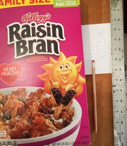
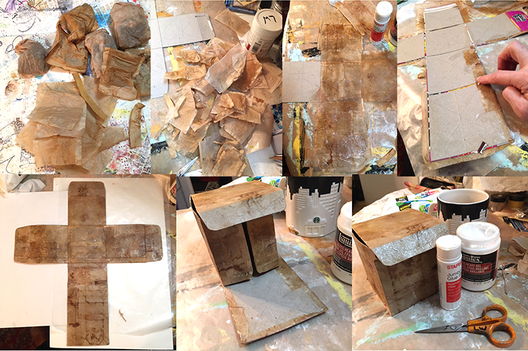
I save wrapping paper, newspapers, magazines, ribbons, teabags, strings, packaging materials, and all kinds of boxes, especially cereal boxes, which I often use to make journals, tags and ATCs. This time, I pulled a family-size empty Raisin Bran box out of my recycling stash and started thinking about making a gift box or Artist Trading Cube.
I decided to make a small sketch of a cube on paper to figure out how the six sides would fit together and where the folds, tabs, and cuts should go. Once that was done, I drew it to scale on the inside of the opened Raisin Bran box, designing a 4” cube. In pencil, I marked the areas that I would keep with “OK” and put an X through the sections I would cut away. I left some tabs to tuck in at the sides and top.
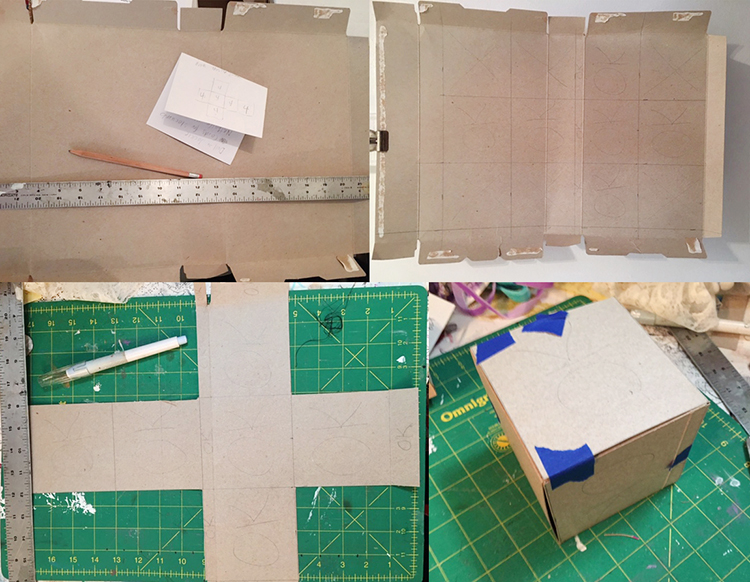
Using a Cricut exacto knife and my green cutting mat, I very carefully sliced the cereal box according to my plan. The 4” square box that emerged, once I cut and folded it, was a little flimsy, so I made a duplicate, then glued the colorful sides together. I also cut the interior pieces just a little smaller (about 1/16” smaller on all sides) so that there would be less bulk when I folded the sides and flaps. Once the piece was dry, I folded the box up carefully to be sure it was designed properly. (I kept thinking of those Iowa IQ tests we took in elementary school where they gave you a flat shape made of dotted and solid lines and ask you what it would be as a 3-dimensional object. My art brain was kind of exploding but I pushed on ahead.)
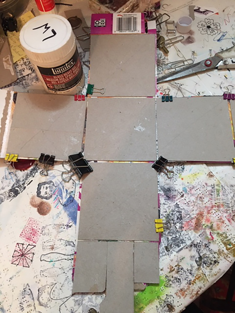
Structurally, it worked out well: the angles were 90 degree and it all fit together even better than I expected. No wonky edges or crooked sides!
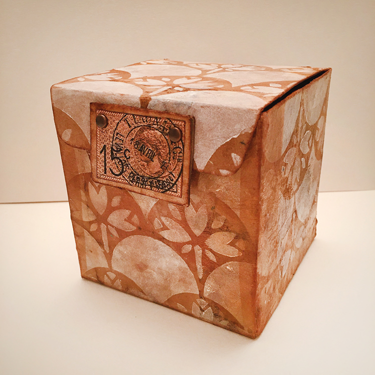
Now for the fun part…decorating my little Raisin Bran box! I decided to double the recycling fun and glued recycled (dry and empty) teabags over the gray box shape. For this project, I used bags from black tea, but I often use turmeric tea or black cherry for color variety.
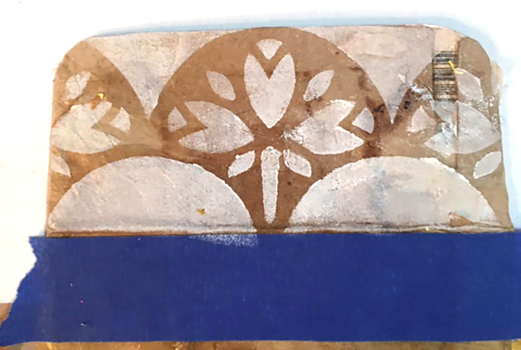
Next, I tested the new stencils. On an interior flap, I used Titanium White Liquitex Basics white acrylic and sponged it through the Art Nouveau Wallpaper stencil. I loved the effect, and decided to use that technique and stencil all over the exterior sides of the box.
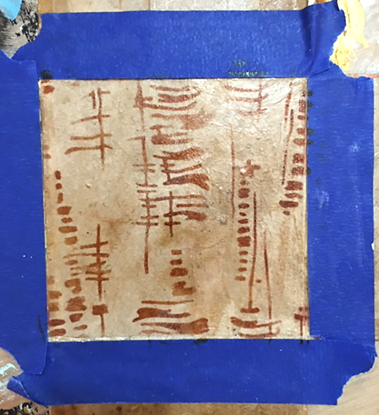
I also wanted to test the new Tokyo stencil, so I taped off the section that would be the interior bottom and tested the Tokyo design with sepia Archival ink on a fingertip dauber. That looked great too, so I decided to use the Tokyo design throughout the inside.
I had a little “oops” sad moment when I realized that I had stenciled the Art Nouveau Wallpaper stencil going the wrong direction on some of the exterior panels. I didn’t mind that the left and right sides were upside down (it added a little visual interest) but the very front was also upside down!
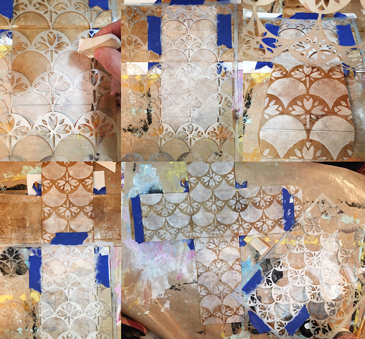
Rather than giving up, I decided to cover the upside-down area of the front with sepia Archival ink. It matched the teabag color perfectly and covered the imperfectly stenciled section perfectly! Later, I carefully positioned the stencil (facing the correct direction this time!) and again used white paint with a cosmetic wedge to reapply the Art Nouveau Wallpaper stencil.
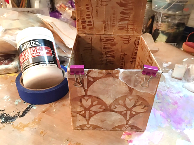
I glued the box and tabs together with Liquitex gloss heavy gel, used small clips and little pieces of waxed paper to keep the clips from sticking to the box, and left it overnight to dry. I also added some extra strips of teabag on the untabbed sides to reinforce the box.
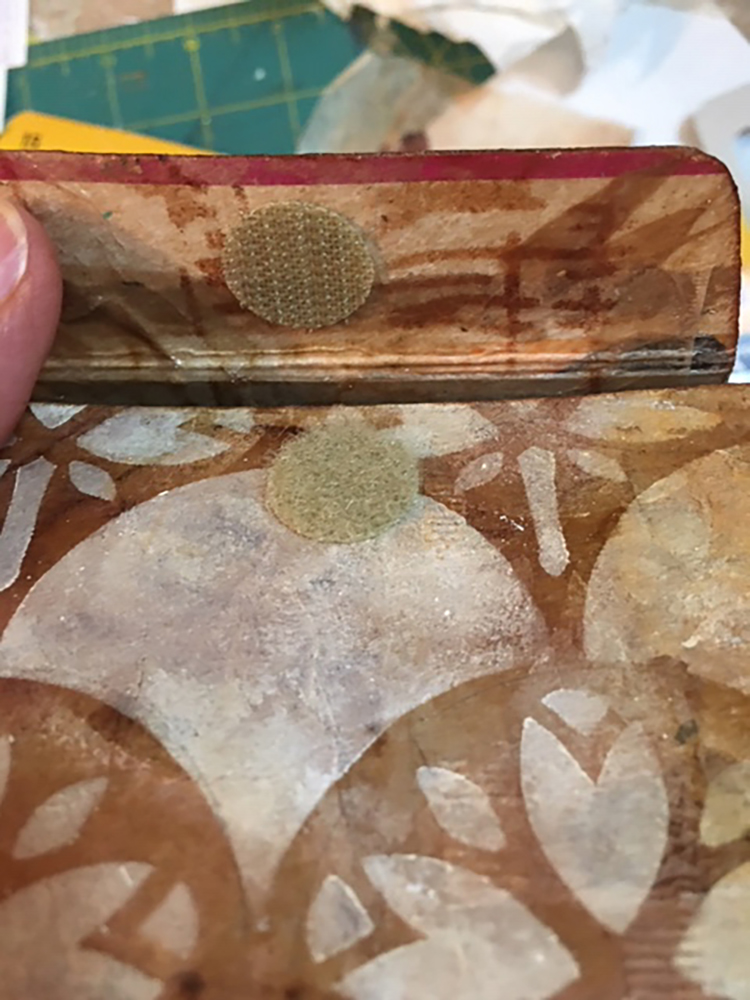
It needed a closure and I thought about what style to use. I could have simply tucked the top front tab inside the box and called it done…but I didn’t. Since the box is cardboard, I also didn’t want to use something that would wear out, shred or rip over time. The perfect solution was sticky-backed Velcro. I chose some round pieces of tan Velcro from my stash, which matched quite well. I aligned each piece of Velcro carefully, removed the backing, and pressed it in place. It worked perfectly, but I still felt it needed a little more visual interest for the closure.
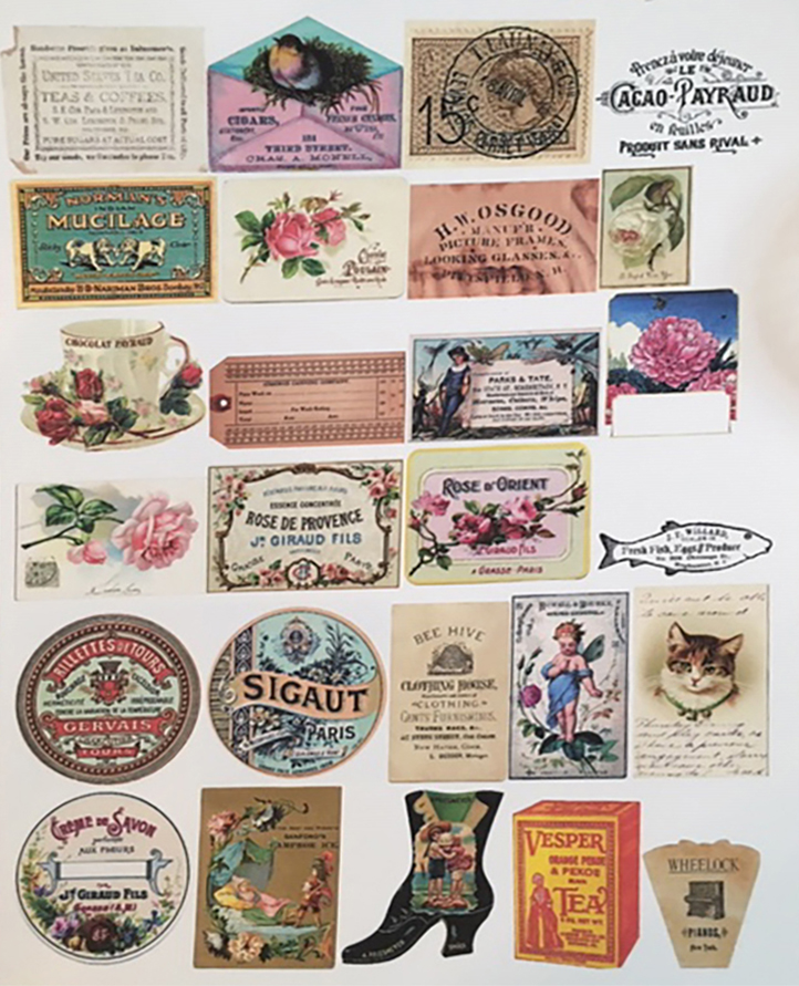
One of my textile design teachers often shouted, “More is More!” to the class, and thinking of her, I decided to embellish the box further. I wanted the closure to be pretty, easy to open, but still hold securely. There was something old-fashioned about the combination of teabags with the Art Nouveau Wallpaper stencil, so I went through my electronic file of vintage images from The Graphics Fairy, printed a sheet of images sized to a 2” scale, then “auditioned” them to see which would go best with the little box.
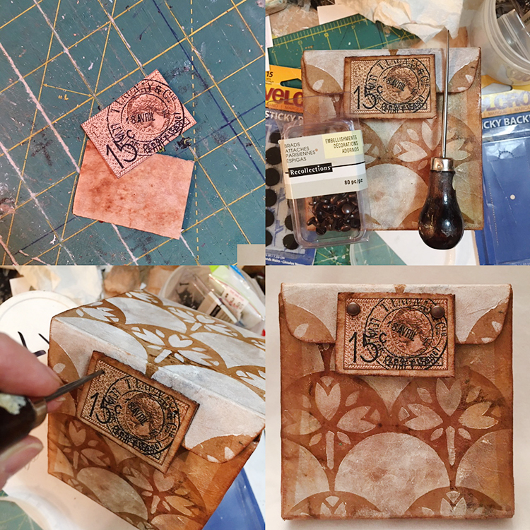
I settled on an image of a French postage stamp and postmark—it was the right color, shape and, I think, actually from the Art Nouveau era. I wanted the closure to have some depth and durability, so I used a small piece of corrugated cardboard cut about ½” larger than the postmark design, covered it with a teabag, edged it with sepia ink, then glued the stamped postmark to the center. I attached the rectangular vintage stamp with the heavy gel at the edge of the front tab, but also added two brads for extra strength and visual interest. Finally, I darkened all of the edges of the box with sepia ink applied using a fingertip dauber.
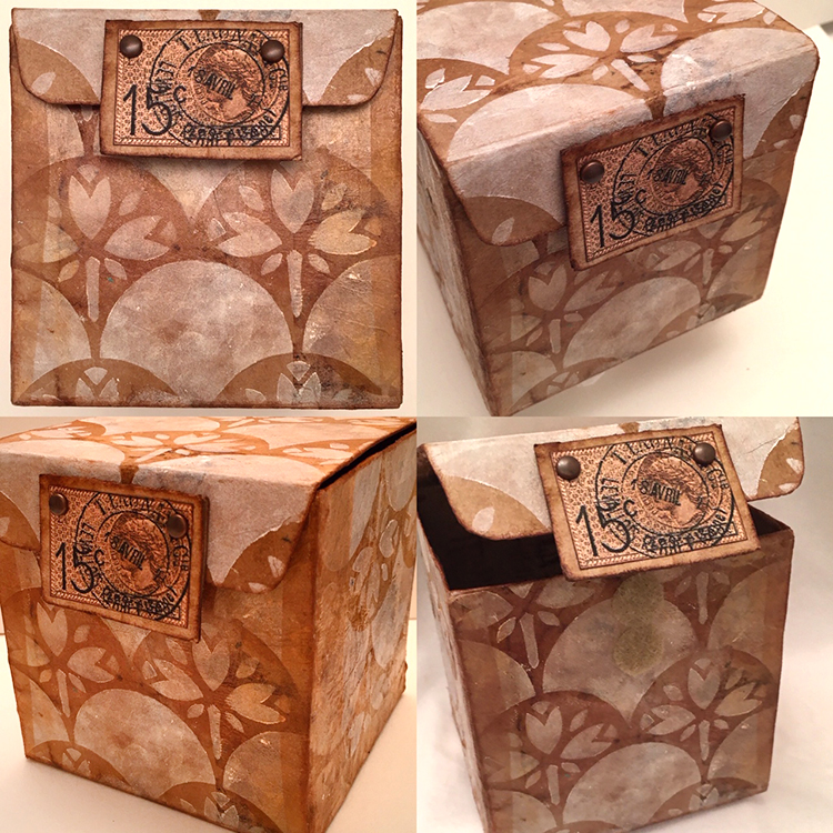
Would you ever guess that this adorable little Art Nouveau-inspired treasure box was once a family-sized box of Raisin Bran?
Thanks Linda! Love the idea of giving a cereal box a second life!
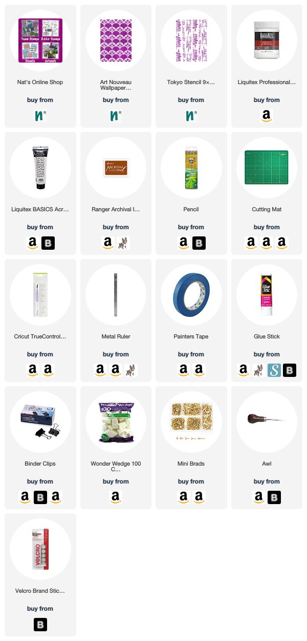
Want to give Linda’s project a try? You can find all my Stencils in my Online Shop and in addition to a discarded box, some cardboard, and a used and dry teabag, here are some of the other supplies she used:
Comments (1)
Jill McDowell
| #
Bravo Linda! Brilliantly designed. I love this project, cereal boxes, tea bags, NATS’s steciks and that stamp! I’m swooning.
Reply