
Hello from my Creative Squad! Today we have a post from Jordan Hill who is sharing an art journal spread where she pushes her color comfort zone and uses my Triple Play and LOVE foam stamps for our theme: A Tale of Two Colors – Think about two different colors, one you love using and one you find more of a challenge to work with. Use them together in a project and see what happens.
Hello everyone! I’m excited to be back with a brand new project for May! This month’s concept of using a color I tend to avoid really pushed me creatively; there are a few colors I shy away from in my artwork, simply because I find them difficult. Red is one of these colors. For this month’s spread I decided to pair the red with pink, since I use pink a lot more and find it a lot easier to manage.
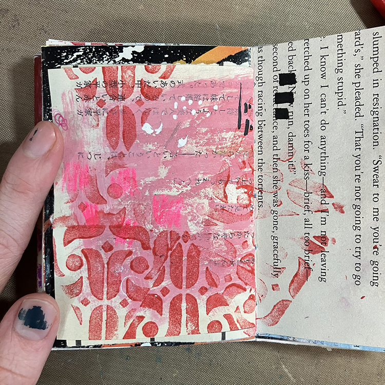
I started things off by selecting a page that I wanted to work on. This particular page already had quite a lot of pink on it from where I had cleaned off my paintbrush after working on a different page. Next up, I used one of the stamps from Nathalie’s Triple Play Foam Stamp Set with some red acrylic craft paint to create a pattern over the background of the page.
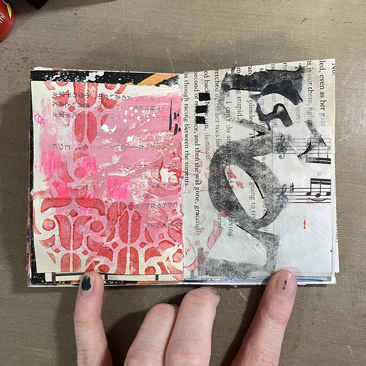
I then wanted to add some texture to the right hand page, so I stamped Nathalie’s CJS22 Limited Edition Foam Stamp onto a piece of white tissue paper. I tore it into a couple of pieces, then used Mod Podge to adhere it to the page. I like how this technique makes it appear as though there are letters on the page, but not necessarily words.
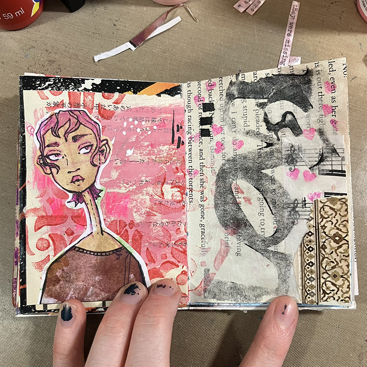
Next, I incorporated a couple of collage pieces. This is where I added the small piece of pattern in the lower right hand corner of the spread, and the face on the left hand side. I also used a pink marker to add a few scattered hearts across both pages; I incorporated these hearts into both halves of the spread in an attempt to make them feel more uniform.
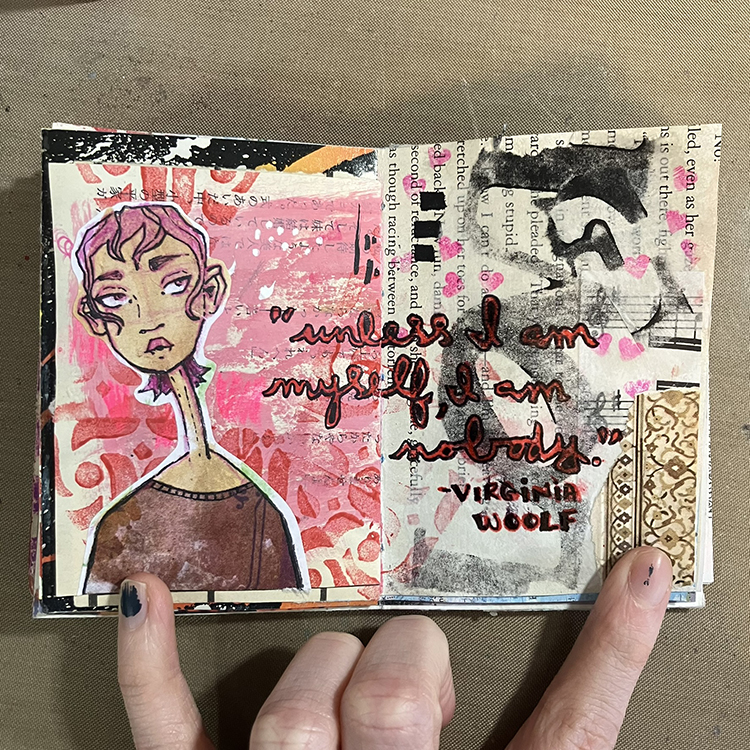
It was then time to add the words. I used a Crayola Fine Line Marker in red to write out my quote, making sure to go across both pages. I then outlined the red with a Paper Mate Flair Felt Tip Pen in Black in order to make sure it stood out against the background.
To finish off the spread, I loaded some India Ink onto a small paintbrush and flicked it in the direction of my page to create some splatters for bonus texture. With that, I was ready to call this spread done! I hope you enjoyed following along with the process!
Thank you Jordan – love that color combination of pink and red!
Give it a try: you can find all my Foam Stamps in my Online Shop and in addition to collage elements, here are some of the supplies Jordan used: