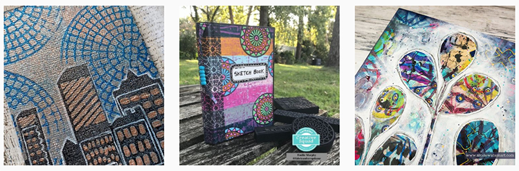
Hello from my Creative Squad! Today we have Robin Seiz sharing with us a project inspired by a journey far away and resulting in the more familiar journey of making art. Robin is using my Elephant Parade and Ornament Wallpaper stencils and our theme: Light & Shadow – In art and maybe also in life, the balance between light and shadow is an important consideration. Play with this equilibrium in your art and show us how the two sides work together.
Light and Dark – Playing with Color
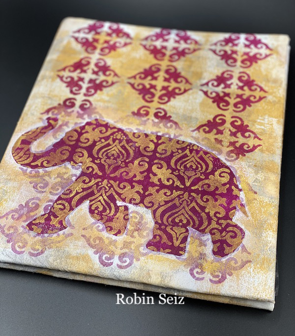
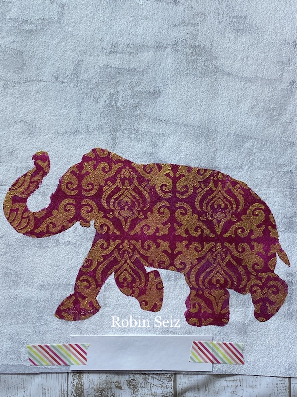
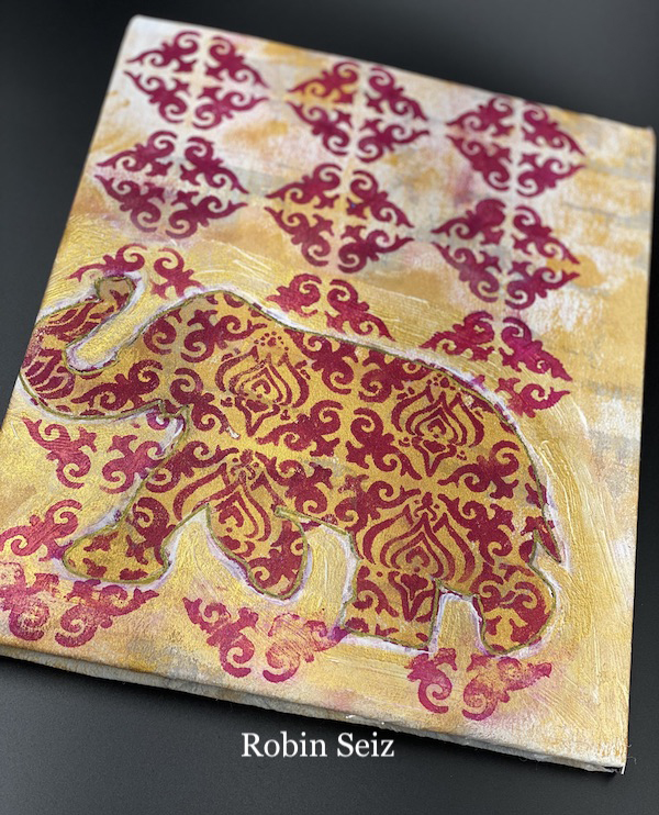
One of the things I remember most about my visit to India is the beautiful patterns and colors of the Saree; the traditional drape that women wear. I remember a friend taking me into a shop and there were hundreds of fabrics laid out.The contrast of light and dark was present in all of them. I just wanted to touch each and every one and drape them over me. It’s with these patterns and color in mind that I chose Nat’s Elephant Parade stencil and mask. It’s the perfect stencil to use for layering colors and pattern. I wanted to try the elephant both with a dark background and light pattern and a light background and a dark pattern to compare the images.
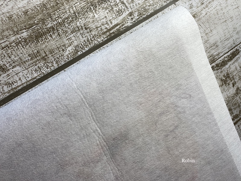
At the beginning of the pandemic I was making masks and I have quite a bit of “featherweight interfacing” left. I have been thinking it would be fun to try and print on this fabric. It has a great texture! So this seemed like the perfect project to combine the two and make a journal cover.
I cut a piece of interfacing 20 inches by 12 1/2 inches and applied White Gesso. I wasn’t worried about covering the entire piece. I just wanted some extra texture and “tooth” to the surface.
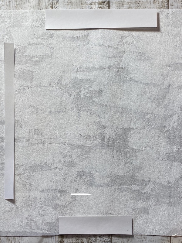
The journal cover was going to cover a used book that I had on my shelf, so I measured and placed a piece of paper in the middle of the interfacing so I would know where the front stopped and the back began. I did the same for the top and the bottom of the journal. I’m not a perfectionist by any stretch of the imagination, so when I say, “I measured,” — I mean I eyeballed it!
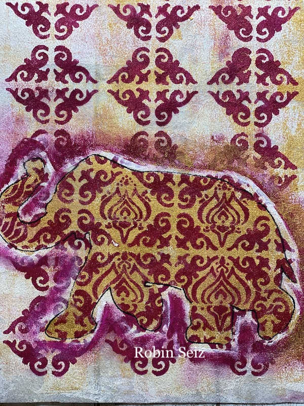
I applied Liquitex Basic Gold acrylic paint with a makeup sponge to the background and then used Golden Quinacridone Magenta to apply the Elephant Parade stencil.
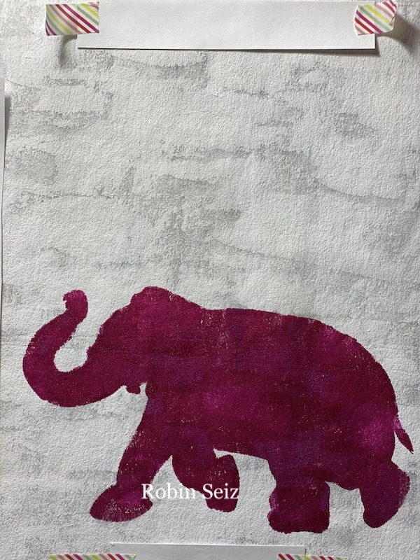
Since I wanted to see the light on dark, I applied the gold paint with the patterned stencil over the dark elephant. I absolutely loved the result.
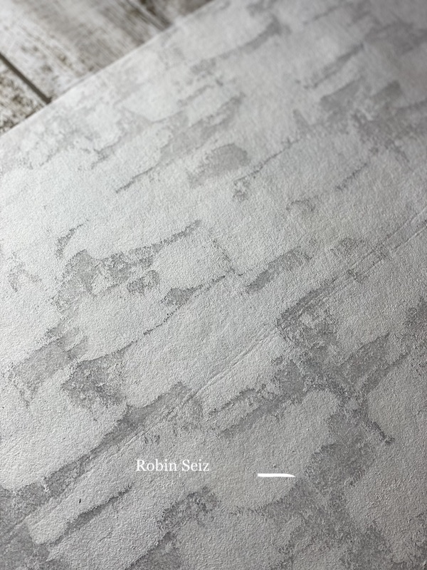
The background definitely needed something, so I applied Nat’s Ornament Wallpaper stencil which also reminds me of an Indian print. I did this in the dark Golden Quinaacridone Magenta. The problem with using the same color, was the elephant faded into the background rather than appearing in the foreground as I had planned.
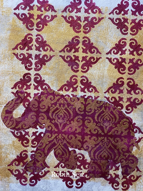
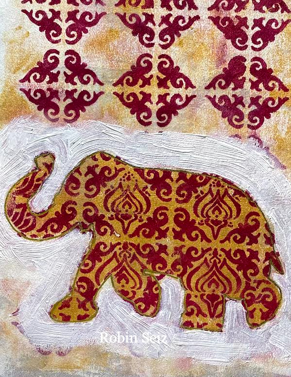
In order for the elephant to stand out from the background I applied white gesso around the edges of the elephant and then added some gold back. This technique brought the elephant to the foreground.
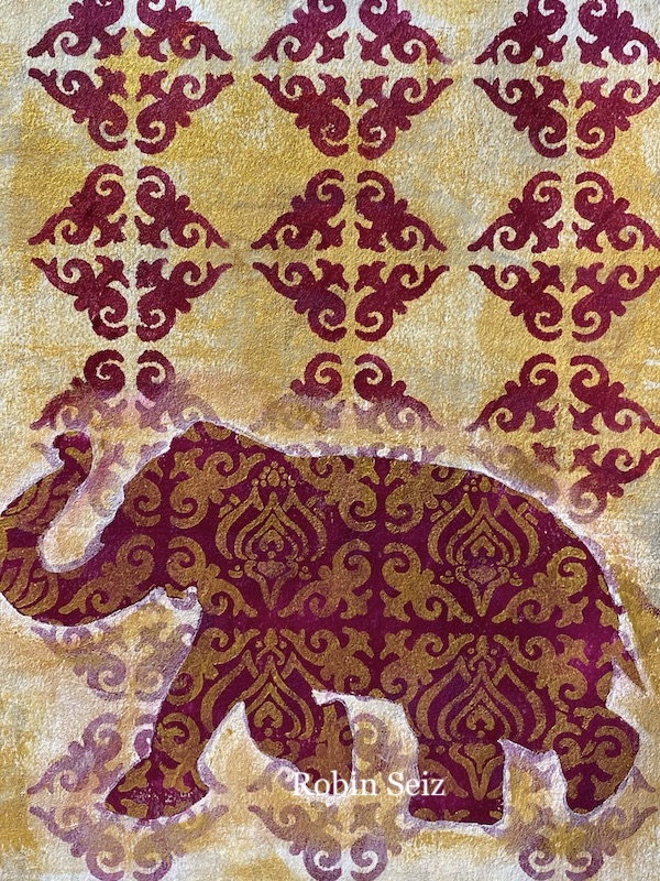
It was time to move on to the back of the journal cover and to experiment with dark on light. Let’s just say this took a lot of work to get anywhere close to the same effect as the front of the journal. Sometimes, what I have in my head just doesn’t turn out the same way on paper (or fabric in this case!) The dark on light paint just didn’t have the same “pop” as the light on dark.
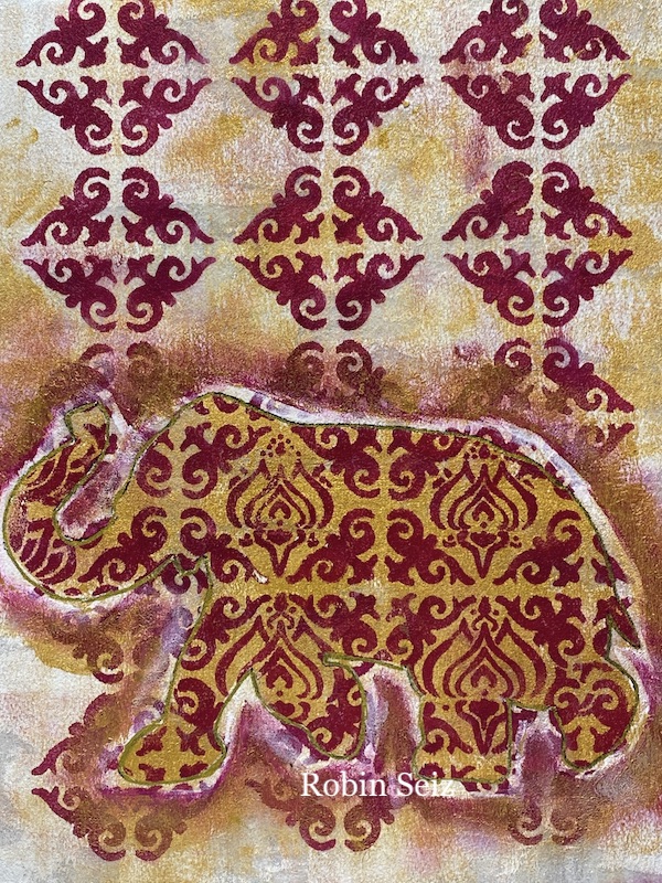
First I tried the same technique of applying the white gesso with a cosmetic sponge. I was in a hurry and didn’t wait long enough for the paint to dry before I applied the gesso and it turned the magenta to a light pink. ICK! The technique that worked on the front, really didn’t work the same for the back. Next, I outlined the elephant with a black marker thinking it would bring it forward; that didn’t work either! I tried adding the dark magenta color around the elephant and didn’t like that.
When all else fails, I usually go back to covering everything with gesso. (again!) This time I let it dry completely. This time I went over the white gesso with gold paint leaving a little edge of white. I also outlined the elephant in gold gel pen. I added the same background stencil. The elephant did come to the foreground, but I’m definitely not as happy with the back of the journal. I did learn an important lesson — the contrast of light on dark is much more striking and pleasing to my eye than dark on light.
This project is an example of why I love mixed media. When things don’t work out the way I have planned, I let go of what I thought would happen, keep adding layers and trying different techniques until I’m satisfied with the end result.
Thank you Robin – loved hearing how you worked through your process to achieve a rich, beautiful result!
Give it a try: you can find all my Stencils in my Online Shop and here are some of the other supplies Robin used:
Don’t forget to check out Nat’s Creative Squad on Instagram too: Each week we post projects, ideas, and inspiration for mixed media art.