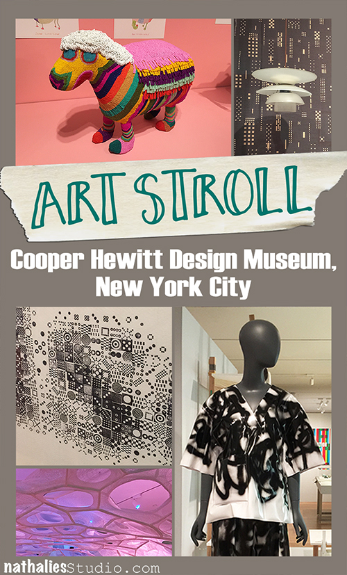
A couple weeks ago I went on an Art Stroll with my friend Andrew and he suggested we should visit the Cooper Hewitt Smithsonian Design Museum. Well – I haven’t been there yet- so of course I was up for it!
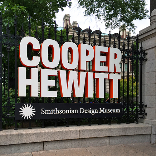
And boy was I glad went- it was so much fun and so worth it- btw- it almost right at the Guggenheim where we did another Art Stroll that day, so if you are ever in the area :)
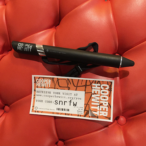
Upon our entry we received a big pen which, we were told has two functions.
- to use on certain interactive stations to do your own designs and
- to save the information of everything you saw and want to keep track of and the designs you created
Or as a very sweet guard said to me: “You can collect the whole museum and take it home with you!”
HOW COOL IS THAT . Big shout – I loved it. It definitely changed the way how people including us viewed the museum. You weren’t so focused on writing things down or photographing everything – and yes I know there are avid hater of the fact- but this is how information and things get consumed nowadays and I feel as this was the smartest most amazing way of a museum to embrace it, go with it and make it better for everyone! People do not feel they are missing out on taking home the memory ..they take the whole museum home *wink
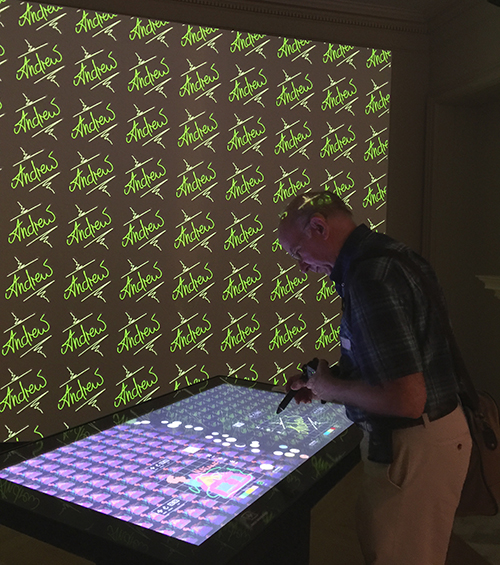
Here is Andrew in front of a wall paper creator – I made a simple one for him
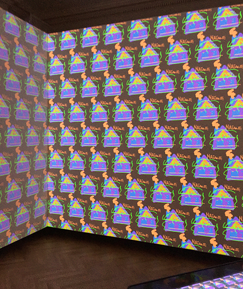
Here he made one for me. I like it ….maybe just one tiny section of a wall because I might get a bit 70s if I’d had this all over my walls- but it is fun !
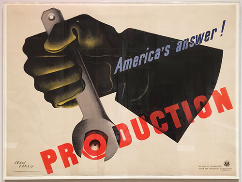
Love this poster *wink
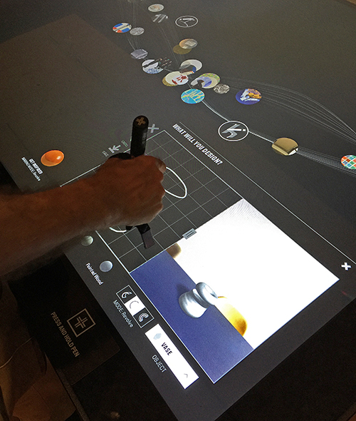
here is Andrew creating a vase.
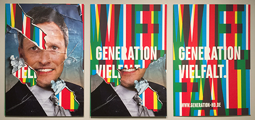
Poster Generation Vielfalt, Götz Gramlich 2014. I loved this- this is how our election posters look like during our election time in Germany – which lasts only a couple weeks- oh boy you wish *wink. Often times those posters change over the time either by weather or by protesters. So the design of Gramlich for an election was actually a play on that. Gramlich’s poster series Generation Vielfalt was designed for the progressive political party Generation Heidelberg. The posters were displayed over time to show a transformation. Here, the second poster in the series shows the image partially torn away to reveal a new message underneath. I love the idea of revealing a new message by tearing away a layer on the top.
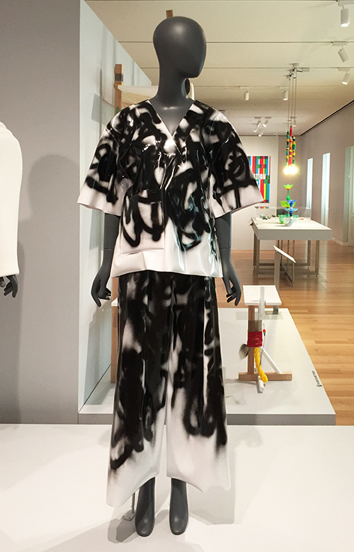
This is a Graffiti v-neck tee and pants. It was designed by Melitta Baumeister. I think it has my name written on it – how cool is that. If I’d longer legs I would take it home with me- but the tee would do *wink . Definitely a reminder for me to do some more wearable art!
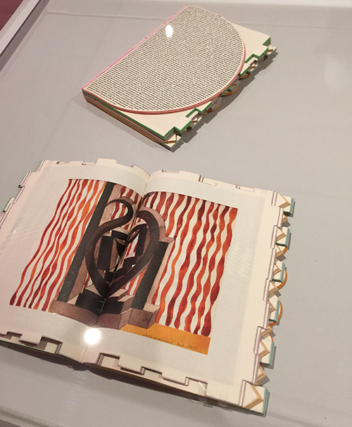
This is a magazine. It was designed by Theseus Chan and printed byAlsOdoMinie and made for WORK. Its medium is die-cut offset lithography over silver foil on paper. Andrew and I agreed it would make for a really cool siding for an art journal.
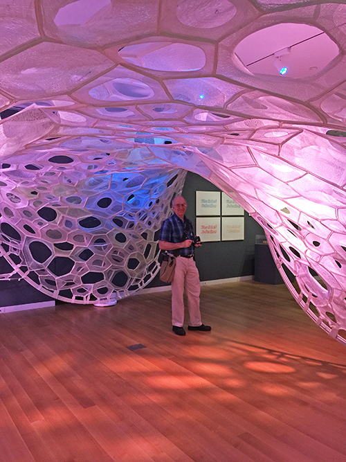
This is Andy standing in a PolyThread knitted textile pavilion. It was designed by Jenny E. Sabin. Its medium is 3d seamless whole garment digitally knit cone elements; photoluminescent, solar active and drake yarns; twill tape; aluminum tubing. Now that is a mouthful and pretty pretty amazing.
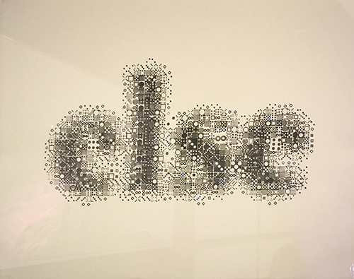
These are prints by Kyuha Shim.
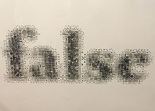
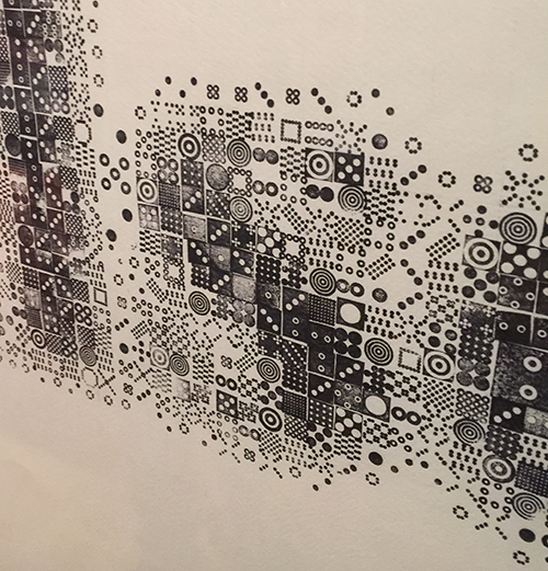
upon closer inspection you see that they are made with stamps- so so so cool!!!! I almost squealed.
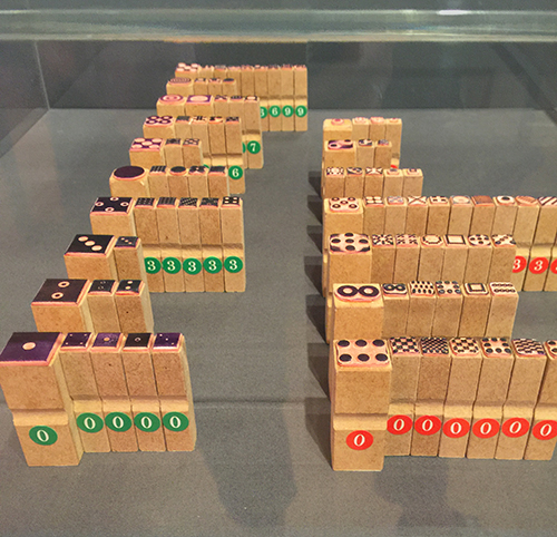
Shim created these ninety-two custom rubber stamps to produce his series of prints Seeing through Circles (2013) above. The stamps have with visual densities that roughly match the brightness or darkness of sixty corresponding pixels. Printing the stamps together creates a texture similar to digital printing.
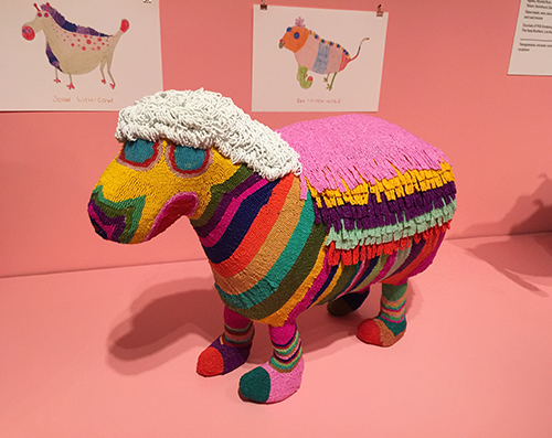
This sculpture was designed by The Haas Brothers, Nikolai Haas andSimon Haas and collaborator: The Haas Sisters of Monkeybiz andMonkeybiz.
glass beads, wire, wood, mixed fiber stuffing, and cast bronze
The colors made me happy and I would have loved this as a toy as a kid!
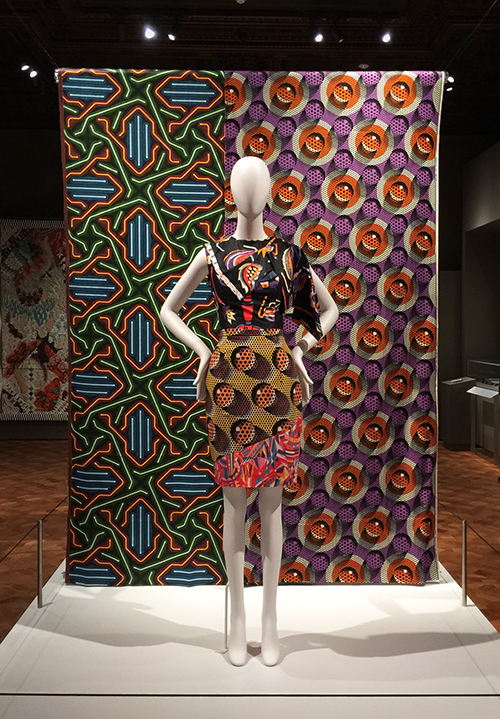
Some beautiful textile pattern design!
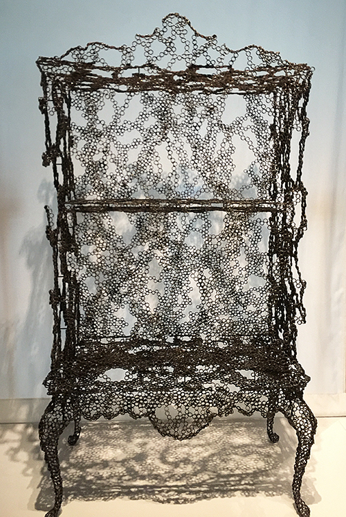
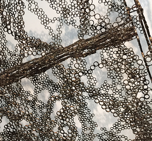
loved this airy piece …and forgot to use my pen on it – so ….unfortunately I have no information on who designed it but I thought it was really
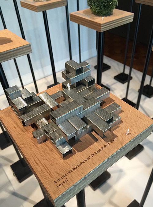
Sou Fujimoto Architects created this series of models for the 2015 Chicago Architecture Biennial. Called Architecture Is Everywhere, the project discovers architectural possibility in found objects and everyday materials. Simple artifacts such as a lottery ticket, an ashtray, or a ring of binder clips become intriguing structures when placed on pedestals with tiny human figures. In the words of Sou Fujimoto, “This is kind of a funny trial to expand our ideas of architecture beyond our usual understanding.”
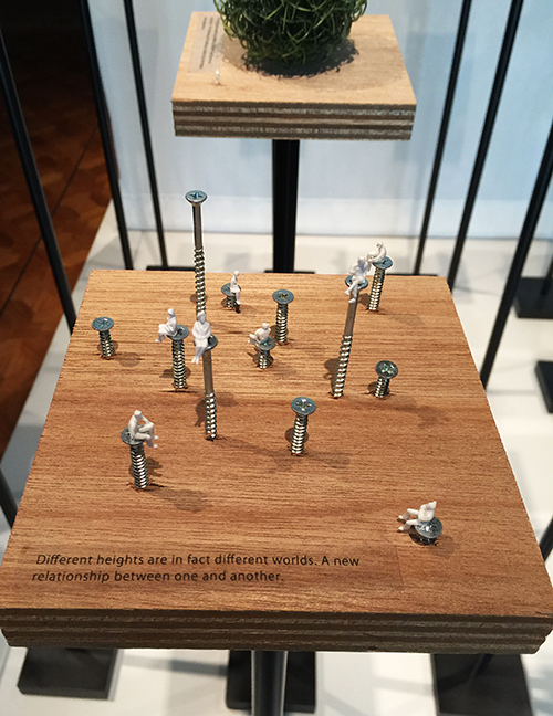
This looks way cooler in person -you have to see it. It mad me giggle !
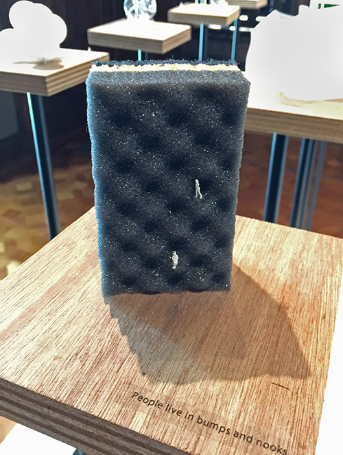
That a treasure of inspiration was found in this museum. I am getting all excited again while writing the post and looking at the photos again.
Hope you enjoyed this Art Stroll! There are more to come soon !
