Hello from my Creative Squad! Today we have a super cool project from Jordan Hill using a mini billboard model and my Triangle Love rubber stamps. Our theme is: In the City – Although we aren’t traveling much these days, let’s reminisce about a time we traveled to another town or city. Think about the flavor of the place and let that guide your color and design choices.
Hello, everyone! I’m very excited to be back with my project for May 2021. This month I was working with the Billboard Model Kit, which I found to be a lot of fun and an interesting change of pace from the style of work that I usually do.
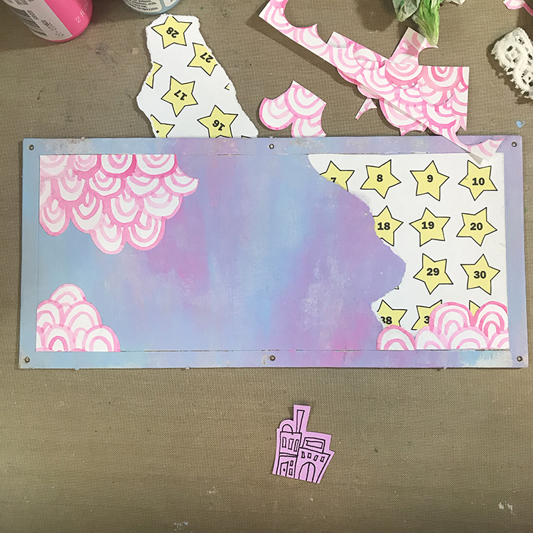
I decided to begin my project by decorating the flat billboard part of the model. In order to do this, I used some white gesso to prep the chipboard surface, then used CraftSmart craft paints in Pale Blue and Neon Pink to create a background that reminds me of some of the colors of lights you might see in the city at night.
In order to create this particular background, I tried to work quickly and allowed the paint colors to blend together as I applied them to the chipboard. The two colors I chose created a pretty soft purple when mixed, which added a bit more depth to the background colors. After the acrylic paint had dried, I then added a few pieces of collage (some star paper I found at a thrift store and some hand painted neon pink arcs) that reminded me of graffiti.
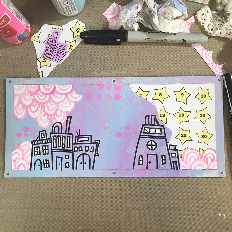
Next, I knew I wanted to incorporate the theme of “In the City” in the form of some freeform building doodles. Using a Sharpie, I drew squares, rectangles and arches to represent the shapes of houses, windows and doors. I then used some leftover neon pink paint I had on my palette and the tip of my finger to add some dots to the background. I also added some white to the windows of the houses to help them stand out a bit more.
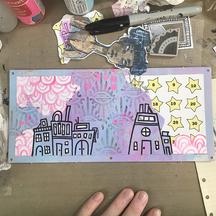
After I had my buildings in place, I knew I wanted to add some more pattern and texture to the background. In order to do this, I chose Nathalie’s “Empire Triangle” rubber stamp to stamp over the entire background. Since there was already a lot going on, after inking up my stamp, I stamped once on a separate scrap of paper before applying it to my background. This gave me a much more muted effect, which I quite like.
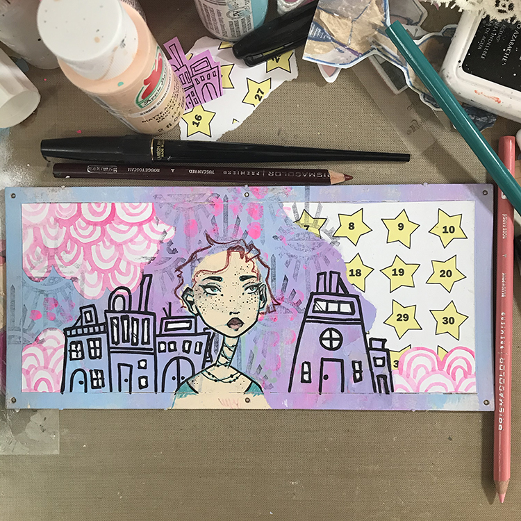
Next it was time to add the figure. I played around with the idea of collaging a face onto this piece, but ultimately decided to draw a new one from scratch. I did this in much the same way as I typically do, by first blocking in the shape of a face with acrylic paint, then sketching over the top in colored pencil. This time however, I did opt to use an Aquamarine Prismacolor pencil for my sketching as opposed to my typical navy or deep purple. I then inked the illustration and sketched in some hair.
The next step was to add color to the hair I sketched in previously. I chose to go with CraftSmart Aqua for this step; I recently discovered I have three bottles of this paint in my possession, and I wanted to use some of it up! It also just so happened to coordinate with the colored pencil I had already used to draw the face and it had a nice contrast with the pre-existing colors of the background.
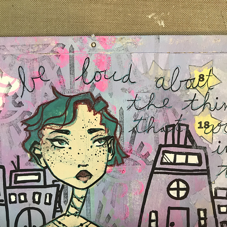
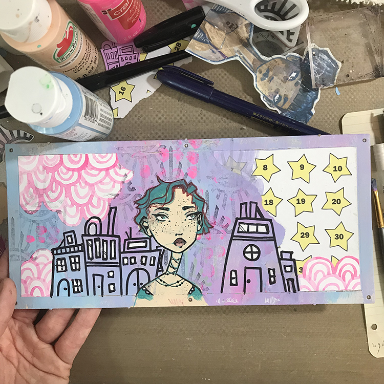
As I reached this point in the project, I knew I wanted to add a quote. This particular model feels very much like a display piece, so I felt that some motivational words would work well. In order to add the words to the piece, I chose a thin ink pen and wrote my quote in a large cursive font. This is the first part of the typical style of lettering that I recreate frequently in my artwork.
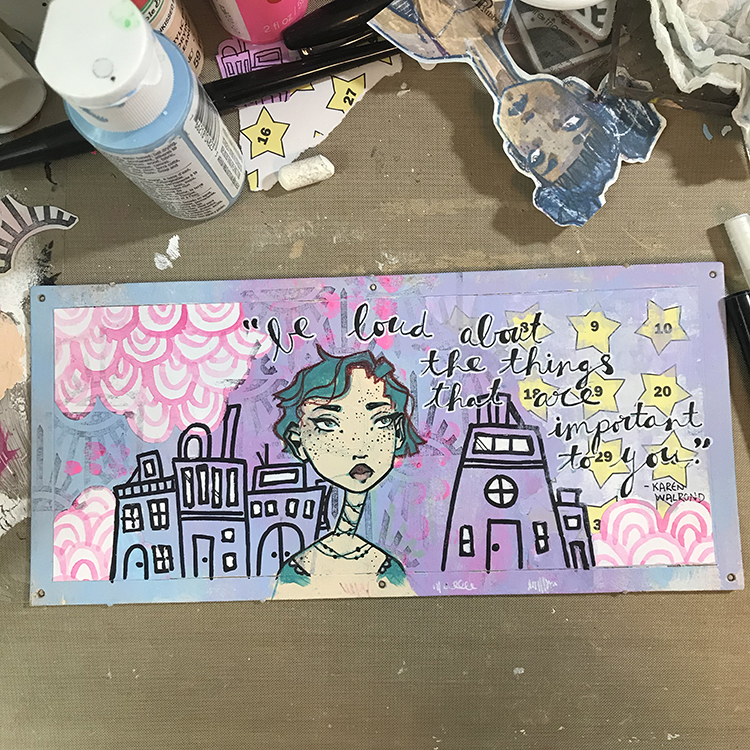
The second part of this lettering style is to simply thicken one edge of the cursive writing. You can use the same thin ink pen to do do this, or you can choose to go for a brush pen in order to fill more space more quickly (this is what I chose to do on this particular project). Once I was happy with the lettering, I then used a white gel pen to outline the text in order to make sure it stood out from the background enough to be legible.
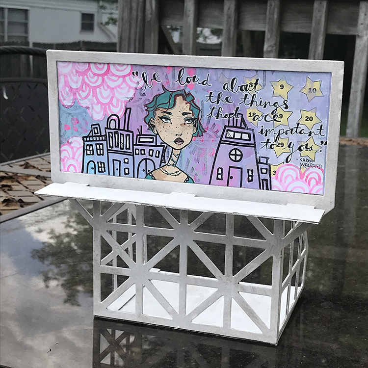
Finally, it was time to actually put the model together! I painted all of my chipboard pieces white before I started assembly, since I felt that the color would fit my project better. Then, I simply followed the instructions to create this fun display piece that I’m definitely going to enjoy using as a part of my studio decor!
I hope you all enjoyed following the process of creating this project!
Thank you Jordan! I just love your color palette on this and watching you build your composition – it works great for the billboard!
Give it a try: you can find all my Rubber Stamps and those cool Cardboard Models in my Online Shop and in addition to some collage papers, here are some of the supplies Jordan used:
For more from the Creative Squad check out Nat’s Creative Squad on Instagram too: Each week we post projects, ideas, and inspiration for mixed media art.
Comments (1)
Sue Clarke
| #
I really like this Jordan and how you explained what you did…simple enough for me to be inspired by them.
Reply