Creative Squad

Creative Squad: The Great Outdoors – Jordan Hill

Hello from my Creative Squad! Today we have a post from Jordan Hill who is sharing a gorgeous floral art journal spread using my Triangle Love rubber stamps and ATC Mixup stencil and our theme: Great Outdoors – The experts agree that getting outside for activity each day is a super healthy thing you can do for your mind and body. Let’s get outside and seek artistic inspiration out there. Find something that catches your eye and then when it’s time to come back in, use that inspo to create.


Hello everyone, I’m happy to be back with another project for June! I was very excited to work with this month’s theme of The Great Outdoors, since nature is very much an inspiration for me and my work. Let’s get started.

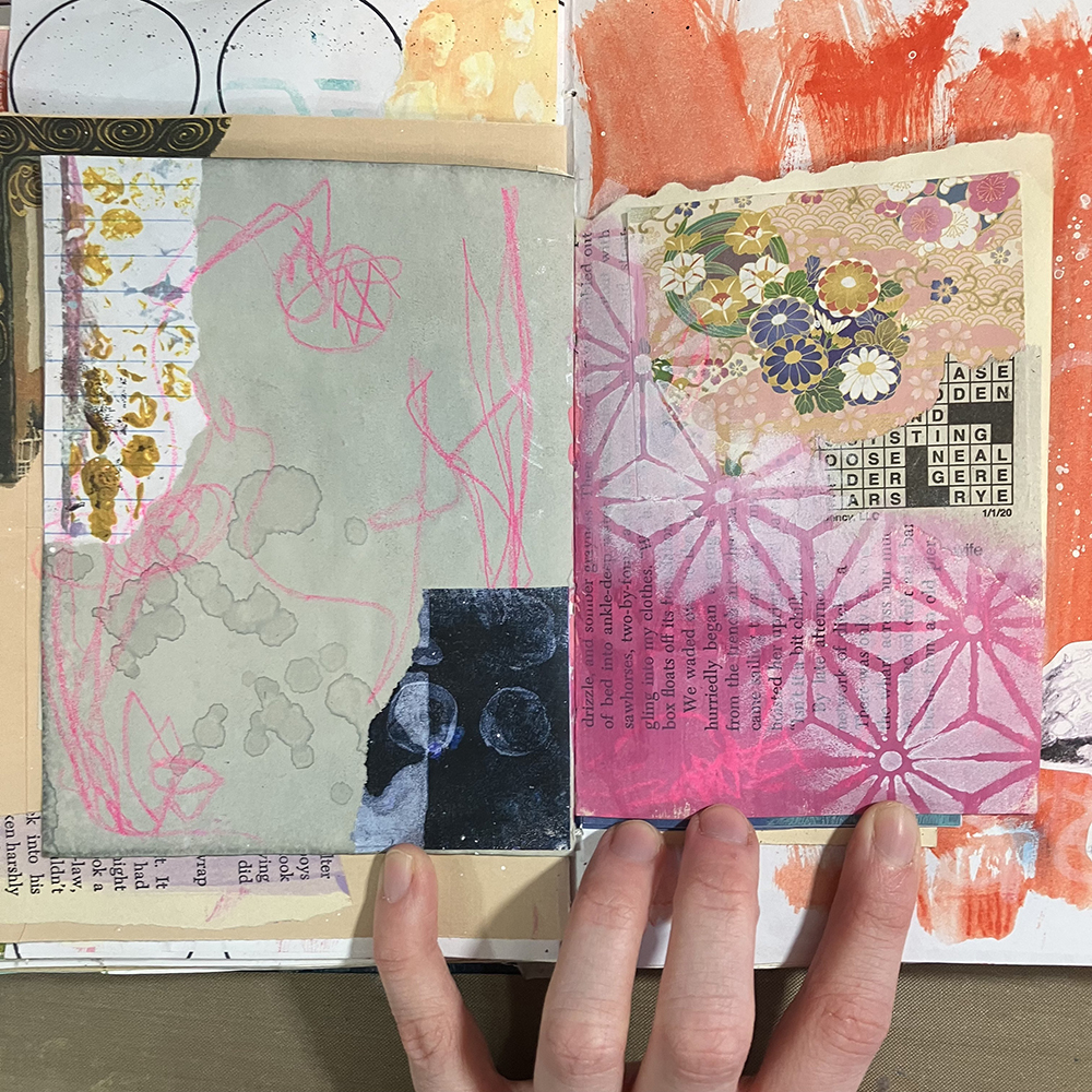
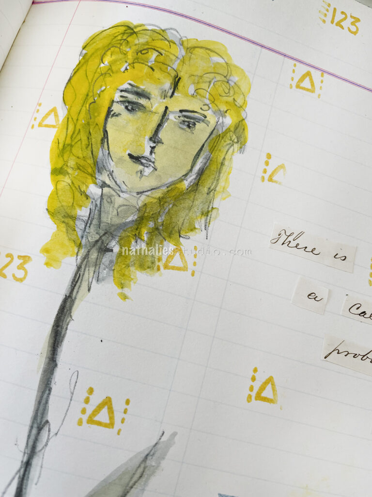
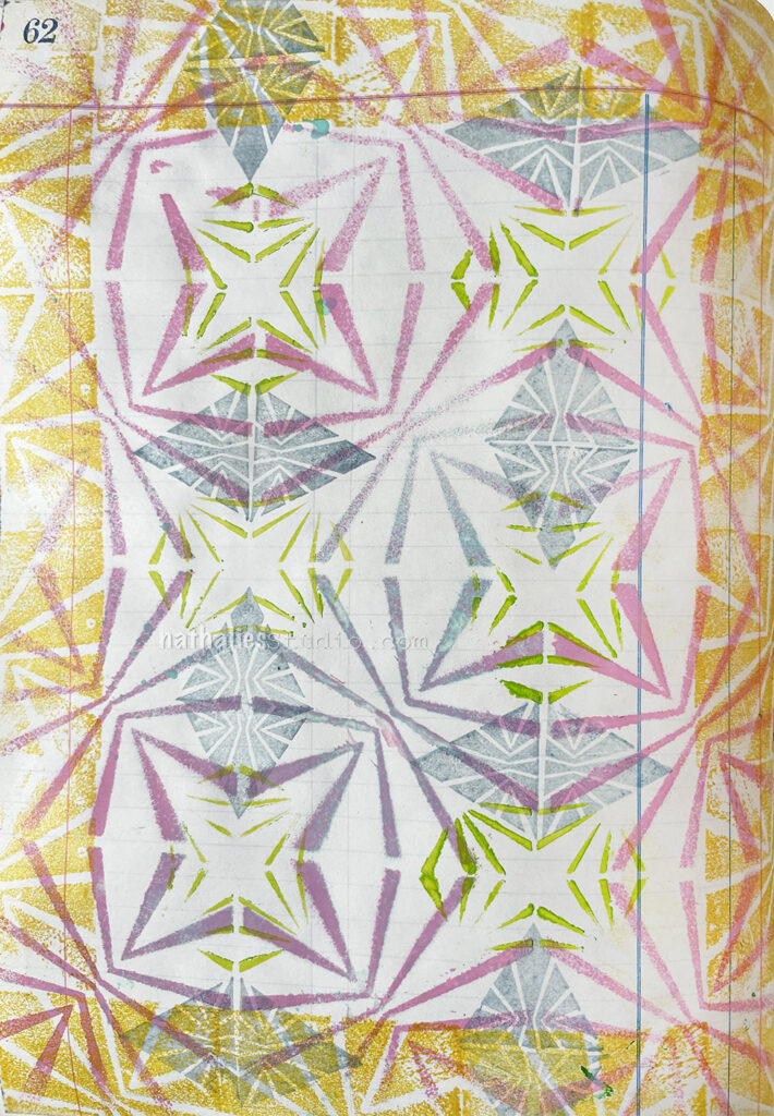
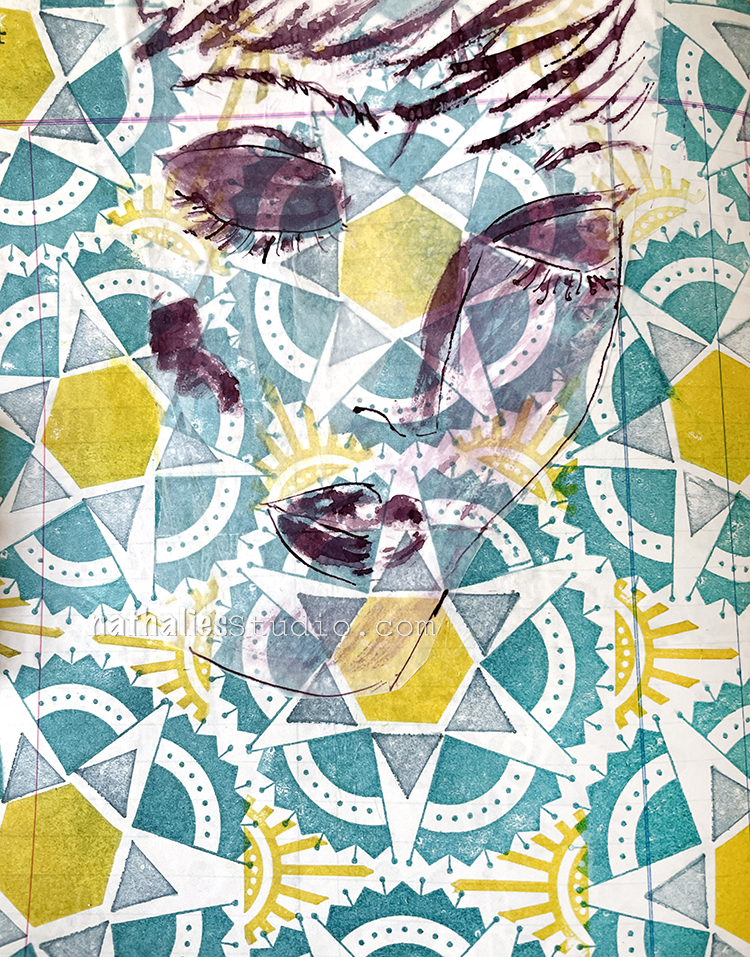
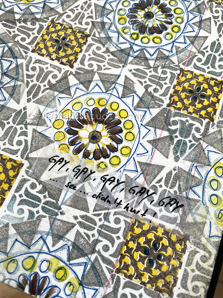
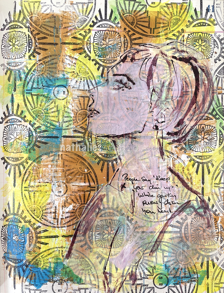
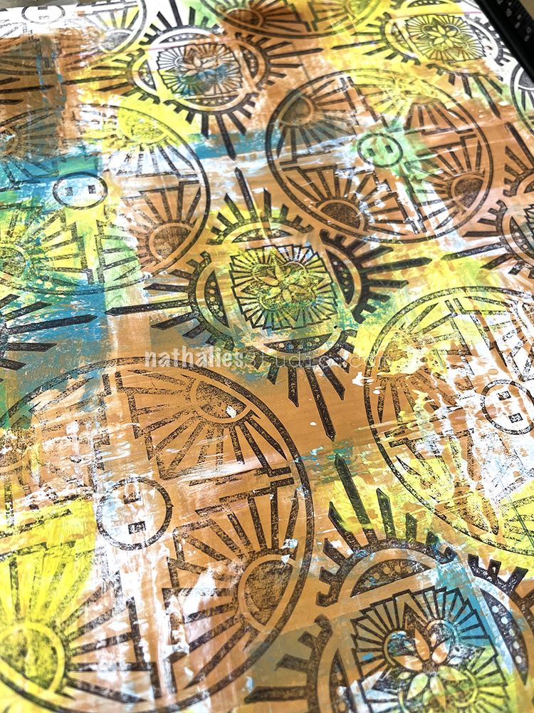
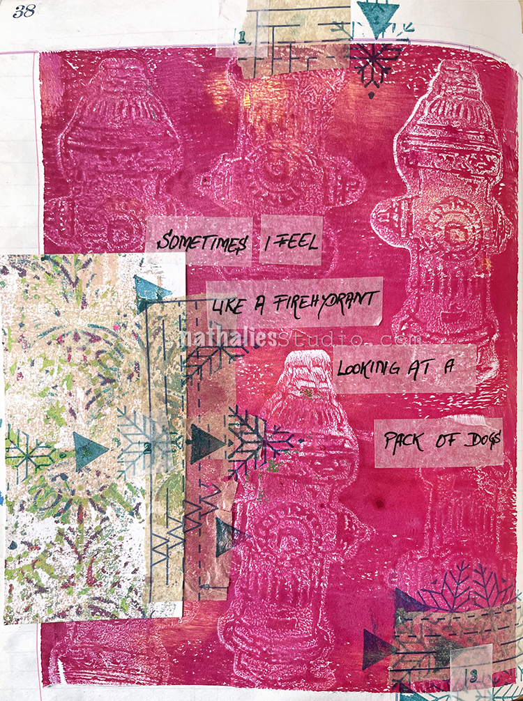
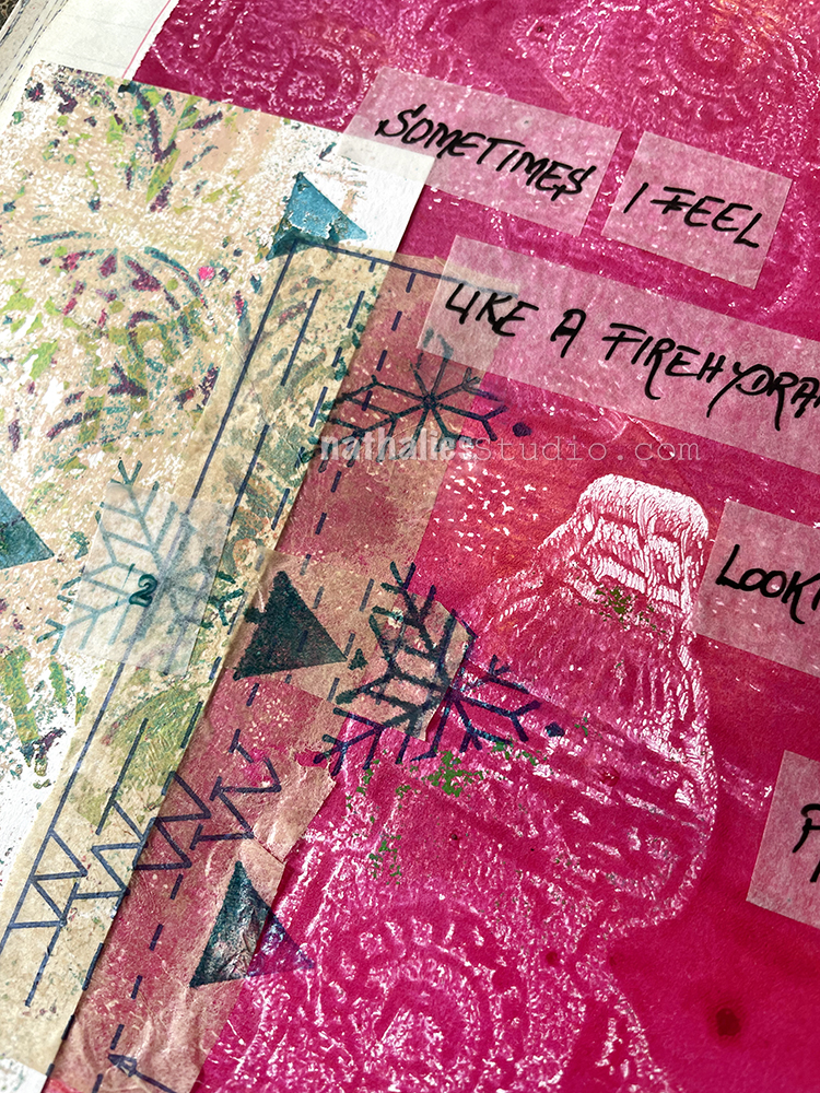
First things first, I started by flipping through one of my art journals to find a page that I wanted to work on. I ended up selecting this one, mostly because I liked the colors. Additionally, I had already used Nathalie’s ATC Mixup Stencil on the right hand page, so it just felt fitting.

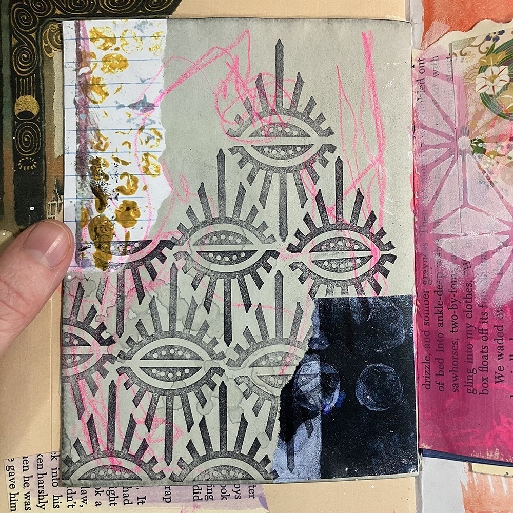
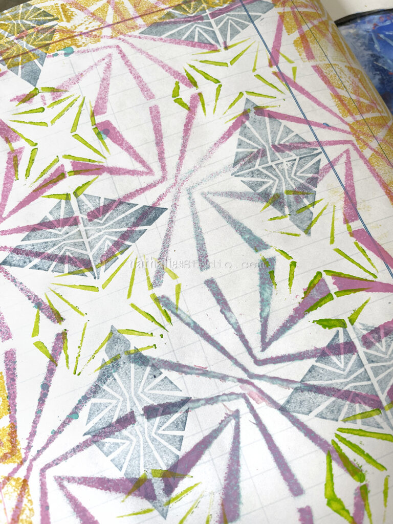
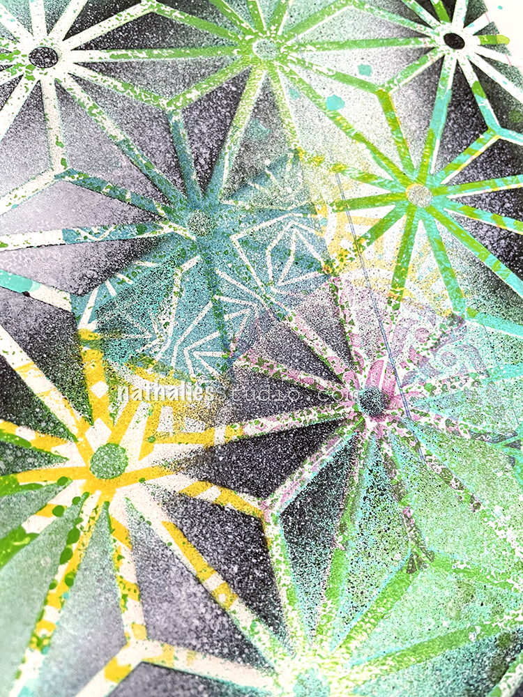
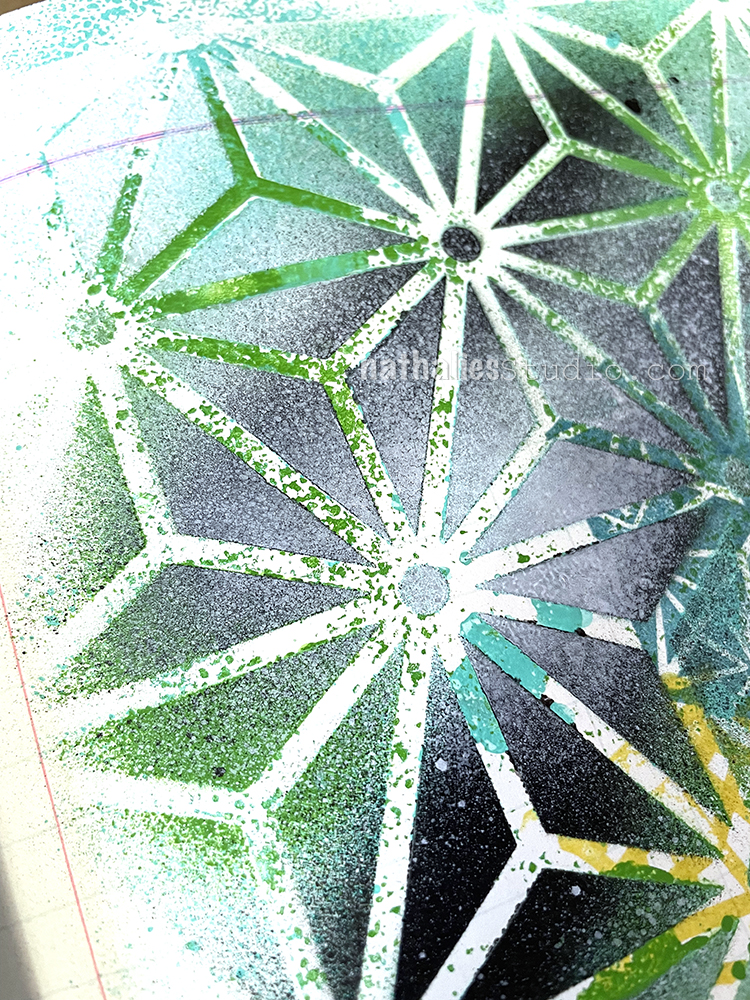
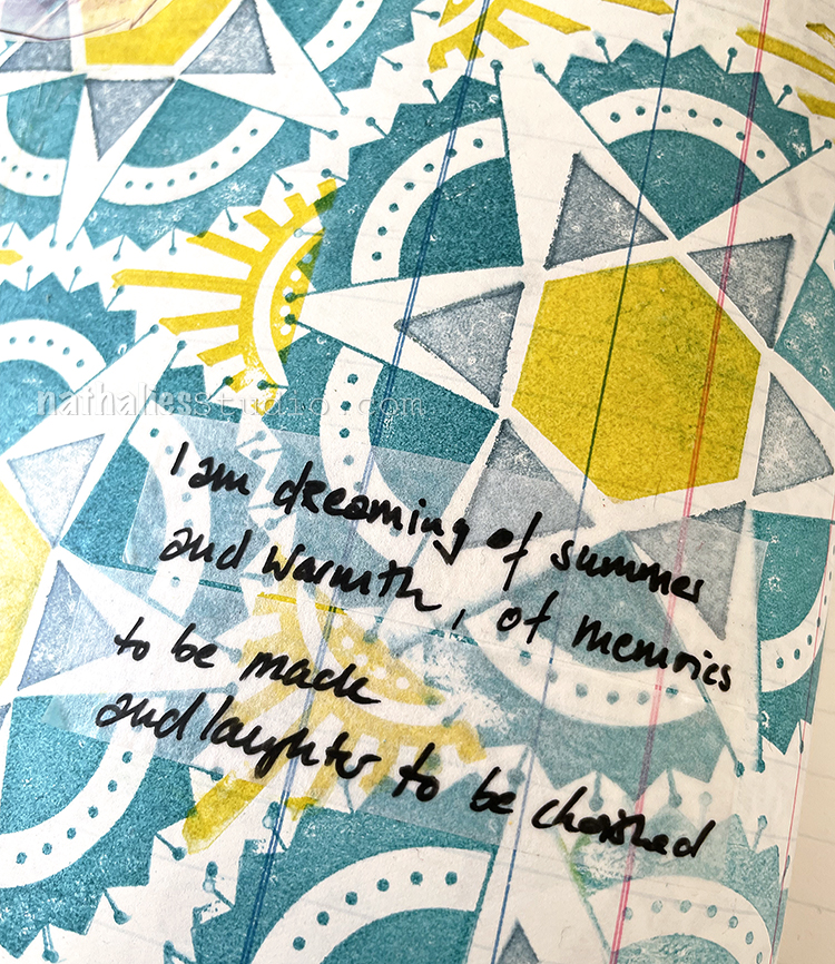
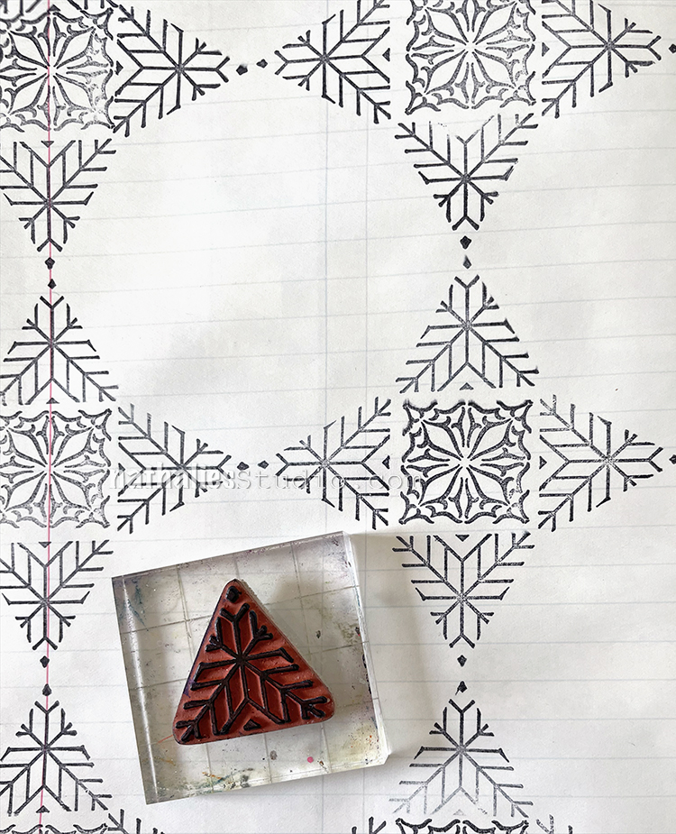
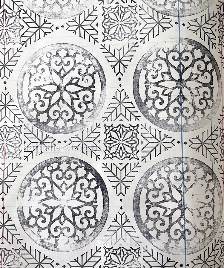
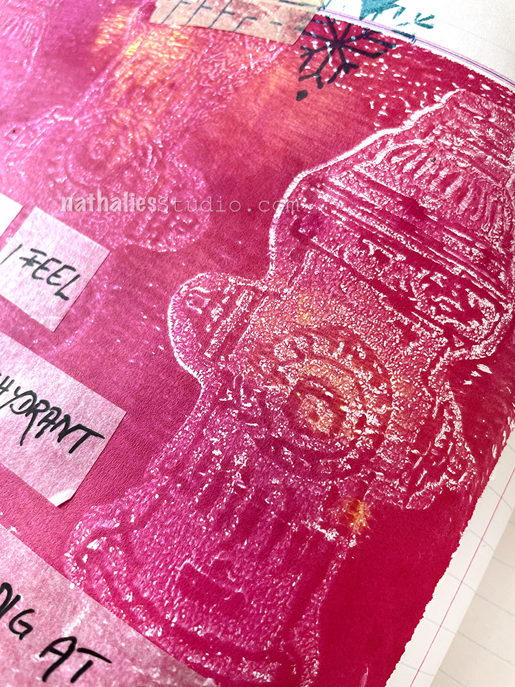
After selecting a page to work on, I used Nathalie’s Empire Triangle stamp from the Triangle Love Cling Rubber Stamp Set with some black Archival Ink to create an all-over pattern across the left hand page.

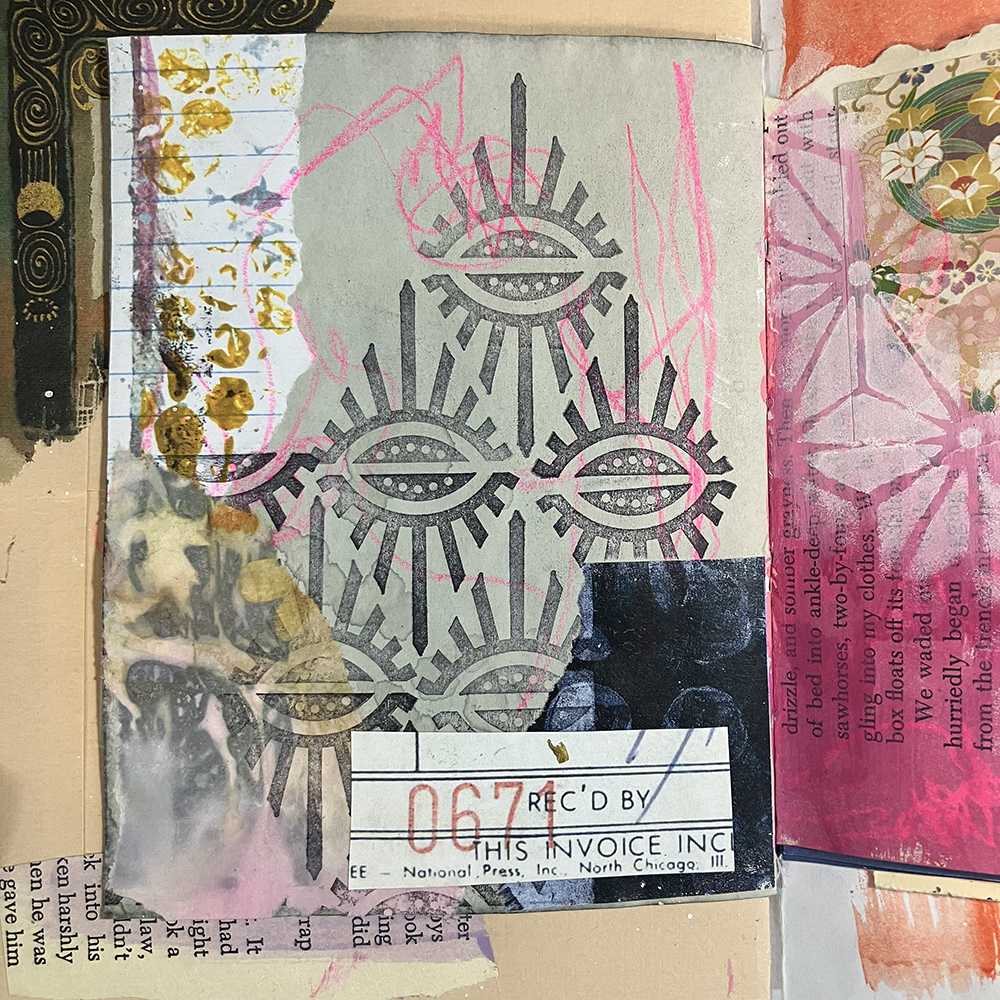
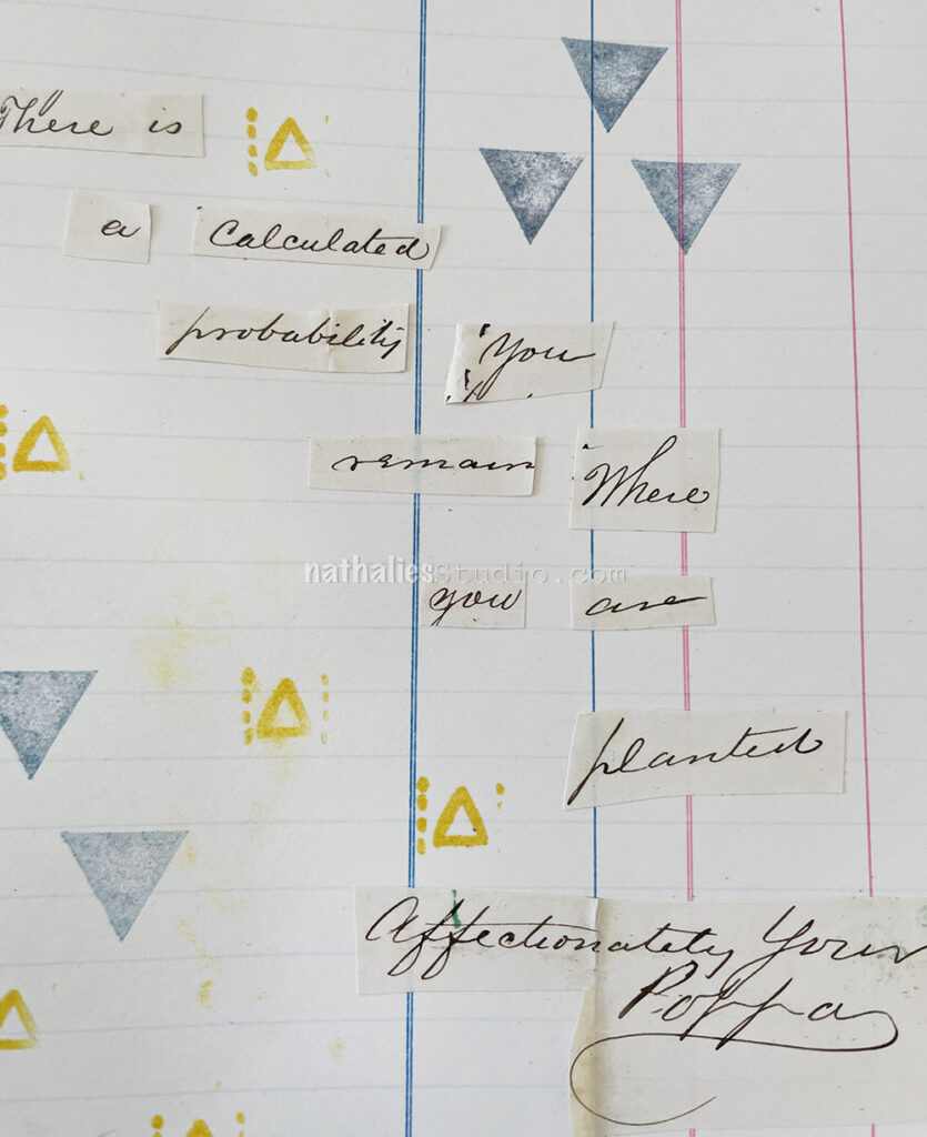
Next up, I added a few pieces of collage that I felt fit the colors and general feeling of the page. In the lower left hand corner, I used a piece of eco printed paper that I made a while back, since I felt it matched this month’s theme of The Great Outdoors. I also added a little piece of paper featuring some numbers from one of my collage sheets.

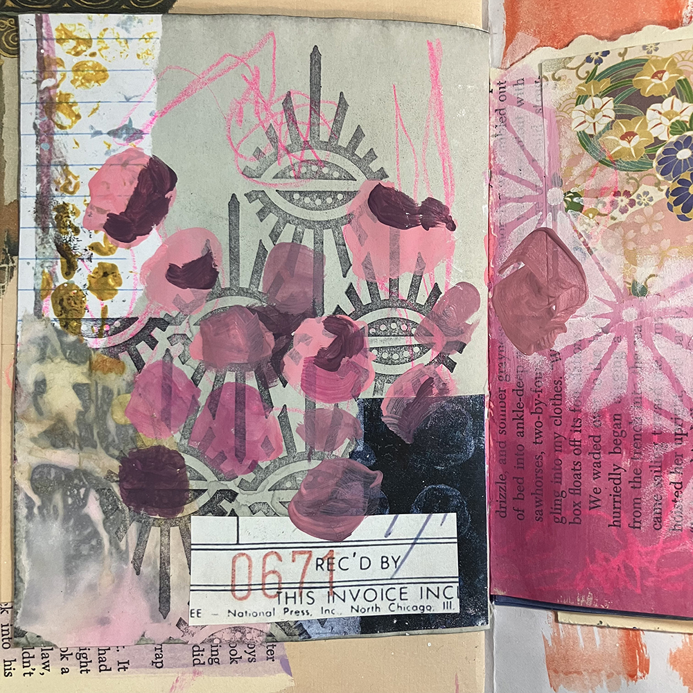
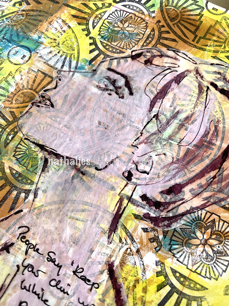
For this month’s page, I wanted to experiment slightly with subject matter when it came to my focal point. In the past, I’ve relied fairly heavily on drawing faces when it comes to my art journals. I still love drawing people, but with this month’s theme of The Great Outdoors, I thought I would experiment with an abstract floral instead. I started off my floral design with a number of acrylic paints in pinks and reds. I then applied the color in small splotches across the page, making sure to vary the lights and darks in each section.

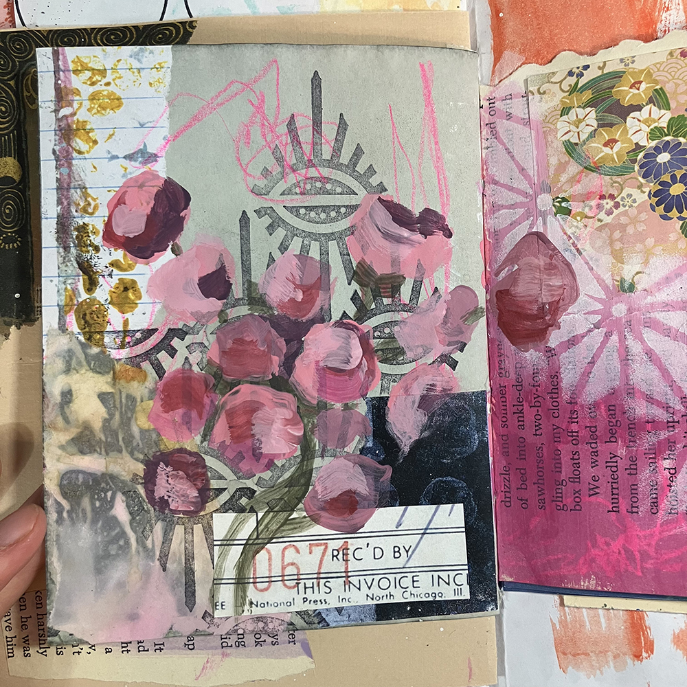
After my first layer of paint had dried, I continued to add more depth to the flowers by adding a few more layers of color. I tried to keep my brushstrokes very loose, as these flowers were still supposed to be fairly abstract, as opposed to fully rendered. I also added some green in between the pinks in order to give the appearance of leaves and stems.

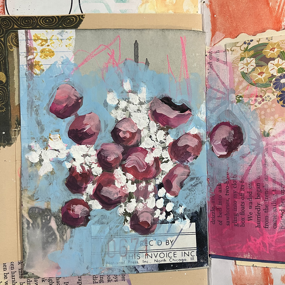
At this point, I felt as though the flowers were not standing out enough, so I made the decision to paint in a new background. I selected a light, bright blue, and added it around the entirety of the flower shapes (which also gained a few more layers of paint and deeper shadows). To finish off my little bouquet, I used some white acrylic paint and a small paintbrush to blot on some smaller shapes to be reminiscent of Baby’s Breath.  

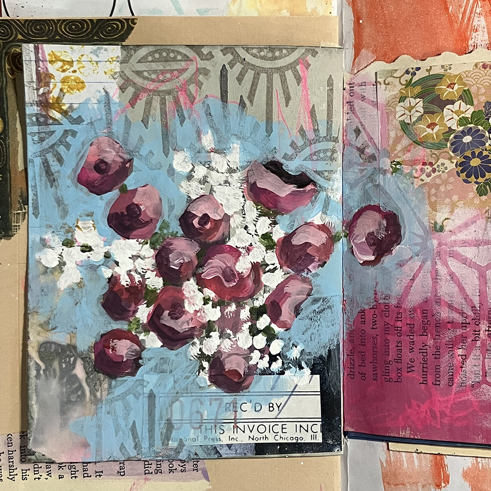
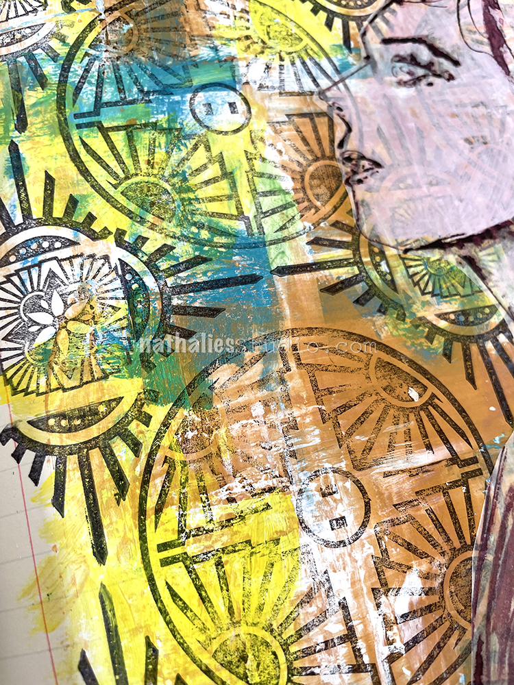
To finish off the page, I wanted to bring back the stamping that I lost during the painting process. However, I wanted the stamping to be more gentle this time around, since stamping in black felt as though it would be too harsh for the aesthetic of the page. I used Tim Holtz Distress Ink in the color Pumice Stone to do my stamping, again using Nathalie’s Empire Triangle stamp.

With that, I was ready to call this page complete! I hope you enjoyed following with the process!


Thank you Jordan! Wow those flowers came together so successfully and the Baby’s Breath is such a fun addition.

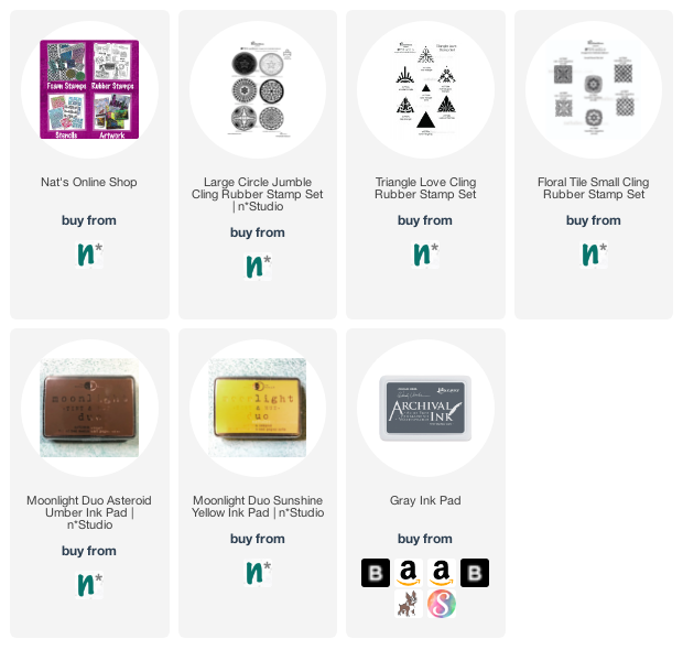
Give it a try: you can find all my Rubber Stamps in my Online Shop and in addition to collage material, here are some of the supplies Jordan used:

Looking for more projects? Follow the Creative Squad on Instagram.

Comments (2)

  • Erica Meares

    |

    I just found Nathalie’s Studi. This is the very 1st post on her Blog I had the Honor of reading, & wow, Wow, WOW!!!! I love the way you explained your process & provided pictures of your Work along the way! It was such a great experience to watch this transform from what was already a very pretty page (Due to the types of paper used; As well as the Colors, Marks & Stamping you’d previously applied); …To an absolutely stunning abstract representation of “The Great Outdoors Theme! I think my favorite part was when added splotches of pinks & reds. I’ve gone back & forth looking at each pic; Seeing the green added to resemble leaves & stems, & then even more shades of pink & red being put on the page with loose strokes. What really got me was the final pic where a simple change in backgcolor & adding a few dots of white… The entire spread came together! It was as if those blobs of color magically turned into beautiful flowers from one pic to the next; Using some techniques! I’ll definitely be looking you up soon! ~🙏💙🙏Much Graditude, Erica🙏💙🙏~

    Reply

  • Sue Clarke

    |

    Jordan, this is beautiful! You can create flowers as well as faces.

    Reply

Leave a comment

Calculated Probabilities – Art Journal

I had more fun with old letters in this art journal page – in this case I stumbled across the words “calculated probabilty” and I cut the rest out of the letter to form the journaling “there is a calculated probability you remain where you are planted, affectionately your poppa”.

Now the original 160 year old letter didn’t say anything of that kind but it did have at parts a little bit of a condescending tone to it, and I gathered well meaning Poppa was writing to an adult daughter. In any event, that is what lead to this page.

I also tried my new Caran D’Ache water soluble Graphite Pencil set. I love it – the green and blue graphite pencils are so cool. I did add some yellow acrylic ink on top of the face which I honestly regret, it looked way better before… but that is fine – I learned about the pencils and I broke them in. They might be my new favorite thing.

I finished things off with my Solid Triangle Small and Numerals stamp – just stamping the triangle part of the Numerals stamp.

Here are some of the supplies I used:

Leave a comment

Stars Gone Too Early – Art Journal

I made this page last week not knowing that yet again an horrific shooting took place. I made this page after the Shooting in Buffalo as I use my art journal not only to explore materials and techniques but sometimes also to work through thoughts and things that happen in the world. This was another very sad morning when I created it – the page does not really reflect my anger and helplessness about the horrible things that keep on happening here.

I cannot even imagine the pain the families of all those incidents have to go through. All I know is that this has to stop!

What kind of a society are we where we let this happen over and over again?

Quoting Amanda Gorman “What might be if only we tried. What might we become if only we listen.”

Leave a comment

Stay Gentle – Art Journal

For this spread I used the Star Struck stencil that was still wet from applying spray paint over it for the It’s Worth It art journal page. I flipped it over and pressed it onto the next page in the ledger, which created an uneven reverse print, mostly visible with the green structure of the stencil on the top right. I love getting inspired by something I was working on earlier and not just starting on a blank canvas, so to speak.

My first idea was to stamp into the Star Struck areas with my Triangle Love stamps and some Versafine – which worked out nicely but it was a bit off. So I layered the Star Struck stencil back on top, basically covering up what I had printed before and used the same colors yet again but tried to spare most of the area that was stamped.

I love the effect and I definitely want to play more with the flip flop stencil technique :) There is also a slight dimension to the built up spray paints which is hard to see in the photos, but I love it and I think I want to explore this a bit more on some of my bigger paintings as well as for the backgrounds.

Here are some of the supplies I used:

Leave a comment

Summer Dreams – Art Journal

I was really dreaming of summer while I played with this page in my art journal, right as we had another cold spell here.

I enjoyed having a little pattern play with some stamps from my Triangle Love set, my Mini Motifs set, and the Solid Hex Small rubber stamp too. Isn’t it fun to see how they all fit together? I used Versafine ink pads for the stamping.

My journaling was done on some blank, transparent washi tape that I just love – but still don’t remember where I got it.

I drew the face with a bamboo sketching pen (a favorite drawing tool of mine) and acrylic ink on deli paper. I adhered the sketch with fluid matte medium and really let the pattern shine through.

Here are some of the supplies I used:

Leave a comment

Doesn’t Hurt You – Art Journal

This one would have probably turned out a bit better if I had used different colors for the different stamps – maybe rainbow colors – but it was fun to explore and I really love some of the elements.

I used the Versailles stamps in the Floral Tile Small set with yellow and brown inks, the Solid Triangle Small stamp and the Amsterdam Triangle from the Triangle Love set, as well as the Valley Road stamp from the Large Circle Jumble set. I do think a different circle stamp would have worked better with the Versailles and Amsterdam stamps but I am glad I tried – I had lots of fun making this page. And even though you might not like it… it doesn’t hurt you! LOL

Here are some of the supplies I used:

Leave a comment

Judgement Day – Art Journal

“We need less people thinking they are the powers on Judgement Day”

I wanted to pick up the way I created the pattern for the Hypocrites art journal page, but this time I chose different patterns out of each stamp set – my Large Circle JumbleTriangle Love, and Floral Tile Small rubber stamp sets.

I stamped right onto the background with black archival ink and then used Daniel Smith watercolors on top. This works because the archival ink is waterproof.

Then like the Hypocrite page I did a sketch with muted violet ink on deli paper, added some white acrylic paint into the ink to add to the face and make the background less prominent, after I added the deli paper to the background with liquid matte medium.

For the journaling I used the tissue paper-like strips with adhesive backing that I found recently. I still don’t remember where they came from and what they are. I wish I did as I am growing found of them LOL

Here are some of the supplies I used:

Leave a comment

Hypocrites – Art Journal

“People say ‘Keep your chin up’ while gently pushing down your head.”

Using a credit card, I put down some colors with different viscosities – heavy body Liquitex white acrylic paint, soft body gold and blue acrylic paint, as well as some yellow acrylic ink, picking it up with the card and scraping the colors partly into each other. The white heavy body paint stayed wet and pliable for a longer time making for some really nice grungy marks.

After the paints dried I added different stamps, my Large Circle Jumble, Triangle Love, and Floral Tile Small rubber stamps, to create a pattern.

Then I sketched with a bamboo sketching pen and muted violet ink on deli paper.

As the background was very dark and prominent – unlike in the Things Change art journal page – I added some white acrylic paint mixed into the violet ink in a thin manner so that the background would still look through but not take over and “hide” the sketch. I adhered it with gel fluid medium.

Here are some of the supplies that I used:

Leave a comment

Pack of Dogs – Art Journal

“Sometimes I feel like a fire hydrant looking at a pack of dogs.”

As I was moving, packing and unpacking my studio, I swore to myself to use what I have which includes the huge stack of collage material in one of my letter press drawers. So here I am… sticking to my self made promise.

The background is from a gelli plate print – lifting off paint I had applied to it with my Hydrant foam stamp.

Next I added some collage paper I made in the Time Traveler workshop with Birgit and Marsha, one of the techniques I show in the workshop that resembles old peeled wallpaper. Then I added some sewing pattern paper and stamping with my Triangle Love rubber stamp set.

As for the journaling, that is a reflection on a recent phase… Happy to say the fire hydrant made it and is not drowning ;)

Here are some of the supplies I used:

Comments (1)

  • Sue Clarke

    |

    What a fun page Nat.
    We have fake fire hydrants at our dog park and we joke that the dogs from MA have to teach the dogs from NH how to use them.
    Most areas in NH do not have fire hydrants (our fire engines suck up water from local ponds to fill their tanks).

    Reply

Leave a comment