
Hello from my Creative Squad! Today we have a really lovely post and video from Riikka Kovasin who is sharing some of her travel memories with us in her mini billboard project, using my Fan-tastic Small stamps and our theme: In the City – Although we aren’t traveling much these days, let’s reminisce about a time we traveled to another town or city. Think about the flavor of the place and let that guide your color and design choices.
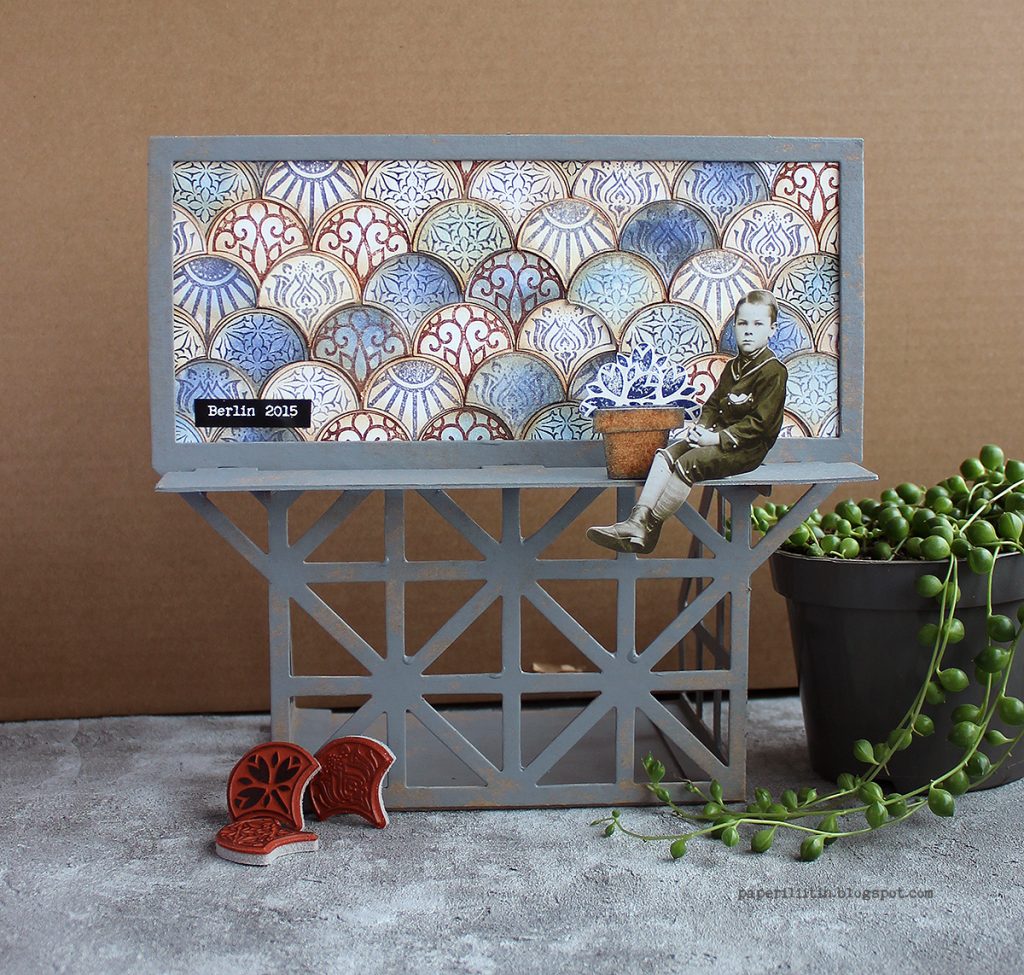
Moikka! It’s Riikka here today sharing my May project with you! I was excited to get this Billboard Model Kit to play with. I drew inspiration from a couple of different cities or travels.
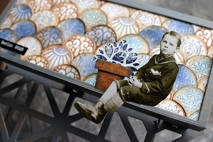
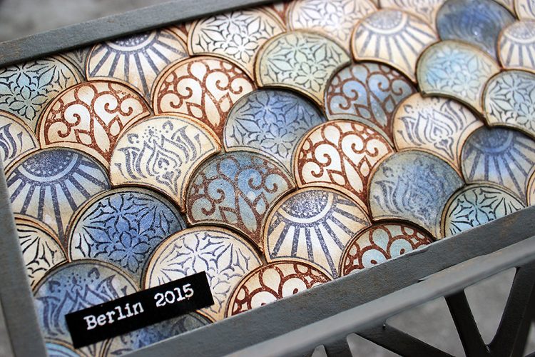
The biggest influence was Berlin where we traveled for a family vacation back in 2015. There was a lot to take in but somehow the most vibrant mental images are of grungy surfaces and tiles. We had a room in a hotel/hostel that was built inside an old apartment building. The staircase of the place was just amazing – it screamed history with the polished wooden handrail, ironwork columns for the handrail, painted walls with decorative motifs and a tile laid floor just behind of the massive front door. I can’t remember the actual patterns of the tiles, but I remember feeling a little sad each morning when we left to go about the town as a couple of the tiles were missing and there were gaps in the beautifully decorated floor.
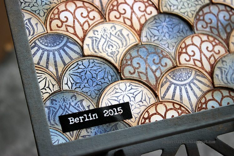
I chose the Fan-tastic Small stamp set to represent the tiles and their patterns. I used three different stamp inks to stamp the patterns and colored some of the tiles blue in a later stage of creating. I’m pretty sure the Berlin tile floor was in the colors of browns and cream, but still I went with blue as the accent. Even though I brought a lot of the brown to the piece by inking the edges of the tiles, I guess the blue has its origin on another trip and city. The blue takes me to 2013, to Amsterdam, Utrecht and especially Amersfoort. The blue is related to a tile Marsha Valk showed me when visiting her beautiful home.
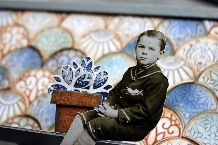
But besides Berlin and Amersfoort, there’s still one more city that inspired a detail to this piece. That’s Ischia. The colors are all wrong for that but coming off the ferry from mainland Italy to the island, there was a flowerpot with vibrant red geranium on a windowsill of one bright white building. Sunny day made the colors so vibrant, it felt like saturation was up by 100. The window with the flower was the only window on that side of the house and the flowerpot got etched into my brain vividly. So, while my piece has tulips and they are blue, the idea of this detail came from that mental image.
I recorded a little video while working with the billboard. The camera angle is a bit off in the end as I assembled the piece before adding the finishing details, but I hope you can still see my process.
Thank you for stopping by today! Wishing you a lovely week and great travels though the different memories!


Thank you Riikka – was so nice to hear the travel inspiration behind the color and pattern choices that you made and to see how you incorporated that into the piece.
Give it a try: you can find all my Rubber Stamps and those cool Cardboard Models in my Online Shop and here are some of the supplies Riikka used:
Follow Nat’s Creative Squad on Instagram too: Each week we post projects, ideas, and inspiration for mixed media art.
Comments (1)
Sue Clarke
| #
I absolutely love the colors that you used and the cute bill board display.
Reply