Creative Squad

Videos from the Creative Squad – Part 3

My Creative Squad has made some really cool videos for their projects through the years (what a talented bunch indeed) so I’ve been doing a little 4 part series sharing some with you. Also I encourage you to check out the Creative Squad archive of projects as an excellent resource for serious artistic inspiration.

Let’s get started!


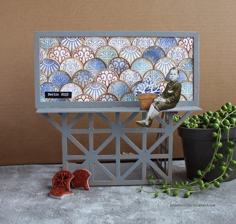
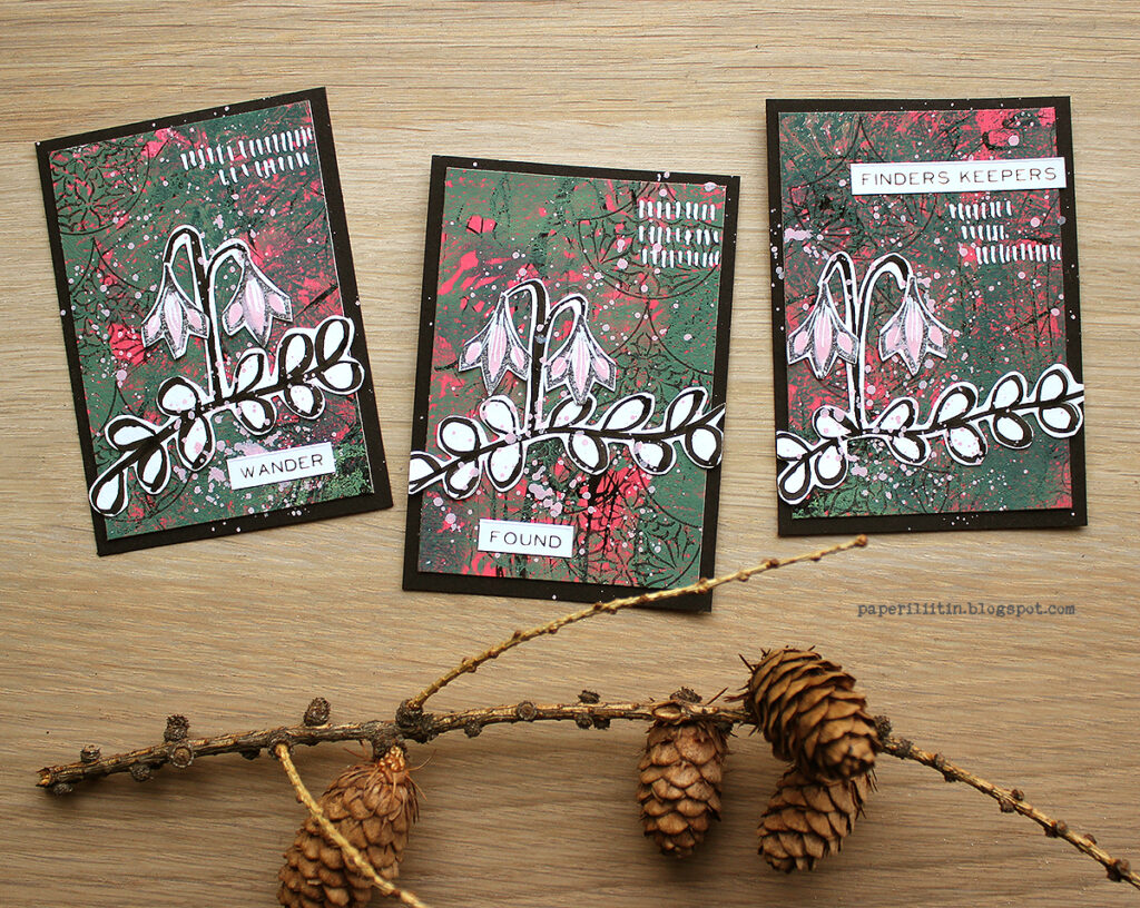
Today we have one of the sweetest project ideas from Riikka Kovasin using one of those mini billboard kits (50% off now while supplies last – use the code nowsave50 ) and my Fan-tastic Small stamps. The theme was In the City – let’s reminisce about a time we traveled to another town or city. Think about the flavor of the place and let that guide your color and design choices.

Here is the link to her original post and here is the video she shared of her process:

I love how she created a distressed look to the whole thing and that flower pot fits perfectly to scale. Such a cool way to use the billboard!

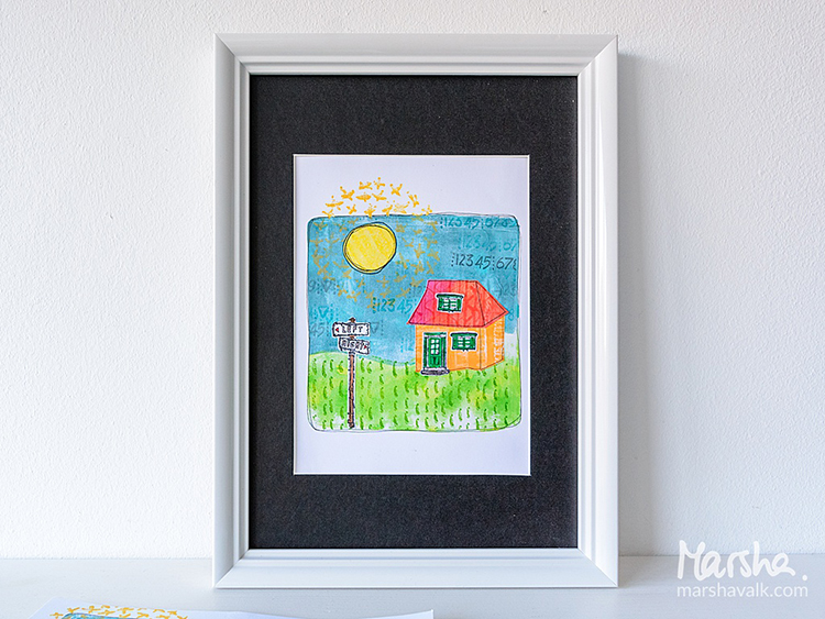
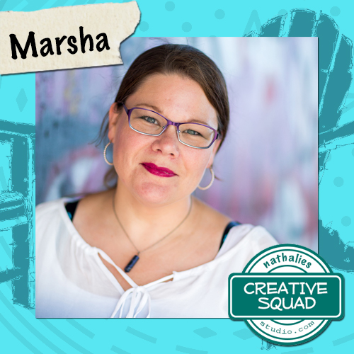
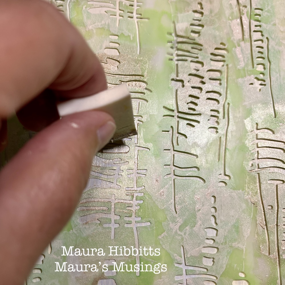
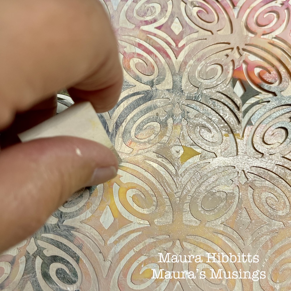
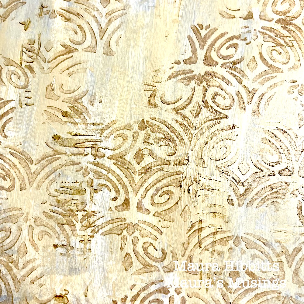
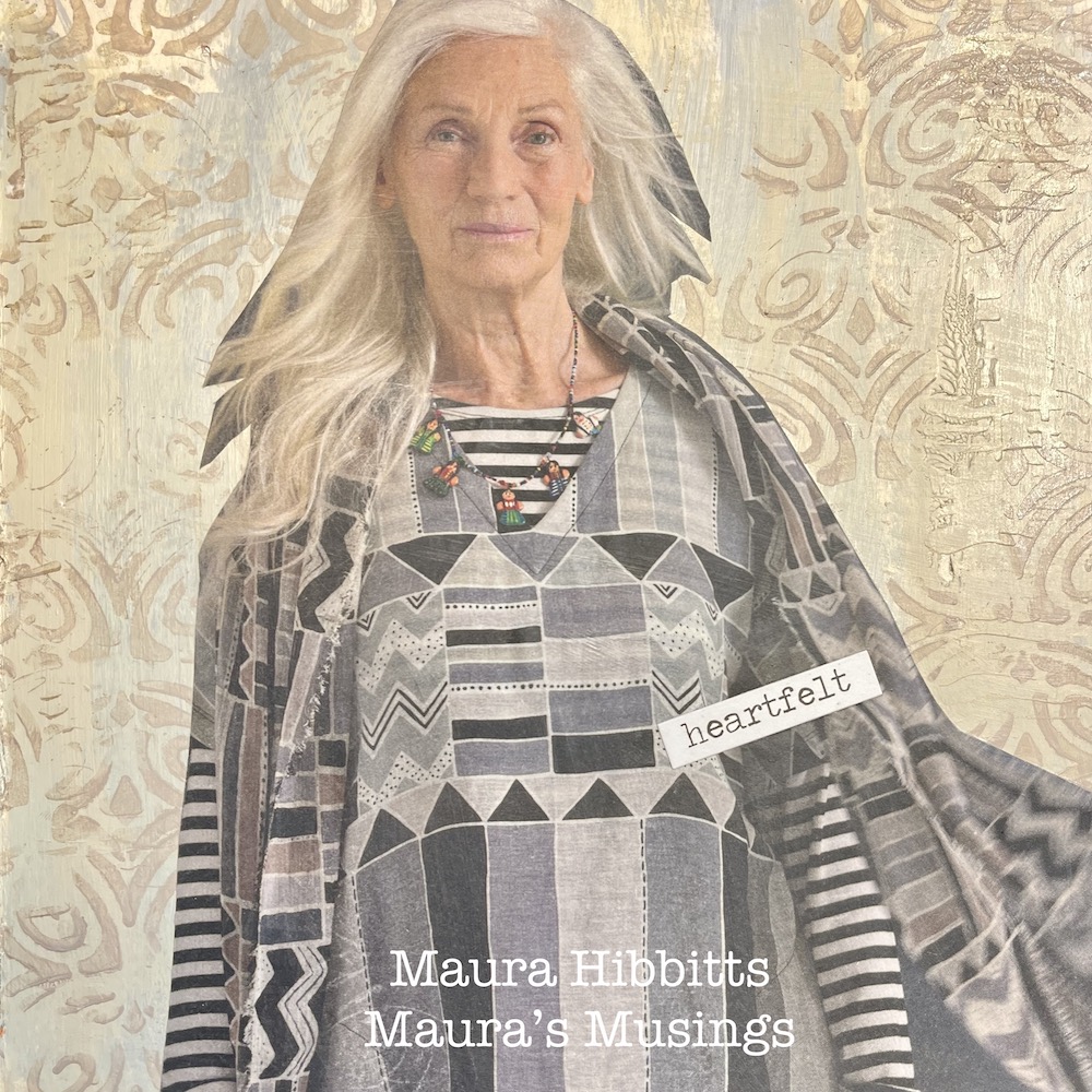
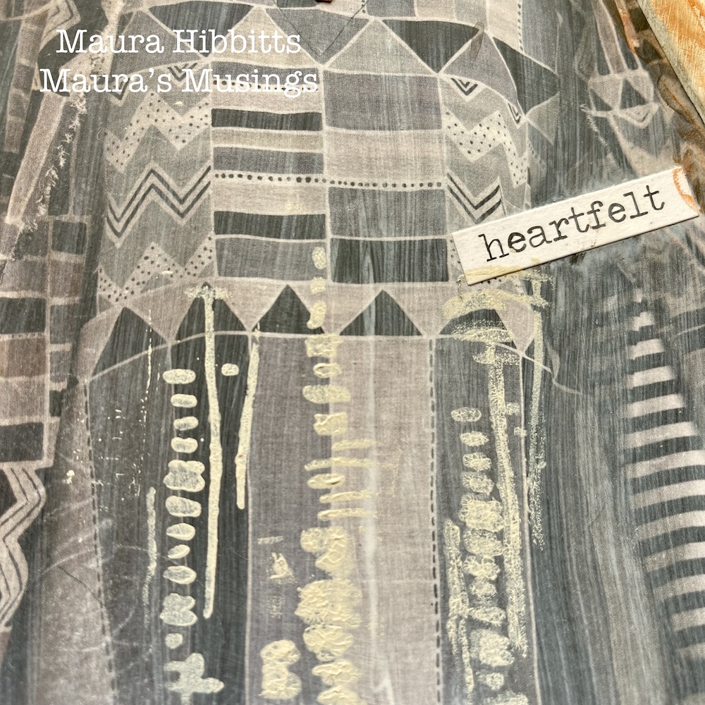
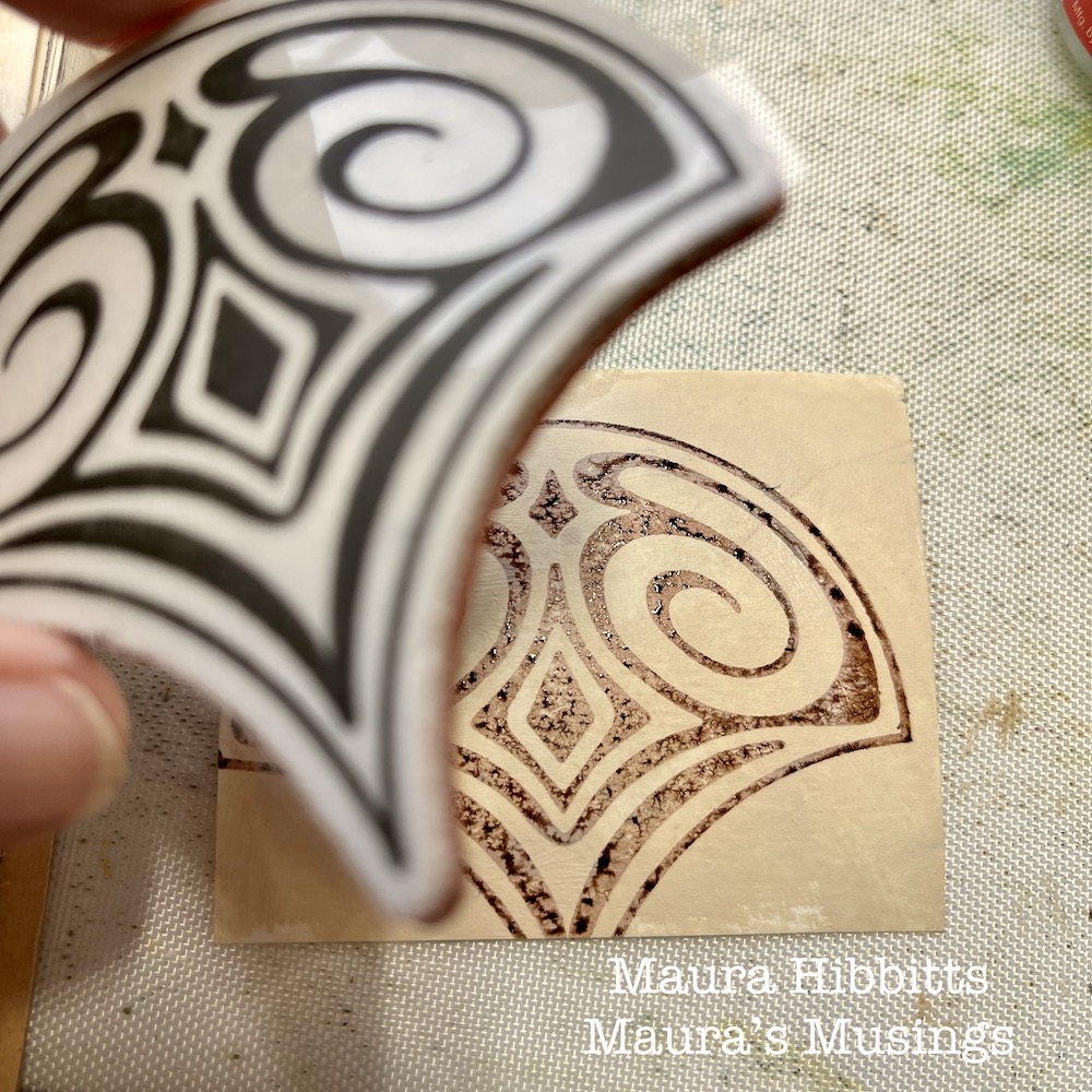
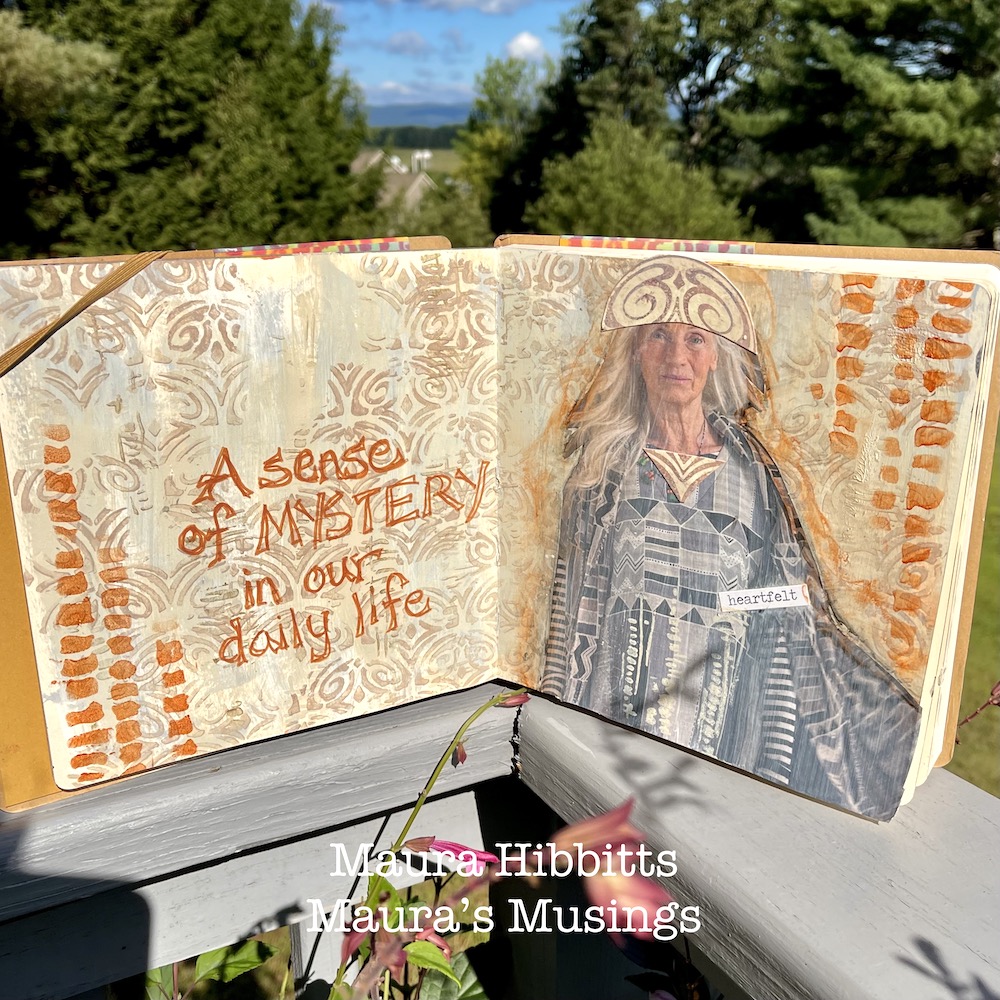
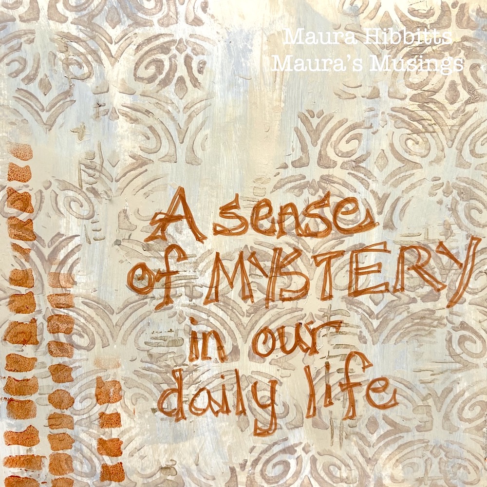
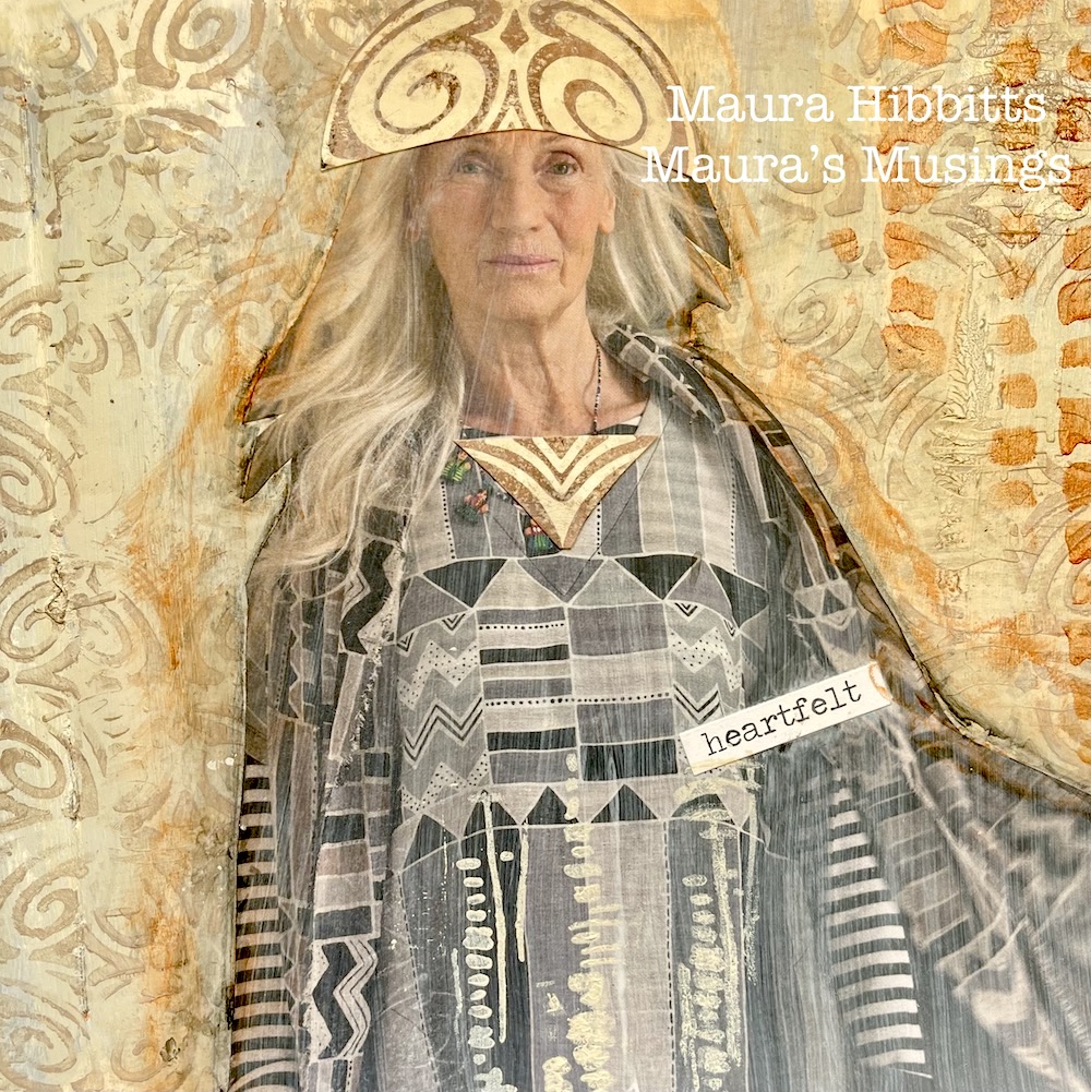
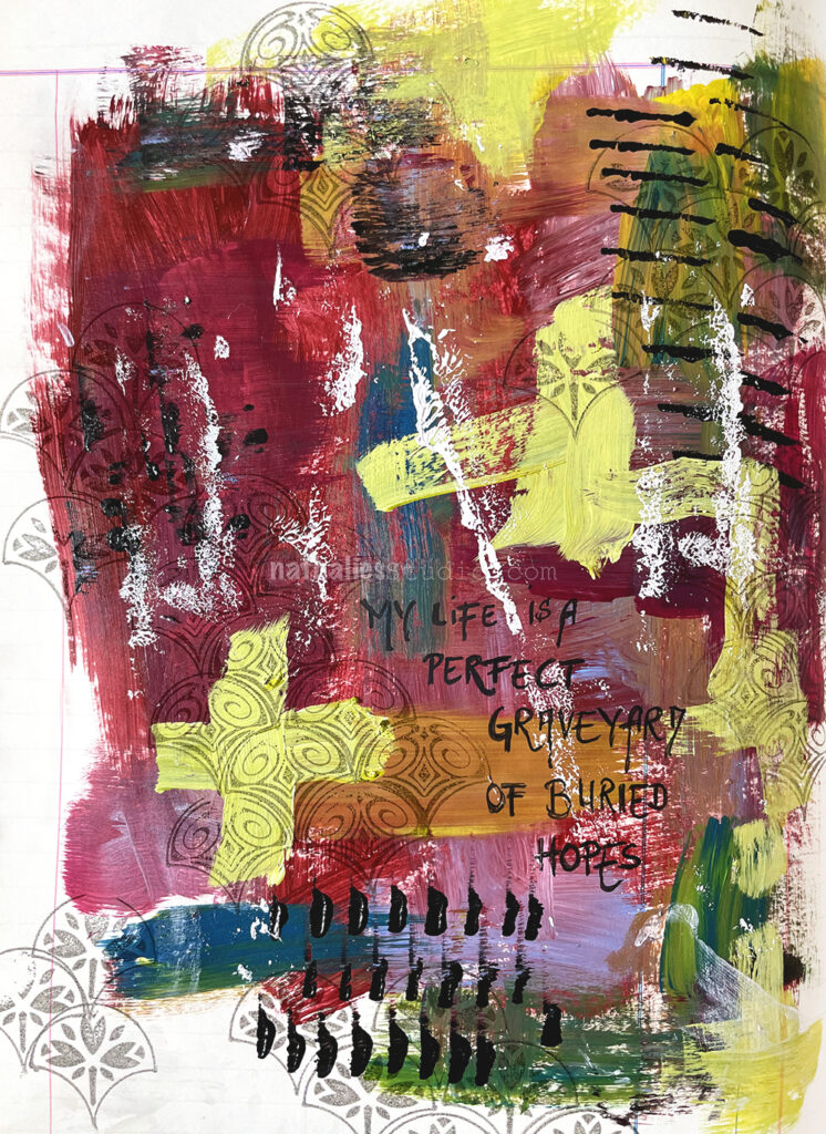
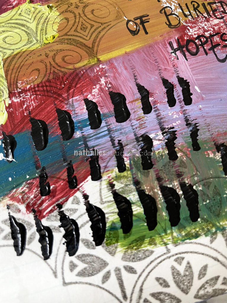
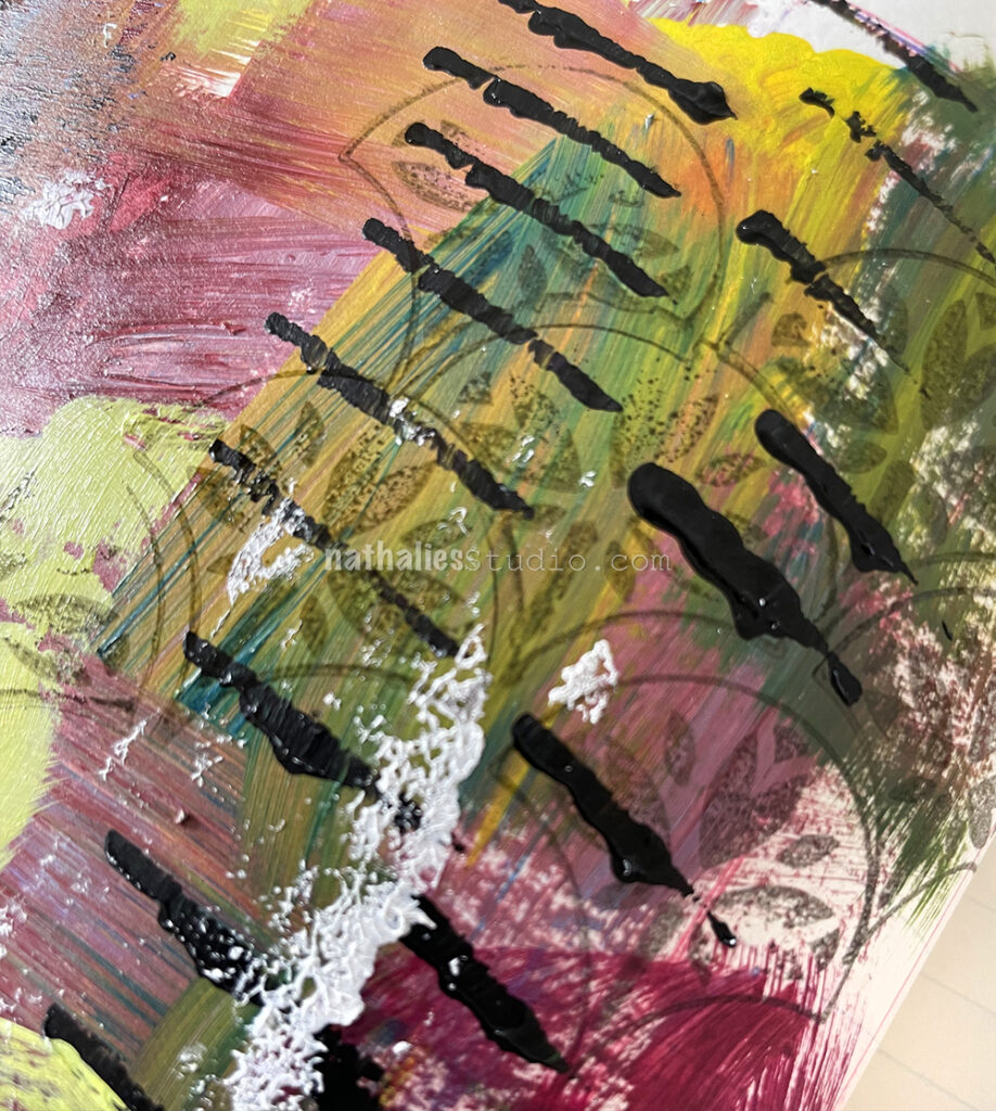
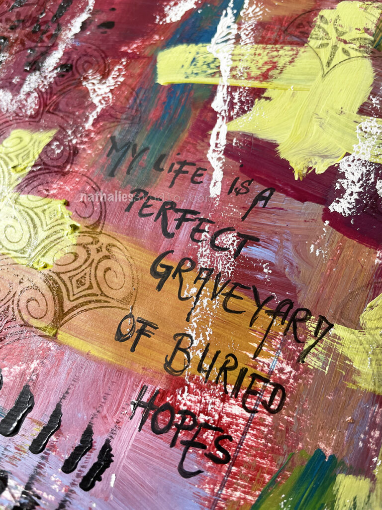
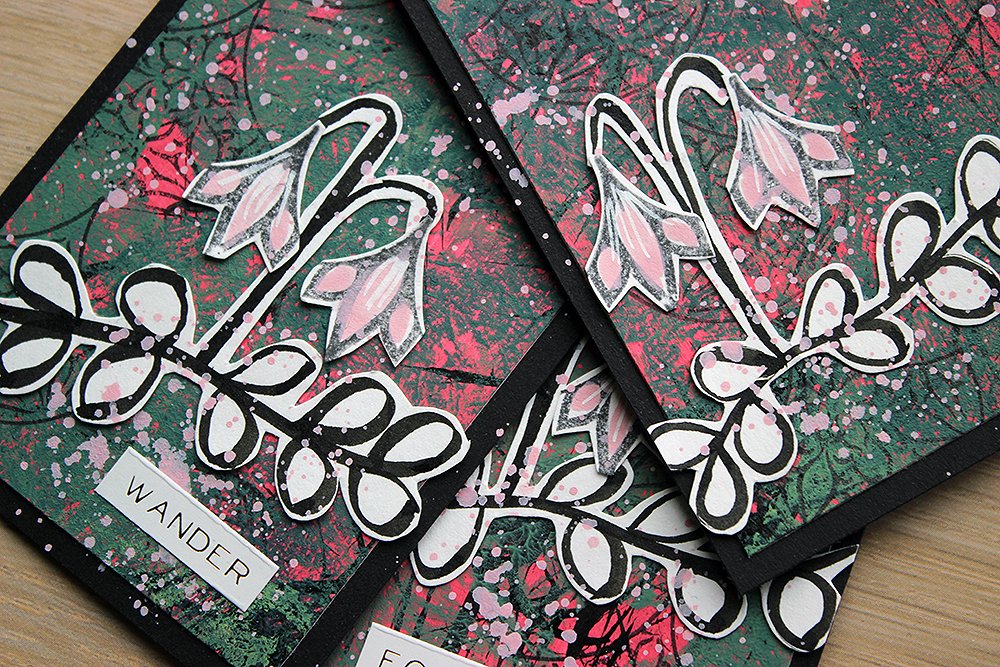
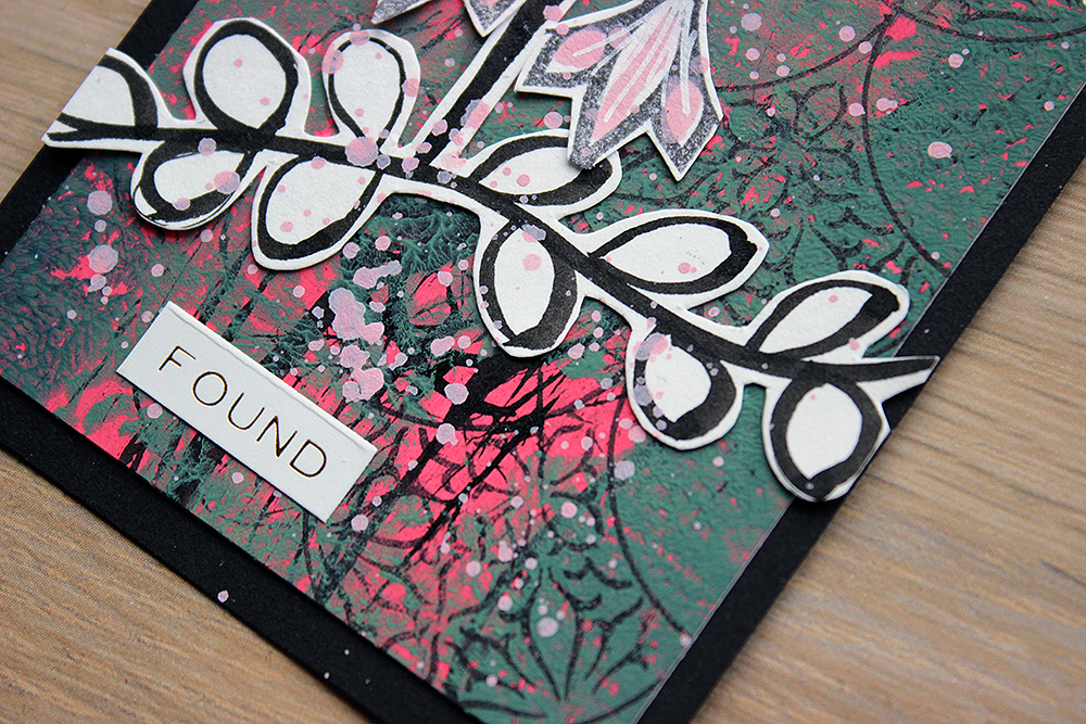
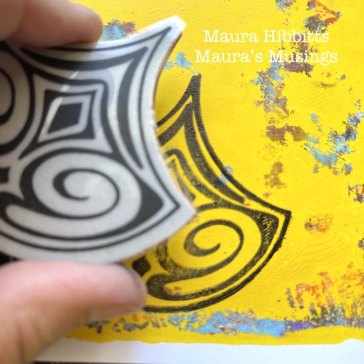
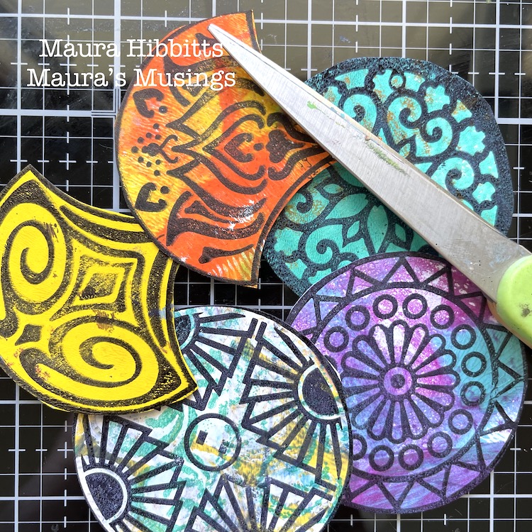
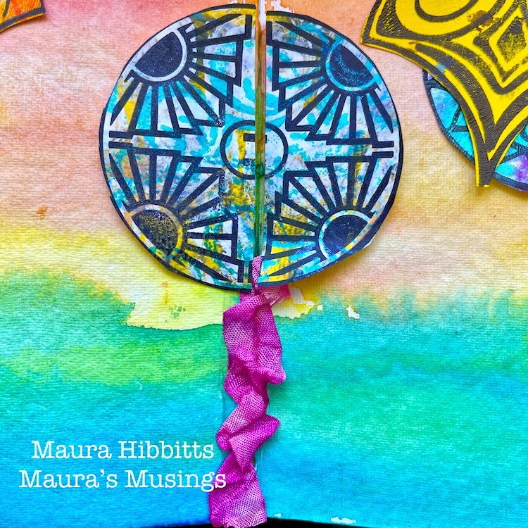
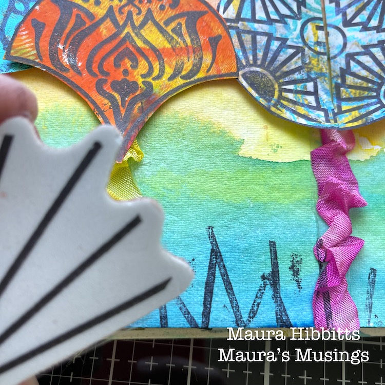
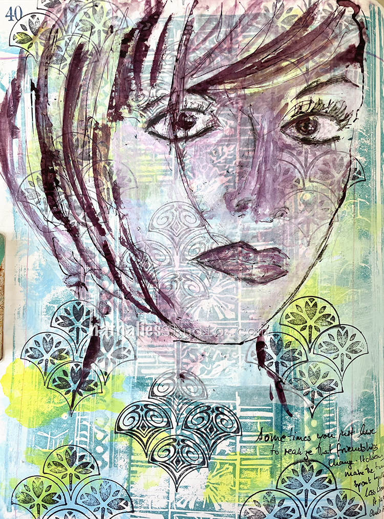
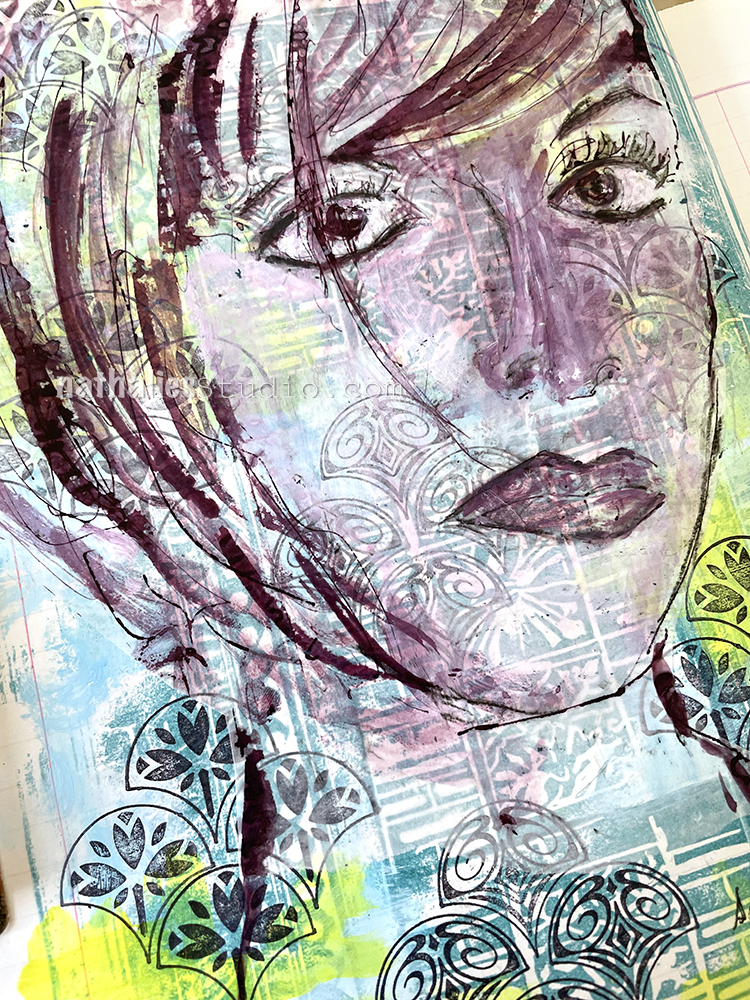
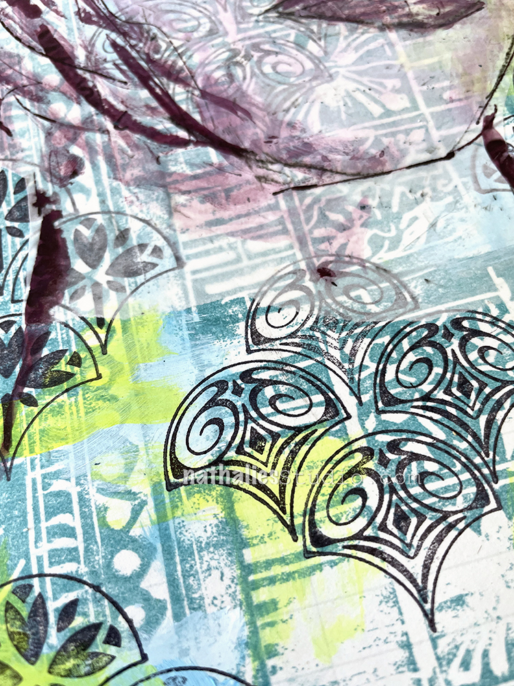
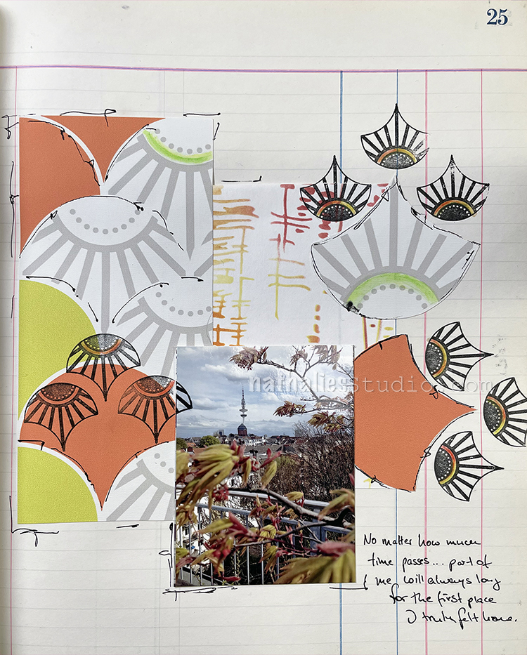
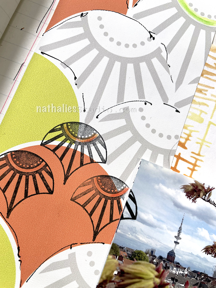
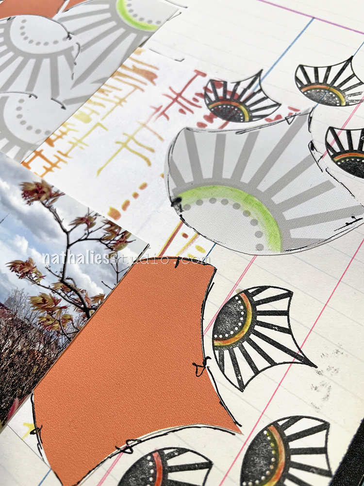
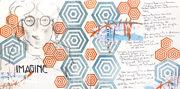
Here is a lovely little mixed media piece from alum Marsha Valk using rubber stamps from my My Home Is My CastleEmbroidery, and Cardboard stamp sets. She was working from our theme: This Must Be the Place –We’re all on a journey to somewhere or something. Sometimes we’re just making preparations for simple things like dinner or weekend plans. Other times we’re aiming for bigger goals, bigger places. Whether it’s a location or a state of mind, you’ll know when you get there. Where are you headed?

Here is the link to her original post and here is the video she shared of her process:

I love the little textural details Marsha adds by using the stamps in her piece.

If you had fun watching these videos, be sure to tune in next time for a couple more from the archive.

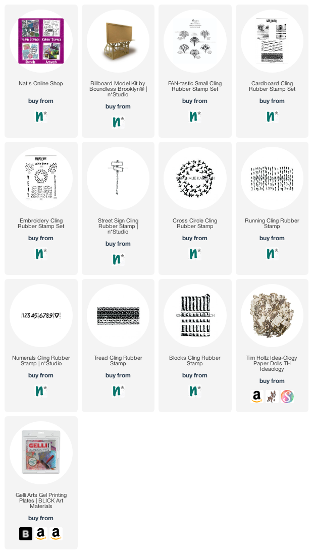
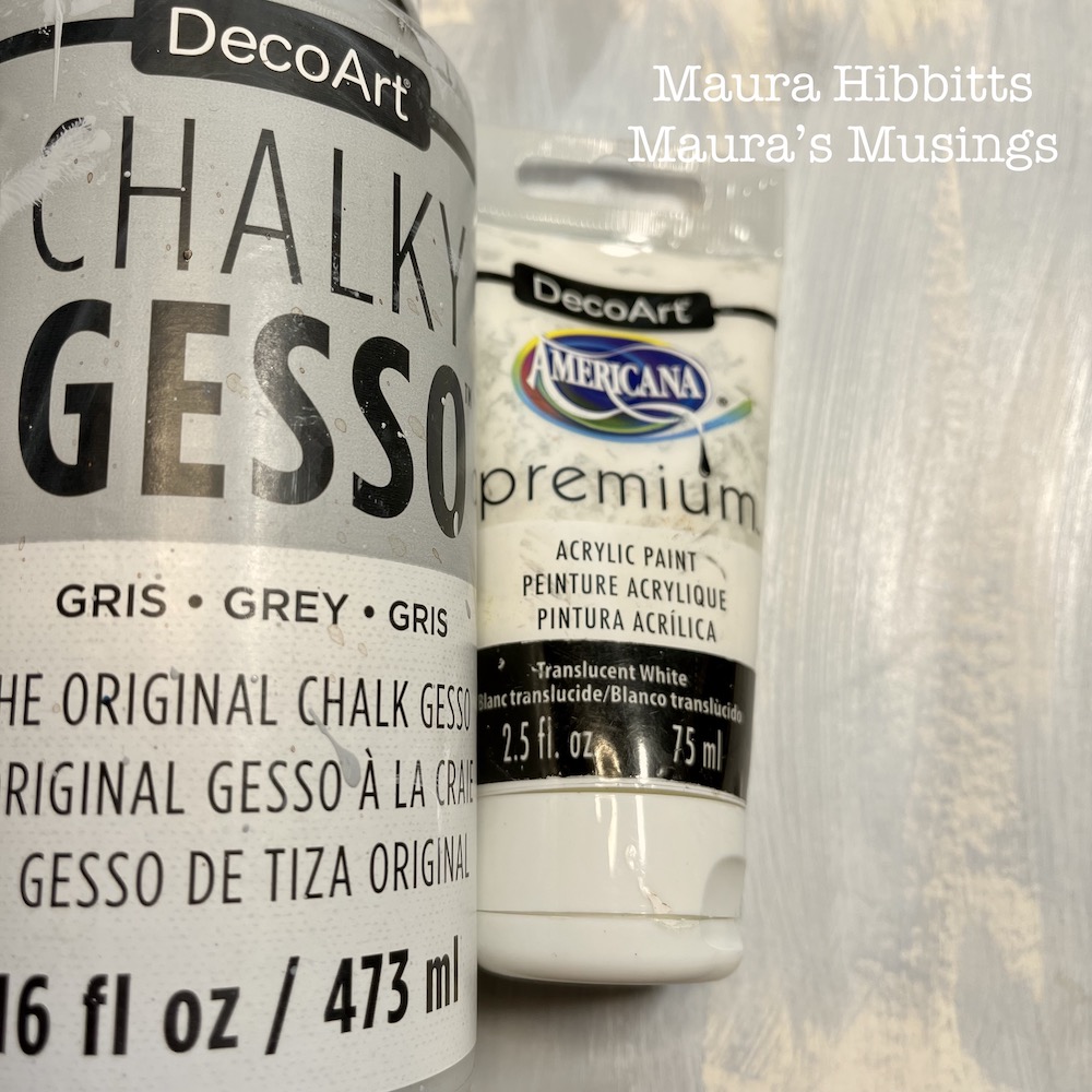
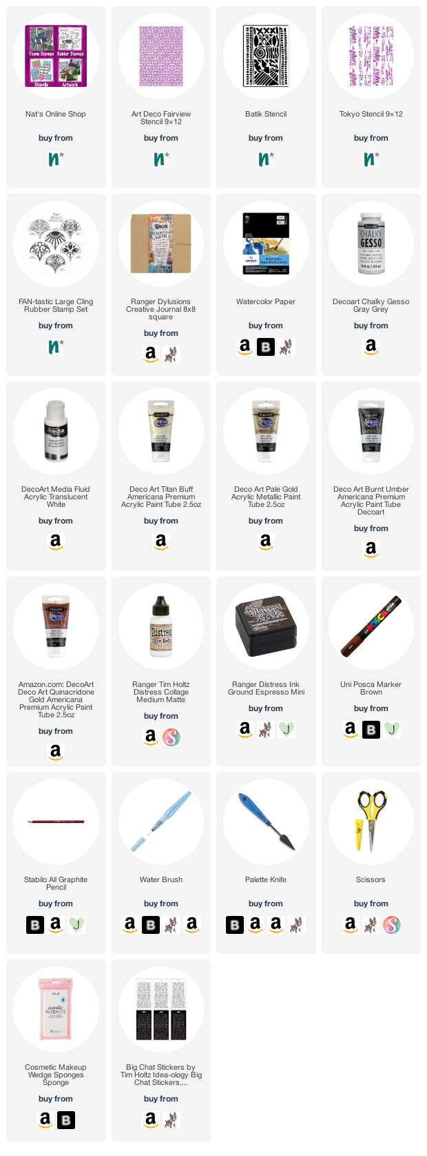
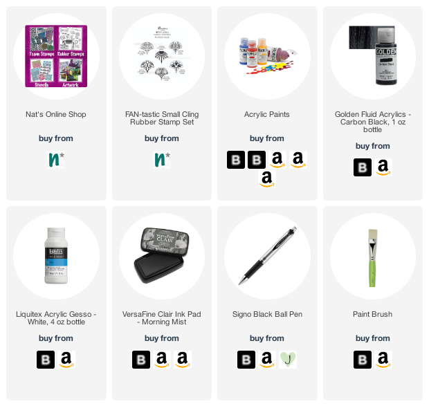
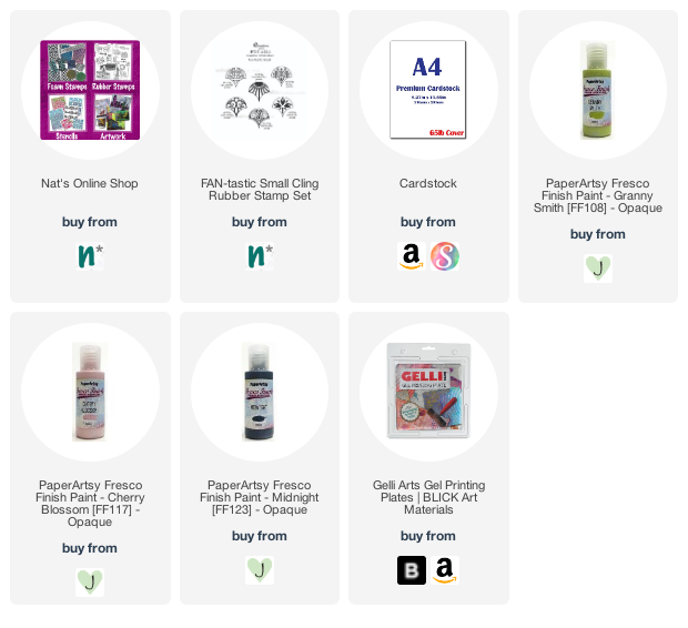
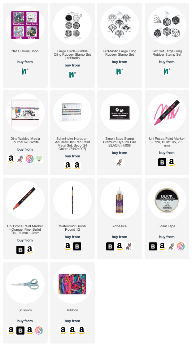
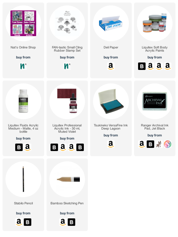
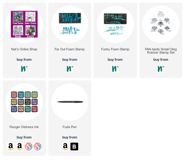
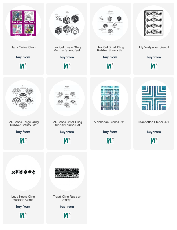
Here are some of the supplies used in these projects:

Comments (1)

  • Sue Clarke

    |

    Riikka, I LOVE that mini-billboard!!!

    Reply

Leave a comment

Creative Squad: Favorite Art – My Way – Maura Hibbitts

Hello from my Creative Squad! Today we have a mysterious and serene art journal spread from Maura Hibbitts using my Art Deco Fairview, Batik, and Tokyo stencils and my Fairview Fan rubber stamp for our new theme: Favorite Art – My Way – Look at a favorite work of art and create something inspired by it, drawing from the colors, shapes, subject matter, feeling etc. that strikes you most when you look at it.


For reasons I don’t completely understand, I’ve been drawn to “Smoke of Ambergris” by John Singer Sargent, since I first saw this painting in a museum. Usually, bright colors call to me, but this painting is soaked in neutrals. Maybe it’s the hints of far off lands seen in the echo of architecture and floor tile. Maybe it’s the feeling of serenity as the woman lifts her veil over the brazier. There is a mystery here that is both simple and complex, an insight into another time and place, that intrigues me.

I began by brushing chalky grey gesso up and down my art journal pages, leaving some open areas. Next, I added a layer of translucent white paint, again using vertical strokes, to mimic the vertical lines in the painting. I also felt like this created the hint of shadows.

I added a stenciled layer to the dry background using Nat’s Tokyo stencil and pale gold paint.  I like to use a cosmetic sponge for this step, and you always want to use a light touch with the paint to keep the design crisp.

Next up, another stenciled layer. This time, I used Nat’s Art Deco Fairview stencil and a blend of titan buff and burnt umber paints. The layers are building…

Cut a figure out of a magazine or catalog and adhere to the page using collage medium. I added a word sticker over a label on the clothing. I chose this particular figure for the neutral clothing.

I added a bit of stenciling to the dress using Nat’s Tokyo stencil and titan buff paint.

On a piece of watercolor paper, paint it with titan buff and let dry. Next, stamp Nat’s Fairview Fan stamp onto it, using ground espresso distress ink (or any brown ink).

Smudge quinacridone gold paint around the figure and let dry. Edge the figure with a graphite pencil, then use a water brush to create a shadow.

Add three vertical stripes on the opposing corners of the pages with Nat’s Batik stencil and quinacridone gold paint.

Cut the stamped image into a hat to represent the veil in the painting. Also add a portion to the dress.

Hand letter some words to the open page with a brown Posca pen. I chose the words “A sense of mystery in our daily life.” I feel the mystery in the painting “Smoke of Ambergris”, but also sense this is a ritual for the woman in the painting. I wanted to echo the neutral tones of the painting and vertical lines, as well as bringing in a hint of the east into my art journal. Get inspired by a favorite piece of art and create! Maura


Thank you Maura! I love that painting too and how you interpreted the color palette and elements is very pleasing to the eye :)

Give it a try: you can find all my Stencils and Rubber Stamps in my Online Shop and in addition to her magazine image, here are some of the supplies Maura used:

Looking for more projects? Follow the Creative Squad on Instagram here.

Comments (2)

  • Sue Clarke

    |

    Love love love this Maura!
    The original is peaceful and you’ve captured the feeling perfectly and made it modern.
    This gives me some ideas.

    Reply

    • Maura

      |

      Thanks so much Sue! I am so glad you enjoyed this, and it gave you some creative ideas. Have fun creating! Maura

      Reply

Leave a comment

Buried Hopes – Art Journal

Sometimes when I paint on canvas and have leftover paint on the palette, I get real stingy and add it into my art journal. And that may or may not be good, but it always kind of pushes me to think of the next thing to do and acts as a starting point :)

Here I added some marks with a brush and black paint, as well as some gesso texture with pressed cloth.

Then I stamped the Fan-tastic Small rubber stamps using a grey Versafine ink pad. The Journaling is done with a black Signo ball pen. Fun!

Here are some of the supplies that I used:

Leave a comment

Creative Squad: The Great Outdoors – Riikka Kovasin

Hello from my Creative Squad! Today we have a post and video from Riikka Kovasin who is sharing a batch of ATCs using a unique found tool to create them, as well as my Fan-tastic Small stamp set and our theme: Great Outdoors – The experts agree that getting outside for activity each day is a super healthy thing you can do for your mind and body. Let’s get outside and seek artistic inspiration out there. Find something that catches your eye and then when it’s time to come back in, use that inspo to create.


Hello there! It’s Riikka here today with my take on the monthly theme of “The Great Outdoors”. 

While I did go outside to get some inspiration for my project, I stuck with my first idea when I started to think about outdoors in Finland. While we have over 150,000 lakes (if the small ones are calculated as well) and mainland has over 6,300 km of shoreline, I started immediately to think about the forests! And I’ve lived in coastal cities my whole life! But I recall Finland being called “the land of green gold” as well, meaning the vast area of forests that cover over 75% of the land. While the old Finnish films usually always depict birch trees, to me the old coniferous forests are the type that scream Finland. Those murky fir tree forests with lush green moss and thin lines of sunlight seeping through from the gaps in the thick canopy. 

In such a forest you can find a delicate flower during the height of summer. In the dim lit forest floor, you see these little dots of the palest pink that seem to radiate in the dark like tiny stars. The flower was also Carl von Linné’s favourite, that’s why the plant carries his name – Linnaea Borealis. Linnaea is after his original last name, Linnaeus and ‘borealis’ meaning ‘northern’. The plant is found in the Northern parts of America, Asia, and Europe.

When I was roaming about in an old forest, looking for further inspiration, I came across some fir tree branches that had fallen to the ground as there had been strong winds the previous day. I packed some with me and ended up using them as a brush and as a patterning tool. They bring that forest aspect to my ATCs depicting the delicate flower. 

Now I had my topic and some of the means to create it, but I was still pondering about HOW to create the flower. I ended up deciding to use one of the FAN-tastic stamps to make the flower but didn’t look them thoroughly through before I was making the cards. My original thought was to stamp the fan shape and twist it into a dimensional little cone, but I found something even better. When I then was choosing the stamp to be used for the delicate bell-shaped bloom, I couldn’t believe my eyes as I saw one in the stamps! I couldn’t have drawn or found a better way to depict the flower! The “Park Ave” stamp had a linnaea borealis in it! I’m happy that you can only see my hands in the video so you can’t see my stunned face!

As you could see from the video, I used the FAN-tastic stamps also for another purpose. I added some highly stylized fir trees to the background before adding the plants in place. I picked the “Van Vorst” stamp as it’s thin line patterning reminded me of fir tree needles.

Now you may ask if the flower is called linnaea borealis why my project is named Linnea. There are two reasons for that – first that I misspelled it and second, probably why I misspelled it in the first place, that one my other daughter’s names is Linnea, after her great grandmother. If you want to read more about the flower, here’s a link to Wikipedia

Thank you for stopping by! Have a great time exploring the outdoors for inspiration! You never know what you may find!

Xoxo Riikka


Thank you Riikka – I love the story behind your project and that serendipitous moment of finding the flower in the Fan-tastic stamp – how cool is that?!

Give it a try: you can find all my Rubber Stamps in my Online Shop and in addition to her fir tree “brush”, here are some of the supplies Riikka used:

Looking for more projects? Follow the Creative Squad on Instagram

Leave a comment

Pressing Questions – Art Journal

This is another art journal page with some inspiration from an old letter from the 1860s. This sentence said “I want to know if you have seen much of the sun lately?” It struck me as funny.

BTW reading all those letters and creating with them made me think about how much I loved to receive and send letters. I have a lot of letters that I kept from dear friends and family members and it is a funny thought that maybe in 100 years someone will make art with them hahaha.

I used my Art Deco Summit and Art Deco Empire stencils with Ranger distress oxide inks and a blending tool through the stencils.

On top I adhered a piece of Grafix acetate on which I had stamped with my Fan-tastic rubber stamps and Versafine ink. It was a leftover from a project and I thought it would be fun to use. I just added some double sided adhesive tape to the back and pressed it down.

For the letter I used my fav Coccoina glue stick.

Here are some of the supplies I used:

Comments (1)

  • Sue Clarke

    |

    Wouldn’t it be wonderful for someone to use one of your letters for art…absolutely a delightful thought!

    Reply

Leave a comment

Creative Squad: The Great Outdoors – Maura Hibbitts

Hello from my Creative Squad! Today we have a gorgeous post from Maura Hibbitts using my Large Circle Jumble, Fan-tastic Large, and Hex Set Large rubber stamp sets and our new June theme: The Great Outdoors – The experts agree that getting outside for activity each day is a super healthy thing you can do for your mind and body. Let’s get outside and seek artistic inspiration out there. Find something that catches your eye and then when it’s time to come back in, use that inspo to create.


What a perfect time to celebrate the great outdoors! It’s a time of year when people love to get out in nature and play. Camping, hiking, boating, gardening…and the list goes on. I have always been drawn to the woods. As a child, you could find me playing out there almost every day. This year, I closely observed the leafing out of the trees, and celebrated their return to glory.

I began in my Media Journal with a watercolor background. I decided to use non-traditional colors on my spread. I used a #12 brush to swipe color across the pages.

While the background dried, I stamped onto gel prints (any collage paper would work) I had in my stash using a black dye ink. I used Park Boulevard, Broadway and Valley Road stamps from the Circle Jumble large set…

…and the Lily and Fairview stamps from the large Fan-Tastic set by Nathalie.

Next step is to cut out the stamped shapes to use as the trees.

Run adhesive over the area of the tree trunk and layer ribbon down. I used some hand-dyed ribbon I had in my stash, but any ribbon will work.  Pleat it a bit to get some texture. Add foam tape to the stamped image and use as the tree canopy. Note – split the center image and space far enough apart so the book will close.

Use the Beacon Positive stamp from the large Hex set, and black dye ink to create grass and flower stems along the bottom of the page.

To finish the pages, I hand lettered “ A walk in the woods” and added dots to make flowers, using Posca markers.

Popping up the tree tops with foam tape, and scrunching the ribbon adds some lovely texture that you can see in the sunlight. Many days, I just observe the trees  from my deck and that brings me peace. It is a special day when I can get out to the woods for a walk or picnic. I wish you many opportunities to enjoy the great outdoors this summer! – Maura


Thank you Maura for this colorful and fun celebration of the outdoors! Love the idea of using all the stamps to create different trees :)

Give it a try: you can find all my Rubber Stamps in my Online Shop and in addition to gelli printed papers from her stash, here are some of the supplies Maura used:

Looking for more projects? Follow the Creative Squad on Instagram here.

Comments (2)

  • Rebeccab

    |

    A great way to interpret trees!

    Reply

  • Robin

    |

    Maura, beautiful bright piece of work! I love the texture you created too!

    Reply

Leave a comment

Things Change – Art Journal

In this page I was just reminiscing that sometimes friendships change throughout the years and that is ok, it doesn’t lessen the good times, it is just a different path.

I started out the background with layering some of the architectural stamps I had carved a long time ago, using versa fine ink to stamp with them. Then I added a bit of yellow and light blue acrylic paint in some of the gaps to brighten it up. Next I stamped a pattern with my Fan-tastic Small rubber stamps and archival ink in black and added a sketch in ink done on deli paper. As you can see, I had a bit of a nose job struggle …but I am cool with it LOL. You just have to let go sometimes.

I adhered the deli paper with Liquitex matte fluid medium. I love when the background fades a little bit behind the deli paper but still comes through.

Here are some of the supplies I used:

Leave a comment

Longing – Art Journal

While packing up some stuff I found this photo from our old apartment in Hamburg, Germany and I got a little melancholic. I had a great time in Hamburg and miss it a lot – I cannot wait to hop on a plane once things ease up more (I am not ready yet for a long haul flight and the uncertainties that go with international travel and a pandemic and regulations).

I used a piece of wallpaper I had designed for my studio bathroom a while ago as well as some collage paper I had created with distress ink pads and my Funky and Far Out ArtFoamies. I also used the small Broadway Fan stamp – the leaves of our Maple tree on the roof terrace reminded me of the shapes in the Broadway stamp …shapes are a funny thing :)

Here are some of the supplies I used:

Leave a comment

A Look Back – Inspired by Songs – Cool Stuff You May Have Missed 31

A Look Back – Today I’m looking at art journal spreads, projects, and even an old layout from 2009 where specific songs inspired me to create. I have always been a big fan of alternative and punk music but lots of times a song from an entirely different genre will inspire me. Poetic lyrics definitely catch my… ear lol

A Look Back is a blog series to show you some projects and posts that you may have missed – sometimes going WAY back in the archive. I think it will be fun to revisit a few ideas that we haven’t seen for a while. I’m excited to see how a little look back might inspire something new in the future :)

I created this art journal spread in 2019 after watching a doc on John Lennon and Yoko Ono. I think this song (“Imagine”) in particular always resonates when we are going through a period of strife. I felt the need to copy down a lot of the lyrics (maybe all of them), filling in the empty space I created using my Hex Set Small and Hex Set Large stamps.

Also in 2019 I joined a challenge by my friend Tina Walker called The Stencilfied Journal and it was a series of about 25 song prompts to get inspired by. The above one was U2’s “I Still Haven’t Found What I’m Looking For” – and as a U2 fan I had no trouble finding inspo in that. I created a background with my Lily Wallpaper stencil and my Fan-tastic Large and Fan-tastic Small stamp sets and then put in my contemplative figure who is wondering, “maybe I should quit looking?”

As you know, I always have my eyes open for architecture and one time in San Francisco I saw this great house, snapped a pic of it, and later put it in this art journal spread as a transfer. The Crosby, Stills, Nash, and Young song “Our House” often comes to mind when I see a lovely home so it all came together in this spread in 2017. I added my Manhattan stencil, Love Knots rubber stamp, and my Tread rubber stamp too. Now where are those two cats…?

Time to go back in time to 2012 and this collage I created on an old record, inspired by the German song “Ein Freund, ein guter Freund” – a song that came to my mind when I was going through old photos of my Aunt Margo and her friends on a camping trip in 1949. She had shared some of the funny stories of that trip with me and I loved thinking about her and her good friends going on a rather madcap adventure when they were young :)

And now I take you alllll the way back to 2009 and this layout inspired by “Stand By Your Man” (as performed by the incomparable Blues Brothers) and featuring some ridiculous slippers that my husband had back then. I don’t know about those slippers but I still dig some of the collage elements I brought into this.

I hope you enjoyed this look back on some artwork inspired by songs. Here are some of the supplies I used:

Leave a comment