Hello from my Creative Squad! Today we have a post and video from Riikka Kovasin who has created a set of ATCs that will make you chuckle :) using my ATC Mixup stencil and our theme this month: Time for Texture – Visual texture or actual texture is an element that can give dimension, depth, and touchable interest to any piece of art. Let’s play with texture in a series of ATCs and see what emerges!
Snarky Kids
Moikka moi! It’s Riikka here today with some snarky ATCs! Boy, there might be some explaining to do. Not in the project itself, those cards are quite straight forward, but the focal points and the juxtaposition. Let’s get started!
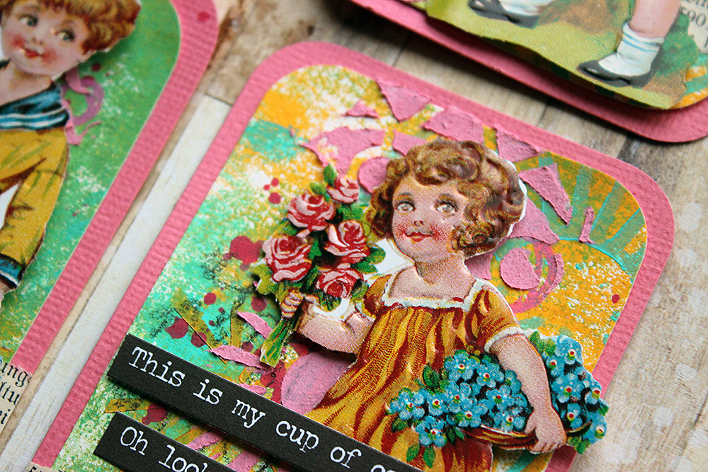
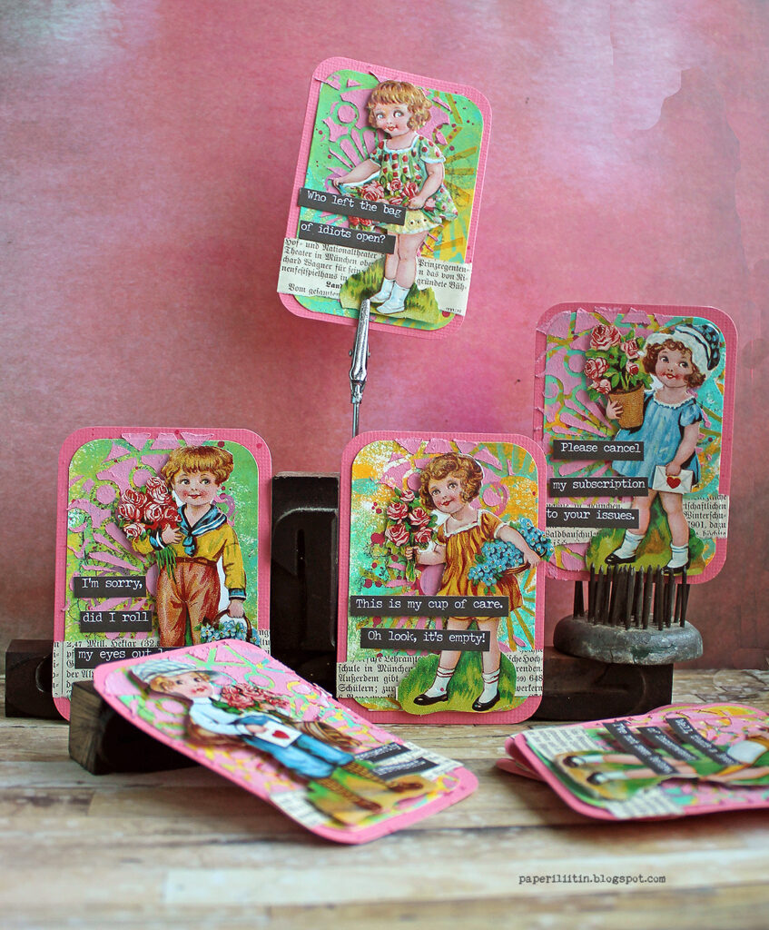
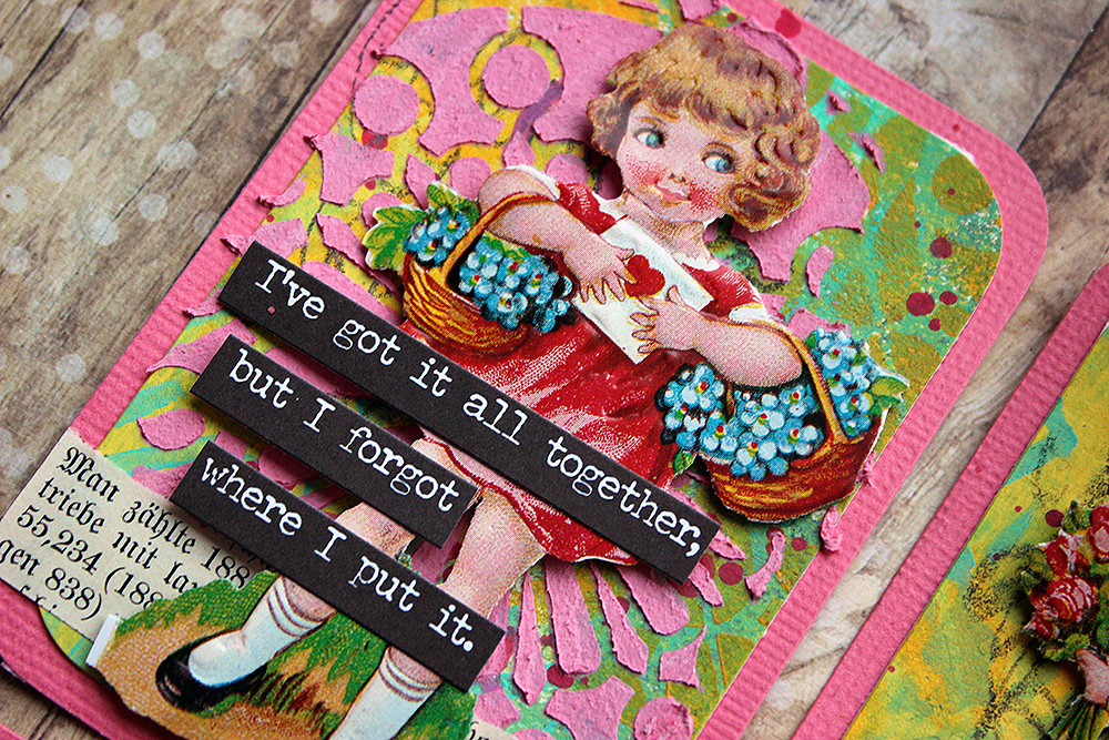
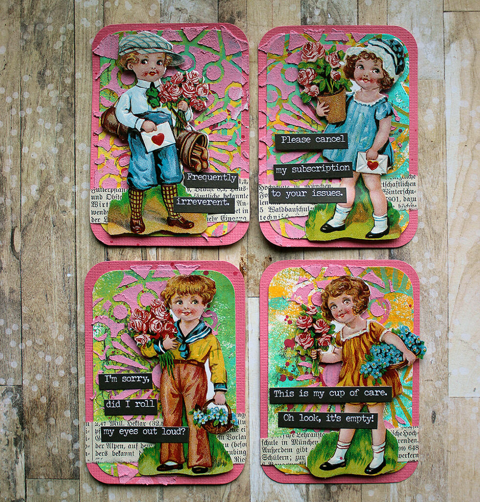
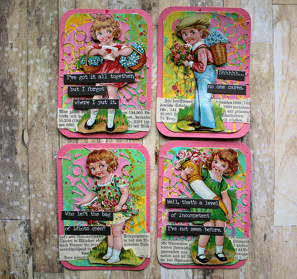
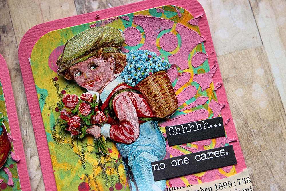
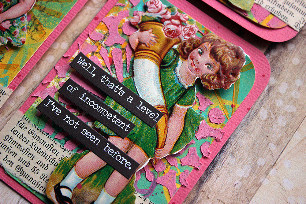
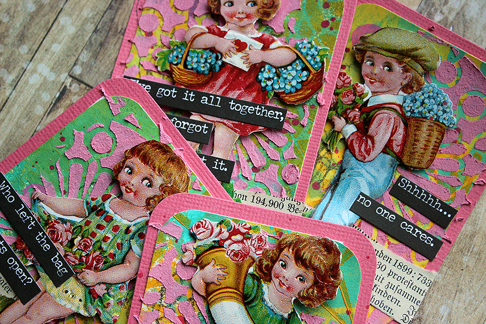
First of all, I’m not sure you are familiar with these “glossy pictures” I’ve used here as focal points. The term is a direct translation of a Finnish word “kiiltokuva”. From what I gather, these items are not widely used or known. For example, Wikipedia article of the subject can be found in Finnish, German, Norwegian, Swedish, and Danish. Glossy pictures are thought to originate in Germany in mid-19th century. They are printed images with a glossy finish, cut in shaped sheets with little connecting bridges. The idea was to cut the individual images loose from the sheet. Nowadays collectors are looking for the uncut sheets rather than individual images. The pictures were used to decorate gifts, ornaments or put in little keepsake books.
My glossy pictures may look old, but in fact they are relatively new. They were bought from a local craft store. As a kid I had a huge collection of the pictures, some adhered in books with little poems. I chose these particular pictures because Valentine’s Day is not that far away. But I wanted to add something surprising to the otherwise sweet cards. There’s the candy colors, kids with flowers and then rather snarky comments! My idea was that when you glance the cards you may think they are sweet but when you take a closer look, you see the juxtaposition between the sweetness and the lines. The texts are from Tim Holtz’s “Snarky” sticker book.
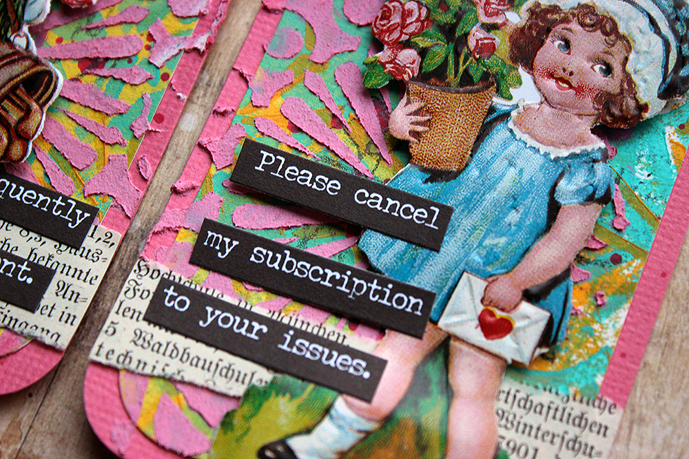
Now that we have those explained, let’s go to the theme of the month – texture. I used both visual texture and touchable texture in these. Visual texture for me here is the background design – using acrylic paints to color the white cardstock and then using the ATC Mixup stencil on top to create different clusters of pattern there. Tactile texture is done using the stencil again, but this time with texture paste. To match the white paste to the candy colors better, I colored it using a pink acrylic paint. While the patterns underneath differ from card to card, I used the same doily like design to the raised layer. To see how I created the cards, please see the video below!
As you could see from the video, I started the cards by creating a master sheet. This is the way I tend to start ATCs nowadays. A master sheet allows making a number of backgrounds at once with similar color scheme and patterning but each individual card is still a bit different, each having its own personality. What allows the mix of different patterns here is the wonderful “ATC Mixup” stencil. I just love how this big stencil holds so many great patterns! And as you can move the stencil, you can still make big areas with the pattern easily.
Thank you for stopping by today! Wishing you all the best and happy Valentine’s Day to you all a bit early!
Xoxo Riikka
Thank you Riikka – these made us laugh so hard!!! But we also appreciate the richly textured backgrounds you created :)
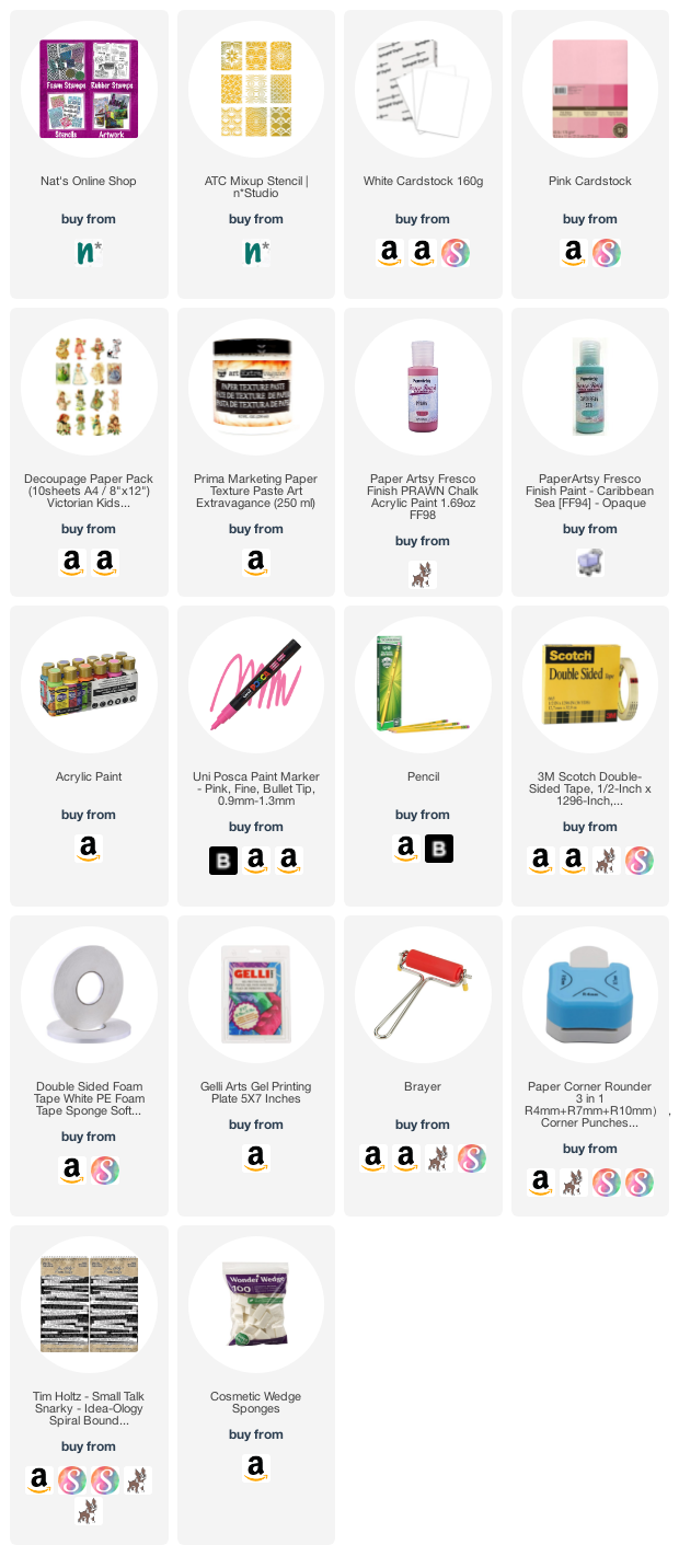
Give it a try: you can find all my Stencils in my Online Shop and in addition to her glossy pictures from her stash and old book pages, here are some of the supplies Riikka used:
Looking for more projects? Follow the Creative Squad on Instagram here.
Comments (2)
jjhere
| #
These are so funny! Love how you paired the sweet Valentine kids with the snarky comments.
Reply
Sue Clarke
| #
Riikka, I love LOVE love these, especially the snarky comments!
Reply