Creative Squad

Creative Squad: Favorite Art – My Way – Jordan Hill

Hello from my Creative Squad! Today we have a post from Jordan Hill who is working with gouache this month along with my ATC Mixup stencil, Triangle Love rubber stamp set, and our theme: Favorite Art – My Way – Look at a favorite work of art and create something inspired by it, drawing from the colors, shapes, subject matter, feeling etc. that strikes you most when you look at it.


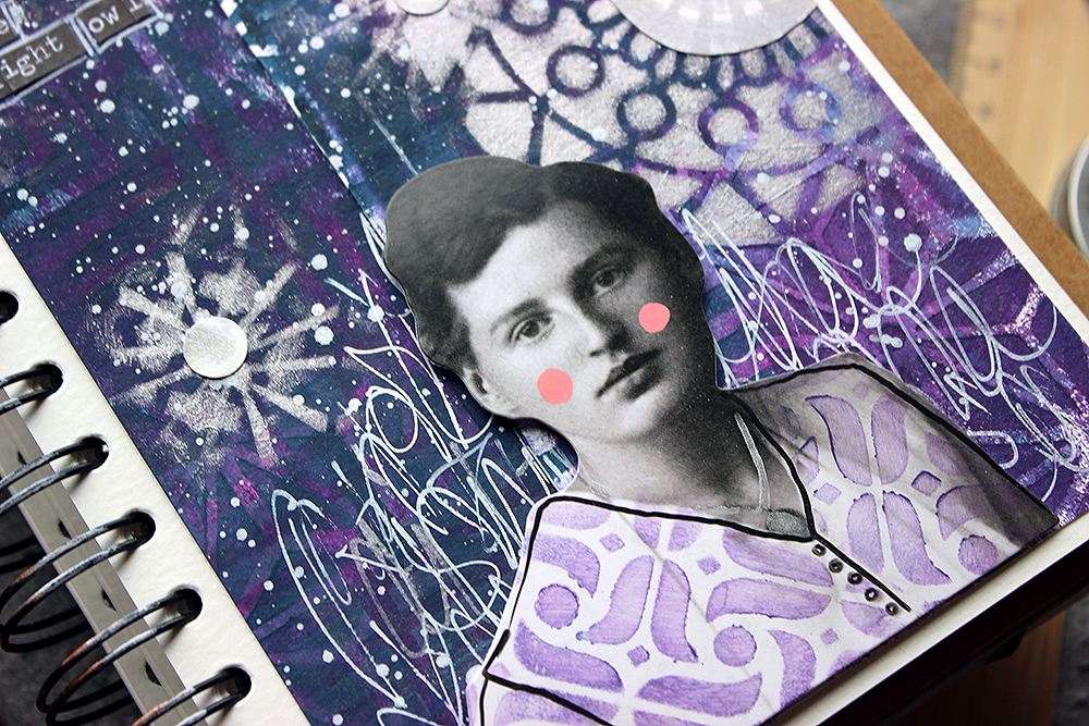
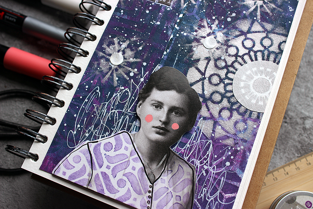
Hello everyone! I’m excited to be back for the month of September to share another art journal page with all of you. For this month’s theme of “Favorite Art – My Way”, I thought it might be fun to do a master study of a painting by copying one directly into my art journal. I’ve been wanting to play around with gouache for a while now (its been quite a few years since I last used it), and I decided to use the painting ‘Girl with a Pearl Earring’, painted by Johannes Vermeer as my inspiration. Let’s get into it!

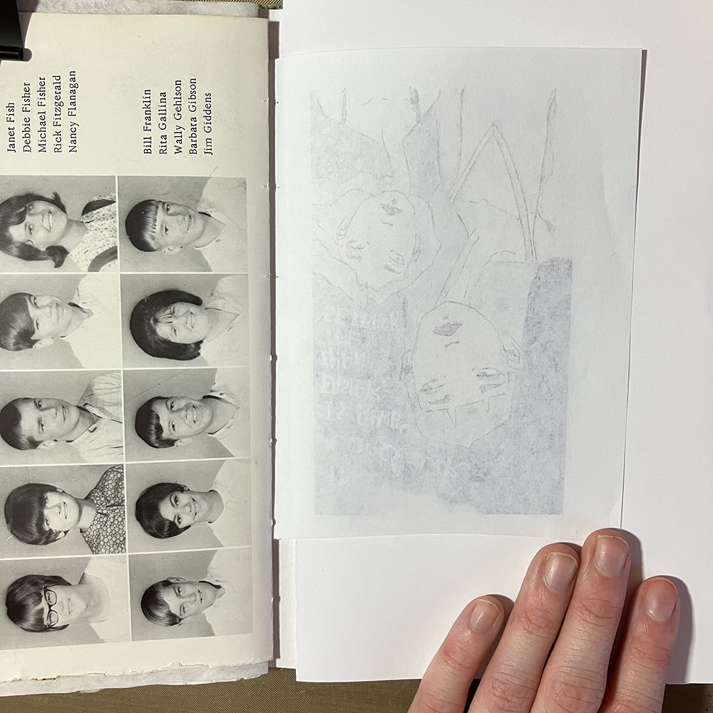
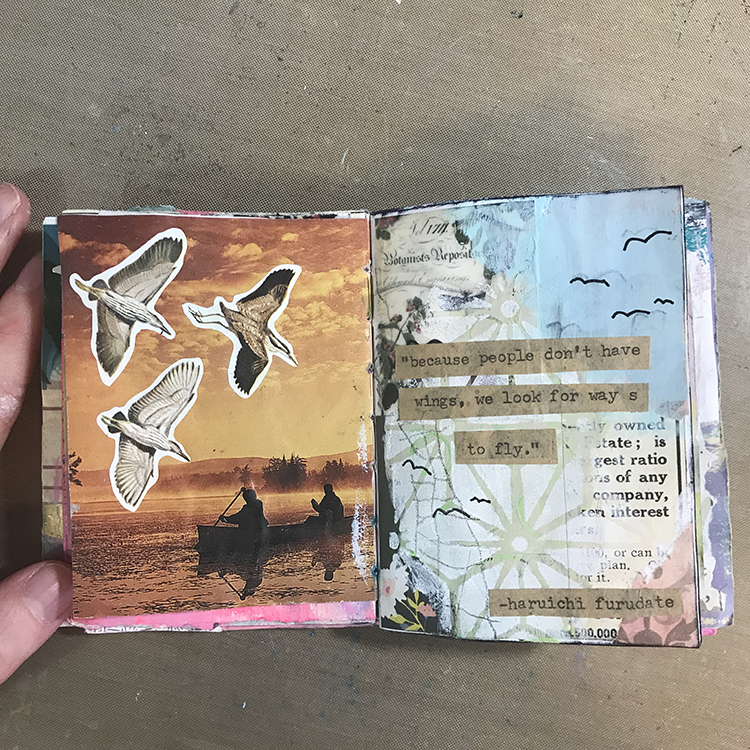
The first step was to select a page to work on. Since I had a pretty specific idea of what I wanted to paint, I chose a page that I thought the illustration would look good next to. 

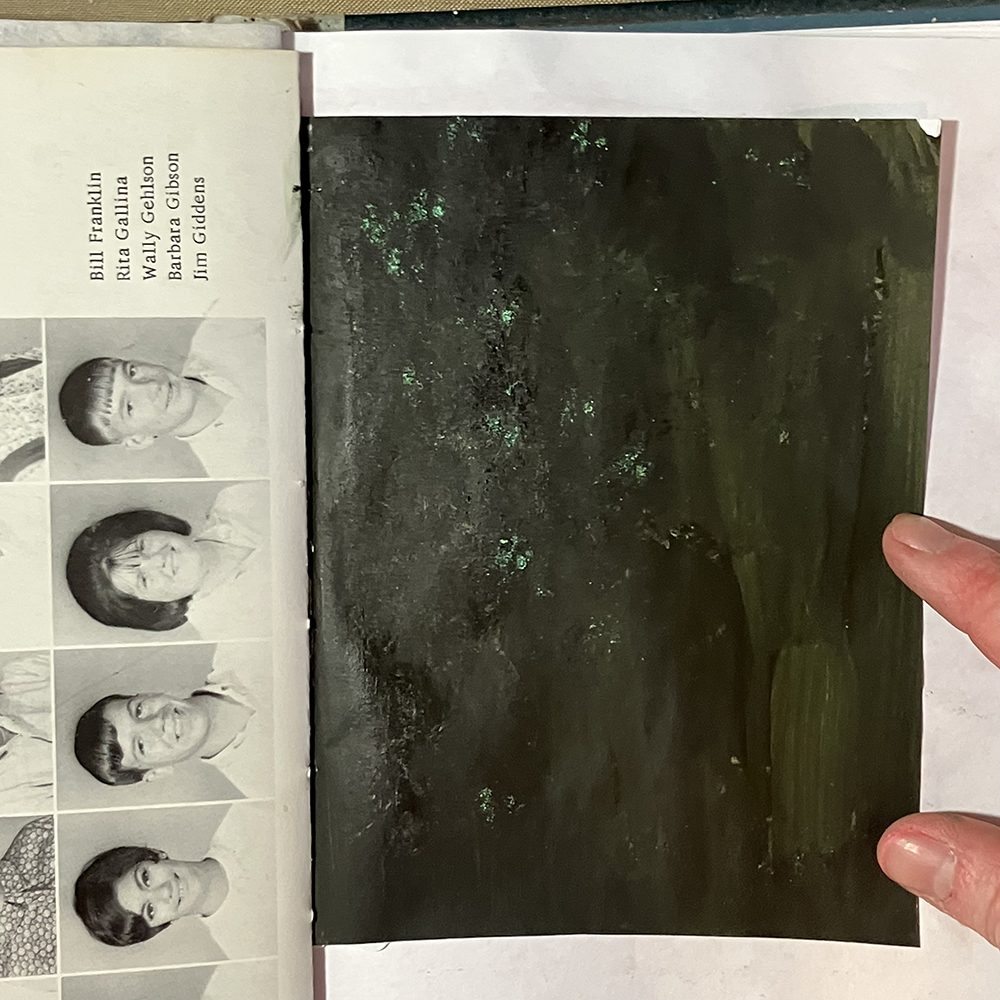
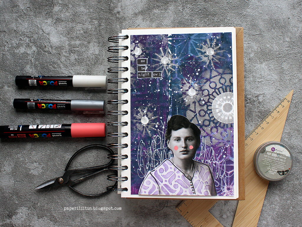
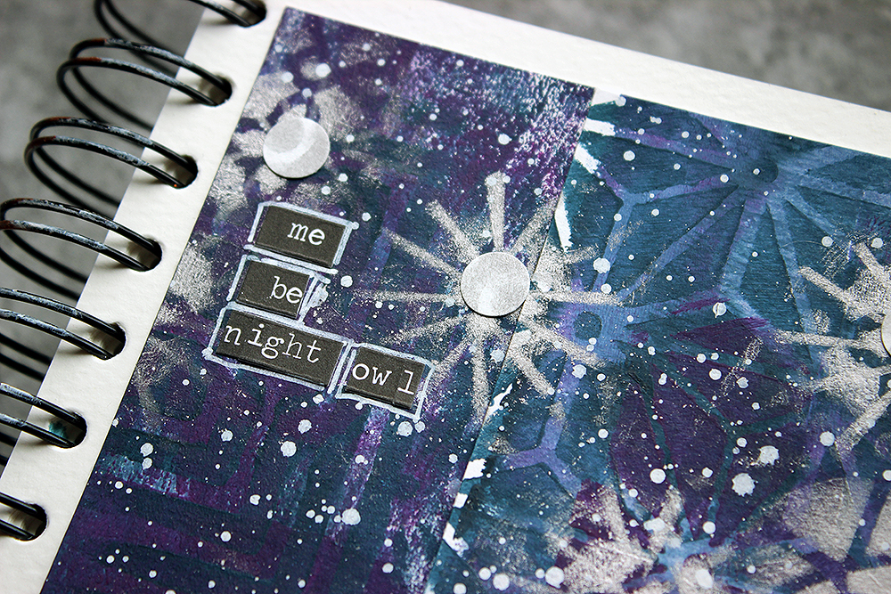
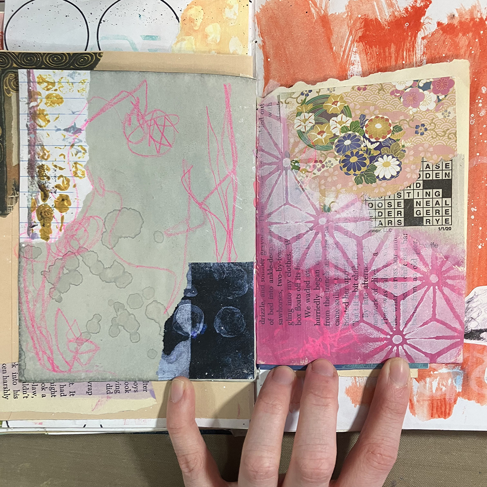
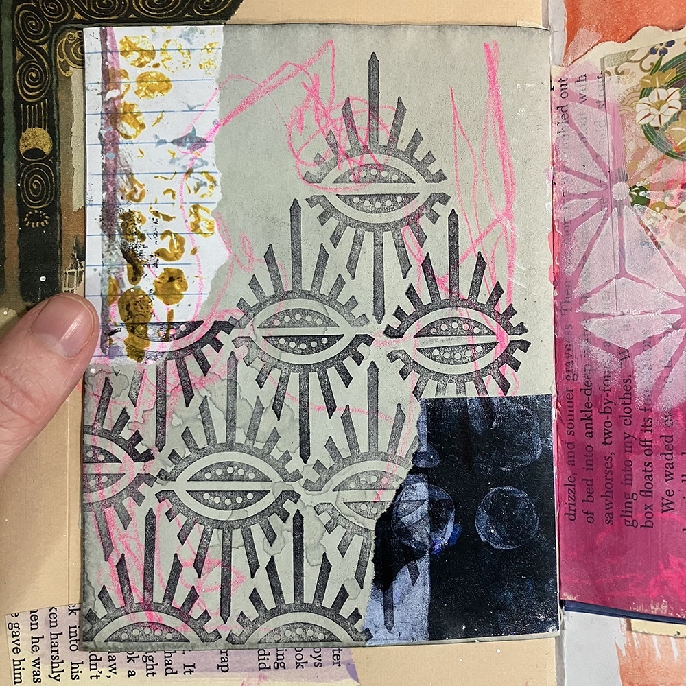
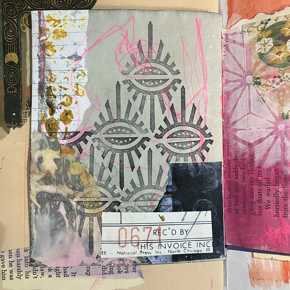
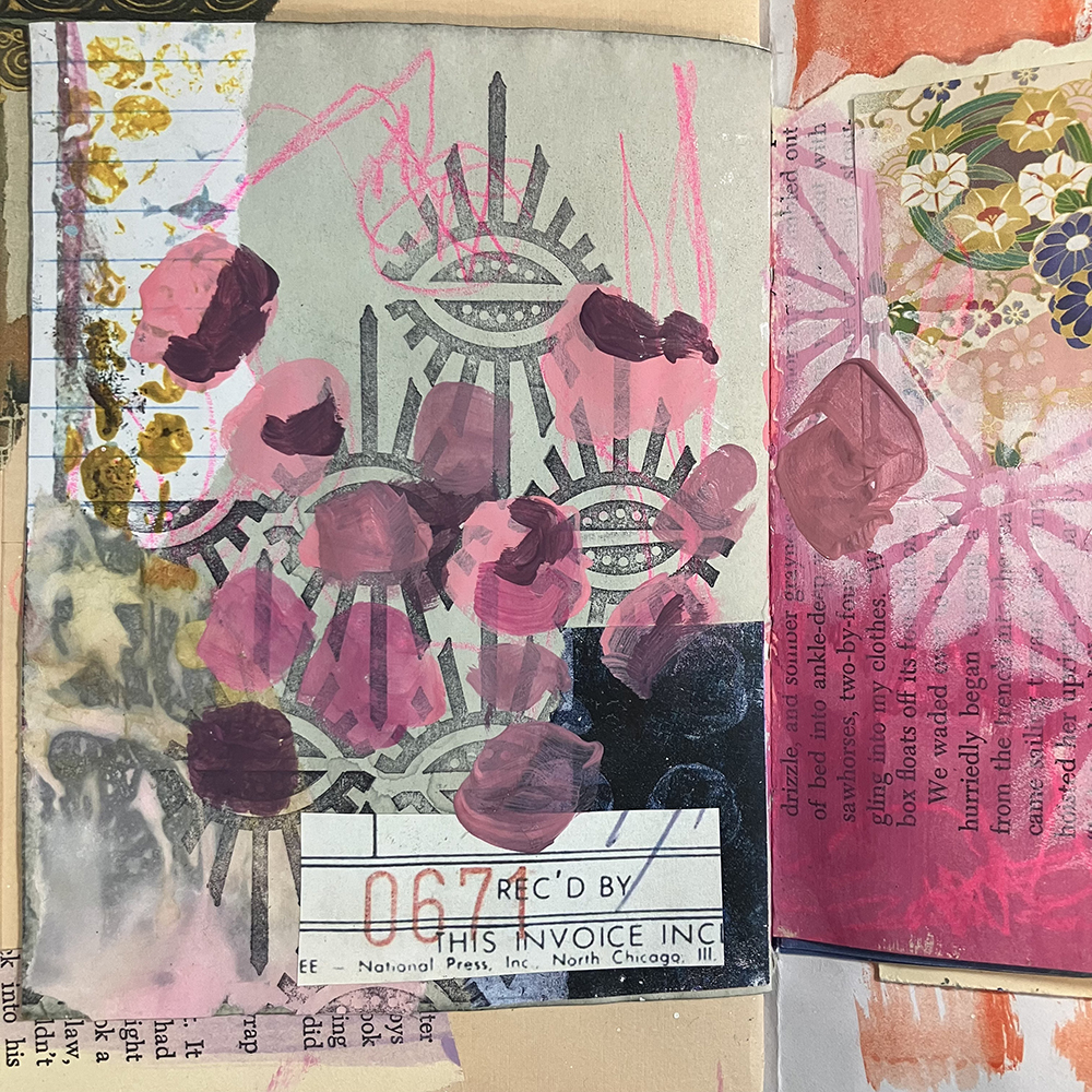
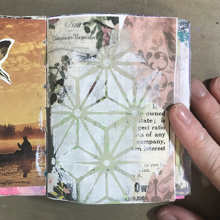
Once I had determined which page I was going to use, I decided to create the background first. In the original “Girl with a Pearl Earring” painting, the background is quite dark. I added some green and black paint directly onto my page, then moved it around with a paintbrush. Once it had been spread out, I blotted a crumpled up paper towel over the surface to give it a mottled texture.

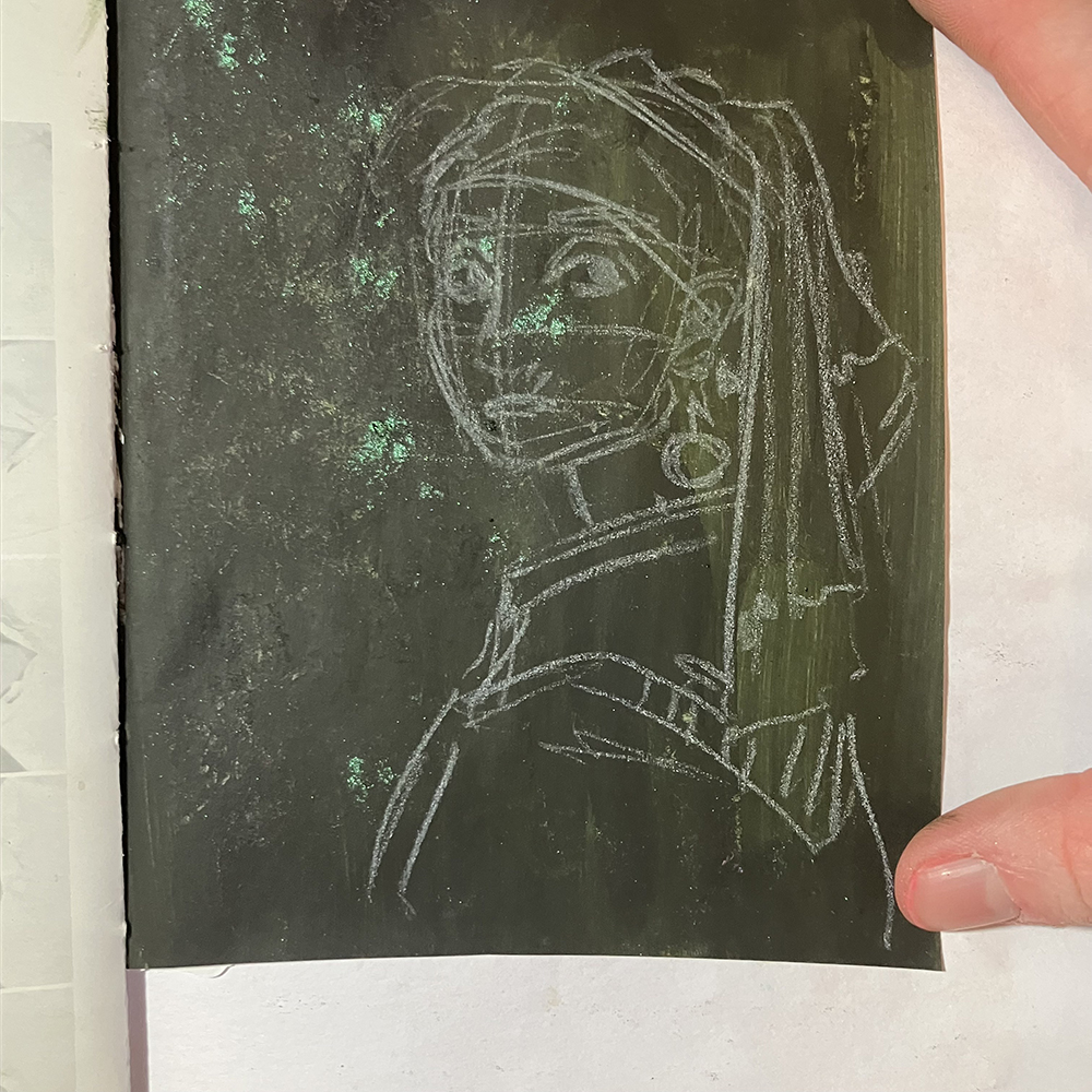
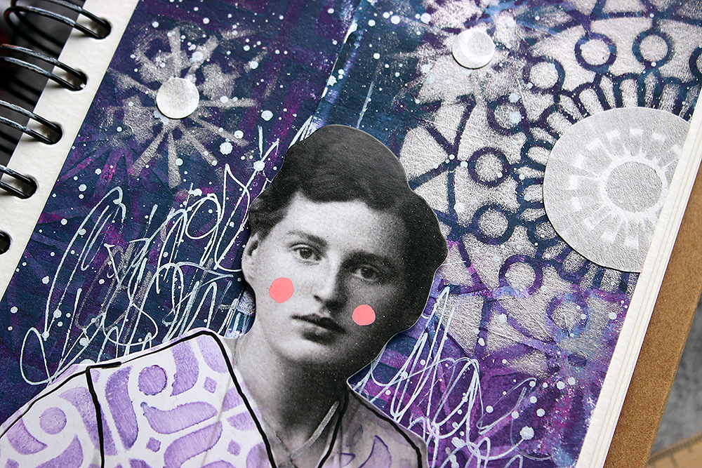
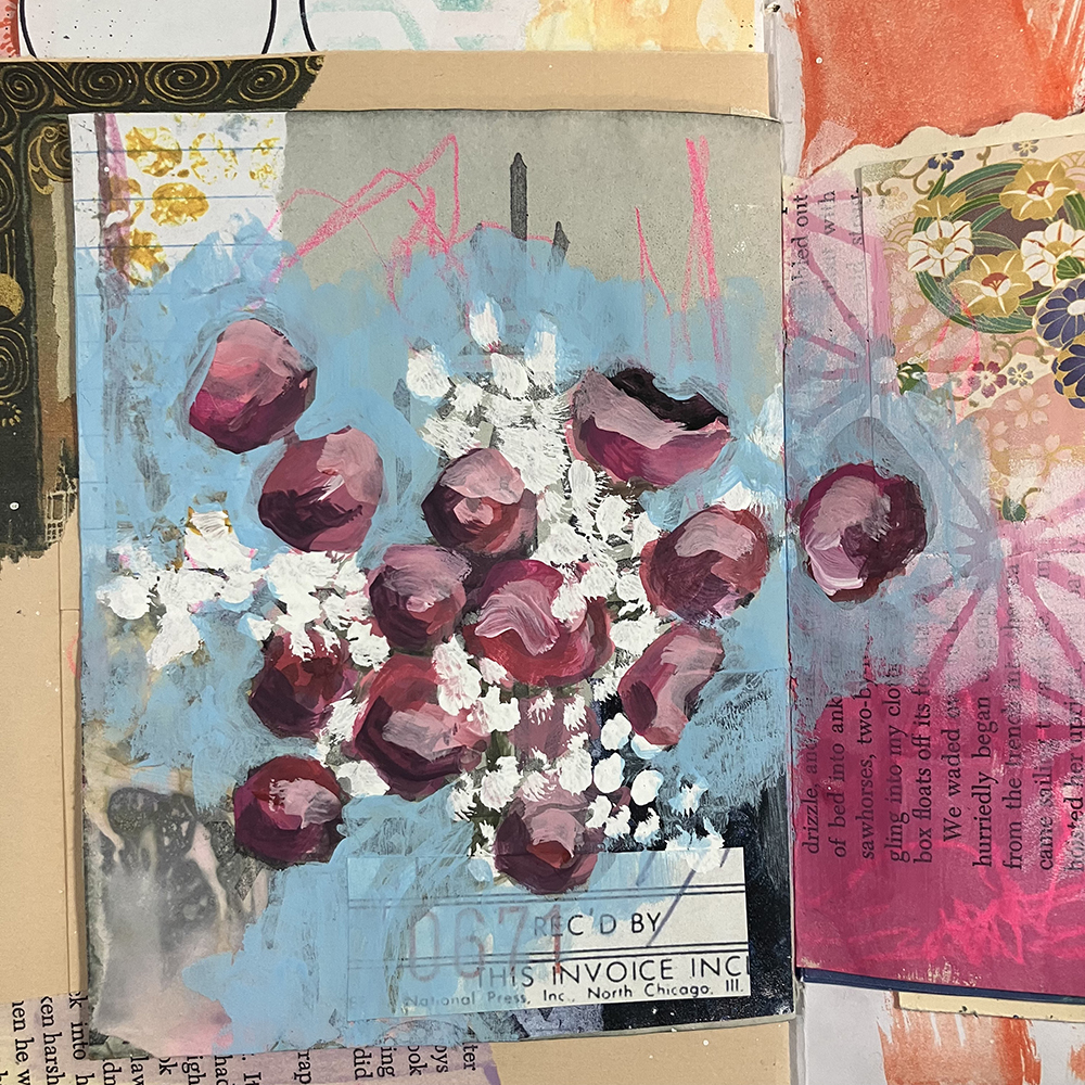
Once the background had dried, I used a white colored pencil to lightly block in the shapes of the painting. I copied directly from a photo of the original and tried to focus on getting the general idea of the painting down on paper, since I knew I was going to cover it up anyways.

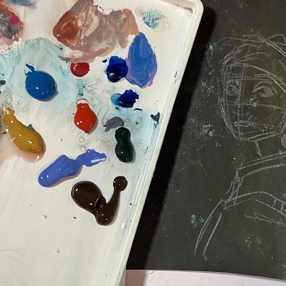
Next, I prepared my palette. Like I mentioned before, I knew that I wanted to use gouache, so I selected some colors of paint that matched the tones in the original painting. Though I didn’t have the perfect assortment of colors, I knew that I would be able to mix them in order to get the colors I wanted.

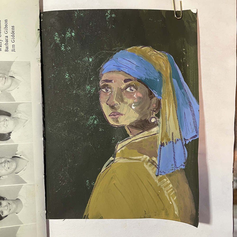
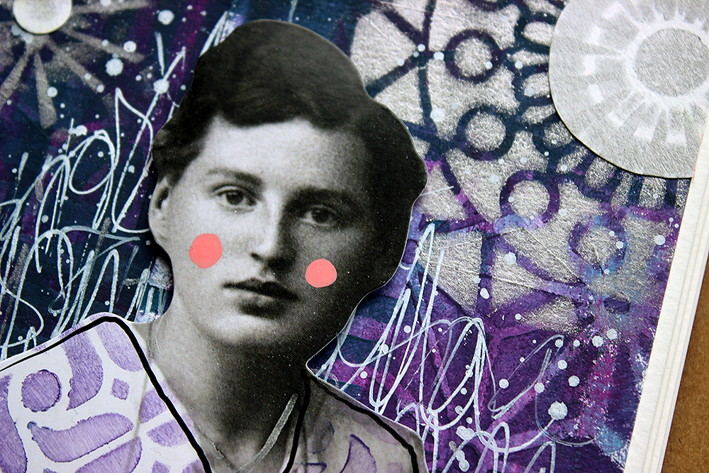
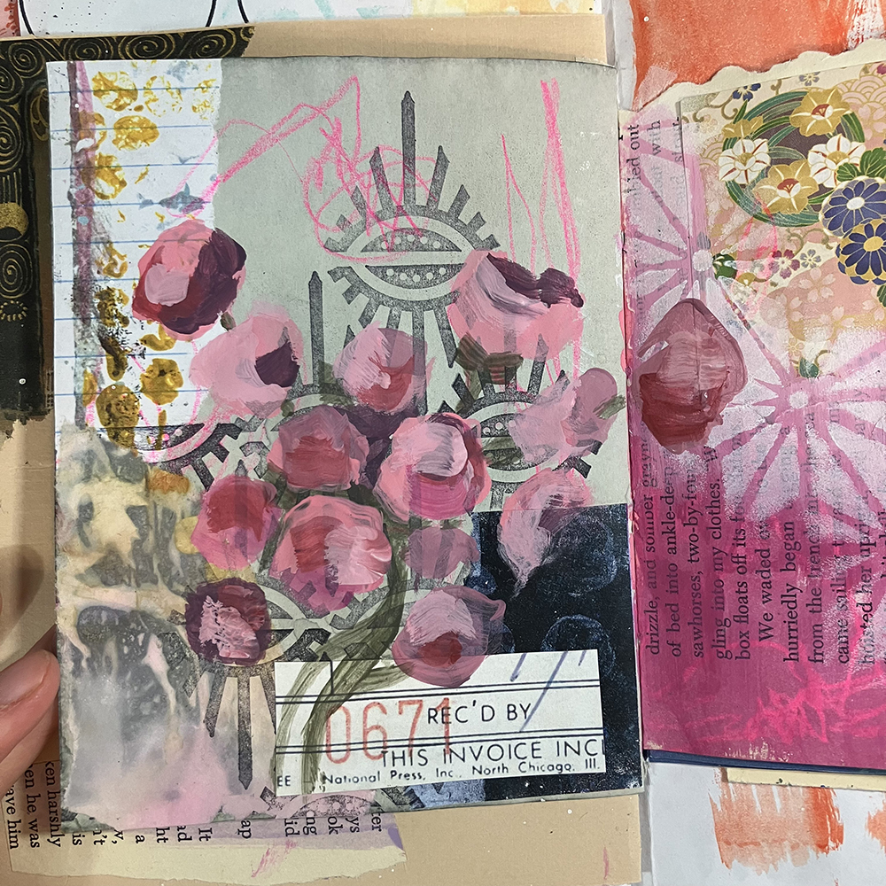
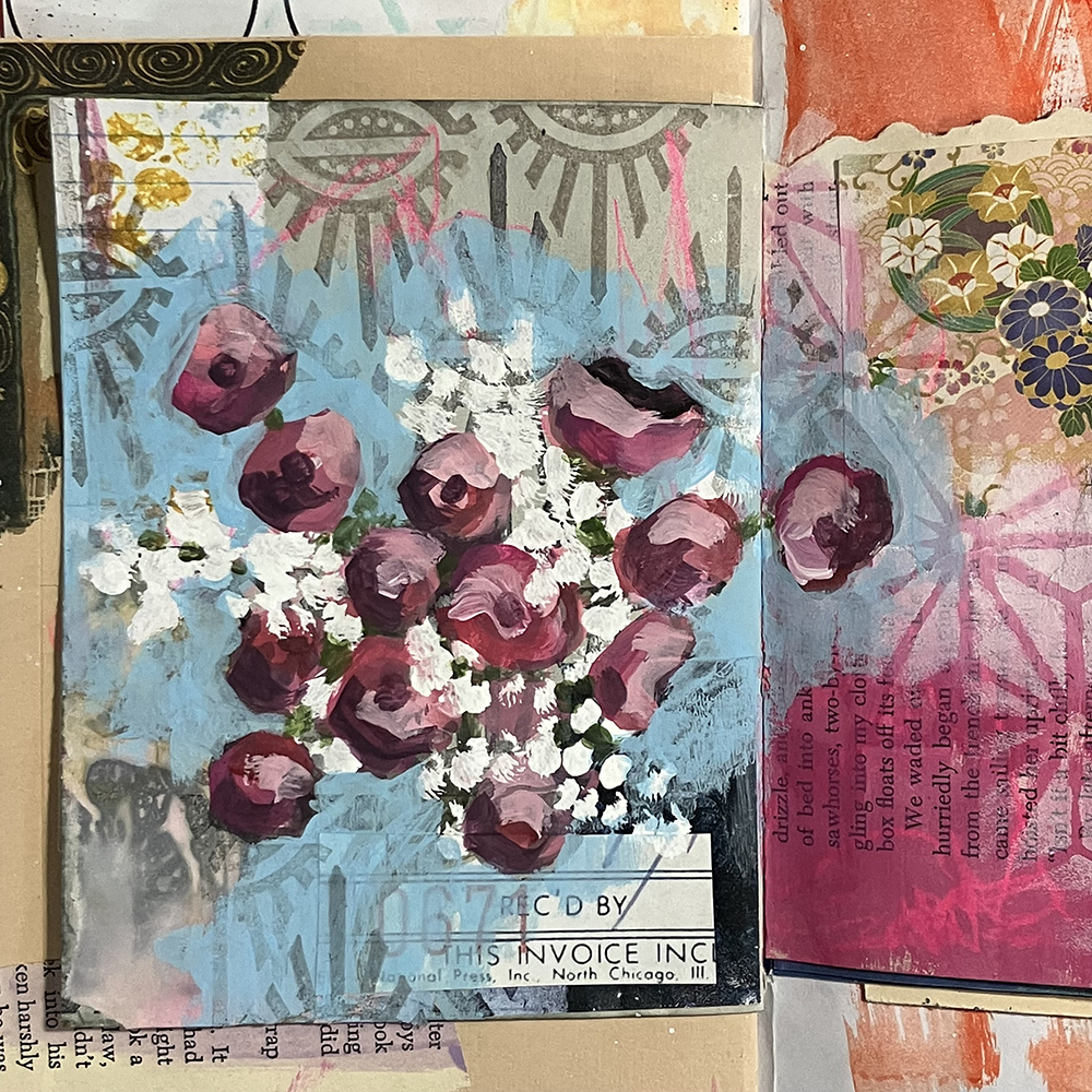
I then worked on building up the painting itself. I worked with the gouache in layers, starting out by applying a thin layer to each section of the sketch. This first layer was mostly about blocking in the colors. I then let that dry, and added another layer on top. In the second layer, I focused on the shadows. While working on this painting, I continued to cross reference my painting with the original, observing where the colors and shadows were placed and trying my best to replicate that.

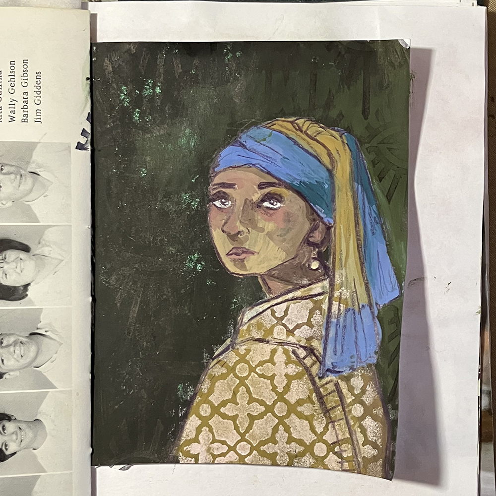
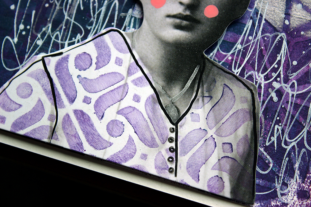
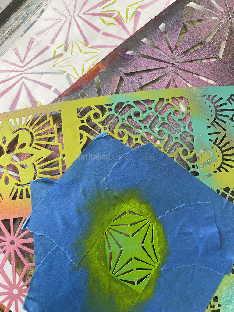
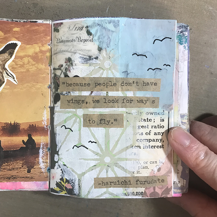
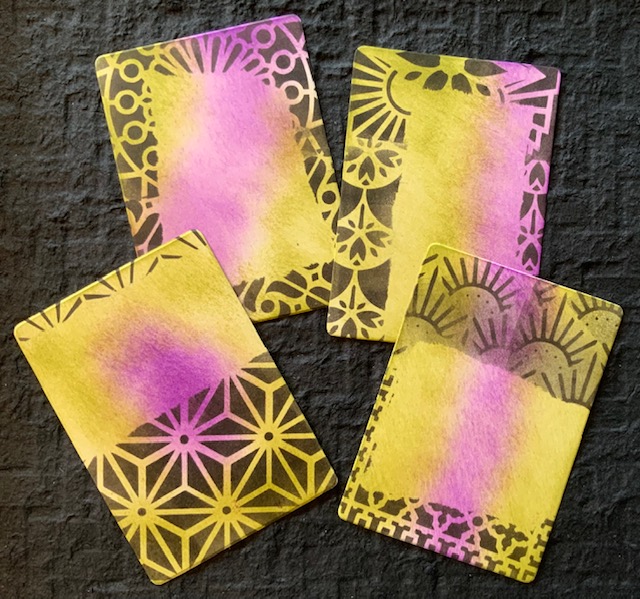
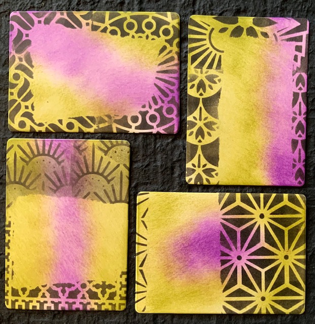
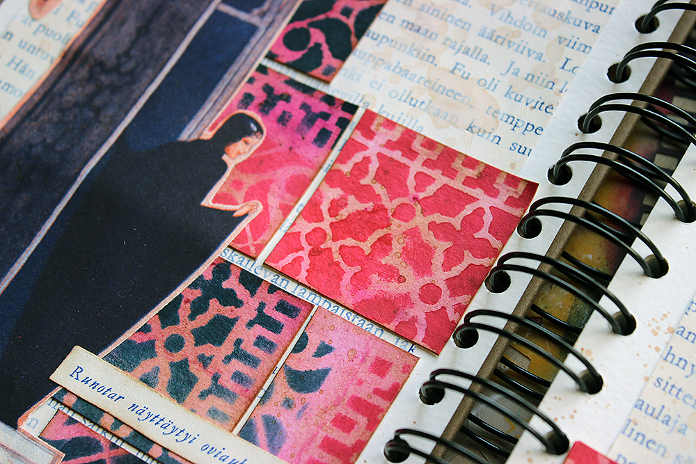
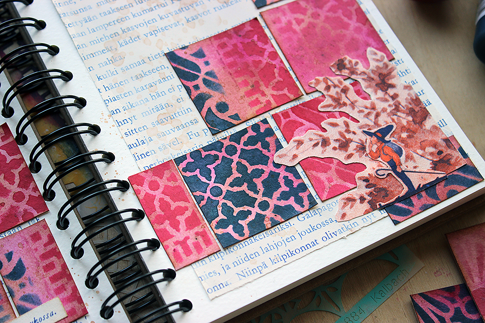
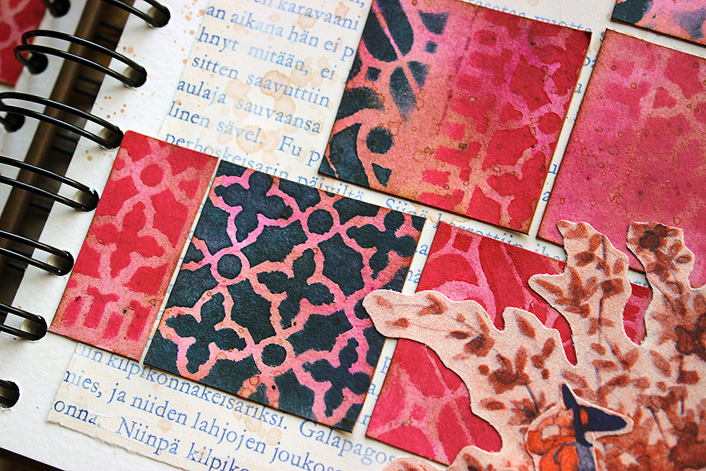
This is where I deviated from a typical study. Since the shirt consisted of such a large empty block of color, I thought it was the perfect place to add in a pattern. Using one of the patterns from Nathalie’s “ATC Mixup Stencil” and some light pink acrylic paint on a makeup sponge, I applied a pattern across the surface of the shirt. I then went in with a Prismacolor colored pencil and started to add lines to the piece, defining some of the areas that I lost while using the paint. 

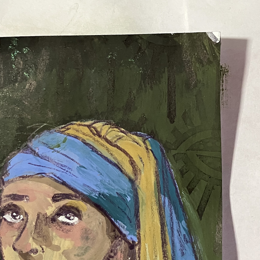
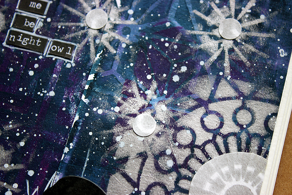
At this point, I wanted to add some subtle texture to the background, so I used Nathalie’s “Empire Triangle” and a black ink pad to create a pattern over the dark green color. Since the background was almost black, there wasn’t a lot of contrast between the pattern and the background, which is exactly the kind of subtlety I was looking for.

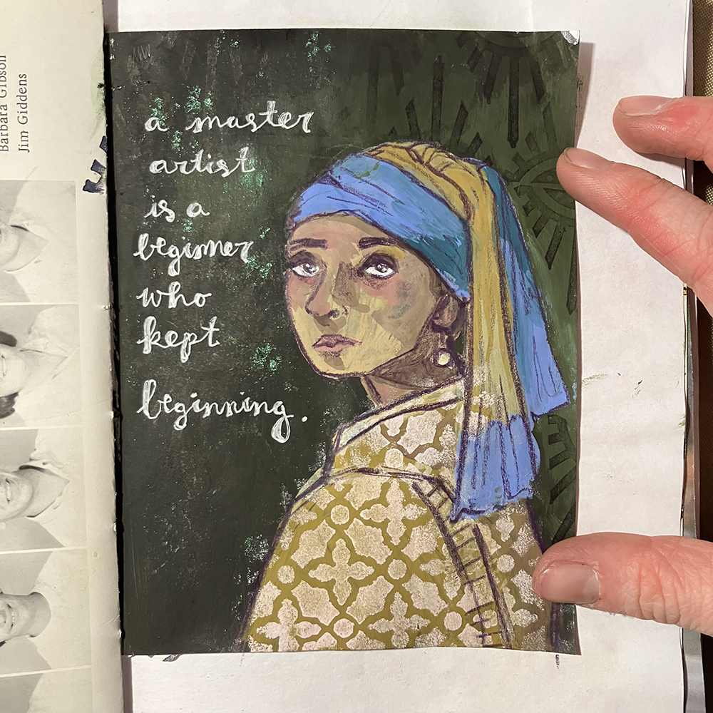
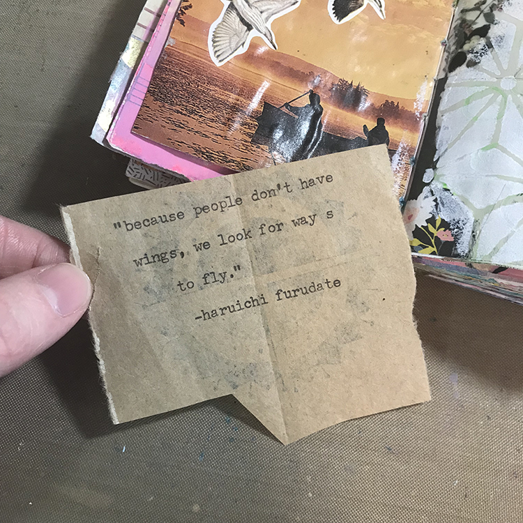
Finally, I added a quote to my page with a white gel pen. This quote seemed fitting considering the subject of the page, and it was a nice reminder to myself that everyone goes through struggles with their artwork, but that’s just part of the process!

I hope you enjoyed following along with the process of creating this page and that you consider doing a master study of your own! They’re a great way to learn and grow as an artist.


Thank you Jordan – wonderful idea to practice by copying a master and then putting your stamp (or stencil lol) on it. Looks awesome!!!

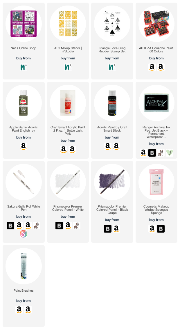
Give it a try: you can find all my Stencils and Rubber Stamps in my Online Shop and here are some of the supplies Jordan used:

Looking for more projects? Follow the Creative Squad on Instagram here.

Comments (1)

  • Robin

    |

    Always love your work Jordon! This quote is really wonderful too! Thanks so much!

    Reply

Leave a comment

Creative Squad: Favorite Art – My Way – Riikka Kovasin

Hello from my Creative Squad! Today we have a post and video from Riikka Kovasin who is sharing an art journal page that takes an artwork and subject matter and makes them all her own with my Fairview Fan foam stamps, ATC Mixup stencil, and Mesa Verde stencil. Our theme: Favorite Art – My Way – Look at a favorite work of art and create something inspired by it, drawing from the colors, shapes, subject matter, feeling etc. that strikes you most when you look at it.


The Whole World is a Garden

Heippa! It’s Riikka Kovasin here today to share my take on the “Favourite art – my way” theme. Like I say in the video, I again struggled a bit in the beginning. This time the trouble was to narrow down the options!

Choosing a Finnish artist was a must for me. At first, I thought about a female artist, but didn’t want to go with Helene Schjerfbeck. For one, I wanted to highlight someone maybe not as known and secondly, I’ve already used her art to inspire me a couple of times (check out an example here). My second choice was a lady, who’s photo is always on my craft table, Ellen Thesleff. I love her work, but none of the pieces really jumped up to me this time and was like “me, redo me!”. The reason for this might also be that I’ve used her art before as well here. Back to the drawing board it was!

I then decided to take a totally different approach to the subject and let a tool do the deciding for me. Like I say in the video, since I got the “Fairview Fan” foam stamp set, I’ve seen the other stamp as a skull. I have been eyeing it before, thinking about a Halloween card, but had not yet jumped to the idea. So, now was the perfect time! After deciding on the skull, it was then easy to pick up the artist and artwork.

Death, as a personification, is a re-occurring character in the works of Hugo Simberg. He’s not a scary character but more a bit lost and an outsider. In some ways he reminds me of the Death in the Discworld series, not quite getting the ways of men. My favorite piece with Simberg’s death character is a painting called “Kuoleman puutarha”. The subject was so dear to the artist himself that he did several versions of the piece. What I used as my reference here, is made in 1896, a small gouache and watercolor work. You can read more about the piece here (link) and about the artist here (link).

In the painting, there’s three death characters caring for the plants in their garden. While my favorite of the three is the one on the left, leaning on the workbench, watering the plants, I chose to make a version of the second character, the one in the center. He’s the one who usually gets pointed out as the posture of the character is so tender, almost fragile. My character doesn’t have the same fineness of the posture, but I hope the atmosphere still comes across!

If you’d like to see, how I made the page, please see the video below. If you want to jump directly to the making process and avoid the introduction, the process starts at 1:08.

What I used in my piece, besides the obvious character, was the warm honey toned color scheme. Like I said earlier, Hugo Simberg did several versions of the subject, but as they are mostly black and white, they are missing the warmth of the watercolor piece that inspired me. Another colored version of the “Kuoleman puutarha” is at Tampere Cathedral. The colors are a bit different in it as well, as it’s a fresco, painted on the cathedral wall.

While the original artwork has an abundance of strange plants, I depicted those in my take more uniformly. The background flowers represent the other plants in the garden, while I highlighted the bluebell-styled flora as it’s the one the character is holding.

I hope you don’t get frightened by this character but rather find him endearing! Thank you for stopping by today!

Xoxo Riikka


Thank you Riikka for sharing your brainstorming process and also your beautiful take on a subject that is not often represented in such a tender way!

Give it a try: you can find all my Foam Stamps, Stencils and Rubber Stamps in my Online Shop and here are some of the supplies Riikka used:

Looking for more projects? Follow the Creative Squad on Instagram here.

Leave a comment

Creative Squad: Goodnight Art Journal – Riikka Kovasin

Hello from my Creative Squad! Today we have a post and video from Riikka Kovasin who is sharing an art journal page using my ATC Mixup and Manhattan stencils and our theme: Goodnight, Art Journal – Create an art journal page inspired by nighttime. Think about the colors, sounds, rituals of night – any aspect of it – and use that as your catalyst to create! 


Me be night owl

Hi there! It’s Riikka Kovasin here today to share my take on the month’s theme! Like I say in the process video, first I got a bit puzzled as not so long ago I did a nighttime inspired art journal page for the team. I say, “not so long”, but actually it was almost a year ago! Time does fly. You can see that page here.

Why I’m bringing this up was that I didn’t want to repeat myself! Although there’s similar elements in my page now, there’s also something new, so I call that mission accomplished! Because like I say in the earlier post, I would love to be a night owl. In everyday life my current work and family life doesn’t allow me to follow my natural rhythm, but if I had the possibility I’d work until midnight and then sleep in. I seem to have a new productive sequence in between 9-11 pm!

I first tried to think what to do, but then gave in and just started doing, going with the flow. And I really like how the page turned out! I first colored two strips of paper using gel printing, then added patterns on top using stencils and lastly a flurry of stars and a moon. Why two strips of paper, you might ask. Well, they just happened to be there when I was reaching out to get a background piece. I thought it would be fun to start with those, to use “left-overs”. If you want to see how the page came into being, please see the video below:

As you could see from the video, I used two Nathalie’s stencils in my make. Why I chose these two? Well, the reason for the ATC Mixup is kind of obvious, I think. It’s because of the multitude of patterns in one stencil! I didn’t have to settle to just one or two patterns but could use an abundance! And as you can move the stencil and continue the pattern, the smaller size doesn’t matter, either. I did want to add another stencil to the mix, to have a bigger pattern. For that I chose Manhattan. Its angular design complimented the curvier, softer patterns of the ATC Mixup nicely.

I went through several Tim Holtz paper dolls when searching for the right one. This lady had the right air about her, and she somehow reminded me about Edith Södergran, a Finnish poet. One of the first poems I read from her was titled “Stars”. But when I was checking the placement, her white shirt looked too pale, and it had such a big contrast between the inky blue background it was stealing the attention too much. Luckily, I had an easy solution! You could see that from the video, too, I just added a pattern on top.

To keep the project cohesive color-wise, I used one of the colors I had used in the background as well. The patterning hid some of the details of the garment, so I then drew those in. You can probably see my hesitation in the video. I was afraid that the black Posca marker might be too much, but luckily it was just what the doctor ordered! Her hair balances the dark marks nicely.

Thank you for stopping by today! I can’t wait to see what the teamies have made for this topic!

Xoxo Riikka


Thank you Riikka – love the night sky you’ve created with the layered stencils and splatters – great sense of depth in there!

Give it a try: you can find all my Stencils in my Online Shop and here are some of the supplies Riikka used:

Looking for more projects? Follow the Creative Squad on Instagram here.

Comments (1)

  • Sue Clarke

    |

    I love the page from a year ago and I also like this one! I especially like how you stamped the pattern on her blouse.
    Thanks for the inspiration Riikka!

    Reply

Leave a comment

Creative Squad: The Great Outdoors – Jordan Hill

Hello from my Creative Squad! Today we have a post from Jordan Hill who is sharing a gorgeous floral art journal spread using my Triangle Love rubber stamps and ATC Mixup stencil and our theme: Great Outdoors – The experts agree that getting outside for activity each day is a super healthy thing you can do for your mind and body. Let’s get outside and seek artistic inspiration out there. Find something that catches your eye and then when it’s time to come back in, use that inspo to create.


Hello everyone, I’m happy to be back with another project for June! I was very excited to work with this month’s theme of The Great Outdoors, since nature is very much an inspiration for me and my work. Let’s get started.

First things first, I started by flipping through one of my art journals to find a page that I wanted to work on. I ended up selecting this one, mostly because I liked the colors. Additionally, I had already used Nathalie’s ATC Mixup Stencil on the right hand page, so it just felt fitting.

After selecting a page to work on, I used Nathalie’s Empire Triangle stamp from the Triangle Love Cling Rubber Stamp Set with some black Archival Ink to create an all-over pattern across the left hand page.

Next up, I added a few pieces of collage that I felt fit the colors and general feeling of the page. In the lower left hand corner, I used a piece of eco printed paper that I made a while back, since I felt it matched this month’s theme of The Great Outdoors. I also added a little piece of paper featuring some numbers from one of my collage sheets.

For this month’s page, I wanted to experiment slightly with subject matter when it came to my focal point. In the past, I’ve relied fairly heavily on drawing faces when it comes to my art journals. I still love drawing people, but with this month’s theme of The Great Outdoors, I thought I would experiment with an abstract floral instead. I started off my floral design with a number of acrylic paints in pinks and reds. I then applied the color in small splotches across the page, making sure to vary the lights and darks in each section.

After my first layer of paint had dried, I continued to add more depth to the flowers by adding a few more layers of color. I tried to keep my brushstrokes very loose, as these flowers were still supposed to be fairly abstract, as opposed to fully rendered. I also added some green in between the pinks in order to give the appearance of leaves and stems.

At this point, I felt as though the flowers were not standing out enough, so I made the decision to paint in a new background. I selected a light, bright blue, and added it around the entirety of the flower shapes (which also gained a few more layers of paint and deeper shadows). To finish off my little bouquet, I used some white acrylic paint and a small paintbrush to blot on some smaller shapes to be reminiscent of Baby’s Breath.  

To finish off the page, I wanted to bring back the stamping that I lost during the painting process. However, I wanted the stamping to be more gentle this time around, since stamping in black felt as though it would be too harsh for the aesthetic of the page. I used Tim Holtz Distress Ink in the color Pumice Stone to do my stamping, again using Nathalie’s Empire Triangle stamp.

With that, I was ready to call this page complete! I hope you enjoyed following with the process!


Thank you Jordan! Wow those flowers came together so successfully and the Baby’s Breath is such a fun addition.

Give it a try: you can find all my Rubber Stamps in my Online Shop and in addition to collage material, here are some of the supplies Jordan used:

Looking for more projects? Follow the Creative Squad on Instagram.

Comments (2)

  • Erica Meares

    |

    I just found Nathalie’s Studi. This is the very 1st post on her Blog I had the Honor of reading, & wow, Wow, WOW!!!! I love the way you explained your process & provided pictures of your Work along the way! It was such a great experience to watch this transform from what was already a very pretty page (Due to the types of paper used; As well as the Colors, Marks & Stamping you’d previously applied); …To an absolutely stunning abstract representation of “The Great Outdoors Theme! I think my favorite part was when added splotches of pinks & reds. I’ve gone back & forth looking at each pic; Seeing the green added to resemble leaves & stems, & then even more shades of pink & red being put on the page with loose strokes. What really got me was the final pic where a simple change in backgcolor & adding a few dots of white… The entire spread came together! It was as if those blobs of color magically turned into beautiful flowers from one pic to the next; Using some techniques! I’ll definitely be looking you up soon! ~🙏💙🙏Much Graditude, Erica🙏💙🙏~

    Reply

  • Sue Clarke

    |

    Jordan, this is beautiful! You can create flowers as well as faces.

    Reply

Leave a comment

Stars Gone Too Early – Art Journal

I made this page last week not knowing that yet again an horrific shooting took place. I made this page after the Shooting in Buffalo as I use my art journal not only to explore materials and techniques but sometimes also to work through thoughts and things that happen in the world. This was another very sad morning when I created it – the page does not really reflect my anger and helplessness about the horrible things that keep on happening here.

I cannot even imagine the pain the families of all those incidents have to go through. All I know is that this has to stop!

What kind of a society are we where we let this happen over and over again?

Quoting Amanda Gorman “What might be if only we tried. What might we become if only we listen.”

Leave a comment

Creative Squad: Lost in a Book – Jordan Hill

Hello from my Creative Squad! Today we have a post from Jordan Hill who is sharing an art journal spread inspired by one of her favorite books and using my ATC Mixup stencil and our monthly theme: Lost in a Book.


Hello everyone, I’m excited to be back with you for April! Initially, I wasn’t sure how I wanted to approach this month’s theme of “Lost in a Book”. However, after much thought, I decided to base my project on the manga series Haikyuu!!, which is my favorite series of all time. At its core, Haikyuu!! is a story about a high school volleyball team, but it is steeped in symbolism and contains some of the best character writing I’ve ever seen. Let’s get started!

First things first, I selected a page to work on. I liked the birds on the left side of this spread, since birds (especially crows) are a reoccurring visual theme in Haikyuu!! On the right side of the spread, I had previously glued down a number of scraps of paper. To attempt to blend some of these scraps together, I used CraftSmart acrylic paint in the color Suede and painted over the edges of the pieces. I then used the back end of my paintbrush to scrape through the paint and create some subtle circles.

Next, I used Nathalie’s ATC Mixup Stencil with some white acrylic paint and a makeup sponge to add patterning to the painted sections of the page. Though it’s not exact, these shapes did vaguely remind me of the segments of a volleyball.

I knew that I wanted a quote to be the main focal point of my page, so I used my typewriter to type one out onto a scrap of brown paper bag. This is one of my favorite quotes from the series; I find it very beautiful, and it has stuck with me for many years. It only made sense to incorporate it into one of my journals.

At this point, I decided that I wanted some blue paint in the upper right hand corner of the page in order to represent the sky. I selected the color “Cloudless” by the brand Apple Barrel, and used a paintbrush to apply it to my page. I then cut out the quote from the last step and glued it down. Then, using a black pen, I added a few “bird” shapes to some areas of the page I thought could use a bit of interest. I specifically chose to do seven birds in order to represent the number of starting players on a volleyball team.

Next, I wanted a border of sorts, so I used an Archival Ink Pad in Black to brush along the edges of the page. I then used a graphite pencil to make some light marks along the left side. I have been experimenting with similar marks in some of my recent work, and I felt as though it could be interpreted as a volleyball net.

To add some finishing touches to the page, I used an orange oil pastel to add a hint of color, since the jerseys in Haikyuu!! are orange and black. Next, I added a Mod Podge image transfer of the number 10, to represent the number of the main character’s jersey. I also used Nathalie’s ATC Mixup Stencil once more to apply the paint ever so slightly over top of the blue section in order to blend it in a little better. I was then ready to call this page done!

I hope you enjoyed following along with the process of this little spread in my journal and that you are able to find something in it to inspire your own work!


Thank you Jordan – I loved how you used various visual elements to symbolize important aspects of the book. The finished page is really interesting with the different layers of media and meaning.

Give it a try: you can find all my Stencils in my Online Shop and in addition to collage elements from her stash, here are some of the supplies Jordan used:

Looking for more projects? Follow the Creative Squad on Instagram here.

Leave a comment

Creative Squad: Department of the Interior – Judi Kauffman

We’ve got an extra project from Creative Squad member Judi Kauffman for you today. If you enjoy sending notes in the mail or even tucking little cards in lunchboxes or laptop bags with a special note on them then this is definitely for you :) Judi is on a roll with my ATC Mixup stencil with these and rocking all the patterns. Read on!


If you’re like me, far too often all attention is paid to the exterior of the cards I make and the interior is left blank, getting at most a line or two and my signature. I thought it was about time I do something different so while I was stenciling insert cards for my early April “Lost in a Book” library pocket project, I stenciled a big bunch of extras to keep handy for stamping with a birthday, anniversary or other sentiment, or for adding a hand-written note to the inside of some of my upcoming folded note cards!

These are larger than ATC size, but this same idea would work at 2.5 x 3.5 as well. Masking the center area with torn paper before stenciling the rest of the surface provides interesting open spaces for writing or stamping and for adding collage or found poetry.


Thank you Judi – love the combination of color and bold pattern on these. They are also a great reminder when you’re working on a larger project to keep some cards, tags, or ATCs around to stencil, stamp and work on as well.

Give it a try: you can find all my Stencils in my Online Shop and here are some of the supplies Judi used:

Leave a comment

Creative Squad: Lost in a Book – Riikka Kovasin

Hello from my Creative Squad! Today we have a post and video from Riikka Kovasin who is sharing an art journal page that is an ode to a favorite book from childhood. She is using my ATC Mixup Stencil and our theme: Lost in a Book – What is one of your favorite books (from childhood or as an adult) or a book that you recently read and really enjoyed? Create a project inspired by the characters, plot, or any element of the book that really stuck with you.


The Muse of Poetry 

Hi there everyone! It’s Riikka here today with an art journal spread with the month’s theme “Lost in a Book”. I had a number of possibilities here – like “The Blind Assassin” by Margaret Atwood, the only book I’ve been reading when a complete stranger walks up to me and says: “That’s a really good book” to start a conversation. Or Agatha Christie’s “Big Four”, a really neglected looking volume in the school library that I ended up picking for a reading assignment and it blew my mind so that I ended up reading everything the local library had from Christie.

But while these could have been the books to draw inspiration from, instead I chose perhaps the first book memory I have. I had this children’s story book called “Satuja” by Raul Roine, and I was leafing through it before I could read. When I then could read, I did like the stories, but I especially loved the illustration. The pictures were done by Rudolf Koivu, a beloved Finnish illustrator and artist. I was captivated by the beautiful pictures, the ornate details but also about the fact that none of the pieces had any yellow! 

I still have the book, but I wasn’t going to cut into it. Instead, I found a copy of the same book in poor shape in a second-hand bookstore. It had water damage but I didn’t mind as most of the illustrations were still intact. I bought the book just for art journaling. You can see me leaf through the book in the beginning of the video.

My next task was to decide which one of the beautiful illustrations to use. I again took a trip down memory lane and tried to remember which illustrations I was most drawn to. There were three, that I remember. An Asian princess with a big fan and a graceful stance, a princess with blue garments flowing in the wind while she hurried away from the palace, and a muse of poetry opening a beautifully decorated door, all dressed in black. As you can see from the photos, I went with the one mentioned last. There was a couple of reasons, but one was the name of the character – “Runotar”. It’s somehow such a beautiful word, the beginning meaning a poem (runo) and then the female suffix (-tar), corresponding to English “-ress”. Although poemress sounds a bit daft, the Finnish version is really beautiful to my ear. As the topic was connected to books essentially, I thought that following the words would be the thing.

I used the thing that used to make me ponder as a child, to my advantage in the art journal page. That is the lack of yellow. I went with just red and dark blue. I first dyed the paper with a pink dye and then layered the patterns on top using Nat’s “ATC Mixup” stencil. I just love that stencil! It’s so handy with different patterns so you have plenty to choose from! If you want to see how I made the spread, please see the video below.

As you could see from the video, I used two book pages as my background for the whole thing. Like I say in the video, they are printed with blue, not black. As a child I also found that really intriguing, too, as all the other books had black text! Using the pages was another way to add the words, the text to the project. The final addition of text was the text stickers and the image caption I added to the spread. The black word stickers make up a recent story, a journaling for the present, while the caption adds another reference to the past, the story which the illustration belongs. The story is that of Peukaloinen, Little Thumbling, by the way. In it he decides that he wants to be a poet and needs to find his way.

Thank you for stopping by today! Wishing you a wonderful day!


Thank you Riikka – loved hearing about what drew you to this book as a child and then seeing how you incorporated these unique style and color elements in your own artwork.

Give it a try: you can find all my Stencils in my Online Shop and here are some of the supplies Riikka used:

Looking for more projects? Follow the Creative Squad on Instagram here.

Leave a comment

A Fire Looms – Art Journal

Again I used the sold out Artist Almanac to begin my page. Although it’s sold out, the original painting is still available here ;)

When I unpacked my art supplies in the new studio I realized I hadn’t used my wax water soluble Neo Colors and Derwent Artbars in a while and thought this calendar page would be the perfect inspiration piece to use these vibrant, highly pigmented supplies with.

I started by just layering some of the shapes and forms I saw in the page and that was just to get me going. I layered more and more color on top, blending the different colors with water and making some marks. I used the ATC Mixup Stencil and rubbed some of the color over it and used my finger to work it.

I left some space for journaling as I know that it is not a good idea to write on top of the waxy material – just doesn’t go together, and found this wonderful poem and decided to use a part of it:

“A Fire burns in the evening sky

Breaking like an egg in a pan

A sea of yellowish orange spreads in accordance with divine plan

Vibrant paint drips to the edge of ashen clouds drifting past

The sun is a messy painter

Every brush stroke is massive and vast’’

Justin Wetch – Bending the Universe

Here are some of the supplies I used in the page:

Comments (2)

  • Robin Seiz

    |

    I love the bright colors in this!

    Reply

Leave a comment