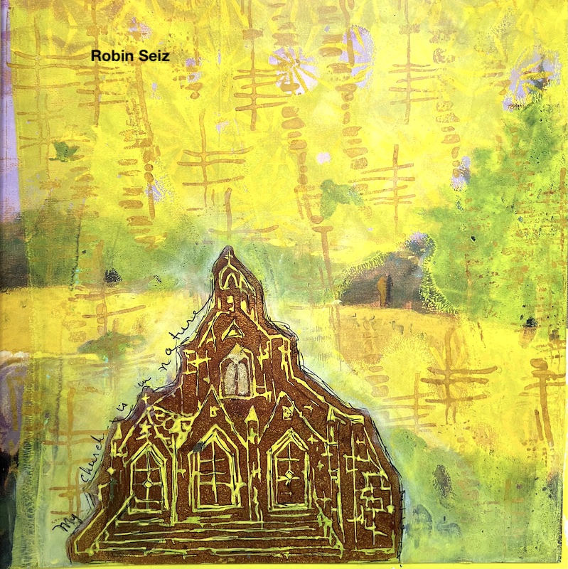
Hello from my Creative Squad! Today we have a post from Robin Seiz who is sharing an art journal page with a focus on nature, using my Church and Funky foam stamps, and inspired by our theme: A Tale of Two Colors – Think about two different colors, one you love using and one you find more of a challenge to work with. Use them together in a project and see what happens.
Hello friends, Our theme this month is “A Tale of Two Colors”. We were asked to pick two colors; one we love working with and one we find more challenging to work with. One of the wonderful things about being on the Creative Squad is that I always set out to follow the theme and often learn something about myself in the process. I began with yellow, (one of my go to colors because of it’s transparency and the sunny emotion it portrays) and realized that while I use yellow quite a bit in my art, I have almost nothing yellow in my everyday life. I don’t buy yellow clothes, don’t have yellow accents in home decor, (except for my studio walls, which I really don’t like and am changing) and rarely use yellow except when creating. Hmmmm…. And conversely, I chose brown as the color I find more challenging to work with. I often find it too bold for the art that I create; I tend more to colors of nature or more vibrant colors in my art; yet, in my everyday life, our home has shades of brown in the furniture wood, the a fairly neutral pallet with shades of brown or tan. So interesting! I may need to find more ways to incorporate yellow into my life!
I decided to create an art journal page this month. My go-to book to create in is a children’s story book with magnificent illistrations on each page. I love to use parts of the pictures and incorporate them into my page. I started out with a picture of an owl and a happy accident happened.
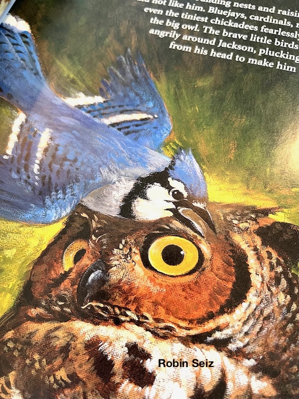
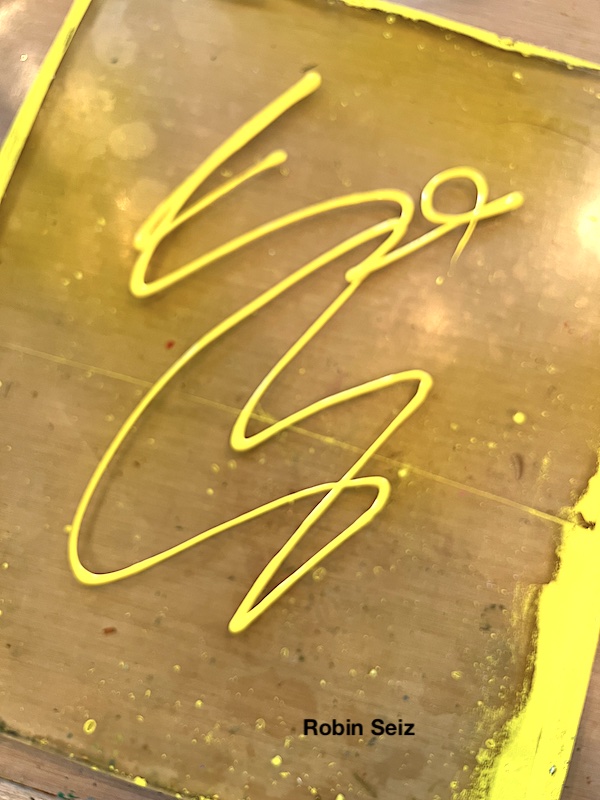
I laid down yellow acrylic paint on my gelli plate. I knew that I would be able to see some of the picture and words beneath because of the transparency of yellow. When I pulled the page up, the paint had not made contact with the owls’ eye. Happy accident! As cool as this is, I actually decided to use a different page for my project. (but wanted to show this to you) I’ll definitely come back to this page later for a different project.
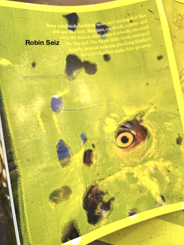
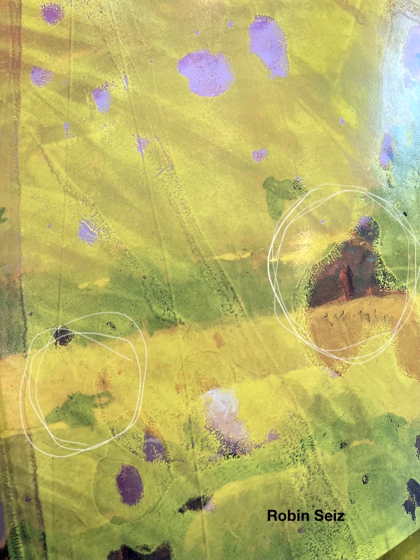
Unfortunately, I forgot to take a picture of the original page I did end up using, but you will see below the reason I chose it and what I love that peeks through. I knew I wanted to use the Church foam stamp, so having something with the country side in the background was calling to me. I have drawn a white circle around a few things that made me decide on this page so you can see what drew me here. To me, the green layers were the country side. On the left hand side, you can see just the head of a sheep popping over the hill. I love that! And the right white circle shows the hay stack barn in the distance. It’s so fun when I can use these little surprise elements to tell a story.
Next I used Burnt Sienna acrylic paint on the Church Foam stamp and pressed it down. As I frequently find brown, it was too bold and too prominent on the page. You will see I take care of this later.
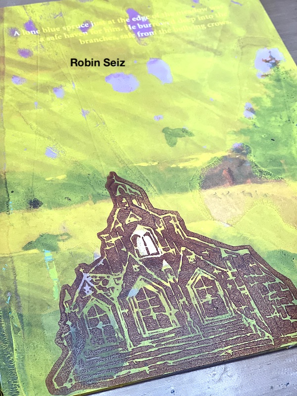
In order to add some interest to the church, I used some gold leaf on the two windows in the upper middle. I love that little pop of sparkly that it added. I also added some extra yellow (in the white spaces of the stamp) with a yellow Posca Pen. It makes the church look like it’s glowing. I used a small brush and Ranger ink to bring out the color of the sheep and make it a little more prominent.
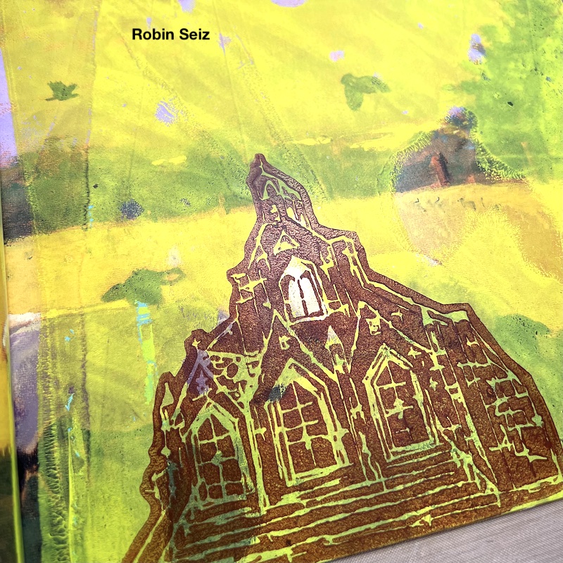
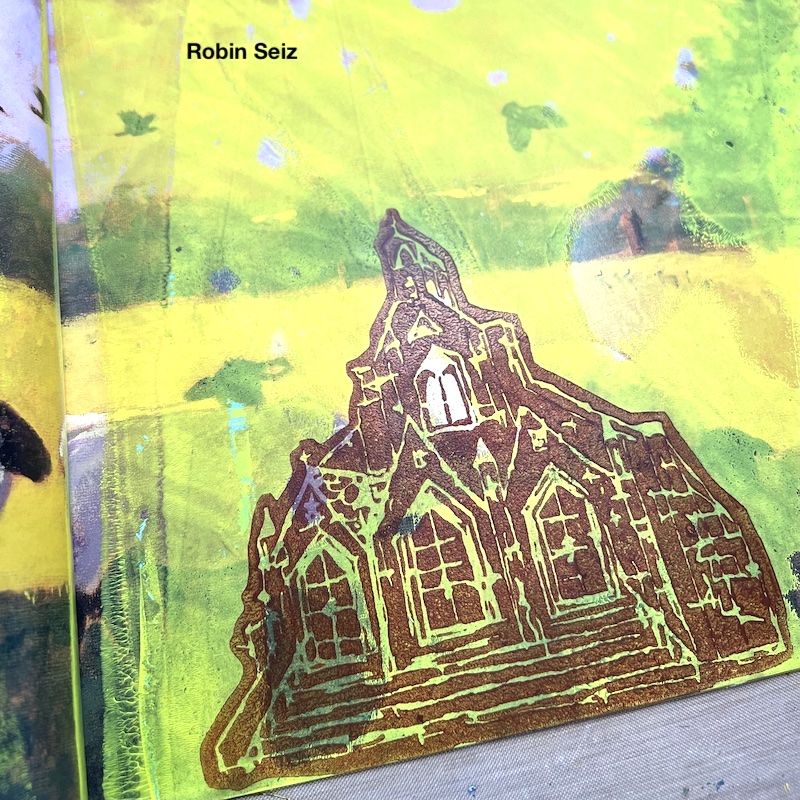
The church, while the focal image, was still too prominent. I masked the church and added the Funky foam stamp to the background to add some interest and take some of the focus off the church. I also added white gesso around the church to make it stand out a little from the background and the page. I went a little heavy with the gesso (which I have a tendency to do) and wiped it back a little with a baby wipe. I also added back a little yellow.
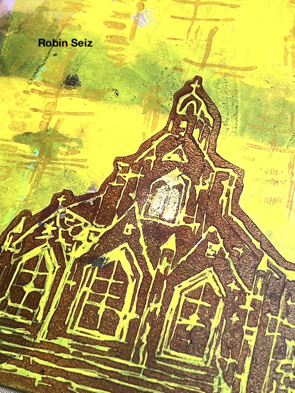
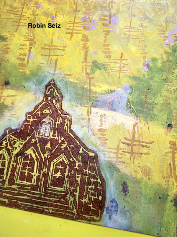
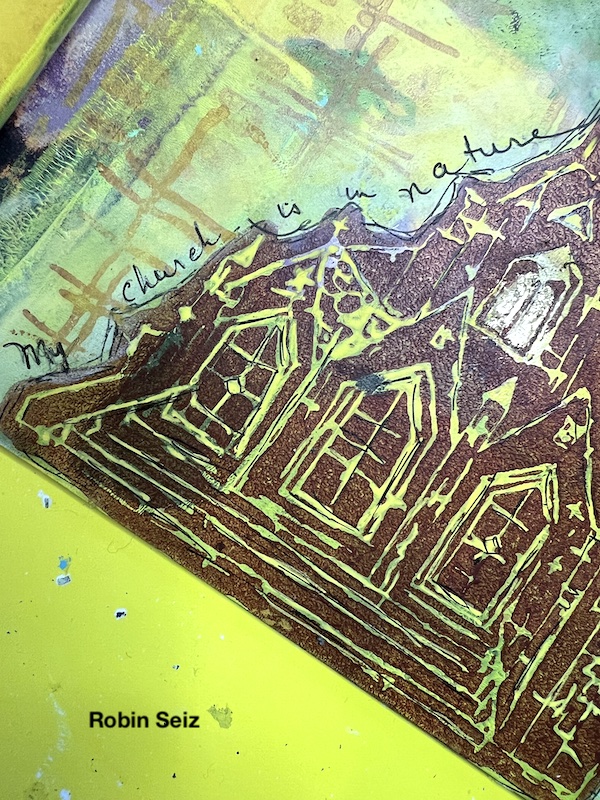
For the final step I drew some black lines on the church to give it more dimension and to write my thoughts along the side. This page really is a good representation of who I am; when in nature, I feel feel closest to myself and the world around me.
What colors do you like to work with? What ones do you find challenging? Try them together you might have a happy surprise. What makes you feel connected to yourself and the world at large? Let me know in the comments or visit me on facebook or instagram.
Thank you for sharing your process with us Robin! Love how you toned down some things and emphasized others to create your finished page.
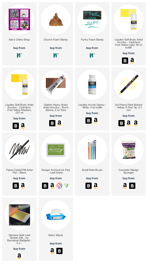
Give it a try: you can find all my Foam Stamps in my Online Shop and in addition to an old book, here are some of the supplies Robin used:
Looking for more projects? Follow the Creative Squad on Instagram.
