Creative Squad

Creative Squad: On Repeat – Robin Seiz

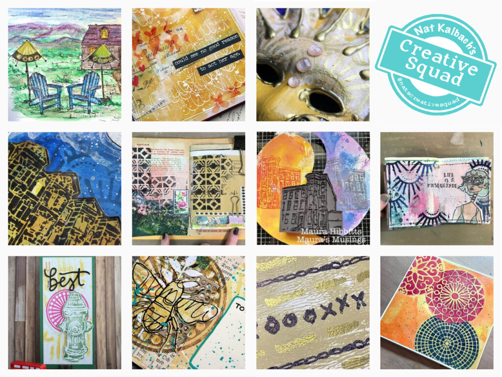
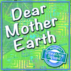
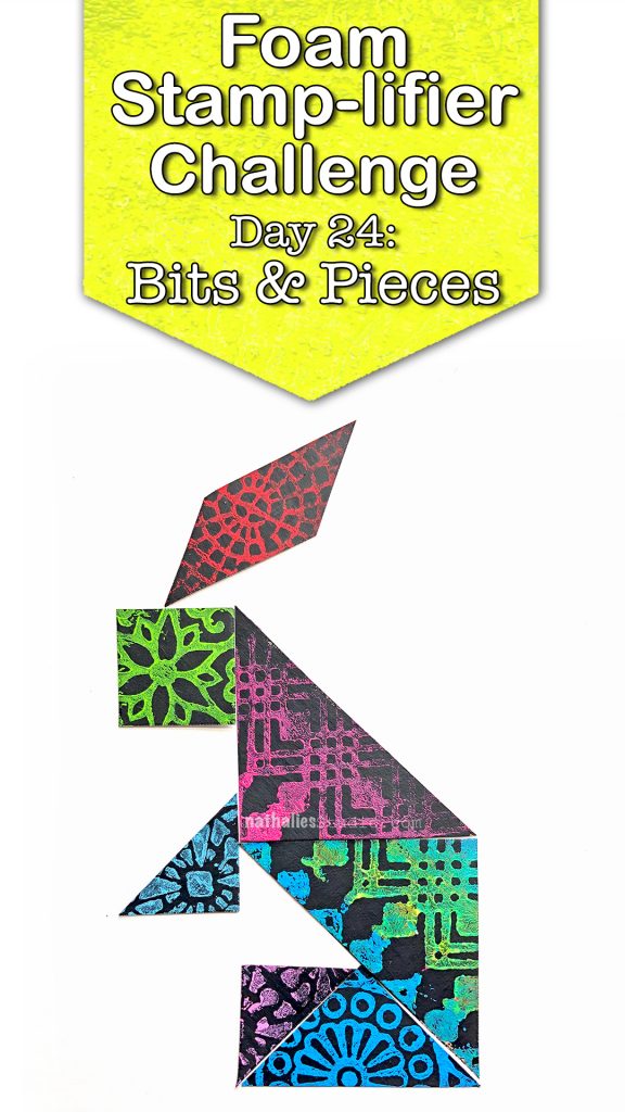
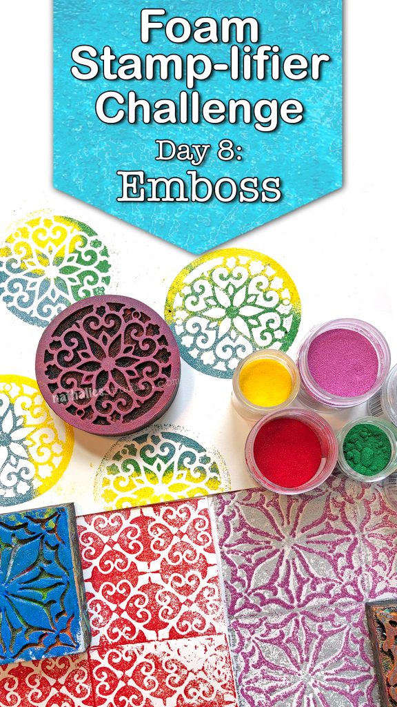
Hello from my Creative Squad! Today we have a post from Robin Seiz who is sharing a project with us beginning with one of her favorite creative techniques – working from a master board. She’s also using my Funky and Mid Century Squared foam stamps and our monthly theme: On Repeat – Let’s play with patterns! Repeat a design motif or shape to create a pattern-inspired project of your choosing.


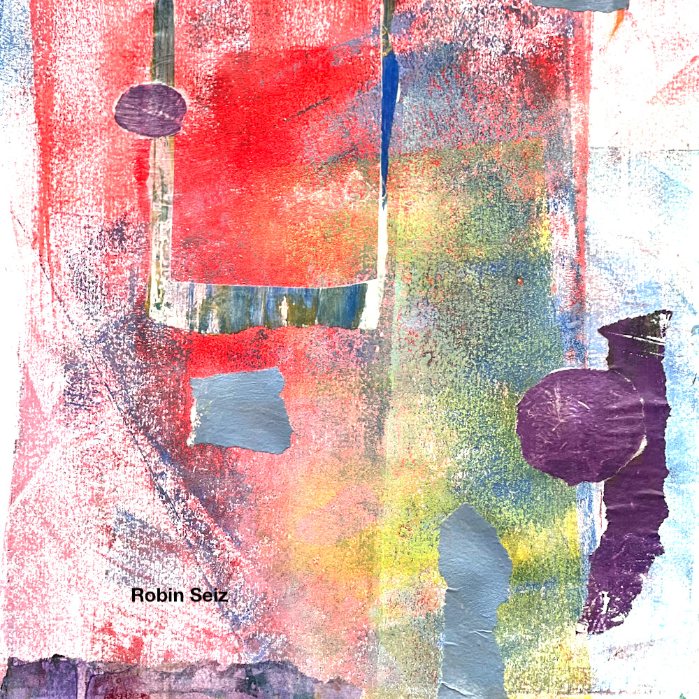
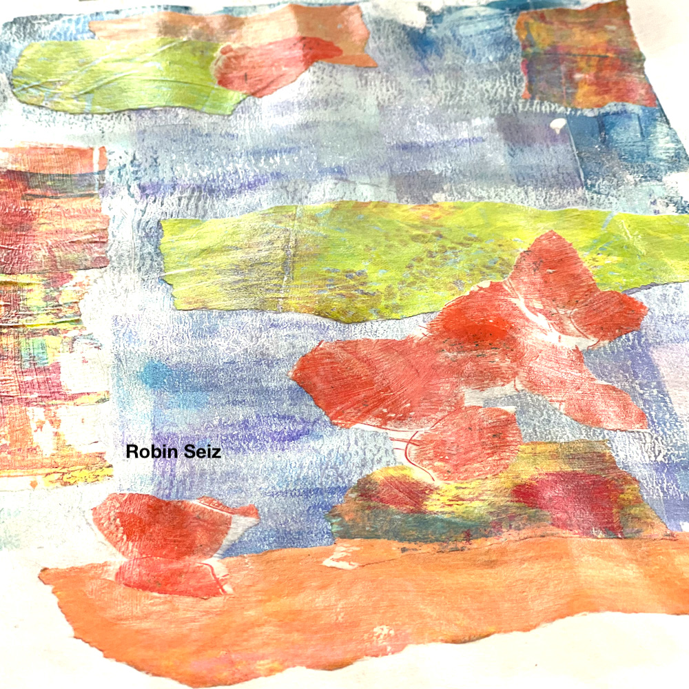
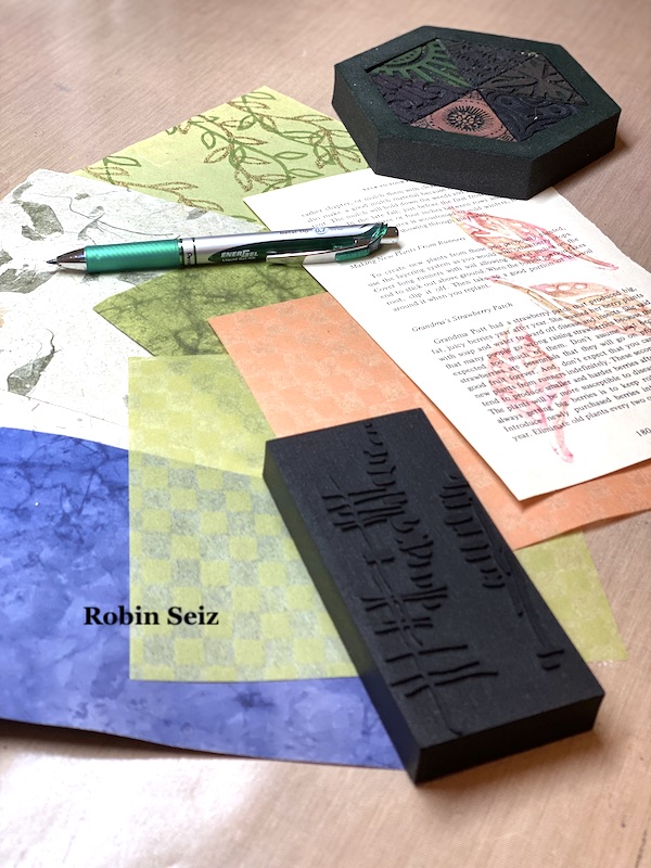
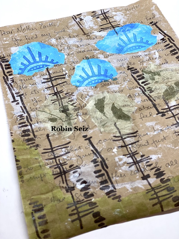
Dear Friends, I’m not exactly sure where June went, but here we are in July already. This month’s theme is patterns, created with foam stamps. I love foam stamps so it’s always fun for me to use them. I also consider myself “earth friendly” composting,  recycling, and reusing things. To start this project I grabbed some clean-up papers (a few that I used to clean off my brayer while gelli printing) They make the perfect beginnings for master boards, my project this month. 

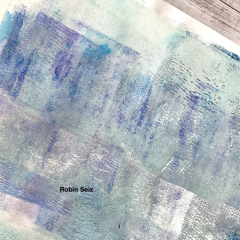
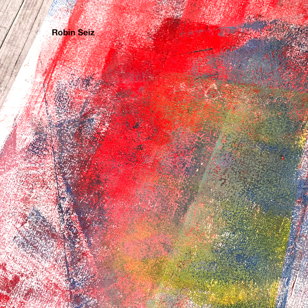
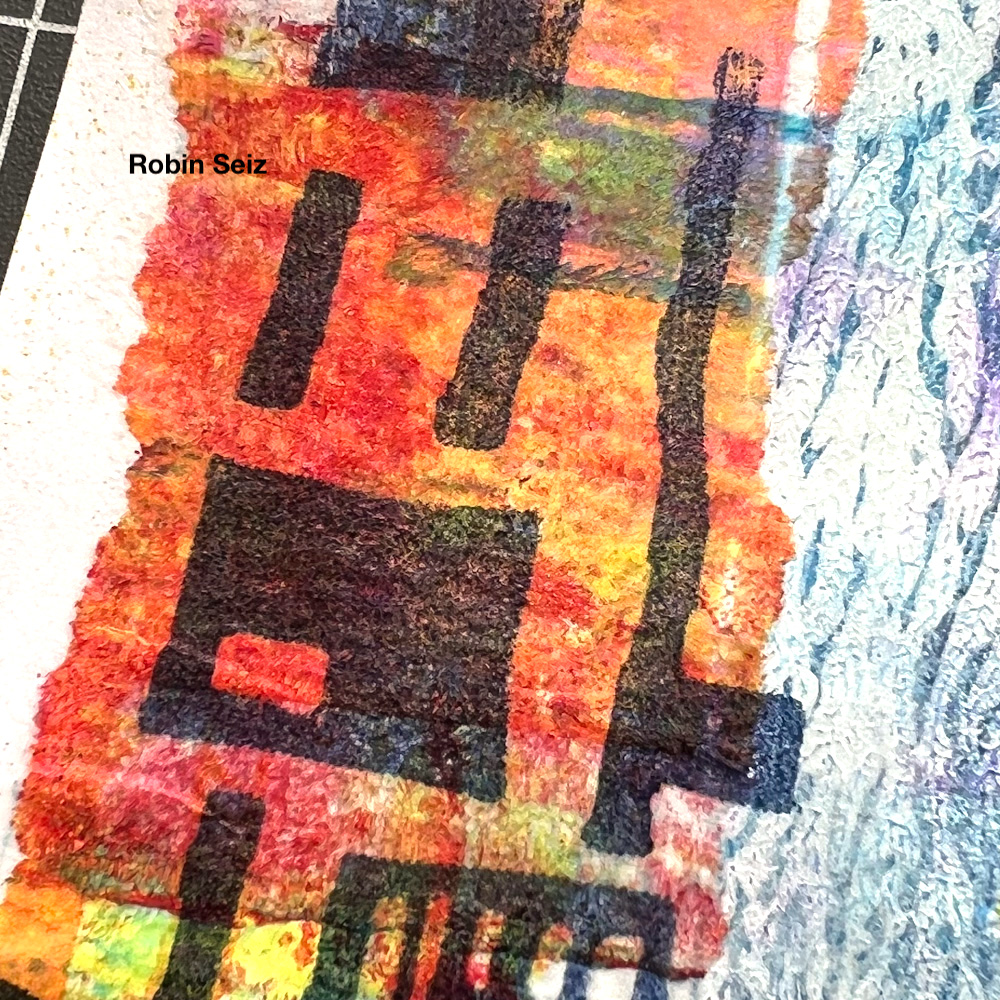
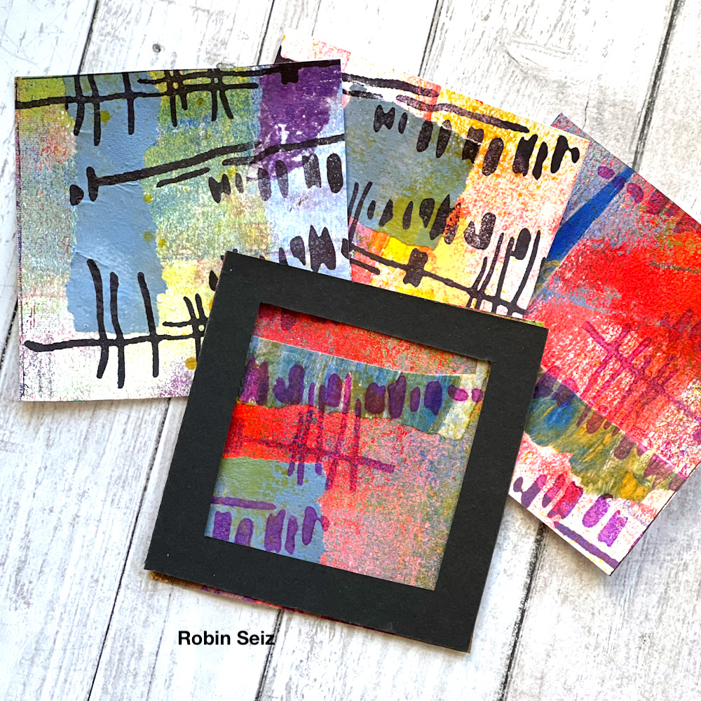
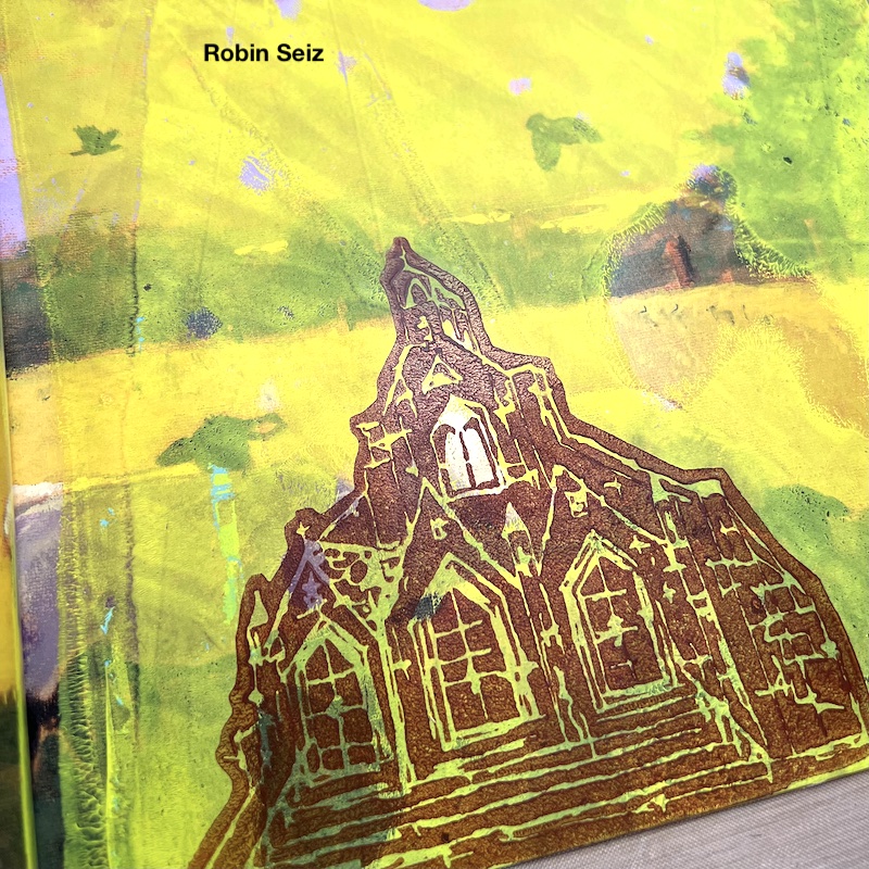
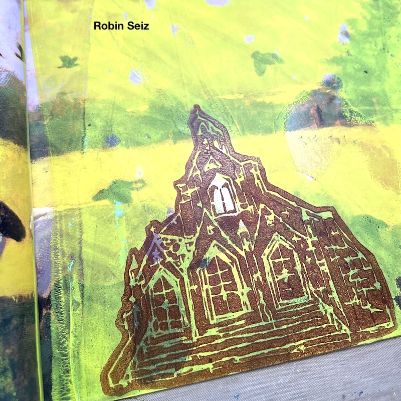
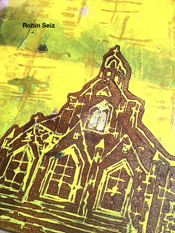
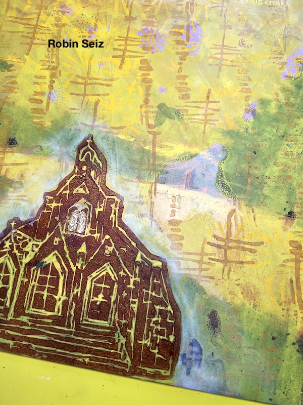
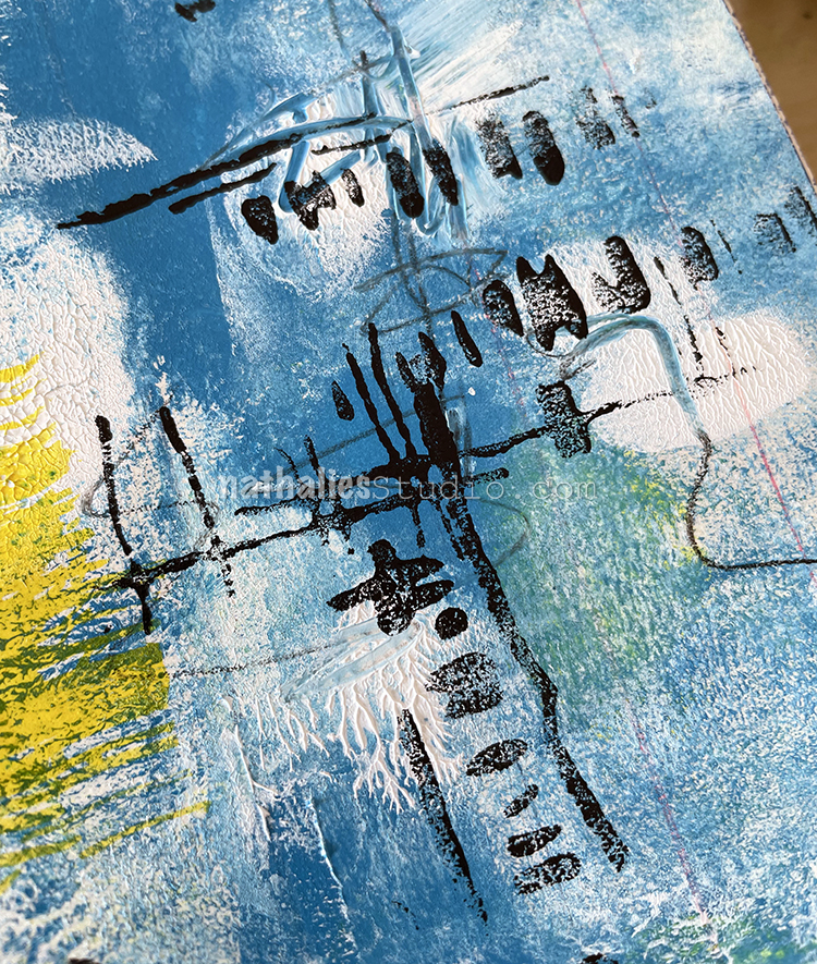
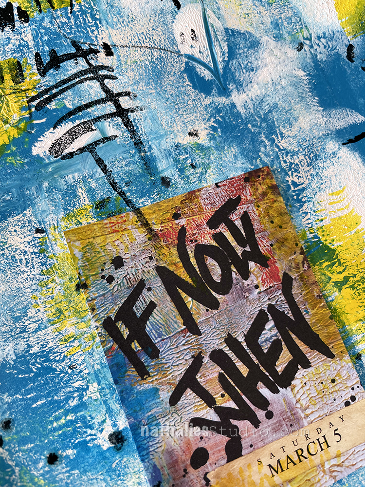
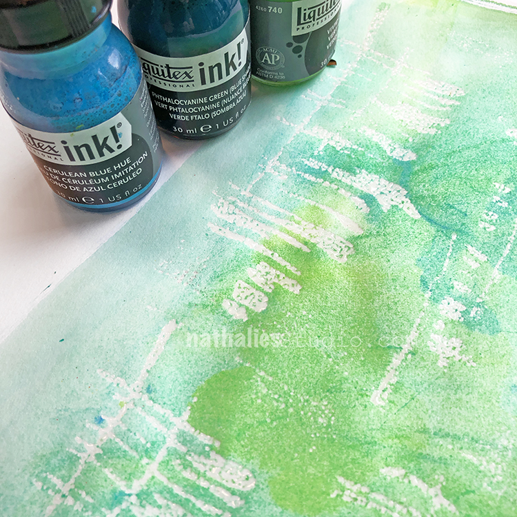
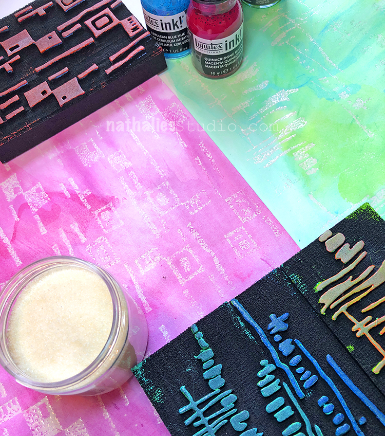
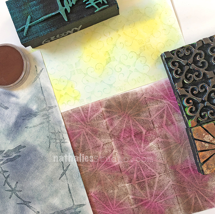
The next thing I did was tear up some colorful deli paper scraps and randomly apply them with clear gesso. This creates a wonderful texture to the paper. You can cover the whole page, or as much or little as you like.

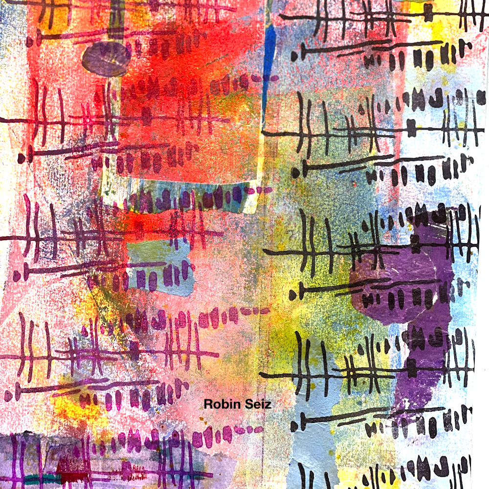
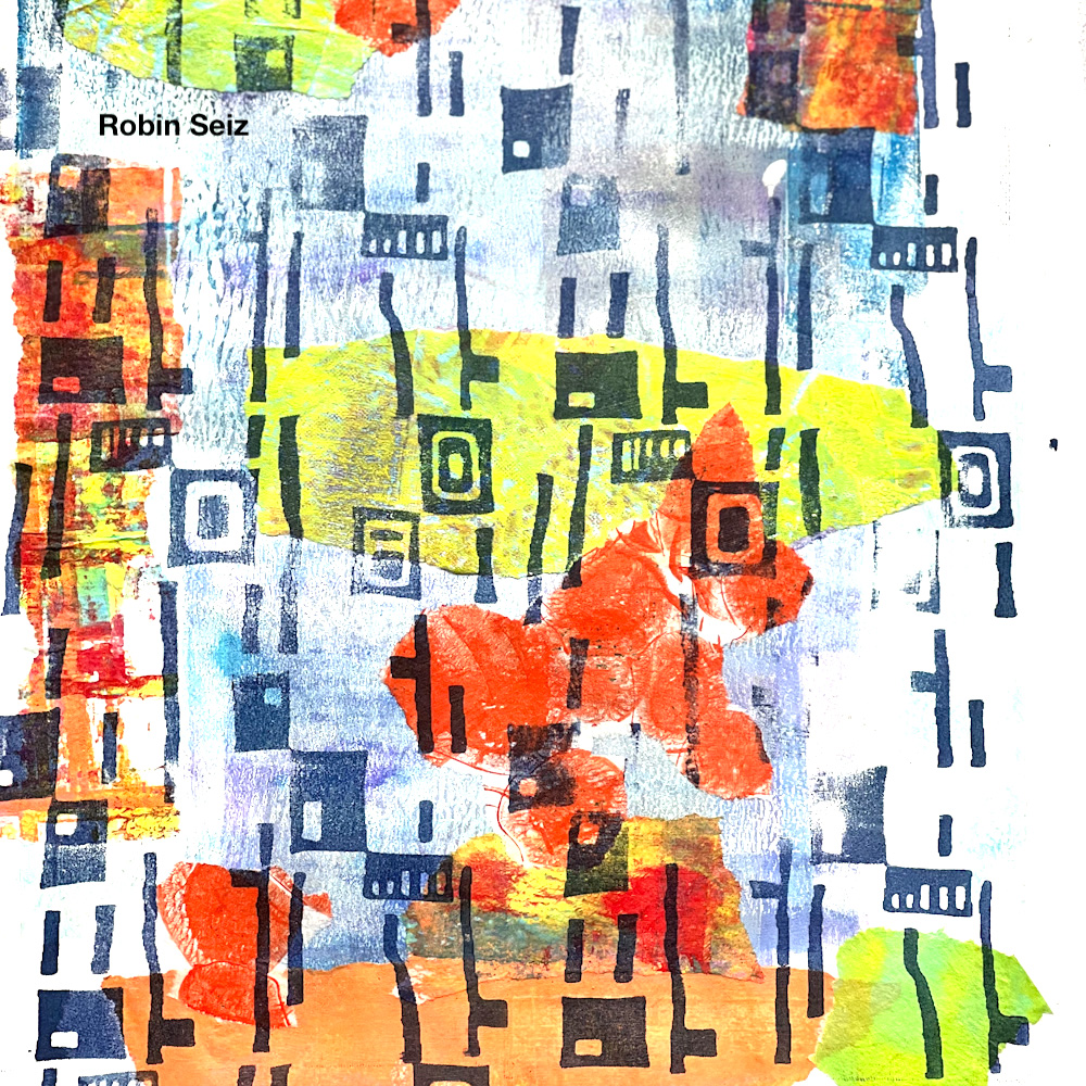
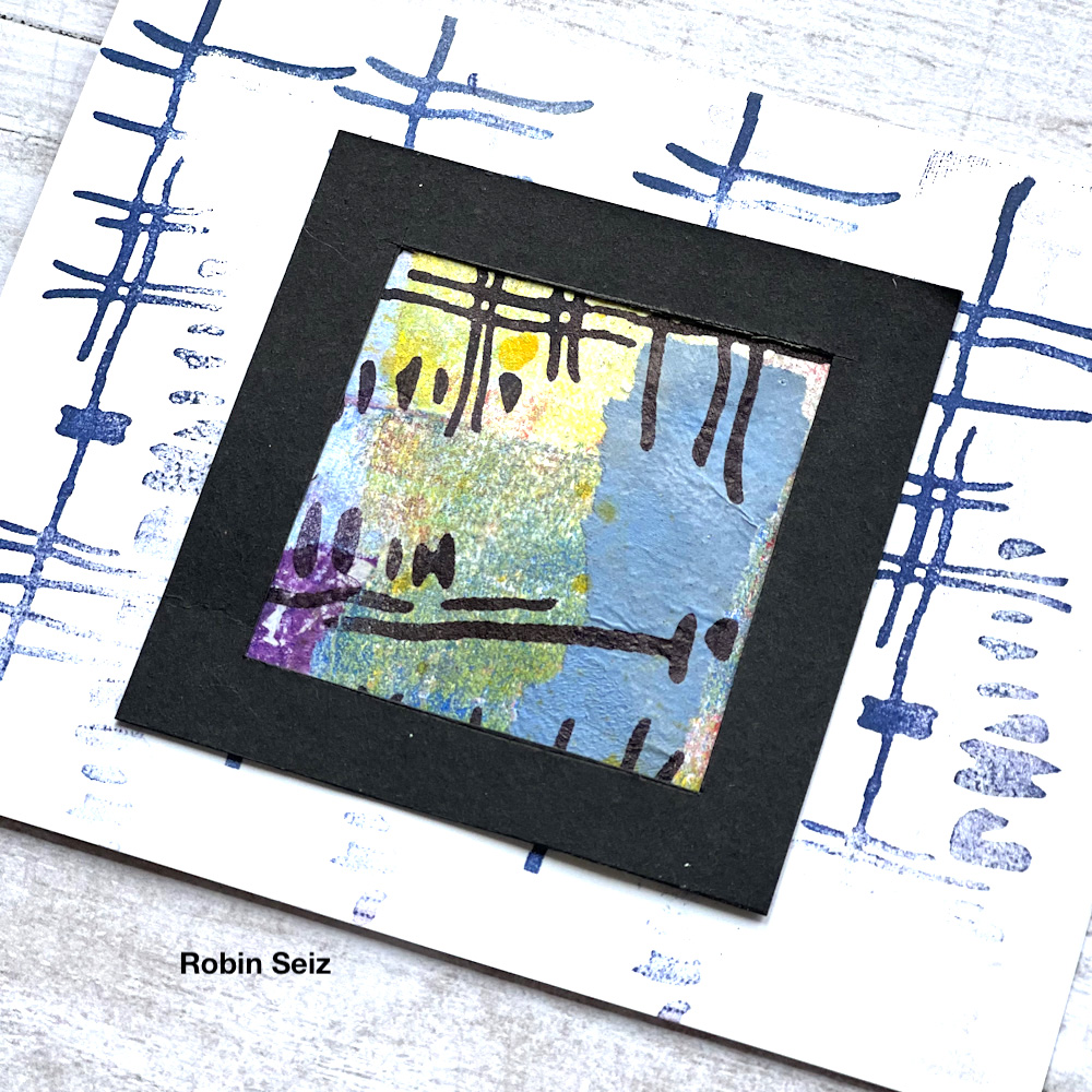
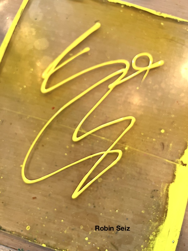
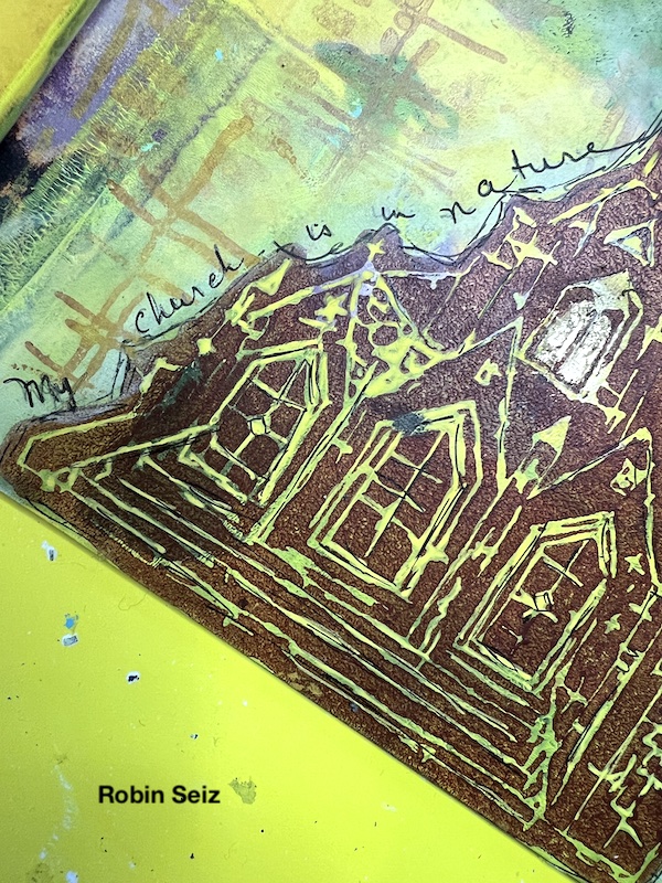
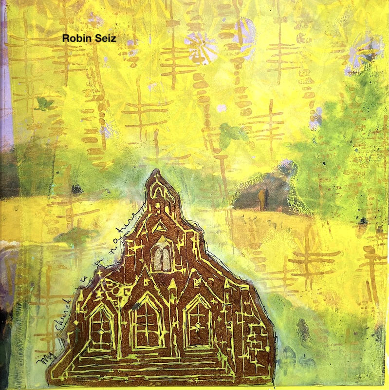
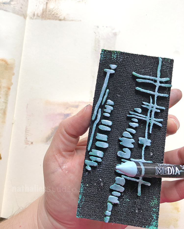
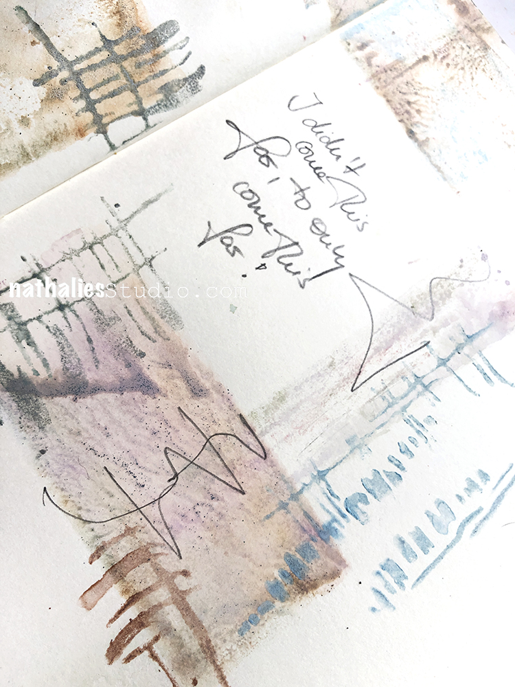
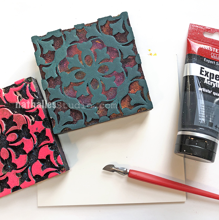
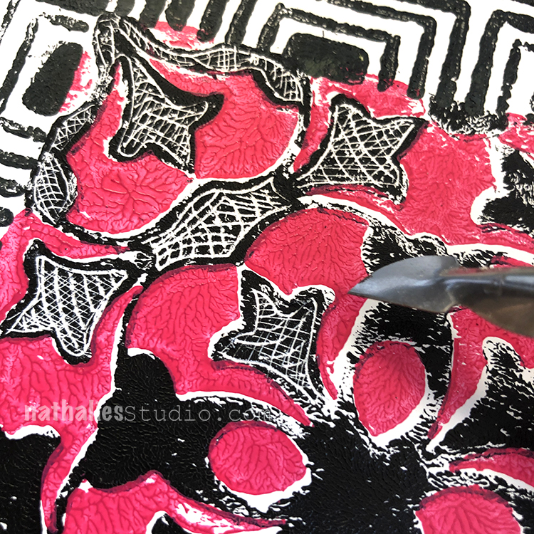
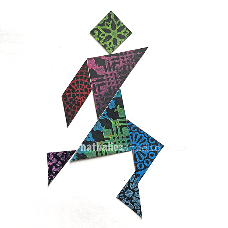
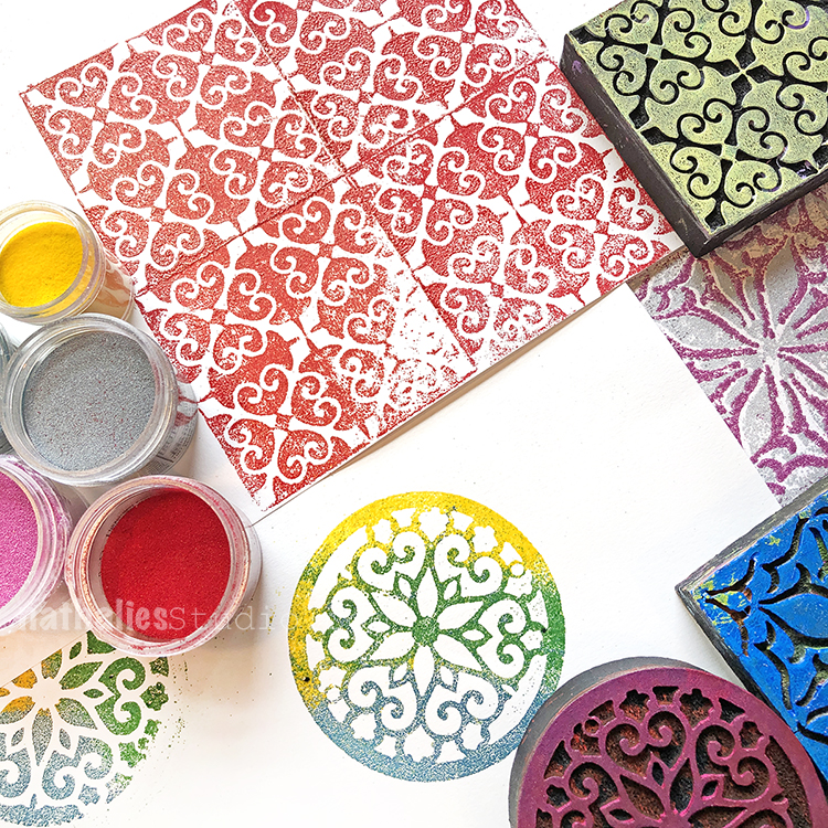
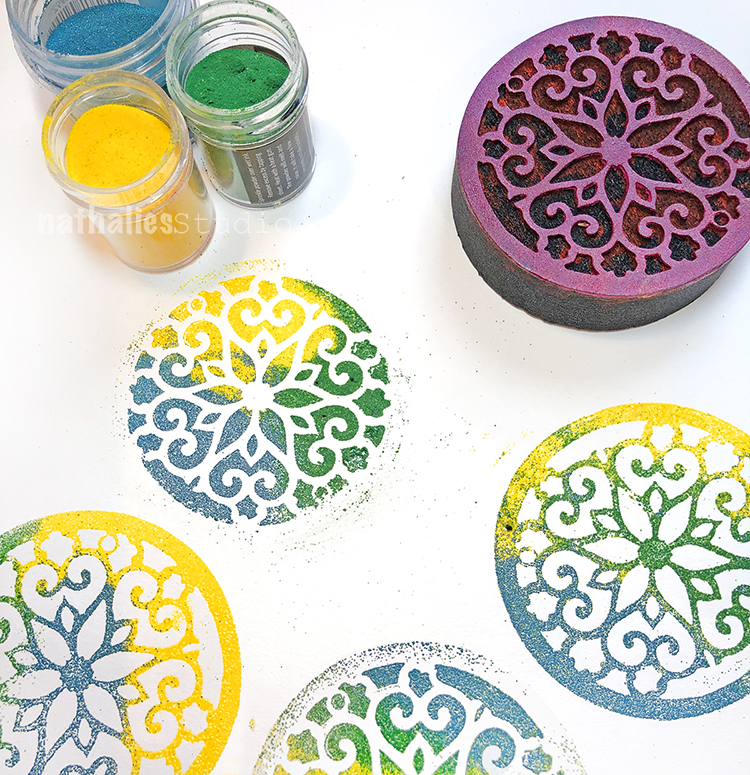
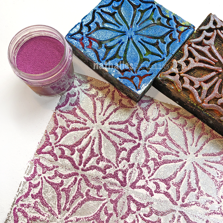
I then used Ranger Archival Ink and Nathalie’s foam stamps ( Funky Foam Stamp and Mid Century Squared) and stamped over the textured paper. I especially love the areas where the ink goes over the deli paper. It creates an imperfect stamp. I love this variation. I sprayed some Distress Spray Stain in Mustard Seed on the finished pieces. It made them pop more.

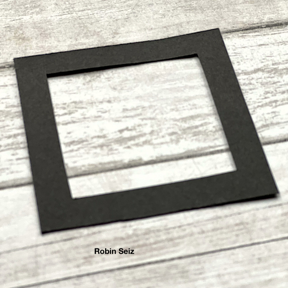
Waiting for the paper to dry (it does take several hours) is the hardest part of this project. Since I knew that I wanted to make some cards and a few little pieces of mini-framed art from this master board, I took the time to cut the little frames with a craft knife using black construction paper.  Once cut, it made it easy to audition the pieces I wanted from the master board. 

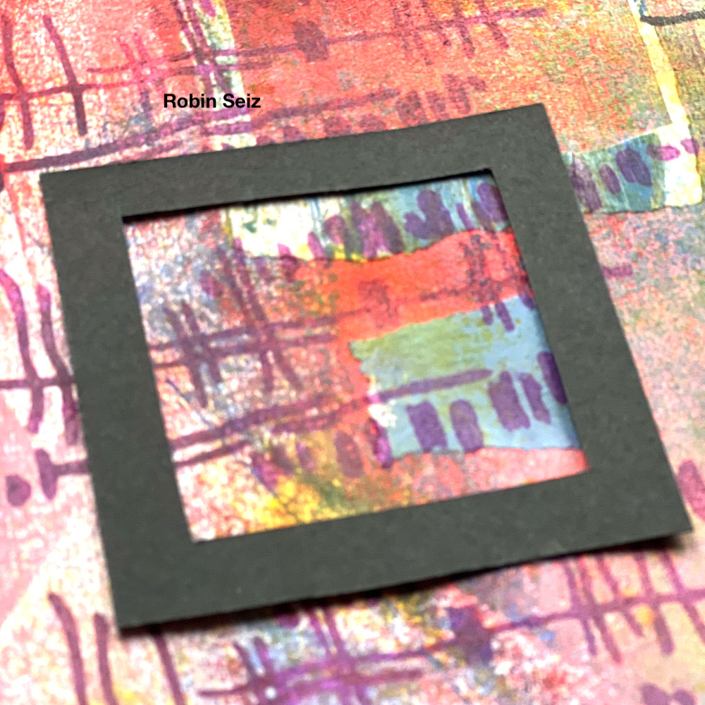
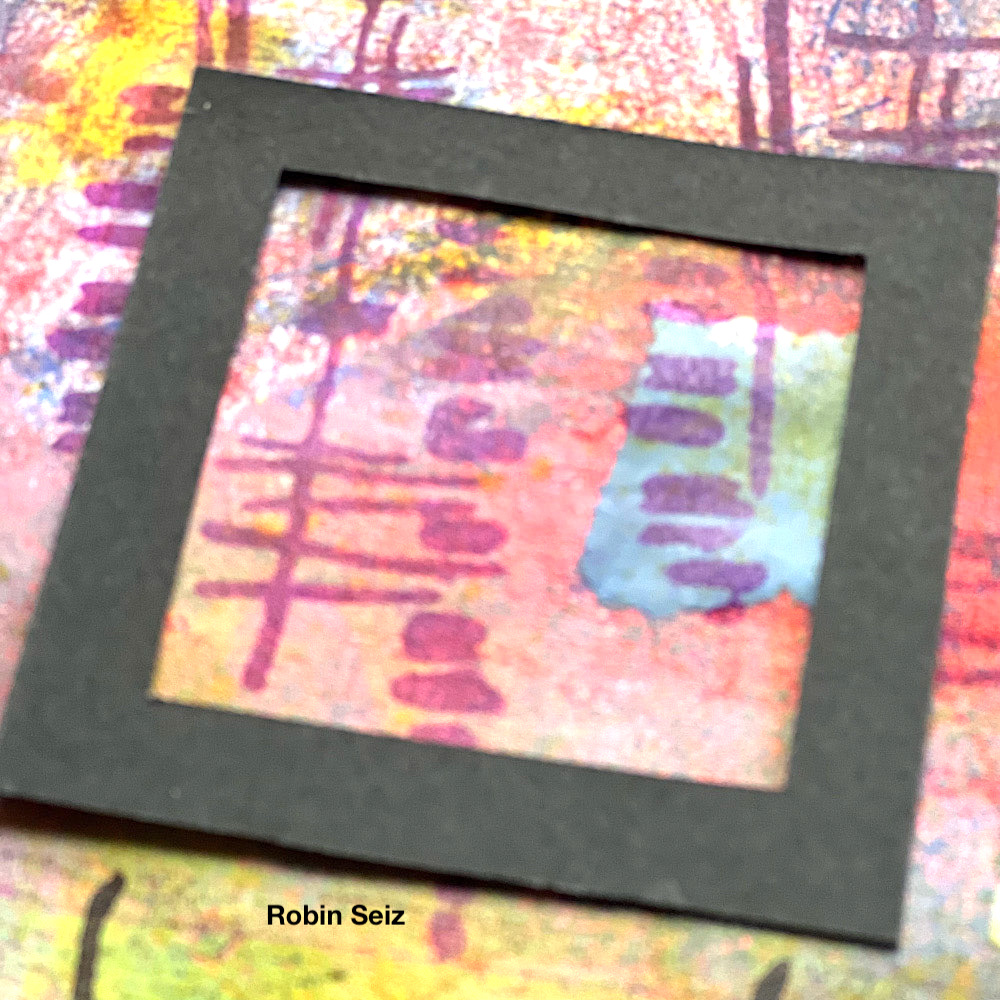
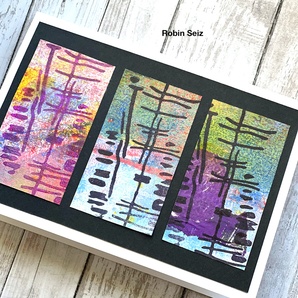
Once the paper was dry, I cut out the pieces and applied them with my Xyron Mega Tape Runner to the black frames and to the card.

Creating a master board allows for so many options. I love having a few of them around for those moments when I don’t have a lot of inspiration or time. They make it easy to create something quickly. It’s also easy to do several of them at one time. Make a day out of making master boards. I can’t wait to see what you create! 


Thank you Robin – love seeing how you build up the colorful master boards and then tie the image together with the repeating foam stamp patterns.

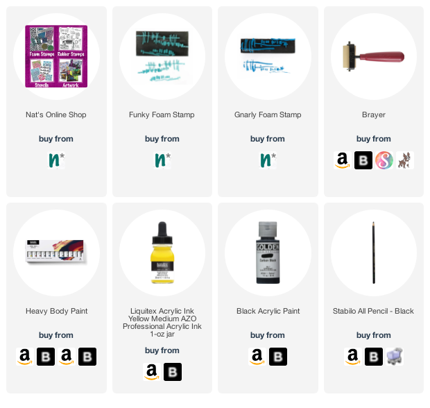
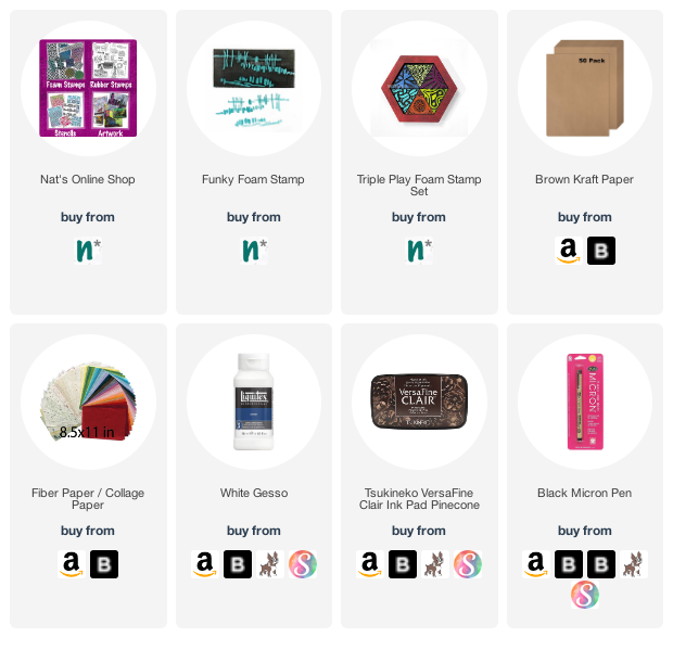
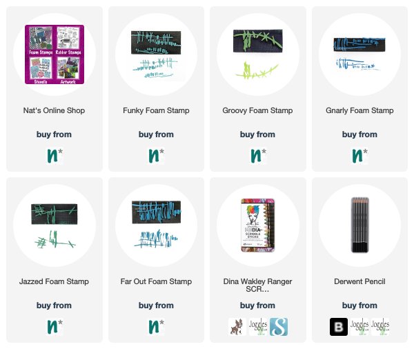
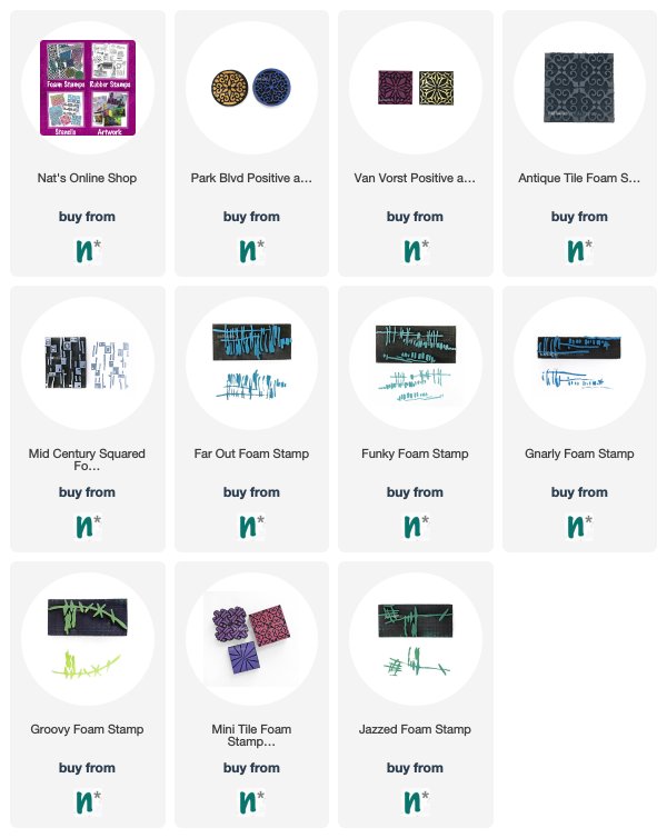
Give it a try: you can find all my Foam Stamps in my Online Shop and in addition to collage papers from her stash, here are some of the supplies Robin used:

Looking for more projects? Follow the Creative Squad on Instagram.

Comments (1)

  • Sue Clarke

    |

    Love these colors and the idea of having some on hand to use as needed.

    Reply

Leave a comment

Creative Squad: A Tale of Two Colors – Robin Seiz

Hello from my Creative Squad! Today we have a post from Robin Seiz who is sharing an art journal page with a focus on nature, using my Church and Funky foam stamps, and inspired by our theme: A Tale of Two Colors – Think about two different colors, one you love using and one you find more of a challenge to work with. Use them together in a project and see what happens.


Hello friends, Our theme this month is “A Tale of Two Colors”. We were asked to pick two colors; one we love working with and one we find more challenging to work with. One of the wonderful things about being on the Creative Squad is that I always set out to follow the theme and often learn something about myself in the process. I began with yellow, (one of my go to colors because of it’s transparency and the sunny emotion it portrays) and realized that while I use yellow quite a bit in my art, I have almost nothing yellow in my everyday life. I don’t buy yellow clothes, don’t have yellow accents in home decor, (except for my studio walls, which I really don’t like and am changing) and rarely use yellow except when creating. Hmmmm…. And conversely, I chose brown as the color I find more challenging to work with. I often find it too bold for the art that I create; I tend more to colors of nature or more vibrant colors in my art; yet, in my everyday life, our home has shades of brown in the furniture wood, the a fairly neutral pallet with shades of brown or tan. So interesting! I may need to find more ways to incorporate yellow into my life! 

I decided to create an art journal page this month. My go-to book to create in is a children’s story book with magnificent illistrations  on each page. I love to use parts of the pictures and incorporate them into my page. I started out with a picture of an owl and a happy accident happened. 

I laid down yellow acrylic paint on my gelli plate. I knew that I would be able to see some of the picture and words beneath because of the transparency of yellow. When I pulled the page up, the paint had not made contact with the owls’ eye. Happy accident! As cool as this is, I actually decided to use a different page for my project. (but wanted to show this to you) I’ll definitely come back to this page later for a different project.

Unfortunately, I forgot to take a picture of the original page I did end up using, but you will see below the reason I chose it and what I love that peeks through. I knew I wanted to use the Church foam stamp, so having something with the country side in the background was calling to me. I have drawn a white circle around a few things that made me decide on this page so you can see what drew me here. To me, the green layers were the country side. On the left hand side, you can see just the head of a sheep popping over the hill. I love that! And the right white circle shows the hay stack barn in the distance. It’s so fun when I can use these little surprise elements to tell a story. 

Next I used Burnt Sienna acrylic paint on the Church Foam stamp and pressed it down. As I frequently find brown, it was too bold and too prominent on the page. You will see I take care of this later. 

In order to add some interest to the church, I used some gold leaf on the two windows in the upper middle. I love that little pop of sparkly that it added. I also added some extra yellow (in the white spaces of the stamp) with a  yellow Posca Pen. It makes the church look like it’s glowing. I used a small brush and Ranger ink to bring out the color of the sheep and make it a little more prominent.

The church, while the focal image, was still too prominent. I masked the church and added the Funky foam stamp to the background to add some interest and take some of the focus off the church. I also added white gesso around the church to make it stand out a little from the background and the page. I went a little heavy with the gesso (which I have a tendency to do) and wiped it back a little with a baby wipe. I also added back a little yellow. 

For the final step I drew some black lines on the church to give it more dimension and to write my thoughts along the side. This page really is a good representation of who I am; when in nature, I feel  feel closest to myself and the world around me. 

What colors do you like to work with? What ones do you find challenging? Try them together you might have a happy surprise. What makes you feel connected to yourself and the world at large? Let me know in the comments or visit me on facebook or instagram. 


Thank you for sharing your process with us Robin! Love how you toned down some things and emphasized others to create your finished page.

Give it a try: you can find all my Foam Stamps in my Online Shop and in addition to an old book, here are some of the supplies Robin used:

Looking for more projects? Follow the Creative Squad on Instagram.

Leave a comment

Facts – Art Journal

Here I’m using another old work of mine from an art journal page (you can see the original post and page here) from the sold out Artist Almanac.

I used a brayer to roll out heavy body white and blue paint and added some yellow areas with yellow acrylic ink. I used my Gnarly and Funky foam stamps with black acrylic paint to add some marks, and a stabilo pencil for some softer marks as well.

Here are some of the supplies I used:

Leave a comment

Creative Squad: Dear Mother Earth – Robin Seiz

Hello from my Creative Squad! Today we have a lovely letter to Mother Earth from Robin Seiz using my Triple Play and Funky foam stamps and our theme: Dear Mother Earth – Our planet Earth is an amazing and beautiful gift to all of us. Let’s write her a letter, telling her just how we feel. This could be an actual letter/mail art, an art journal page, or some other mixed media project.


The theme this month is Mother Earth; she has a strong pull on me. From an early age, I was happiest swimming in streams, looking for tadpoles, and exploring the woods. Now my appreciation for Mother Earth is more about spending time doing things that bring quiet and peace. Vegetable gardening, pulling weeds, hiking, strolls on the beach, all feed my soul.

For my project this month, I have written a letter to Mother Earth to tell her what she means to me and to thank her for all that she provides. The last few months have been difficult caring for my sick mom; I have been reminded how much being in nature is important to my well-being.I have written this letter to document this time in my life and my refections. I plan to put my letter in an envelope, seal it and put it away for a later time. It wasn’t important that it be legible in the end, I’ll remember this time.

Using recycled material was important to me; after all, taking care of Mother Earth is important. I knew I want to use some collage elements so I chose papers I had in my stash which reminded me of the elements of nature. I didn’t use it all, but it gave me a place to start. I also used brown recycled package wrapping as the base for the project. I cut it to an 8” x 11 sheet.

Next, I wrote my letter in black pen; the words flowed easily.

I wanted the writing to fade into the background. After I put my feelings down, it was no longer important for them to be legible. I used gesso to cover some of the writing. I applied it carefully so  that some words would show. 

Next I used diluted PVA to apply the collage elements. I chose green textured paper, blue gelli printed paper that was in my scrap box, and a natural tan paper with fibers that reminded me of leaves. I wanted the elements of Mother Earth to be represented.

After the collage elements were adhered to the paper, I used Nathalie’s Funky Foam Stamp which reminded me of twigs and Versa Fine Clair Ink. This stamp is so versatile. I also used one of the foam stamps from the Triple Play foam stamp set. Both of these were perfect for this project.

Having this prompt of Mother Earth came at the perfect time for me. I felt compelled to write a letter and express my sincere thanks for the peace and soulfulness that she has given me throughout my life. If you do art journaling, this would make a great journal page idea. I love the idea of writing a letter, sealing it, and putting it away for someday in the future. 


Thank you for sharing your story and inspiration behind this beautiful piece Robin. I love the idea of putting it in an envelope to revisit in the future too!

Give it a try: you can find all my Foam Stamps in my Online Shop and in addition to various collage papers, here are some of the supplies Robin used:


Like what you see? Follow the Creative Squad on Instagram for weekly posts, artwork, and inspiration.

Leave a comment

Goals – Art Journal

“I didn’t come this far, to only come this far!”

I received the Scribble Sticks set 3 as a thank you for playing along in the Ranger Designer Challenge in January. I wanted to test them out with my foam stamps. Here is my Funky foam stamp getting a bit of blue…

I wet the foam stamp back and applied the scribble stick and then stamped for the blocks of color. I did the same with the front for the designs.

Here is my Groovy foam stamp design.

Here is a bit of my Gnarly and my Jazzed designs. I loved the colors in this new set – they work perfectly with these foam stamp patterns.

Pretty interesting effect with the back of the stamp too – nice texture. And who doesn’t need a bit of motivation to keep going for more?

Here are some of the supplies that I used:


Comments (1)

  • Sue Clarke

    |

    Wonderful and I have those stamps and scribble sticks…woot woot.

    Reply

Leave a comment

Foam Stamplifier Challenge Prompts 22-24

Day 22 – Plastic

Printing on top of plastic sheets or overhead foils is a fun way to create transparent elements for your work or nice dividers for your art journal but my favorite of all must be using Shrink Plastic. From wine charms, to embellishments to earrings. Using the foam stamps with inkpads of your choice, stamp your desired images.

Then heat the shrink film up as the manufacturer recommends and you will get a tiny version of your stamped image. Too cute! Here is a sample where I used the shrink film to create myself some new fancy earrings.

Day 23 – Scratch!

Another fun way to use Foam Stamps is to stamp onto some Ampersand Clayboard to create some great textured designs.


Stamp on top of the clay board with acrylic paint or spray ink or inks and then start scratching into the design. It is like doodling by scratching- better then coloring books- trust me!

Day 24 – Bits & Pieces

How about using bits and pieces of foam stamped paper to create something new?

You could create a tangram which is a puzzle which consists of 7 flat geographic shapes which put together can create a new shape.


Simply google tangram, print out the template, glue it on some white or black paper, start stamping with your foam stamps and cut it.

And then go and play …

Here are the different foam stamps I used for these prompts


In case you missed the prompt list  here you go:

Leave a comment

Foam Stamplifier Challenge Prompts 8-10

Day 8 – Emboss

I love to emboss with my foam stamps. The foam surface creates some added texture even if you use super fine embossing powder.

Simply press the clear embossing pad onto the foam stamp and then stamp on paper. You can add just one solid color of embossing powder to your image and then heat emboss.

Or for even more fun, add several different colors of embossing powder and heat emboss one after the other.

Another fun way to use embossing powder is to use the positive and negative sets and layer the embossing. I hope you try it

Day 9 – Resist

I am a huge fan of resist techniques and this has always been one of my favorite ones.

Apply clear embossing ink to your foam stamp. Stamp onto paper. Sprinkle UTEE (ultra thick embossing powder) on top and heat emboss. Let cool and then apply a very thin layer of acrylic paint or acrylic ink over the surface.

The paint or ink will dry slower on top of the UTEE as that area will resist the paint. Use a moist rag or a baby wipe and gently wipe over the raised UTEE pattern to remove the paint.

What remains is a wonderfully textured clear pattern.

Day 10 – Pastel

I love using Pastels with my foam stamps. In order to make the pigments stick you need a little trick though. I usually use a clear embossing ink pad and apply it to the stamp, then I stamp onto paper.

My favorite pastels are PanPastels but you can use over pastels as well.

I apply the pastel with a tool over the stamped surface and wherever the embossing ink is on the paper the pastel will accumulate more and collect more of the pastel.

The stamped design will appear darker.

Here are the foam stamps I used for those prompts. Hope you enjoying the Foam Stamplifier Challenge!


In case you missed the prompt list  here you go:

Leave a comment