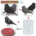
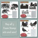
I am so excited as this is the first Tuesday for my Creative Squad to show you a fun project. The theme for March is Opposites Attract and the team will use my new Bird Foam Stamp, Rubber Stamp and Stencil Set. Just as opposite colors on a color wheel highlight one another, or yin and yang fit together so comfortably, sometimes the best is brought out when we celebrate extreme differences!
So here is the wonderful Gwen Lafleur with her amazing and stunning interpretation of the theme in form of an art journal page
—————————————————————————————————–

For the this month’s theme of “opposites attract,” I decided to interpret it in two ways. You can see lots of complementary colors used throughout the piece, but the main way I created “opposites” was by contrasting bright / shiny / new with old / rusty / brown. I tend to use this type of contrast in a lot in my work, so I thought it would be fun to really emphasize it for this piece.
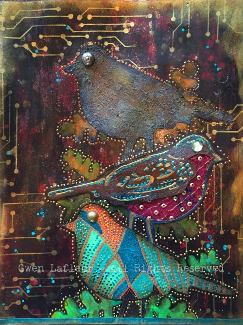
To make the page, I created a background with black gesso and layered some color on top to create a kind of distressed look, but using a mix of bright and dark colors. To add more old / new contrast, I used the Circuit stencil with gold ink. For the birds, I stamped each side of the foam stamp plus the rubber stamp on cardstock, then decorated each of them separately.
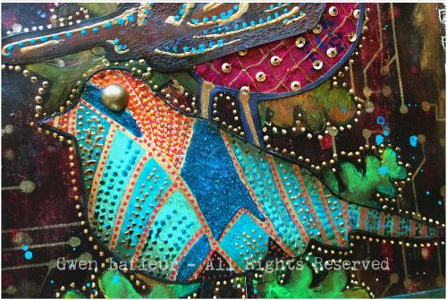
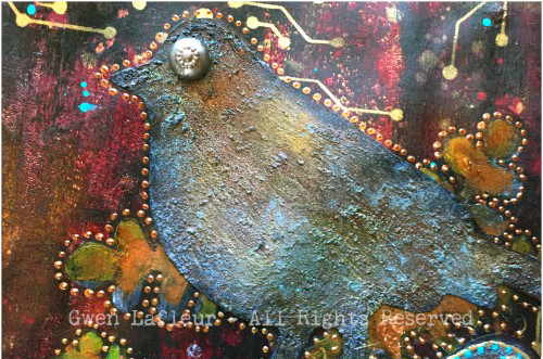
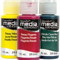
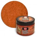
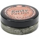
The bottom bird used the rubber stamp, and he’s all about bright colors, beads, gloss and shine. The middle bird used the detailed side of the foam stamp and he’s a fun little hybrid. I made the top look rusty, but layered shiny dimensional paints on top. I cut out a section from the bottom following the lines of the stamp and added some fabric – it’s vintage sari fabric, but it has shiny sequins on it. The top bird is from the solid side of the foam stamp and is all old and rusty with no shine or bright colors. I used acrylic paints, texture paste, and Viva Rusty paint and patina to make it look like a piece of rusted metal, then added a vintage metal button for his eye.
To finish, I positioned each of the birds on the page and then used the leaf stencil that comes with the stamps and stenciled the base of the leaves where I wanted them. I kept the same pattern as I added the leaves – brighter green at the bottom moving to brown and dark leaves at the top.
It was so much fun to work with these stamps and stencils – they’re so versatile! Plus, this month’s theme was challenging yet enjoyable, and I really love how it turned out!
———————————————————————————————————-
Wow – I hope you enjoyed Gwen’s project as much as I did. I love how she used all three bird stamp surfaces and created them differently yet cohesive and the texture and detail in this page is stunning!
Besides the supplies listed below, Gwen also used several dimensional paints, misc fabric, jewel and metal buttons to create this art journal page:

And maybe you will even play along -we would love to see how you interpret the theme – email me how you used my stencils and stamps with the theme and email me an image – I would love to share what you did at the beginning of next month!
See you next Tuesday for the another project with the theme ‘Opposites Attact’.




Comments (16)
Dee Ann O'Brien
| #
Wonderful birds- inspiring. Great technique directions!
Reply
gwenlafleur
| #
Thank you so much! So glad you liked it :)
Reply
Karen Petitt
| #
Oh no and dang! I now have to change what new stamps and stencils I had planned to purchase in May. This is just dang! For me it was an OMGee when I hopped over, I love the rich deep colour which is so perfectly opposite yet matches the rusted layer. I own one of Natalie’s stamp and stencils sets and I knew when I could I was going to purchase more of her tools. Today’s post has reminded me not to plan ahead so much because I need these new stamps and stencils so very much! Just as I thought it couldn’t get better this month you guys release these beautiful products.
Thank you so much for the blog hop, the awesome inspiration and for sharing your gorgeous art with us Karen x
Reply
gwenlafleur
| #
Thanks so much Karen! I have to admit, this is a pretty fun stamp set… plus it’s 3 stamps and one stencil in one! You really kind of have to have it ;)
Reply
VikiB
| #
That is an awesome piece! I love the contrast and the addition of the circuit looks so cool.
Reply
gwenlafleur
| #
Thank you so much! I couldn’t resist adding the circuit stencil as part of the opposites theme – so glad you like it!
Reply
alisa
| #
Love the creative team! Great ideas
Reply
gwenlafleur
| #
Thanks Alisa! I’m thrilled to be included in such fantastic company :)
Reply
cheiron
| #
Amazing page Gwen. I am loving the colors and texture!
Reply
gwenlafleur
| #
Thanks Cheiron! I can’t wait to see what you did for this challenge :D
Reply
Martha Richardson
| #
I’m so glad to see a Creative Squad! Love the project and tutorial ;)
Reply
gwenlafleur
| #
Me too Martha! And thank you! It was fun to work with this month’s stamp set :)
Reply
Michelle LaPoint Rydell
| #
Gorgeous page Gwen! I love how you combined the rusty elements with the bright colors – it really pops!
Reply
gwenlafleur
| #
Thanks Michelle! I really like the contrast of old and new… glad I’m not the only one!
Reply
Sue Clarke
| #
I love how you used the Circuit stencil Gwen!
Makes it seem like branches. Nice job.
Reply
Gwen L.
| #
Thanks Sue! I thought that was a fun stencil to use for this – it felt like it fit, but still added some cool (to me!) contrast :)
Reply