I hope this post finds you wrapped in the warmth of creativity! I am excited to share some delightful updates with you!
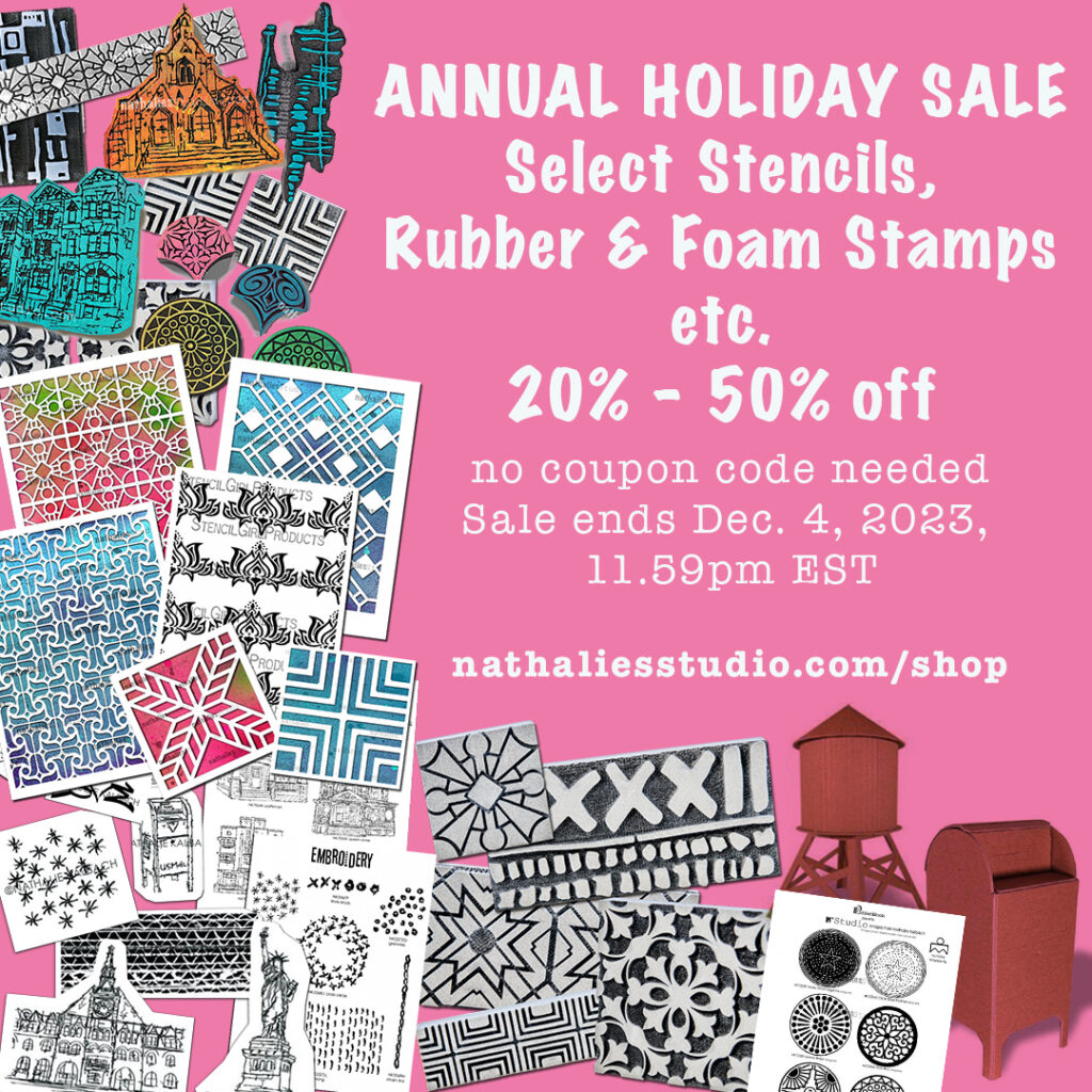
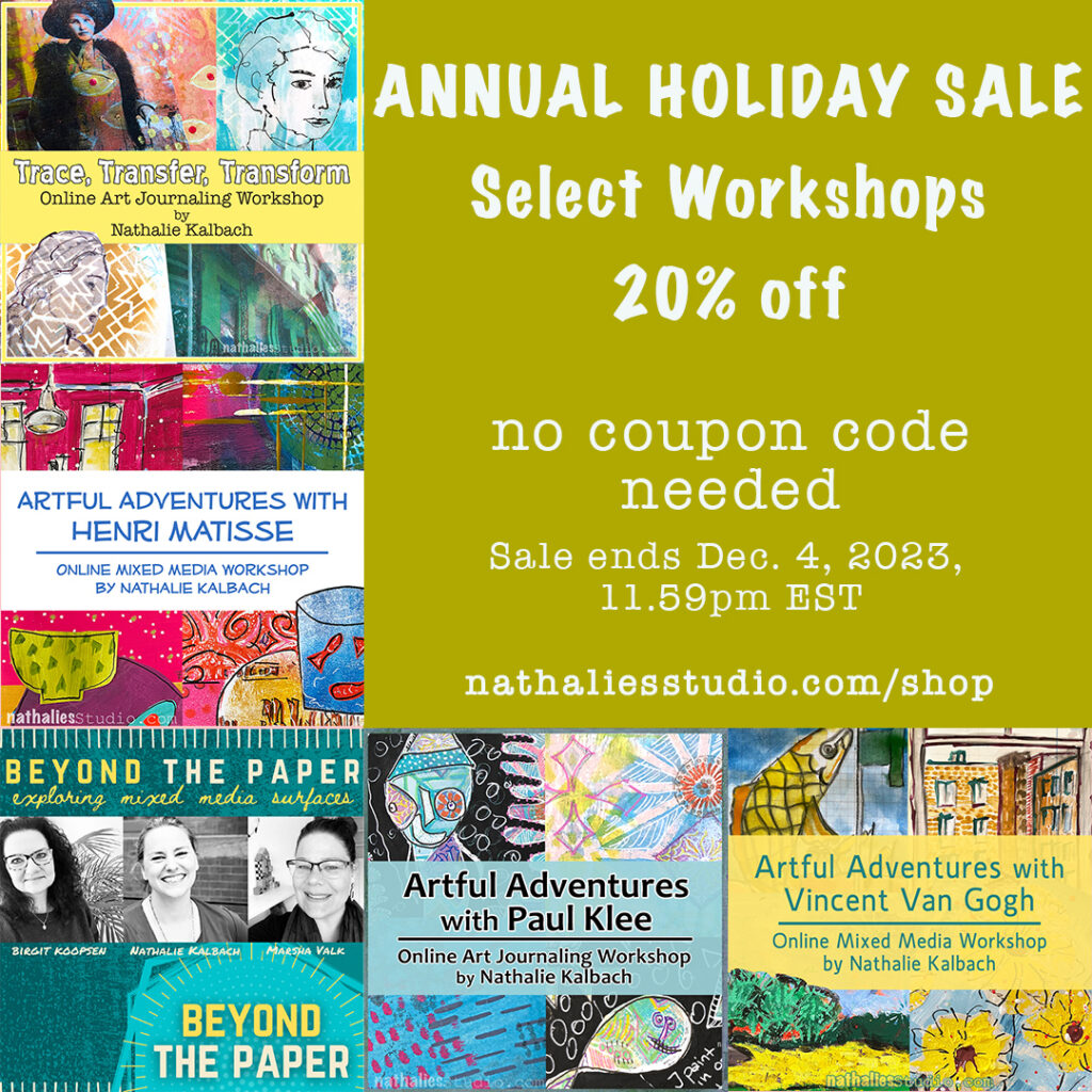
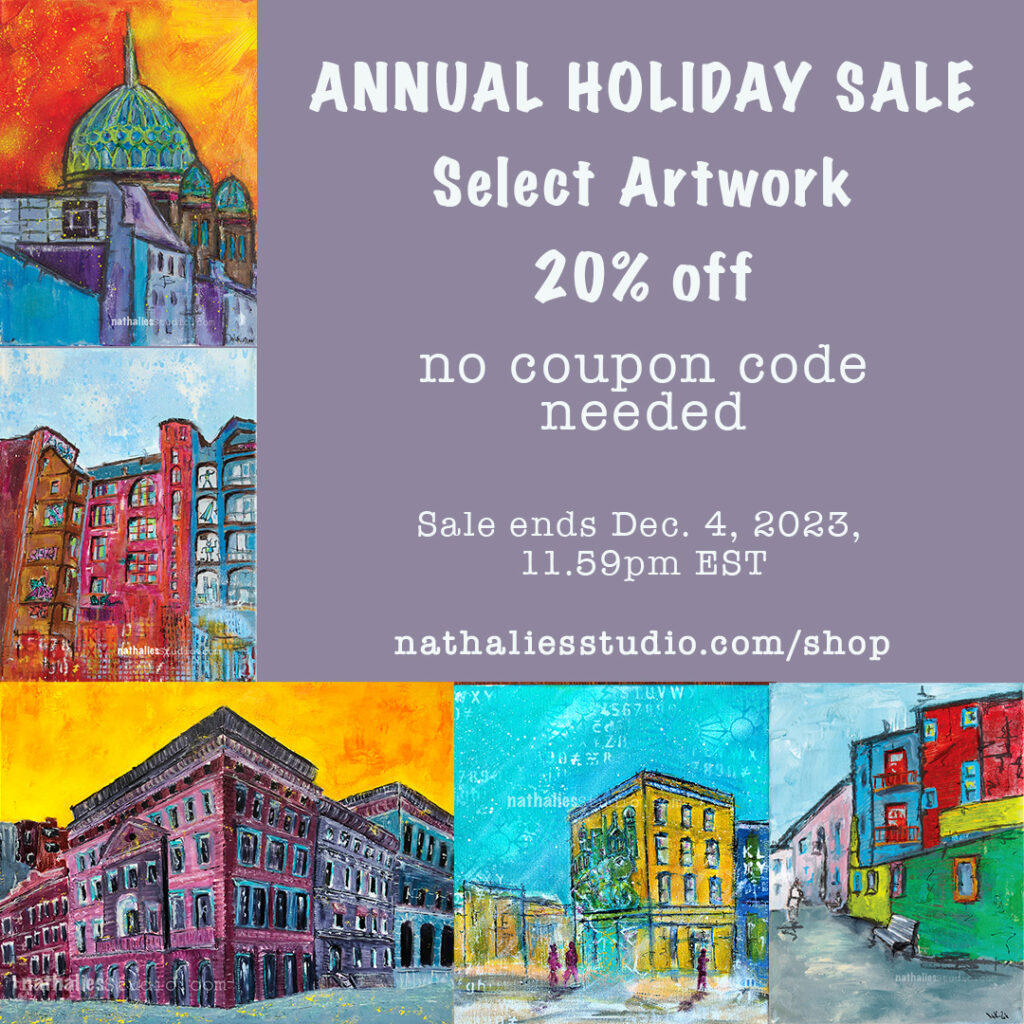
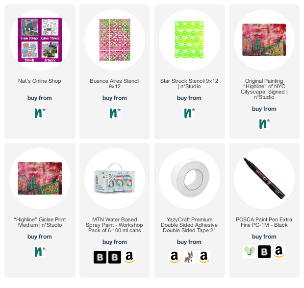
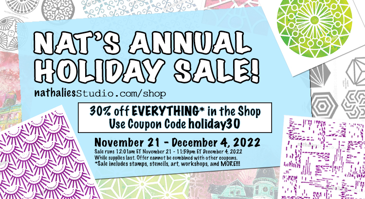
ArtFoamies Foam Stamps, Stencils, Rubber Stamps, Original Artwork, and Online Workshops – All on SALE! 🌈
Now, not only are my favorite Foam Stamps up to 50% off, but I’ve also added select Stencils and Rubber Stamps to the mix, all at a fantastic 20-40% discount! That’s not all – selected pieces of my original artwork and online workshops are joining the celebration with a 20% off deal!
No coupon code needed, and the sale is on until December 4th, 11.59 pm EST or while supplies last. Don’t miss this chance to bring a burst of creativity into your holiday season!
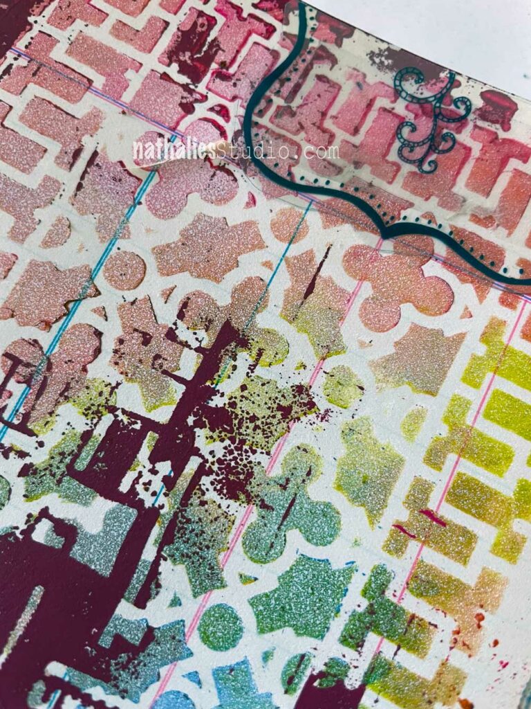
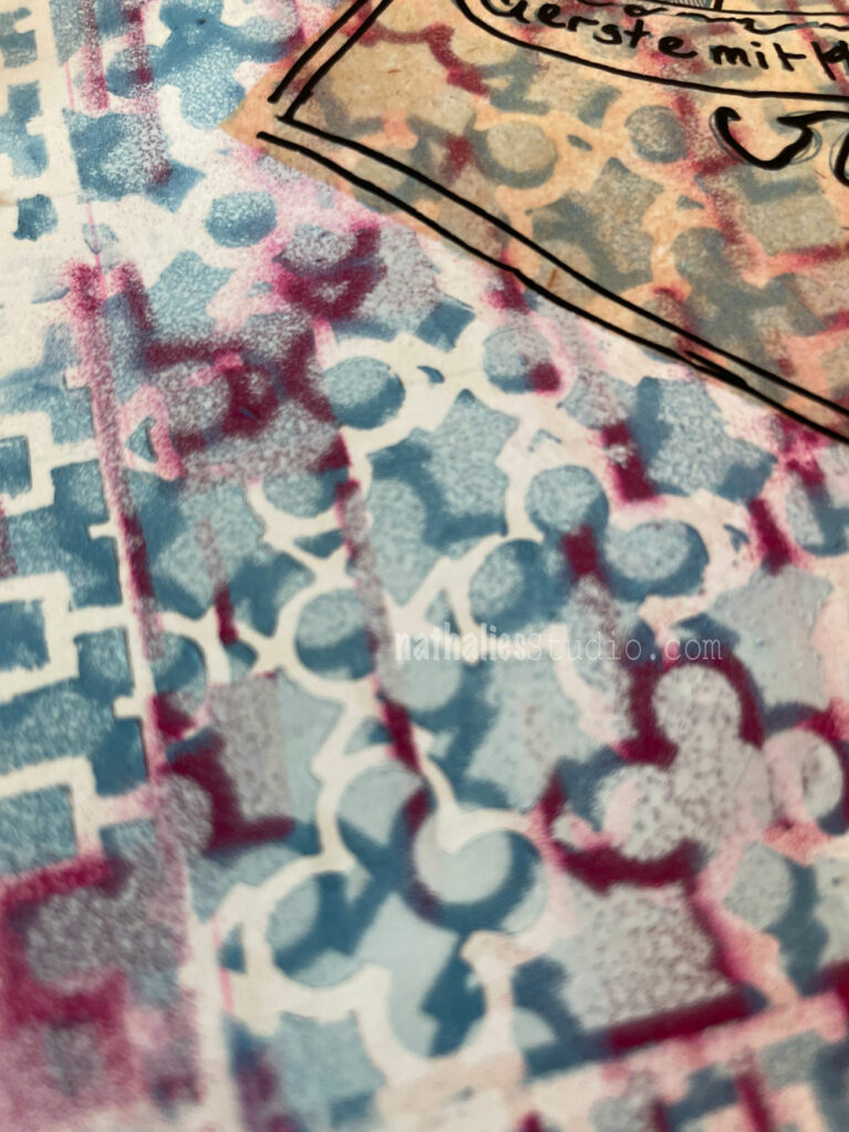
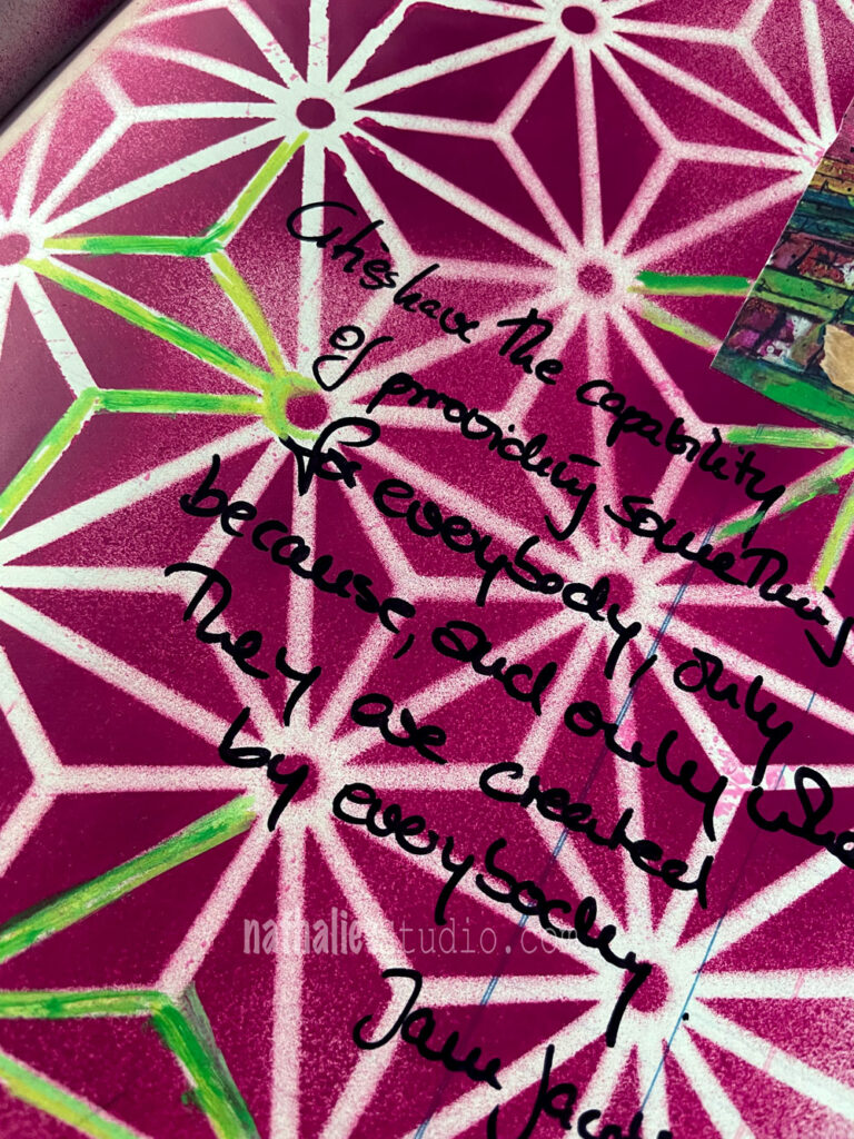
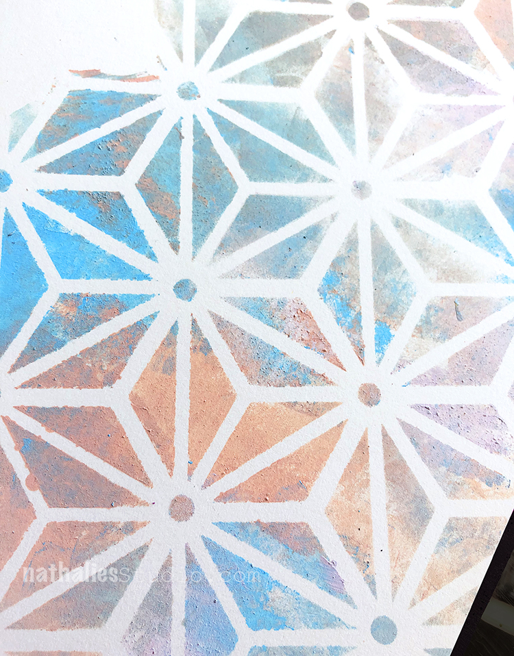
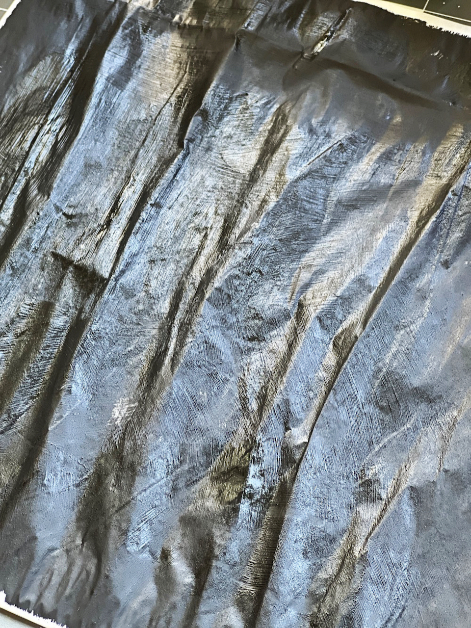
I had fun playing with some Spray Paint and my Downtown Stencil (you see some grungy remains of a blotted Space Age Stencil as well)
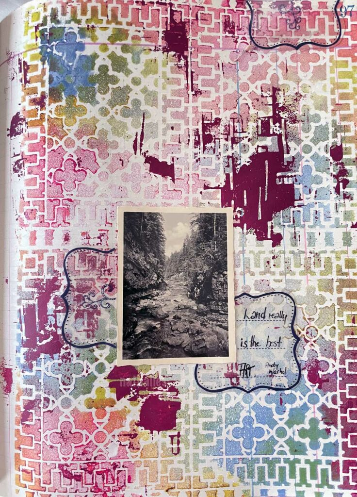
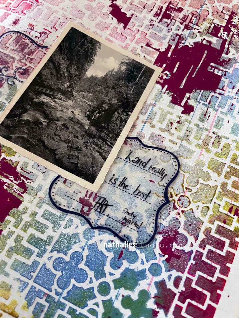
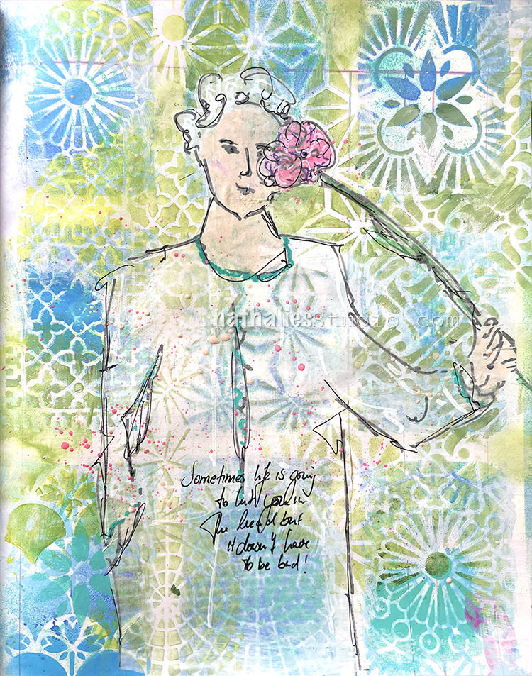
The photos is from an old album with a lot of double nature photos my great aunt must have taken on one of her trips – she didn’t write anything about it down- but I can see the beauty.
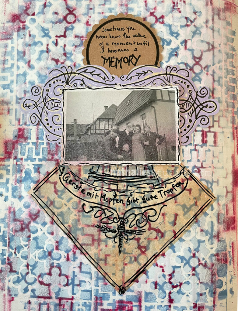
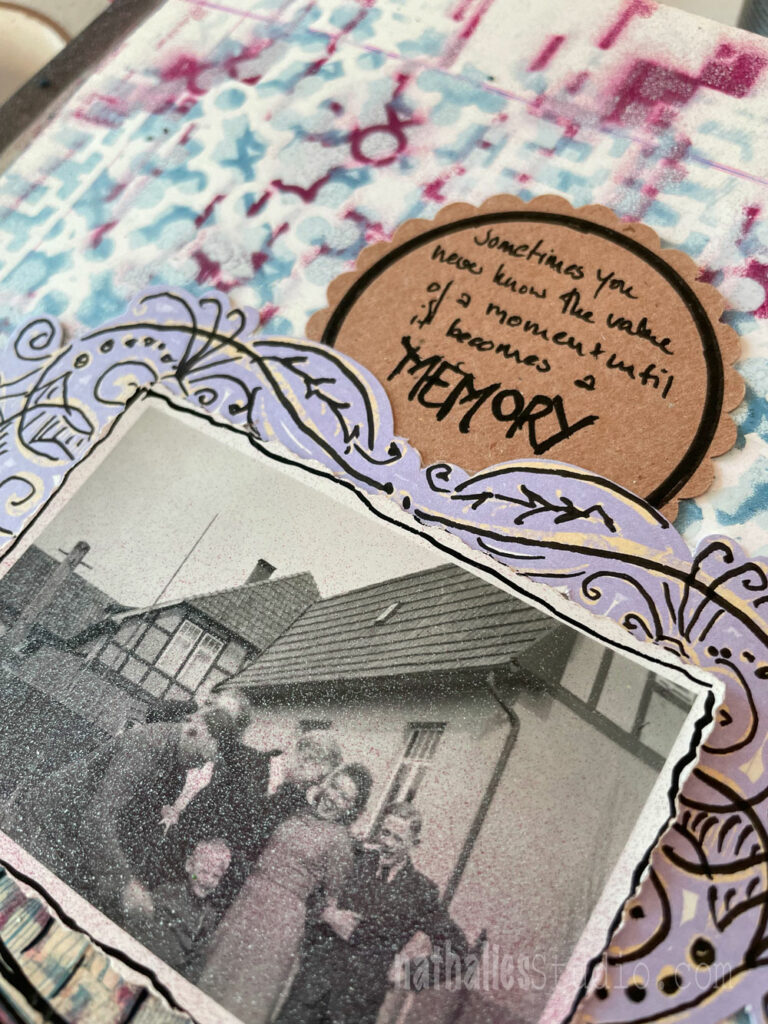
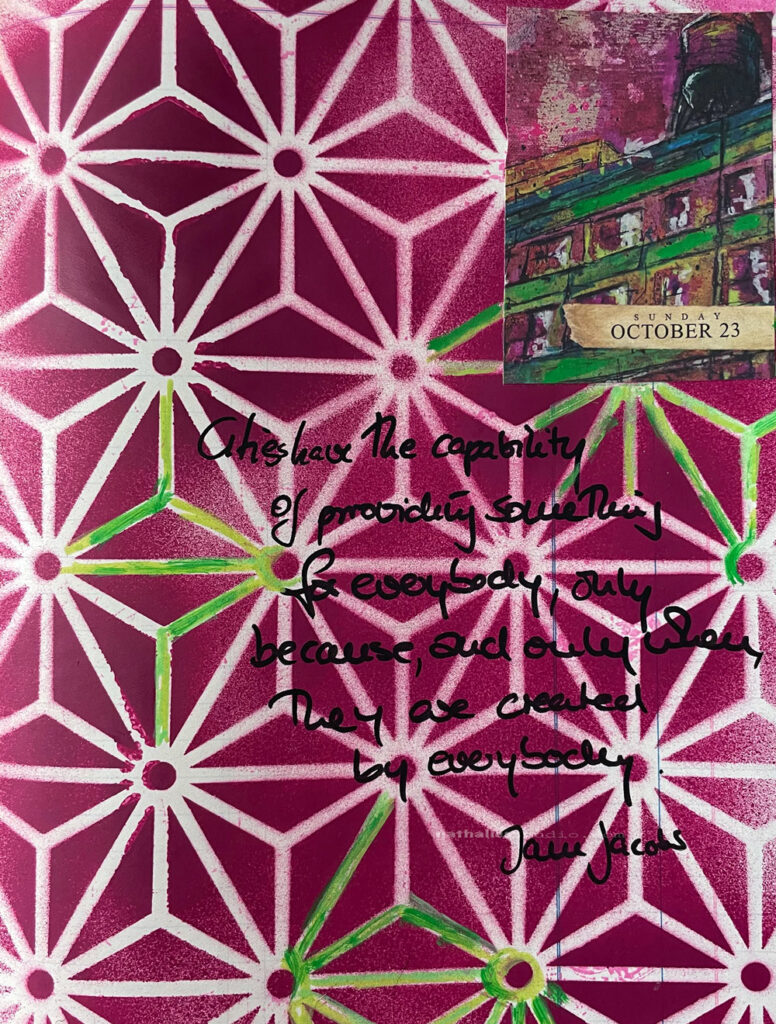
“Sometimes you never know the value of a moment until it becomes a memory”
This is a photo I found and to be honest, I have no idea where it came from – was it from a box of my great aunt, was it something I found at a flea market? In any event I found it again, put it on my work bench for later use and accidentally had some spray paint get on it…making the image even more blurry. ..hence ..this is the store how this page with it’s quote came along ;) I used my Downtown Stencil for the background – moving it around and spraying it over with acylic spray paint in different colors. I also used an old napkin with a german beer quote and some snippets I had in my stash. I love rummaging through my collage drawer to see what could fit my idea for a page.
“Cities have the capability of providing something for everybody, only because and only when they are created by everybody” Jane Jacobs
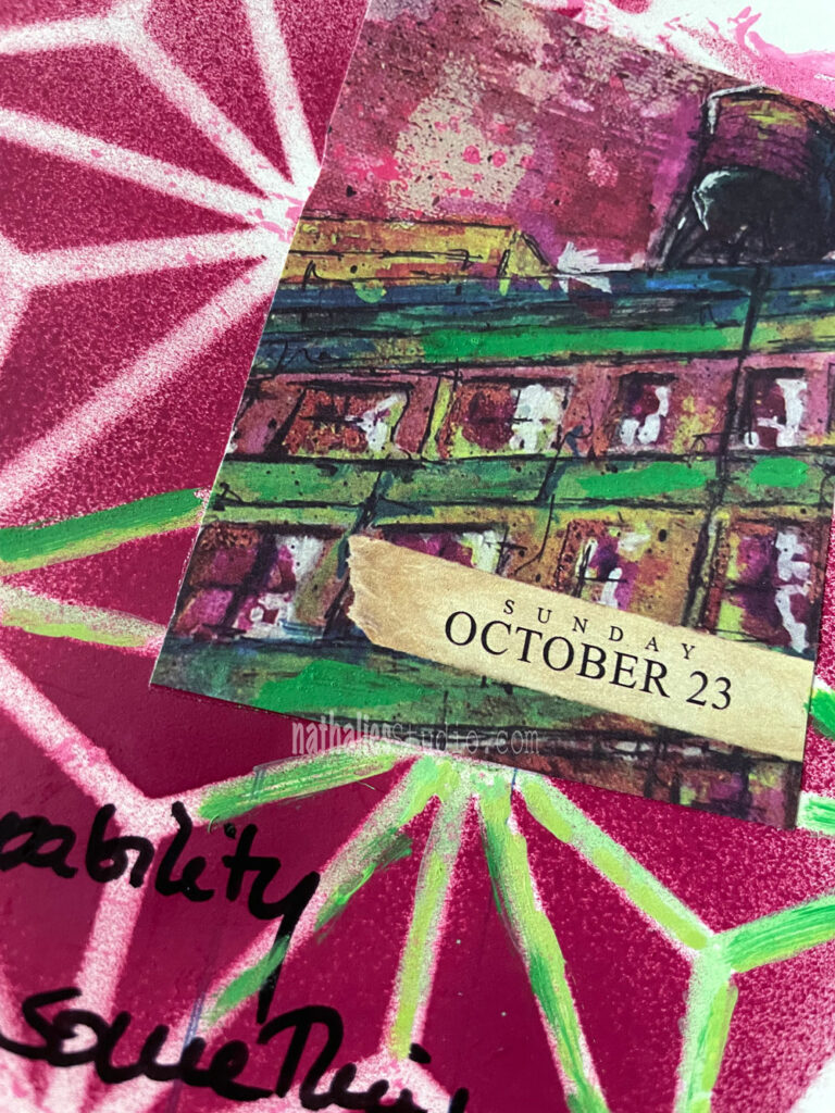
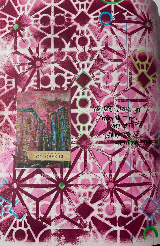
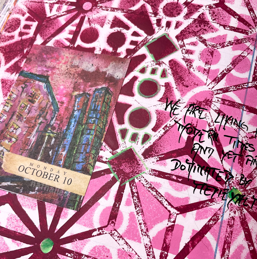
I used another page of the 2022 Artist Almanac calendar with my artwork – at the time I am writing this blogpost I am not sure if the new – 2023 Artist Almanac Calendar is still available in my store- but check it out if you are interested – I had a lot of fun playing with the 2022 version.
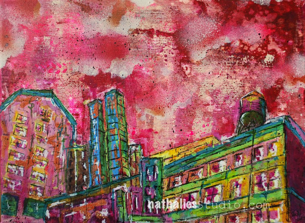
The page is based on this original artwork “Highline”
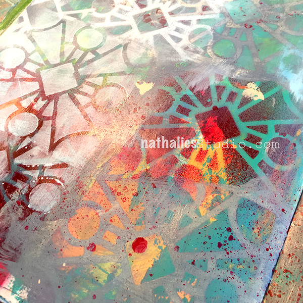
Acrylic Paint, Spray paint, marker 12×16″ – Available for PurchaseFor the background I used my Star Struck Stencil and some Liquitex Spray paint. I filled in some of the grid with green acrylic marker to pick up the green in the collage paper.
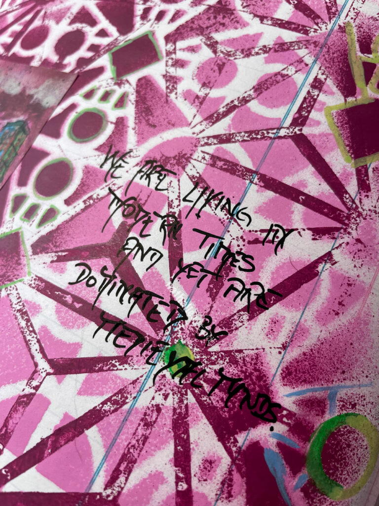
“We are living in modern times and yet we are dominated by medieval minds.”
Isn’t this the truth.
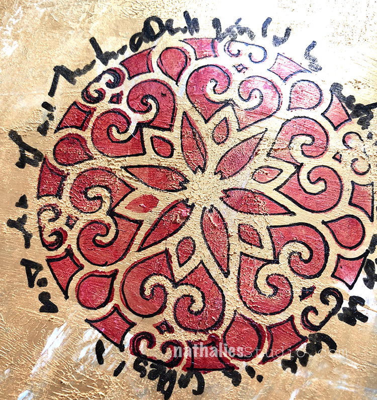
For this background I played with my Buenos Aires Stencil and Star Struck Stencil using Acrylic Spraypaint. I outlined some of the areas with acrylic marker to add some colors that were used in the painting in the collage calendar page.
I remember when I created the original painting that the colors were unusual to use for me and yet I still love the painting- which is for sale here: Highline Original Painting also available as prints.
Pattern and texture are two elements of artwork that always catch my attention. If you know me, I am pretty big on using both in my own work too. I think they add so much – movement, complexity, and that little something that makes you want to look more closely. They invite the viewer in and hey, that’s a good thing.
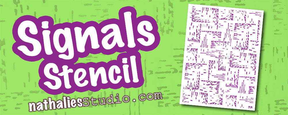
One way I add pattern and texture is through stencils and a favorite is my Signals stencil. It is definitely abstract and a little bit random too. The pattern was inspired by a vintage German roller stamp and it is just the thing for instant mark-making.
When I want pattern in a background of an art journal page to balance with some heavy duty journaling, Signals really works. I think it’s so successful because of its smaller scale and also it’s not super perfect with harsh edges. It isn’t geometric – it has a hand drawn feel to it that is very human.
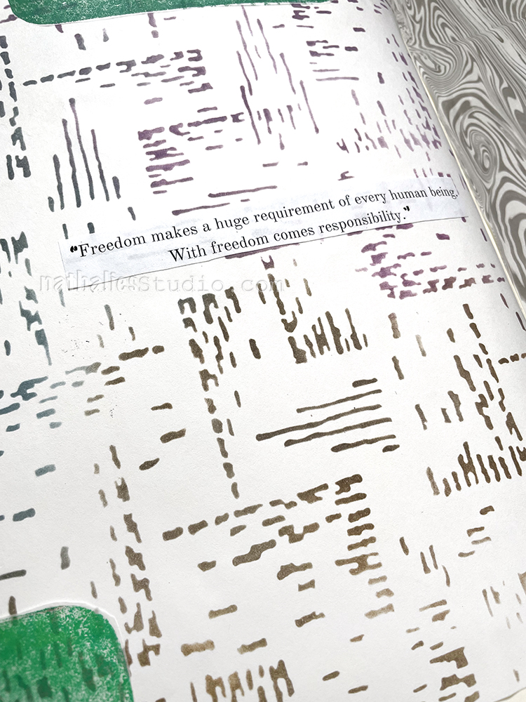
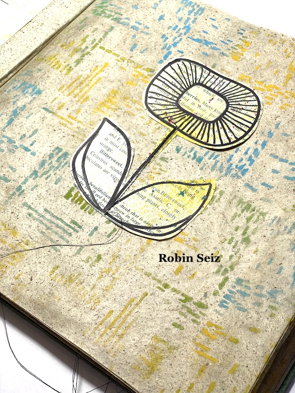
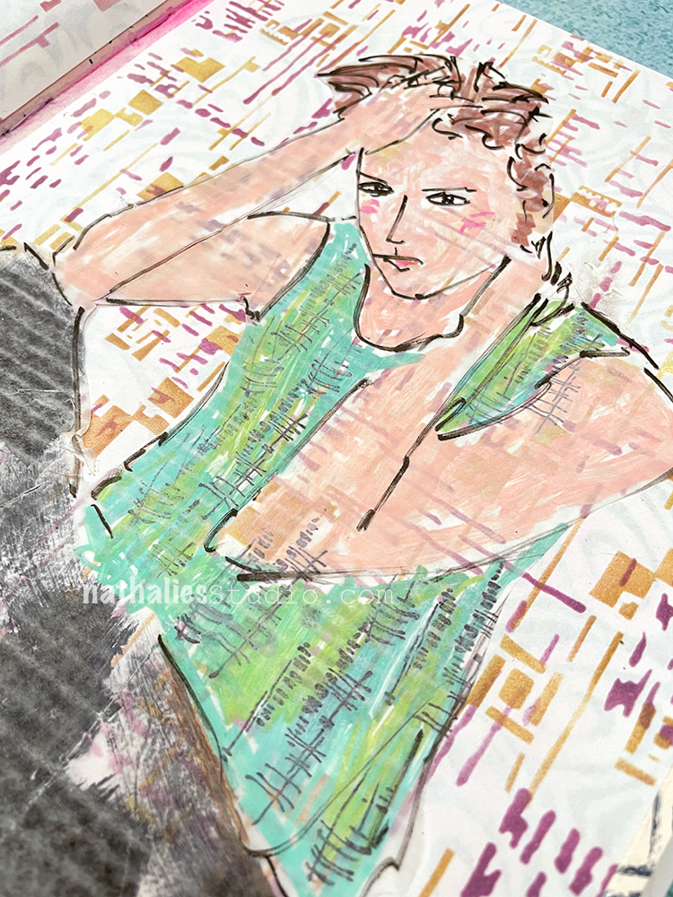
Here my Creative Squad team member Robin uses it in muted tones over book pages for a quiet background that still has interest.
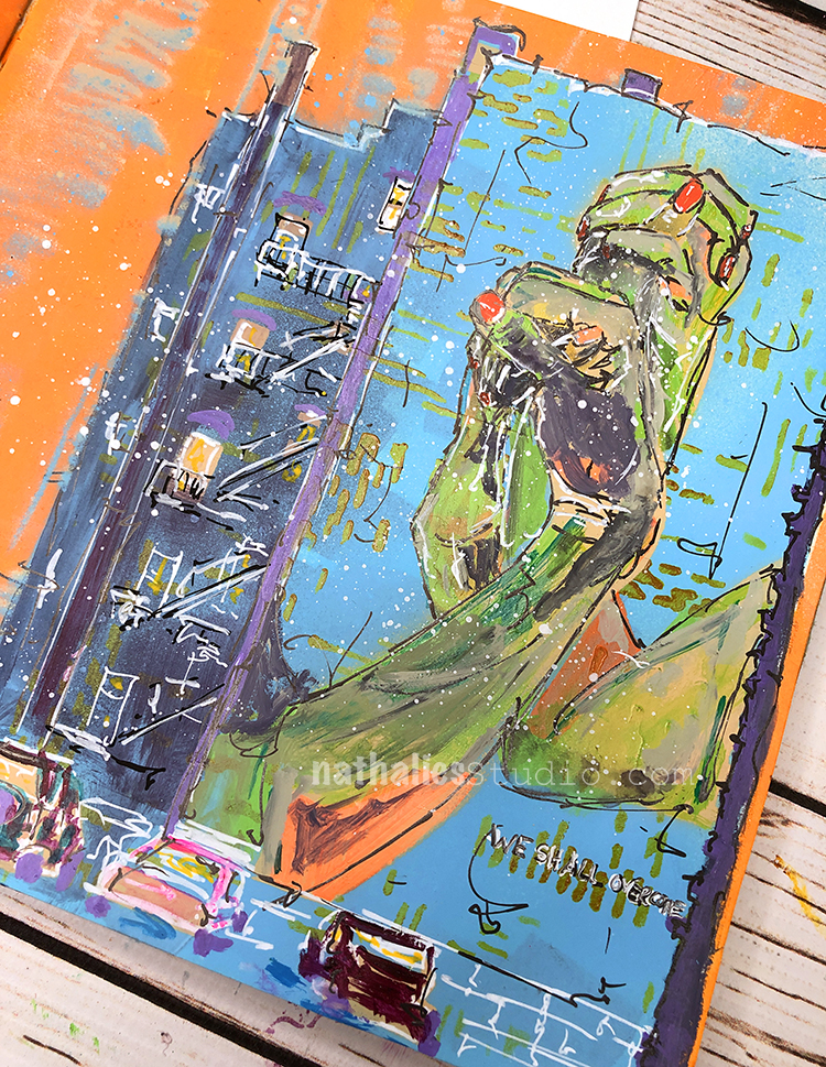
Besides backgrounds, Signals was my solution in this art journal page to give my building a little visual texture. Is it masonry showing through the mural or maybe just a little gritty urban texture? You can decide :) I think it works.
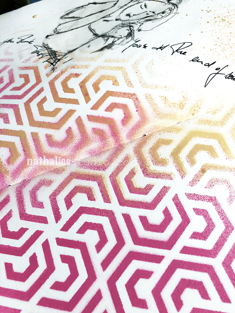
Signals plays nicely with other stencils too for layering, probably because it is more about texture and marks. Here it’s layered with my Space Age Modern stencil in pink and orange Distress Ink for a more complex look. Kinda gives an agitated vibe to the art journal page and fits the pose of the figure.
If you need a bold pattern though, Signals can work in that way too. I love layering it in black over bright colors. It has serious energy here.
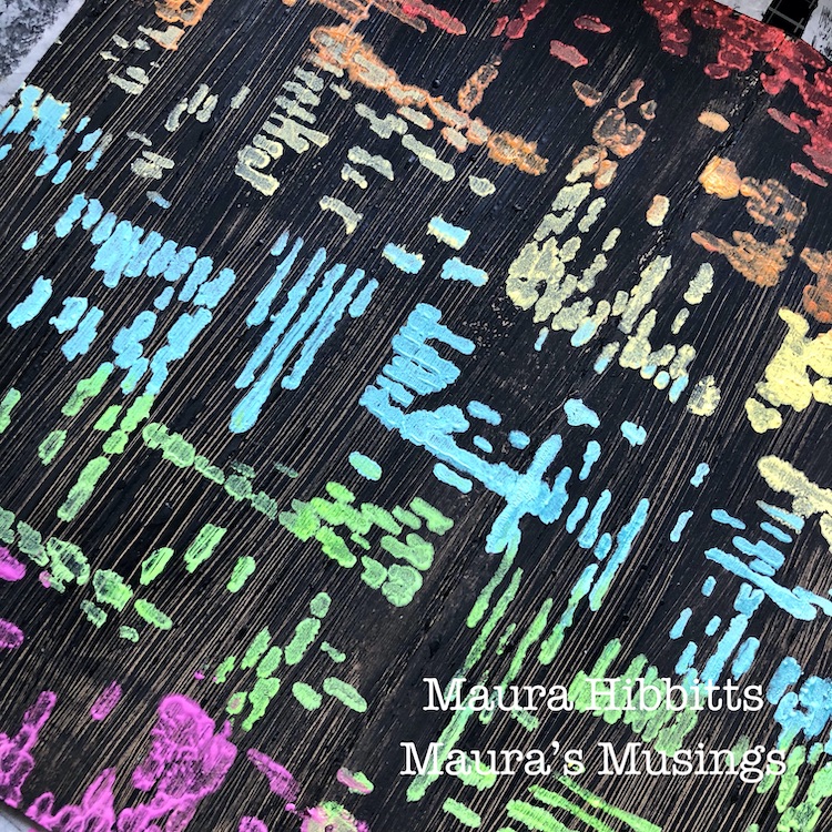
Or do the opposite like my Creative Squad team member Maura does here – use the Signals stencil in bold colors over a black acrylic background. I love it!
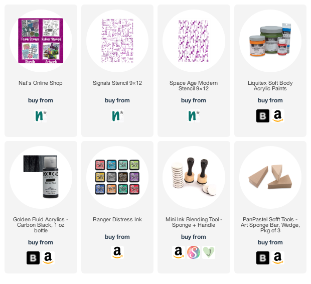
Hope you enjoyed seeing how you can use the Signals stencil to add pattern, texture, and interesting details to your mixed media artwork. Give it a try! Here are some of the supplies used in these examples:
Hello from my Creative Squad. Today we have a post from Robin Seiz who is sharing her beautiful and final project with us today! We have been so lucky to have Robin with us on the Squad and have always appreciated her thoughtful takes on our themes and also her skill at combining colors and elements within her compositions. She will be missed and we wish her all the best as she continues on her art journey!
Today she shares a repurposed bag project with us, using my Star Struck, Central Ave, Grove Street, and Park Blvd stencils and our theme: Favorite Art – My Way – Look at a favorite work of art and create something inspired by it, drawing from the colors, shapes, subject matter, feeling etc. that strikes you most when you look at it.
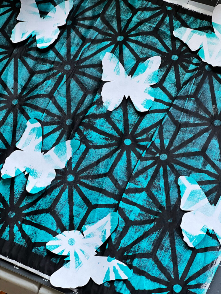
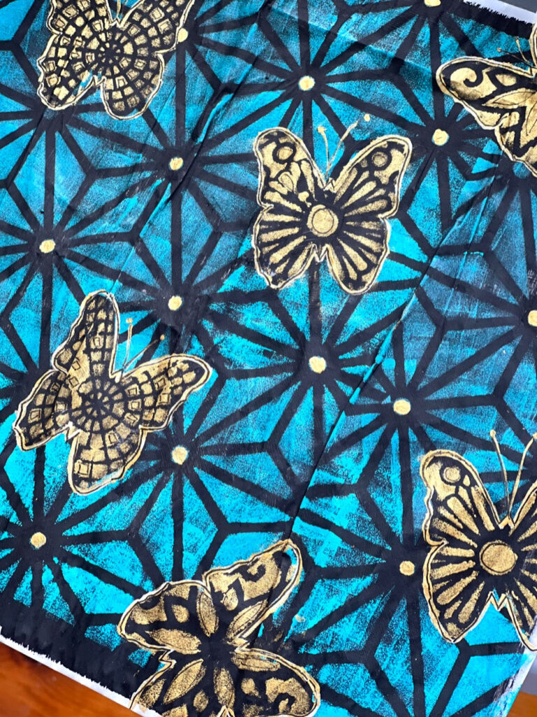
Hello friends. This month’s theme is Favorite Art – My Way. My partner gave me a painting on canvas for an engagement present. It’s a realistic painting of glass jars in the most beautiful shades of blue. By far, it’s my most favorite piece of art in our home. This painting was what I thought about when I started this project. While I didn’t use shades of blue, I did start with teal as the basis for my project this month.
My studio is being renovated, as is much of our home. I have a tiny little space right now to create with most of my supplies packed up in boxes in the basement, so using recycled materials seems to make sense right now. I recently got a shipment of art supplies in glassine bags and decided to use one of those bags for my substrate. This finished bag will make a terrific hostess gift bag.
Since the glassine bags are quite shiny and smooth, I started by adding a layer of white gesso to give it some tooth. Once the gesso was on, I realized the teal paint would look better on a black background; so I put down a layer of black gesso. (One of the things I love about mixed media is more layers often make the piece more interesting).
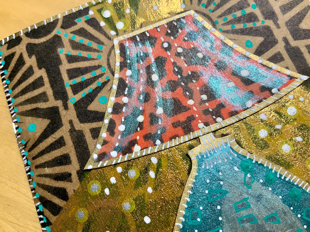
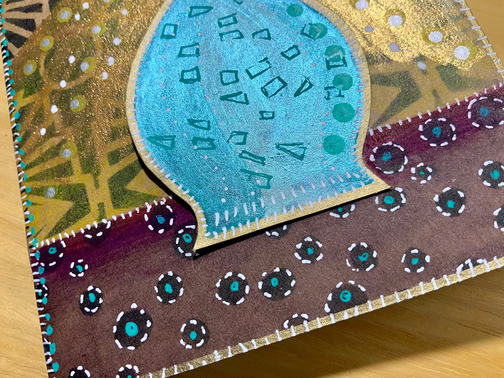
Next I drew a butterfly on a post-it note and cut it out. Once I was satisfied with it, I cut out 8 more butterflies. I placed these down on the black glassine to act as masks before I put down Nathalie’s Star Struck stencil. I used Golden Teal paint with a sponge and “pounced” the paint through the stencil. I removed the stencil and the masks which left black butterflies on the page. I thought I wanted to make the butterflies stand out, so I used a white Posca Pen to outline each butterfly.
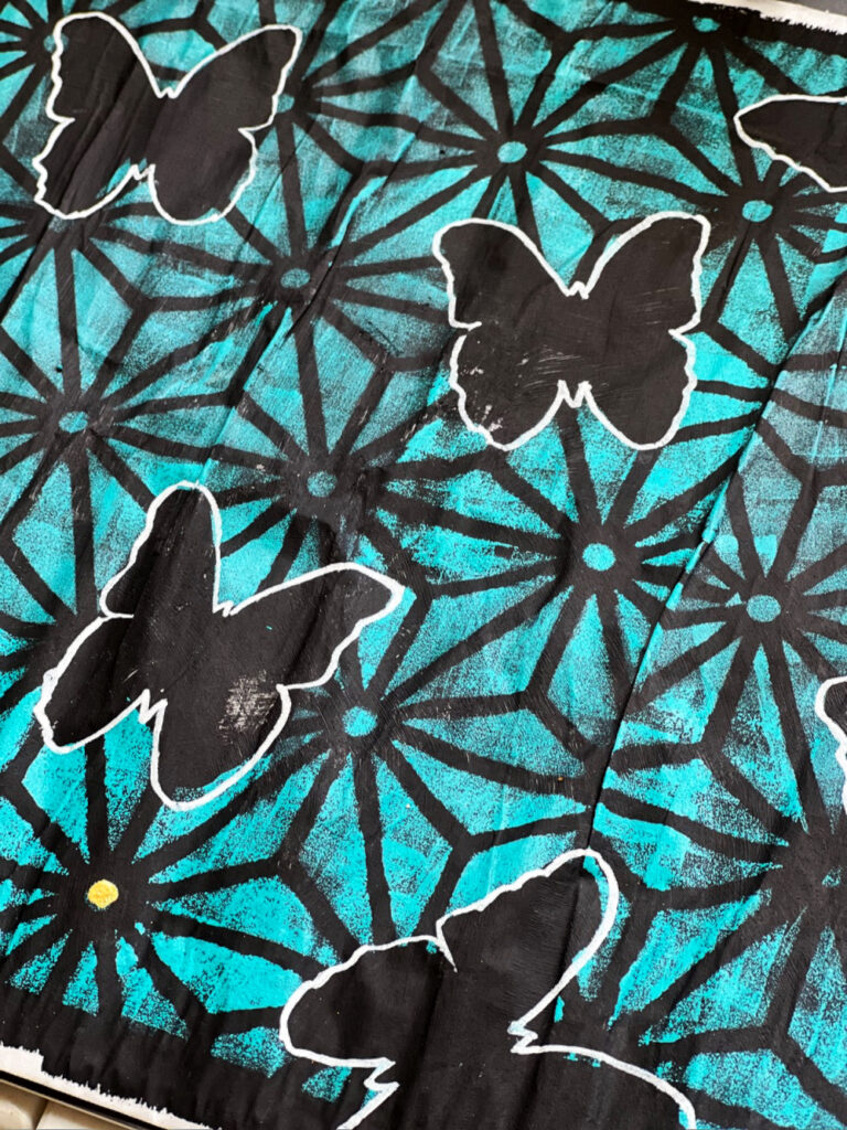
I wanted some “Bling” on the page. With a small paint brush, I applied gold gesso to the dots in the Star Struck stencil. See the lower left bottom corner to see how I filled in the gold dots.
Next I used Natalie’s Grove Street stencil, Central Ave Stencil, and Park Blvd stencil and a makeup sponge to lay down a design on each butterfly.
After the designs were on each butterfly, I realized I didn’t like the white outline, so I covered it up with gold paint and then applied a black micron #8 to outline the gold providing more depth to the butterflies.
Thank you Robin for this fun project idea that could be used to repurpose lots of different types of bags! Also thank you for participating in the Creative Squad for the past 2 years – it has been a pleasure working with you!
Give it a try: you can find all my Stencils in my Online Shop and in addition to her upcycled glassine bag, here are some of the supplies Robin used:
Looking for more projects? Follow the Creative Squad on Instagram here.
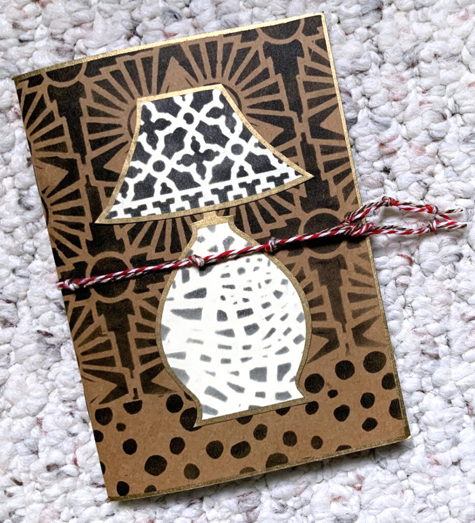
Last month our Creative Squad member Judi Kauffman shared her lovely little stenciled lamp journal with us (check out the full post here) and in the process, caught the eye of a friend. Sometimes you create something and at that moment the project is complete… until you decide that you could take it further LOL. Well, that’s just what happened here and we thought it would be fun to share the update with you.
First let’s look at that sweet project from last month:
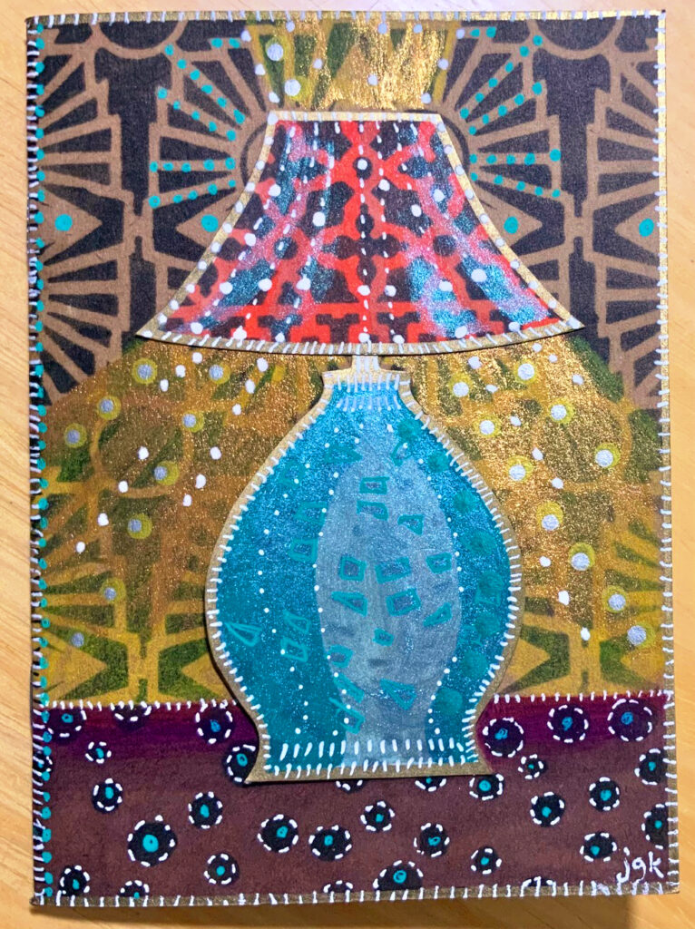
W O W !!! Look at allll that color! Here is what inspired the update:
“My friend in California whose birthday is coming up fell in love with it, but said I had to do “more” to it because she thought it should have COLOR…”
We love it Judi! The lamp light is glowing, the details enhancing the sparkle, and the color palette is very Mid Century cool!!!
Thank you Judi for sharing your color update with us!