Art Stroll

Art Stroll: Hilma af Klint at Guggenheim, NYC

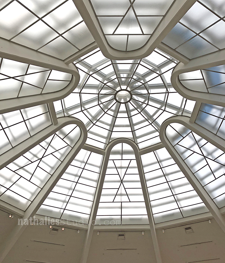
Last week Kim and I went to the Guggenheim to see the Hilma af Klint (1862-1944) “Paintings for the Future” exhibition. I had been excited to see the exhibition for a couple months now and I wasn’t disappointed.

Klint radically started creating abstract paintings years before Kandinsky, Mondrian or other that are called the pioneers of abstraction would change their own artwork from representational content to abstract paintings.

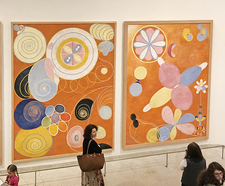
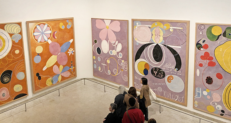
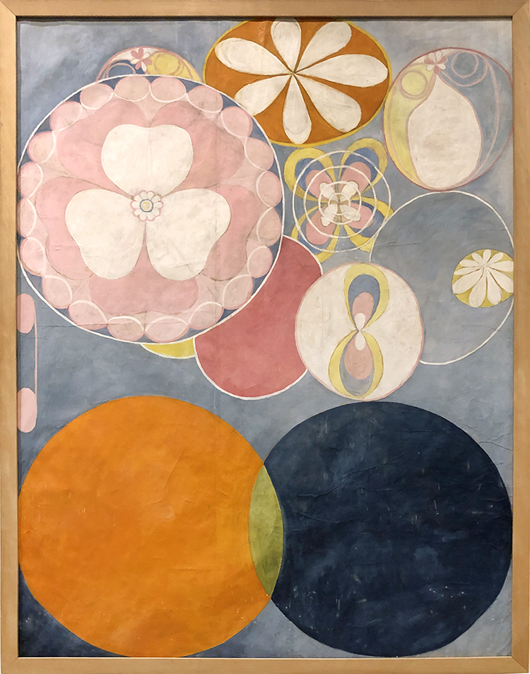
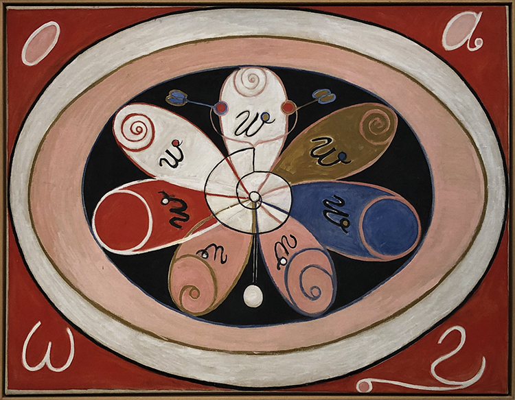
The size and colors of her early paintings are just mesmerizing and such a happy delight to see – instant feel good right in front of those.

It also struck me how immensely feminine those paintings are.

The color schemes are still muted colors but light and the forms are round and free.

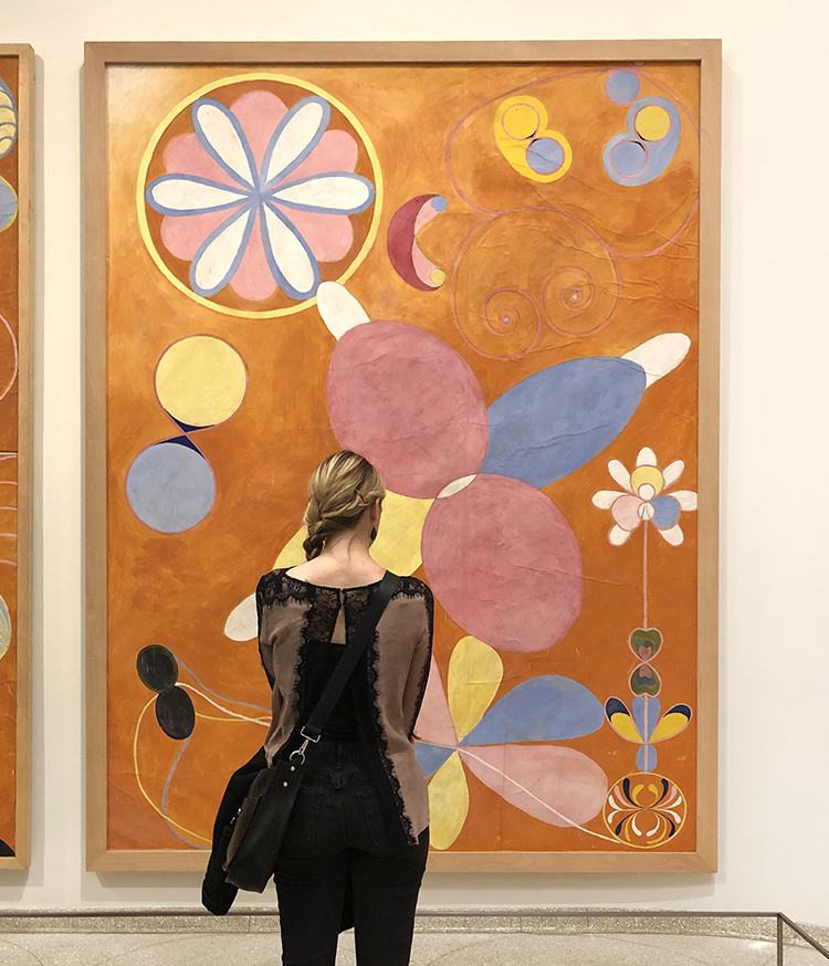
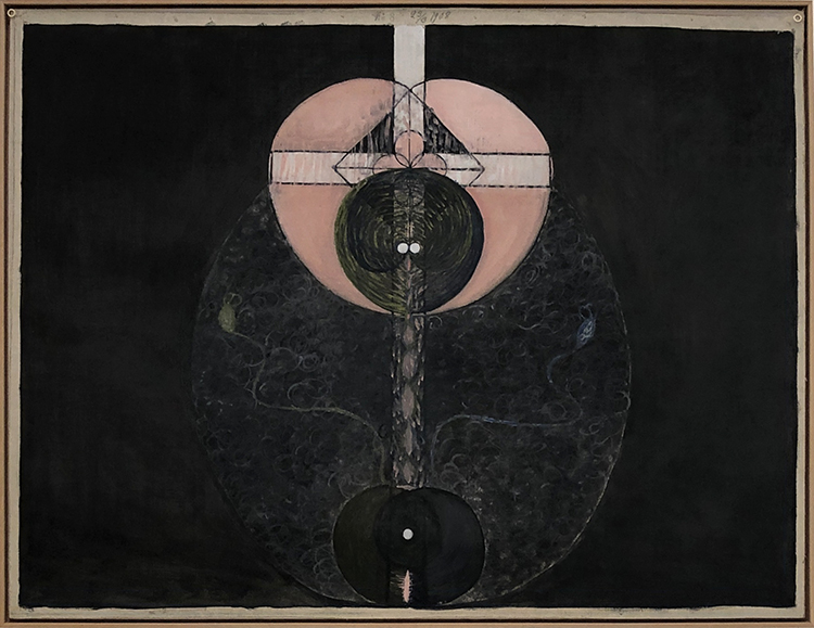
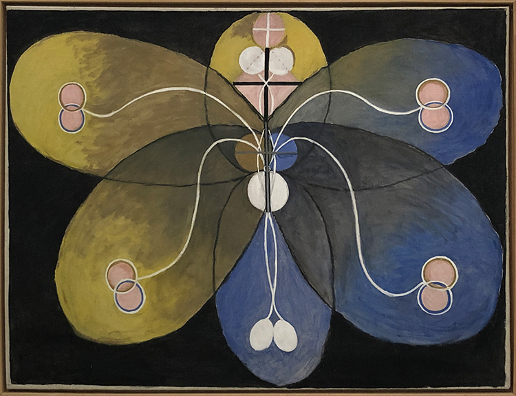
These ten earliest huge paintings of Klint go through the lifespan of humans from birth to old age.

Interestingly enough Klint kept most of her groundbreaking paintings private, because she was convinced that the world was not ready yet to understand her work. In her will she stipulated that a lot of her work was not be shown for twenty years following her death. Ultimately her abstract paintings remained all but unseen until 1986 – 80 years after she painted some of her most prolific abstract paintings in 1906.

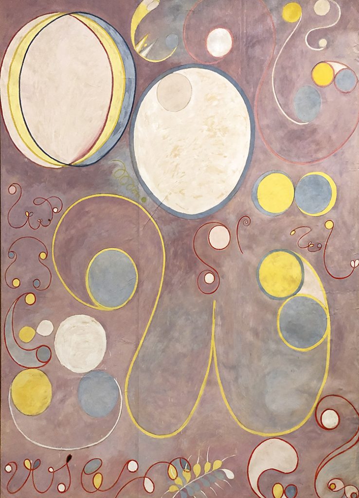
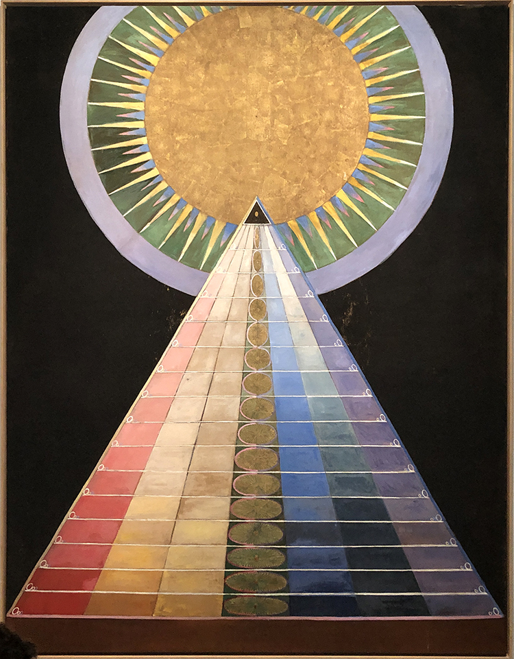
The painting above is a sample of what would be seen mostly of her work. It is just so mind blowing. Given that abstract male painters several years later caused insane outrage about their work, she was probably right that as a female artist on top, people would have not understand her art at all.

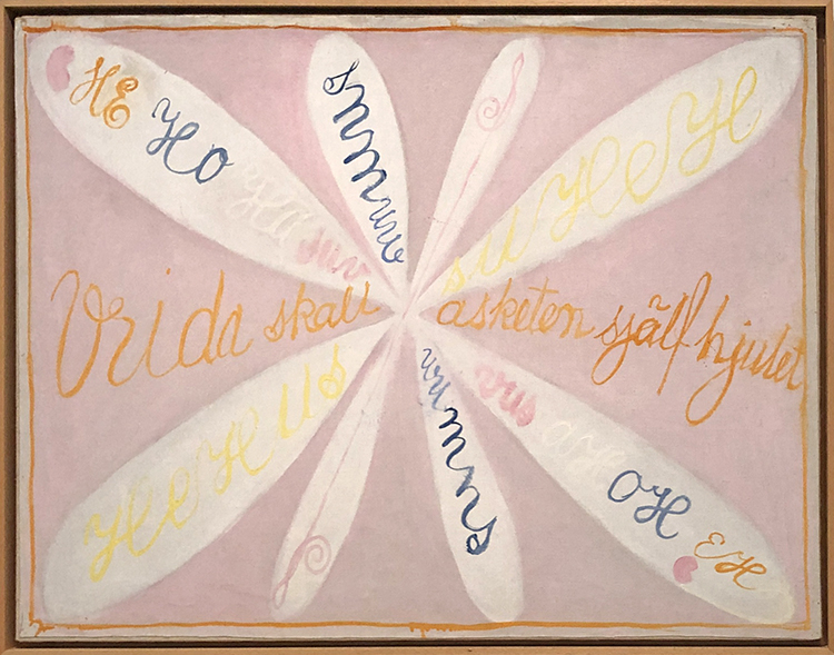
It makes you rethink art history though – it messes with our perception of the timeline of abstract art and of the mainly male key figures of this movement as well.

In 1896 Klint held regular séances with four other women. She had begun attending séances as a teenager, using them as a way to contact her younger sister, who had died young. Spiritualism was a big thing back then and the group wanted to obtain a direct access to a higher order of knowledge.

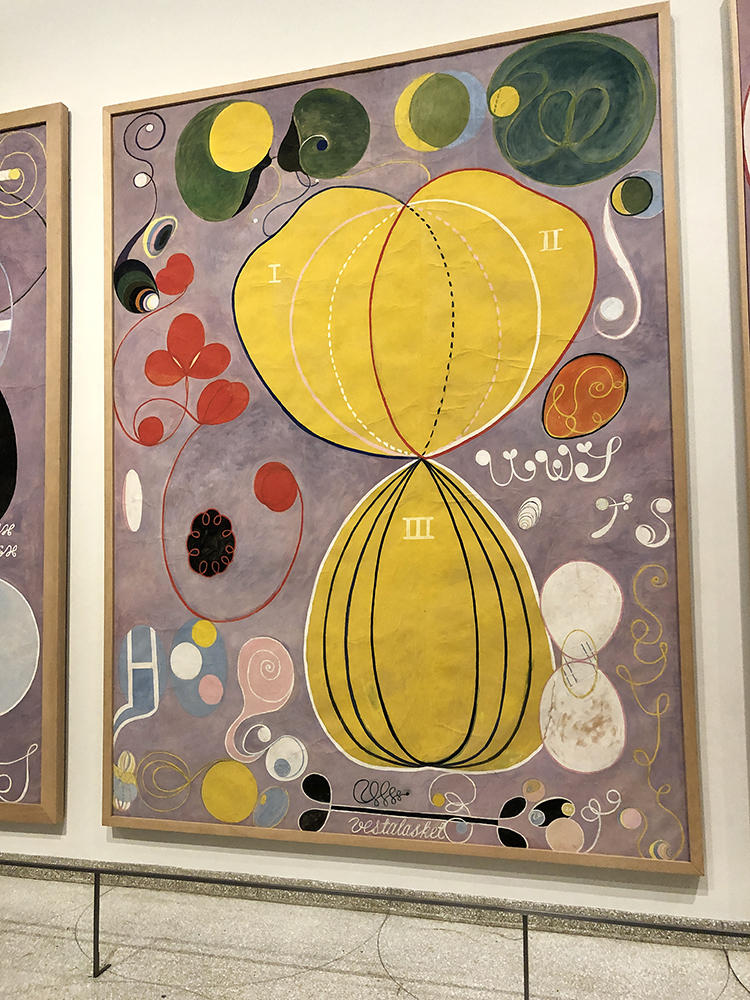
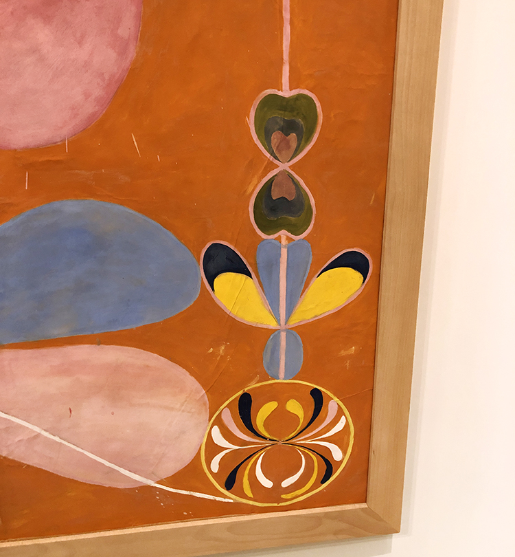
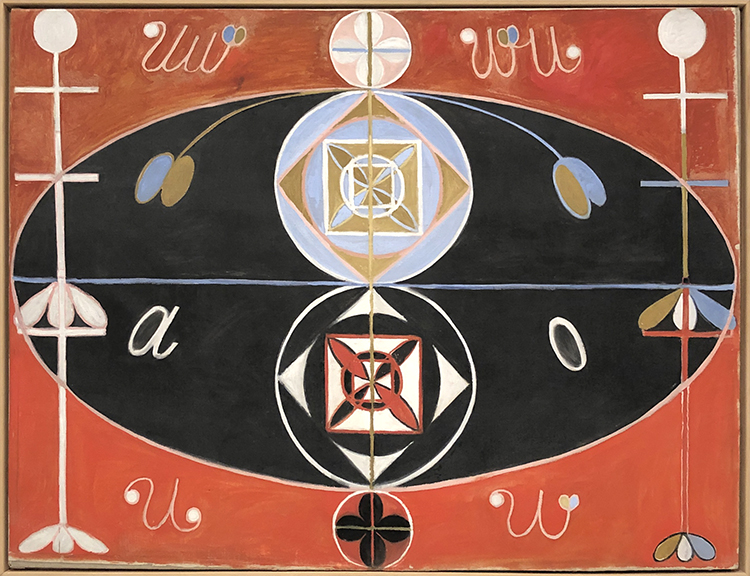
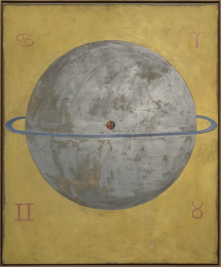
Klint worked earlier as a biological illustrator and her scientifically styled diagrams and her esoteric experiences mixed in her paintings.

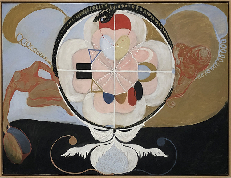
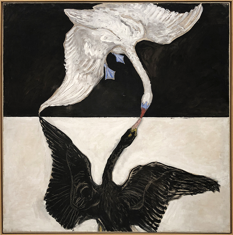
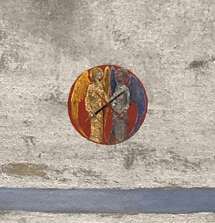
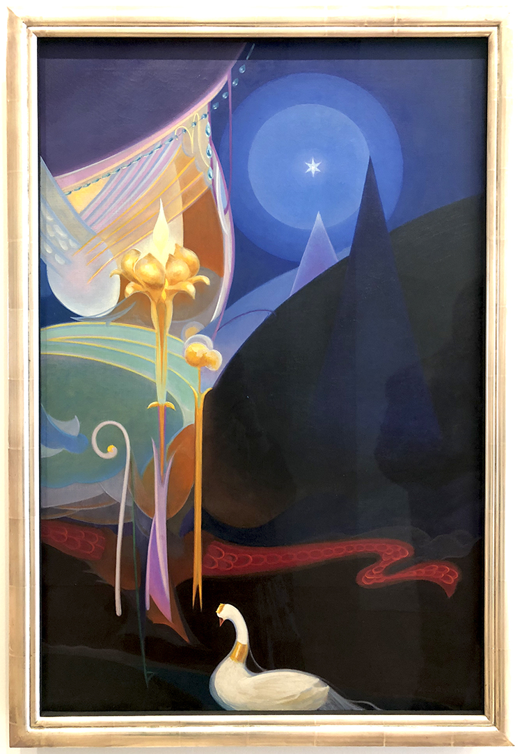
The swan represents the ethereal in many mythologies and religions and stands for completion in the alchemical tradition.

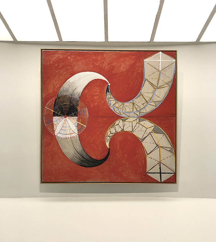
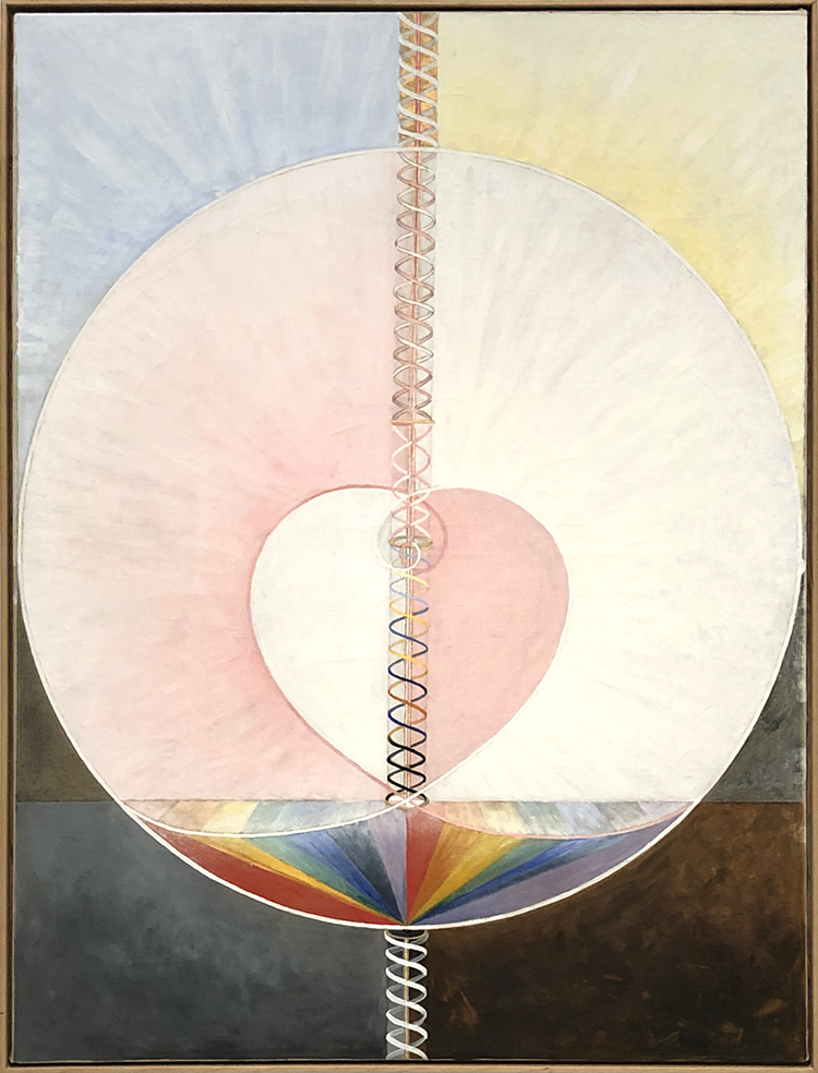
Klint often incorporated insights gleaned from color theory in her paintings. For Klint certain colors represented certain significances. Blue for example represents the female, yellow stands for male, green for the unity of the two.

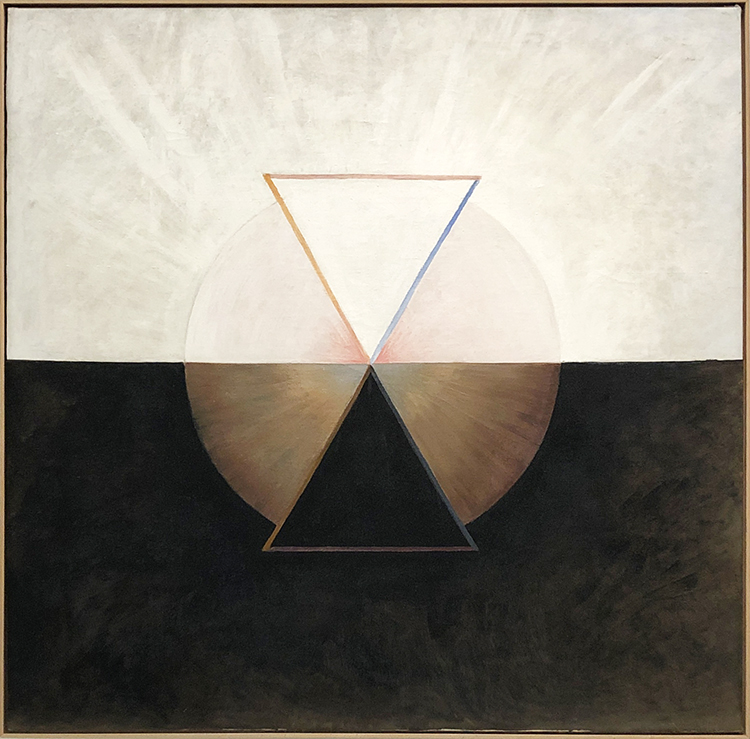
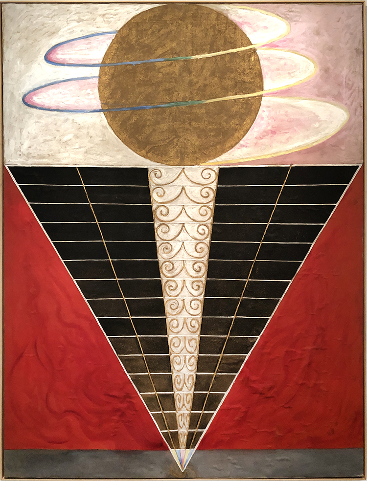
In 1906 an otherworldly spiritual guide commissioned Klint to prepare a message to human kind and so she painted about 193 paintings containing the spirit of the world. Those paintings are known as the “Paintings for the Temple”

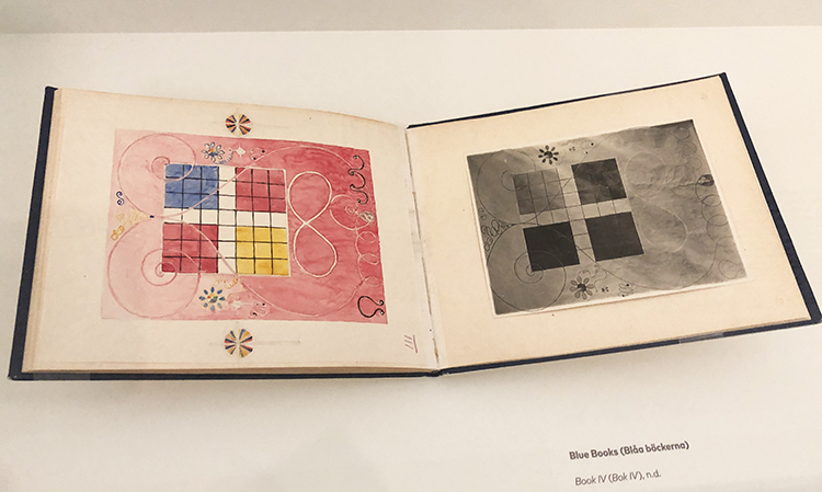
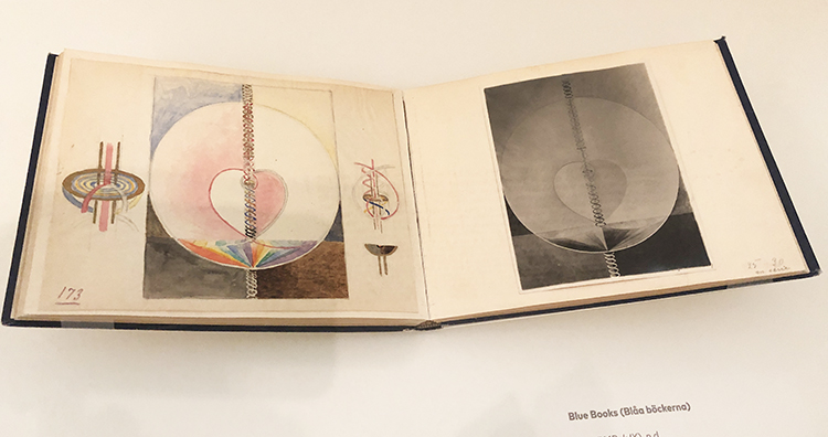
Not all of Klints work were kept secret by her. The Blue Books were a tool that Klint created to show trusted viewers her paintings. They contain black and white photos and next to them carefully rendered watercolor reproductions.

At the time she made those works, the art world was generally dismissive of work made by women and on top many critics did not take abstraction seriously.

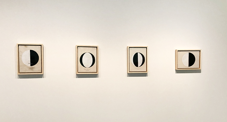
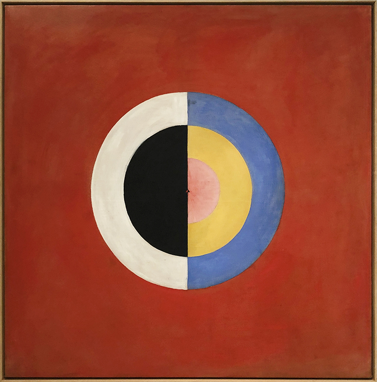
“…in 1920, she made a series of small works that begins with a single circle, half black and half white, called “Starting Picture”—the world as a balanced duality, physical and material, dark and light.

Subsequent entries in the series offer similar circles, differently divided up between black and white: one divided into four alternating slices; one with black crescents framing a white center; etc. The titles suggest they are supposed to represent different graphs of the great spiritual traditions: “The Current Standpoint of the Mahatmas,” “The Jewish Standpoint at the Birth of Jesus,” “Buddha’s Standpoint in Worldly Life,” and so on.”

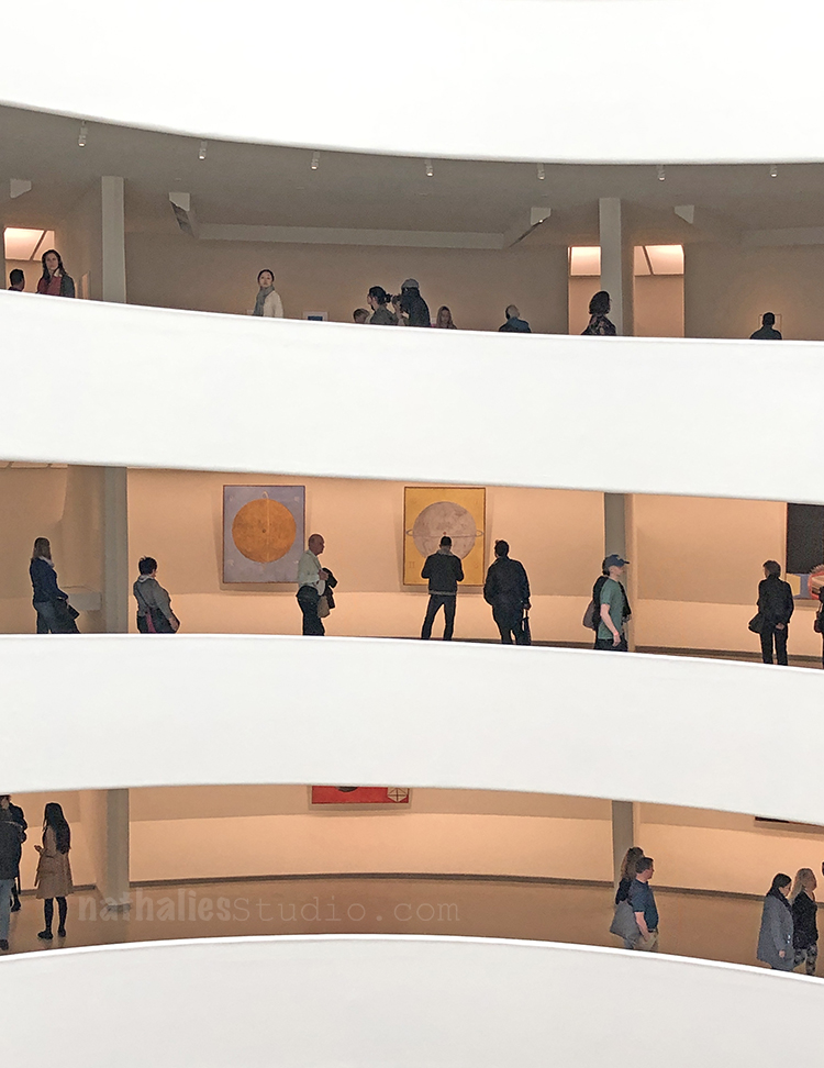
Klint made sketches for a spiraled building that would show her work ascending the spiral case to the heaven ….! “In many ways, the Guggenheim retrospective fulfills the artist’s long-buried dream.”

This was an uplifiting and thought provoking exhibition. Did I decipher her work? Nope …but …I was content and happy just looking at it and make me feel good. Nothing wrong with that …and hey …maybe that was the message all along ;)

Comments (4)

  • Sue Clarke

    |

    It is amazing to me how intense her colors are and yet they are light pastels in many paintings.
    I totally felt the different ages of the first grouping (even before you pointed it out).
    I want to look for a book about her life. Kline sounds like quite the woman and painter!
    Thanks Nat.

    Reply

    • nathalie-kalbach

      |

      Thanks Sue for joining! Yeah I am also very intrigued about her life!

      Reply

  • ARHuelsenbeck

    |

    Nathalie, thank you for this fabulous article. You’ve educated me about an artist I didn’t know.

    Reply

Leave a comment

Art Stroll: Andy Warhol at the Whitney, NYC

Last week Kim and I took a day off and for our annual Christmas Party at the n*Studio we decided to go into the city to visit the Andy Warhol Exhibition at the Whitney and have a nice lunch afterwards. It was a wonderful day!

Warhol began his series of Flower paintings in 1964. He used an image of four hibiscus flowers from a magazine and, with the help of assistants, silkscreened it across more than five hundred individual canvases, methodically producing paintings in different sizes and seemingly endless color combinations.

“In the mid-1960s Warhol employed carpenters to construct numerous plywood boxes identical in size and shape to supermarket cartons. The finished sculptures were virtually indistinguishable from their cardboard supermarket counterparts. Warhol first exhibited these at the Stable Gallery in 1964, cramming the space with stacked boxes that recalled a cramped grocery warehouse. He invited collectors to buy them by the stack, and, though they did not sell well, the boxes caused controversy. In reference to his boxes, Warhol later said that he “wanted something ordinary,” and it was this mundane, commercial subject matter that infuriated the critics. The perfectly blank “machine-made” look of Warhol’s boxes contrasted sharply with the gestural brushstrokes of abstract expressionist paintings.”

Would you buy one? (if money was no obstacle)

Sorry- it was so crowded it was hard to take any pictures LOL – but this was too iconic to let it just go …

Loved seeing his gold leafed shoes – the detail are actually quite fascinating on those

Love his sketches the most

The early stages of his work and concepts.

I love seeing the early work that shows where things were going -stencils, marks, people, lines …

In embracing the image of the Coca-Cola bottle as fine art, Warhol opened up the possibility of linking the worlds of commercial and fine art.

Death and Desaster- depicting magazine and newspaper headlines in oversized images.

“Warhol’s depiction of Superman is based on a drawing by Kurt Schaffenberger from the comic Superman’s Girl Friend Lois Lane (April 1961). Warhol’s decision to use Superman as a subject may offer a biting commentary on the heroic machismo associated with Abstract Expressionist “action” painting, or a queer reading of the Man of Steel, or both. Warhol displayed Superman and four other paintings shortly after they were made in a window display at the Bonwit Teller department store (below), where he and many other artists produced window displays.”

“Warhol based this composition on a small advertisement for a plastic surgeon that ran in the National Enquirer in early April 1961, which he had enlarged and projected in order to trace it onto the surface of the canvas-a precursor to the silkscreen technique he pioneered the following year. The work was first exhibited in the window of Bonwit Teller, the Fifth-Avenue department store, in early April 1961 as part of a display that included five other early paintings by the artist.”


Loved this – I had just used this very same image in a class for image transfers and seeing this silk printed with a similar effect in a big size was quite cool.

Well – another iconic one

“Warhol was as captivated by the lives of the ordinary as he was the rich and famous. This work was created from the Newsweek article, “Two Tuna Sandwiches,” about two Detroit mothers, neighbors who ate tuna sandwiches while they watched their children play and, two days later, the women died. The two housewives died via poisoning from tainted tuna. It shows how harmless consumerism can lead to accidental death. Warhol explored the brief and tragic fame bestowed on people after violent and unexpected termination of life.”

“Warhol chose the image of Mao—then the Chairman of the Chinese Communist Party—after reading news coverage of President Richard Nixon’s trip to the People’s Republic of China in February 1972. An unprecedented act of Cold War diplomacy, Nixon’s trip marked the first visit by a sitting American president to the nation, which at the time was considered an enemy of the state.”

When I went to the Andy Warhol museum in Pittsburgh I was fascinated by the collaborative works Warhol made with Jean-Michel Basquiat. “According to Basquiat, Warhol would begin the paintings with “something very concrete, like a newspaper headline or product logo, and then I would sort of deface it.” Depending on the work, this process could continue for two or three rounds, until a balance was reached between Warhol’s hand-painted images and Basquiat’s abstract gestures, text, numbers, and pictographs. ”

“Unlike in his other portraits, Warhol did not name the subjects of this series. They were not, however, truly anonymous. Marsha P. Johnson (bottom right), for example, had been a key player in the Stonewall rebellion that sparked the struggle for LGBTQ rights and, like Wilhelmina Ross, was a member of the performance group the Hot Peaches. In recent years, research into the other sitters’ identities has allowed their names to be instated. Warhol’s portrait of Marsha P. Johnson captures the confidence, warmth, and charm that made her a beloved member of New York’s queer community. Johnson was a pioneering trans-rights activist: she participated in the 1969 Stonewall uprising and later, with her friend and fellow trans activist Sylvia Rivera, founded Street Transvestite Action Revolutionaries (STAR), a political organization that advocated for the rights of queer and trans people and sex workers, particularly those who were homeless or incarcerated.”

What are the symbols of a country? Thought provoking? Was he political?


“For a series of still lifes begun in 1975, Warhol worked with assistants to make theatrically lit studio photographs of a variety of objects, such as a skull or a hammer and sickle, positioning them to cast shadows so dramatic that they took on identities of their own. In the years that followed, he created a number of paintings based on these photographs. It was through these investigations into photography—a medium most commonly associated with accurate representation—that Warhol was able to make works that read more overtly as abstraction. Beginning in 1978, he made a radical shift and did away with the objects entirely, producing an expansive series of more than one hundred paintings focused only on shadows, which he titled just that: Shadows. In these works Warhol freed himself from his Pop subjects by experimenting with something close to pure abstraction. Yet he never completely divorced himself from his sources, maintaining his connection to the everyday world while still playing with the problem of how images generate meaning.”


I love what someone said that there is no “supreme court of art and he experimented with the boundaries of art is” It is a great exhibition – I would def. go again but in the new year and during the week again as it the museum was stuffed even early at 10am when we went.

I hope you enjoyed the is little Art Stroll! Hope to take you on another one soon :)

Comments (2)

  • linda-faber

    |

    I loved the Warhol stroll (sounds like a new dance step). A story to share: In the 70’s, I was a docent at the UM campus museum (The Lowe) in Miami and we showed a fabulous Warhol exhibit of his portrait series with some of the advertising pieces as well. The gift shop had a small # of verified signed tomato soup cans. My friend was the director’s assistant and she got first crack at buying one to add to her beautiful art collection. It sat on top of her refrigerator for years…..until one day she noticed that it was leaking!! Sigh. Impermanent art because the acid in the tomato soup rusted the bottom of the can. Shoulda bought the catalog instead.

    Reply

    • nathalie-kalbach

      |

      Linda, what a fun story ! LOL – I wonder if she kept it emptied out? hahah- shoulda bought the catalog instead made me really laugh. Thank you for sharing !

      Reply

Leave a comment

Art Stroll: The Met Cloisters, NYC

For my birthday my husband and I took the day off and went to The Cloisters in NYC. I am so glad we did this.

Hard to believe you are still in the city and with the magnificent Fort Tryon Park right at the Hudson River you could almost think you are somewhere in Europe. At parts I could imagine being at the River Rhine.

The Cloisters are a museum (part of the MET) built from 4 different European cloistered, acquired by an American fellow, then sold to Rockefeller. Between 1934 and 1939 they were dissembled over stone by stone and built up again here in a way of a nice Frankenstein Cloister. At times you feel you are not in the States anymore – everything feels real- and yet then upon turning another corner you realize something is off …it is weird and fun.

An incredible amount of medieval art is hosted in the museum as well. A lot of art in this time period of course was made for the church.

above piece was tiny!


The three heads on the wood carved altar are relics made around 1500 in Germany and contain each a skull of a saint.


Church bench….mhhhhh ….

When I entered the Unicorn Room with it’s tapestry I gasped- it was magical. In 1922, John D. Rockefeller, Jr. purchased the 7 pieces for for one million US dollar and donated them in 1938 to the Met.

The tapestries tell the story of the Unicorn from the hunt to its captivity. They were made probably in Belgium and woven in wool, metallic threads, and silk and incredible vibrant.  The initials “A” and “E” can be seen hidden in each tapestry several times.  The “E” is backwards and one example can be seen in the tree between two hunters, others are found in the bottom corners

Detail of another tapestry – I will call it “Grumpy guy on tapestry .”..

Throughout the cloisters gorgeous windows from all over Europe.

And four wonderful gardens inviting to rest.

The exhibition “Heavenly Bodies: Fashion and the Catholic Imagination” is running until October 2018. Here a 1967 wedding ensemble from the House of Balenciaga

Stunning wooden cross.

Details of the pillar.

Two Valentino pieces – I found the inspiration for the capes interesting.

Clear reference to stained glass window.

This wooden panel was amazing. Loved how the figures were drawn  and the colors – you could almost think it was a piece from the 60s  but nope – made in Spain, 13th Century

Maria Grazia Chiuri and Pierpaolo Piccioli for Valentino, Spring 2014. Now this one was stunning! The embroidery was breathtaking!

A medieval herb garden in one of the cloisters.

Wherever you turn artwork collected and put in here- again – it was kind of odd- yes I know it is a museum but it also felt so right and then also so misplaced.

A 14-century work, probably created for a convent in Nuremberg, depicting St. Clare receiving a palm from the Bishop of Assisi.

These dresses are in a section inspired by Hieronymous Bosch’s triptych The Garden of Earthly Delights.

I loved those windows – cruel scenes in some of them:

Souls Tormented in Hell – 1500-1510

Not sure why he is feeding the dragon but beware of your neighbor ;)

Monkey business I guess :)

Fountain – fun!

Unicorn water vessel – gosh so gorgeous!

I loved it. It is well worth the trip – if you are longer in NYC and want to see something that a bit off the beaten path … check it out. When you get there with the subway and get out at 190th St Station you will also have to enter the elevator still rund by an elevator attendant. It is a pretty cool station.

Hope you enjoyed the Art Stroll through The Cloisters and will join me soon for a different one.

Comments (4)

  • ARHuelsenbeck

    |

    Nathalie, The Cloisters is one of my favorite places on earth! In fact, the opening of the YA novel I’m writing is set in The Cloisters. She’s looking at one of the tapestries you pictured (The Unicorn in Captivity), and the unicorn talks to her, and a docent tells her she’s the chosen one who will save the unicorn…

    Reply

    • nathalie-kalbach

      |

      Oh how cool- that sounds so fun! I hope she will save the unicorn!

      Reply

  • Sue Clarke

    |

    The church bench is very comical.
    Souls Tormented in Hell I would very much like to avoid!
    I love the window at the end of the post. I really should have been born long ago to live in a castle.
    Thanks for sharing your art stroll Nat.

    Reply

    • nathalie-kalbach

      |

      Thanks for joining me Sue! Yeah- no sitting on that church bench LOL

      Reply

Leave a comment

Stroll Through The Hood – July 2018

Time for a Stroll Through the Hood . Strolls through my hood get me out of my studio, they help me unstuck and often I get inspired by what I see and to get new ideas to create something. It is part of my philosophy about Artful Adventures in Mixed Media – which is the subject of my book. Here are some photos that I gathered in the last couple weeks.

This above actually taken in NYC – love it! Love how the heart is part of the figure.

YESSS – thats what I say- LOL: Love the lettering and the colors inside the individual letters.

Van Hook Cheese – is one of my favorite stores in the hood …not only do they have delicious cheese – they also have always the best window display. Look at those painted houses made from cardboard – LOOOOOVEEEE

4th July Jersey City firework over the Hudson – pretty :)

Near the Holland Tunnel there are tons of murals -I don’t go there often with my bike but I had to run some errands at Home Depot and I took the time to check those out. I like the perspective here.

Dramatic. Still thinking what the reference might be. Any ideas?

Looking at Open Houses is interesting. This bathroom wallpaper was in a beautiful Brownstone which had a lot of time capsule features. I love the bright paisley (well…I wouldn’t in my bathroom hahahah) and the lamp is so cool- look at the pattern in it)

In my newly embroidered dress -in front of the pencil factory where I live. I love this little street, every time I go out of our building or come back I think about how cool it is that this is preserved.

This mural shows all kinds of known landmarks for Jersey City, the Colgate Clock, the Liberty State train station, the Mana Watertower, the Loew Theatre and more. Fun! Makes me want to grab my Stroll stamps.

And …I showed this before on my Instagram and FB – OMG – this painted wooden floor …my heart was going like a million beats a second LOOOOVEEE. Unfortunately the flooring didn’t justify the rest of the house…but hahahahaha almost ;)

Hope you enjoyed the Stroll Through the Hood-  join me next month again!

Comments (2)

  • Sue Clarke

    |

    Sounds like you’re house hunting Nat…have fun and don’t rush (find the most perfect place for you).
    Love the strolls photos as always. Not sure about that one with the two women, but my first impression was how the establishment has been holding Latinas down (not as many opportunities in employment and maybe even the immigration issues that are in the forefront these days)???

    Reply

    • nathalie-kalbach

      |

      No rush at all Sue- I agree about the most perfect place :) But it is fun nonetheless to see all the different options.
      Interesting thought about the graffiti ! I should find out who made it and see if there is a connection.

      Reply

Leave a comment

Art Stroll: Whitney Museum – Permanent Collection

I always enjoy time at the Whitney – it is a short 15 minutes PATH ride from here and every time I am there I also enjoy seeing changes in the permanent collection.

Florine Stettheimer, New York, Oil on Canvas – 1918

I love this painting – how Stettheimer worked the folds of Lady Liberty’s toga, the view , the frame!

Japer Johns, Two Maps, 1965,Encaustic, oil, found paper and cotton on canvas

just look at the details – swoon!

Louis Lozowick, Strike Scene, 1935 – Lithograph

What an impressive print – it also kind of blew my mind how much work went into into creating the plate and the print showing a split of a second moment – being so used to photography nowadays.

Reginald Marsh, Death Avenue, 1927, Oil, charcoal, fabricated chalk, and ink on canvas

This painting shows the “Death Avenue” as it was called before the 1930s – and before the elevated train tracks were built – nowadays more known as the High Line. The freight line would frequently cause the death of a pedestrian. Marsh chronicled everyday urban life in his paintings.

When asked for his advice to young painters, Marsh replied, “How to draw? Go out into the street, stare at the people. Stare, stare, keep on staring. Go to your studio, stare at your pictures, yourself, everything.”

Charles Demuth, Buildings, Lancaster, 1930, Oil and graphite pencil on composition board

Thomas Hart Benton, Poker Night, 1948, Tempera and oil on linen

This is a scene from the theatre play A Street Car Named Desire. The story is that the painting was a commission and the female actor on the right looking into this mirror was totally offended by her portrayal since she was not wearing anything like the neglige in the painting.

Fairfield Porter, Portrait of Ted Carey and Andy Warhol, 1960, Oil on linen

In 1960, Warhol and Carey commissioned Fairfield Porter to paint their portraits. They thought they could save money by requesting a double portrait which they planned to cut in two, each taking his half. But Porter foiled their scheme by posing them so closely together that they could not divide the forty-inch-square of painting without ruining it. Warhol ended up buying Carey’s share and ultimately giving the portrait to the Whitney Museum of American art in New York.

Good on you Fairfield- well played :)

George Tooker, The Subway, 1950, Tempera on composition board

I always feel haunted by this painting and cannot stop looking at it.

The people look trapped, the woman seems anxious. Where is she going? What are the guys doing in the cubicles? Is it modern live anxiety …or the anxiety of living in an Mc Carthy era? I always think about the later.

Rockwell Kent, Moonlight, Winter, c. 1940, oil on linen

Agnes Pelton, Untitled, 1931, Oil on canvas

I hope you enjoyed the little Art Stroll through the Whitney – see you soon again with a different stroll.

Comments (4)

  • Sue Clarke

    |

    Well played indeed Fairfield Porter!
    I always enjoy your strolls although The Subway is just bizarre enough to make me uneasy. LOL

    Reply

  • Pam Hansen

    |

    I really enjoyed this, thank you for sharing your stroll. ❤️

    Reply

Leave a comment

Swapped – Painting

A new finished painting which I call Swapped. I was intrigued by the story of the Morton F. Plant House, located on the prestigious Fifth Avenue in NYC.

Apparently Cartier wanted the building, and Plant exchanged it in 1917 for 100 Dollars and a double stranded pearl necklace worth about 1,000,000 Dollars at the time. Then the necklace “only” made 151,000 USD in 1957 at an auction, so I guess that swap didn’t really work out. And so there is a jeweler and watch store up to this day in the building. There are quite some weird real estate exchange stories in NYC …this is certainly one of them. I imagined the building being just an “ordinary” apartment building -it is still so beautiful and one could only guess at how many necklaces would be needed for such a swap today! These are the things that went through my head when I painted Swapped.

The painting is 24″x18″ in size, acrylic paint, spray paint and marker on canvas.

It is available in the store here and meanwhile waits for a new home on my living room wall.

SaveSave

SaveSave

Leave a comment

Farewell Painting

I finished this painting last week – some of you might have seen it in some of my Facebook Live Videos.  The painting captures the iconic Flatiron building in New York City, located in the wedge created by the intersection of Fifth Ave and Broadway. I am always fascinated by the Flatiron building and it’s story.

Although it has stood strong at this busy intersection for over a century, the world around it is always in constant flux. The city weeds out the weak, and businesses and people who may once call it Home may find themselves bidding it Farewell another day.

The bold colors represent the energy of the city and the sweeping lines suggest a place where nothing stays still for long. Yet the Flatiron remains, a focal point of stability in a very busy place.

The original “Farewell Painting” is up for sale now in the store. Maybe it will find a new home :) Acrylic paint, acrylic ink, spray paint, and pencil on 12”x16” canvas.

Have a gorgeous day you all :)

SaveSave

Comments (4)

  • Sue Clarke

    |

    I love buildings that are on corners like this and have seen several in person in Boston.
    This painting is wonderful, especially the firy colors!
    I hope it finds a deserving home.

    Reply

    • nathalie-kalbach

      |

      Thank you Sue! I actually just saw one of those buildings in Amsterdam and thought it was fun because the architecture in general was so different :) Tiny rooms I guess in the corner part- LOL

      Reply

  • Janene

    |

    Whew! You scared me with the title “Farewell Painting”. I’m thinking, Nathalie is moving? She’s giving up painting? Whaaaaaaat? In all seriousness – the Flatiron building glows in contrast to the gray streets and nearby buildings — fabulous! — and I love the title now that I understand it. :-)

    Reply

    • nathalie-kalbach

      |

      Aweee- sorry to have scared you Janene- that wasn’t my intention! I am not going anywhere right now – LOL- and a new canvas is up on the easel- just thinking of what I want to paint next :)

      Reply

Leave a comment

Art Stroll: American Museum of Natural History, NYC

A couple weeks a friend and I went to the American Museum of Natural History. It was the first time in 17 years I was back there and I really enjoyed it. Now …I know that is going to be a question for some … “Wait…an Art Stroll there? But is it Art?” …Welllllllll….let’s think about it LOL

I loved the subway art when you get out of the subway station at the museum – lot’s of mosaics of different animals- here a beautiful bird.

Love the gorgeous windows …that would be a really cool stencil, don’t you think?

“The dioramas at the American Natural History Museum, when they were first built, were an opportunity for people to see a world that most didn’t get to travel to,”

I also think they are beautiful artistic interpretations of landscape painting.


The explanation about Japanese woodblock printing was amazing  – I really enjoyed all the little displays about crafts and arts in different countries.

In Japanese tradition there is a recognition of a spiritual quality in all materials, which must not be negated. Therefore each wood block for the printing process is used from both sides for each stage in a progression of the print. The use of only one side would deny the wood its total efficacy.

I loved seeing the different stages of the print- for this art form. …or is it a craft form ….well…what do you think?

gorgeous pieces of hand made containers and dishes

kids toys

and even drawings as explanations of certain pieces in the museum as well

Gorgeous sculptures – some of them actually not the real deal but remakes- but I would only know when reading the signs


and beautiful patterns

gorgeous pottery …anyone thinking of Picasso here? Why is his pottery art ..but this is craft?

gorgeous earrings …well ….maybe a bit tough to wear for me …but look at the inlay!

These two llamas were some of my favorites!

It was different and fascinating …and I know it is for some a far fetch to call some of the pieces art …but hey …it is an interesting ongoing question and if it is inspiring to me – then there you go…it is an art stroll. That’s all that counts…for me on my blog anyway – LOL  – but what do you think?


Comments (6)

  • Sue Clarke

    |

    Yes, those windows would make a terrific stencil!
    The blue block painting with the birds caught my eye right away.
    It’s all art to me.

    Reply

  • ARHuelsenbeck

    |

    Thanks, Nathalie! I love going to the museum with you.

    Reply

  • Janis Loehr

    |

    Thanks Nathalie… very much enjoyed this stroll and your comments. Art isn’t just on paper of course. Three dimensional art. The word “craft” doesn’t get the respect it deserves. Thanks again!

    Reply

    • nathalie-kalbach

      |

      I agree Janis – craft has this weird connotation of being less worthy …It is so interesting why that is.

      Reply

Leave a comment

Different Kinda Art Stroll: Freeman Alley, NYC

Freeman Alley is a little …well alley  in the Lower East Side

you almost walk by and miss it. In 1909 people would line up in a so called “bread line” through the alley in the hope to receive some food from the Bowery Mission.

In a more and more polished looking part of the city …it is a refreshing to find some wheat pastes and graffiti – Lot’s of layers

At the end of the alley you find a restaurant -but I was more into the fire escapes !

Definitely have to come back and see what’s new when I am in the East Village next time. You find it off Rivington Street – don’t miss it ;)

Leave a comment