Blog: Acrylic paint

Tagging Along

There is something that makes me happy about a small little gift tag :) Here is one I created using some metallic color and teal with my new Downtown Stencil.

Love the pattern and border you can create with this stencil. I filled in the free space with my Numeral Stamp – another favorite of mine :)

Hope you are having a wonderful fall week :)

Here are the supplies I used for this simple tag:


Leave a comment

Move On – Art Journal

Lately I wonder why I have wasted so much time in my live worrying about what other people think. I am glad I am at a stage where I move on :)

I used my new Van Vorst Stencil with  green and teal Spray paint on a copper and gold painted background.  I painted the lady with acrylic paint and gouache.

I love my new Van Vorst Stencil …the floral design makes me happy and green and blue on copper and gold always reminds me of old buildings ..hey you think I am weird? Well …LOL

Here are some of the supplies I used for this spread:


Comments (1)

  • Sue Clarke

    |

    Interesting thought Nat. When I hit 40 I found I can’t much less about what others thought.
    Once I hit 50 I must say that I pretty much don’t care at all what people think.
    As long as I’m kind and not hurting anyone, I do what my spirit moves me to do.
    Which includes singing in public and saying hi to all dogs that I meet on the street (much to the embarrassment of my teenage son).

    Reply

Leave a comment

Farewell Painting

I finished this painting last week – some of you might have seen it in some of my Facebook Live Videos.  The painting captures the iconic Flatiron building in New York City, located in the wedge created by the intersection of Fifth Ave and Broadway. I am always fascinated by the Flatiron building and it’s story.

Although it has stood strong at this busy intersection for over a century, the world around it is always in constant flux. The city weeds out the weak, and businesses and people who may once call it Home may find themselves bidding it Farewell another day.

The bold colors represent the energy of the city and the sweeping lines suggest a place where nothing stays still for long. Yet the Flatiron remains, a focal point of stability in a very busy place.

The original “Farewell Painting” is up for sale now in the store. Maybe it will find a new home :) Acrylic paint, acrylic ink, spray paint, and pencil on 12”x16” canvas.

Have a gorgeous day you all :)

SaveSave

Comments (4)

  • Sue Clarke

    |

    I love buildings that are on corners like this and have seen several in person in Boston.
    This painting is wonderful, especially the firy colors!
    I hope it finds a deserving home.

    Reply

    • nathalie-kalbach

      |

      Thank you Sue! I actually just saw one of those buildings in Amsterdam and thought it was fun because the architecture in general was so different :) Tiny rooms I guess in the corner part- LOL

      Reply

  • Janene

    |

    Whew! You scared me with the title “Farewell Painting”. I’m thinking, Nathalie is moving? She’s giving up painting? Whaaaaaaat? In all seriousness – the Flatiron building glows in contrast to the gray streets and nearby buildings — fabulous! — and I love the title now that I understand it. :-)

    Reply

    • nathalie-kalbach

      |

      Aweee- sorry to have scared you Janene- that wasn’t my intention! I am not going anywhere right now – LOL- and a new canvas is up on the easel- just thinking of what I want to paint next :)

      Reply

Leave a comment

Not Flowery – Art Journal

For not being a flowery girl, I did an awful lot of flowery stuff lately, huh? LOL.

This spread was inspired by a mural I saw in Birmingham, UK last year- can you spot which one in the post about it?

The background was spray painted over my Kassel stencil, and the flowers are painted with acrylic paints and gouache. For the face I used neopastels.

I like how all the different paint mediums look together and play with them.


Leave a comment

Ready for Spring Sneakers – DIY

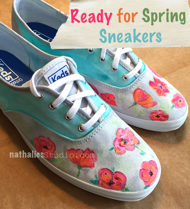
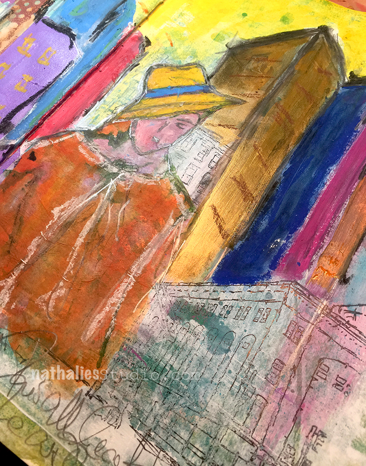
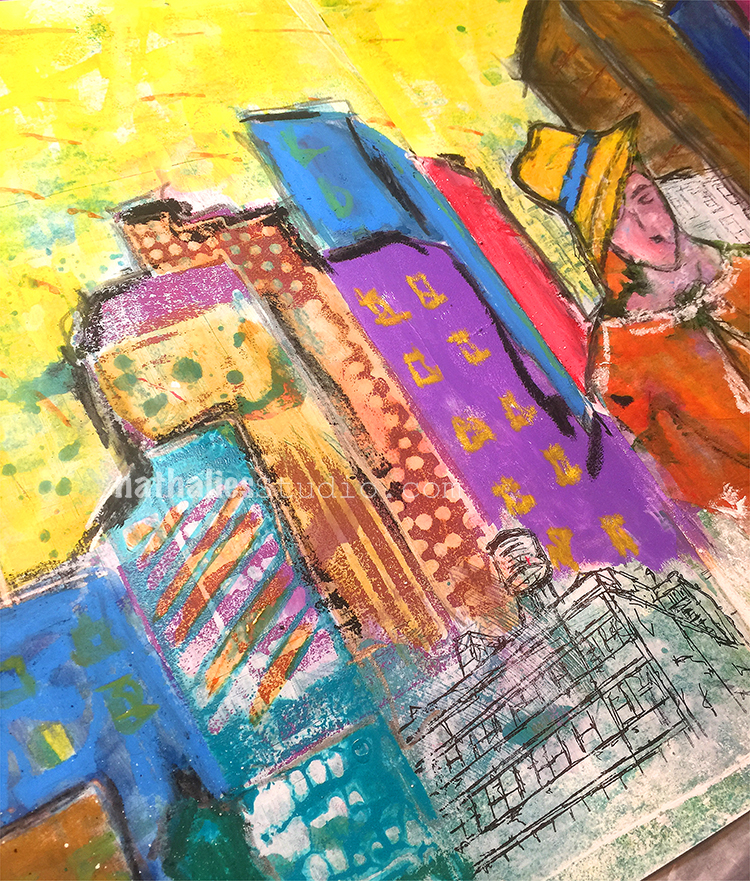
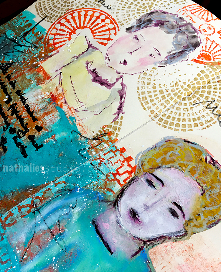
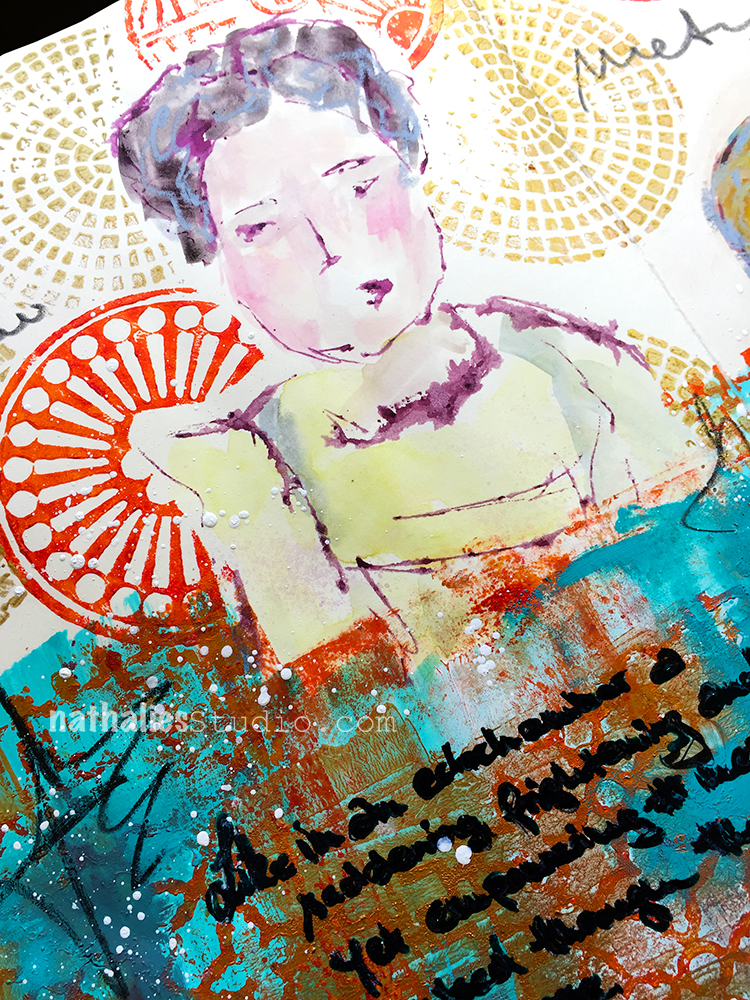
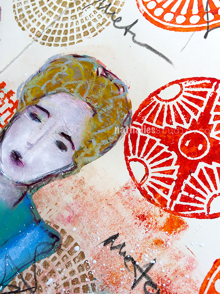
I am telling you, I am longing for spring!

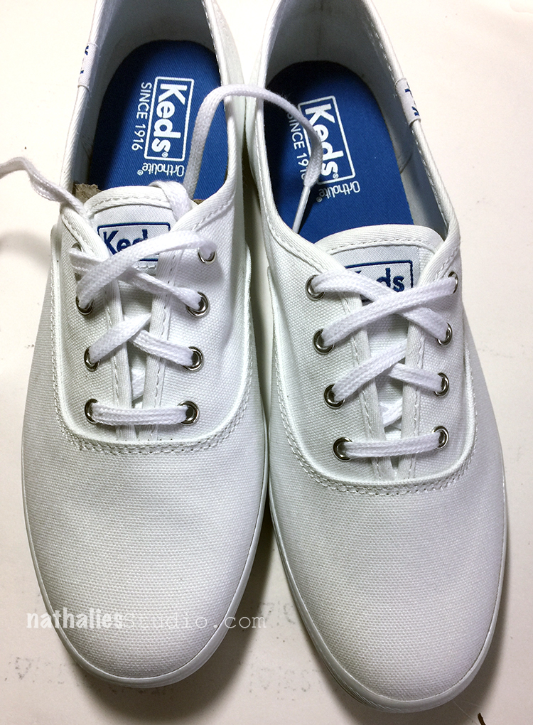
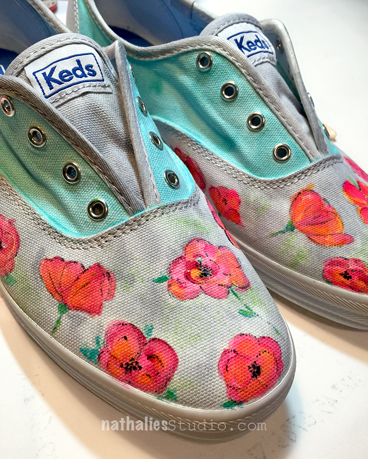
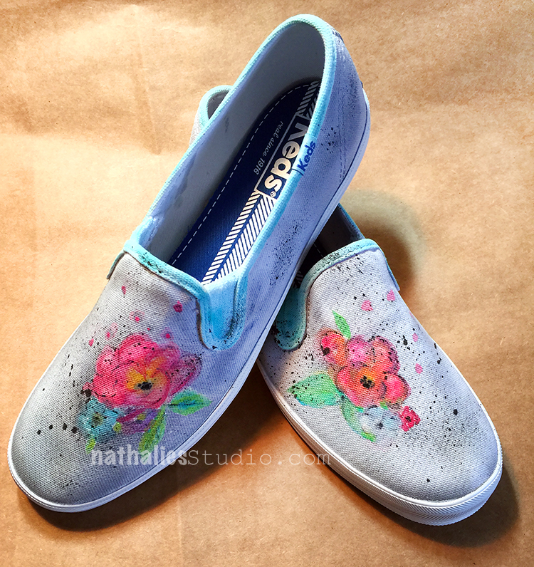
I painted two pairs of plain white sneakers a couple weeks ago with basically the same colors but different designs.

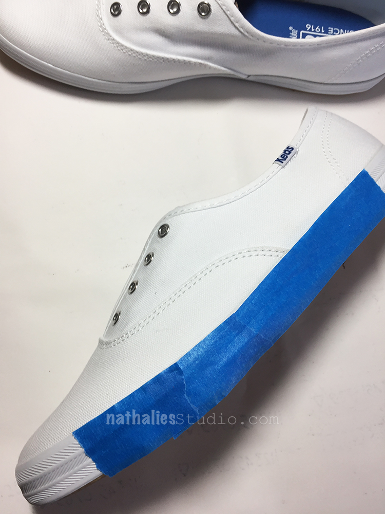
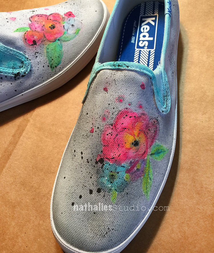
I removed the shoe laces and taped off the rims of the soles and then started painting. I used acrylic paint and ink and I dipped the brush instead of into water into Flow Aid between every paint application.

The Flow Aid serves two purposes, it makes the acrylic paints react more like watercolor and it also keeps the canvas of the shoes soft.

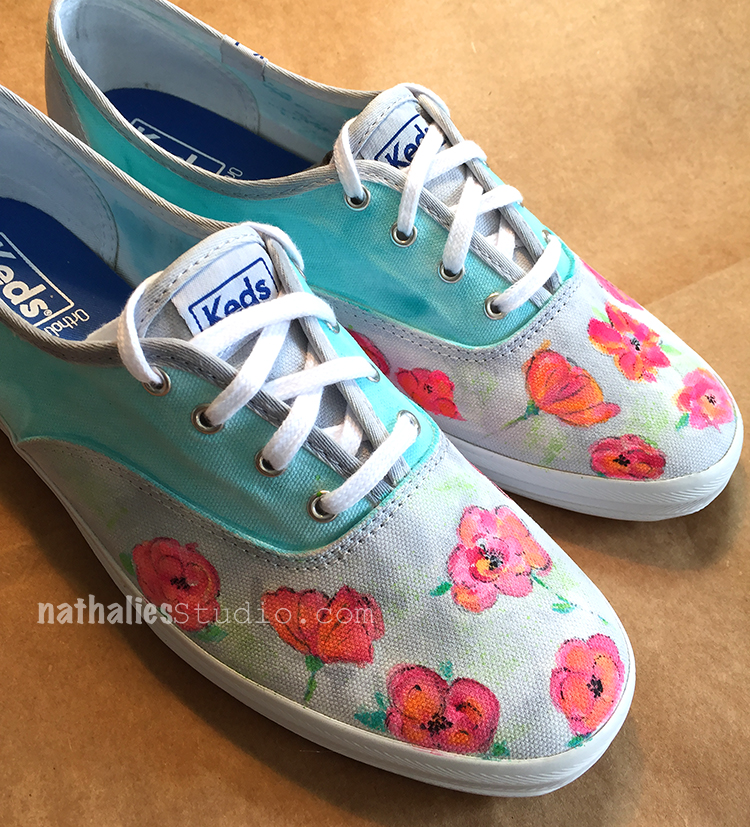
Since the are painted with acrylic paint, the paint is permanent, so there is no further step for setting the paint needed. It was easy to paint on the shoes- and I have to say the Keds fabric was also nice because the paint didn’t bleed crazily and I felt I was in control (and no I am not affiliated with Keds nor did they sponsor this post :) )

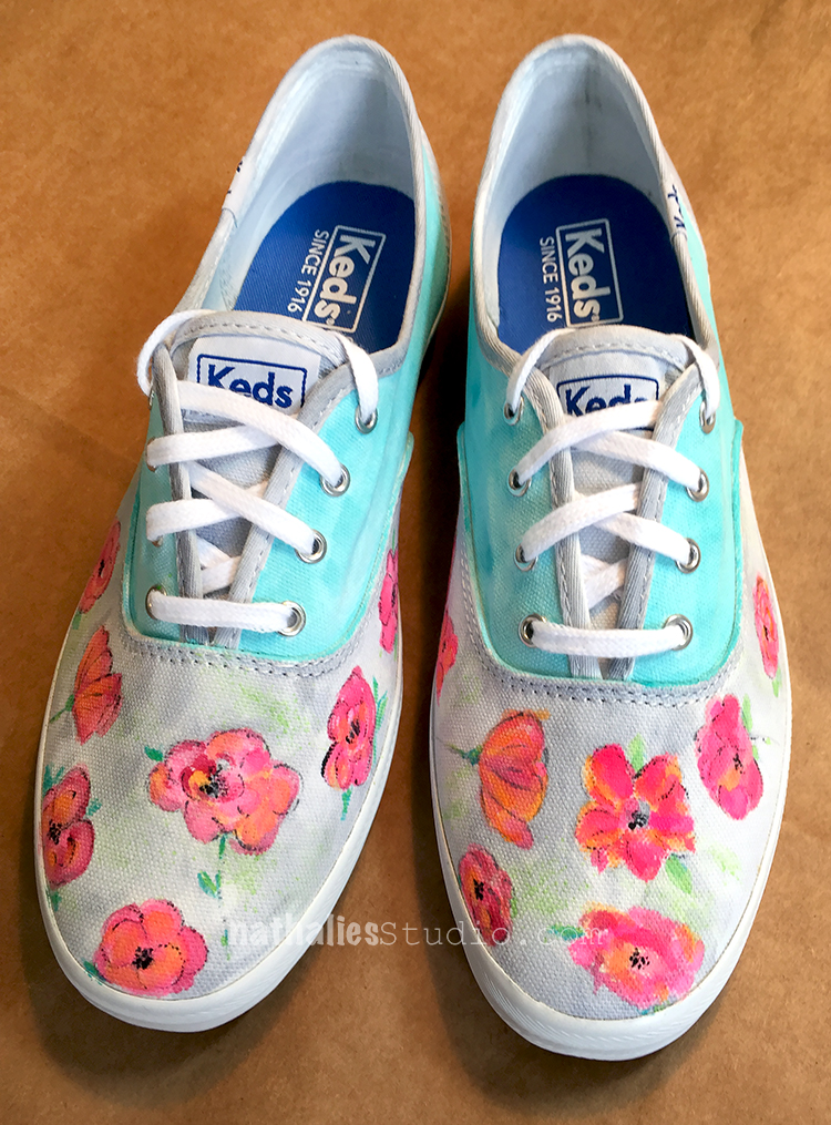
For the second pair I used the same colors but since they are a different design, I chose a different flower design as well.

I personally like the second pair better, while Kim likes the first pair better, and so those shall be hers when I get them back (they were for an assignement) :)

It was actually less difficult when I thought it would be – I was a bit intimidated starting to paint on those pristine white sneakers but then I just kept on going. I figured worse case scenario I will paint them over with a really dark color and stencil white on them- LOL. Which pair of spring sneakers do you like better, the first one or the second one?

Spring can come now – I am ready :)

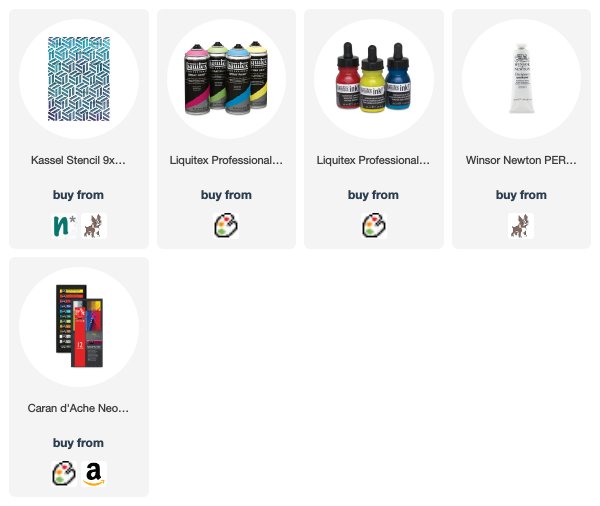
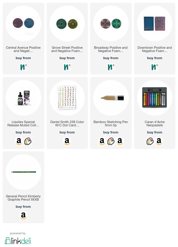
Here is what I used to paint those sneakers:
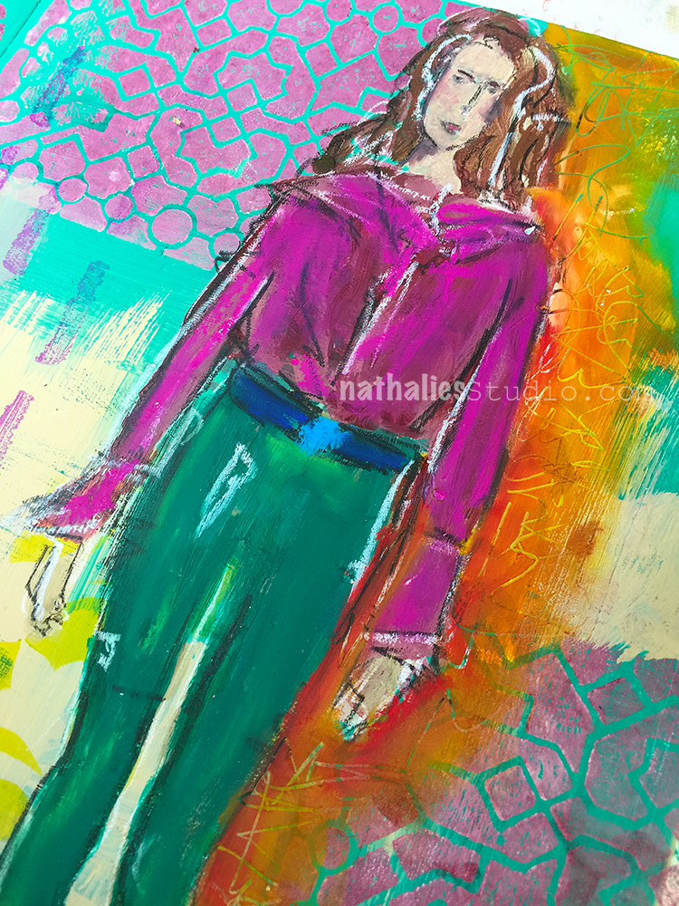
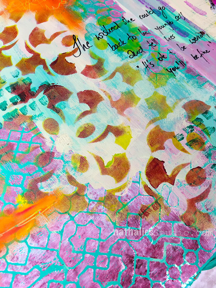

Comments (2)

  • Sue Clarke

    |

    The first pair yell SPRING at me but the second pair are more my style to actually wear.
    Looks like fun and yes, worse case you go dark (purple perhaps) and then add some white.

    Reply

    • nathalie-kalbach

      |

      Oh I like the idea of dark purple and white! Great idea!

      Reply

Leave a comment

Up in the Air

Sometimes everything is up in the air …but you gotta just keep on going …

I mixed up stamping the patterned and solid sides of my Midtown Foam Stamp Set buildings with some Stroll Through The Hood buildings and hand painted buildings. I used various acrylic paint colors to stamp with the foam stamps and pain the buildings.

I painted over some area with a light gesso wash which helped making the fine lined stamps show better

I like how this came together and it is fun to use the Midtown Set from both sides- so many possibilities.

Besides acrylic paint , I used the following supplies for this spread:


Have a gorgeous day!

Leave a comment

She wished she could go back ….

“She wished she could go back to her younger self and tell her “It’s ok, to be weird, you’ll be fine” ”

This was a demo page from a class and I blocked in some color here and there and stamped with my new Exchange Place ArtFoamies Stamp. I added some stenciling with translucent acrylic paints using my Versailles Stencils – love how this turned out. I added some stamping with my Embroidery stamps to add some more even mark making using different colors of Archival Ink Pads- love those.

I painted the lady with acrylic paints neopastels and used some of the neopastels also here and there on the spread and scratched some writing into it.

I like how the lines of the Exchange Place Stamp and the floral Versailles Stencil work together.

Here are the supplies I used:


Hope you enjoy this page- have a wonderful day!

Leave a comment

Echo Chamber

In this journal spread I wrote “Like in an echo chamber a saddening, frightening and yet empowering #metoo echoed through the universe.”

I drew the left women with ink using a bamboo sketching pen and colored her in with watercolor- the right one is a painted on deli paper which I collaged into the art journal.

I stamped with some of my ArtFoamies stamps and acrylic paint and added some mars with Neopastels and a Charcoal pen.

Here are some of the supplies I used for this spread


Comments (2)

  • Gunvor

    |

    It’s a lovely spread and an important matter. Thanks for sharing.

    Reply

    • nathalie-kalbach

      |

      thank you Gunvor! Yes- it is a very important matter-!

      Reply

Leave a comment

Chase Your Stars Fool!

“Chase your stars fool, life is short” – I toned down this very bright red, orange and yellow acrylicpaint-ed background with some gesso and added some stenciling in yellow on top using my Batik Stencil.

I stamped with my new Circle Drive ArtFoamie Stamp and black acrylic paint and added some stars with black archival ink using my Star Tag Cling Rubber Stamp.

I adhered a magazine image and painted over it with acrylic paints and Neopastels. I love how soft those Neopastels are and how beautifully they can be blended.

Here is a supply list with most of the materials I used to create this page:


Leave a comment