Hello from my Creative Squad! Today we have some standard size composition books and 7×5″ flip cards from Judi Kauffman using my Hamilton, Amsterdam, and Crackle stencils and this month’s theme: Light & Shadow – In art and maybe also in life, the balance between light and shadow is an important consideration. Play with this equilibrium in your art and show us how the two sides work together.
Light Wins!
This was an awful year. My first thought when I heard this month’s theme, “Light & Shadow,” was to design something in black-on-black with just a tiny hint of white or yellow – a very direct interpretation of how awful the last ten months have seemed. Dark. Very, very dark. I have been home since March and have no idea when I’ll be able to go out into the world again.
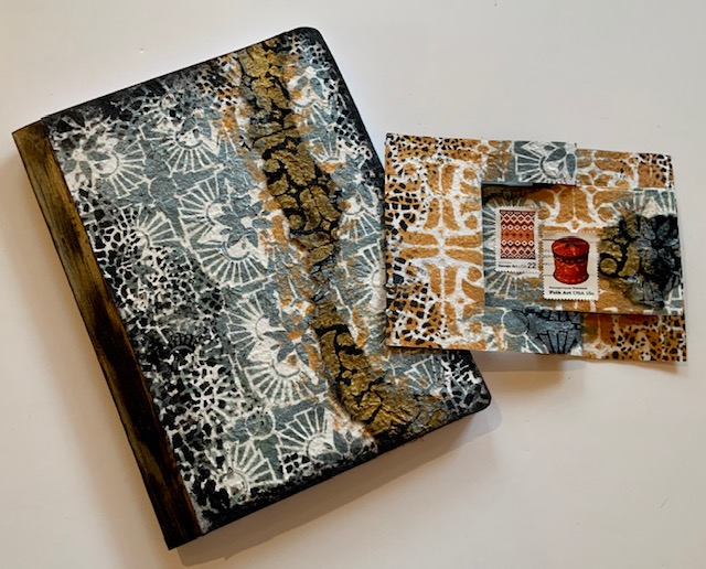
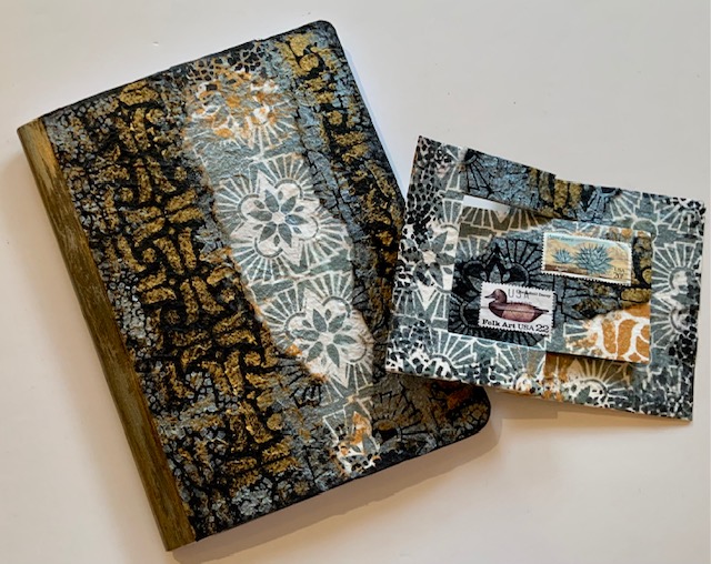
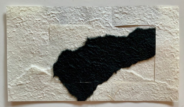
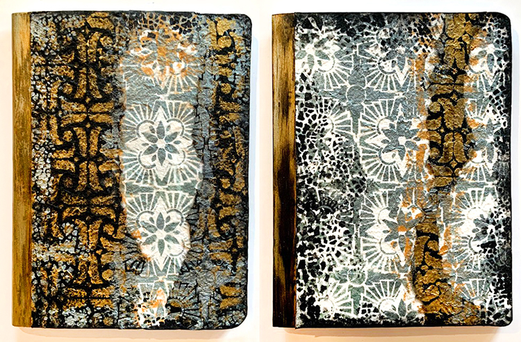
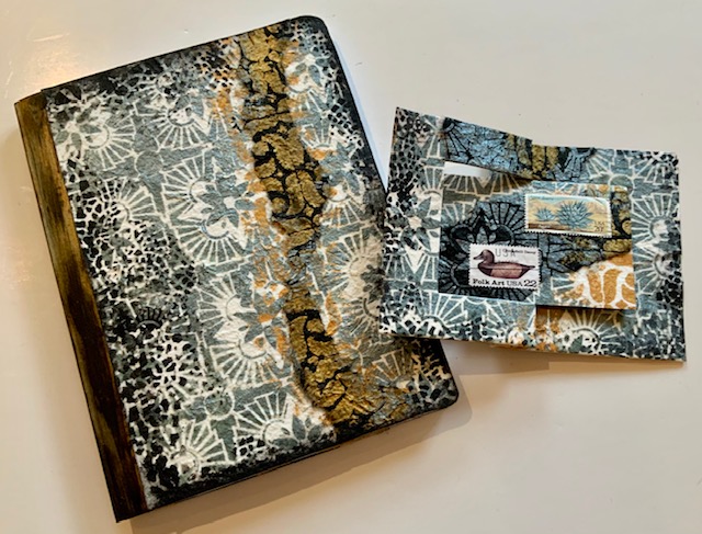
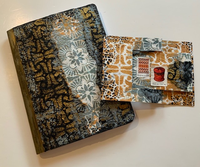
And yet, when I think back through these challenging times and look toward the unknowns still in front of us, it turns out that light wins, not darkness or shadow. After all, we solid, upright human beings cast shadows only when there is light. So I switched direction and decided to give some composition books a new look with a mix of stencils on black and white mulberry paper using sparkling metallic paint – one to give and one to keep. And, of course, I made cards while I was at it – one to match the notebook.
For the books –
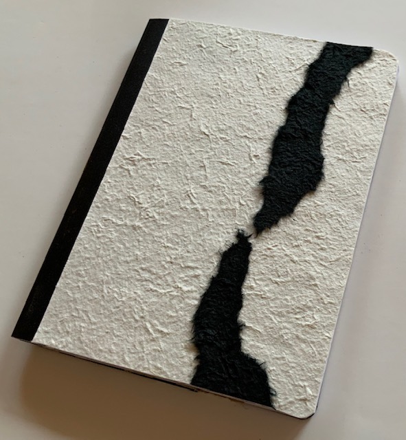
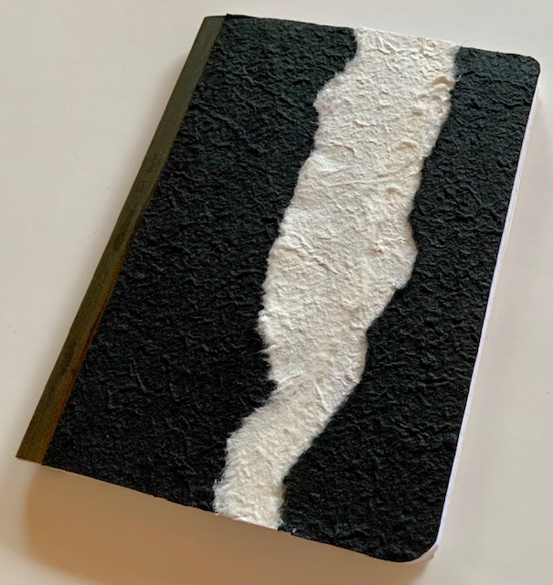
1. Adhere mulberry paper to the front and back of a composition book, using predominantly black for the covers of one of the books and predominantly ivory for the other. Tear papers and layer as shown or as you prefer. Trim at the edges and avoid the black tape binding of the books. Design strategy: Choose one stencil that has a bolder, simpler allover pattern and another that is intricate for contrast.
2. Stencil Hamilton in Gold and Amsterdam in Patina on the covers, alternating patterns in random vertical stripes and overlapping paints to blend.
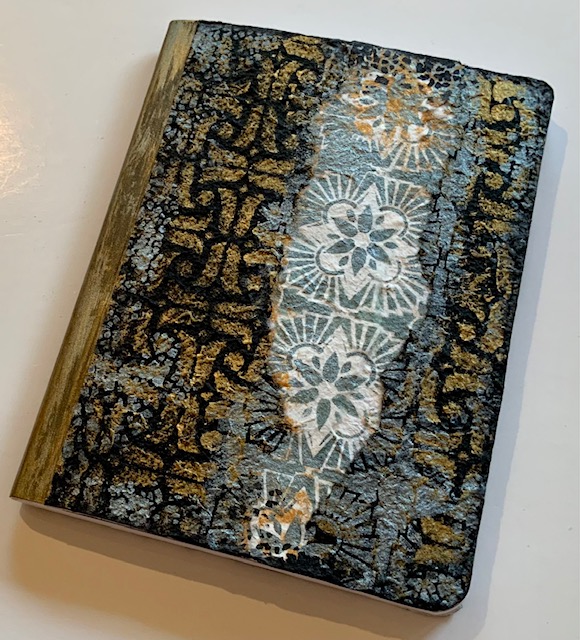
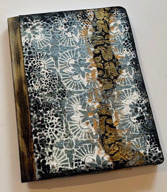
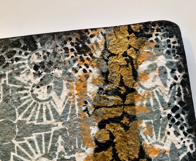
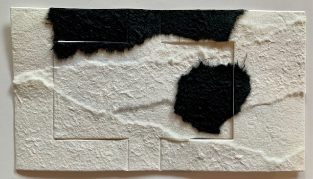
3. Stencil Crackle in Black randomly at the edges of the covers. Edge the covers with a bit of black paint. Design Strategy: Crackle is symbolic of the fragility of life, and yet when the pattern is used at the edges of the rectangles it acts to unify.
For the card –
1. Adhere two sheets of ivory mulberry paper back to back with textured sides facing out. Adhere torn pieces of ivory and black paper. Mulberry paper is floppy, layering adds stability. For extra stability add a piece of cardstock between layers.
2. Hand- or die-cut a horizontal flip card from the sheet. (Shown: AccuCut A7 flip die)
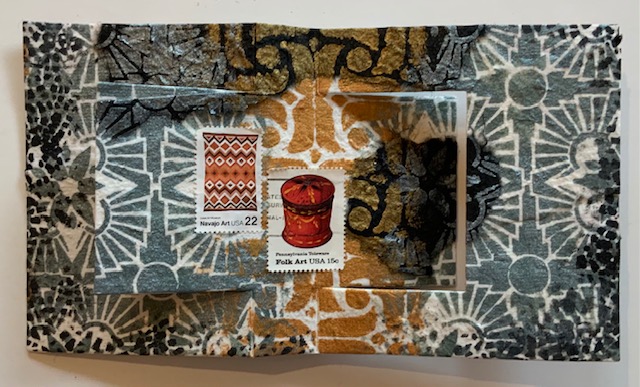
3. Stencil both sides of the card with Hamilton and Amsterdam patterns (same Gold and Patina paints as on notebooks). Optional: Add a bit of Crackle pattern in Black. Edge with smudged-on Black.
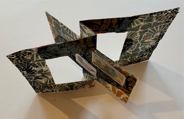
4. Embellish with canceled stamps that pick up the colors of the paints.
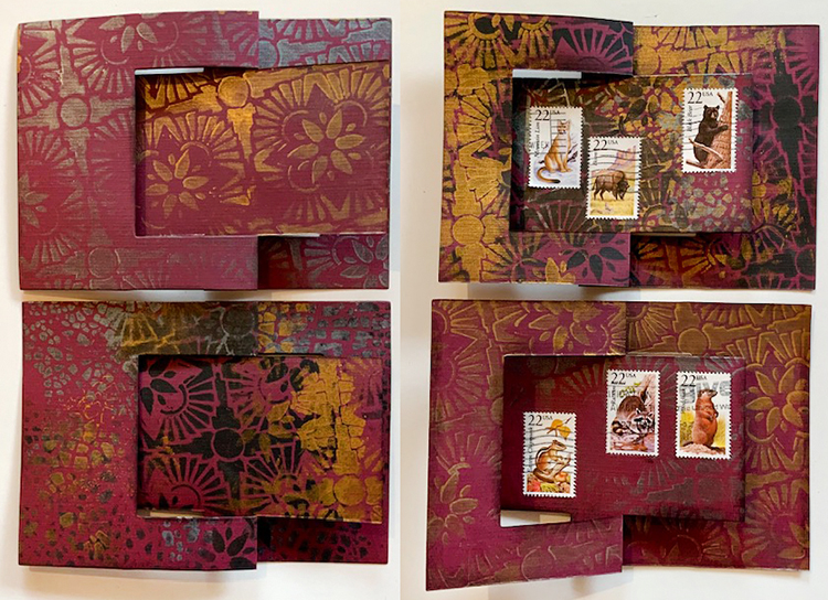
Bonus cards –
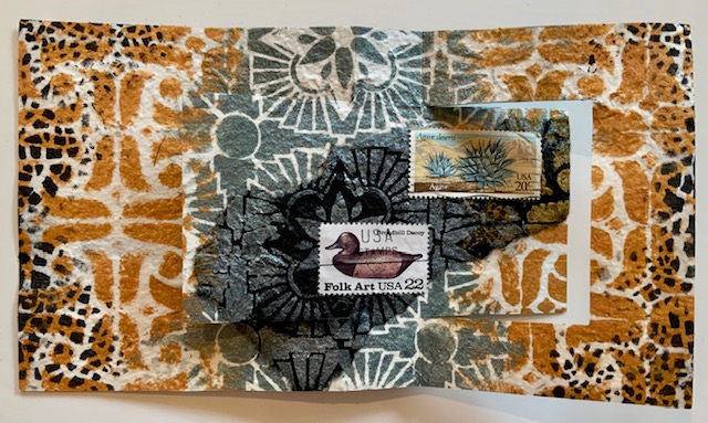
1. Instead of mulberry paper, make cards from heavyweight cardstock. Use only one of the stencils or a combination of several.
2. Embellish with canceled stamps that pick up the colors of the cardstock and coordinate with the paints.
Thank you Judi! Just love the ideas behind these designs – something that we can all relate to this year.
Give it a try: you can find all my Stencils in my Online Shop and in addition to canceled stamps, here are some of the other supplies Judi used:

Don’t forget to check out Nat’s Creative Squad on Instagram too: Each week we post projects, ideas, and inspiration for mixed media art.