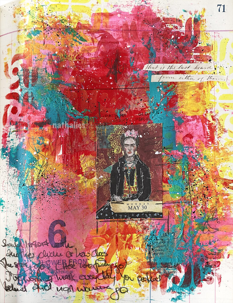
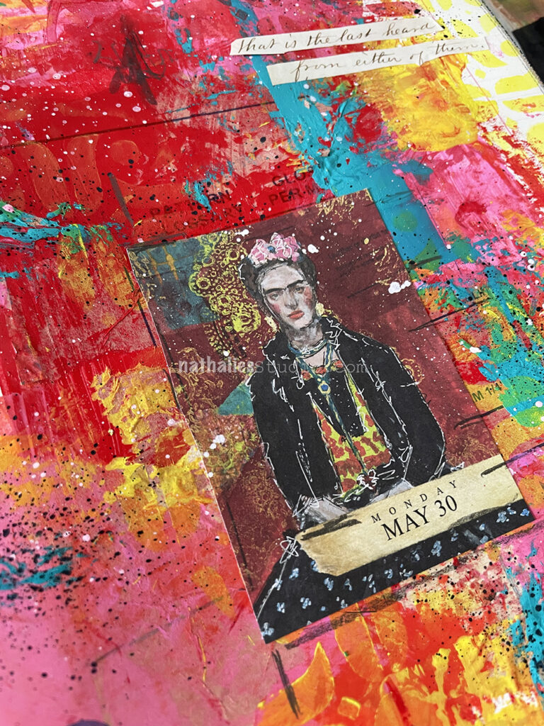
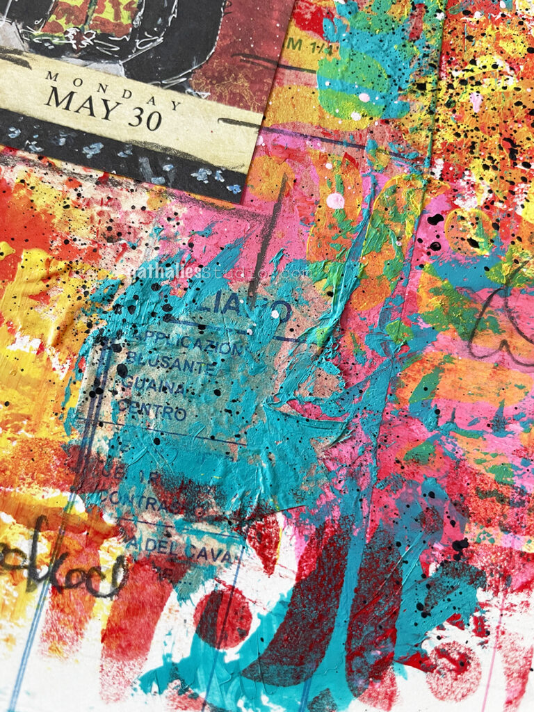
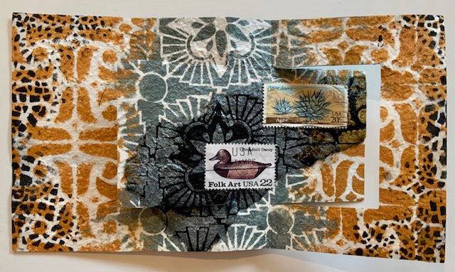
This art journal page began with another one of those pages from the 2022 Artist Almanac calendar. (It’s sold out but the 2023 is in the works and you can join my monthly newsletter for word on when they’re available).
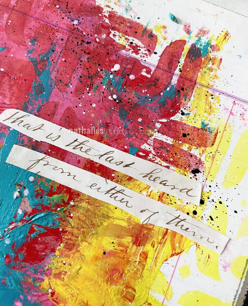
I’m still playing with old letters as well, and I added the sentence “That is the last heard from either of them”. It is interesting to think of the times of no phone or social media or email – you would have to just wait and wait… Again this was from a letter from the 1860s.
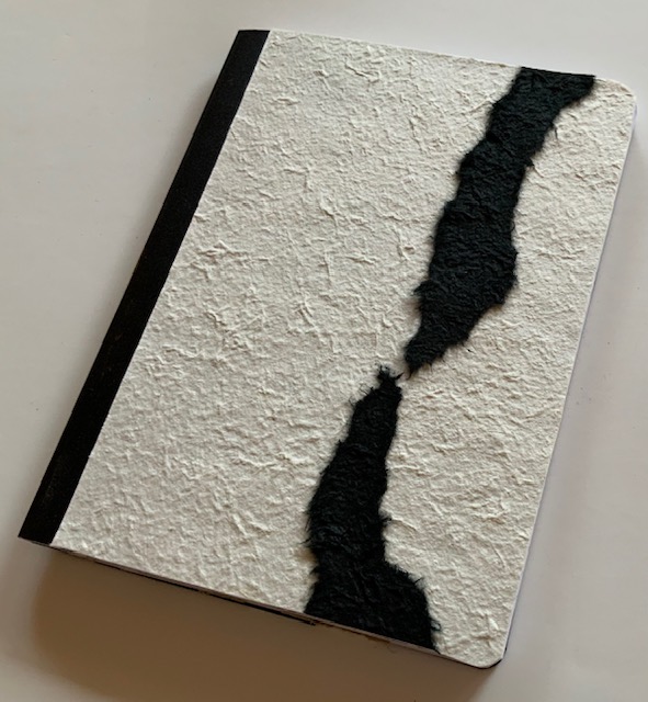
I recalled that I had used some sewing pattern tissue for the original art journal page that I made with Frida and so I pasted some down and instead of gel medium I used the actual acrylic paint as the adhesive underneath the tissue and on top.
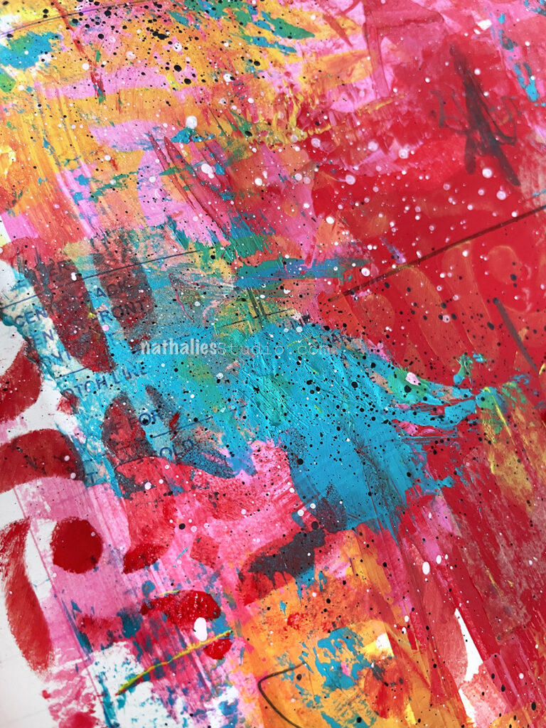
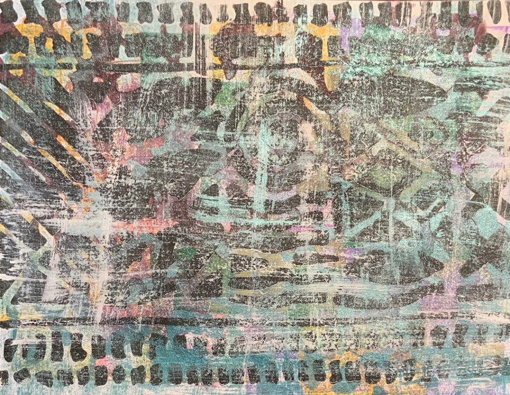
I also added some patterned areas with my Amsterdam stencil. I like the grungy background – I always find it so freeing to just play with the paint and layer it all up.
Last month our Creative Squad member Judi Kauffman shared some stenciled papers she made while going through her stack of ink pads. Here is what she did with my Batik and Amsterdam stencils and the beautiful patterned papers that resulted:
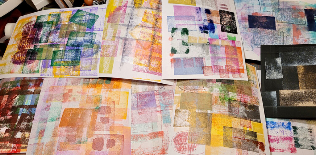
I had started out testing my old ink pads to see which ones were worth keeping. Some of the foam on ancient pigment pads had disintegrated, others were dry and discontinued so re-inkers weren’t possible. (The first photo with lots of sheets show where things started.)
The rest of the photos show sheets that I stenciled and dry-brushed.
Not shown: I trimmed the sheets, cut them into randomly-sized rectangles, and put the prints onto white and ivory card bases in three sizes ranging from A2 to 5×7. Also kept one scrap for a bookmark and made one card with the tiny slivers that were leftovers from trimming. I left one sheet as-is and made Mark Rothko-style cards, another sheet is waiting for some stamping. And I did use a stencil from another company for one sheet as well. (Last week’s Big Project was organizing ALL of my stencils – egad!)
Thanks for sharing Judi! What a great way to get organized and to make something beautiful from the process. And I love that the sheets then went into other card projects and a bookmark etc.
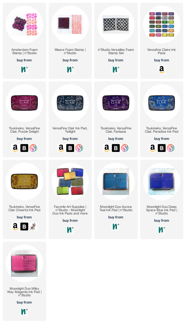
You can find all of my stencils in my Online Store. Here are some of the supplies that Judi used:
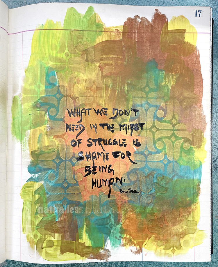
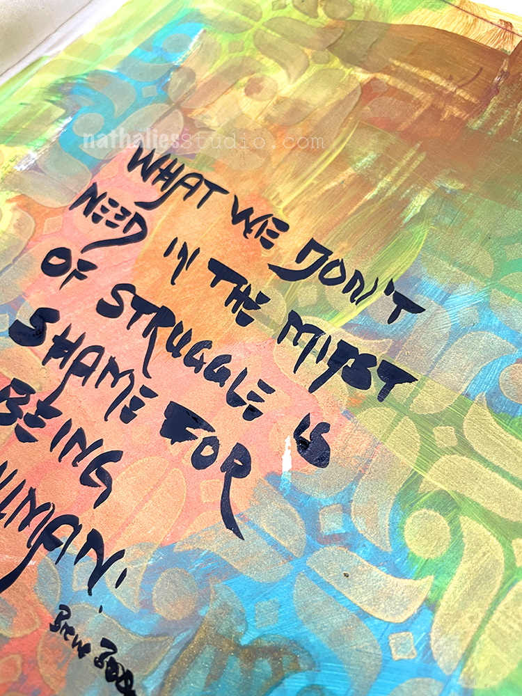
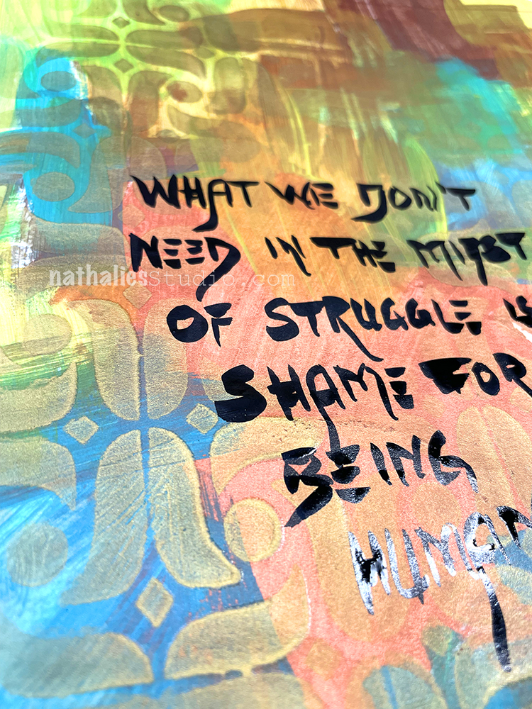
“What we don’t need in the midst of struggle is shame for being human.” – Brene Brown
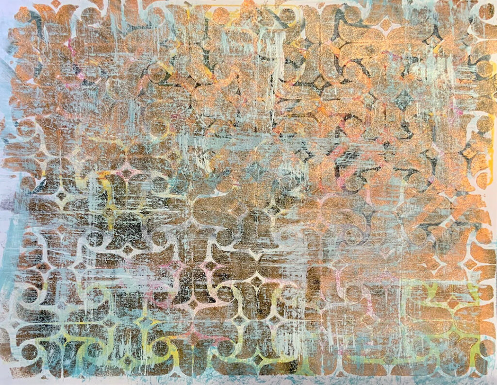
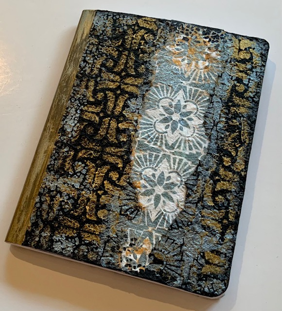
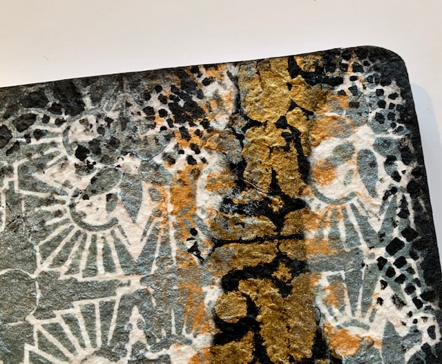
This is just a simple art journal page: I had some leftover paint on the ledger and then I used my Amsterdam Stencil with new spray paint – Mtn water-based gold spray paint. I wanted to try it out and was pleasantly surprised by how the metallic spray paint actually created some real texture.
I finished up the page with a Fude pen for the journaling.
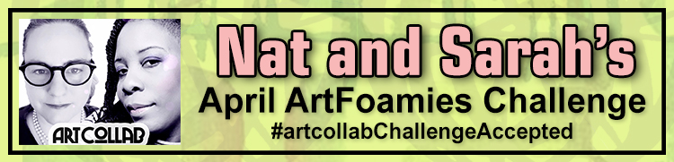
We’re recapping Day 05, 06, and 07 of Nat and Sarah’s April ArtFoamies Challenge today! You can follow along on my Instagram daily with videos and photos, and I will post updates here on the blog too from time to time throughout the month.
Let’s get started!
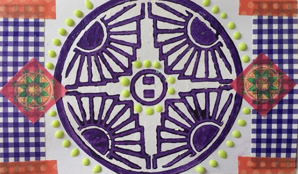
April 5: Peace – Flowers always give me peace and this stamp with its tulips is called Amsterdam – very fitting no? This stamp called to be inked up with two different colors alternating and while it was a fast and quick spread, it was fun and a good reminder to do this more often, the ink pads give a good chance to do a multicolor print quick.
Here is a look at the April 05 page:
April 06: Hydrate – I used my Weave stamp because the pattern looks a bit like waves and as Sarah and I are meeting today to talk about Challenges and also about this Challenge I thought I should rock it out and do it like Sarah the Queen of Layers does. Oh boy …it worked well until I added the third color, crooked, not inked up well. What was I thinking? But then I kept going and I like part of it. I learned my lesson and I apologized to my ledger. So I am keeping up, the ledger is 125 years old, no way I am stopping now in this book.
Here is a look at the April 06 page:
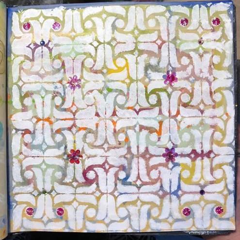
April 07: Repeat – Definitely repeating what I know with my Versailles positive and negative stamp. I love the faint stamping on the ledger as it lets the ledger peek out more but to be honest it is a good reminder for everyone that you should absolutely clean your foam stamps – especially when you use them with acrylic paint. If you do not they harden up with a thin layer of plastic – acrylic paint is essentially plastic – on top and it makes it hard with a non absorbent slick surface to use other paint media for example ink pads. So while in my workshops it is sometimes just not possible to have every student scrub their foam stamps, I really urge you to do this with the ones you purchase …unless you want to repeat your purchase with me ;) which I wouldn’t mind but I’d rather have you happy :)
Here is a look at the April 07 page:
Follow along with the challenge on instagram and post your artwork too with the hashtag #artcollabChallengeAccepted
Hello from my Creative Squad! Today we have some gorgeous tote bags from Judi Kauffman using my Amsterdam and Hamilton stencils and this month’s theme: Life in Bloom – It’s been a long winter where we are and I’m dreaming of flowers and gardens and spring. Indulge us all in a project that focuses on one of Mother Nature’s most exuberant symbols of life: flowers flowers flowers!
I completed my “Life In Bloom” theme projects in late February, a week after getting my first covid vaccine shot. I will have been home for a full year as of March 18, but by the time you read these words I will have had my second shot and will be able to double-mask and head back out into the world – just in time to greet the new season. Spring!
I can’t wait… I can’t wait to see the iris, peonies, begonias, and other hearty perennials peeking up, ready to put in an appearance. And I can’t wait to go to Costco to buy some annuals to fill in the empty spaces. And a rotisserie chicken for dinner…I can almost smell the aroma of that aisle. Gee, I think I missed those trips to Costco more than almost anything else during my time at home.
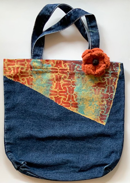
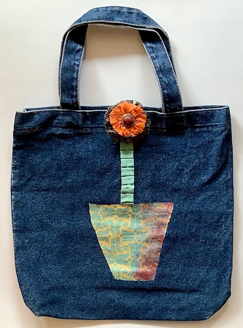
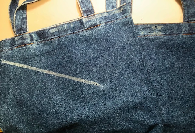
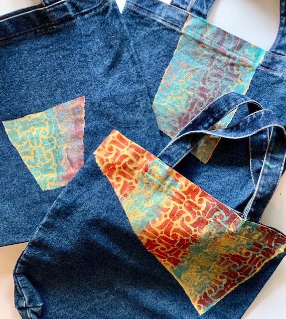
Meanwhile, like many of you I have spent many hours cleaning closets and going through supplies. I found a trio of simple denim totes, two with flawed spots, and thought they’d be a great surface for a stencils-only project. Here’s how they looked when I started:
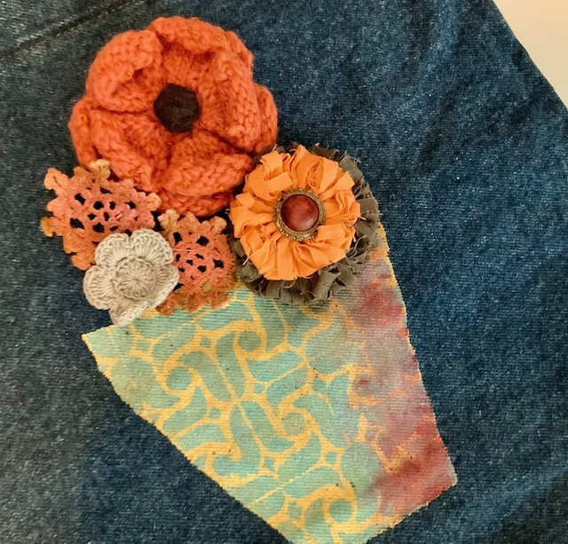
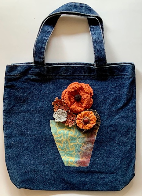
My concept was to create a flower pot/vase on one of the totes for a literal interpretation of the theme but stenciling the other two with more wonky shapes for a more abstract approach.
INSTRUCTIONS:
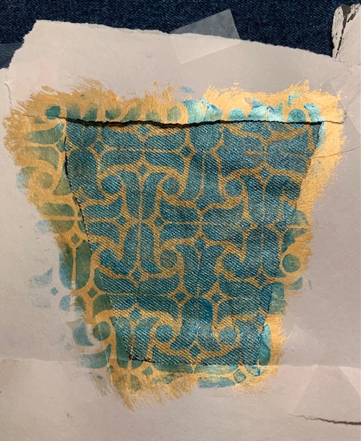
Using torn strips of newsprint, mask around the areas earmarked for painting and stenciling.
Using gold metallic or other light color acrylic paint and a wide brush fill the area to be stenciled. Optional: Mix paint with fabric medium.
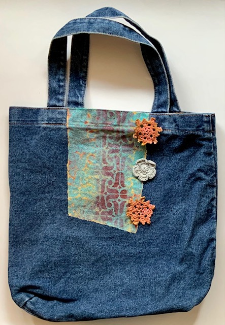
Using a mix of stencils (I used Nat’s Amsterdam and Hamilton stencils) and two darker paints (shown: red and metallic teal) add pattern to the gold areas. Overlap stencils here and there. Allow paint to dry for distinct patterns, work wet-on-wet for less distinct designs (smudge paint at edges to add dimension – note right side of flower pot).
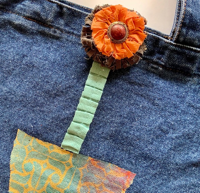
Embellish stenciled totes with knitted, crocheted, and/or frayed fabric flowers. Pleated hem tape makes an interesting stem for a single blossom. Sew in place or use fabric glue to adhere.
NOTE: Embellishments shown are positioned for photography and are being ‘auditioned’ – nothing finalized yet! I plan on adding beads, embroidery, charms and more.
Thank you Judi – absolutely love the idea of bringing these totes to the farmer’s market or garden center!
Give it a try: you can find all my Stencils in my Online Shop and in addition to various beads and embellishments, here are some of the supplies Judi used:
Don’t forget to check out Nat’s Creative Squad on Instagram too: Each week we post projects, ideas, and inspiration for mixed media art.
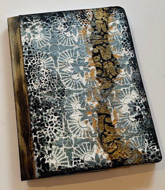
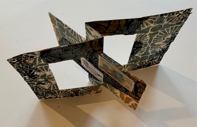
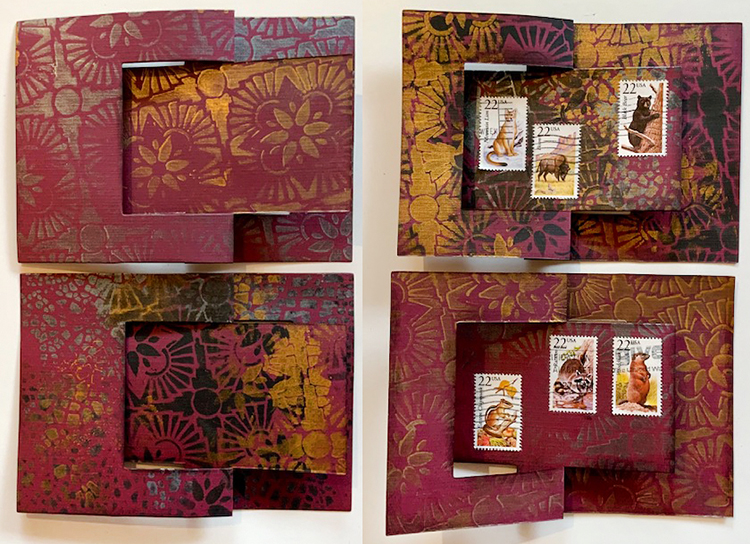
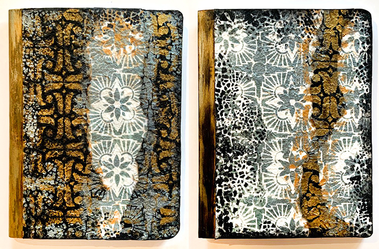
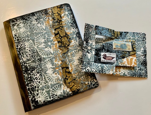
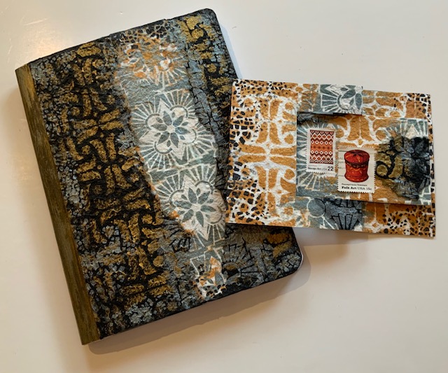
Hello from my Creative Squad! Today we have some standard size composition books and 7×5″ flip cards from Judi Kauffman using my Hamilton, Amsterdam, and Crackle stencils and this month’s theme: Light & Shadow – In art and maybe also in life, the balance between light and shadow is an important consideration. Play with this equilibrium in your art and show us how the two sides work together.
Light Wins!
This was an awful year. My first thought when I heard this month’s theme, “Light & Shadow,” was to design something in black-on-black with just a tiny hint of white or yellow – a very direct interpretation of how awful the last ten months have seemed. Dark. Very, very dark. I have been home since March and have no idea when I’ll be able to go out into the world again.
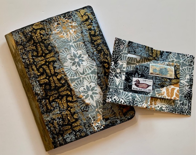
And yet, when I think back through these challenging times and look toward the unknowns still in front of us, it turns out that light wins, not darkness or shadow. After all, we solid, upright human beings cast shadows only when there is light. So I switched direction and decided to give some composition books a new look with a mix of stencils on black and white mulberry paper using sparkling metallic paint – one to give and one to keep. And, of course, I made cards while I was at it – one to match the notebook.
For the books –
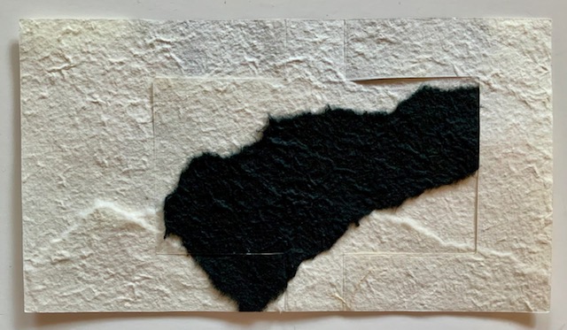
1. Adhere mulberry paper to the front and back of a composition book, using predominantly black for the covers of one of the books and predominantly ivory for the other. Tear papers and layer as shown or as you prefer. Trim at the edges and avoid the black tape binding of the books. Design strategy: Choose one stencil that has a bolder, simpler allover pattern and another that is intricate for contrast.
2. Stencil Hamilton in Gold and Amsterdam in Patina on the covers, alternating patterns in random vertical stripes and overlapping paints to blend.
3. Stencil Crackle in Black randomly at the edges of the covers. Edge the covers with a bit of black paint. Design Strategy: Crackle is symbolic of the fragility of life, and yet when the pattern is used at the edges of the rectangles it acts to unify.
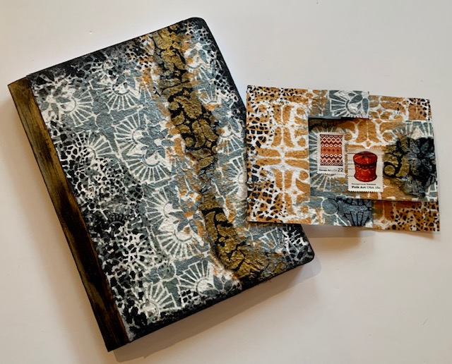
For the card –
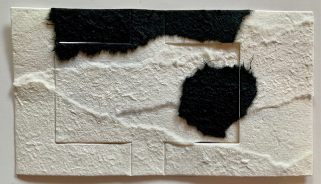
1. Adhere two sheets of ivory mulberry paper back to back with textured sides facing out. Adhere torn pieces of ivory and black paper. Mulberry paper is floppy, layering adds stability. For extra stability add a piece of cardstock between layers.
2. Hand- or die-cut a horizontal flip card from the sheet. (Shown: AccuCut A7 flip die)
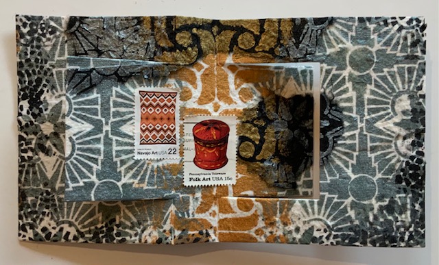
3. Stencil both sides of the card with Hamilton and Amsterdam patterns (same Gold and Patina paints as on notebooks). Optional: Add a bit of Crackle pattern in Black. Edge with smudged-on Black.
4. Embellish with canceled stamps that pick up the colors of the paints.
Bonus cards –
1. Instead of mulberry paper, make cards from heavyweight cardstock. Use only one of the stencils or a combination of several.
2. Embellish with canceled stamps that pick up the colors of the cardstock and coordinate with the paints.
Thank you Judi! Just love the ideas behind these designs – something that we can all relate to this year.
Give it a try: you can find all my Stencils in my Online Shop and in addition to canceled stamps, here are some of the other supplies Judi used:
Don’t forget to check out Nat’s Creative Squad on Instagram too: Each week we post projects, ideas, and inspiration for mixed media art.
Ready for some inspiration? Today we have some projects from around the globe. It’s always fun to see how you’re using my stamps and stencils and I am so happy to share some examples today. So let me know if you’re doing something cool with my products, tag me on social media, and you might see yours on the next Inspiration from Around the Globe!
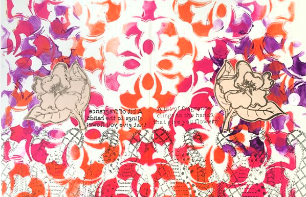
First we have Addi Mahajan from India using my Versailles stencil as a background in her vibrant art journal page.
Linda Edkins Wyatt from the US is using my Broadway foam stamp on this index card composition for a bold focal point.
And here is Karen D’Angelo from the US using my Amsterdam stencil for some unifying all-over pattern.
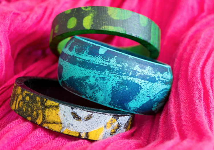
And Marsha Valk, a Creative Squad alumni from the Netherlands, and a funky blue bangle bracelet she decorated using my Batik stencil.
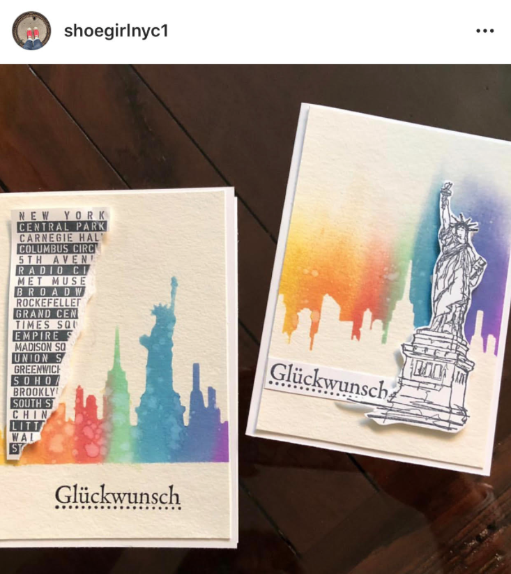
And finally, my friend Liz from Germany who made a card with my Lady Liberty stamp. Love it!
If you’re working on something fun with my stamps or stencils, be sure to tag me and share! I’d love to see! You can find all my stencils, rubber stamps, and foam stamps in my Online Shop. Here are some of the supplies used in this post:
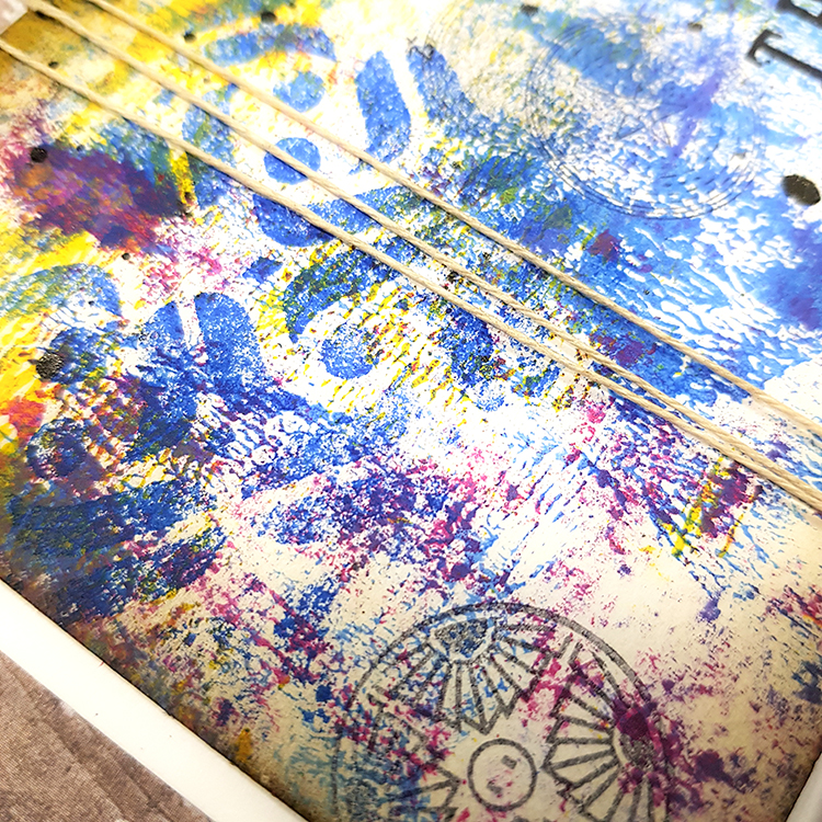
Happy Tuesday from the Creative Squad! Today we have a post from the lovely Tania Ahmed, sharing with us a set of cards using rubber stamps from my Small Circle Jumble set and my Mini Amsterdam foam stamp from the Mini Tile Set. Tania was inspired by this month’s theme: Doin’ My Thing – We all have a unique artistic style and way of working with supplies. This is the time to rock it! Be yourself. Do your thing.
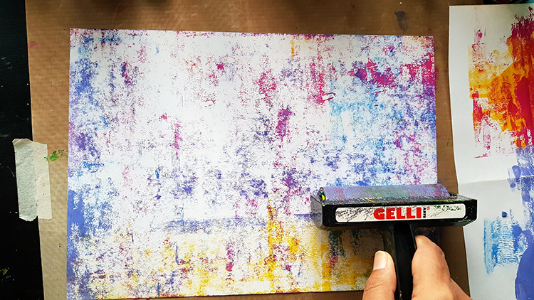
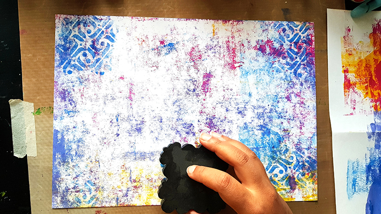
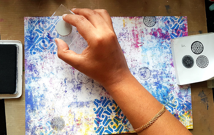
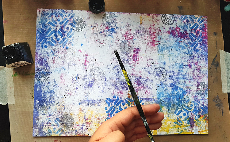
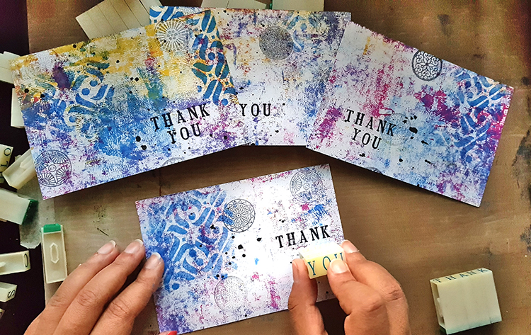
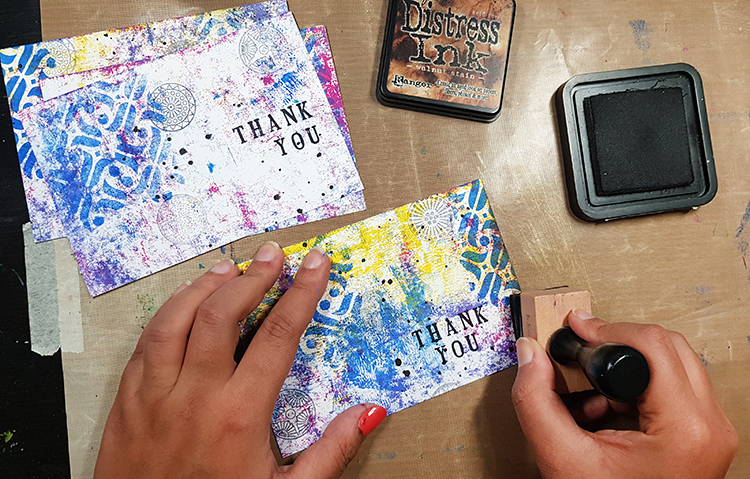
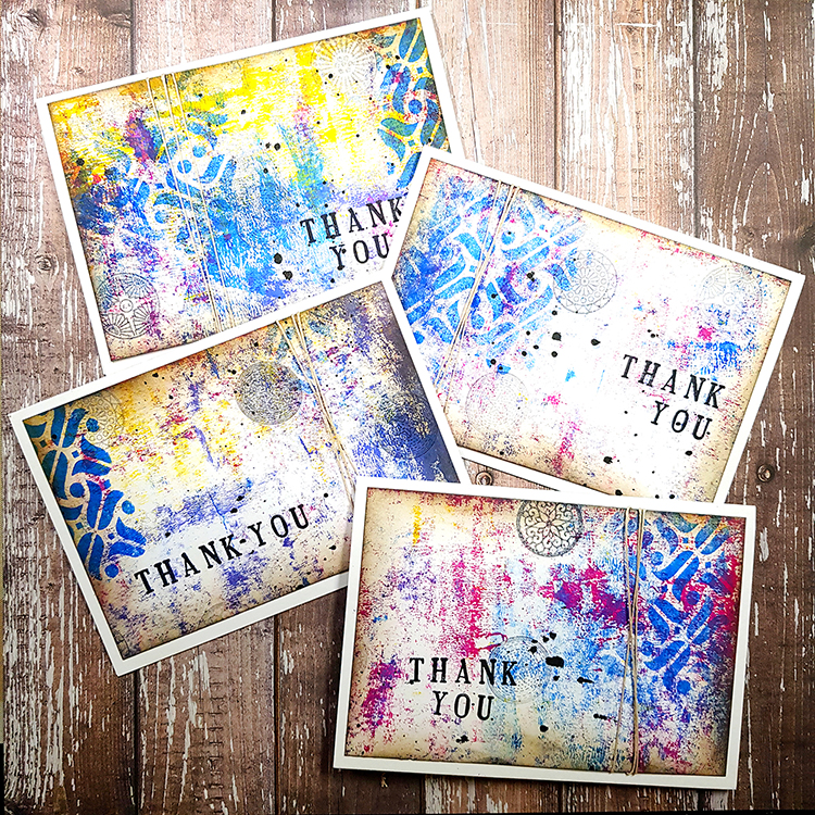
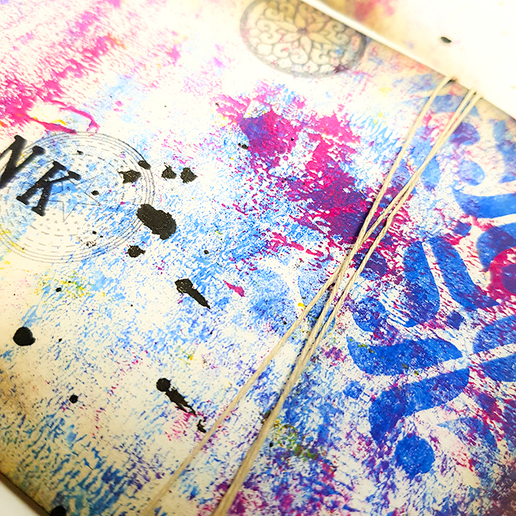
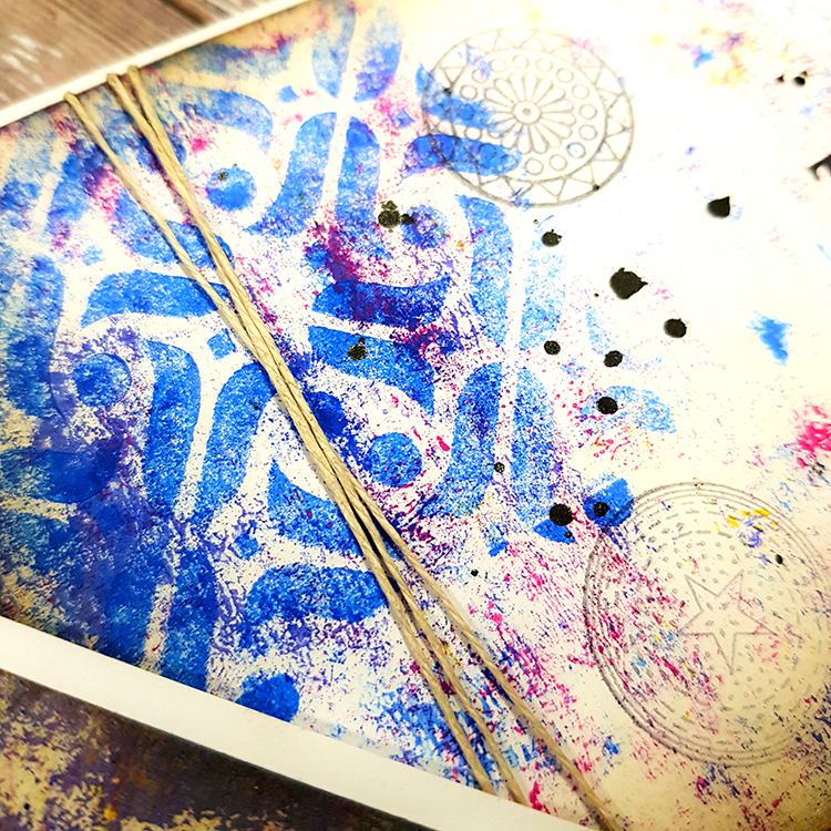
Our challenge this month was to use Nat’s Small Circle Jumble Stamps plus one of the foam stamps from the Mini Tile Set. I love using different kinds of patterns and seeing how I can make the two work together. I needed some thank you cards, so I thought this was the perfect opportunity to create a master board. A master board is basically a sheet of paper or cardstock that you create a background on with stamping, paint and mediums applied to it, which can be cut into smaller pieces to use as collage material or even cards. Also we were asked to really show off our styles so this project has all things that I love: bright colours, stamping, making cards, splatters and using brayers to create a super easy and quick background!
Lightly apply paint to cardstock with brayer. Less paint gives better effects!
Stamp lightly with the Mini Amsterdam ArtFoamie. Double stamp to create ghostly impressions.
Ink the Small Circle Jumble Stamps with Jet Black Archival Ink and stamp off on a scrap piece of paper and then stamp on your masterboard cardstock paper a few times to get light stamped images.
Add splatters with black ink.
Cut the masterboard cardstock into four 3.75 x 5.5 panels. Add sentiment with alphabet stamps.
Add Distress Ink around edges. Add twine and adhere to white card base.
Thank you Tania – I love all those yummy layers! Want to try Tania’s card method? You can find all my Rubber Stamps and Foam Stamps in my Online Shop. Here are some of the other supplies that Tania used:
Feel inspired? Working on something yourself that you’d like to share? I love to see how you interpret our monthly themes. Email me how you used my stencils and stamps with the theme and email me an image – I would love to share your projects in my next “n*Spiration From Around the Globe“.
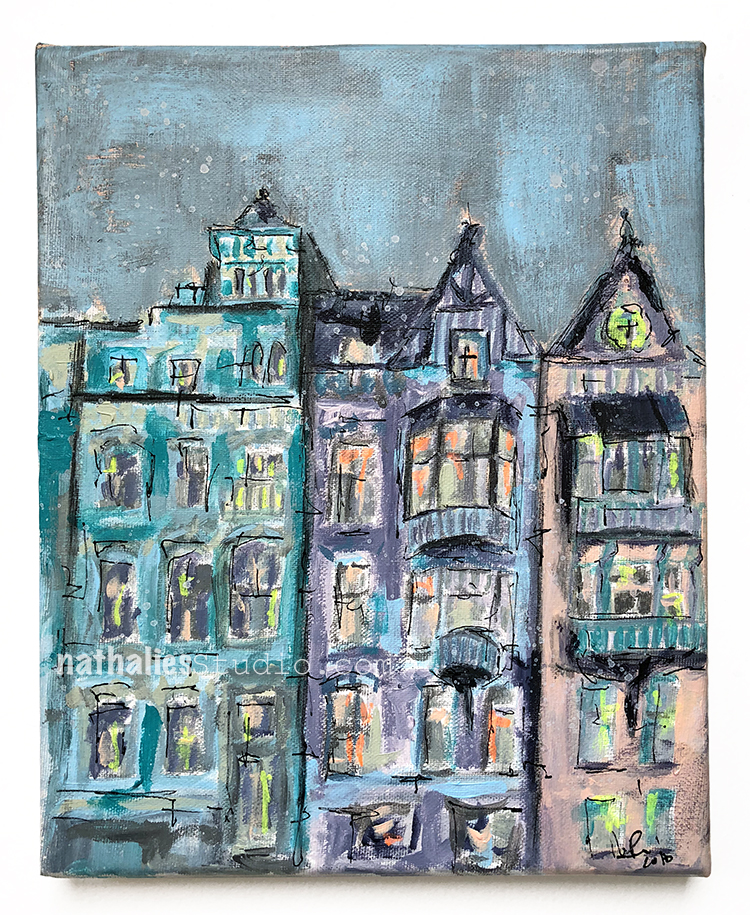
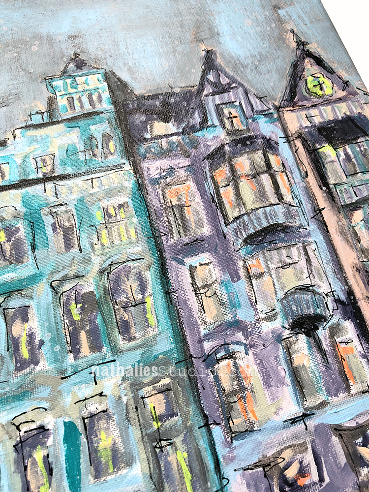
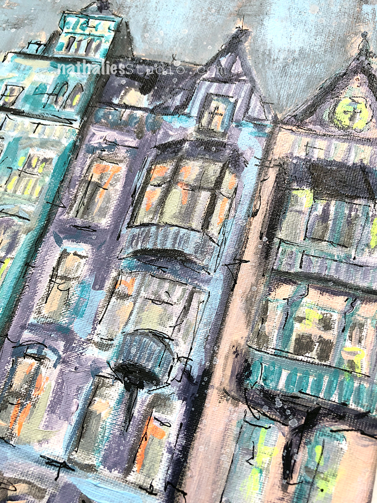
It depicts a quintessential streetscape in the city of Amsterdam, with it’s unmistakable architecture and one-of-a-kind beauty. On a recent trip to the city, after an afternoon spent enjoying the Rijksmuseum, I took in this lovely view while waiting for a tram. Since it was a pretty long wait I just looked for 20 minutes at the details and contemplated about who used to live there, how the street looked like when it was built and who might live in there now.
I used acrylic paint, gouache, graphite and marker on canvas and the painting measures 10″ x 8″. It is available in the store now :)
Nat, it just blows me away how far your art has come. From colorful scrapbook pages and cards to paintings that evoke feelings of warm neighborhoods that I want to visit! You go girl…you have the creative world by its heart strings.


Think I need to go through long forgotten ink pads hummm big and juicy ones spring to mind though they might be all mud lol
Reply