Creative Squad

Creative Squad: Goodnight Art Journal – Judi Kauffman

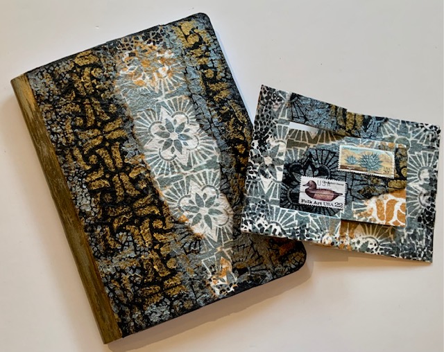
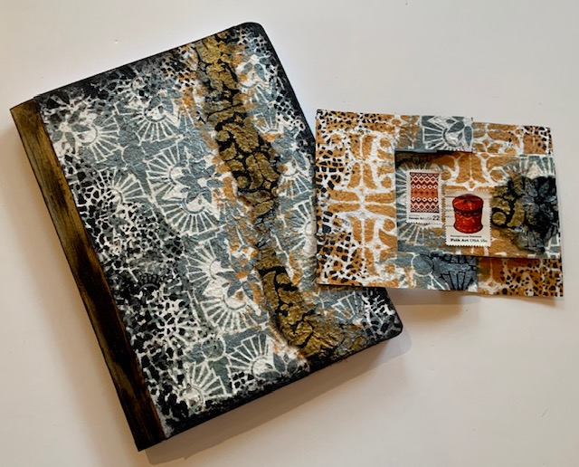
Hello from my Creative Squad! Today we have a post from Judi Kauffman who is sharing a creative way to personalize a notebook cover using my ATC Mixup, Crackle, Hamilton, and What’s the Point stencils and inspired by our theme: Goodnight, Art Journal – Think about the colors, sounds, rituals of night – any aspect of it – and use that as your catalyst to create! 


LAMP LIGHT by Judi Kauffman

I don’t keep an art journal – just an over-stuffed Traveler’s Notebook – so my project deviates from this month’s assignment. We’re tasked with using Nathalie’s stencils to create an art journal page inspired by night time. I took a more literal approach to nighttime, the wonderful, lazy part of my day when I am most often in a comfy chair reading by lamp light.

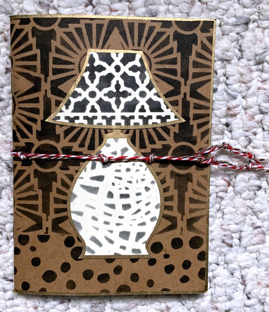
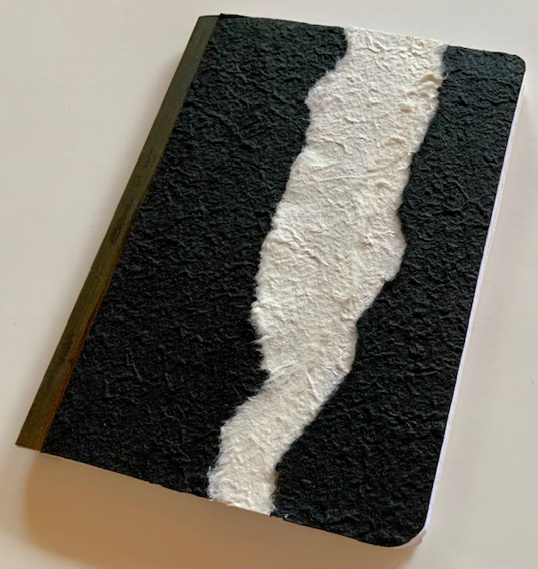
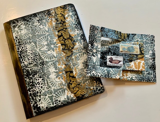
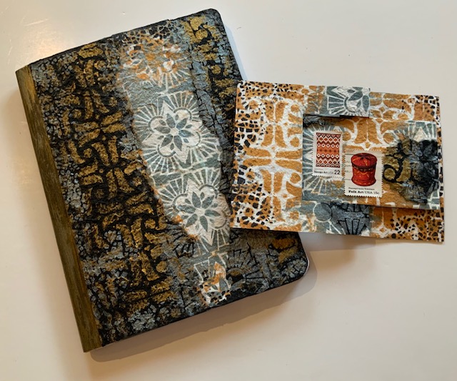
The project itself started with a 4” x 6” blank book with a Kraft brown cover, small enough to sit next to the chair or tuck into a tote. I can record what I’m reading, make shopping lists for books I want to buy or pick up at the library, jot down recommendations from friends. I plan to glue in book reviews from newspapers and magazines, and – of course – I’ll doodle.

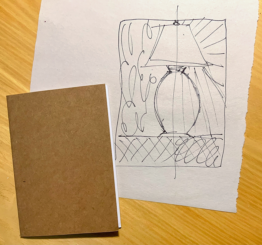
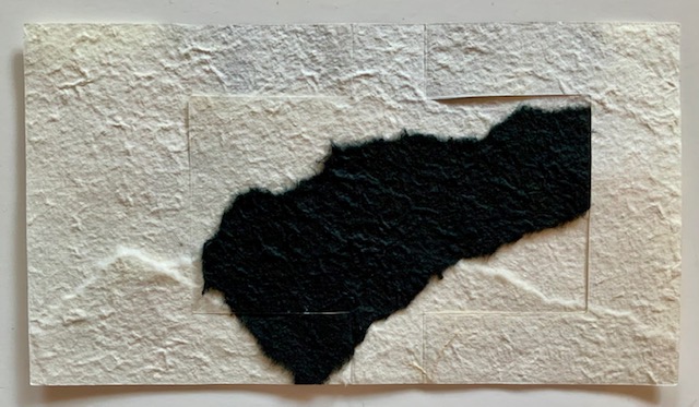
My original idea, shown in the sketch above, was a lamp on a table, divided so that one half was daytime and the other was nighttime – rays at the right showing the nighttime illumination. I knew I wanted a very graphic design with very simple shapes so the stencils would take the starring role.

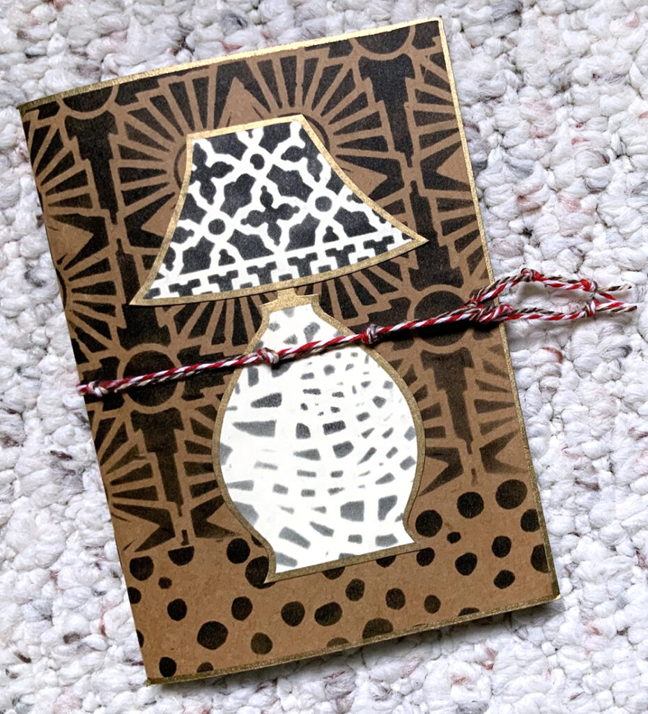
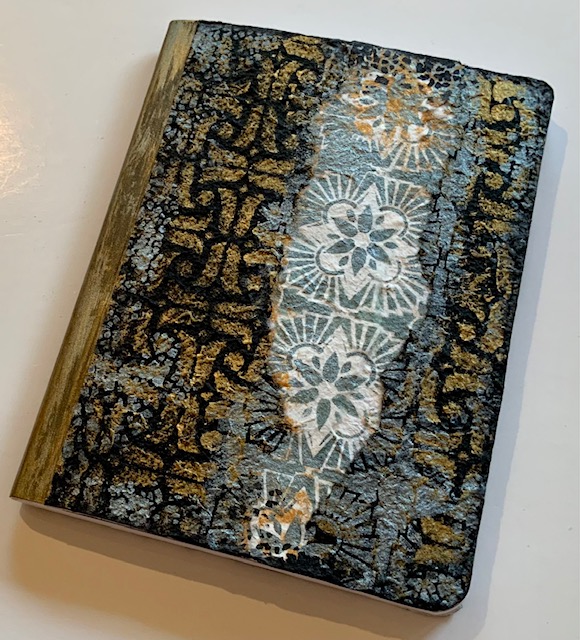
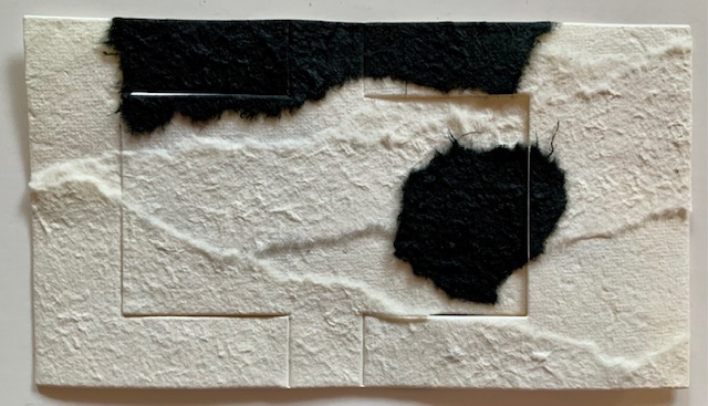
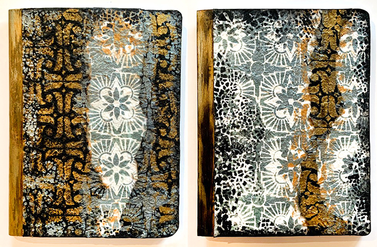
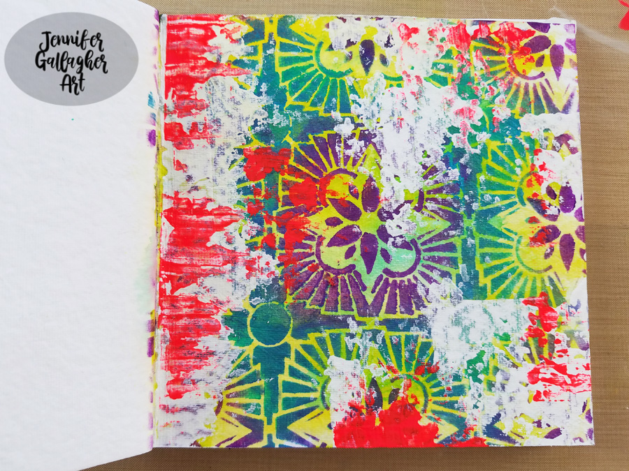
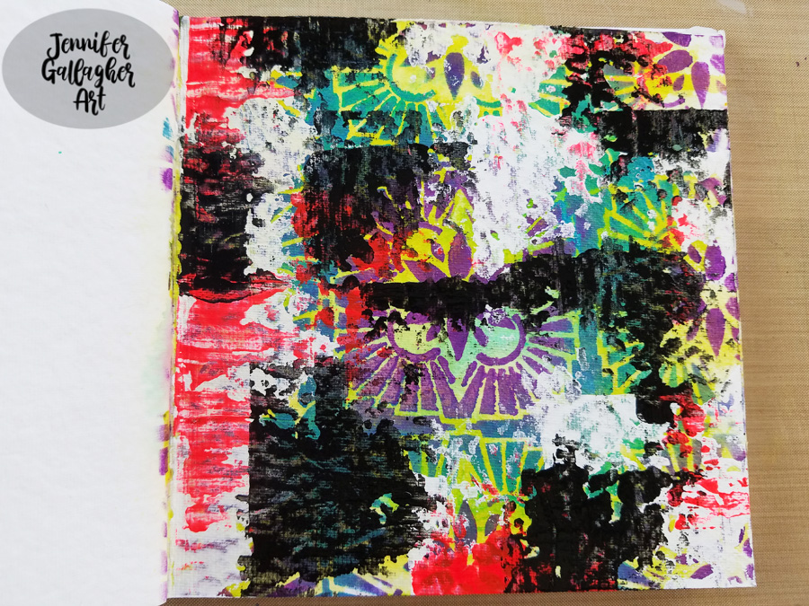
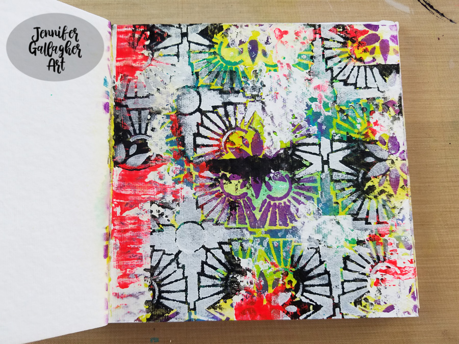
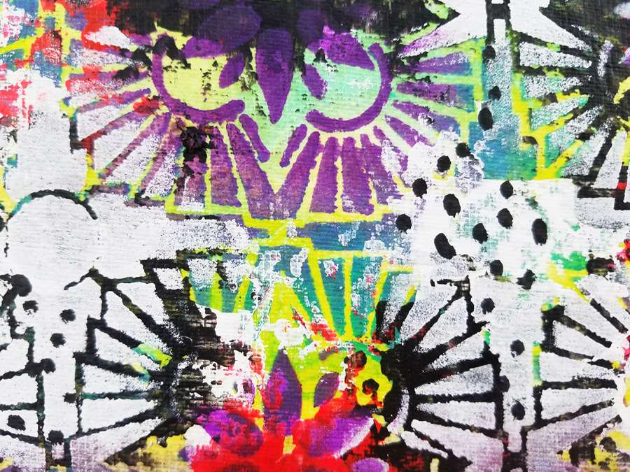
When I spread out Nathalie’s stencils I took a slightly different approach, a simple lamp sitting on a table with one stencil pattern for the tabletop and another stencil for the wallpaper behind the lamp, a third stencil for the lamp shade and a fourth for the base. A nice bonus: the stencil I chose for the wallpaper (Hamilton) also looks like rays of light in a subtle way! Feel free to use this sketch if you prefer that approach to the one I ended up using.

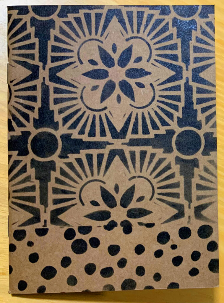
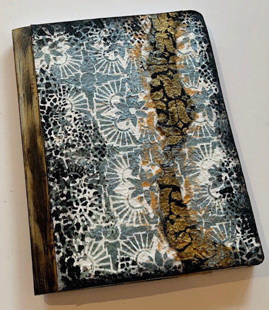
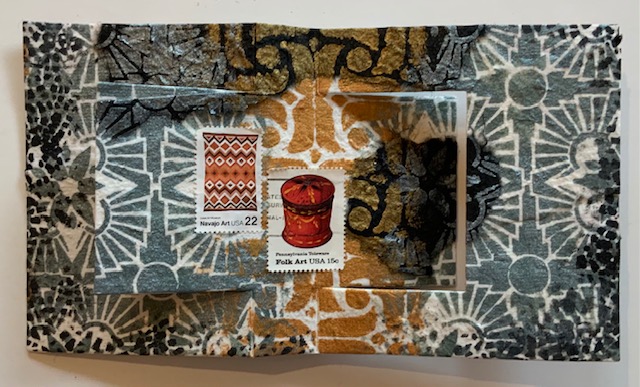
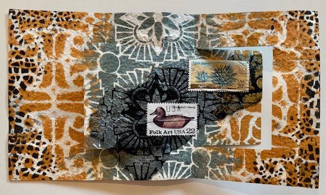
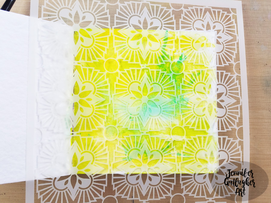
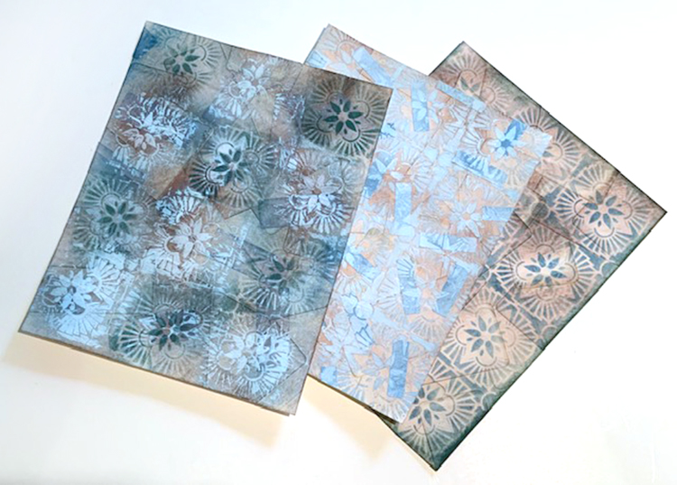
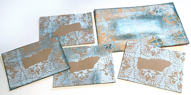
Using black ink or paint or color(s) of choice: Stencil the designs for the wallpaper (here I used Hamilton) and table top (here I used What’s the Point) onto the book cover. Stencil designs for the lamp shade and base onto ivory cardstock (I used the Crackle and ATC Mixup stencils). You’ll only need a few inches of stenciled cardstock for the shade and base.

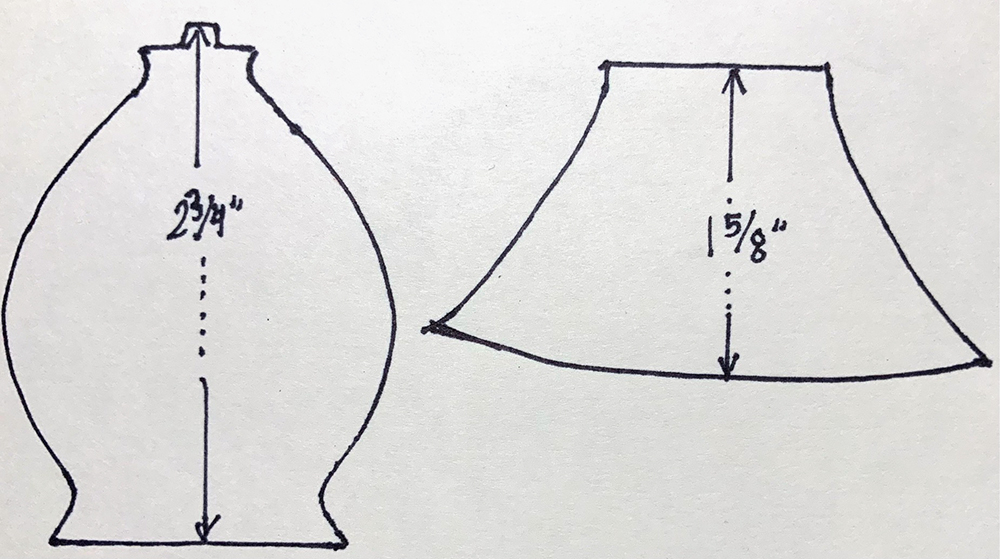
Create cutting patterns for the lamp shade and base by using my drawings or your own preferred lamp as inspiration. Lots of options for free designs on the internet. Cut out the patterns.

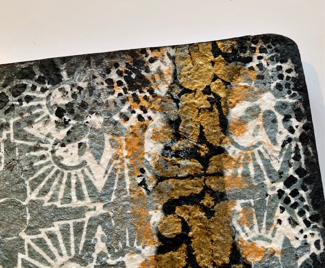
Position the cutting patterns onto the stenciled ivory cardstock. Draw around the patterns; cut out the shapes. Design strategy to note: I picked a portion of the crackle pattern for the lamp base that has a rounded look to add dimension to the otherwise flat shape. I carefully centered the pattern on the lamp shade.

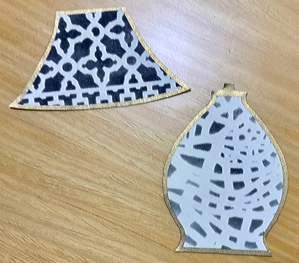
Edge the book cover, lamp shade and base with gold paint pen. Glue the shade and base to the cover.

Optional: For a pop of color create a belly band with knotted baker’s twine, ribbon, elastic, or yarn. Make sure the band is loose enough to easily slip on and off or easy to untie and re-tie. (Baker’s twine is tedious so my belly band will remain knotted.)

More Options:
*Start with a photo of your own lamp as the source for the cutting patterns.
*Use a mix of colors instead of only black.
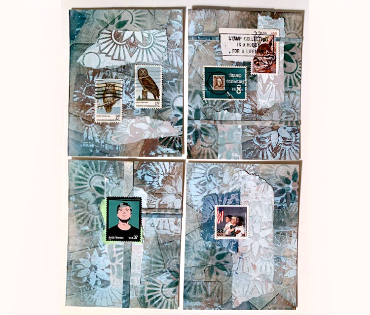
*Make a batch of stenciled cards – this is a very fast and easy project to do ‘assembly line’ style since the shapes are so simple.
*Stencil onto patterned paper instead of solid colors.
*If the finished look is too minimalist for your taste, embellish with pen doodling; add collage or develop dimension with colored pencils.


Thank you Judi! Love the thoughtful positioning of the stencils to suggest light and form!

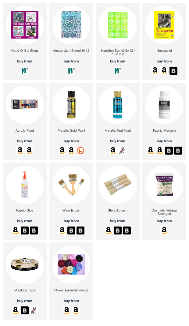
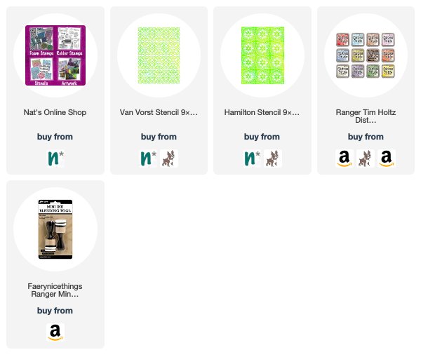
Give it a try: you can find all my Stencils in my Online Shop and here are some of the supplies Judi used:

Looking for more projects? Follow the Creative Squad on Instagram here.

Leave a comment

Creative Squad: Life in Bloom – Judi Kauffman

Hello from my Creative Squad! Today we have some gorgeous tote bags from Judi Kauffman using my Amsterdam and Hamilton stencils and this month’s theme: Life in Bloom – It’s been a long winter where we are and I’m dreaming of flowers and gardens and spring. Indulge us all in a project that focuses on one of Mother Nature’s most exuberant symbols of life: flowers flowers flowers!


I completed my “Life In Bloom” theme projects in late February, a week after getting my first covid vaccine shot. I will have been home for a full year as of March 18, but by the time you read these words I will have had my second shot and will be able to double-mask and head back out into the world – just in time to greet the new season. Spring!

I can’t wait… I can’t wait to see the iris, peonies, begonias, and other hearty perennials peeking up, ready to put in an appearance. And I can’t wait to go to Costco to buy some annuals to fill in the empty spaces. And a rotisserie chicken for dinner…I can almost smell the aroma of that aisle. Gee, I think I missed those trips to Costco more than almost anything else during my time at home.

Meanwhile, like many of you I have spent many hours cleaning closets and going through supplies. I found a trio of simple denim totes, two with flawed spots, and thought they’d be a great surface for a stencils-only project. Here’s how they looked when I started:

My concept was to create a flower pot/vase on one of the totes for a literal interpretation of the theme but stenciling the other two with more wonky shapes for a more abstract approach.

INSTRUCTIONS:

Using torn strips of newsprint, mask around the areas earmarked for painting and stenciling.

Using gold metallic or other light color acrylic paint and a wide brush fill the area to be stenciled. Optional: Mix paint with fabric medium.

Using a mix of stencils (I used Nat’s Amsterdam and Hamilton stencils) and two darker paints (shown: red and metallic teal) add pattern to the gold areas. Overlap stencils here and there. Allow paint to dry for distinct patterns, work wet-on-wet for less distinct designs (smudge paint at edges to add dimension – note right side of flower pot).

Embellish stenciled totes with knitted, crocheted, and/or frayed fabric flowers. Pleated hem tape makes an interesting stem for a single blossom. Sew in place or use fabric glue to adhere.  

NOTE: Embellishments shown are positioned for photography and are being ‘auditioned’ – nothing finalized yet! I plan on adding beads, embroidery, charms and more.


Thank you Judi – absolutely love the idea of bringing these totes to the farmer’s market or garden center!

Give it a try: you can find all my Stencils in my Online Shop and in addition to various beads and embellishments, here are some of the supplies Judi used:

Don’t forget to check out Nat’s Creative Squad on Instagram too: Each week we post projects, ideas, and inspiration for mixed media art.

Comments (1)

Leave a comment

Creative Squad: Light & Shadow – Judi Kauffman

Hello from my Creative Squad! Today we have some standard size composition books and 7×5″ flip cards from Judi Kauffman using my Hamilton, Amsterdam, and Crackle stencils and this month’s theme: Light & Shadow – In art and maybe also in life, the balance between light and shadow is an important consideration. Play with this equilibrium in your art and show us how the two sides work together.


Light Wins!

This was an awful year. My first thought when I heard this month’s theme, “Light & Shadow,” was to design something in black-on-black with just a tiny hint of white or yellow – a very direct interpretation of how awful the last ten months have seemed. Dark. Very, very dark. I have been home since March and have no idea when I’ll be able to go out into the world again.

And yet, when I think back through these challenging times and look toward the unknowns still in front of us, it turns out that light wins, not darkness or shadow. After all, we solid, upright human beings cast shadows only when there is light. So I switched direction and decided to give some composition books a new look with a mix of stencils on black and white mulberry paper using sparkling metallic paint – one to give and one to keep. And, of course, I made cards while I was at it – one to match the notebook.

For the books –

1. Adhere mulberry paper to the front and back of a composition book, using predominantly black for the covers of one of the books and predominantly ivory for the other. Tear papers and layer as shown or as you prefer. Trim at the edges and avoid the black tape binding of the books. Design strategy: Choose one stencil that has a bolder, simpler allover pattern and another that is intricate for contrast.

2. Stencil Hamilton in Gold and Amsterdam in Patina on the covers, alternating patterns in random vertical stripes and overlapping paints to blend.

3. Stencil Crackle in Black randomly at the edges of the covers. Edge the covers with a bit of black paint. Design Strategy: Crackle is symbolic of the fragility of life, and yet when the pattern is used at the edges of the rectangles it acts to unify.

For the card –

1. Adhere two sheets of ivory mulberry paper back to back with textured sides facing out. Adhere torn pieces of ivory and black paper. Mulberry paper is floppy, layering adds stability. For extra stability add a piece of cardstock between layers.

2. Hand- or die-cut a horizontal flip card from the sheet. (Shown: AccuCut A7 flip die)

3. Stencil both sides of the card with Hamilton and Amsterdam patterns (same Gold and Patina paints as on notebooks). Optional: Add a bit of Crackle pattern in Black. Edge with smudged-on Black.

4. Embellish with canceled stamps that pick up the colors of the paints.

Bonus cards –

1. Instead of mulberry paper, make cards from heavyweight cardstock. Use only one of the stencils or a combination of several.

2. Embellish with canceled stamps that pick up the colors of the cardstock and coordinate with the paints.


Thank you Judi! Just love the ideas behind these designs – something that we can all relate to this year.

Give it a try: you can find all my Stencils in my Online Shop and in addition to canceled stamps, here are some of the other supplies Judi used:

Don’t forget to check out Nat’s Creative Squad on Instagram too: Each week we post projects, ideas, and inspiration for mixed media art.

Leave a comment

Wild and Free – Jennifer Gallagher

Hello from my Creative Squad! Today we are starting a new theme for the Squad for August and we have Jennifer Gallagher kicking it off in her art journal with my Hamilton Stencil and my Art Deco stamp. This month’s theme is: Wild and Free – After so many months of careful living, it’s time to go Wild and Free… In our Art Journals! Go a little crazy in there and live it up with bright colors, exuberant mark making, bold colors – however you want to go a bit bananas. It’s time to let loose! 


This month we are going wild in our art journals using some of our favorite n*Studio products. I threw caution to the wind and layered lots of bold color and pattern along with mark making and a fun stamped focal image. It’s super easy so let’s get started.

I started by applying a layer of clear gesso onto a page in my square Dina Wakley Media journal. I applied a little Distress Stain in Mustard Seed on the left hand side of the page and then spritzed some water over it. I held the journal up so the color would run down the page.

After that dried,I applied some olive green acrylic paint in some of the open spaces with a cosmetic sponge.

Next, I spritzed on some Aquamarine Marabu Art Spray and added a small spritz of water. I blew the color around with an air puffer.

I chose Nat’s Hamilton Stencil and placed it down on the page, working to center the design from the inside of the page. Then I applied Blackberry, Cobalt Teal Hue, and Emerald Green acrylic paint with cosmetic sponges. 

Using an old gift card and some white acrylic paint, I scraped white in various areas of the page.

I repeated the process with fluorescent pink and black.

To bring back some of the design, I laid the stencil back over the page, exactly where it was before. Any place that had black paint was painted white through the stencil.

Using a black posca pen, I added some dots in a few of the white areas.

Using the Art Deco stamp from Nat’s Stroll Around the Block Set, I stamped a focal image onto multifarious card with Versafine Clair ink ink Nocturne. Before applying the image, I splattered some Distress Spray in Picket Fence around the page. Once dry, I fussy cut the image out and applied it to my page with 1/8 inch scor-tape.

The final touch was to add a few stickers from Tim Holtz idea-ology Big Chat and Small Talk sticker sets. I hope you have enjoyed this art journal page. I really went wild with the layers, colors, and pattern. Be sure to play along with us this month and create something bold in your art journal.


Thank you Jennifer! Loved watching this wild background come together with all those yummy layers :)

Give it a try: you can find all my Stencils and Rubber Stamps in my Online Shop and here are some of the other supplies Jennifer used:

Feel inspired? Working on something yourself that you’d like to share?  I love to see how you interpret our monthly themes. Email me how you used my stencils and stamps with the theme and email me an image – I would love to share your projects in my next  “n*Spiration From Around the Globe“.

Leave a comment

Stencil Inspiration from my Creative Squad

Our friend and Creative Squad member Judi Kauffman surprised us with some envelopes and 4”x5.25” collages that she created with her newest Nathalie Kalbach  9”x12” stencil – Hamilton!

She dipped into her stash of vintage office supplies and covered three sheets of cardstock with randomly overlapped mailing labels.

She sponged them with dye inks before she stenciled the sheets using my Hamilton stencil with more ink and white acrylic paint.

She cut each sheet into four rectangles (sized for A2 card fronts or to put into her Traveler’s Notebook) and added more stenciled texture with torn newsprint scraps that were protecting her work table.

Her finishing touches: Canceled postage stamps and a few straight, thin strips from the cardstock sheets.

While she was at it, she stenciled a batch of envelopes with the Hamilton stencil too!

Thanks for sharing Judi!

Leave a comment

The Stencilfied Journal – Prompt 11

My wonderful friend Tina Walker is at it again – she invited several people to join her Stencilfied Prompts. The prompts are music related and each week she is posting a song. You can be inspired by the lyrics, the video, the album cover or anything related and the only restriction is that you have to use StencilGirl Product Stencils. Here is my take on Prompt 11:

This week’s prompt is “Cat’s in the Cradle” by Harry Chapin. A good reminder to live in the now and to not use too many rainchecks ;)

I used my Van Vorst Stencil as well as my Hamilton Stencil and created the background by using Distress Oxide Inks with the stencils.

Love the soft chalky look.

Here are the Stencils and supplies I used:

Leave a comment