Art Stroll

Art Stroll: Hilma af Klint at Guggenheim, NYC

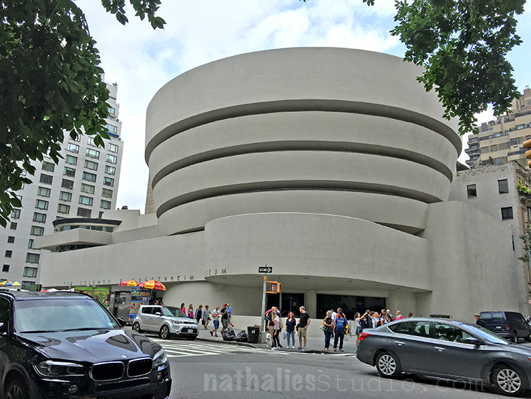
Last week Kim and I went to the Guggenheim to see the Hilma af Klint (1862-1944) “Paintings for the Future” exhibition. I had been excited to see the exhibition for a couple months now and I wasn’t disappointed.
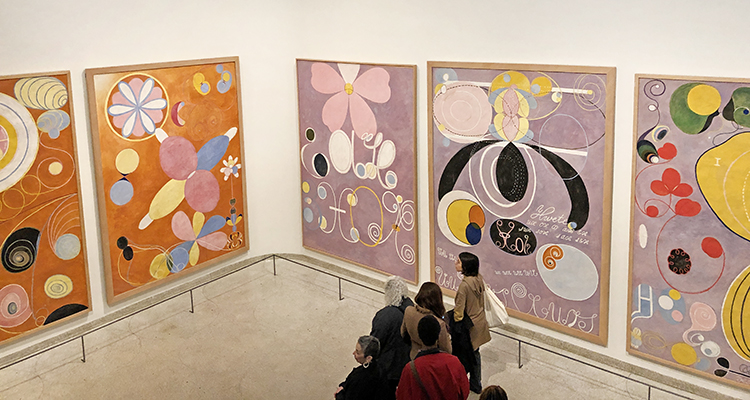
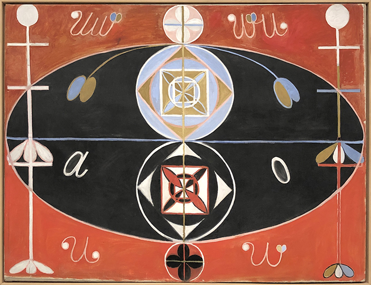
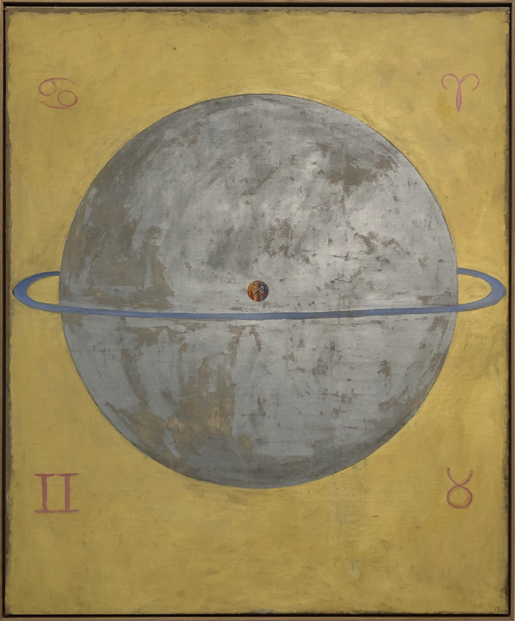
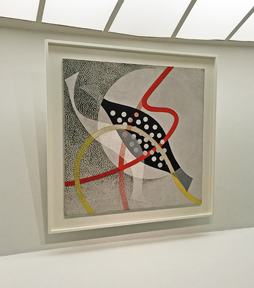
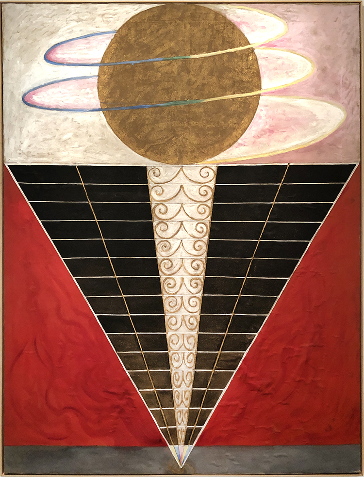
Klint radically started creating abstract paintings years before Kandinsky, Mondrian or other that are called the pioneers of abstraction would change their own artwork from representational content to abstract paintings.
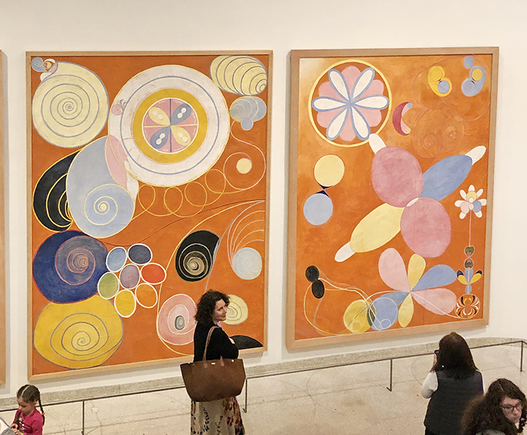
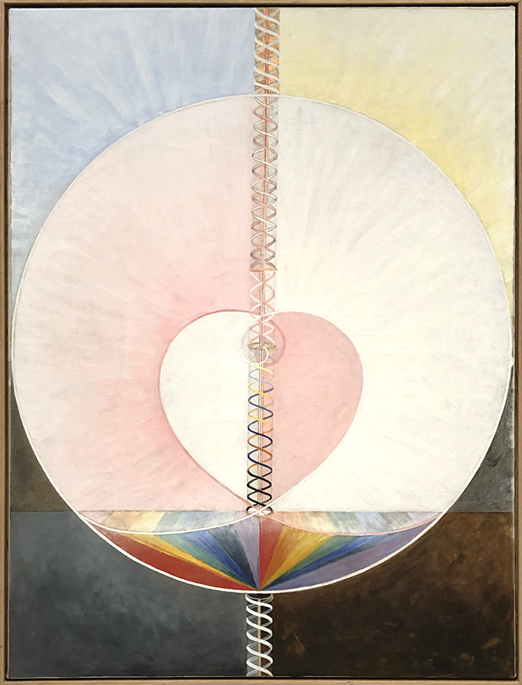
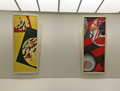
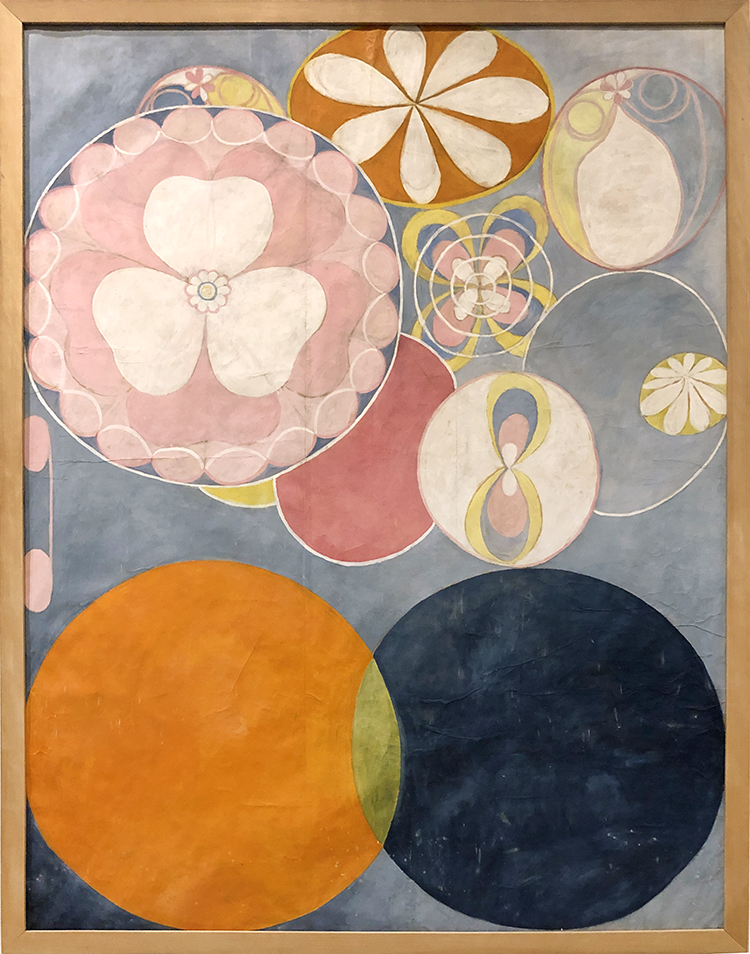
The size and colors of her early paintings are just mesmerizing and such a happy delight to see – instant feel good right in front of those.
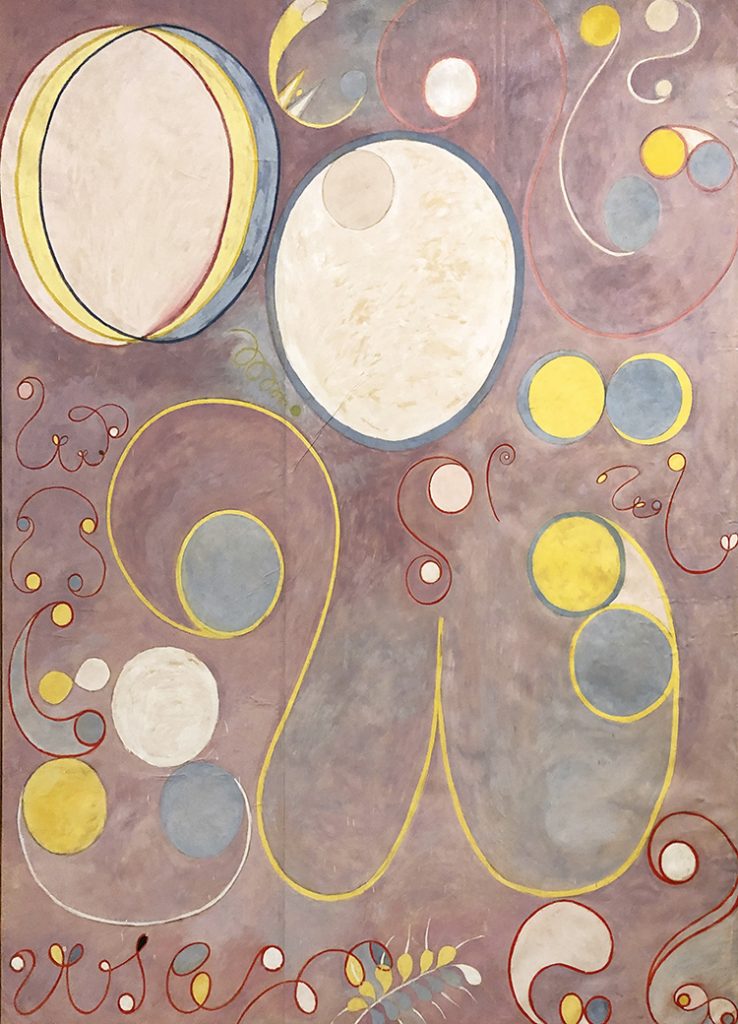
It also struck me how immensely feminine those paintings are.
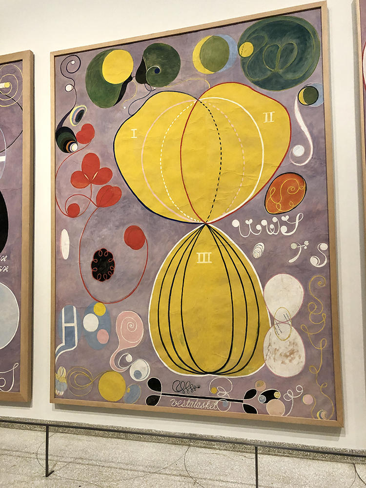
The color schemes are still muted colors but light and the forms are round and free.
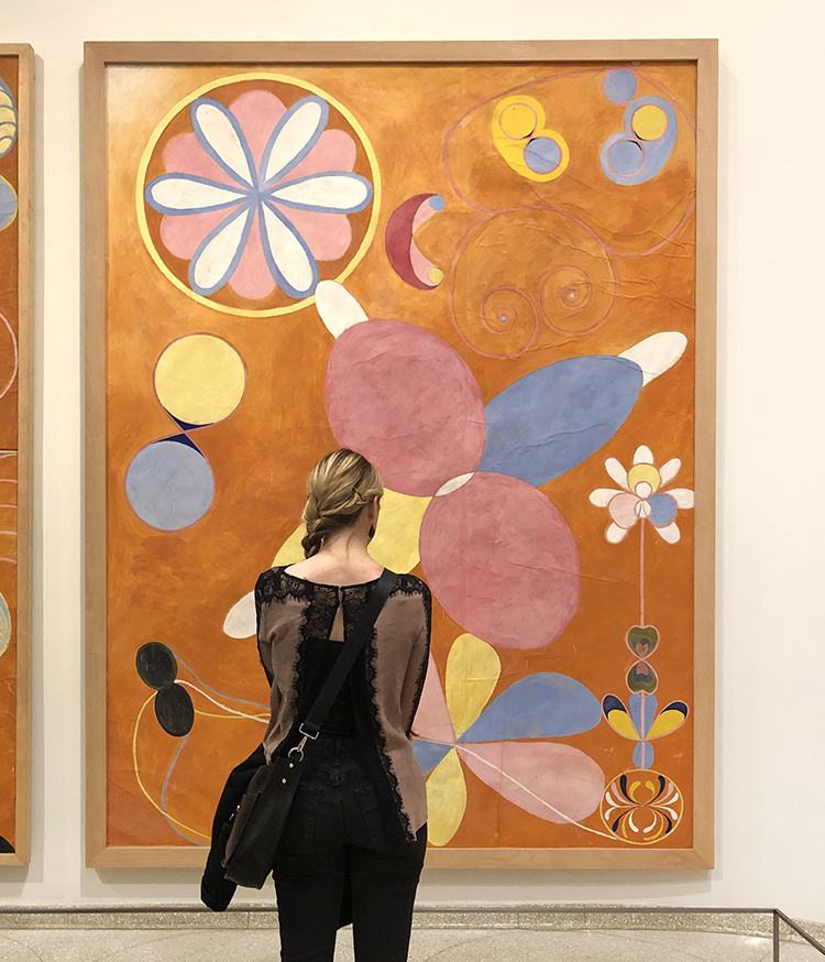
These ten earliest huge paintings of Klint go through the lifespan of humans from birth to old age.
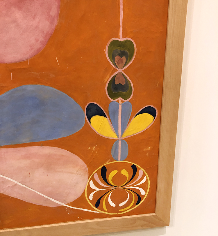
Interestingly enough Klint kept most of her groundbreaking paintings private, because she was convinced that the world was not ready yet to understand her work. In her will she stipulated that a lot of her work was not be shown for twenty years following her death. Ultimately her abstract paintings remained all but unseen until 1986 – 80 years after she painted some of her most prolific abstract paintings in 1906.
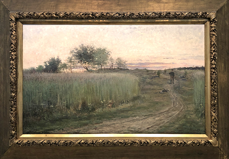
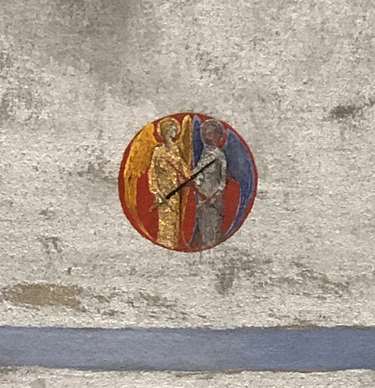
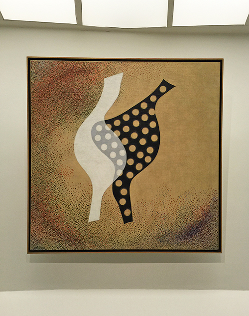
The painting above is a sample of what would be seen mostly of her work. It is just so mind blowing. Given that abstract male painters several years later caused insane outrage about their work, she was probably right that as a female artist on top, people would have not understand her art at all.
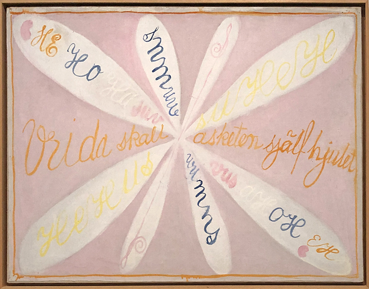
It makes you rethink art history though – it messes with our perception of the timeline of abstract art and of the mainly male key figures of this movement as well.
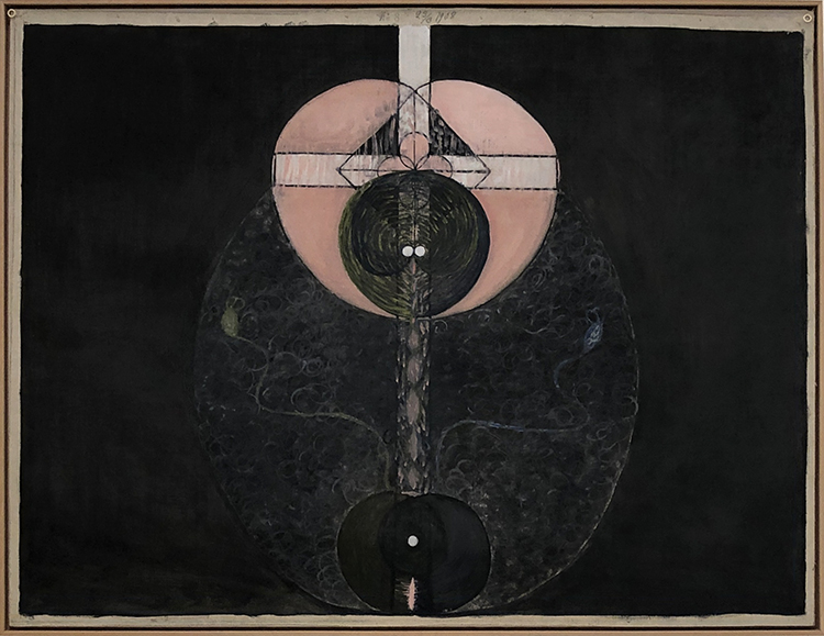
In 1896 Klint held regular séances with four other women. She had begun attending séances as a teenager, using them as a way to contact her younger sister, who had died young. Spiritualism was a big thing back then and the group wanted to obtain a direct access to a higher order of knowledge.
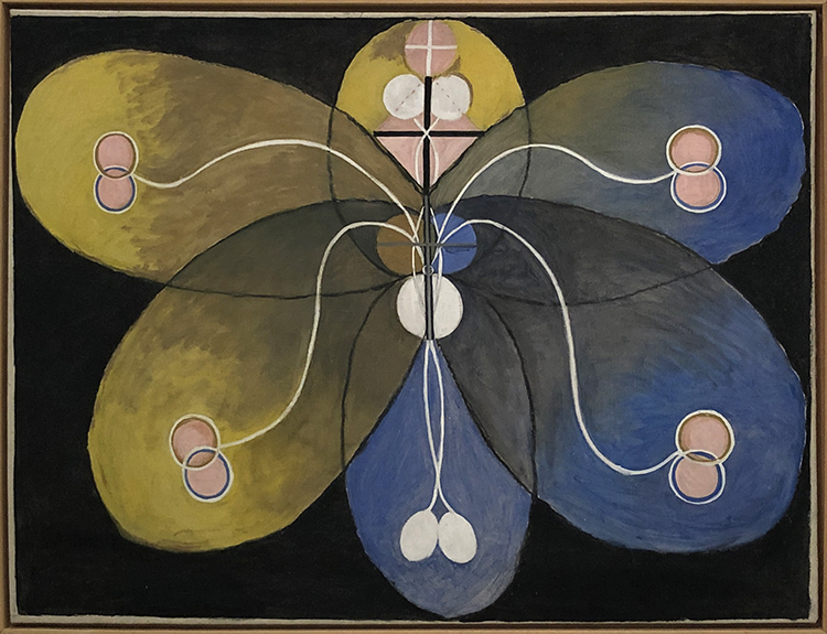
Klint worked earlier as a biological illustrator and her scientifically styled diagrams and her esoteric experiences mixed in her paintings.
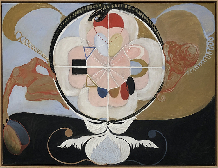
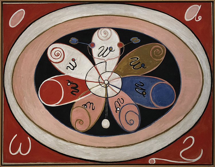
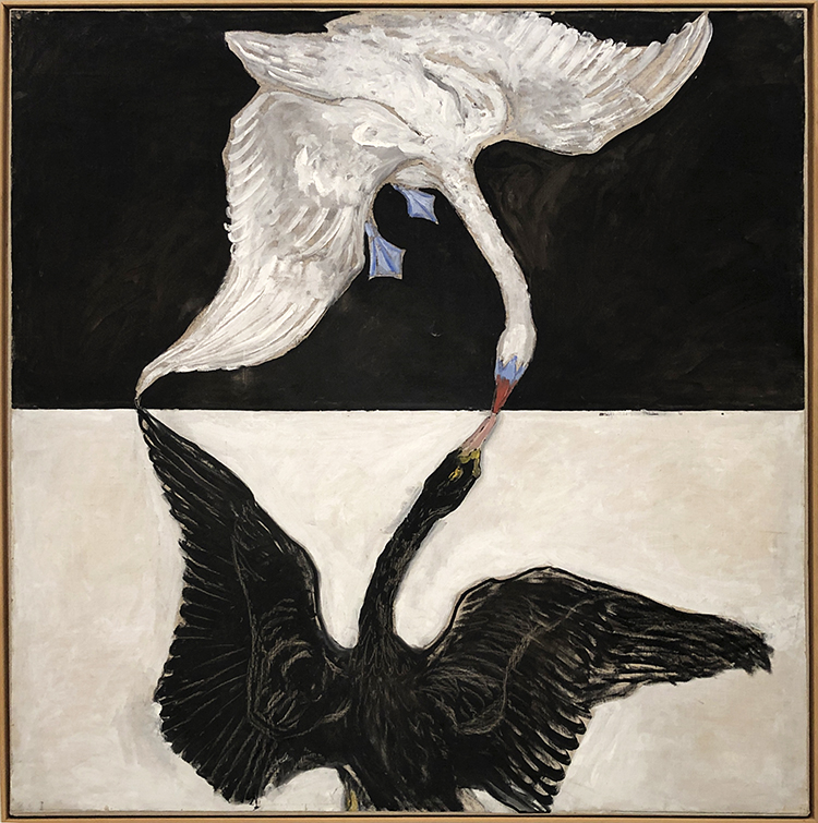
The swan represents the ethereal in many mythologies and religions and stands for completion in the alchemical tradition.
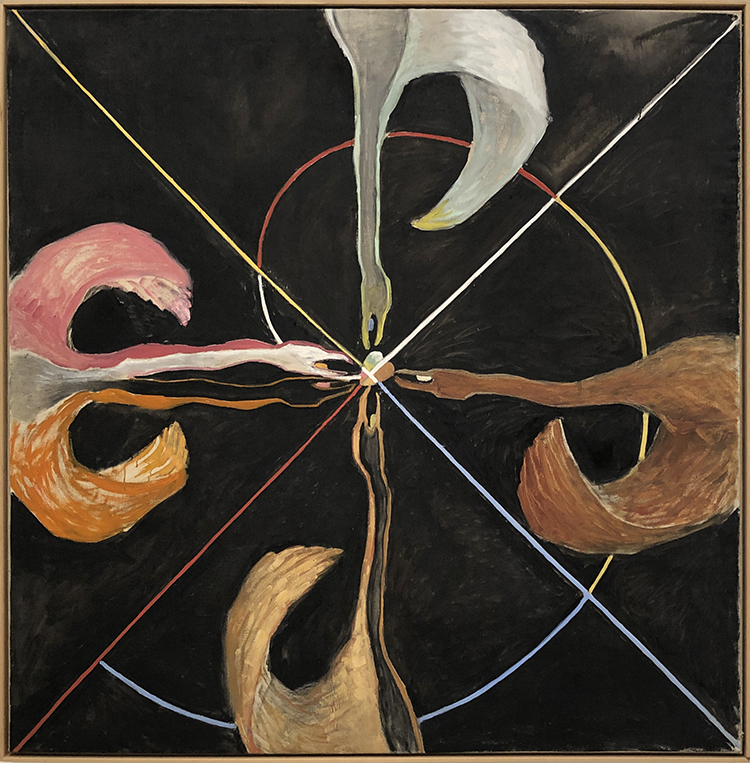
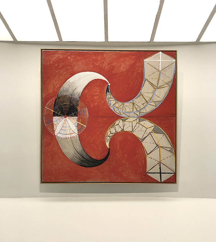
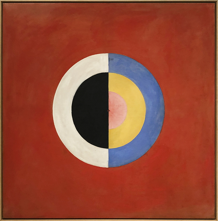
Klint often incorporated insights gleaned from color theory in her paintings. For Klint certain colors represented certain significances. Blue for example represents the female, yellow stands for male, green for the unity of the two.
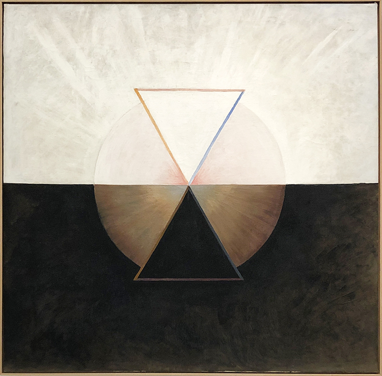
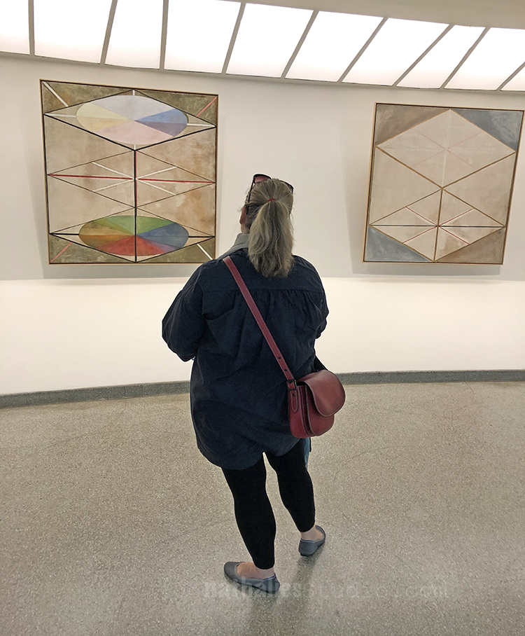
In 1906 an otherworldly spiritual guide commissioned Klint to prepare a message to human kind and so she painted about 193 paintings containing the spirit of the world. Those paintings are known as the “Paintings for the Temple”
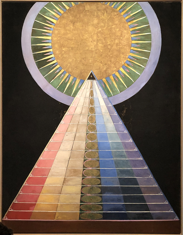
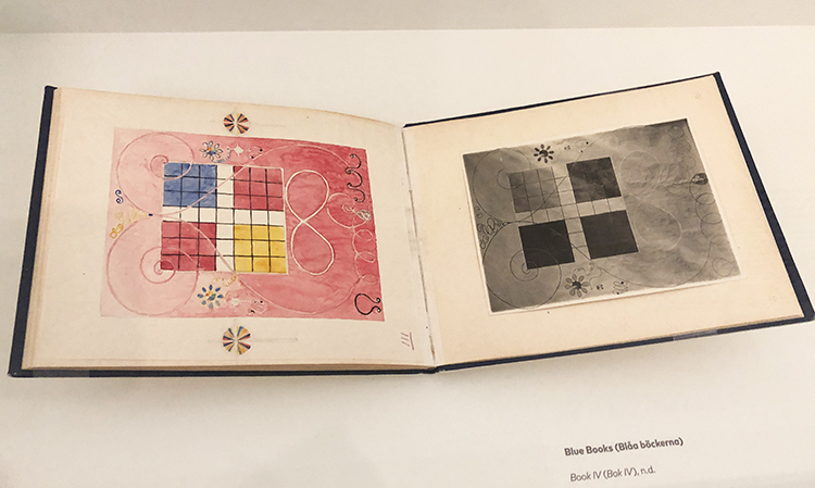
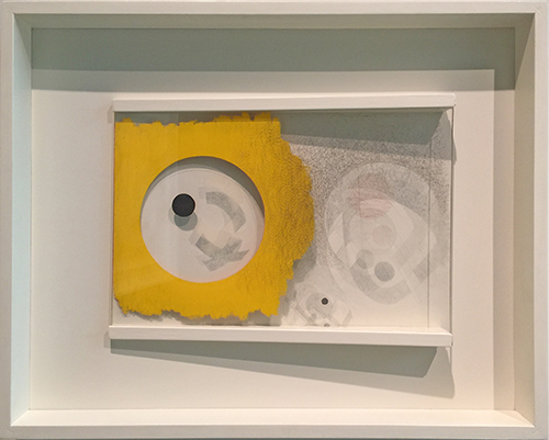
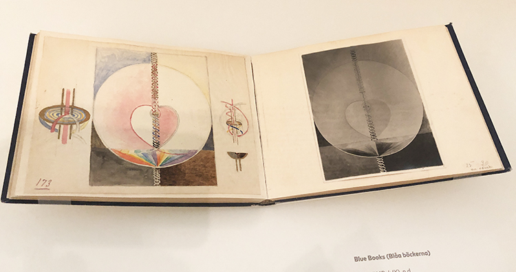
Not all of Klints work were kept secret by her. The Blue Books were a tool that Klint created to show trusted viewers her paintings. They contain black and white photos and next to them carefully rendered watercolor reproductions.
At the time she made those works, the art world was generally dismissive of work made by women and on top many critics did not take abstraction seriously.
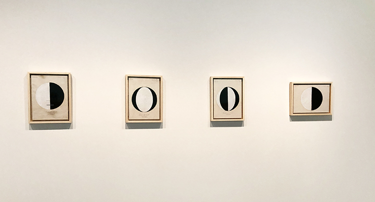
“…in 1920, she made a series of small works that begins with a single circle, half black and half white, called “Starting Picture”—the world as a balanced duality, physical and material, dark and light.

Subsequent entries in the series offer similar circles, differently divided up between black and white: one divided into four alternating slices; one with black crescents framing a white center; etc. The titles suggest they are supposed to represent different graphs of the great spiritual traditions: “The Current Standpoint of the Mahatmas,” “The Jewish Standpoint at the Birth of Jesus,” “Buddha’s Standpoint in Worldly Life,” and so on.”
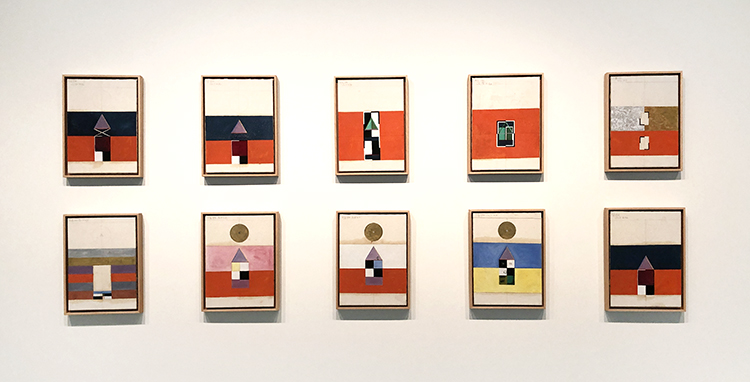
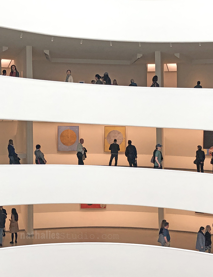
Klint made sketches for a spiraled building that would show her work ascending the spiral case to the heaven ….! “In many ways, the Guggenheim retrospective fulfills the artist’s long-buried dream.”
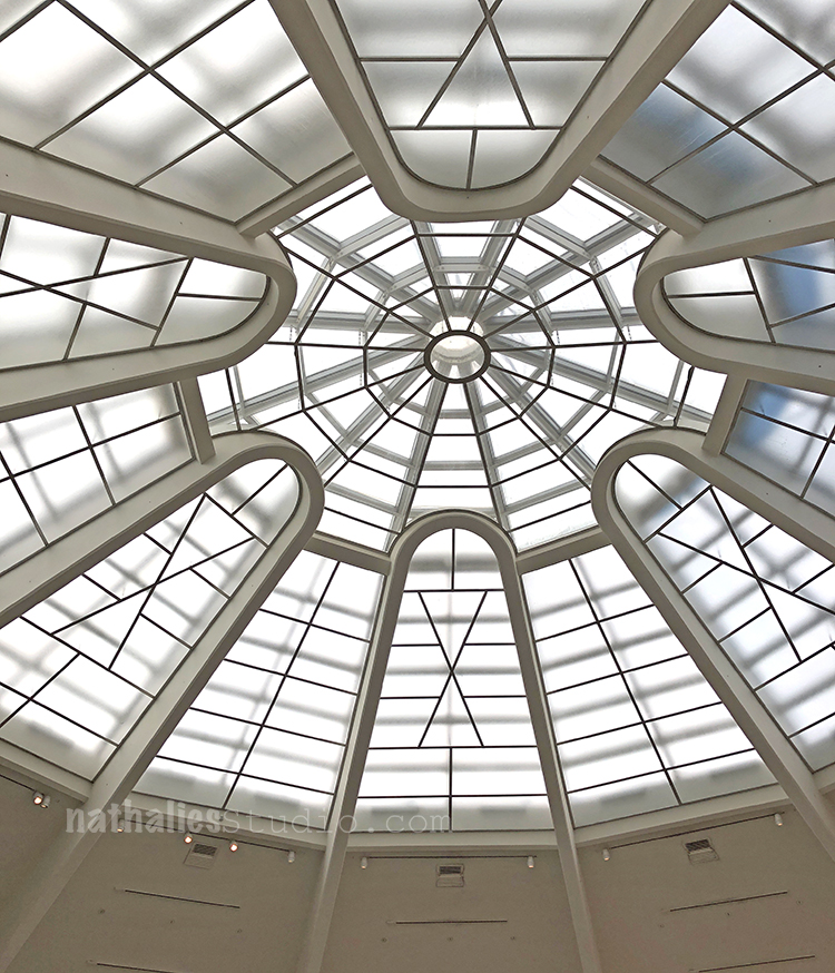
This was an uplifiting and thought provoking exhibition. Did I decipher her work? Nope …but …I was content and happy just looking at it and make me feel good. Nothing wrong with that …and hey …maybe that was the message all along ;)

Comments (4)

  • Sue Clarke

    |

    It is amazing to me how intense her colors are and yet they are light pastels in many paintings.
    I totally felt the different ages of the first grouping (even before you pointed it out).
    I want to look for a book about her life. Kline sounds like quite the woman and painter!
    Thanks Nat.

    Reply

    • nathalie-kalbach

      |

      Thanks Sue for joining! Yeah I am also very intrigued about her life!

      Reply

  • ARHuelsenbeck

    |

    Nathalie, thank you for this fabulous article. You’ve educated me about an artist I didn’t know.

    Reply

Leave a comment

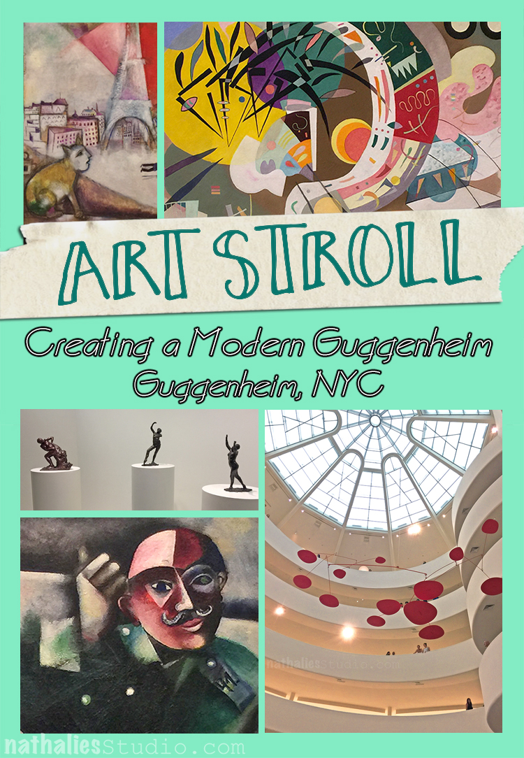
Art Stroll: Creating a Modern Guggenheim, Guggenheim NYC

A couple weeks ago when my godson visited we went to the Guggenheim Museum. The exhibition Creating a Modern Guggenheim showed a collection of Modern Artwork by six major art patrons. I thought it was a great way to have a walk through Modern Art and major Modern Artists and see if my young visitor would enjoy it.

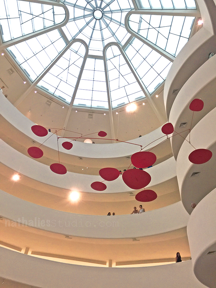
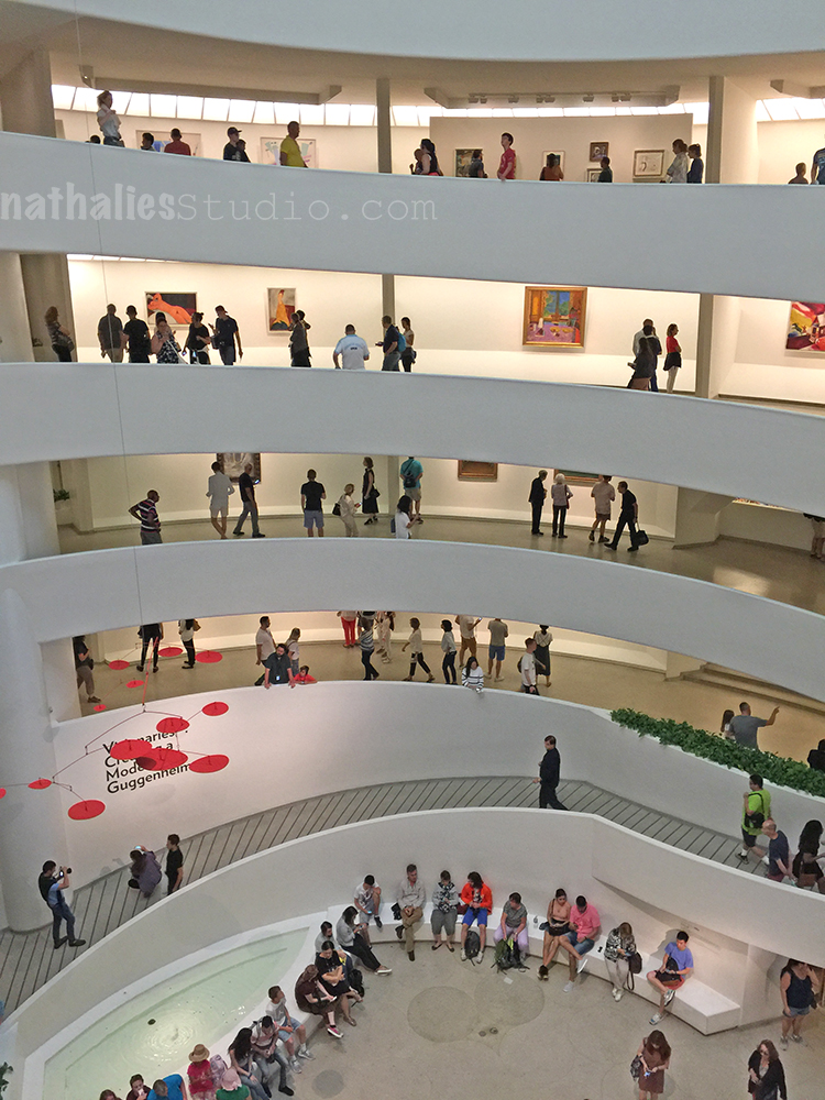
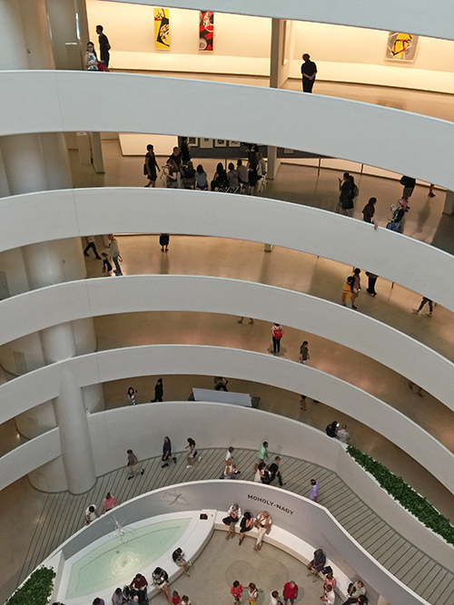
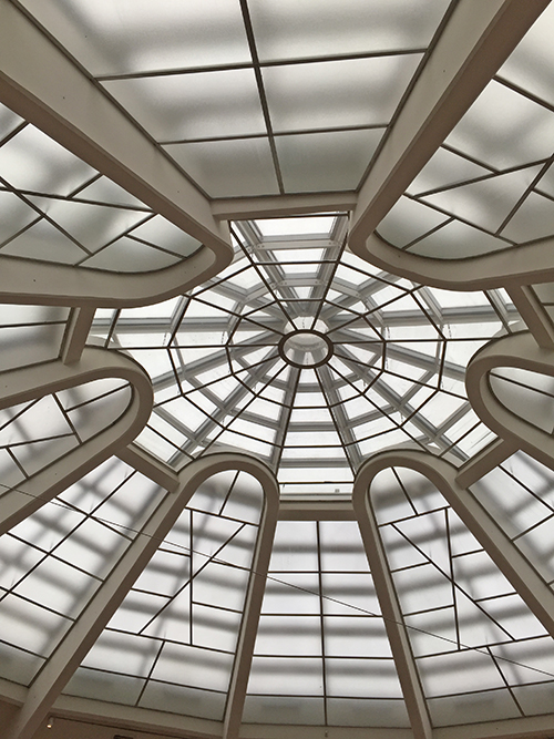
He totally enjoyed the building – which I love myself very much.

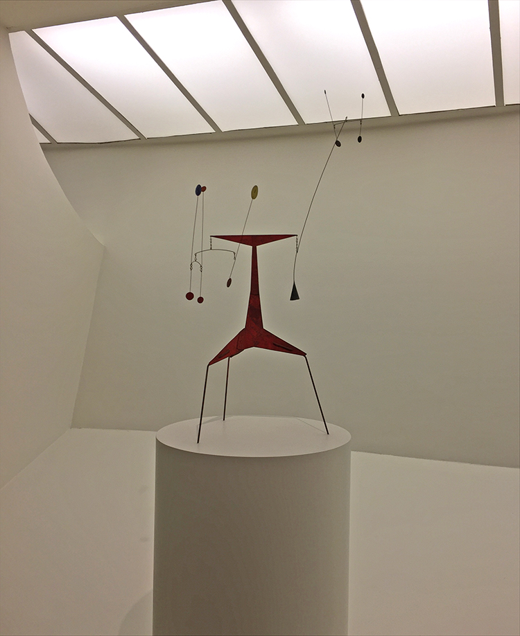
And what a wonderful environment for this beautiful Calder Mobile!

It was fun to see more Calder Mobiles after just having been to the Whitney Exhibition on Calder.

What I loved about the collection was that there was a lot of early works by famous modern artists displayed and it was wonderful to see how from those early works they developed their distinctive styles later or dabbled in different areas – for some it felt as if you saw a study of their later work.

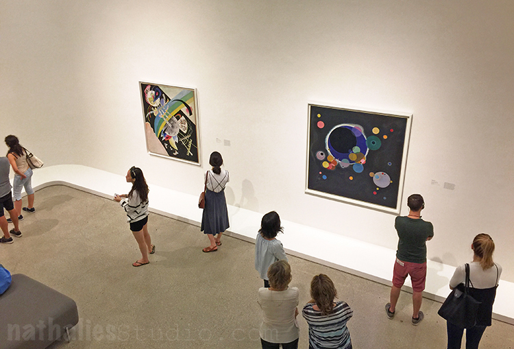
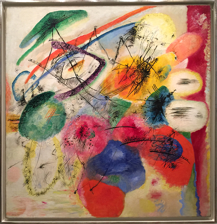
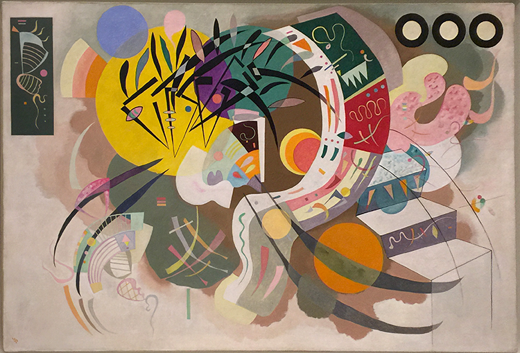
Two Kandinsky’s – the top one from 1913 and the one below from 1936. I loved seeing those two and see how his artwork was still the same and yet changed.

Which one of the two do you like better?

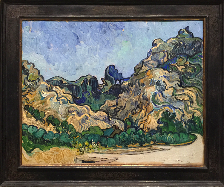
Beautiful van Gogh – It makes me want to try this swirly impasto style with some of the landscapes I saw during my recent travels through the Southwest.

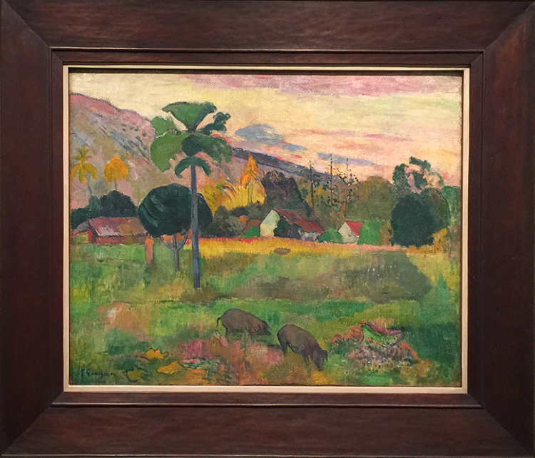
An early Gaugin

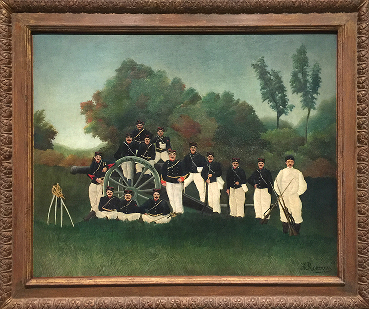
An early Henri Rousseau – so tamed and restricted- I love his later paintings so much more. check him out!

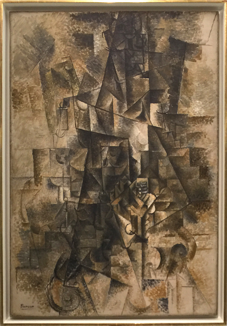
Picasso -my godson did not like this at all – I could tell he wasn’t that much into cubism in the first place but all the earth tone colors totally put him off.

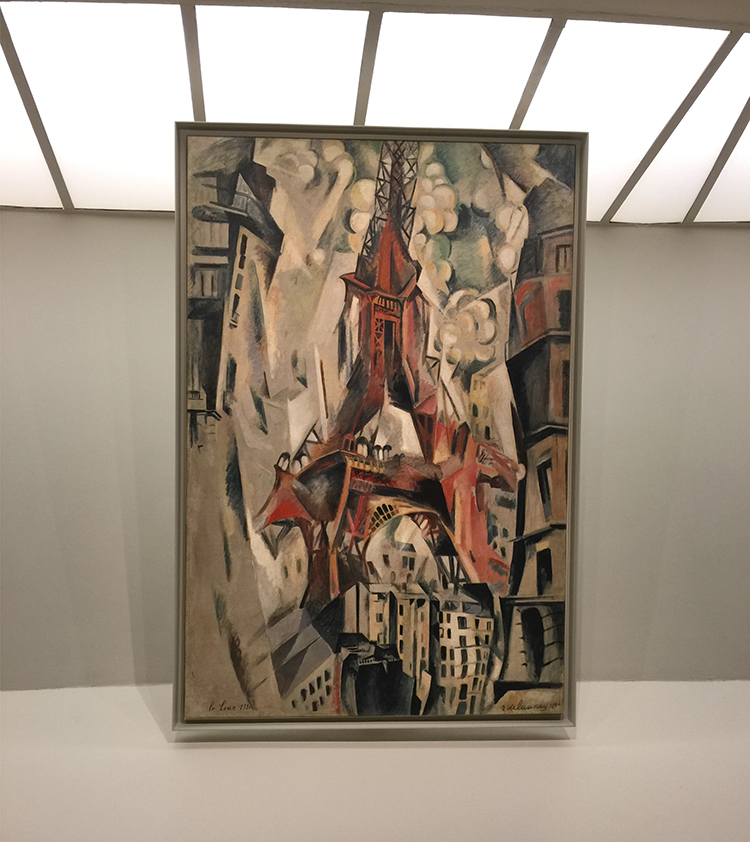
an early Robert Delaunay – gosh I love this one – and wow so different from his circular colorful forms later

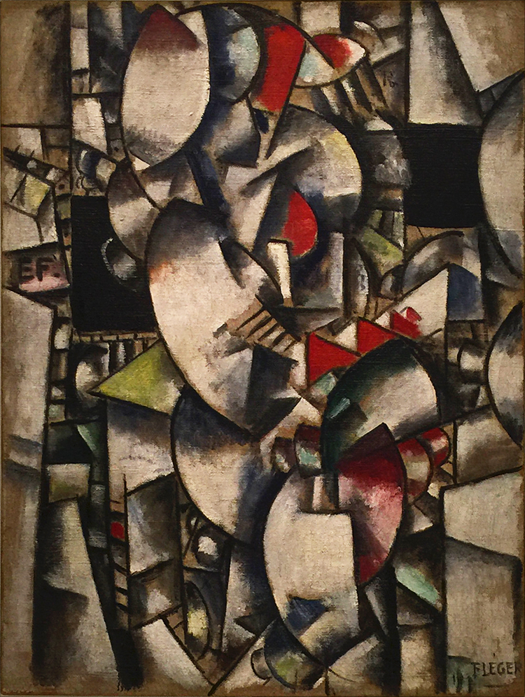
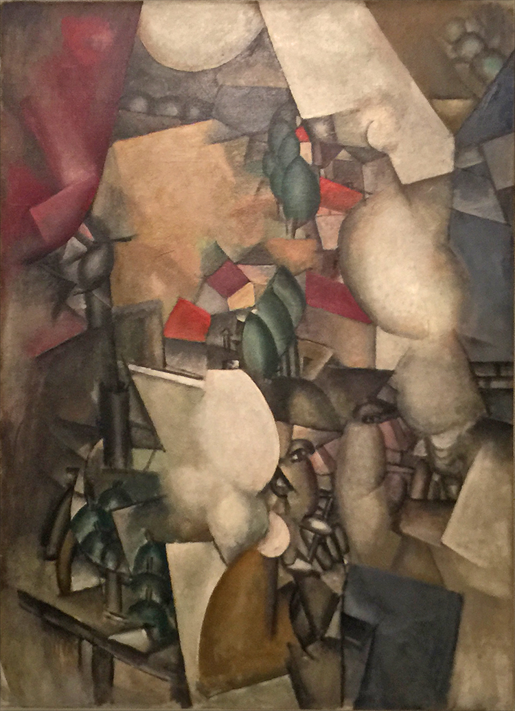
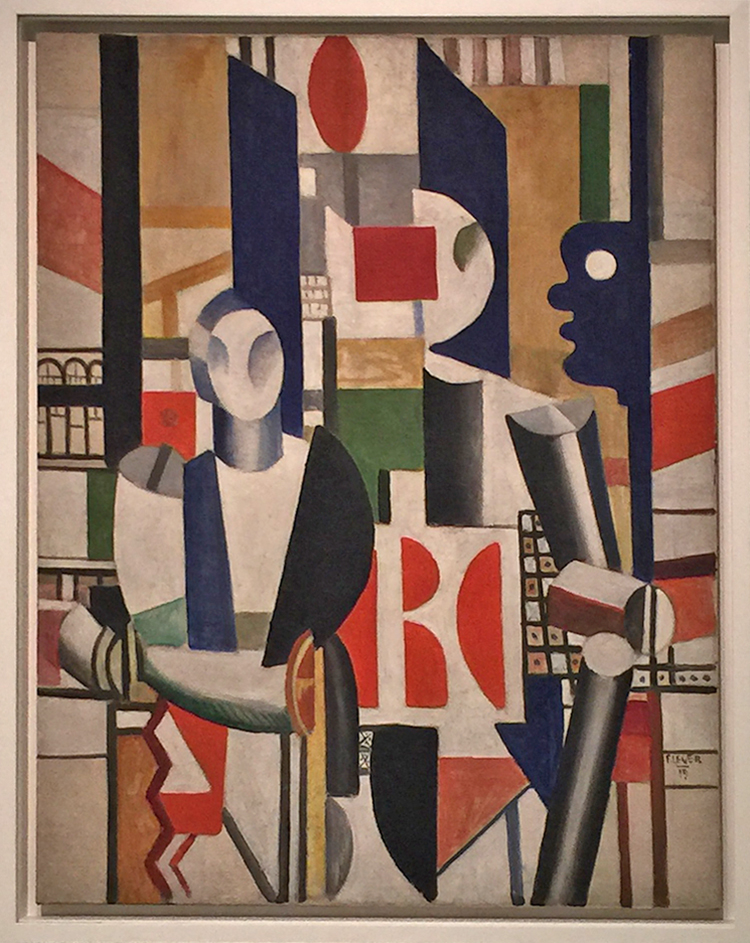
Fernand Leger – above and below also dabbling in the style of cubism of the time and then later finding his own cubism style.

Here is a later one below

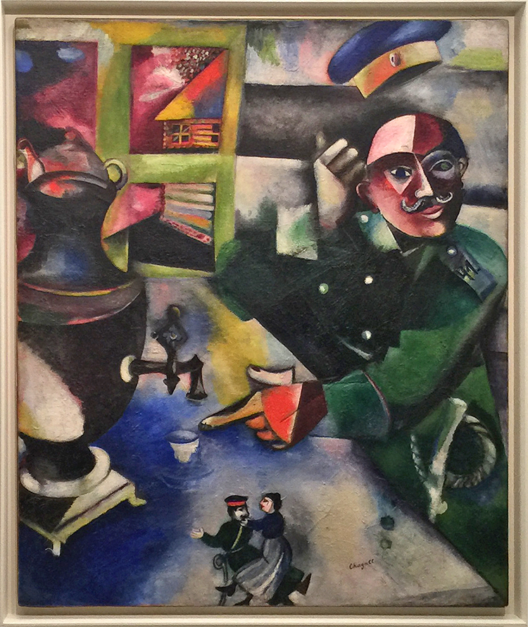
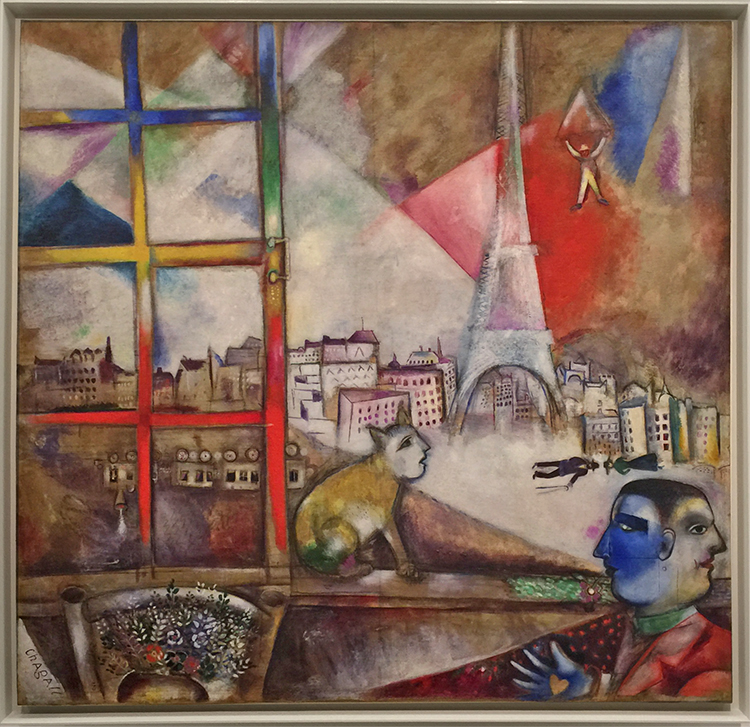
A Chagall below- …the colors are so obviously him

but the subject and painting itself …interesting …

This one by him I love love love! I cannot stop looking at all the details!

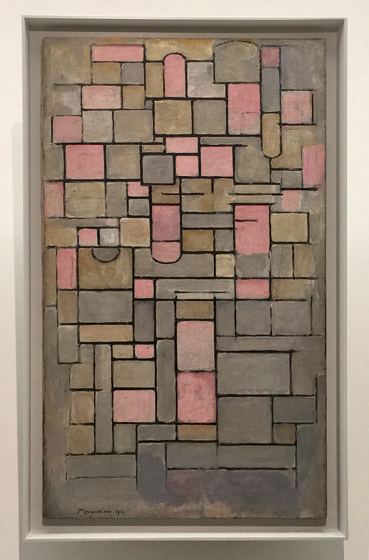
An early Piet Mondrian – uniquely his style but not yet at the primary color grid.

It was a massive collection of paintings and while I enjoyed it I would have loved staying longer or listening to the audio explanations of some but …there is only that much time a 17 year old wants to spent at a museum ;)  He wanted to go and I wanted to make sure he would not regret that by being held hostage there for longer than he wanted – hahahah ;) Hope you enjoyed the little Art Stroll.
Leave a comment

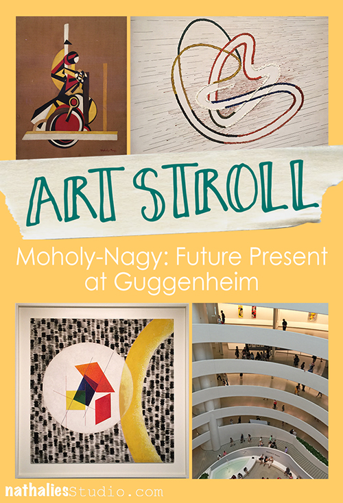
Art Stroll: Moholy-Nagy: Future Present at Guggenheim

KalbachNagyCollage

The retrospective of Laszlo Moholy-Nagy at the Guggenheim – Future- Present- was Andrew’s and my second stop for an art stroll a couple weeks ago.

KalbachNagy01

Meandering from bottom to top in a spiral his work developed from the 20s to the mid 40s in front of the viewers eyes.

KalbachNagy27

KalbachNagy28

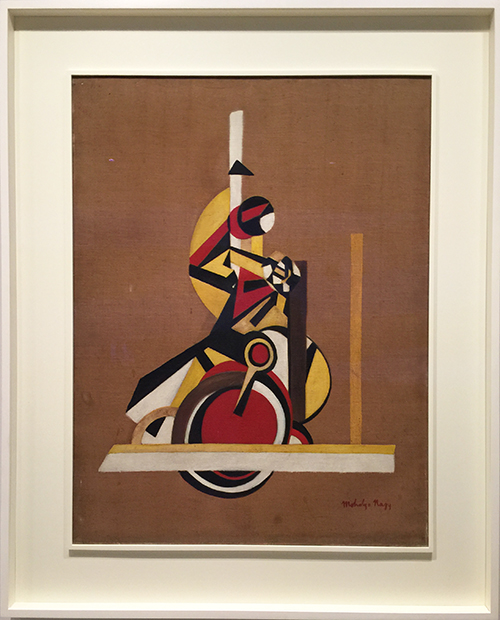
The Bicyclist (Still Life) Moholy-Nagy, 1920-22, Oil on Canvas
I loved seeing this and how the geometric shapes evolved into something else with time.

KalbachNagy26

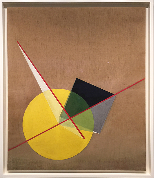
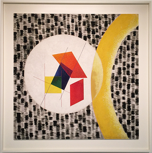
Yellow Circle and Black Square (Gelber Kreis und schwarzes Quadrat) by Moholy-Nagy, 1921, Oil and Graphite on Canvas

KalbachNagy23

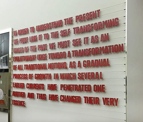
Moholy-Nagy believed that art could be a vehicle to for social transformation and was combining technology and fine art elements. He experimented with a wide variety of mediums.

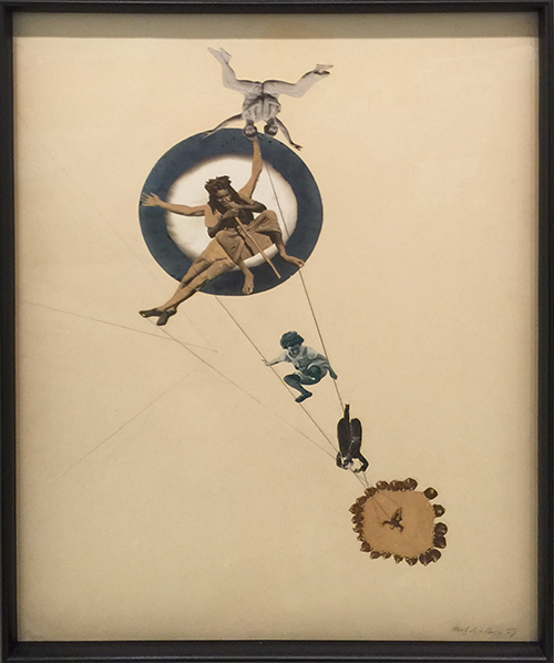
Coming from the Dadaglobe Exhibition Art Stroll just a couple hours before- we loved seeing the artwork below. Moholy-Nagy who was born in Hungary-Austria in 1895 moved to Berlin in the 1920s where he met the Dada artists who influenced his work.

KalbachNagy22

Between Heaven and Earth (Zwischen Himmel und Erde) by Moholy-Nagy, 1923, Photomontage (gelatin silver prints, including one photogram; photomechanical reproductions and graphite)  on paper

KalbachNagy21

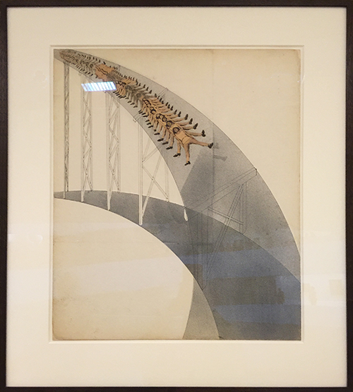
Slide (Rutschbahn) by Moholy-Nagy, 1923, Photomontage (cut and pasted printed papers, sprayed gouache, ink and graphite) on board

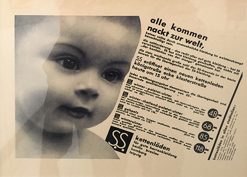
I also loved his modern and funny advertisements. Again of course it is only funny when you can read German

KalbachNagy20

but so the one on top here says “everyone is born naked to this world and should not be disadvantaged in the daily struggle of existence by ugly clothes. The birthright that everyone should access to good clothing was realized by SS (Schröder-Spezial) ” – I guess they had a way longer attention span for advertisements back then – lol

KalbachNagy19

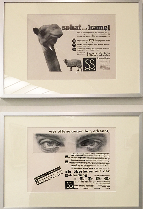
The top here is showing off the good material their clothes are made off and …and the one on the bottom let’s you know if you walk around with open eyes you will spot how superior the clothes of this menswear house is.

Advertisements for Schroeder-Spezial – a menswear chain store, 1930

KalbachNagy18

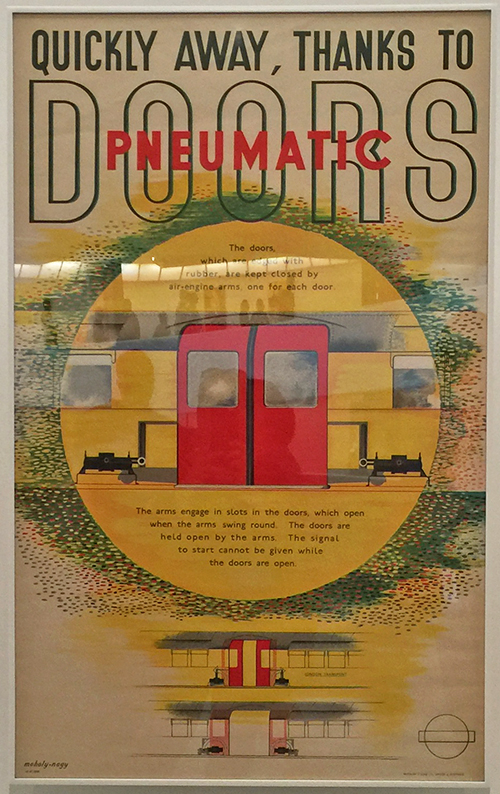
Advertisement for the London Underground, 1937


KalbachNagy17

CH Beata I by Moholy-Nagy, 1939, Oil and graphite on canvas

In 1937 he was appointed to head of New Bauhaus in Chicago and later he opened his own School of Design there. I love seeing traces of the beginning artwork still there but developed more into something else.

KalbachNagy16

KalbachNagy15

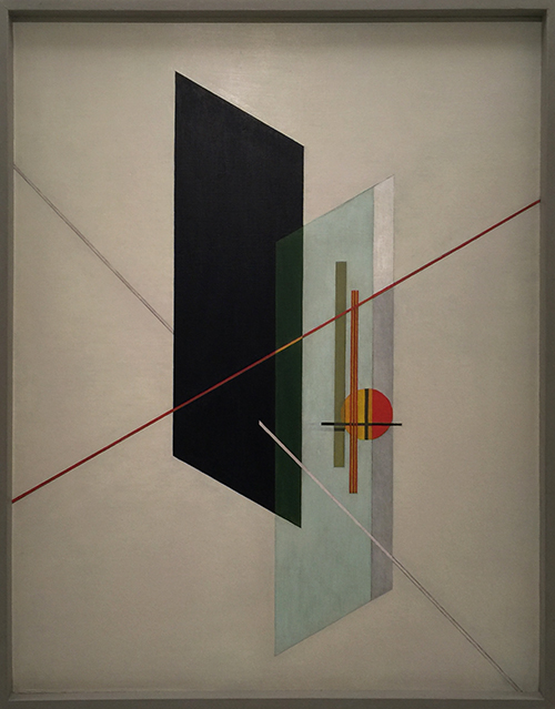
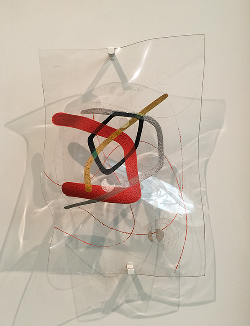
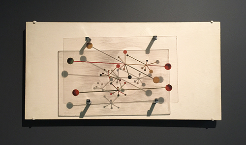
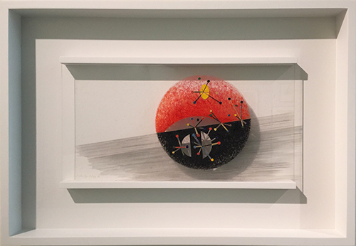
Space Modulators:

KalbachNagy13

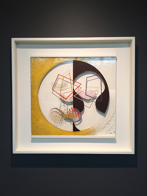
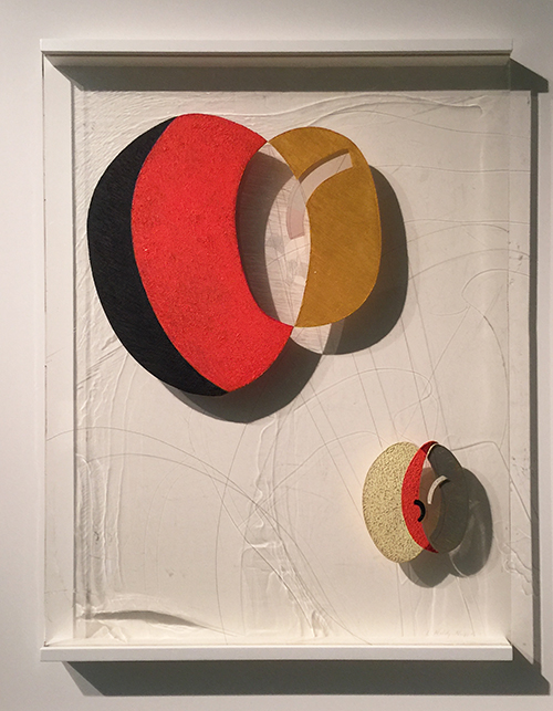
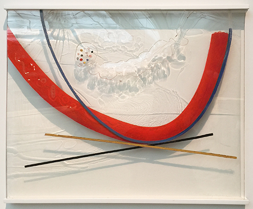
Moholy-Nagy’s technique of suspending Plexiglas sheets with clips or rails several inches in front of white panels allows light to pass through the clear areas while the painted passages generate modulated shadows that become part of the composition. He described this process: “I scratch lines on the back of the transparent sheet and rub color in; the same I do wit the front, rubbing another color it. Light does then what I could not do. A sparkling, vibrating color effect through the addition of the shadows which produce mixtures as no one could on the palette.”

KalbachNagy12

At times, he would manipulate the Plexiglas, as with the work above, by heating the plastic sheets – sometimes in his kitchen oven – and then shaping them by hand to enhance their capacity to distort light and imply undulating movement. Moholy-Nagy died at the age of 51 of leukemia.


KalbachNagy09

Leuk 4 by Moholy-Nagy, 1945, Oil and graphite on canvas

This painting was done a year before his death and is depiction cancer cells. Without context it looked not sad – but knowing the context it made me sad . But here we have another prove of how art can reflect something that happens in the artists live in a symbolic and hidden way- if you wouldn’t see the name of the painting – you might not really know.

More Space Modulators:

KalbachNagy08

KalbachNagy07

KalbachNagy06

KalbachNagy05

KalbachNagy04

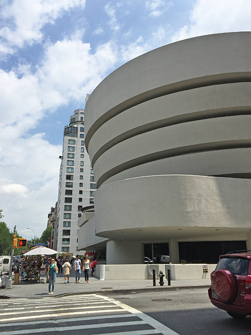
The Guggenheim was the perfect setting for this retrospective and enjoyed it a lot. It is timeless art and even though it has nothing to do with my own style and taste I appreciated his thoughts, ideas and development of his style.


KalbachNagy02

KalbachNagy03

And from here Andrew and I set out for another stop on our crazy art stroll that day… but that is for a different post *wink

Hope you enjoyed this Art Stroll today !


Comments (4)

  • Karen Amdur

    |

    Nice to revisit the exhibit which is fabulous.
    Just saw it at LACMA in LA.
    Thx for creating your tour.

    Reply

    • nathalie-kalbach

      |

      So glad you enjoyed seeing it again -Love that it was also in LA! Thank you for your visit Karen!

      Reply

  • nathalie-kalbach

    |

    Glad you enjoyed it Joi :) I wish you a wonderful weekend as well! Nat

    Reply

  • Joi@RR

    |

    Sooo interesting Nat. I just wanted to keep looking at each piece – they just draw you in but in such a different way. It felt more like looking at architectural pieces somehow!!! Between Heaven and Earth made me laugh – pretty neat!!! And the advertisements were fun. Really a treat to see your stroll and that fabulous building too. Thanks bunches. Have a super weekend. j.

    Reply

Leave a comment