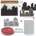
It’s Tuesday, so it’s time for my Creative Squad to share a project with you with this month’s theme: “My City Speaks to Me”. Throughout the month, the team has been using my new Urban Scribble Foam Stamp, Rubber Stamp and Stencil Set to interpret the theme and to share with us what their hometown or city is all about. We want to know what makes it special, vibrant, and important! This month, our Creative Squad has taken us on a trip to their city!
Today we have a really fun art journal page from Michelle Rydell. Her colorful interpretation of the theme is like an insider’s travel guide to Minneapolis :) Thanks for sharing all the good spots, Michelle!
—————————————————————————————————
Up until a few years ago, I lived in the city of Minneapolis my whole adult life. Now, I live in the country, just outside of the city, but Minneapolis will always have a piece of my heart. I love this month’s theme because it gave me a chance to document that!
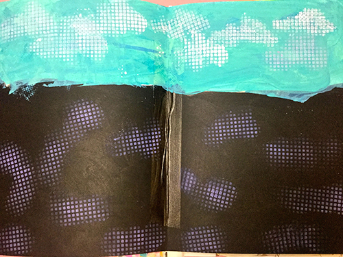
First I created a background in my art journal, using black on the bottom to represent city streets, and blue on top to represent sky. I used white paint with the Urban Scribble stencil to create texture on the streets, and clouds in the sky.
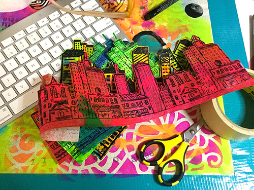
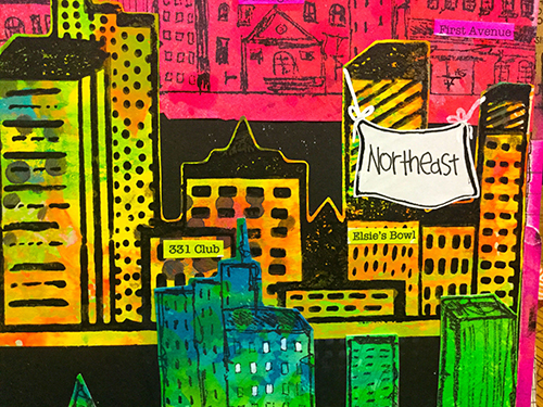
The city is broken up into neighborhoods, so I decided to represent that with a variety of colors and patterns, using painting underpapers as my substrate. I stamped the cling stamp on two different color schemes, and the foam stamp on a third. Then I cut them out…
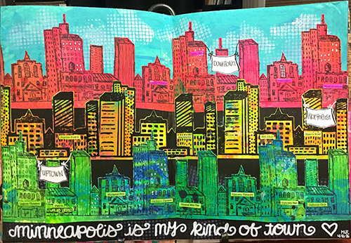
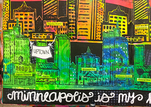
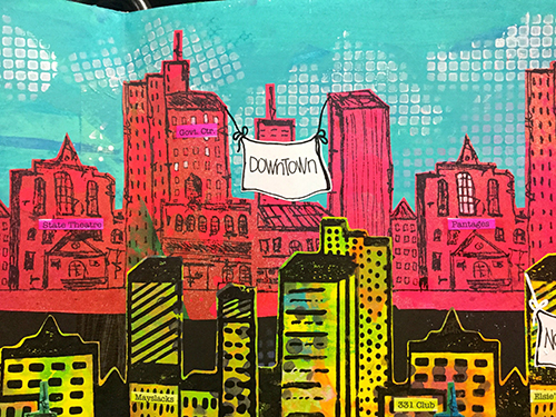
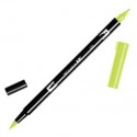
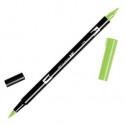
I pasted them onto my page in overlapping rows, and drew little banners on sticker paper to label the neighborhoods. I also typed up the names of some of my favorite places in each neighborhood, printed them onto sticker paper and stuck them on to corresponding buildings. I colored over the building names with tombow markers to blend them in a bit.
Here’s my finished piece:
And a few closeups…
—————————————————————————————————
I absolutely love how Michelle used the Urban Scribble stamp to create rows for different neighborhoods, and her colors are so vibrant against the black stamping, the whole design really pops. The overall idea is a super clever way to share with us the hotspots in Minneapolis!
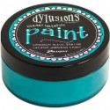
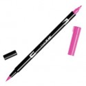
Besides the supplies listed below, Michelle also used newsprint underpapers with a variety of paints and sprays on them:
And maybe you will even play along -we would love to see how you interpret the theme – email me how you used my stencils and stamps with the theme and email me an image – I would love to share what you did at the end of the month!
See you next Tuesday for the another project from the Creative Squad, with a brand new theme for the month of May.
![BLOG TEMPLATE[20]](/app/uploads/2016/04/BLOG-TEMPLATE20-e1461258192673.jpg)
P.S. Stampendous is doing a blog hop this week and you can win one of the stamp sets. Simply comment on this post or their blog post in order to be eligible to win!
Check in with their blog all week long to see some fun projects with my foam stamp sets – my creative squad is posting a lot of new projects this Friday- so stay tuned :)
![STM_NatNfriendsHop_prize[8]](/app/uploads/2016/04/STM_NatNfriendsHop_prize8-e1461258396352.jpg)




Comments (39)
Sabrina Radican
| #
What a great and fabulous stamp!!!! I just love your pages and what you did with these stamps!!!!
Reply
Judy Hodges
| #
Cool idea! I’ve got to try it. Thanks for sharing.
Reply
Michel E
| #
Great project.
Reply
Pam B
| #
I love this colorful layout!
Reply
Lilian
| #
Great project! So colorful!
Lilian (Maryland, USA)
Reply
Julie Tucker
| #
Love love love this! LOVING that cityscape you created!!!!!!!!!!!!!!!!!!!!!!!!!!
Reply
jean marmo
| #
Oh my gosh! This is just wonderful!! Feel like I am in the city!!
Reply
Jackie P Neal
| #
Totally love how Micelle used the stamp with the different colors- clever clever!!
Reply
Mary Holshouser
| #
I love how you layered the different sections of the city on the layout.
this is a good way to cover a lot of territory on one page.
thanks for sharing an amazing idea.
Reply
JoAnn Campisi
| #
Love what you did with Urban Scribble – I have the set but haven’t had the time to play with it. Definitely going to create what you did with an “East Village” section, which is where I grew up in NYC!!! Great job!!
Reply
Karen Petitt
| #
Beautiful scene building, such wonderful jubilant use of colour too. They make a dull day a happy day! Thank you for sharing your art with us and for the blog hop Karen x
Reply
Michelle LaPoint Rydell
| #
Thanks so much for your kind comments everyone! They are really making my day bright!
Reply
Becca Yahrling
| #
Gorgeous city! Beautiful colors.
Reply
Becca Yahrling
| #
Very creative and a great way to showcase a city.
Reply
Tami French
| #
Very pretty!!!!!!! Love the colors
Reply
gwenlafleur
| #
Love the rainbow effect you got as well as all the layers. Super fun idea to label your favorite parts of town. Love this!
Reply
Nicole
| #
Forgot to mention that I’m from Southington, Connecticut!
Reply
Nicole
| #
Fantastic cityscape! Thanks for sharing this journal layout.
Reply
barb macaskill
| #
This is brilliant! I absolutely love how you did the neighborhoods!! Magnificent and fun!! I did not think this set would be one that I would fall in love with but I have!!! I am dying to get my hands on it and create my own cityscape and many other projects! Thanks for sharing your gorgeous creation with me!! It is a true work of (he)art! TFS!
Reply
Carla Hundley
| #
Wow, how neat this is!
Love all the neighborhoods
and the cute way you showed
them.
Carla from Utah
Reply
Nancy Wilcox
| #
This page is amazing.
Reply
Beverly Parkison
| #
Wow! You knocked it out of the park. great creatier ideas.
Reply
Karen D
| #
I really love this post, your journal page is fabulous, the colours really do pop!
Reply
Dee Ann O'Brien
| #
Beautiful combination of colors to create a whole city area!
Reply
Julie Curtis
| #
This looks like a lot of fun! So many things you can do with this. I love it!
Reply