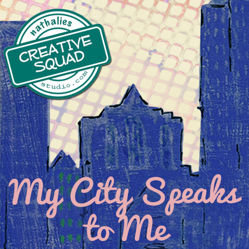
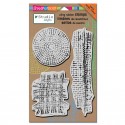
It’s Tuesday so it’s once again time for my Creative Squad to show you a fun project, and we are at the start of April now, so we have a new theme too! The theme for April is “My City Speaks to Me” and throughout the month, the team will be using my new Urban Scribble Foam Stamp, Rubber Stamp and Stencil Set. This month’s theme is all about expressing what your hometown or city is all about. What makes it special, vibrant, and important to you? This month, our Creative Squad will take us on a trip to their city!
So without further ado, here is the uber creative Gwen Lafleur with her gorgeous interpretation of the theme!
—————————————————————————————————–
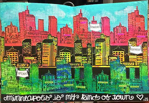
I live in a suburb of Salt Lake City, Utah, but I work downtown and one of my favorite views is when I’m driving in and the city comes into view up against the mountains. I especially love it when the sun is coming up in the background (or the sunset behind the mountains on the other side of the valley when I’m driving home at night!) There are frequently spectacular colors and I never get tired of the view; the contrast of the man-made city with the rugged mountains really draws me. It also influences a lot of the culture here – my office mates are frequently off doing morning ski tours before work and lunchtime discussion usually centers around outdoor activities. I’m not particularly outdoorsy, but I love the views and the openness of this area, and after recently moving back here from Chicago, I’m especially loving the more laid back and less crowded lifestyle!
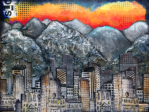
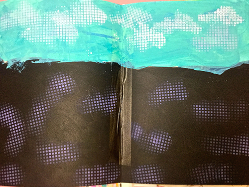
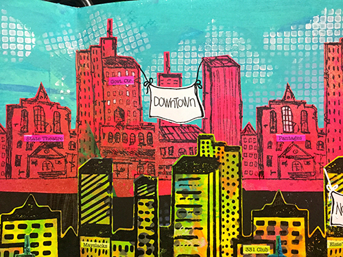
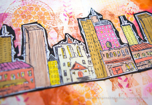
With those thoughts in mind, when I got this month’s challenge I immediately knew that I needed to use the Urban Scribble stamps backed by mountains of some kind. I started by taking an 11″x14″ sheet of heavy weight mixed media paper and I sketched out where I wanted the mountains to be. I used pages torn from a telephone book along with Mod Podge mixed with water and put crumpled paper within the outline of the mountains in the foreground.
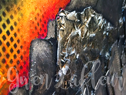
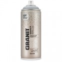
Once they were dry, I used Montana Granit Effect spray paint and gave them a good coat – it really helps them look like rock! I used a few washes of acrylic paint on top to add a little shading and dry brushed some white on the tops (since the mountains still have their snow caps right now.)
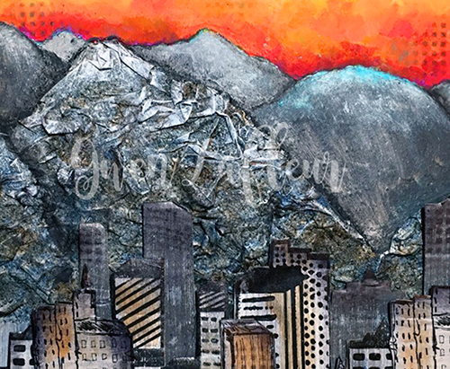
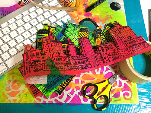
Next, I gesso’d the area above my mountains and painted in some more in the background, then I added a sunrise with lots of fluorescent paints. For the city, I took a few sheets of drawing paper and gesso’d them, then painted them with different shades of gray and silver. When they were dry, I stamped on them twice with both the detailed side of the foam stamp and the rubber stamp. I also stamped in gray with the solid side of the foam stamp. I cut out each individual stamped image and mounted them all on a thin sheet of cardboard, then cut them out again. I lined them up in front of the mountains on my piece and started adhering them in layers, using stacked cardboard on the back of each piece to add dimension. I cut some of the cityscapes into smaller pieces so I could arrange them the way I wanted.
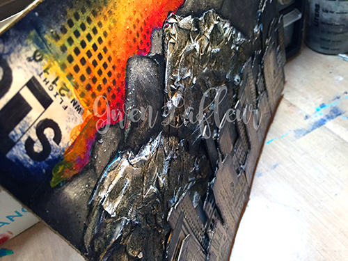
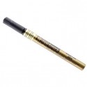
Once that was done, I added a wash of color here and there. I used a black Stabilo All pencil to add some definition to the mountains, then I finished the piece by using the stencil that comes in this set in the sky and in the bottom corners and on some of the buildings and outlined the whole piece with a gold paint marker.
I really love the contrast of the texture from the mountains with the stamped buildings, as well as the colorless early morning city against the beautiful colors of the sunrise. I think it even looks a bit like Salt Lake!
———————————————————————————————————-
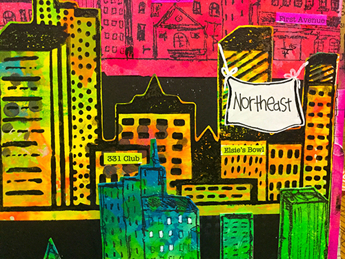
I hope you enjoyed Gwen’s project! I think we’re all wishing we had a scenic commute like hers :) I love how she created really dimensional texture with layers upon layers of stamped cityscape and the crumbled paper mountains in the background. And that orange sunrise! It literally glows.
Besides the supplies listed below, Gwen also used cardboard, phone book pages, and pieces from a luggage tag with SLC on it:
And maybe you will even play along -we would love to see how you interpret the theme – email me how you used my stencils and stamps with the theme and email me an image – I would love to share what you did at the beginning of next month!
See you next Tuesday for the another project with the theme ‘My City Speaks to Me’.


![BLOG TEMPLATE[20]](/app/uploads/2016/04/BLOG-TEMPLATE20-e1461258192673.jpg)
![STM_NatNfriendsHop_prize[8]](/app/uploads/2016/04/STM_NatNfriendsHop_prize8-e1461258396352.jpg)


Comments (12)
das3022
| #
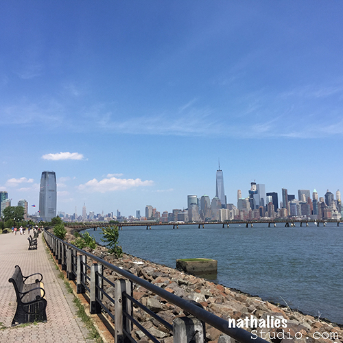
I just signed up for your CJS17 and was checking out your site. Decided to look at your stroll through the hood and was so excited to see that it was Jersey City. I am from Jersey City! and have wonderful full memories of that whole area.
Reply
nathalie-kalbach
| #
Deb- that is so cool! I love Jersey City – it is wonderful to live here. You actually reminded me that it is time to do another Stroll through the Hood soon again :) Have a wonderful day and welcome to CJS!!!
Reply
Kandace Thomas
| #
I love Jersey City. We always stay there when visiting the NYC area. Thanks for sharing the gorgeous views.
Reply
Joi @RR
| #
Heheheh – I know this is crazy Nat but when I think of you taking a stroll in the HOOD – I envision all in black in hoodie/high tops – carrying a weapon and looking mean!!!!!!!!!! Soooooooooo…. I am thrilled to see such wonderful photos of things going on in the hood. Your visits are a delight. Thanks so much for sharing and squelching my fears :) Xj.
Reply
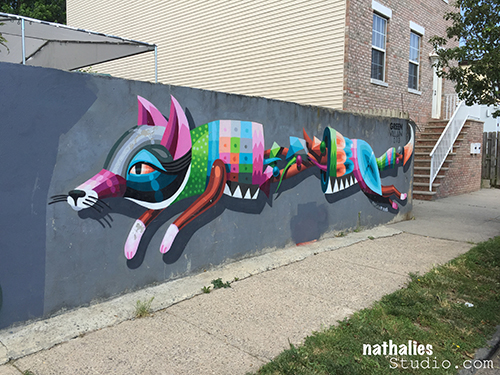
William Charlebois
| #
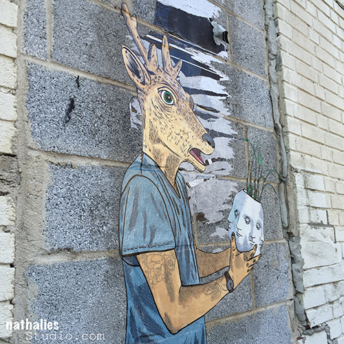
I loved seeing the street art!
Reply
nathalie-kalbach
| #
Bill, glad you liked it! I will try to post more of it in the next months – I need to get back into the habit :)
Reply
Sandy
| #
Hi Nat,
I live in MA and come to NYC often. I would love the address’s for the art you showed in today’s post. Most wonderfully if you would privately email me? And any additional addresses you know of with wonderful street art that only a local would know. If and when you would like to come to MA I live 4 miles from the Plimouth Rock! I would love to show you around!
Reply
nathalie-kalbach
| #
Sandy, here is a google map of some murals in Jersey City – not all of them are on there- but a lot – https://www.google.com/maps/d/u/0/viewer?mid=14sZzQXKMLt7t94MLU34CKVsx-IY
Check it out- Jersey City is so close to NYC! I am sure a stroll in your hood is also amazingly inspiring. Have a wonderful weekend!!!
Reply
Kathy P
| #
Your strolls are always so fun. I always get a different reality of that area through your photos—so beautiful. And the artistic talent is awesome! Thanks for sharing with us, Nat.
Reply
nathalie-kalbach
| #
Glad you enjoy them Kathy !!!And yes- the artistic talent in this area is nuts!
Reply
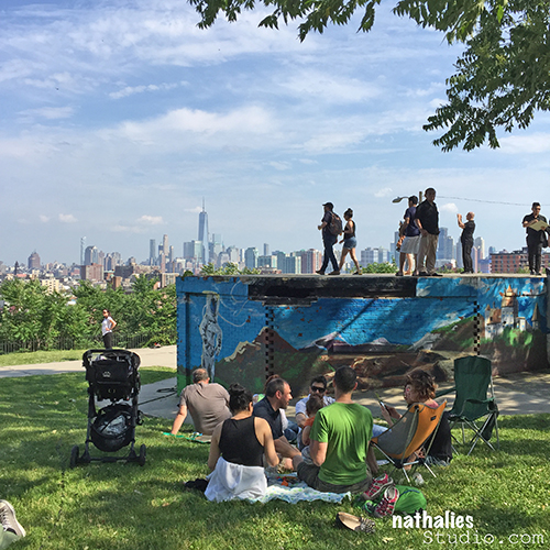
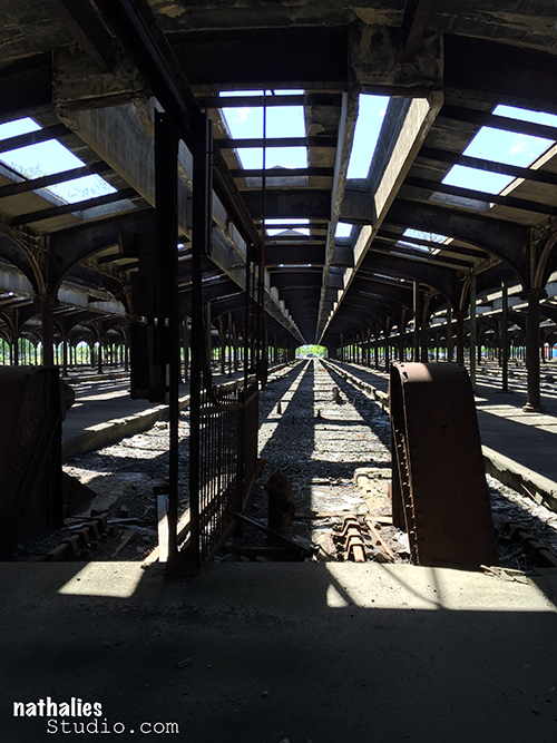
Sue Clarke
| #
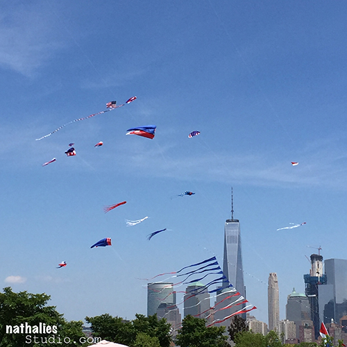
I just love your strolls. Can’t you just feel the people move through the train station? You have an awesome NYC view for sure. Enjoy your summer Nat!
Reply
nathalie-kalbach
| #
HA I know exactly what you mean about the people moving through the station – must have been such an emotionally loaden place too – you just arrived, you have no clue what to expect and lot’s of hope!
Enjoy your summer as well sue!!!
Reply