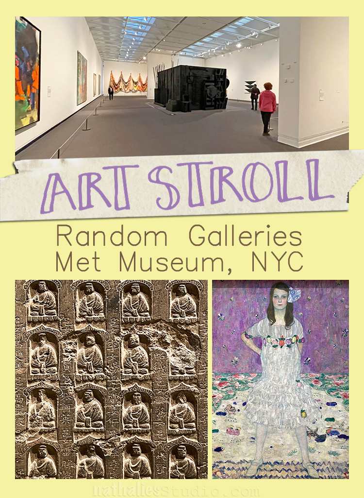
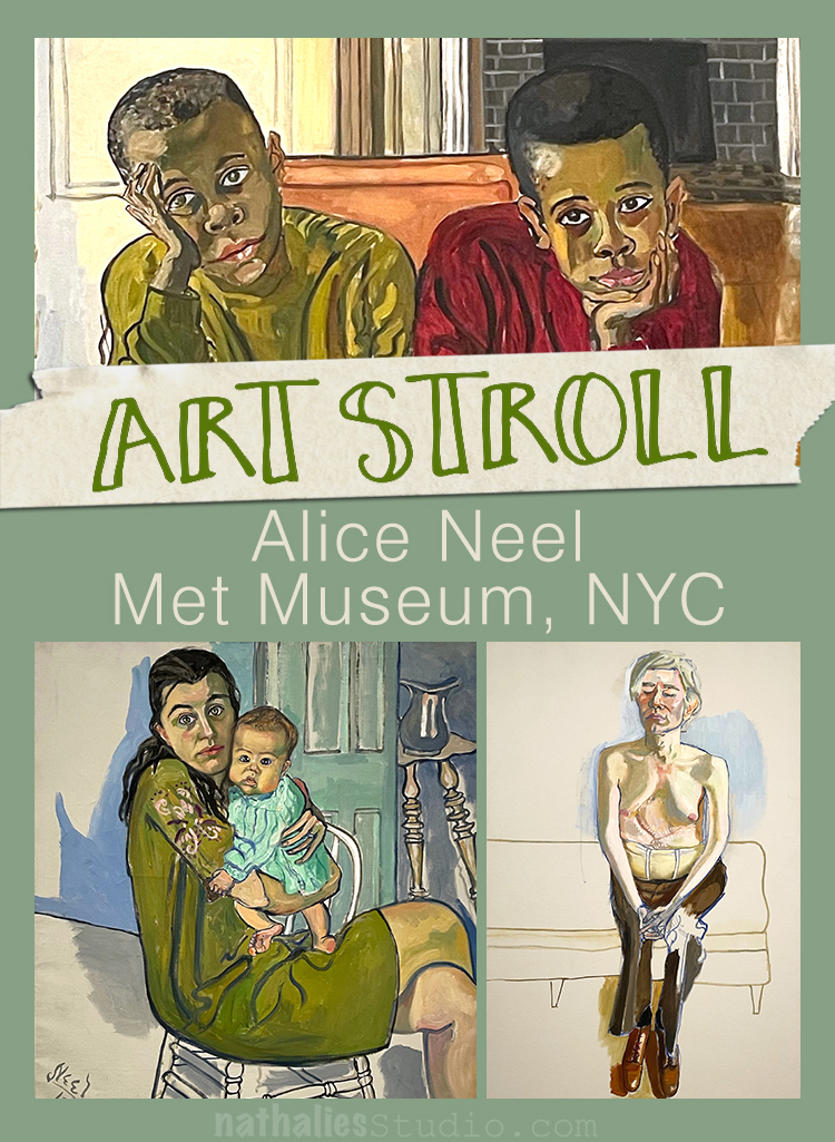
Last month we went to see the Alice Neel exhibition at the Met and were incredibly lucky to be in an almost empty museum – so I thought I would share some more random gallery pictures with you.
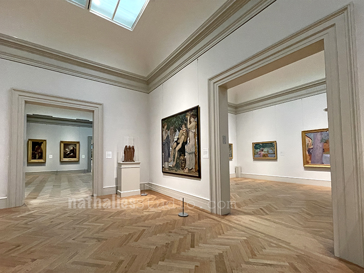
To be honest the Modern Art gallery is never super crowded at the Met but never this empty and nonetheless it was a treat to be for several minutes absolutely alone with the artwork. My heart was so full after not being in any museum for over a year.
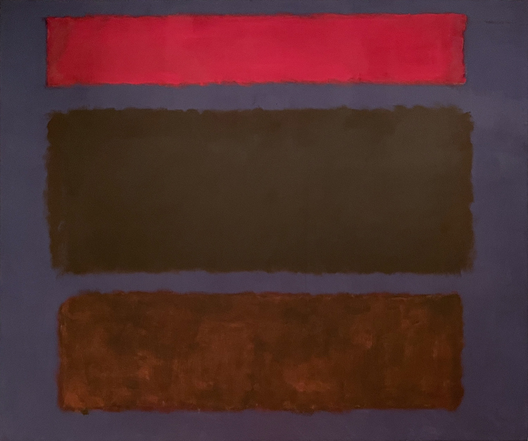
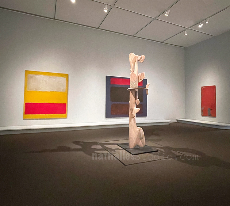
Rothko was singing…
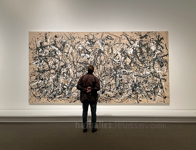
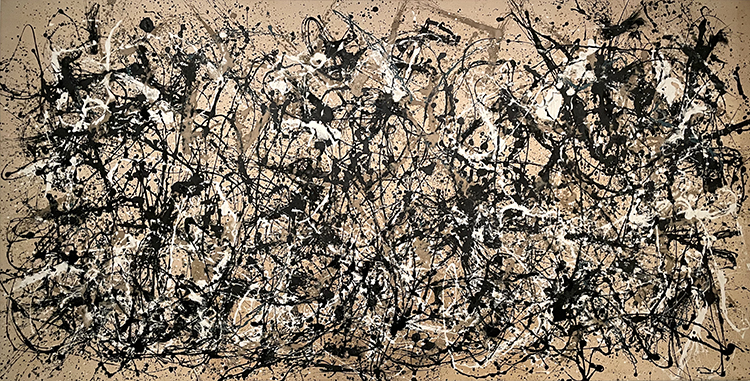
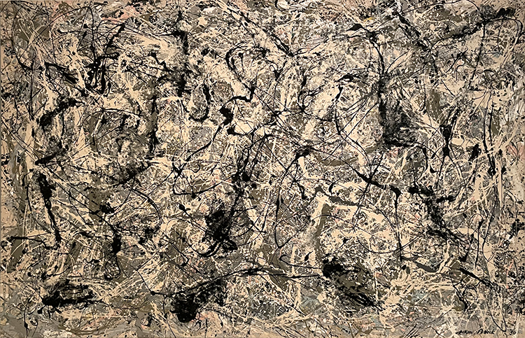
Pollock was moving…
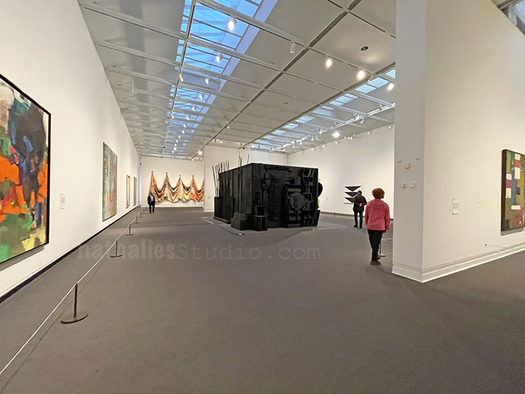
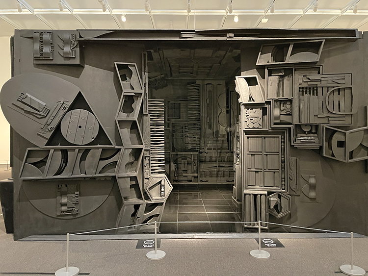
Nevelson was inviting us to Mrs. N’s Palace …
but then still decided to socially distance from the viewer.
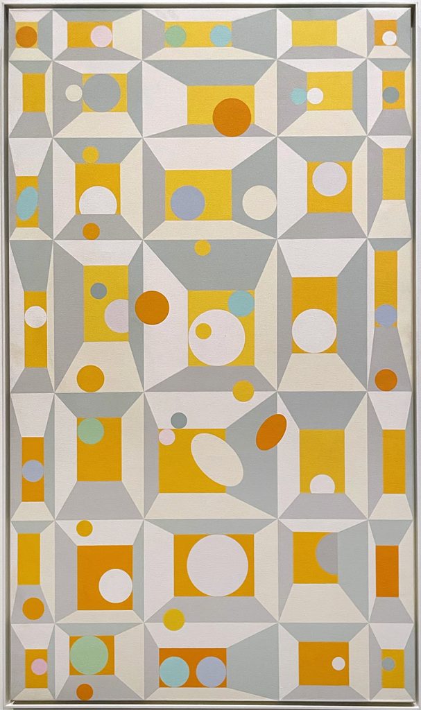
Edna Andrade invited us for a “Summer Game” – which made me very happy
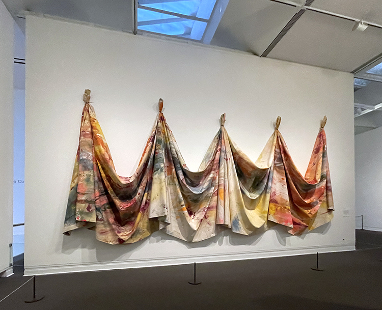
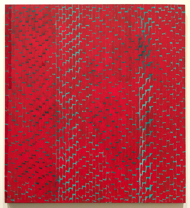
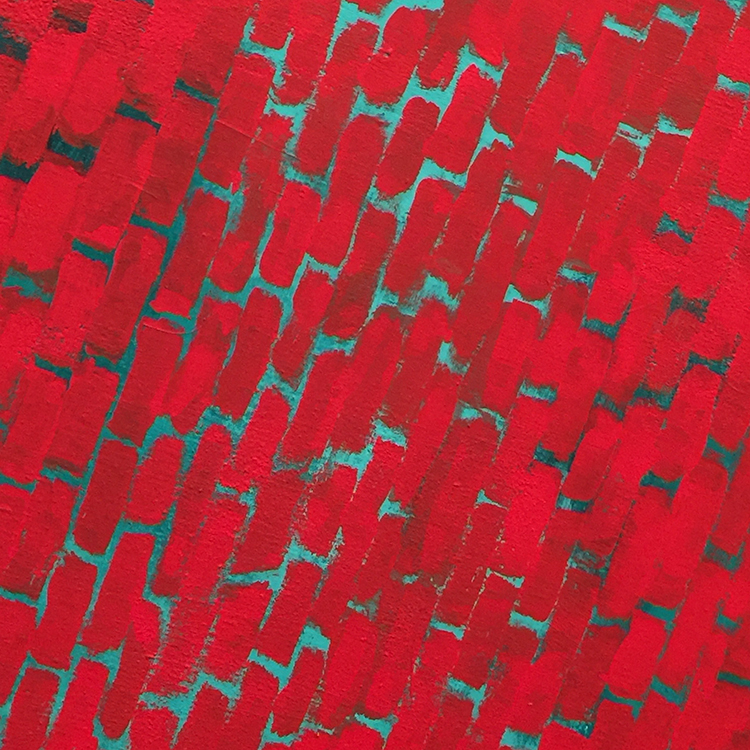
Sam Gilliam made me think rebellious thoughts on how to use canvas cloth …
And boy, Pollock was just super demanding… such an ego …but …
Can you blame him???
There I stood and just thought “wow …what a wonderful day this is”
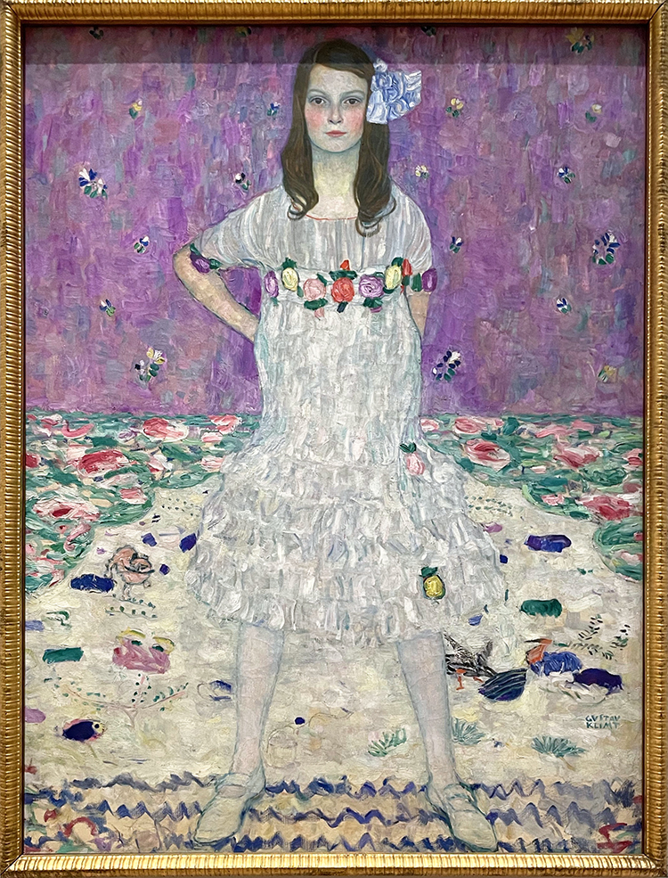
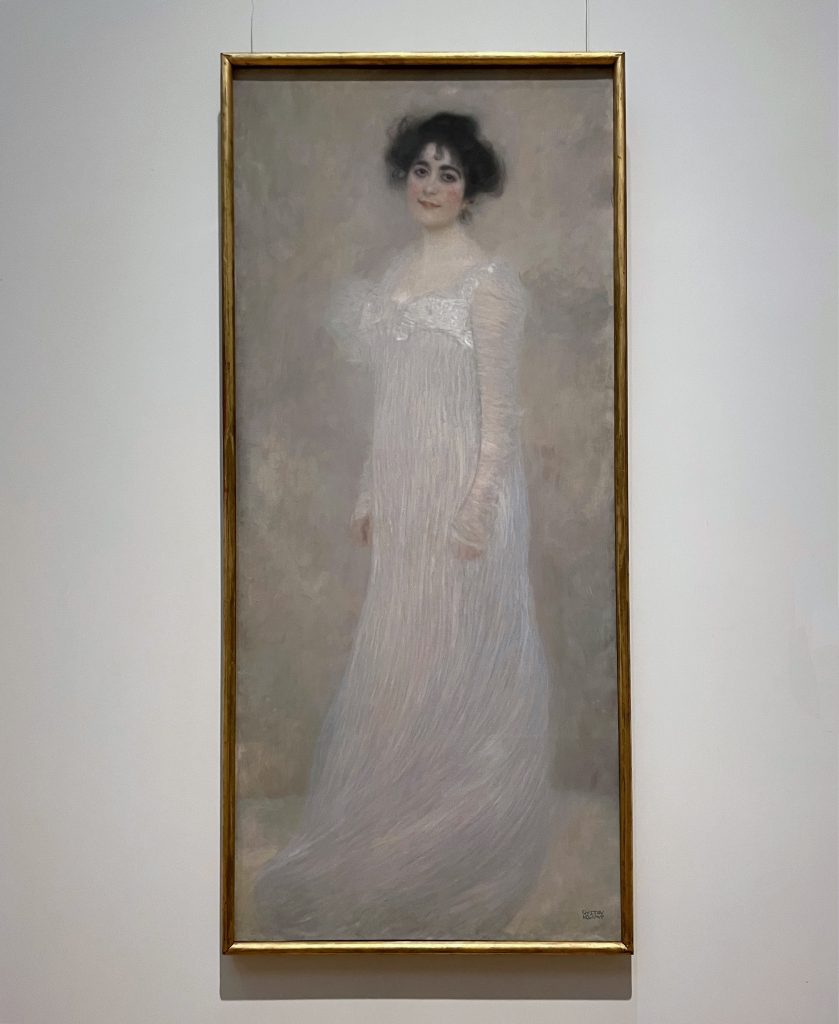
Klimt’s Mäda Primavesi looked rather inquisitive as if to say “where have you been, it was really boring here!”
it was tempting to dance through the empty hall, and I think…
Serena knew that too – she gave me a little smile but asked to contain myself
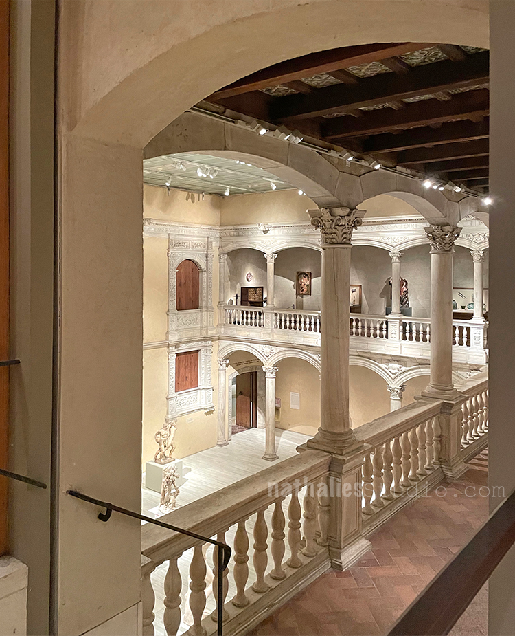
And so I moved on …
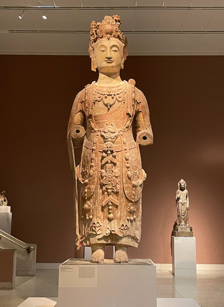
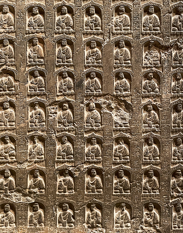
And said hello to this magnificent statue
and details in stone…
And then it was time to leave …as there is only so much you can take in and Alice Neel’s exhibition was also already behind us. What a wonderful day this was. Weeks later I remain on a high, how much I missed this. I hope you enjoyed the Artstroll – cannot wait for the next one.
Your STROLLS are so FULL!! Your experience ‘feeds’ me in so many ways.
You make me chuckle with your choice of words, you make me think abut the way you looked
at something, you made me feel (dance) (boring), and you always inspire me.
I ALWAYS want your strolls to go on! MORE, More, more
THANKS
Last weekend we were able to visit a museum in the first time in over a year. The exhibition “People Come First – Alice Neel” was calling us and after the first hesitation of the thought to be in a closed area with other people I bought some timed tickets for 10am on a Sunday morning. Boy was that the best decision ever. Besides the fantastic exhibition, this was a once in a life time experience at the Met …we entered almost every gallery alone …it was amazing and after such a long time of no artstrolls, seeing art in person was exhilarating. But let’s check out the fantastic Alice Neel exhibition.
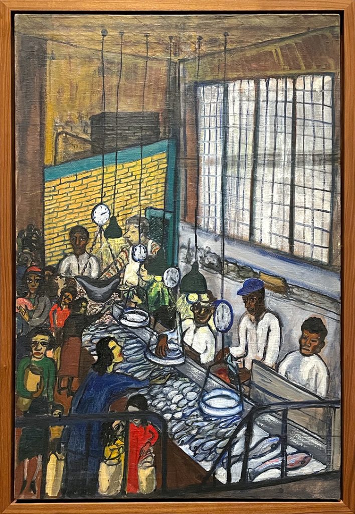
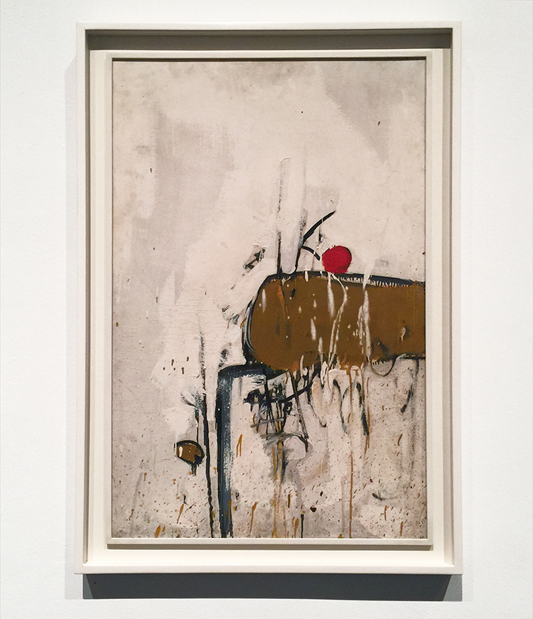
“Fish Market”, 1947
Alice Neel was born in 1920 and died in 1984. The earliest of hier paintings in the exhibition was from 1920 and the oldest one from 1984. Alice Neel saw herself as a collector of souls – painting pictures of people not portraits. She was a political painter in the choice of who she painted, what she painted and the way how she painted.
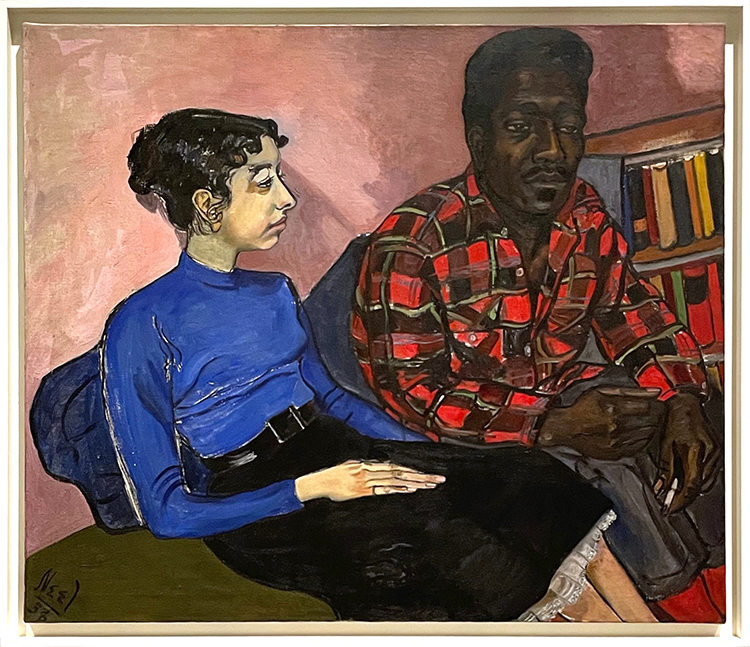
“Mercedes Arroyo”, 1952
Mercedes Arroyo was a social activist in East Harlem. Neel declared in 1950 – echoing Arroyo’s principles “East Harlem is like a battlefield of humanism, and I am on the side of the people here”
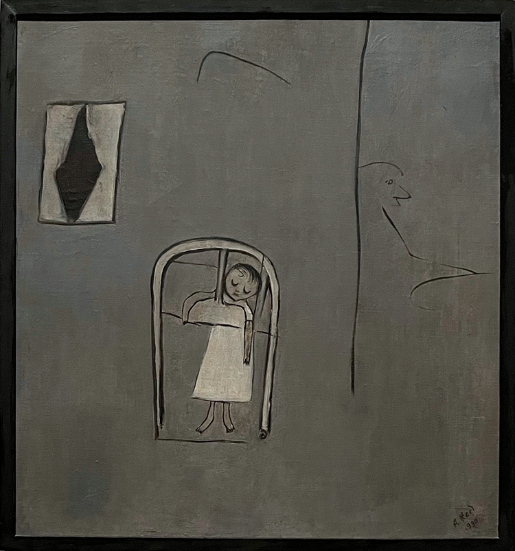
“Futility of Effort”, 1930
This abstract painting is one of two experiences: of the loss of Neel’s daughter to diphtheria and a newspaper article Neel wrote about a mother who lost her child when sie was ironing in the kitchen next door, when her child choked on the bars of her crib. Motherhood and the struggles tied to it is a reoccurring subject of Neels paintings.
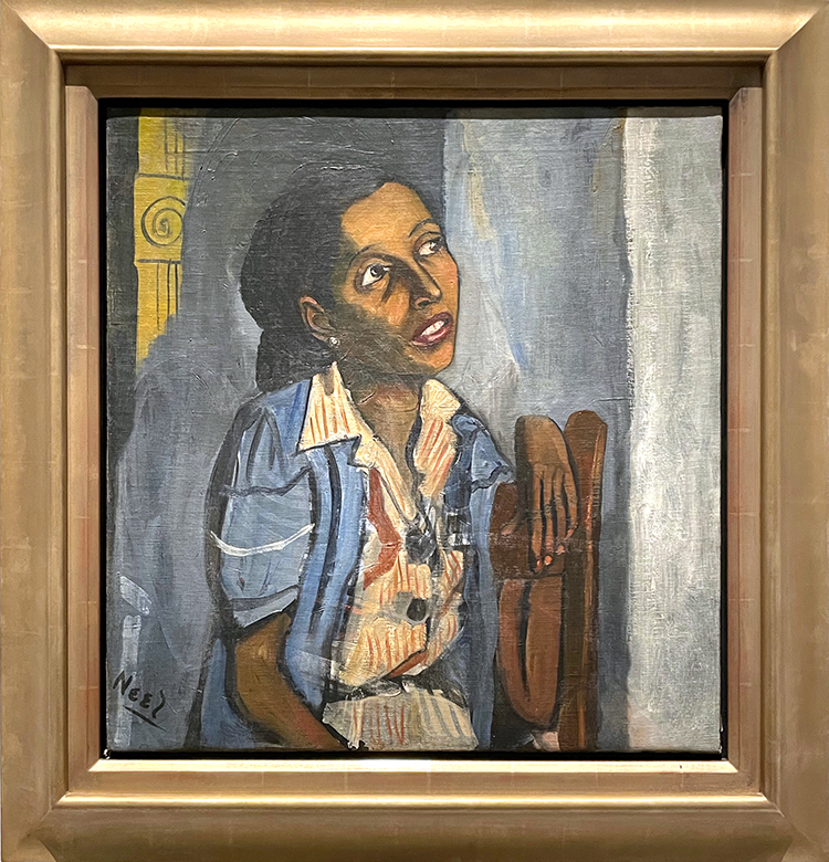
“Rita and Hubert”, 1954. Hubert Satterfield, a writer and his girlfriend Rita (we do not know what she did).
“Peggy”, 1949
Peggy was a victim of domestic abuse and Neel chose to represent her with the bruises and abrasions left by her boyfriend’s recent assault.
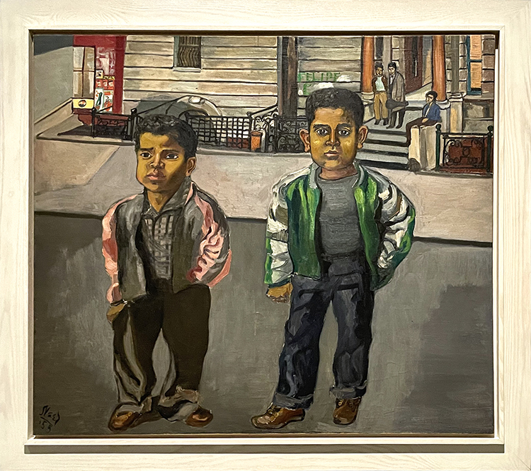
“Dominican Boys on 108th Street”, 1955
While we know those are boys I find them so adult-ish in their gaze and demeanor.
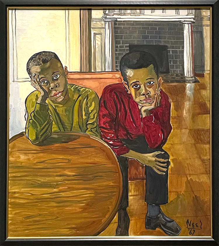
“The Black Boys”, 1967
Neel made this painting of the two young boys Toby and Jeff Neal and I love how you can see the boredom but also discipline to sit this through in those boys. I loved reading an article on how one of the brothers has just seen the painting of him in the very first time after it was finished at the Met and the background story.
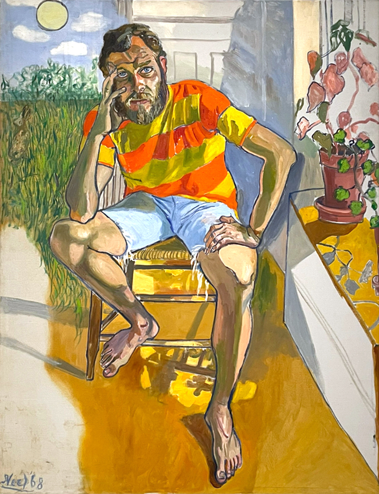
“Richard Gibbs” 1968
So vibrant – what is he thinking?
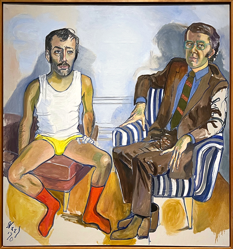
“David Bourdon and Gregory Battcock”, 1970
Bourdon was an editor at Life Magazine, Battcock was an art critic. What a weird juxtaposition of someone in a suit comfortably sitting in an armchair and the other person in his underwear, on an ottoman.
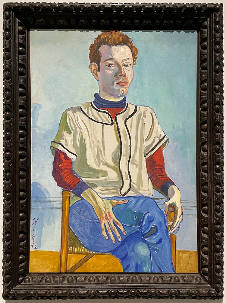
“Jackie Curtis as a Boy” 1972.
Jackie Curtis was a prominent figure in Manhattan’s Lower East side and became very well known when entering the orbit of Andy Warhol. This painting was painted two years later than the one below. This painting reveals the other side of Curtis and play with gender.
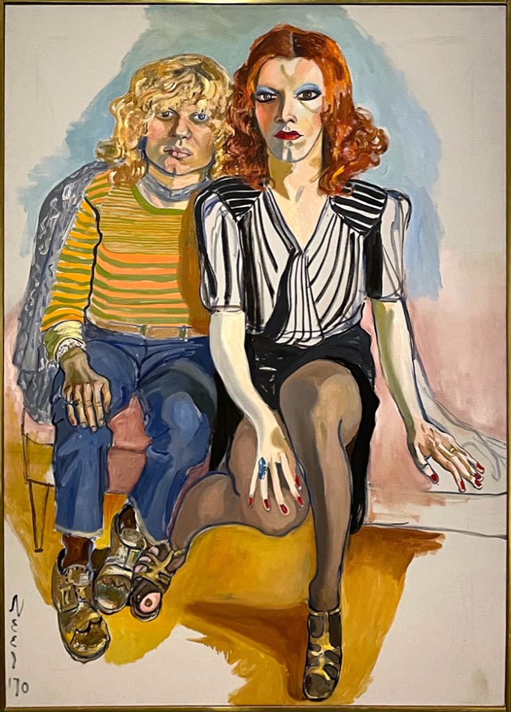
“Jackie Curtis and Ritta Redd”, 1970
I love the torn panty hose showing the big toe!
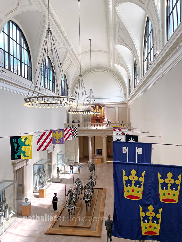
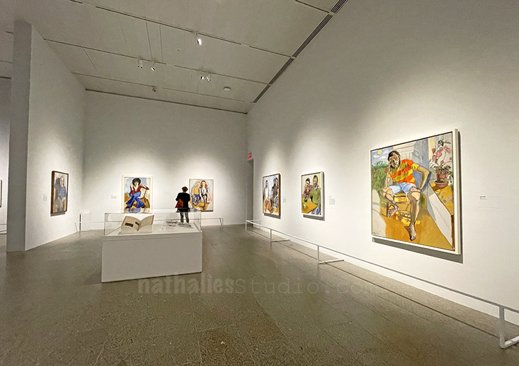
Here you get an idea how empty the galleries were. It was amazing.
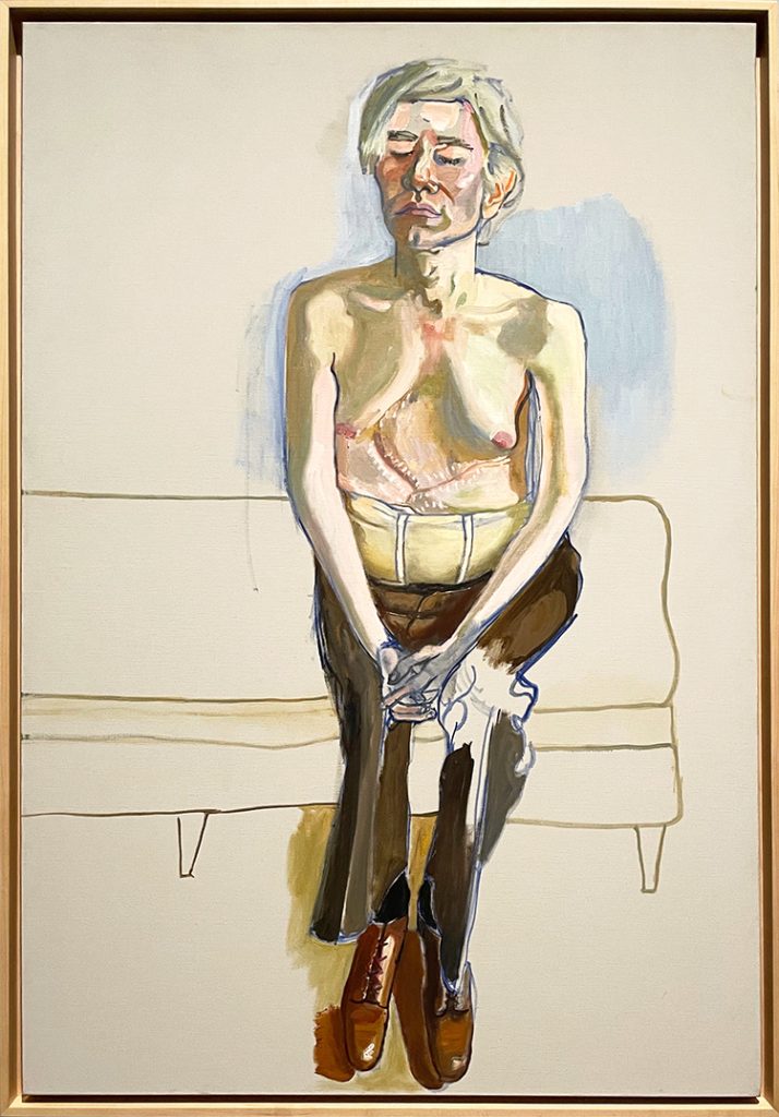
“Andy Warhol”, 1970
Andy Warhol was shot in June 1968 and he had many operations to save his life. He is exposing himself to the viewer – his scars, his corset, his eyes are closed, the man who always looked. A very vulnerable painting of Warhol.
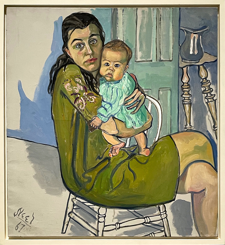
“Nancy and Olivia”, 1967 – drawing from art history the subject of mother and child.
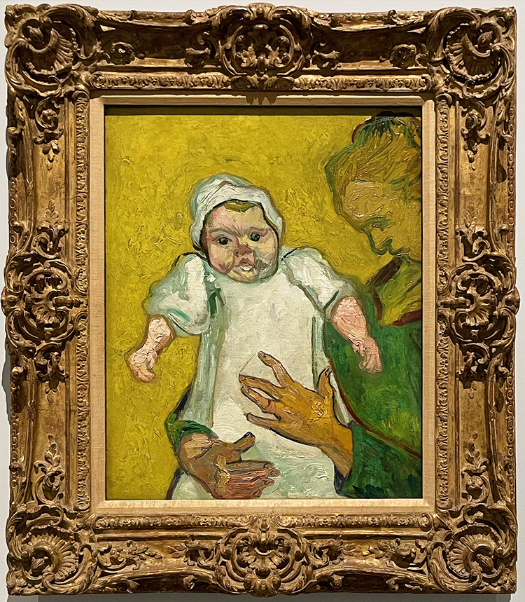
“Madame Roulin and Her Baby”, 1888
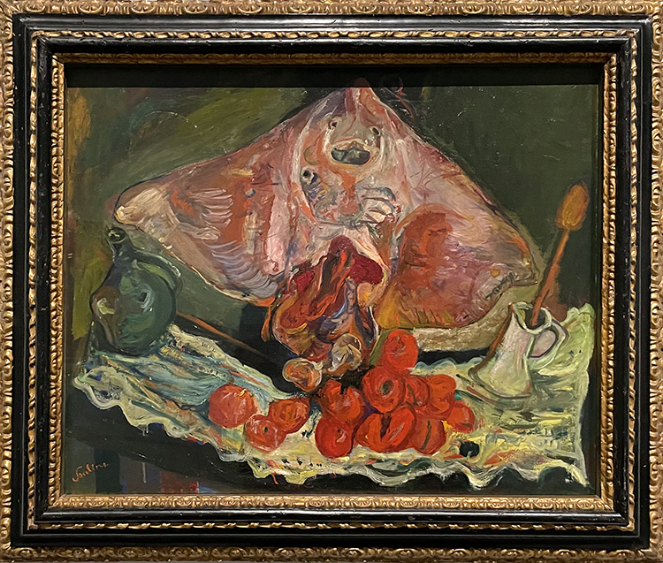
“Thanksgiving” , 1965
A funny painting and one that Americans well know! Neel was very well versed in art history – the reference below shows the same kind of loose brushwork and food painted into abstraction
“Still Life with Rayfish” ca. 1924 by Chaim Soutine
I did not only love how Neel captured her subjects but also how much humor there was in her paintings.
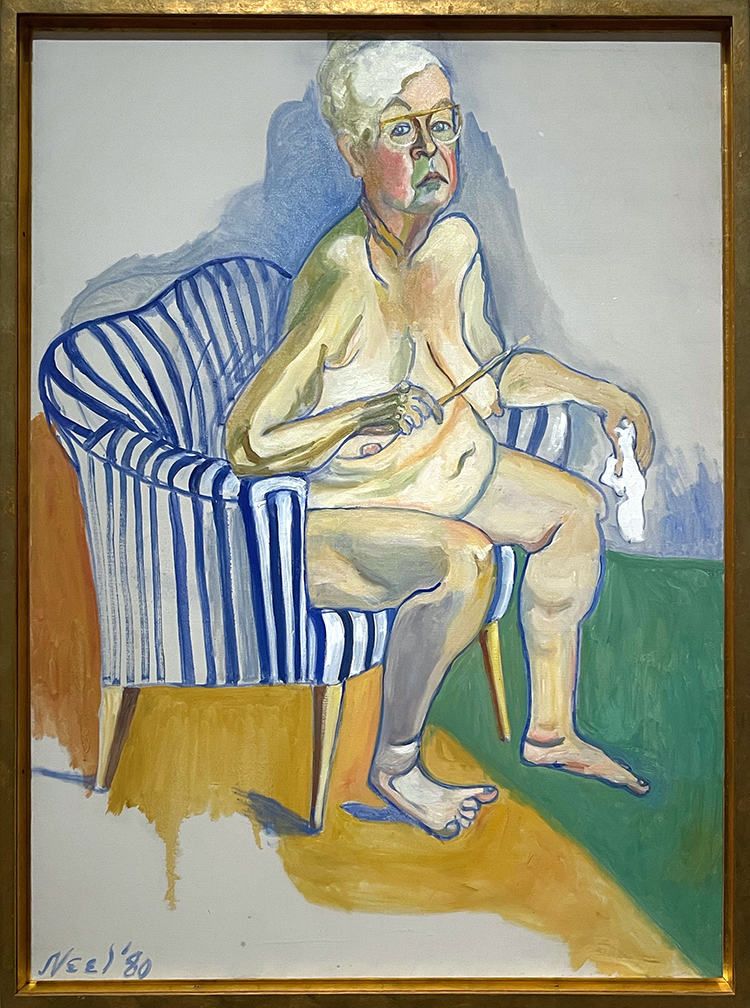
“Self-Portrait”, 1980
One of her only true self portraits where she is a main subject. Provocative to paint herself nude as an older woman. Neel emphasizes her professional identity by showing the tools of her trade in this painting as well.
“Black Draftee (James Hunter)”, completed 1965
Neel met Hunter on the streets of NY – he came for two sittings. The story goes that he was never able to return as he was called to the Vietnam War. Neel decided the painting is finished. This painting was so touching – for me today it told a different story as well .. the many unfinished lifes of Black Men in America!
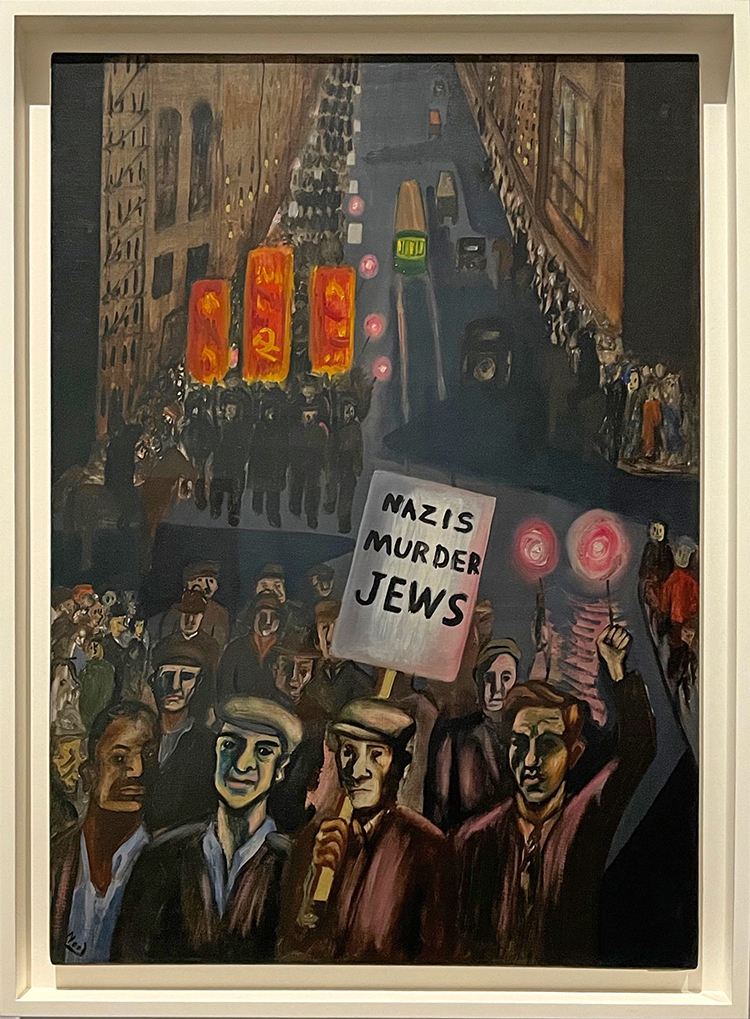
“Nazis Murder Jews”, 1936
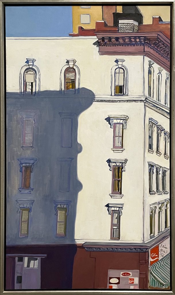
“107th and Broadway”, 1976
This a view of Neel’s final apartment on the the Upper West Side.I love this – the light, the shadow of the other building, the hint of the bodega on the corner. After looking at all the gazes of people Alice Neel painted, this gave me a little breathing time …maybe she used this view to rest a bit too from all the soul collecting she did, it must have been at times really exhausting.
A great exhibition – and if you are in the area, I recommend coming right at opening time of the museum with an already purchased timed ticket (New Yorkers of course for free). It was a wonderful experience and I felt safe the entire time.
Oh Nat. Thank you for sharing such a wonderful experience. I did not know much about Alice Neel. Her painting style and how she captures so much expression and emotion is just incredible. I loved the article about Jeff Neal and how he finally got to see his portrait hanging in the museum. One of the other paintings that really stuck with me was “Black Draftee” (James Hunter). It does seem appropriate that Alice Neel considered it finished in this state. Your comment about the unfinished lives of black men in America is so spot on.
Thanks again for sharing. I always learn so much on your art strolls.
Good health to you…
What an amazing collection. Every person’s face tells a story ( most serious at that). I love the Black Boys…yes, the boredom and discipline you noted Nat.
I cannot thank you enough for sharing so many images along with your thoughts from this amazing exhibition. I had read about it somewhere else and do not think I would be able to come to see it in person. Thank you again!
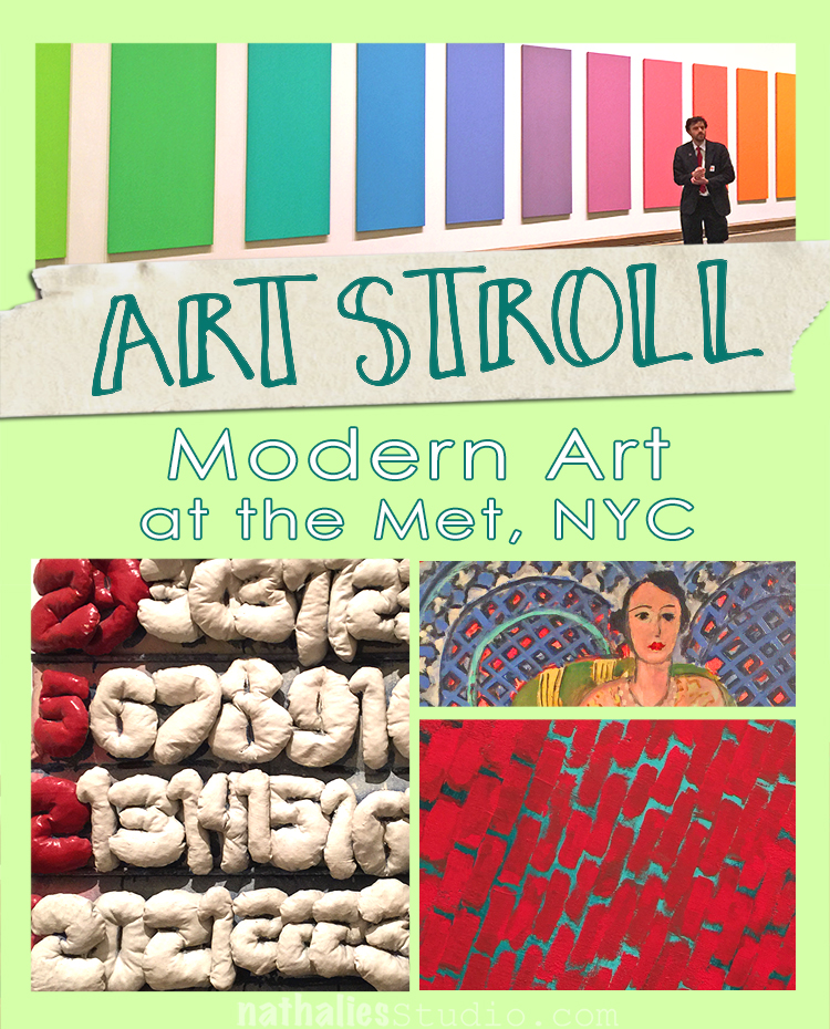
Loved strolling a bit around to see some of the Modern Art displayed at the Met a couple weeks ago while I was there. I just recently saw a documentary about one of my favorite illustrators Christoph Niemann – follow his instagram feed, it is brilliant and makes me laugh! – and he said that “experiencing art is the gateway drug”. I agree – and here is some of fine substance ;)
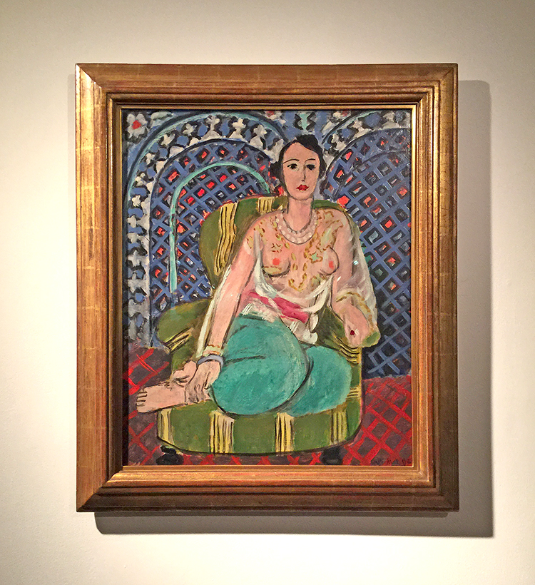
Henri Matisse, Seated Odalisque, 1926
I have said so much about my love for Matisse’s pattern play …there …once again …swoon
Rufino Tamayo, Children’s Games, 1959
Love looking at this and discovering the shapes and scene.
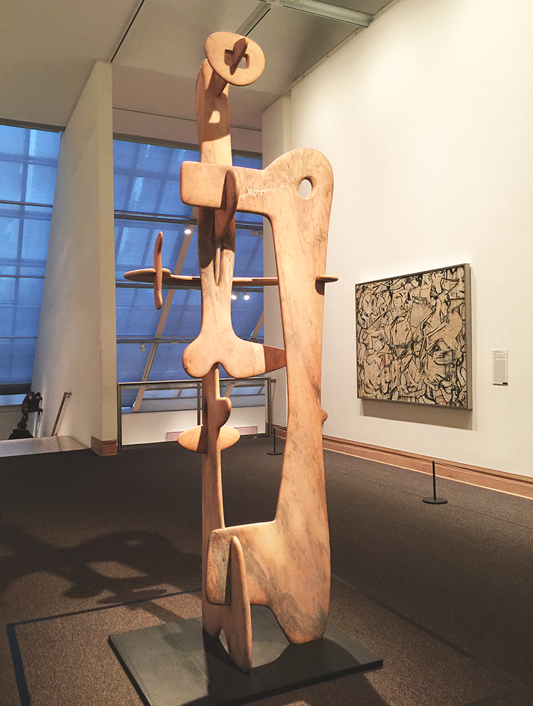
Kouros, Isamu Noguchi, 1945 – Marble
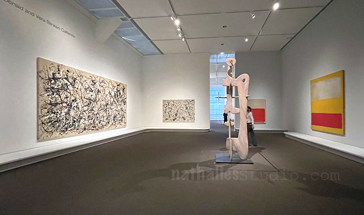
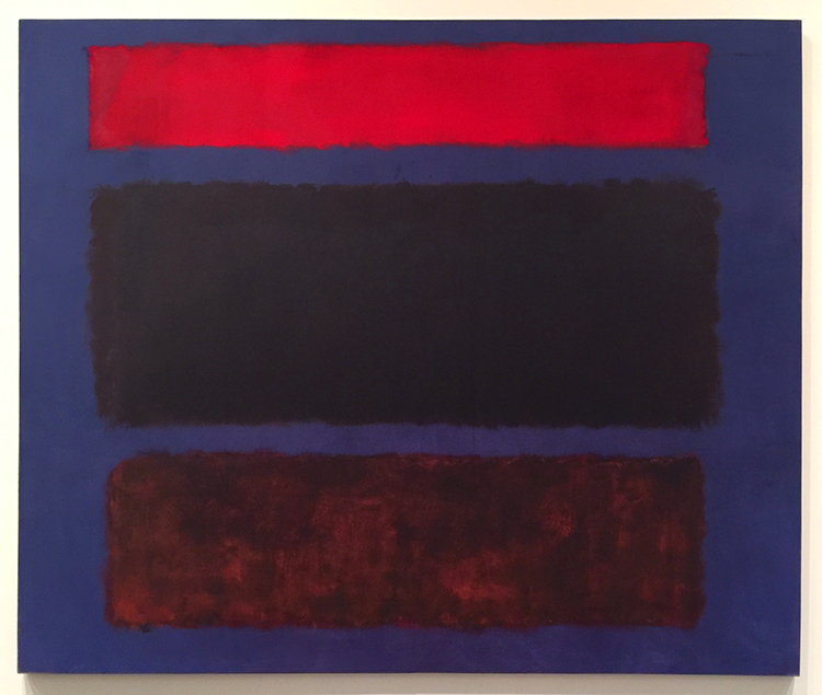
Marc Rothko, No 16, 1960
Color inspiration anyone? Love it!
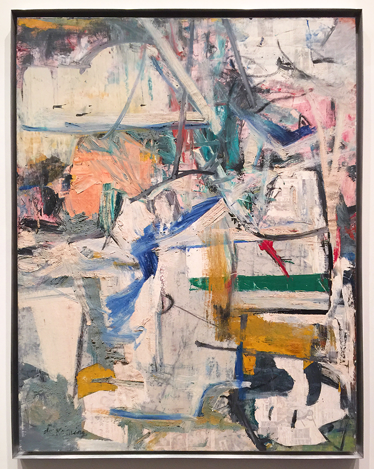
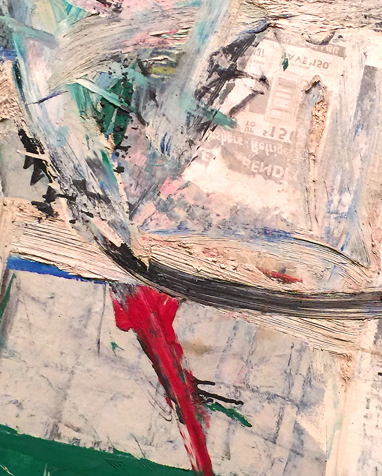
Willem de Kooning, Easter Monday, 1955-56
Texture Galore and collage elements – swoon
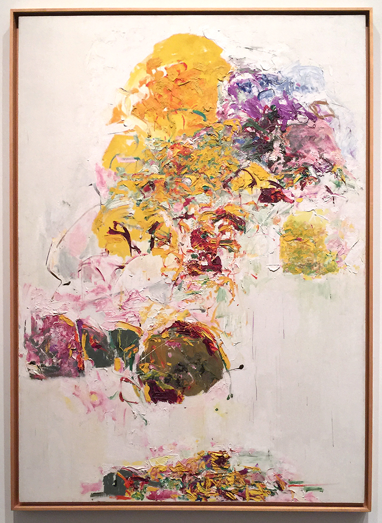
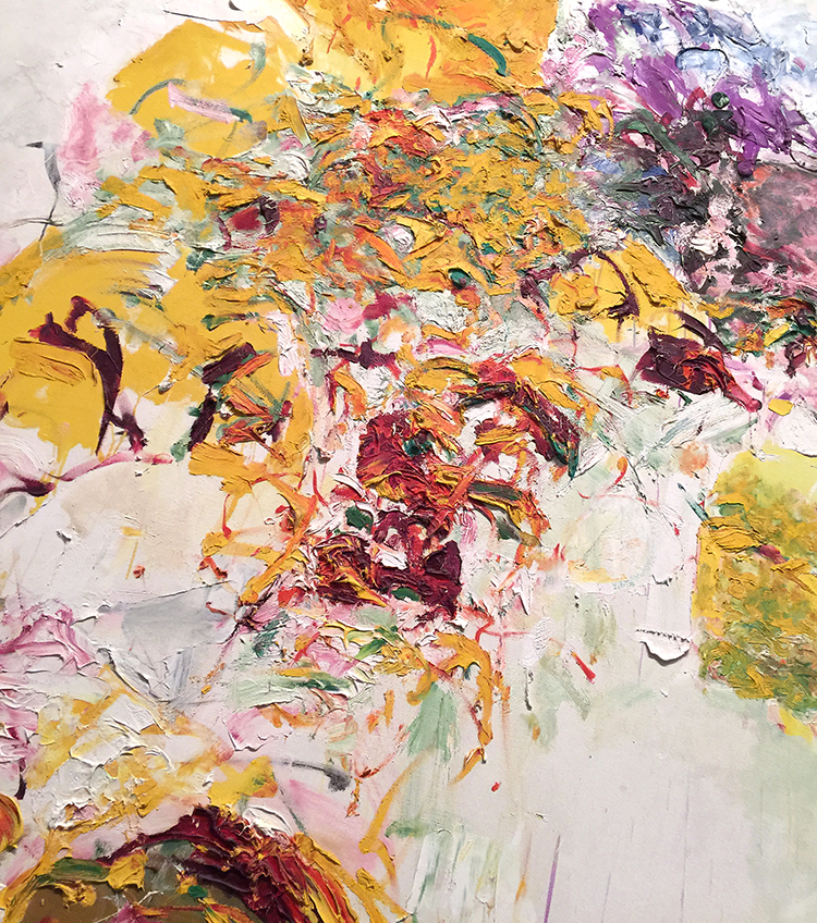
Joan Mitchell, Sunflower, 1969
I love the texture rich and voluminous flower painting – so gorgeous!
Alma Thomas, Red Roses Sonata, 1972 – Acrylic on canvas
This was so intriguing ! Speaking of making colors sing!
“Creative art is for all time and is therefore independent of time. It is of all ages, of every land, and if by this we mean the creative spirit in man which produces a picture or a statue is common to the whole civilized world, independent of age, race and nationality; the statement may stand unchallenged.”
-Alma Thomas, 1970
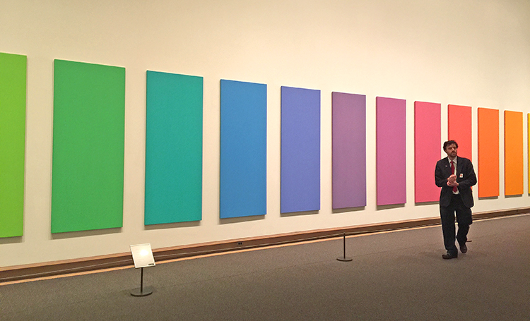
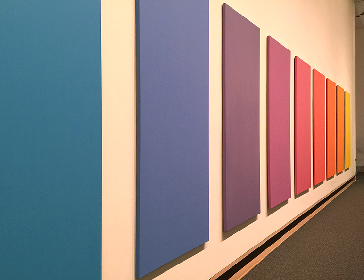
Spectrum V, Ellsworth Kelly, 1969
LOVE!
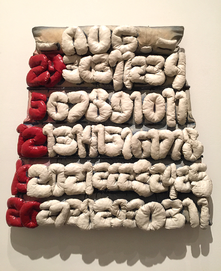
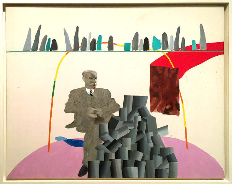
Claes Oldenburg, Soft Calendar for the Month of August, 1962
Canvas filled with shredded foam rubber, painted with Liquitex and enamel – I thought that was interesting – painted with “Liquitex” . But then I remembered that Liquitex was the first water-based acrylic paint created in 1955 – the name deriving from liquid texture hence the name of the company later. I have never seen a painting stating the material instead of acrylic paint with Liquitex – I guess having worked with them made me stumble upon this.
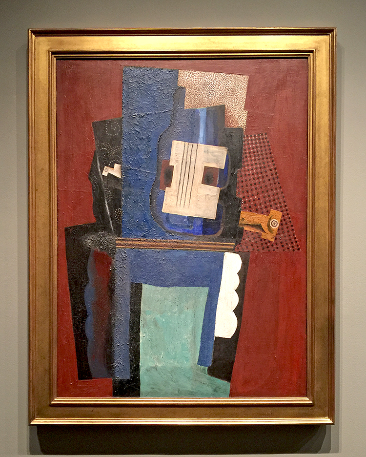
Jim Dine, Two Palettes, 1963
Oil, acrylic, enamel and charcoal on primed canvas
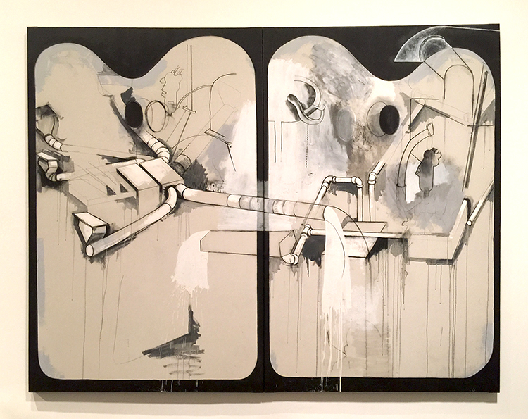
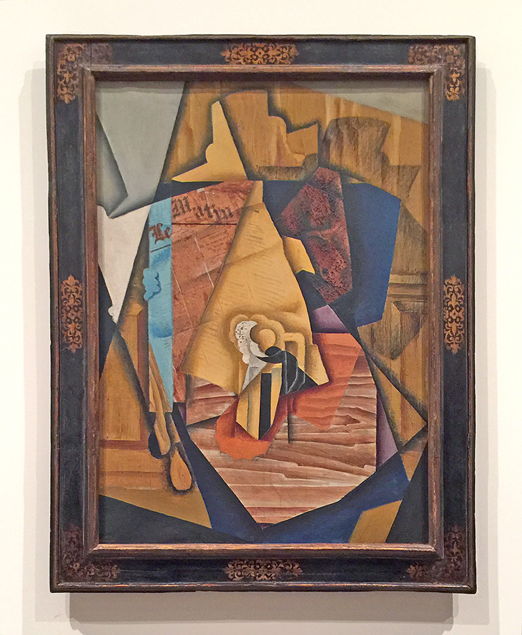
Pablo Picasso, Guitar and Clarinet on a Mantelpiece, 1915
I love the Met but it is just such a hike to get there and it is always so crowded. Strolling through the Modern Art Galleries at the end fo the visit was a wonderful way to catch some breath after an insanely crowded stroll through the Hockney and Cornell exhibition. The next art stroll will probably come from a Museum in Japan …we will see ;) I hope you will join me!
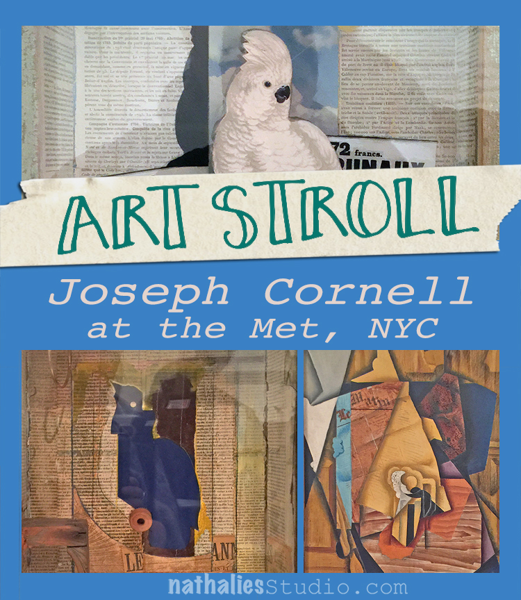
A couple weeks ago I went to the Met and one of the exhibitions I enjoyed in this art mecca was a small exhibition “Birds of Feather” Joseph Cornell’s Homage to Juan Gris. I loved this exhibition because it is about an Art Stroll – which was inspirational and turned into some beautiful art!
In 1953 Joseph Cornell saw Juan Gris’s painting below at an exhibition
“The Man at the Cafe” , 1914 by Juan Gris – oil on canvas with newspaper collage.
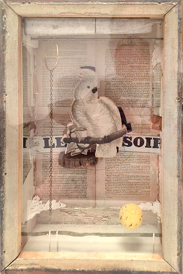
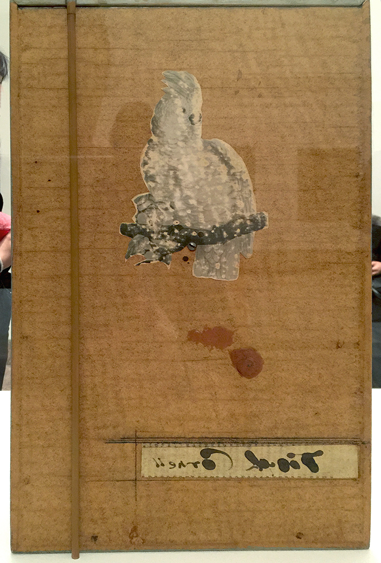
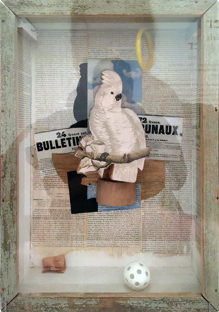
This painting captured Cornell’s imagination and he created 18 glass fronted boxes, two collages and one sand tray over the following thirteen years in homage to Gris. Here are just a few of the boxes:
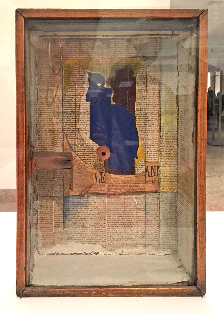
“Josette; Juan Gris #5” ca. 1959-60
This ox is named for Josette Herpin, Gris’s companion. In 1959 Cornell dreamed of a blue cockatoo and explained in his diary that “Josette came to life” . Cornell knew of her two portraits by Gris, where she sits in a black armchair the contour of which mimic the projected shadows of Cornell’s first cockatoos. He was likely inspired by the blue hues of her bust-length portrait. for the colored silhouette in this box.
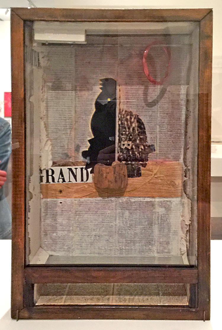
Untitled (Juan Gris Series, Black Cockatoo Silhuette) ca. 1959-60
Cornell’s interest in cut-and-pasted paper was a direct response to Gris’s collages.
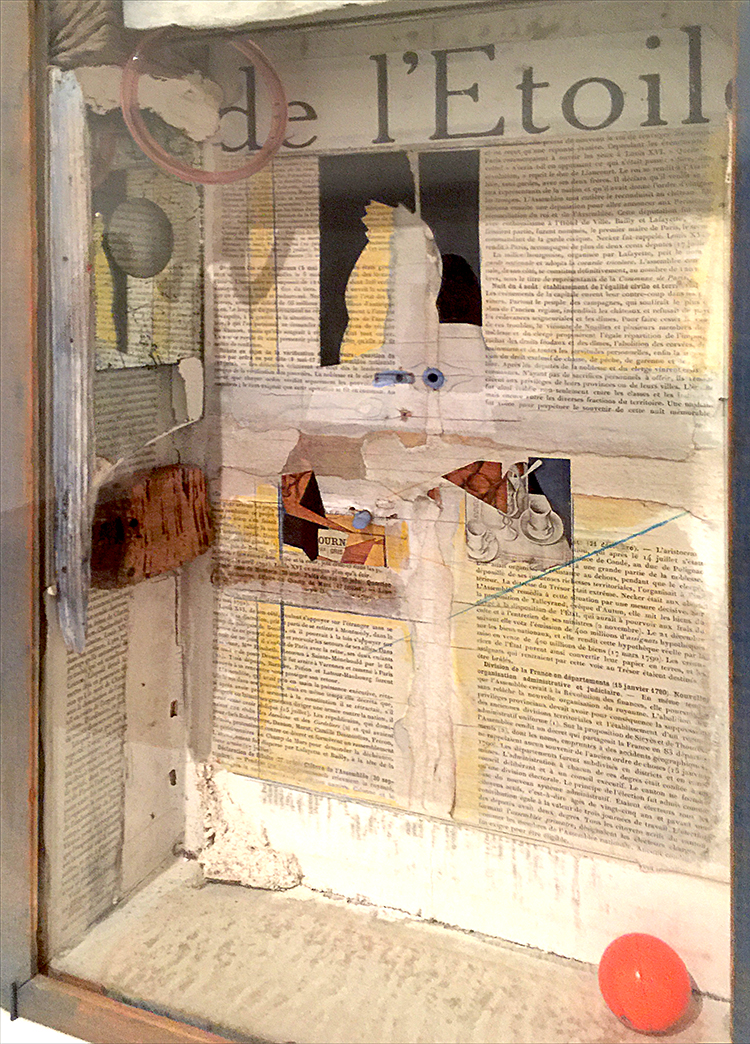
The artist lined his cockatoo boxes with pages from 19th century French texts, which he found in Manhattan book stalls. The photo below is actually the back of one of the boxes -I love this!
Other elements that characterize the Gris boxes are fragments of floral wallpaper, marbleized paper, and commercial labels.
I love Cornell’s boxes- makes me really want to do more assemblage again. I also loved seeing the original inspiration and then so many different versions on how he spun the inspiration. The first box shown here still has some traces of the inspiration – but only if you know about the piece by Gris – but you would not know with the other ones without knowing about the story. Fascinating, don’t you think?
Hope you enjoyed this art stroll- see you soon for another one :)
Pretty cool that Cornell was so inspired after seeing Gris’ art.
I can see that they would be fun to view, but I have to say that it makes me ask the question:
Why is that in a museum more than anything else that has been created?
Interesting what is determined to be “worthy of a museum” art versus anything that someone around me might create.
Just saying.
I tend to enjoy art that makes me question it and evaluate just what the artist was trying to get across.
Just my thoughts.
Enjoy your weekend and thanks for sharing Nat.
It is a good question- love it. I think you always have to see art also in context of art history. Joseph Cornell was a pioneer in using found objects to create 3D art and create assemblage pieces. Taking what once was used and beautiful and then regarded as garbage to create something new was still a pretty new concept and he was taking it a step further from Collage. He inspired many influential artists with his work like Robert Rauschenberg and Andy Warhol. What you see other artists doing today is what sprung from those roots. I think it is easy to forget how new and shocking some things were at certain times. But he who was a pioneer and inspired so many people after him, was also inspired of course by other artists- in this case by Gris who was part of the Cubism movement which again was CRAZY back then (and sometimes even for some people today) That is what fascinates me. I also think that those photos cannot convey the magic of his boxes – they are little wonder boxes. I love that you asked this question – I wonder myself with other art pieces a lot – but the greatest task is trying to find the answer or try to understand – wether it will be satisfying or not – it opens the world and makes us receptive to learn so much about so many things. That is what makes those Art Strolls besides the instant inspiration through color, texture, subject etc. so valuable for me.
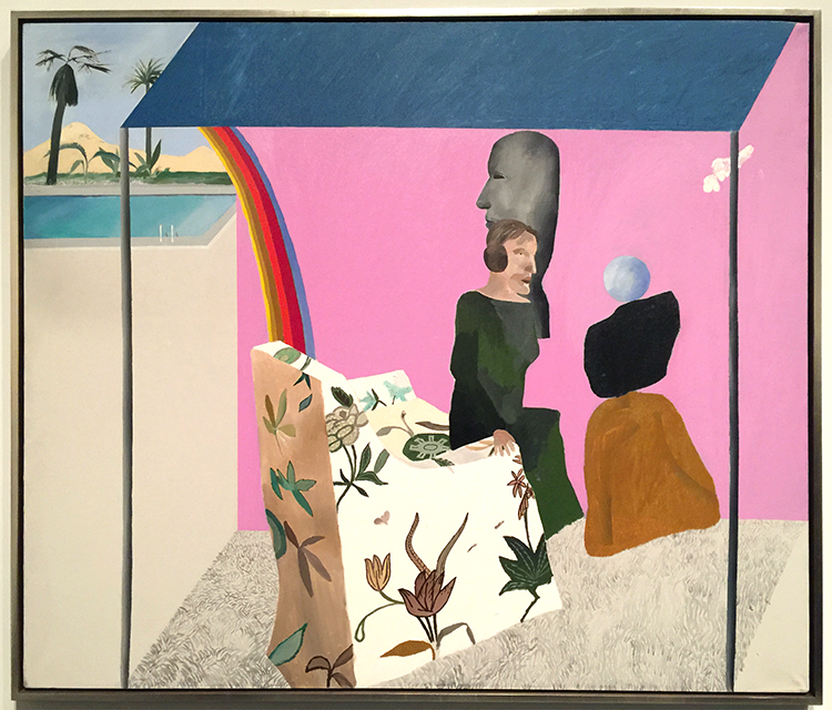
A couple weeks ago I went to the David Hockney exhibition at the Met. I was super excited about it because I have show some of his work in some of my classes as an inspiration to the students. His use of color is fascinating.
I loved seeing his early work- it was so different!
Loved the different materials he used. Lots of texture which is changing soon.
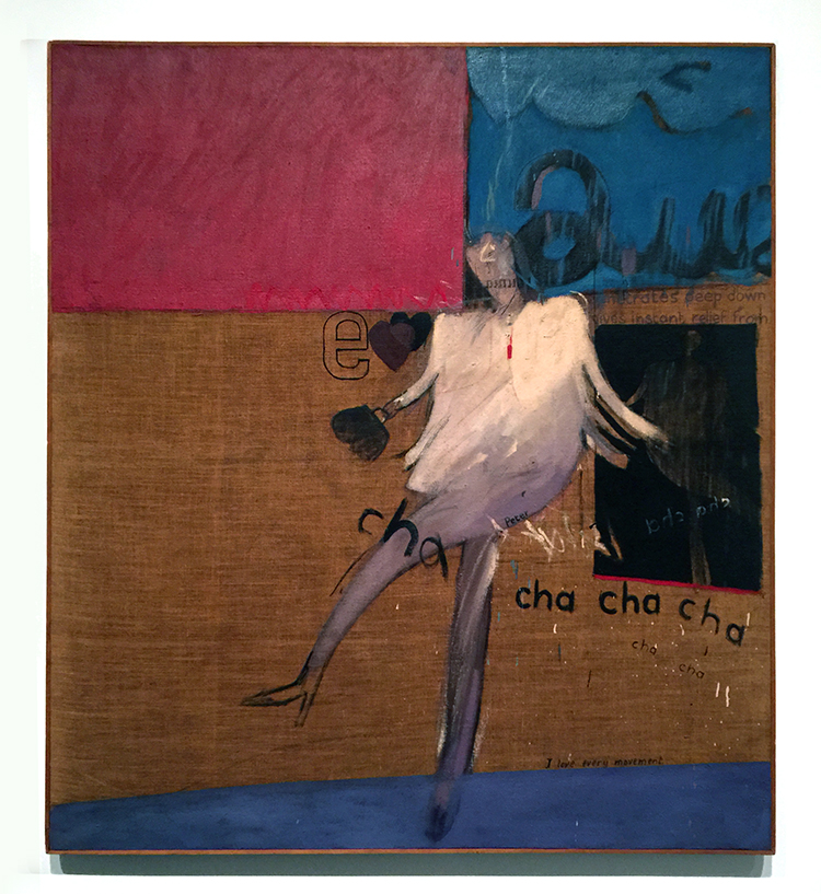
“The Cha-Cha That was danced in the Early Hours of 24th March” 1961
While at the Royal College of Art, Hockney went to a party where one of his fellow students danced the cha-cha for him.
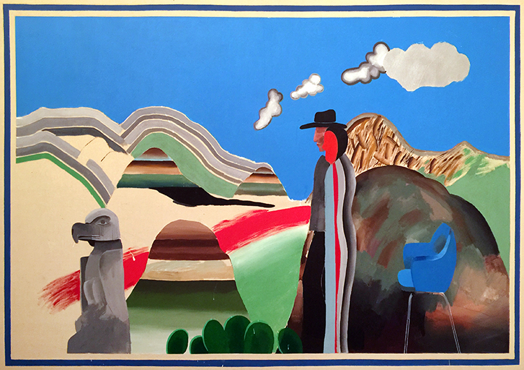
“Rocky Mountains and tired Indians” 1965
What made me laugh out loud was that apparently the American Indians referenced in the title were “tired” because he needed to explain the presence of the chair, which he had only added as a compositional prop. That is hilarious, don’t you think? LOL
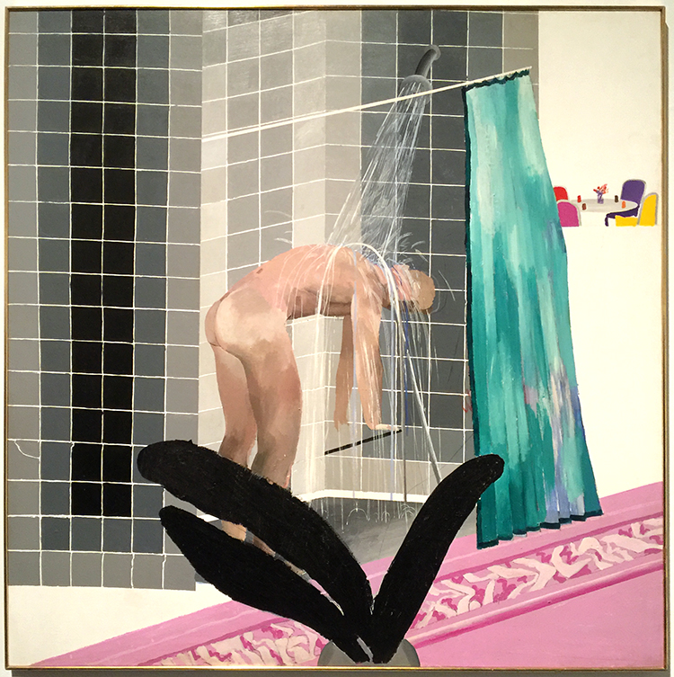
Already in the next paintings you can see his use of colors becoming more bold but also that he is tarting to paint more flat.
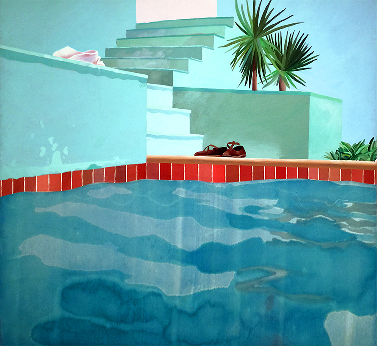
Love the different swimming pool paintings. His most famous painting “The Splash” was impossible to look at – there were sooo many people in front of it, it was insane.
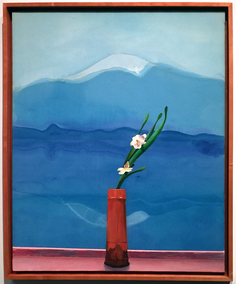
Love this painting of Mount Fuji.
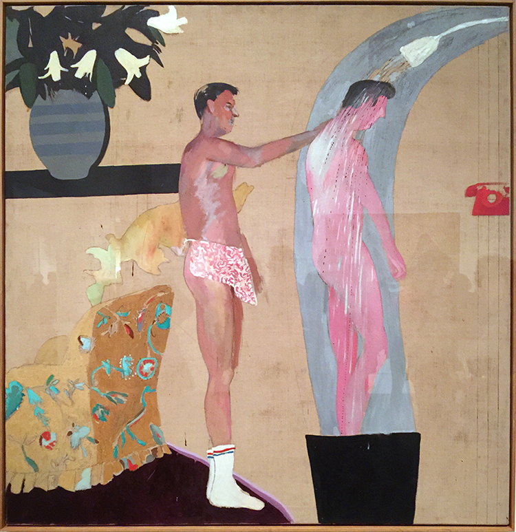
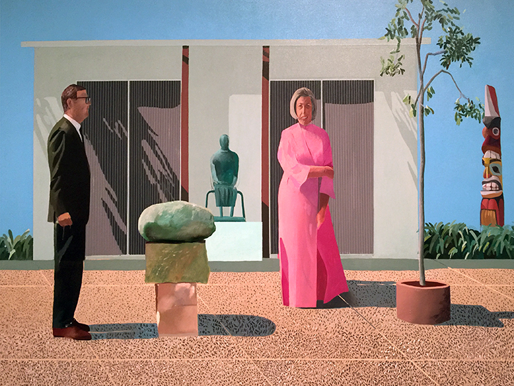
His people are always a bit weird to me- so lifeless and stiff …
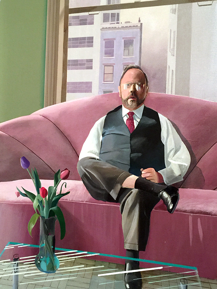
I love the one below
It totally reminds me of a Matisse painting- the window, the iron work of the balcony…
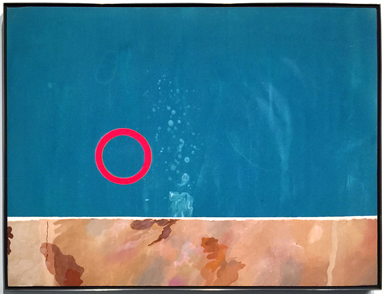
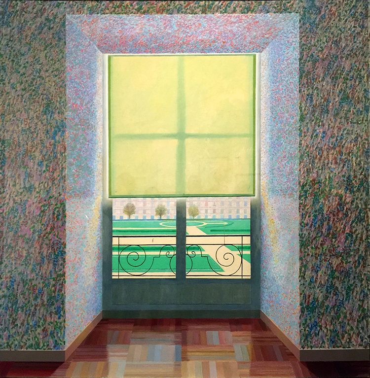
And then below super fascinating
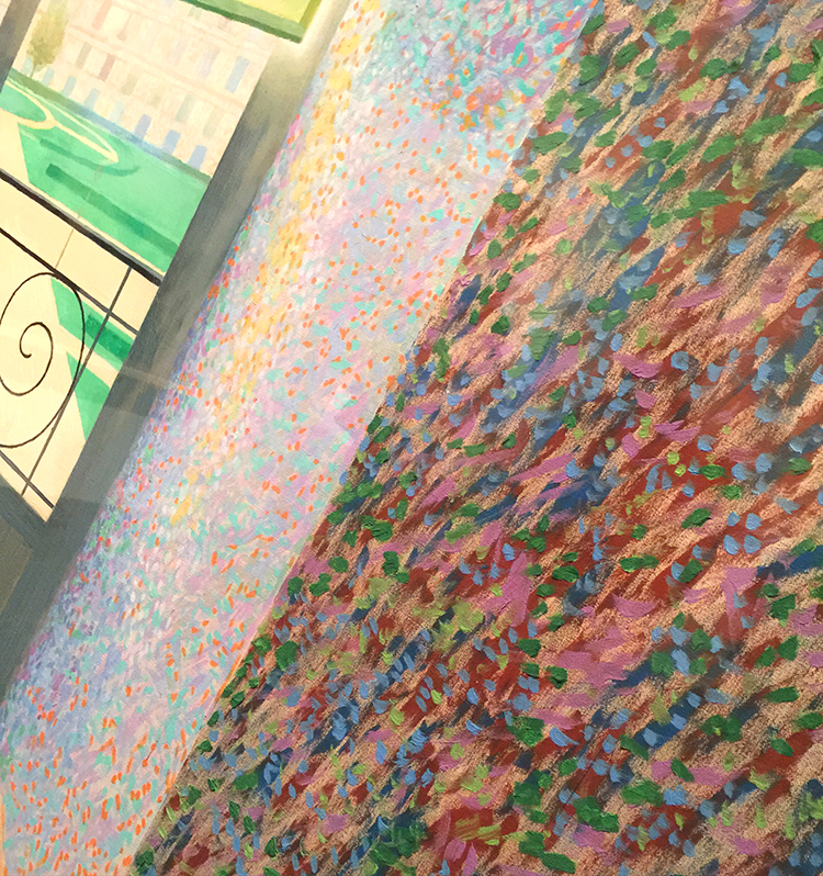
a photo collage – you could think it is a painting from afar, but nope-. He played with those photo collages for 4 years to do something else and exciting and this is his final one.
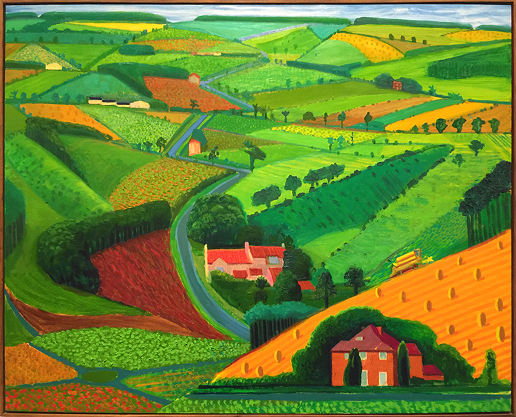
And then look at these colors and how bright and fun the next paintings are!
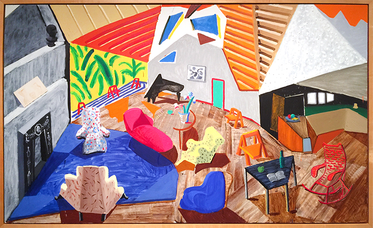
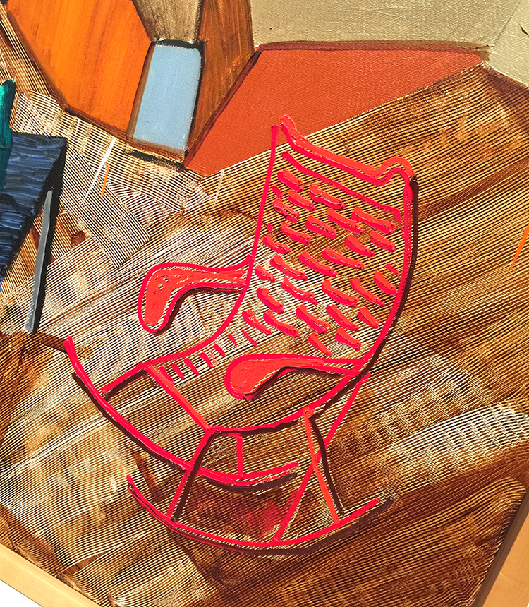
I love the details here and how he added texture here. The perspective is so cool!
And then again he changed …
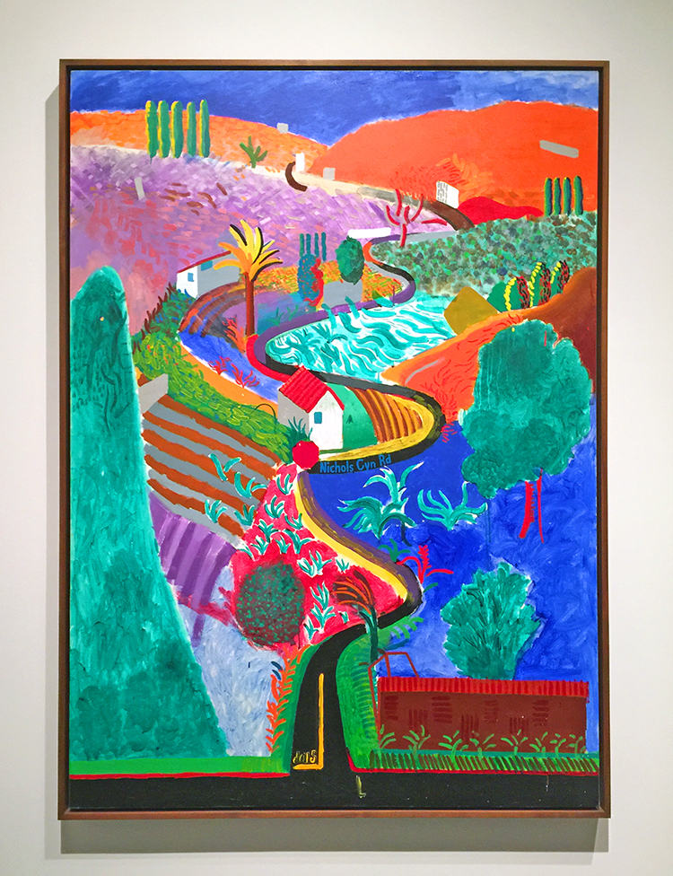
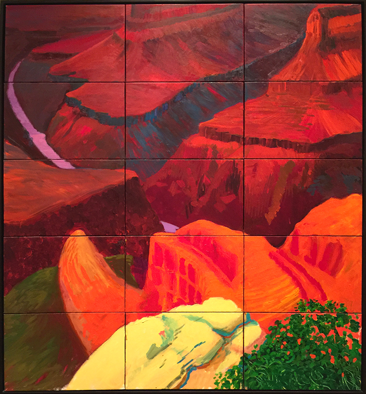
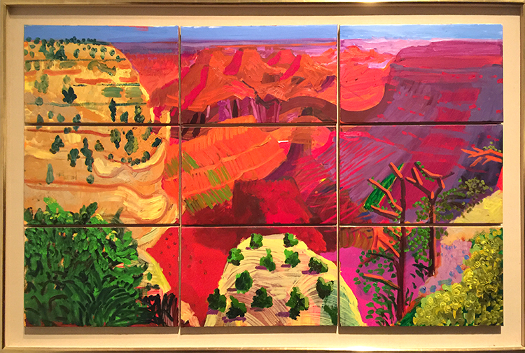
“Colorado River” 1998 – Oil on canvas
I love how he painted this on different panels. The colors are so intense and it felt magnificent just as the view he depicted.
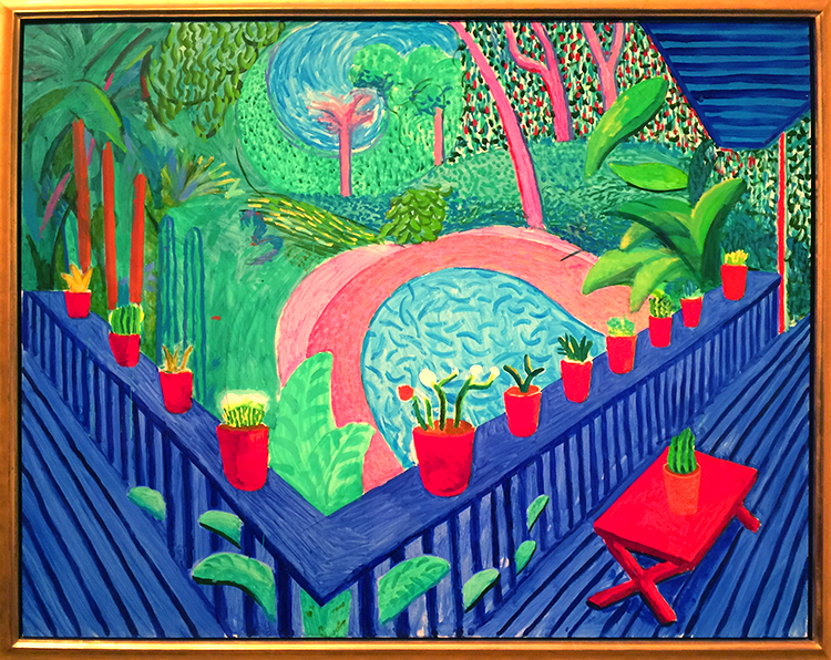
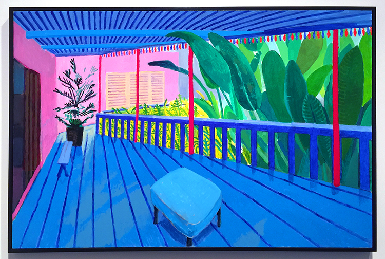
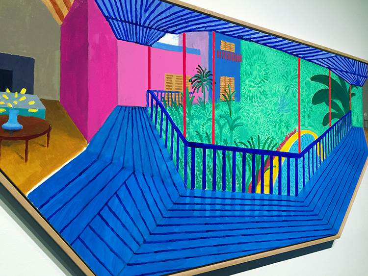
And then his recent work -paintings of his terrace view.
I love those so so much!!!
with the final one below which has this really cool shape !
This was a great exhibition. It was fascinating to see his work change so much throughout his live but I was mostly inspired by Hockney’s use of color. If you have a chance to see Hockney’s work in person – go and see it. You feel the color !
awe- so glad you liked that! I hope you will have a chance to see his work in person- the colors are just incredible and my photos do not do them justice of course!
I am usually a person who loves color and his is nice, but the first one is my favorite one (I think that it speaks to my past depressions).
The people are flat, especially the woman in the pink bathrobe.
Quite the change in style…thanks for sharing.
Comments (2)
Andrea R Huelsenbeck
| #
It’s been so long since I’ve been to the Met. Thank you for sharing your photos. I hope I can visit–maybe next year.
Reply
Vee
| #
Your STROLLS are so FULL!! Your experience ‘feeds’ me in so many ways.
You make me chuckle with your choice of words, you make me think abut the way you looked
at something, you made me feel (dance) (boring), and you always inspire me.
I ALWAYS want your strolls to go on! MORE, More, more
THANKS
Reply