Nat

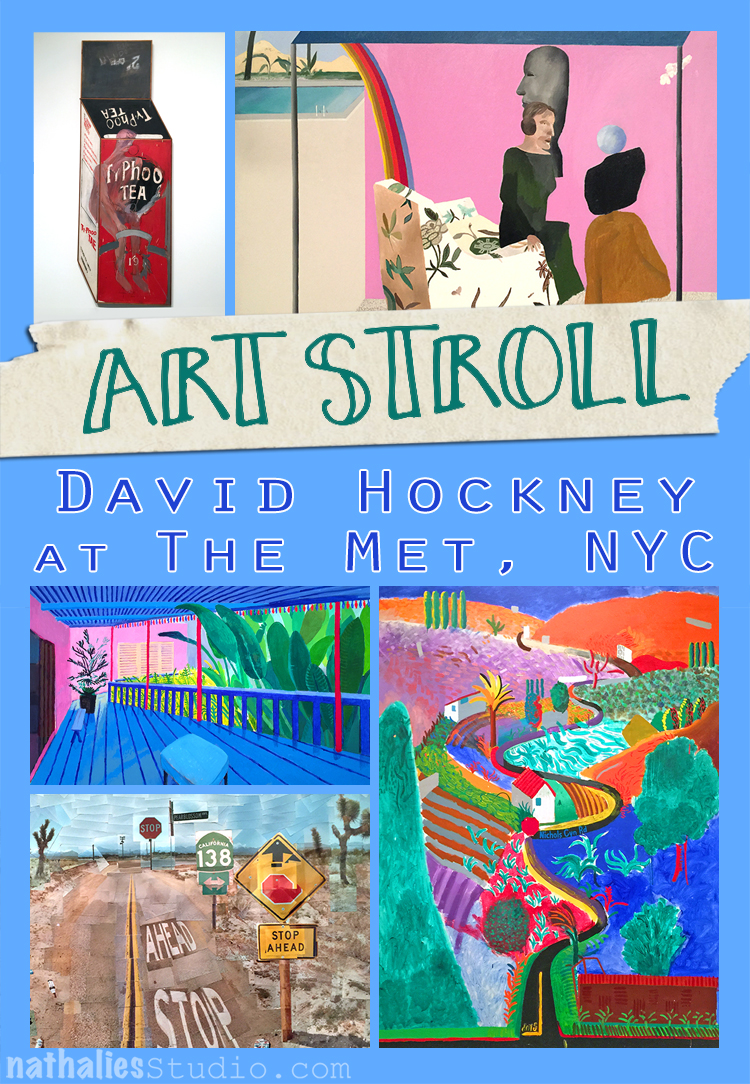
A couple weeks ago I went to the David Hockney exhibition at the Met. I was super excited about it because I have show some of his work in some of my classes as an inspiration to the students. His use of color is fascinating.
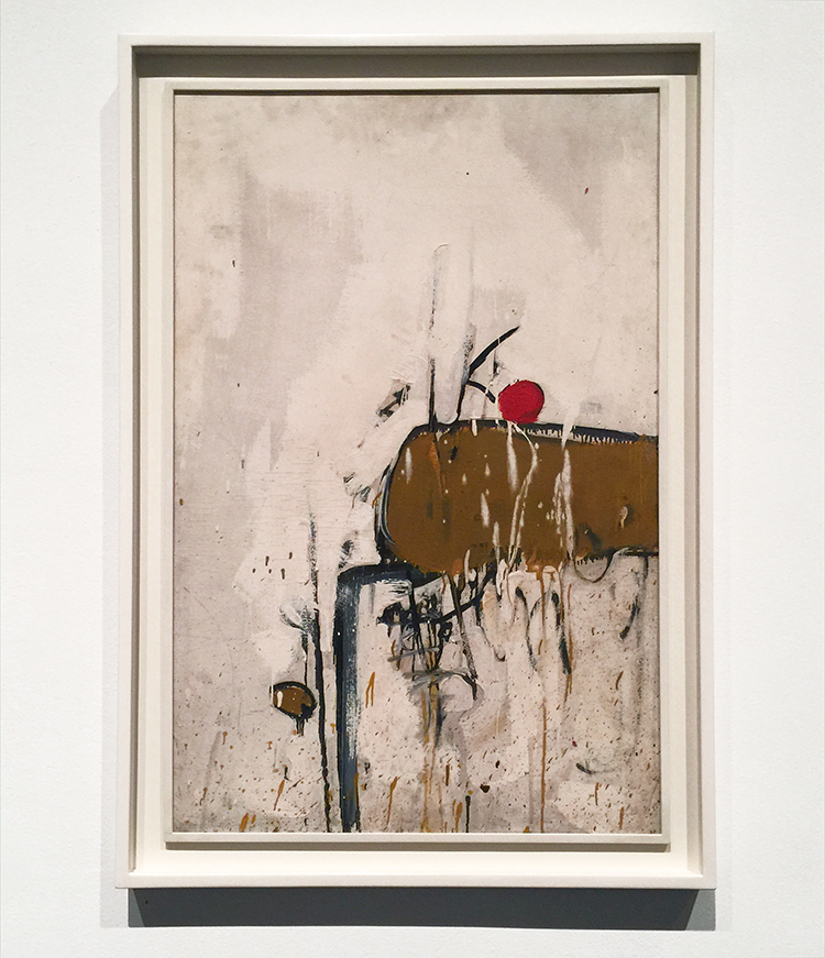
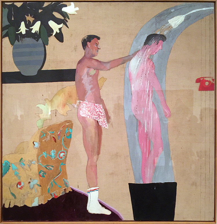
I loved seeing his early work- it was so different!
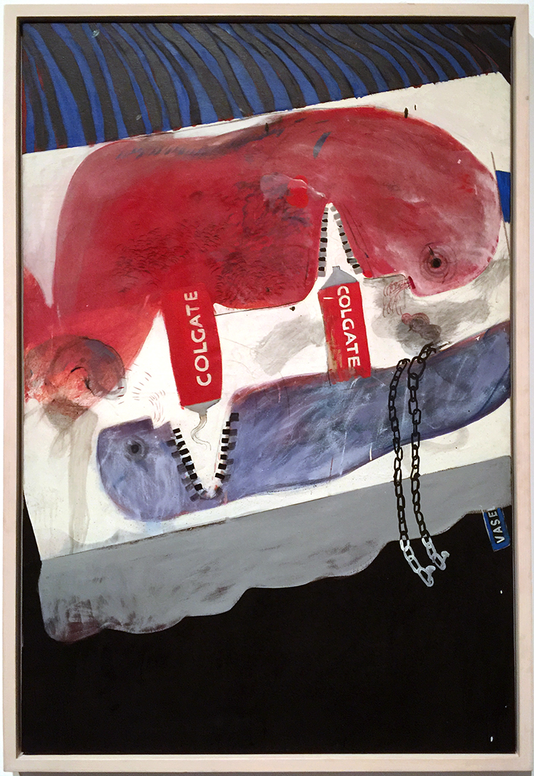
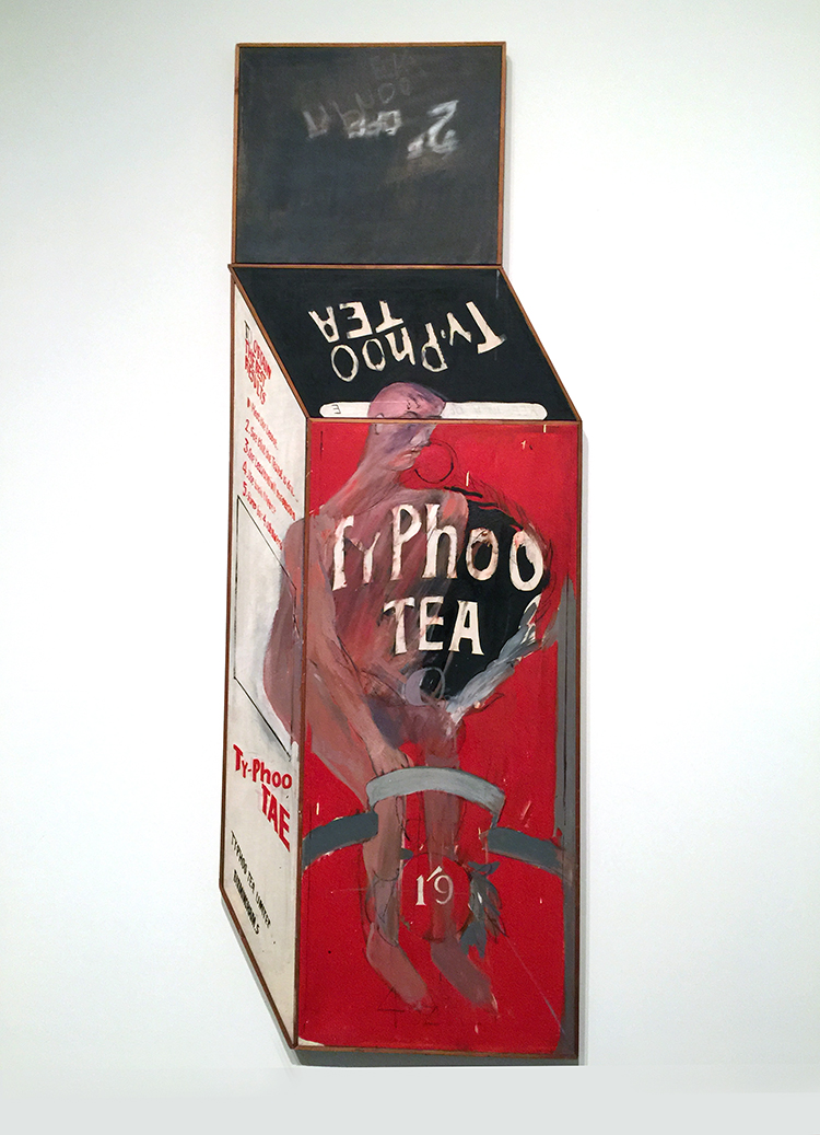
Loved the different materials he used. Lots of texture which is changing soon.
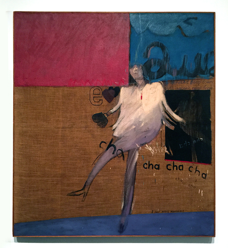
“The Cha-Cha That was danced in the Early Hours of 24th March” 1961
While at the Royal College of Art, Hockney went to a party where one of his fellow students danced the cha-cha for him.
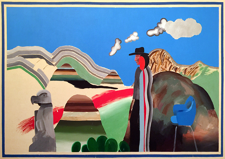
“Rocky Mountains and tired Indians” 1965
What made me laugh out loud was that apparently the American Indians referenced in the title were “tired” because he needed to explain the presence of the chair, which he had only added as a compositional prop. That is hilarious, don’t you think? LOL
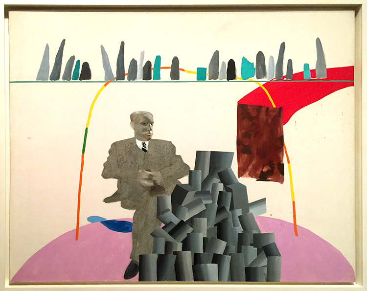
Already in the next paintings you can see his use of colors becoming more bold but also that he is tarting to paint more flat.
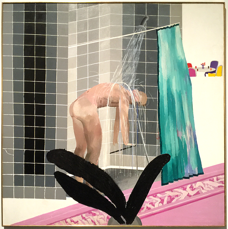
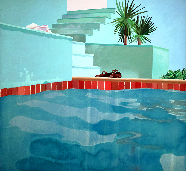
Love the different swimming pool paintings. His most famous painting “The Splash” was impossible to look at – there were sooo many people in front of it, it was insane.
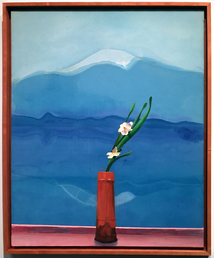
Love this painting of Mount Fuji.
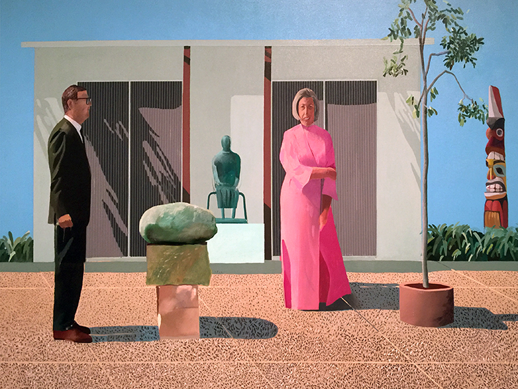
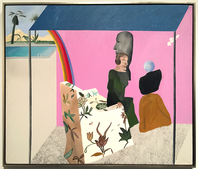
His people are always a bit weird to me- so lifeless and stiff …
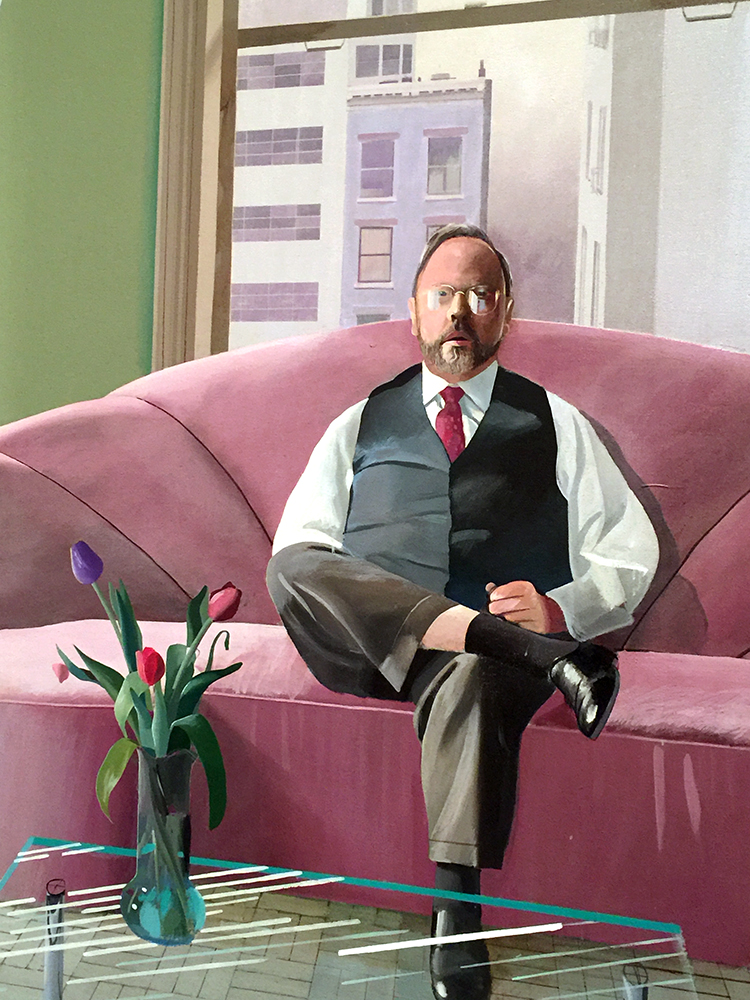
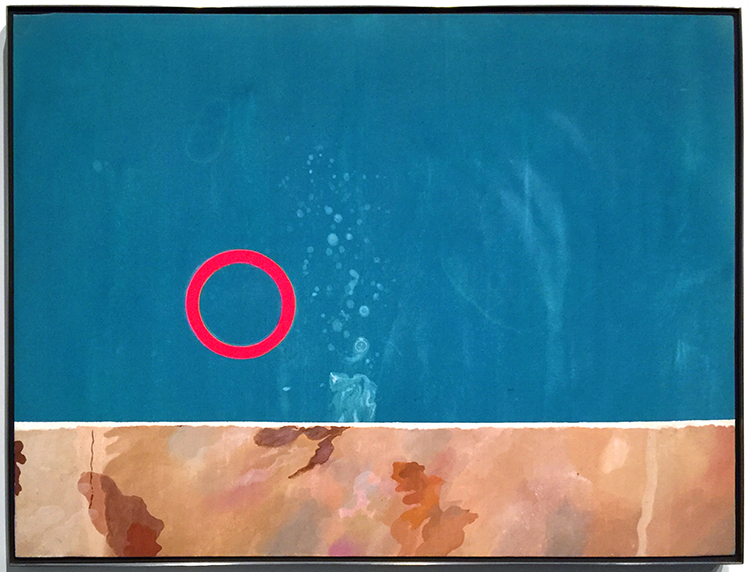
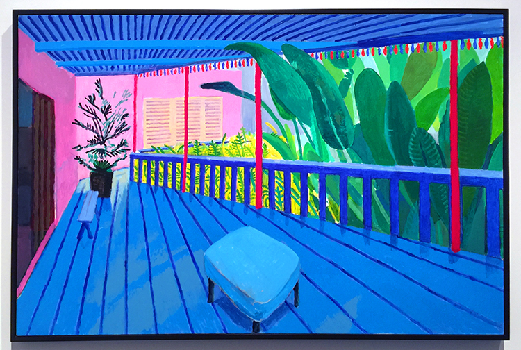
I love the one below
It totally reminds me of a Matisse painting- the window, the iron work of the balcony…
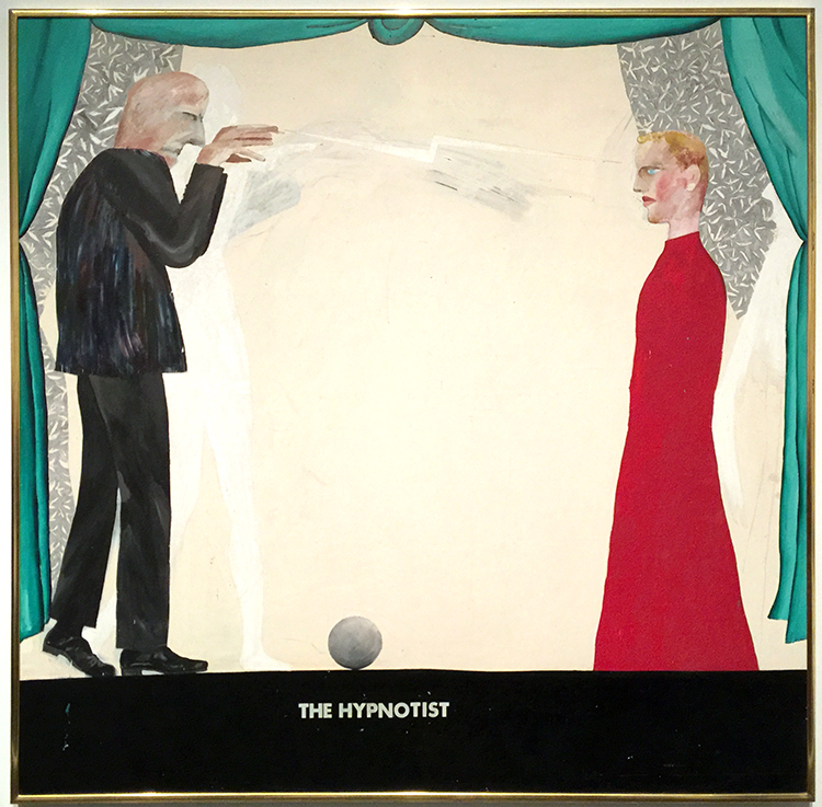
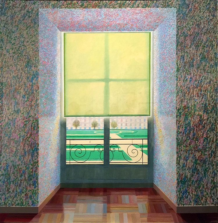
And then below super fascinating
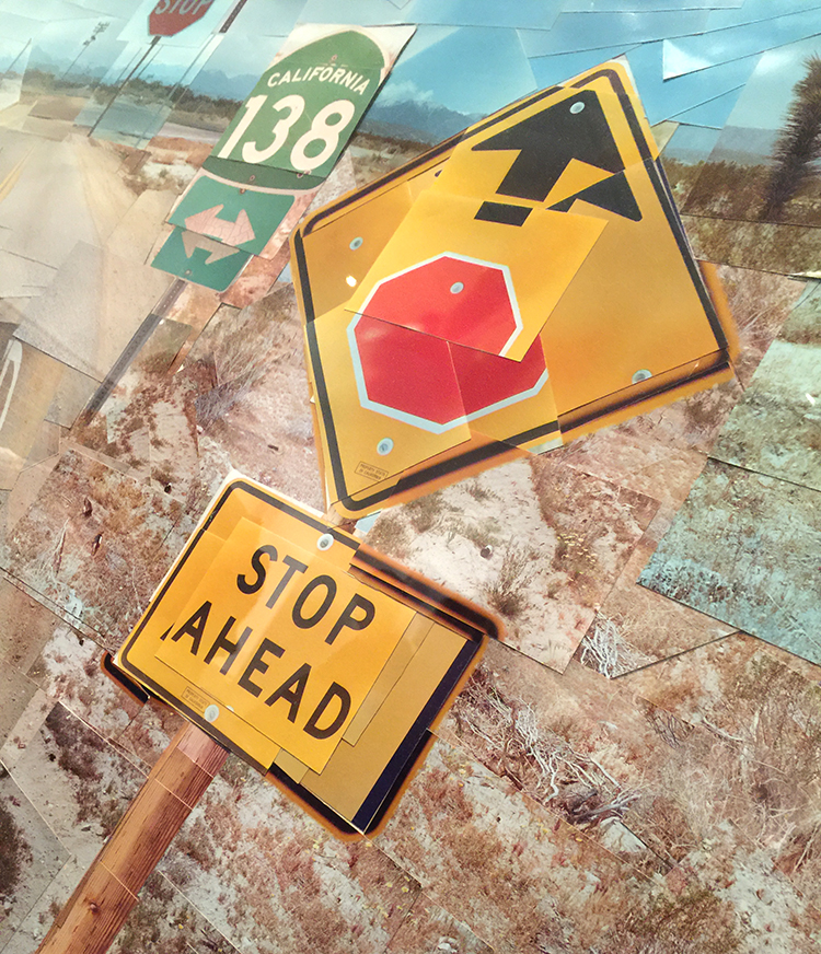
a photo collage – you could think it is a painting from afar, but nope-. He played with those photo collages for 4 years to do something else and exciting and this is his final one.
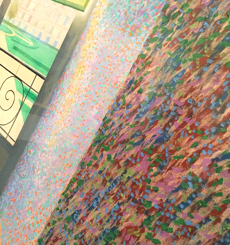
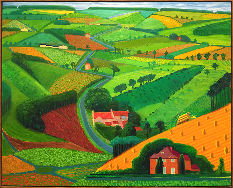
And then look at these colors and how bright and fun the next paintings are!
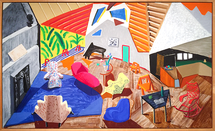
I love the details here and how he added texture here. The perspective is so cool!
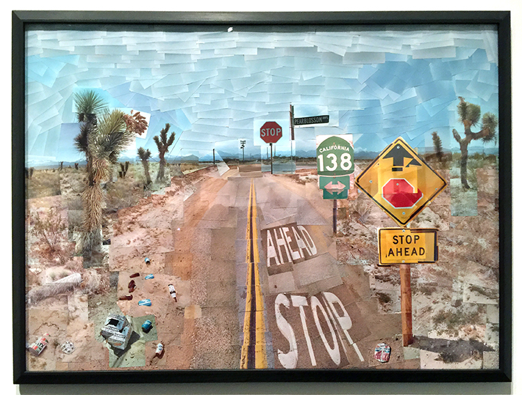
And then again he changed …
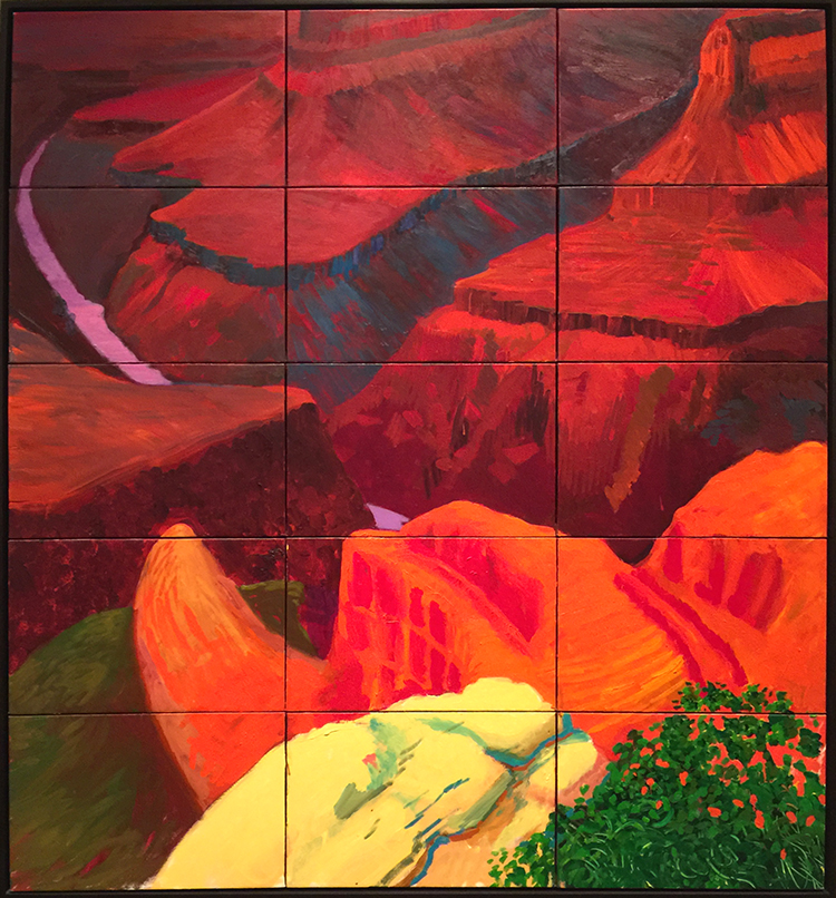
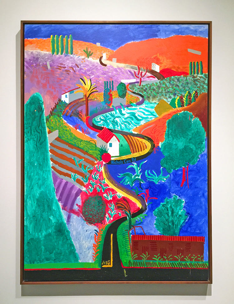
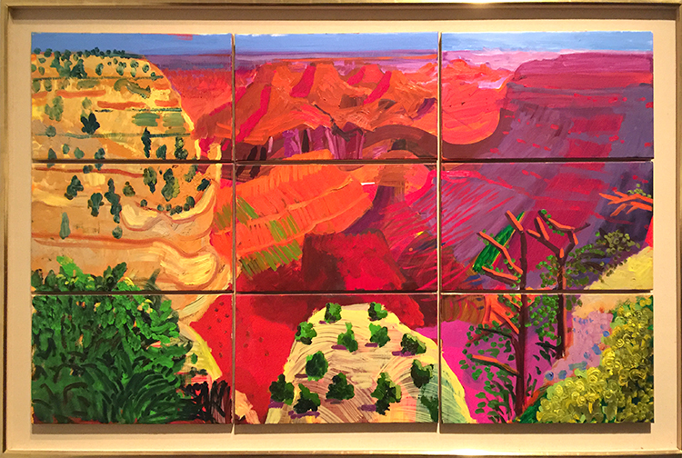
“Colorado River” 1998 – Oil on canvas
I love how he painted this on different panels. The colors are so intense and it felt magnificent just as the view he depicted.
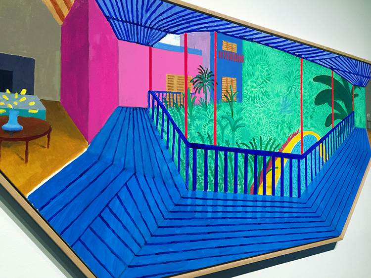
And then his recent work -paintings of his terrace view.
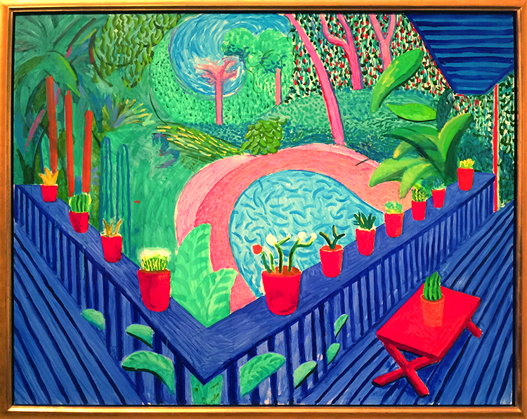
I love those so so much!!!
with the final one below which has this really cool shape !
This was a great exhibition. It was fascinating to see his work change so much throughout his live but I was mostly inspired by Hockney’s use of color. If you have a chance to see Hockney’s work in person – go and see it. You feel the color !
awe- so glad you liked that! I hope you will have a chance to see his work in person- the colors are just incredible and my photos do not do them justice of course!
I am usually a person who loves color and his is nice, but the first one is my favorite one (I think that it speaks to my past depressions).
The people are flat, especially the woman in the pink bathrobe.
Quite the change in style…thanks for sharing.
Yeah the flatness of his work is interesting – the figures he painted in the sixties and seventies are so emotionless too I feel -it is a bit eerie :)
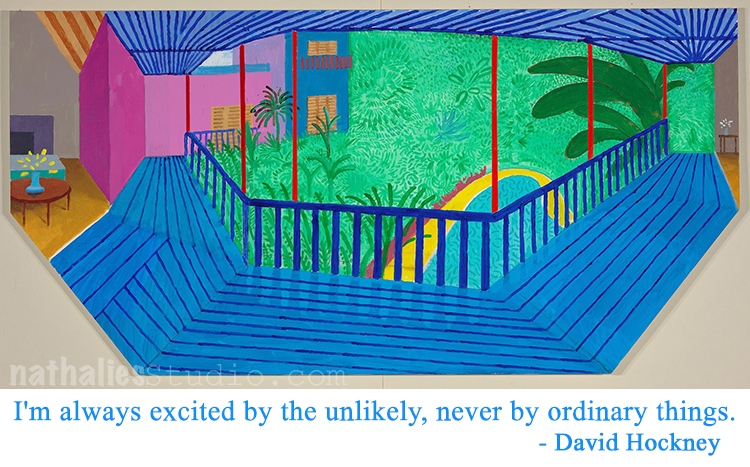
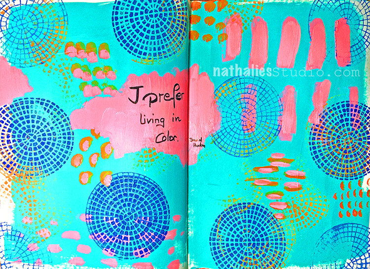
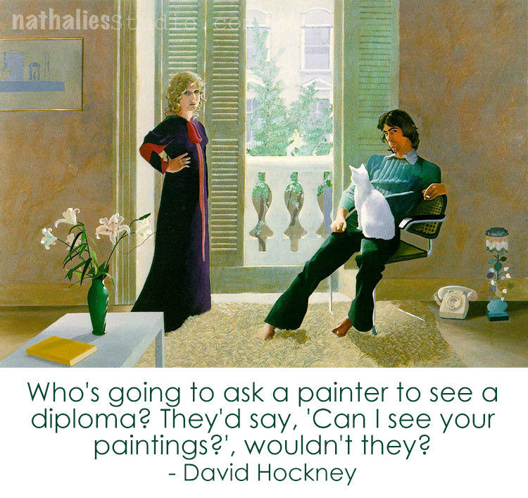
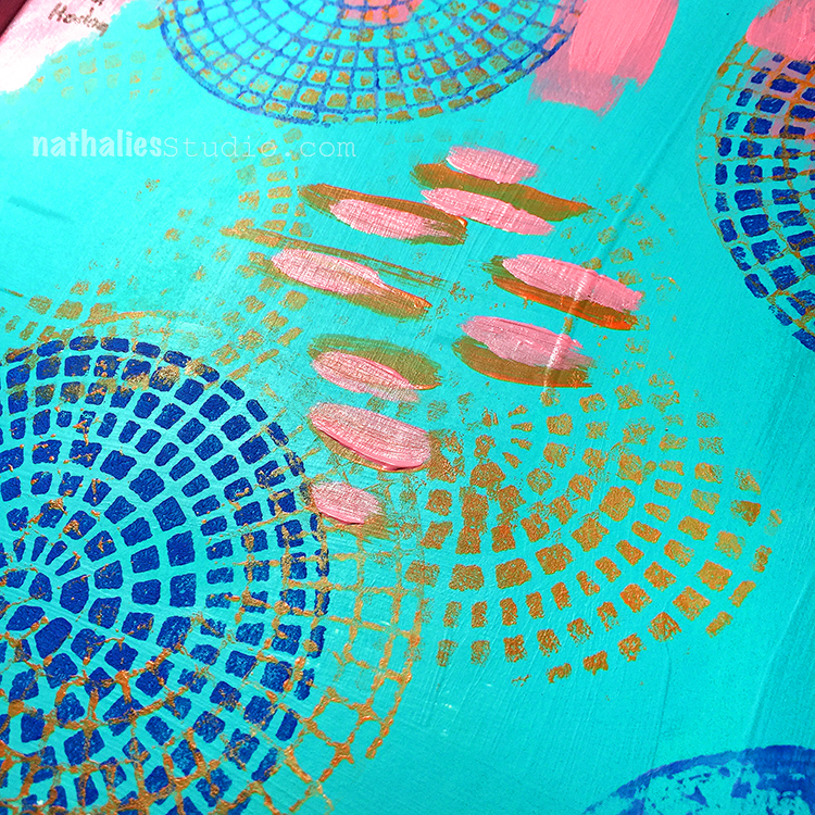
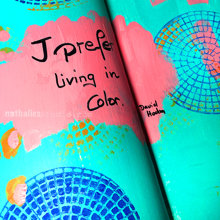
“I prefer living in color” – me too David Hockney- me too. I do love Hockney’s use of colors and I was going for it in this art journal spread
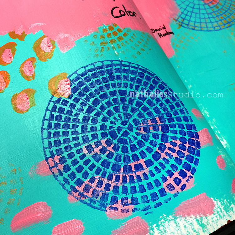
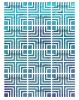
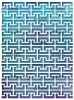
I used my brand new Central Avenue Pos+Neg. ArtFoamies . It comes with two designs- are bold one and a more fine lined one.
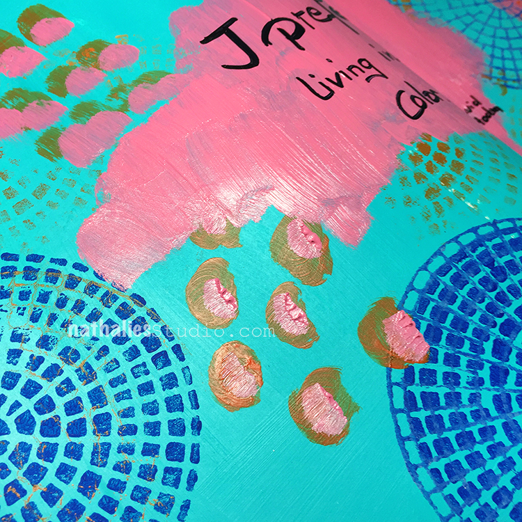
I love using the paint on top of the stamp also only partly to get some areas more lightly as a hint of the stamps
This was fun and an easy creative boost in the morning.
Here are the supplies:


Wishing you a wonderful colorful day !
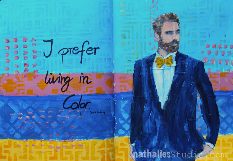
An unusual color combination for me but inspired by David Hockney – a very straightforward but fun page with some stencil play.
Here are the supplies I used:
I think I want to discover this color combination a bit more. Do you like it?
Since you asked Nat, I must say that I’m not wild about that color combo but I enjoy seeing any thing that you’ve created.
Ha- I understand it is a “weird” combo :) Have a wonderful week Sue!


Hi Nat – how fab! I am still inspired by his work from my class with you last spring. I’d love to see it in person.
Reply