Creative Squad

Creative Squad: My Kindred Spirit – Jordan Hill

Hello from my Creative Squad! Today we have a post from Jordan Hill who is sharing her unique take on our theme this month by working on an old playing card with my Triangle Love stamp set. Our theme is: My Kindred Spirit – Animals are often symbols of qualities that we humans identify with, so let’s take some inspiration from them this month. Do you have an animal whose characteristics you identify with? Maybe it changes depending on your mood or what life throws. Who is your Kindred Spirit in the animal kingdom today?


Hello everyone! I’m excited to be back with a new project for the month of April! I had a lot of internal debate on which animal I wanted to focus on for this month’s theme; however, since I’ve always loved amphibians and the symbolism surrounding snakes (the idea of rebirth and new beginnings), I decided to go with a snake. I hope you enjoy following along with the process!

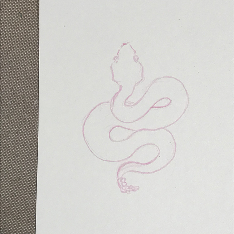
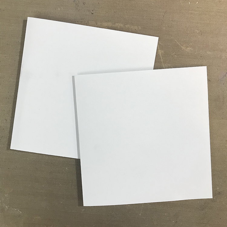
Since I knew that I wanted to do an illustration of my animal this month, I started things off by sketching a snake design on a scrap of watercolor paper with a pink Col-Erase pencil. I used a photo that I found online to get the general shape of the snake down.

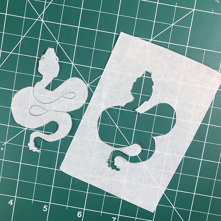
Next, I used a piece of tracing paper and a pencil to trace over my sketch. I then used a craft knife to cut out the shape of the snake so that I had a mask that resembled my drawing.

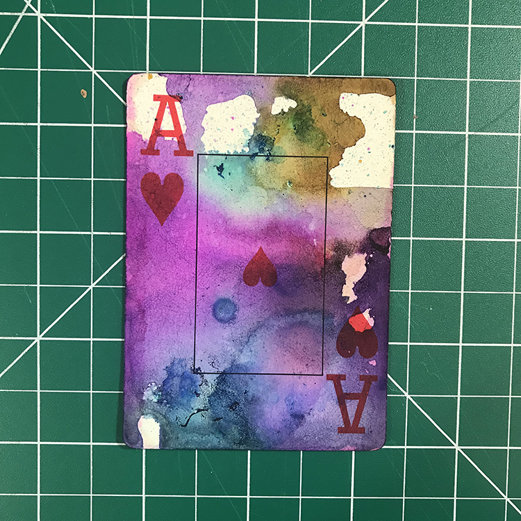
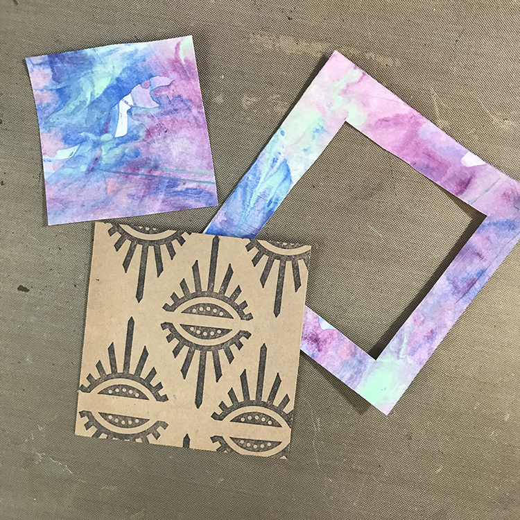
At this point, I wanted to focus on the background. This helped me know how to color my focal image. For the base of my project, I selected a playing card from a deck of cards I purchased at the thrift store for 49 cents. Then, I used a mix of plain rubbing alcohol in a spray bottle and a few colors of alcohol inks to create my background.

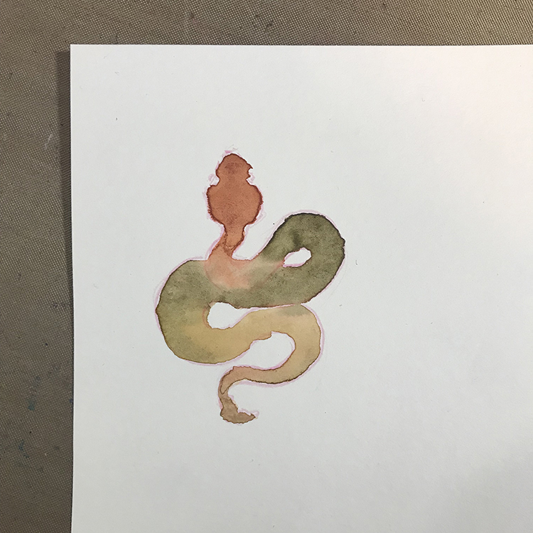
It was then time to paint my snake. Using clean water on a paintbrush, I filled in the shape of my snake. I then dropped several colors of watercolor paint in light oranges and dark greens directly into the water and allowed the colors to blend together.

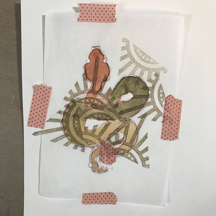
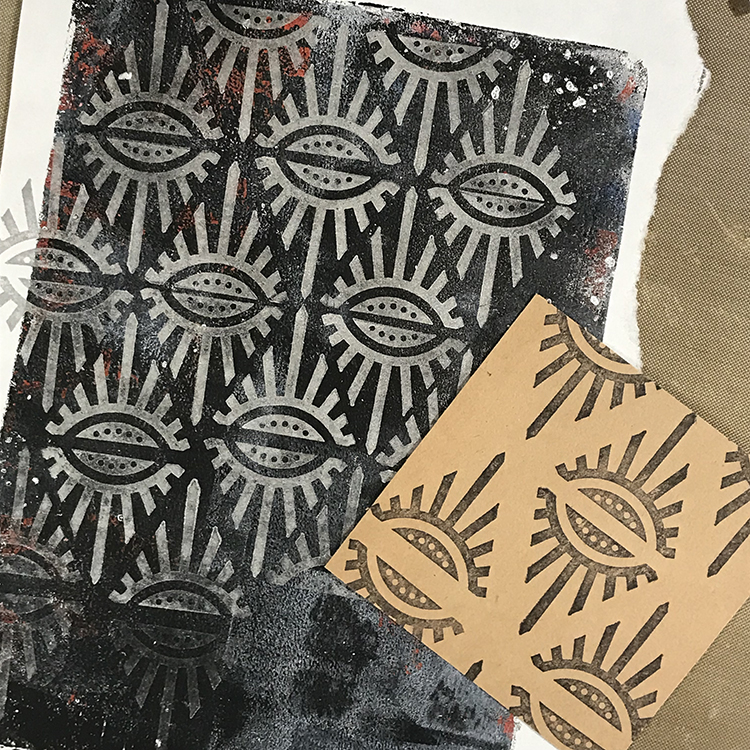
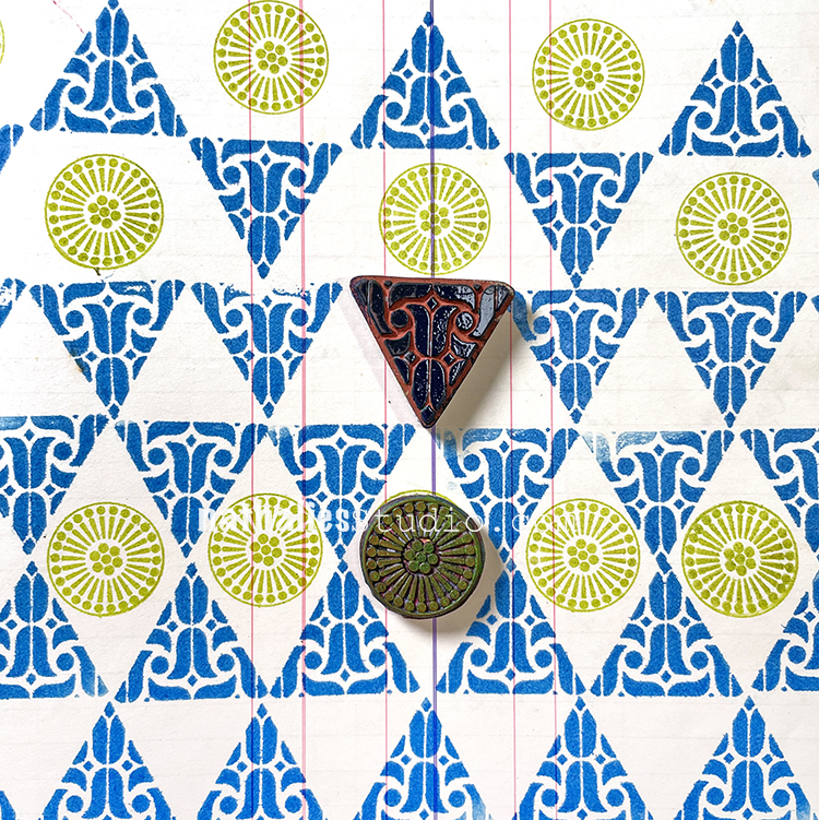
Once the watercolor was dry, I then wanted to add some pattern to the snake. I taped the mask I created in Step 2 over my illustration using washi tape, then used Nathalie’s Empire Triangle stamp paired with Tim Holtz Distress Ink in the color Walnut Stain to cover my snake with a variety of pattern. I then removed the mask and used an ink pen to add some lines the illustration.

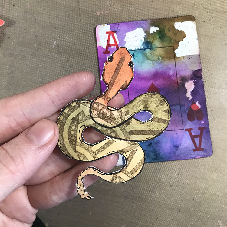
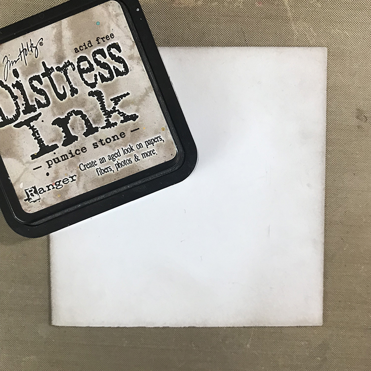
In the end, the use of the mask became mostly meaningless, because I decided I wanted to fussy cut my illustration, again using a craft knife. I then rubbed an Archival Ink Pad in Black around the edges of the piece so that it would stand out more against the background. It also covered some of the raw edges I got from cutting with a blade that wasn’t quite sharp enough.

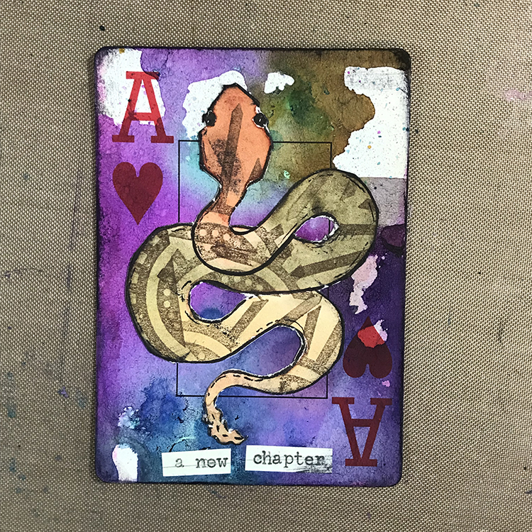
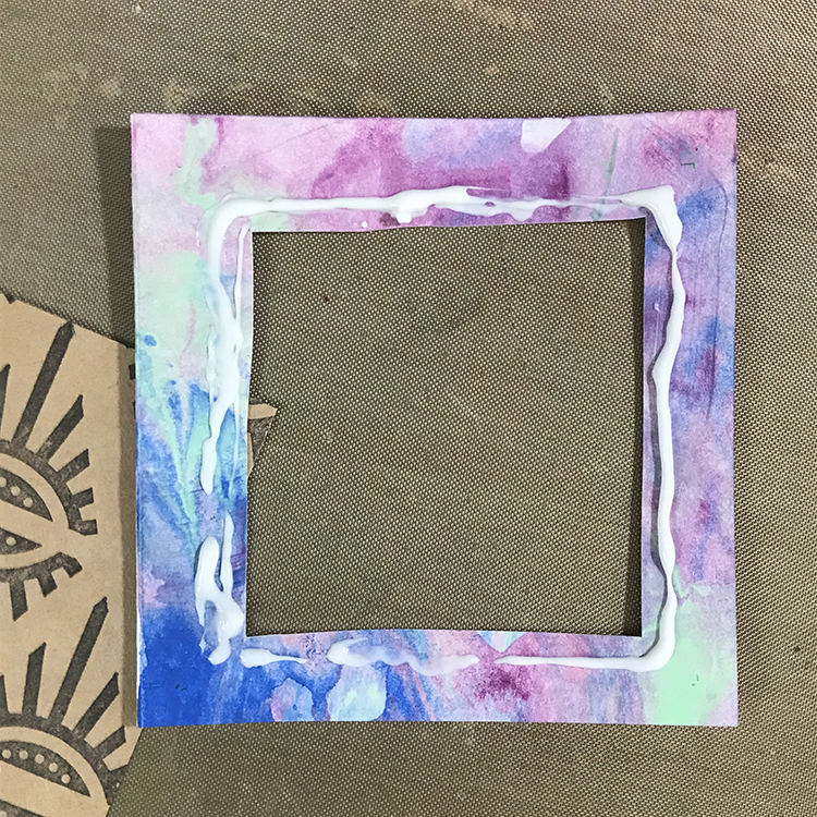
Then all that was left was to actually assemble the playing card! Using Aleene’s Tacky Glue, I adhered the snake to my background. I then used a small phrase I typed out on my typewriter to give the card a title, rubbed my Archival Ink Pad around the edges of the card, and I was ready to call it done!

Altered playing cards can be a great addition to your mixed media repertoire; you can create an entire deck, or staple them into your journals to create quick pages! I hope you enjoyed following the process of creating this card and that you give some of the techniques a try for yourself!


Thank you Jordan – I love that you chose to work on a playing card, and the use of the stamp to create the snake’s marking is just perfect!

Give it a try: you can find all my Rubber Stamps in my Online Shop and in addition to an old playing card, here are some of the supplies Jordan used:

Looking for more projects? Follow the Creative Squad on Instagram here.

Leave a comment

Creative Squad: Gratitude is my Attitude – Jordan Hill

Hello from my Creative Squad! Today we have a post from Jordan Hill who is sharing with us a couple of lovely cards using my Triangle Love and #keepyouposted rubber stamps, with our very appropriate November theme in mind: Gratitude is my Attitude – This month we are playing along with the November ArtCollab: Showing Gratitude – and specifically giving thanks to those who have helped us along the way in our artistic journey. Who was crucial in helping you become the artist you are today? Let’s give these amazing souls a shout out!


Hey everyone! I’m excited to be back with a new project for the month of November. The first thing that came to mind when I heard this month’s theme of “Gratitude is my Attitude” was greeting cards! They are a great way to show you’re thinking of someone, and making that card handmade always adds a little extra touch. 

I started out my greeting cards by cutting down a piece of white card stock to 4.25″x8.5″. I chose this size because it allowed me to cut two cards from an 8.5″x11″ sheet of card stock with next to no leftover (only the 2.5″ strip at the end). Once my card stock had been cut to size, I folded the pieces in half to create two square cards.

Next, I selected a few scraps of paper and using Nathalie’s Empire Triangle stamp, I created a repeating pattern across them. For the lighter piece I used black ink and for the darker piece I used a silver pigment ink. These triangle stamps fit together nicely to create patterns! 

I then cut down my stamped papers into smaller square shapes. For this particular card, I chose a 3″x3″ square. Next, I selected a separate paper scrap to create a mat around that square. A trick I learned back in my scrapbooking days is that if you are having a hard time using up your pretty papers, you can cut out a square from the middle of your mat and save the scrap for another project!

Place your glue around the inside edge of your mat. I used Aleene’s tacky glue for my cards, but any sort of liquid glue, double sided tape, or adhesive runner would work for this! Then, place your patterned paper square into the center of the mat.

Next, I prepared my card bases for assembly by using some Distress Ink in the color Pumice Stone and a Tim Holtz Blending Tool to buff around the edges of my card. I selected this color because I felt the gray fit with my style and the other colors that I was using more than some of the browns I have in my collection.

Then, using Nathalie’s #keepyouposted Cling Rubber Stamp Set and a black ink pad, I stamped some words onto a scrap of file folder and cut them out. I stamped a few extra so that I’ll have them prepared for making cards in the future!

Now it’s time to assemble! Glue your matted patterned paper onto your card base, and add the words to it. Experiment with the location of the words until you get a placement you’re happy with, and you have a quick and easy card to send to your friends or family to express your gratitude for them!

I did a simple variation of this card by cutting my patterned paper down to a larger size (I chose 3.75″x3.75″) and gluing it directly to my prepared card base. I then used a couple of different elements from some of my collage sheets to add a figure before gluing down my words. This adds a little more interest to your card while still keeping it very simple.

I hope you enjoy these tips and tricks to make some simple greeting cards and that you have fun making some of your own!


Thank you Jordan, with the Thanksgiving holiday this week in the US, it is the perfect time to create some one-of-a-kind cards to thank those who are important to us :)

Give it a try: you can find all my Rubber Stamps in my Online Shop and in addition to paper scraps and collage elements here are some of the supplies Jordan used:

Follow the Creative Squad on Instagram for weekly posts, artwork, and inspiration.

Leave a comment

Pattern Monday 22 – Ledger Video

Pattern Monday time and today I’m working in my big vintage ledger and playing with just two little stamps and changing up the orientation and frequency of stamping to create a pattern that has a surprising amount of complexity. So, just one stamp from my Small Circle Jumble set and one from my Triangle Love set is being used here and I definitely wish with this one that my big vintage ledger was even BIGGER so that I could do more of the pattern for you. You will just have to use your imaginations :)

Here is another look at the finished pattern and the stamps I used:

Your turn to give it a try! Here are the supplies:

Leave a comment

Creative Squad: Wish You Were Here – Jordan Hill

Hello from my Creative Squad! Today we have a post from Jordan Hill who is sharing with us a bit of mail art using my Triangle Love and Birds stamp sets, “The World’s Pinkest Pink” powdered paint, and our theme: Wish You Were Here – This time let’s think about those old travel postcards, or someone you are missing or haven’t seen in a while, or maybe a place that you are missing. The message is loud and clear: Wish you were here!


Hello everyone! I’m very excited to be back with my project for September; I thought a fun way to interpret this month’s theme of “Wish You Were Here” would be to create a postcard! I love working in a smaller size, so the 4″x6″ base was perfect for me. I hope you enjoy following along with this process!

A friend recently sent me a powder pigment that is marketed as “The World’s Pinkest Pink”, and I really wanted to experiment with it. I mixed some of the pigment up with water, then painted it over my background in a very haphazard kind of way. The brightness of this particular pigment is so intense that I cannot show it accurately in photos, but just know that it is very bright!

Once the pink background was dry, I used Nathalie’s “Empire Triangle” rubber stamp with some Black Archival Ink to create a repeating pattern over my background. These small motif stamps are perfect for creating patterns!

Next, I started to create a figure with a piece of collage. This particular piece started out as a full illustration, but I cut the body and hair away from the face of this particular scanned image, then glued it down. Sometimes partial images can be a great way to give yourself a jumping off point without committing to anything too intensely. 

I then followed my typical illustration process to give the face a body and hair. Once that had been completed, I then used another of Nathalie’s stamps, this time the “Nightingale” stamp, to stamp onto white tissue paper. I then glued that image to my postcard using Mod Podge and a paintbrush, to make it look like my figure had a bird on their shoulder!

To finish up this postcard, I used a dip pen and some Speedball Calligraphy Ink in Super Black to add a border around the edges of my postcard, as well as to write the words “missing you” in the upper right hand corner of the card. I thought that particular sentiment matched the theme for this month, and it was a nice final addition to the postcard!

Though this month’s project is more on the simple side (for me), I quite like the way this card turned out, and I’m excited to get it in the mail! I hope you enjoyed following the process of creating this postcard and that you try creating one of your own!


Thank you Jordan – love how you used the Bird on her shoulder!

Give it a try: you can find all my Rubber Stamps in my Online Shop and in addition to her collage bits, here are some of the supplies Jordan used:

Looking for more inspiration from the Creative Squad? Follow them on Instagram here.

Leave a comment

Bring it On – Art Journal

“What if things get even crazier from now on… the ride never stops …bring it on.”

This is the first page in my newly bought ledger from 1880/90. I bought 3 and they are not used at all. They came from an estate sale and I bought them specifically for Art Journaling. I have a little weird thing that I am hesitant to fill the first page in any book that I love – when it is handbound or special. I used to be so angry at myself when I messed a sketchbook or diary or art journal up on the first page (meaning I wasn’t thrilled) that I would just burry it in a pile of stuff to not be reminded of it anymore.

Anyway, in order to not fall into that trap here (hahaha) I decided to build up my page on a piece of Grafix Dur-a-lar and adhere that to the first page, so I had a bit of time to decide if I was cool with it ;)

Here’s how I built up the page: I started with a Gelli Plate print with acrylic paints and my Batik and Lily Wallpaper stencils right on the Dur-a-lar. Then I used some collage paper – letters, stamped collage paper (using my Mini Motifs rubber stamps), and a piece from a painting on canvas that I cut apart. Next I made a sketch on deli paper and added some marks with gouache paint and my Triangle Love stamps with archival ink. I layered and adhered it all with double sided tape and a glue stick.

Here are some of the supplies I used:

Leave a comment

Pattern Monday 13 – Video from my Ledger

Happy Monday and welcome to another pattern in my big vintage ledger! Today I’m using my Solid Hex Large rubber stamp and a stamp from my Triangle Love stamp set. I think the simplicity of this pattern works well and when I put the video together, the music made me laugh LOL. Enjoy:

Here is another look at the result and my supplies:

Give it a try! Here are the supplies I used:

Comments (2)

  • Robin

    |

    So creative. I love this pattern!

    Reply

Leave a comment

Another Woman’s Crown – Art Journal

“Be the woman who fixes another woman’s crown without telling the world it was crooked!”

To create my background here I used Moonlight duo ink pads with my Triangle Love rubber stamp set. The figure is a pulled magazine gel print.

On this side I used my Art Deco Empire stencil with Moonlight duo ink pads and then added in my quote.

Here are some of the supplies I used:

Leave a comment

Creative Squad: In the City – Jordan Hill

Hello from my Creative Squad! Today we have a super cool project from Jordan Hill using a mini billboard model and my Triangle Love rubber stamps. Our theme is: In the City – Although we aren’t traveling much these days, let’s reminisce about a time we traveled to another town or city. Think about the flavor of the place and let that guide your color and design choices.


Hello, everyone! I’m very excited to be back with my project for May 2021. This month I was working with the Billboard Model Kit, which I found to be a lot of fun and an interesting change of pace from the style of work that I usually do.

I decided to begin my project by decorating the flat billboard part of the model. In order to do this, I used some white gesso to prep the chipboard surface, then used CraftSmart craft paints in Pale Blue and Neon Pink to create a background that reminds me of some of the colors of lights you might see in the city at night.

In order to create this particular background, I tried to work quickly and allowed the paint colors to blend together as I applied them to the chipboard. The two colors I chose created a pretty soft purple when mixed, which added a bit more depth to the background colors. After the acrylic paint had dried, I then added a few pieces of collage (some star paper I found at a thrift store and some hand painted neon pink arcs) that reminded me of graffiti.

Next, I knew I wanted to incorporate the theme of “In the City” in the form of some freeform building doodles. Using a Sharpie, I drew squares, rectangles and arches to represent the shapes of houses, windows and doors. I then used some leftover neon pink paint I had on my palette and the tip of my finger to add some dots to the background. I also added some white to the windows of the houses to help them stand out a bit more.

After I had my buildings in place, I knew I wanted to add some more pattern and texture to the background. In order to do this, I chose Nathalie’s “Empire Triangle” rubber stamp to stamp over the entire background. Since there was already a lot going on, after inking up my stamp, I stamped once on a separate scrap of paper before applying it to my background. This gave me a much more muted effect, which I quite like.

Next it was time to add the figure. I played around with the idea of collaging a face onto this piece, but ultimately decided to draw a new one from scratch. I did this in much the same way as I typically do, by first blocking in the shape of a face with acrylic paint, then sketching over the top in colored pencil. This time however, I did opt to use an Aquamarine Prismacolor pencil for my sketching as opposed to my typical navy or deep purple. I then inked the illustration and sketched in some hair.

The next step was to add color to the hair I sketched in previously. I chose to go with CraftSmart Aqua for this step; I recently discovered I have three bottles of this paint in my possession, and I wanted to use some of it up! It also just so happened to coordinate with the colored pencil I had already used to draw the face and it had a nice contrast with the pre-existing colors of the background.

As I reached this point in the project, I knew I wanted to add a quote. This particular model feels very much like a display piece, so I felt that some motivational words would work well. In order to add the words to the piece, I chose a thin ink pen and wrote my quote in a large cursive font. This is the first part of the typical style of lettering that I recreate frequently in my artwork.

The second part of this lettering style is to simply thicken one edge of the cursive writing. You can use the same thin ink pen to do do this, or you can choose to go for a brush pen in order to fill more space more quickly (this is what I chose to do on this particular project). Once I was happy with the lettering, I then used a white gel pen to outline the text in order to make sure it stood out from the background enough to be legible.

Finally, it was time to actually put the model together! I painted all of my chipboard pieces white before I started assembly, since I felt that the color would fit my project better. Then, I simply followed the instructions to create this fun display piece that I’m definitely going to enjoy using as a part of my studio decor!

I hope you all enjoyed following the process of creating this project!


Thank you Jordan! I just love your color palette on this and watching you build your composition – it works great for the billboard!

Give it a try: you can find all my Rubber Stamps and those cool Cardboard Models in my Online Shop and in addition to some collage papers, here are some of the supplies Jordan used:

For more from the Creative Squad check out Nat’s Creative Squad on Instagram too: Each week we post projects, ideas, and inspiration for mixed media art.

Comments (1)

  • Sue Clarke

    |

    I really like this Jordan and how you explained what you did…simple enough for me to be inspired by them.

    Reply

Leave a comment