Hello from my Creative Squad! Today we have a clever post from Judi Kauffman using my Triple Play foam stamps, Broadway stencil, and a mini water tower model (including its envelope AND scrap pieces) and our theme: PrimaryColors: Red, Blue, and Yellow it’s your time to shine. Let’s get back to the basics of color and light and play with primarycolors. It’s elementary my friend!
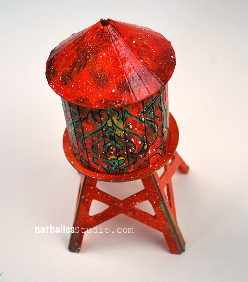
When I heard that this month’s theme is all about primary colors I knew I was going to want to head in a different direction. Instead of using all three, I’d focus on just one – RED, my favorite color, plus basic black and pure white.
Or perhaps it was because I was thinking of the old children’s riddle: What is black and white and red all over? A newspaper! (Red…Read…) Sorry! I couldn’t help myself.
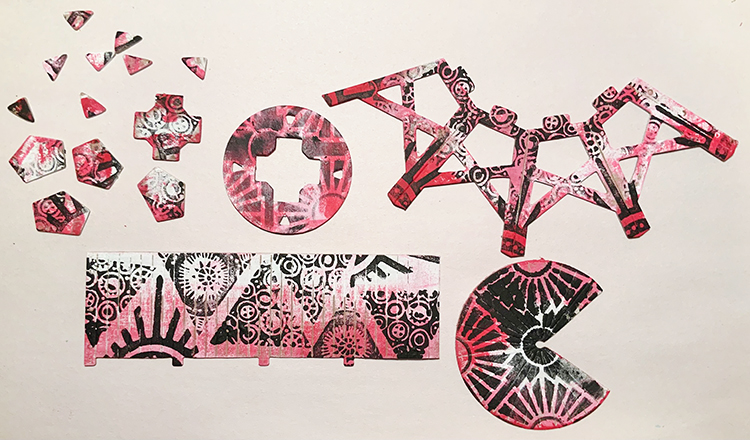
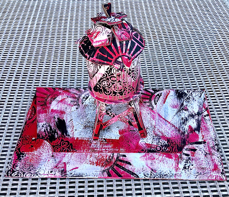
I thought it would be fun to use not only the pieces from the Water Tower Model kit I received but the negative shapes AND the sturdy envelope in which they were packed. Double the fun.
***TIP: If you are going to decorate the envelope be sure to take a photo of the assembly instructions BEFORE starting to paint and stencil!
Randomly paint the model pieces, envelope, and negative shapes with white paint. It’s okay that some of the original board remains visible.
Randomly add red paint to the model pieces, envelope, and negative shapes.
Center the Broadway stencil on the roof piece and use black paint to stencil the pattern. Use black paint and your choice of triangle stamps from ArtFoamies Triple Play to randomly stamp all remaining pieces of the tower, the negative shapes, plus the envelope.
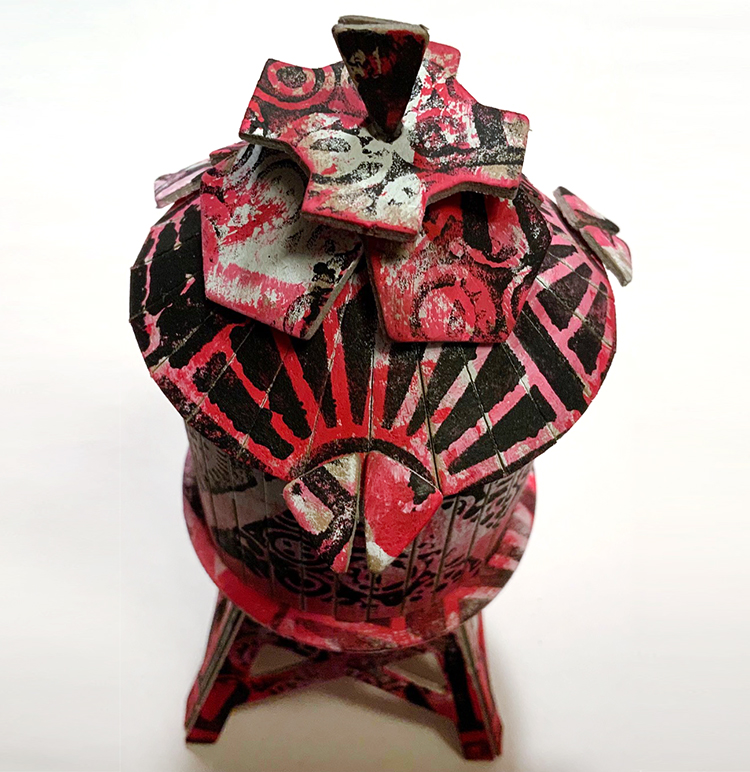
Assemble the tower per instructions. Add the negative shapes to the roof of the tower.
Option: Instead of securing the roof, don’t use the criss-cross piece of board that acts as a structure to hold it in place; just perch it on top so you can hide candies or jewelry inside the tower!
Thank you Judi – love the idea of using the packaging and leftovers too!!! And look at that great use of pattern and layering!
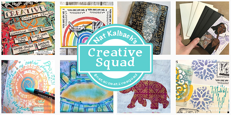
For more from the Creative Squad check out Nat’s Creative Squad on Instagram too: Each week we post projects, ideas, and inspiration for mixed media art.
Judi:
Hard to believe you only used one of the primary colors! It’s really cool and a great way to give a gift to that someone special. Thanks for sharing your creativity and how to use every piece provided.
Marilyn
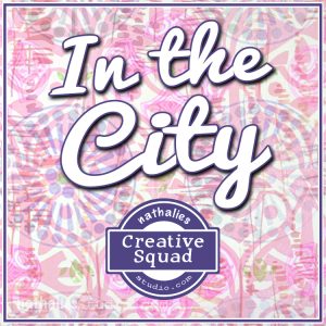
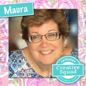
Hello from my Creative Squad! Today we have a really fun project from Maura Hibbitts using some of my rubber stamps and the Water Tower mini cardboard model. This month’s theme is: In the City – Although we aren’t traveling much these days, let’s reminisce about a time we traveled to another town or city. Think about the flavor of the place and let that guide your color and design choices.
I will admit, I am a country girl…I love the mountains and forests and wide open spaces…but every once in awhile I head to the city. I may have an appointment, or go to a museum or a show, but it seems there is always something that draws me there from time to time. I live in an area with small cities, and these have a lot to offer too, that’s where I go to the Asian and Indian markets, to Trader Joe’s, the art store, to the co-op to get the roasted coffee beans I love, to photograph buildings and people and rusty structures. I am a train ride and a few hours away from New York City, and have taken 150 middle school students to explore the city (yep, a few gray hairs from those trips), met my sister for a few days on her business trip and explored Central Park, attended and presented at conferences for education, enjoyed a wonderful high tea with my sisters at a ritzy hotel…truly memories that will be with me forever. No matter if the city near you is small, or a metropolis, go out and explore and see what it has to offer.
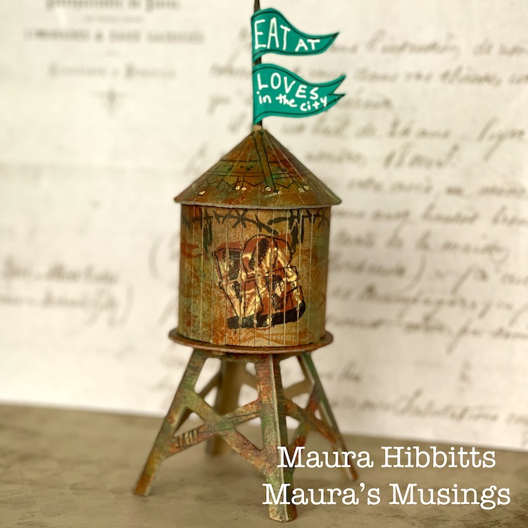
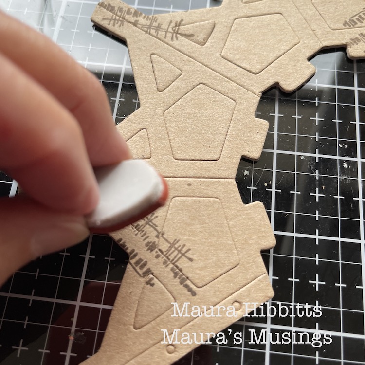
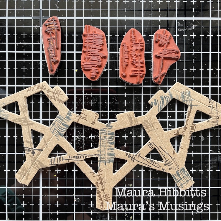
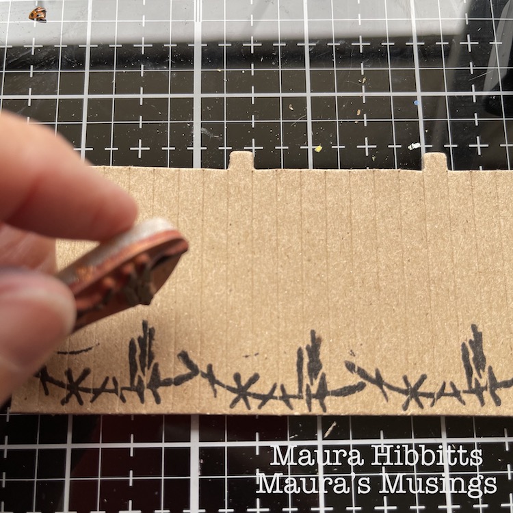
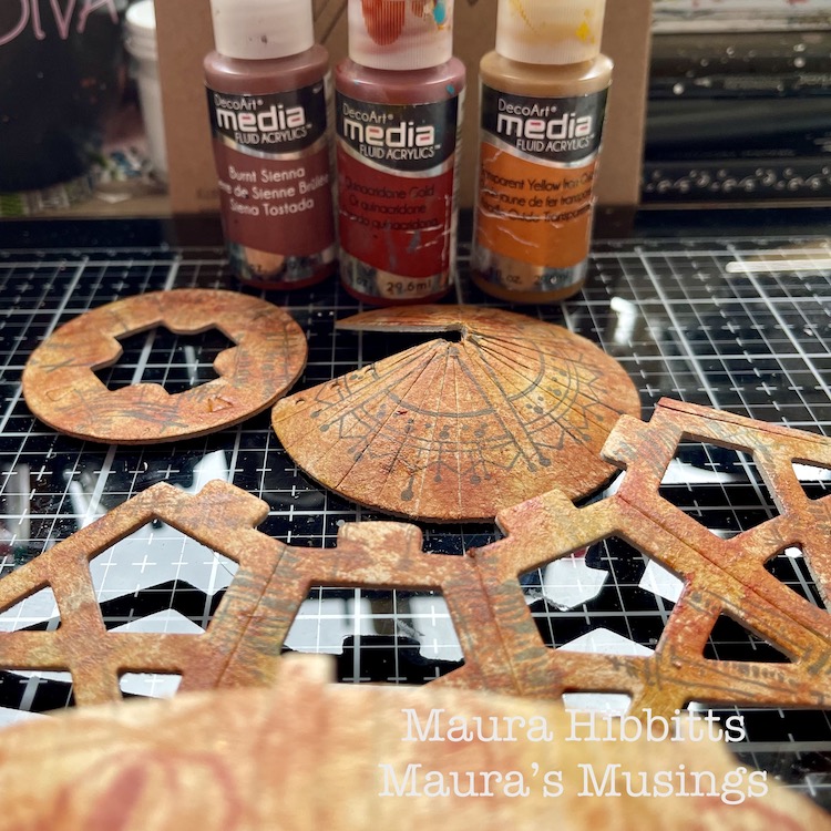
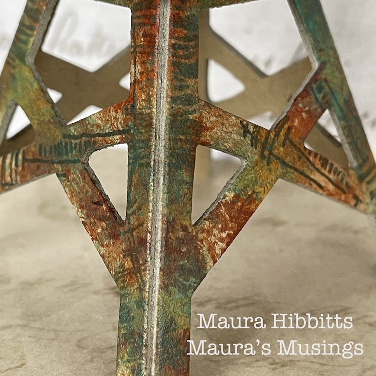
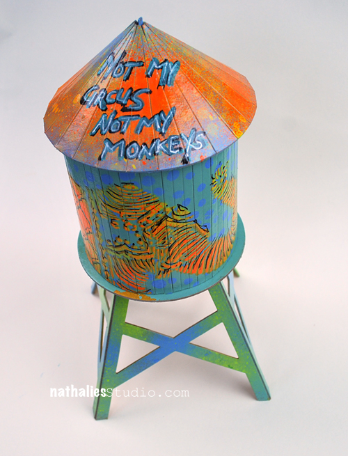
We received these cool models from Nat for this month’s project from a company called Boundless Brooklyn, and mine is a replica of real water tower in the city…I may just have to visit and try to find it. I took everything out of the folder, laid it out, and thought of ideas. I wanted a grungy look, so I started by stamping the bases with the Wabi Sabi stamps – gnarly, funky, jazzed, and far out, and a variety of archival inks in brown, black, grey and blue. I kept the pieces flat for the stamping.
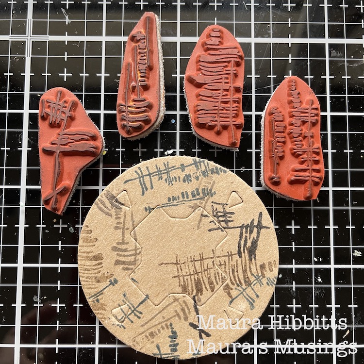
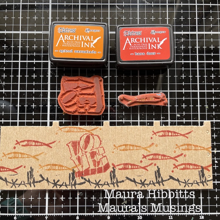
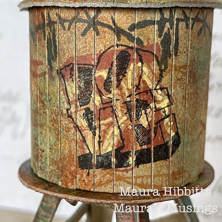
I stamped the walls using the Wabi Sabi stamps, groovy and neato, using archival red, black and orange inks. I also wanted to add a graffiti-like image, so added the Love stamp. I was happy with my design, it looked like fish swimming around the tank.
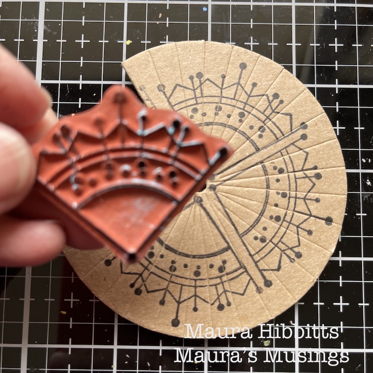
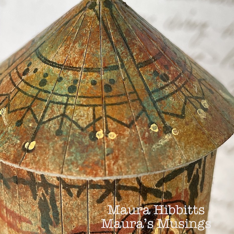
I decided to pretty up the roof too, after all if you were looking down from a higher building, it would be nice to see. I stamped around the piece using the Jugendstil stamp from the Mini Motifs set and black ink.
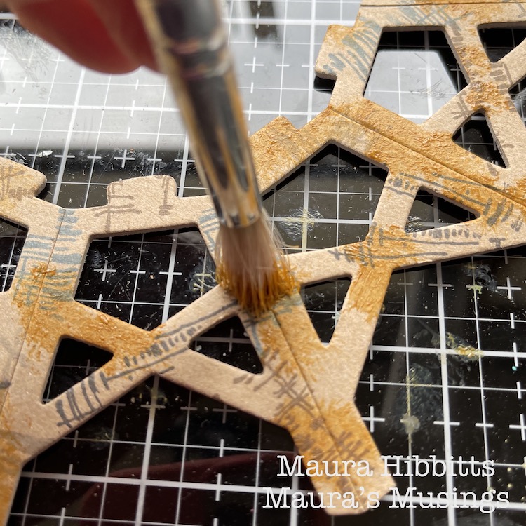
Now, it’s time to add the paint. I used fluid acrylics so that my stamped images would show through. I started with Transparent Yellow Ochre and an old brush, and pounced the paint randomly onto the pieces. I repeated this step with Burnt Sienna and Quinacridone Gold. It created a rusty appearance to age the water tower.
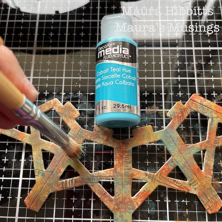
To add more depth to the painting of the tower and a patina effect, I went in and pounced on Cobalt Teal Hue. I felt this would allude to the water tower being constructed of metal.
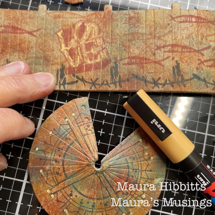
I added a bit of detail to the Love stamp and roof with a light orange Posca pen.
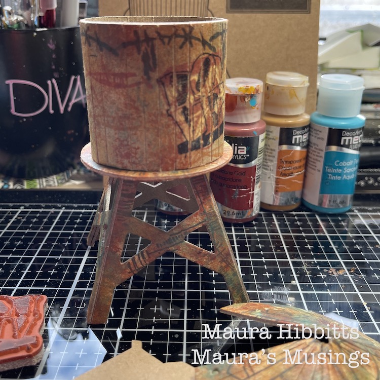
Then I just followed the kit’s directions to assemble the water tower…and that is when I discovered I had stamped the walls upside down…darn it! I thought I was being so careful in laying out all the pieces before I began. So, in order to save my idea, I stamped Love again, upside-down over the first one. Luckily, I had stamped the first one in red, so the second one in black took over.
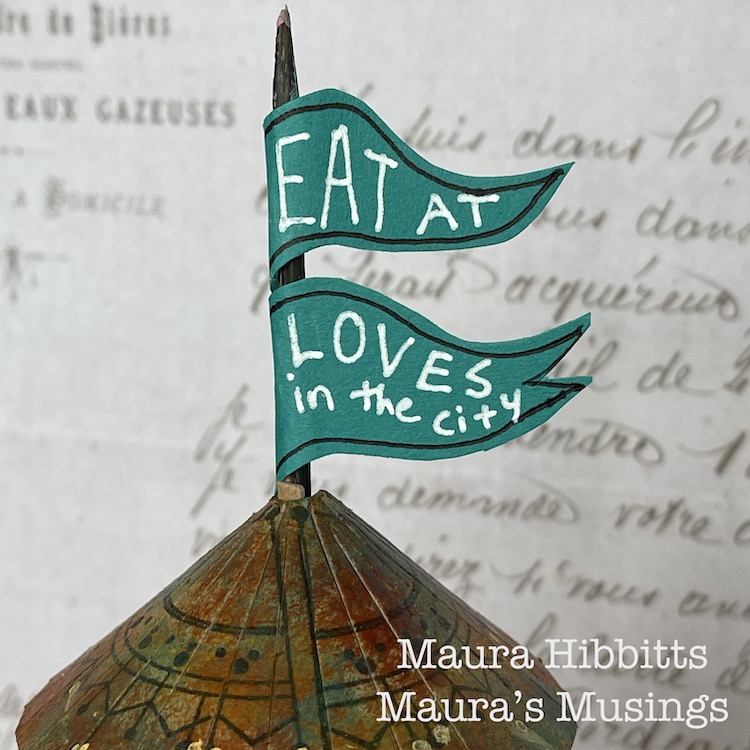
I thought about how structures in the city often advertise businesses in the area, so I made a flag using a skewer and teal paper and added “Eat at Loves in the city”.
What a great little model, and so fun to alter and assemble! You can create a lot of texture and age with stamped images and the right paint colors. I admit, I do love finding rusty structures and photographing them, and the city is a great place to find them.
Find out what makes the city near you unique and different, and go explore. I learned the small cities in my area are known historically for glove making, horse racing, and carpets. I found a small local railway line, which is now a bike path. I’ve learned about the role the Erie Canal played in developing my region. Discover who first settled the city and learn about them, like I found out how many areas near me were settled by the Dutch, and when you look closely, you can find the clues in place names and architecture. Enjoy learning about your city! – Maura
Thanks Maura – love the feeling of age and patina that you were able to create with rubber stamps and paint – this really looks like you could find it in real life. Now… I wonder how the menu is at Love’s :)
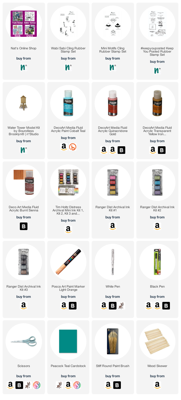
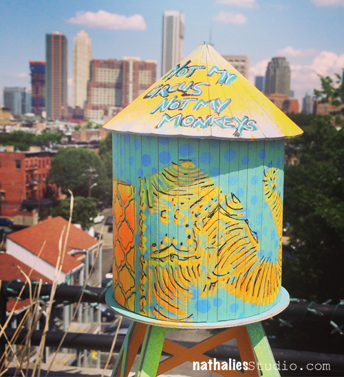
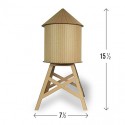
A couple weeks ago I stumbled upon these cardboard water towers on an instagram feed by Boundless Brooklyn. They come blank, are made out of 100% recycled material and you can paint and decorate them as you wish. I was super excited as I love those iconic water towers around NYC and Jersey City. I ordered them right away and 12 hours later I had them in my hand. Nice flat envelopes with scored chipboard pieces and glue dots inside, easy to assemble.
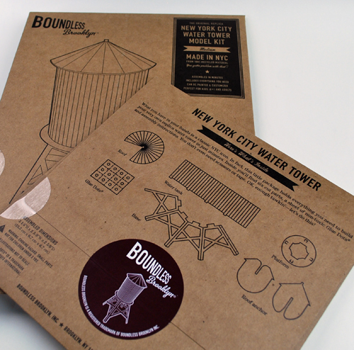
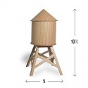
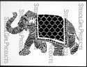
I had ordered two different sizes – The Medium Water Tower comes in 10 3/4” H x 5” . I spray painted the chipboard using my Elephant and What’s The Point Stencil and added the text on the water tower roof.
while adding layers to the chipboard I made sure that I would move the folds so that the cardboard would not become stiff. It was really easy peasy and the whole design made it to simple to put together in a very short time once it was painted.
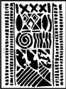
For the small water tower which comes in 5 1/4″ H x 2 5/8″ W x 2 5/8″ D, I used Spray Paint and marbled it on the background by spraying wet in wet and then moving the pieces around. Then I added parts of the Batik and the Lilly Stencil with some acrylic paint.
I sealed off the water towers with some Pouring Medium which gives them a nice shiny glass finish. You can take of the top and put some small stuff in there. Loved this. I have one more water tower and a billboard sign to play with – cannot wait for it.
OH MY, Nathalie, these are just adorable… I think they might be a MUST BUY item! And it looks so real and perfect on your balcony! Finally, the act of spray painting them for that graffiti thrill without the crime is just perfect! What a terrific project!
Awe- thank you! LOL- love your analogy of graffiti thrill without doing something illegal- I would probably though not do it because I am not the right person to climb up high ;)
Thanks so much for the amazing writeup and support, Nathalie. The towers looks incredible, and they’re all so different. Especially love the supplies’ list; makes it so much easier to see what’s needed to make this magic.
LOVE that quote and love LOVE love the water towers as well.
I would use them as centerpieces for tables for an event.
Names could go on them such as “friends”, “family”, “bride’s side”, etc…
They are such fun!


Comments (3)
Marilyn C. Lojek
| #
Judi:
Hard to believe you only used one of the primary colors! It’s really cool and a great way to give a gift to that someone special. Thanks for sharing your creativity and how to use every piece provided.
Marilyn
Reply
jean marmo
| #
Wow – this is so cool! Love the details and using the extra pieces!!
Reply
jean marmo
| #
Judi – I was going to email you but couldn’t find your email address. Do you still have mine? Was hoping to catch up!
Reply