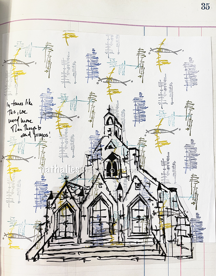
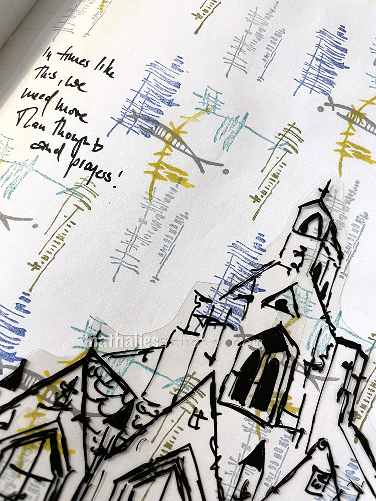
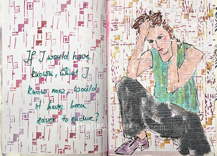
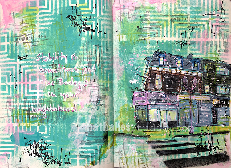
“In times like this, we need more than thoughts and prayers.” —just my thoughts – don’t be cross with me.
I created my background pattern with different versafine ink pad colors and my Wabi Sabi rubber stamps.
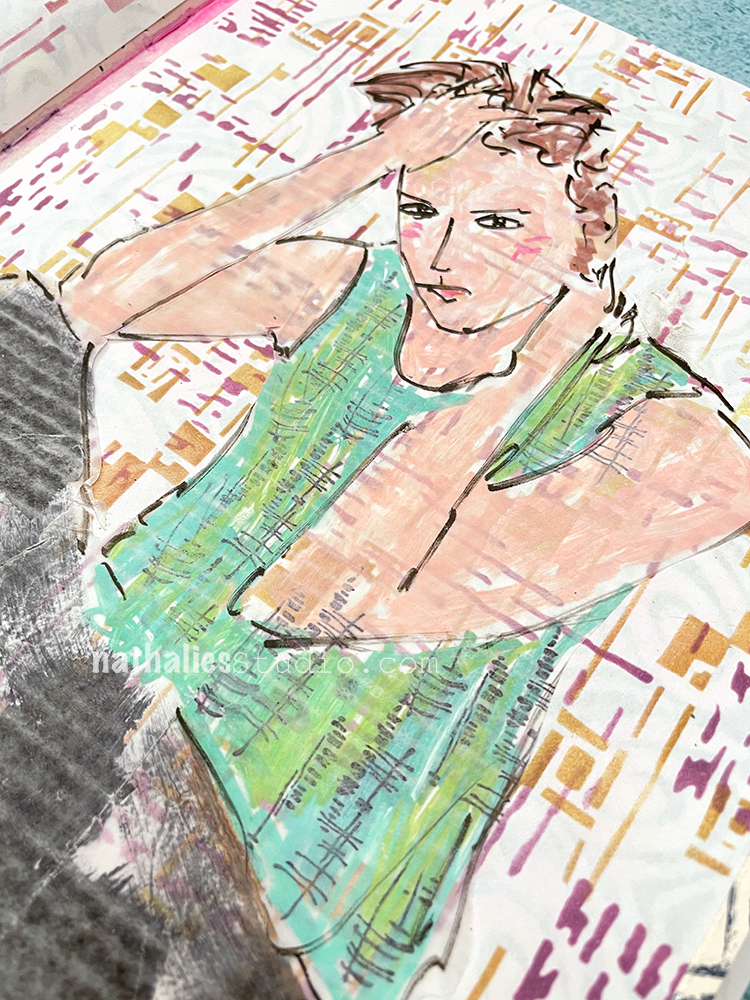
I made a sketch of my Church foam stamp on Grafix Duralar, cut it out and adhered it with double sided tape. For my journaling I used a Sharpie gel pen.
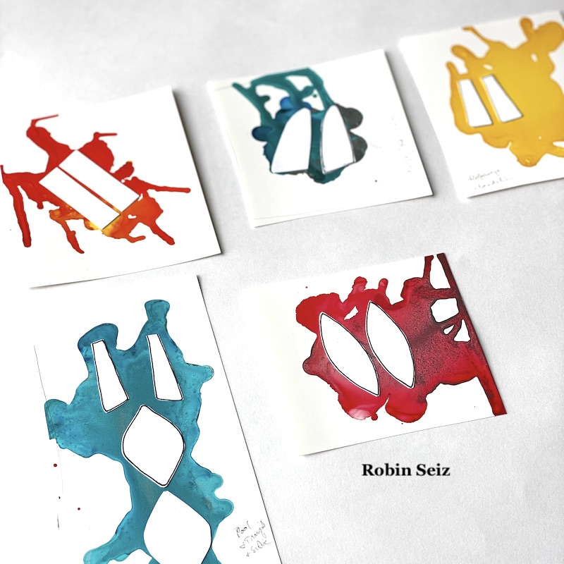
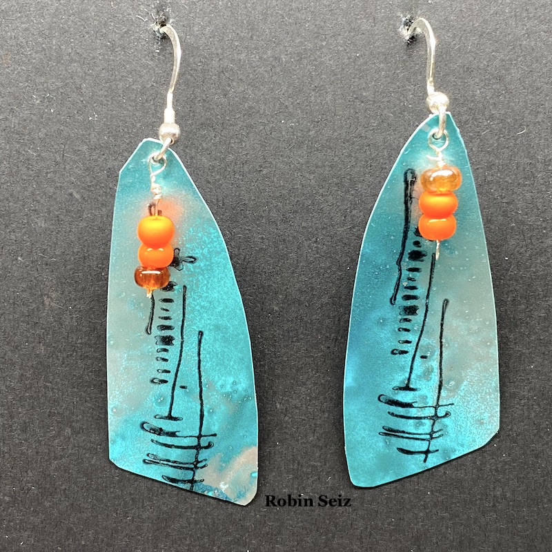
Hello from my Creative Squad! Today we have some seriously awesome earrings from Robin Seiz using my Central Ave 4×4 and Signals stencils and my Wabi Sabi rubber stamps. This month’s theme is: PrimaryColors: Red, Blue, and Yellow it’s your time to shine. Let’s get back to the basics of color and light and play with primarycolors. It’s elementary my friend! This month we are also pleased to be partnering with Grafix who supplied the squad with some cool products to try out. Read on:
Hi Friends,
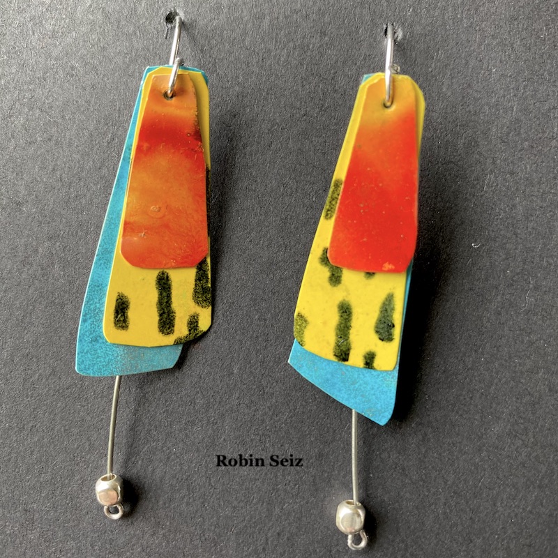
This month was about using primary colors, Grafix Products and of course, incorporating Nathalie’s wonderful products. Primary colors are so happy; they remind me of summer, but I must admit that I don’t use them often. It was good for me to reflect on why they aren’t my “go to” colors. The reason I suspected was amplified in this project. I’m a messy multi-media artist. What I mean by that is, I’m always mixing colors. Primary colors by their nature make a host of other colors, so once I put them down on paper, I always end up with something else; they rarely end up in their pure form. For example, the “red” in the earrings I created is really orange, because once the yellow and red mixed…. well, it’s no longer red and yellow. :)
I hadn’t been introduced to Grafix products prior to this month, but I loved working with the opaque craft plastic. I’m excited to work with some of the other products as well. This opaque craft plastic works really well with alcohol inks. It seems to hold the ink in place a little better than Yupo, for example. This produces even more vibrancy than you normally get with alcohol inks.
My mixed media journey started with scrapbooking and then went to jewelry and then exploded to all kinds of other mediums and substrates. As result of my early days, I still have a lot of jewelry making supplies. Sometimes, I get the urge to combine my mixed media work with making jewelry. For this month, that meant earrings.
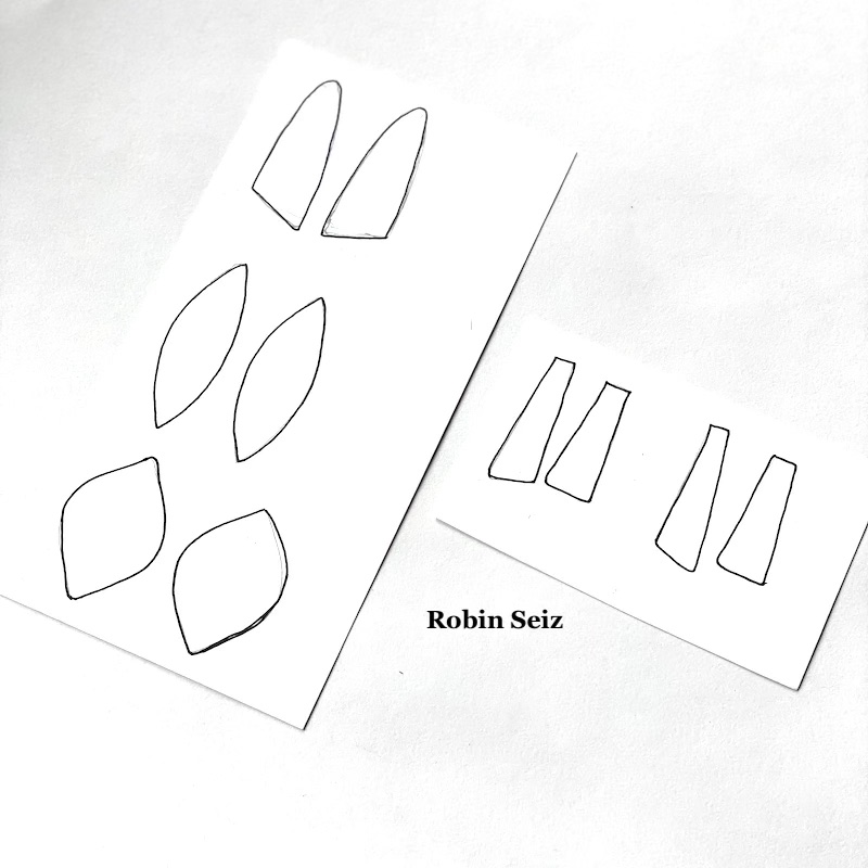
I started the project by drawing the shapes for the earrings on card stock. I chose shapes I like. If you try this project, you could use any shape you like. Next, I cut out the shapes and put them aside.
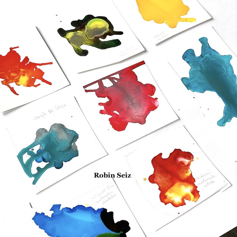
Step 2 was the most fun! I tested various alcohol ink colors on the opaque craft plastic. I could have done this all day; just watching alcohol ink flow is so relaxing and organic. The results are always a surprise. This is the part where the colors often run into each other and make a different color than is intended, but I just go with it.
I chose color patches I liked the most, and the ones which were in the primary color family (at least kind of). I laid out the blank cut out shapes on the opaque craft plastic. This can be a tricky process if you are someone who wants both earrings to look exactlythe same. I don’t really care about that; I like to know they were made by hand rather than manufactured to be identical, but if it bothers you to have them slightly different, then you can take that into account when you lay them out. Additionally, you may want to use solids rather than several colors on a sheet to get more a more consistent look.
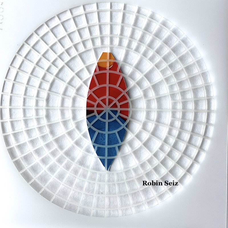
Once they were laid out, I carefully cut them out with a small pair of scissors. The craft plastic is easy to cut. If you are comfortable with a craft knife, you could also use that.
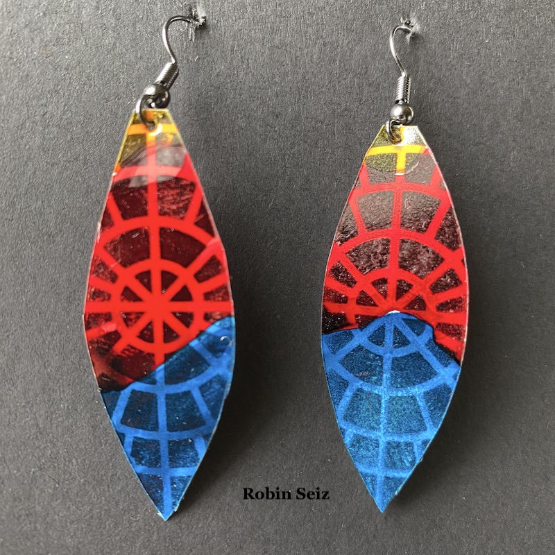
Once cut out, I applied Nathalie’s Wabi Sabi rubber stamps and Central Ave and Signals stencils to the earrings with a permanent black ink. This added so much dimension and interest to each piece.
I took some of my jewelry components, small beads and wire, nothing really fancy, and added it to the earrings. Again, it added more dimension and interest.
The final process, which is important especially if you are going to sell your earrings or want them to last for a long time, is to spray Krylon Varnish and UV protection to them. Alcohol inks dull quickly and this will protect both the color and the inks from smearing. Make sure to do this in a well ventilated area and hold the can pretty far away from the earrings, otherwise, they will smear.
Summer is here, it’s always fun to have a new pair of earrings! I hope you try out this project.
Thank you Robin! I absolutely love these and could totally imagine donning them to liven up an outfit with some artsy style!
Give it a try: you can find all my Rubber Stamps and my Stencils in my Online Shop and here are some of the supplies Robin used:
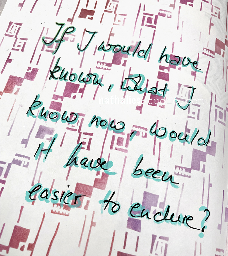
“If I would have known what I know now, would it have been easier to endure?”
Again for the backgrounds on this one I was using papers that I had previously stenciled using my Signals and Space Age Modern stencils, RubberMoon ink pads, and a blender tool. I just pasted them into my art journal and then used deli paper to sketch out the figure. I was working on the back of the deli paper, layering my Wabi Sabi stamps with black archival ink and then painting over it. I cut it out and adhered with a glue stick.
Hello from my Creative Squad! Today we have a really thoughtful card project from Maura Hibbitts that explores some pretty important ideas along with our theme this month: PrimaryColors: Red, Blue, and Yellow it’s your time to shine. Let’s get back to the basics of color and light and play with primarycolors. It’s elementary my friend! This month we are also pleased to be partnering with Grafix who supplied the squad with some cool products to try out. Read on:
Oddly enough, I don’t reach for just primary colors that often, I think I must like them better blended together to make green, purple, orange, and the myriad of colors they create. So, I find it a bit of a challenge to just focus on primary colors, but I did…with just a touch of blending (I couldn’t help myself, lol). I’m also using Grafix products for the first time, and they are wonderful! I tried out a number of mediums and they worked beautifully.
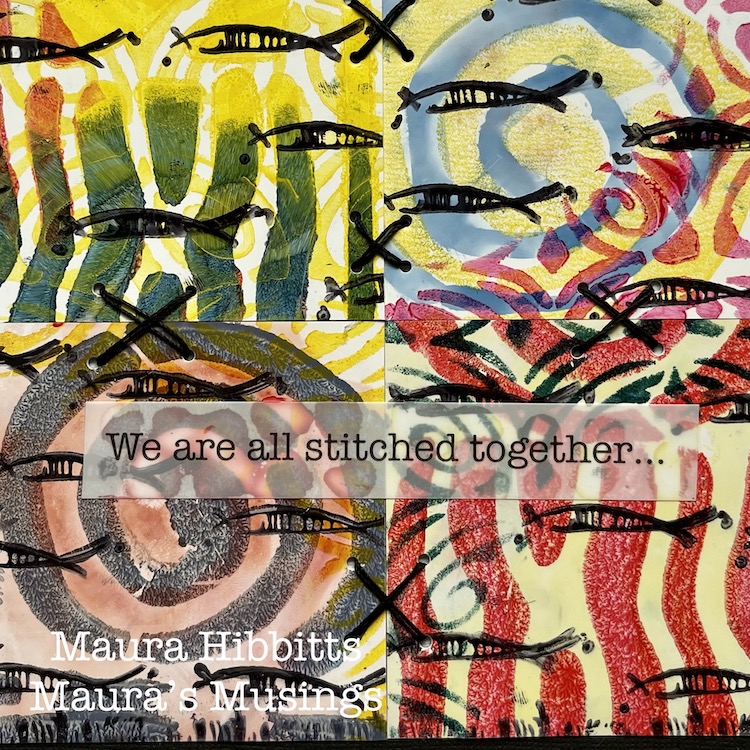
I started creating, thinking of the ocean and my longing to go there again. I was also thinking about my friends in education and the upcoming end to a very challenging year. Somehow this translated into the schools of fish I stamped on the cards. But then, I thought about how everything is interconnected on our planet, from the fish in different oceans, to the people of different lands, and I added some stitches. It’s inter-esting how our creative process can begin with a simple thought, yet end up very complex by the time we finish.
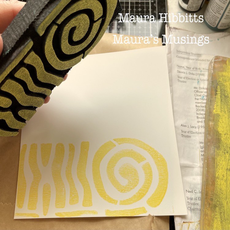
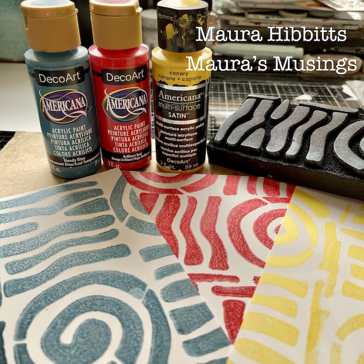
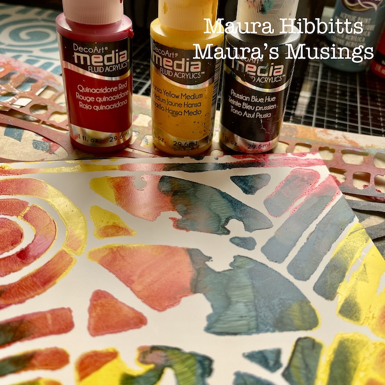
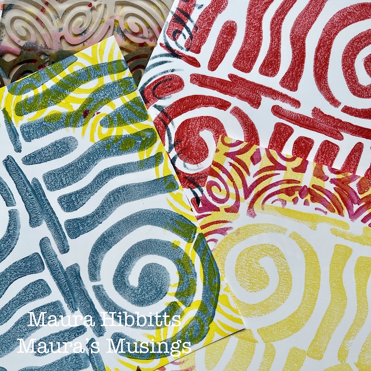
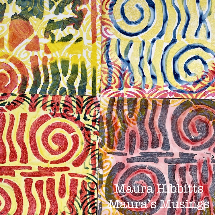
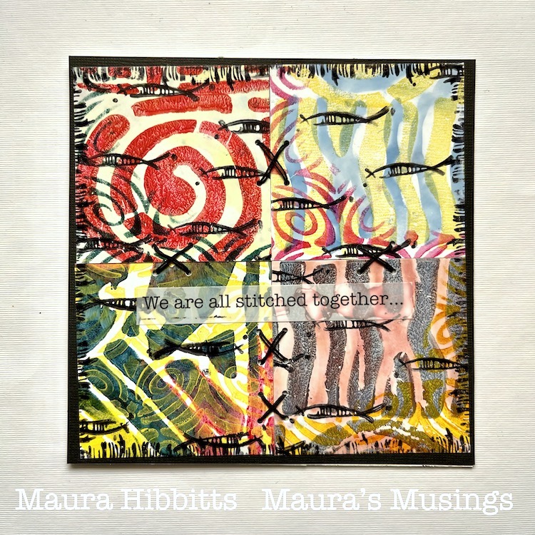
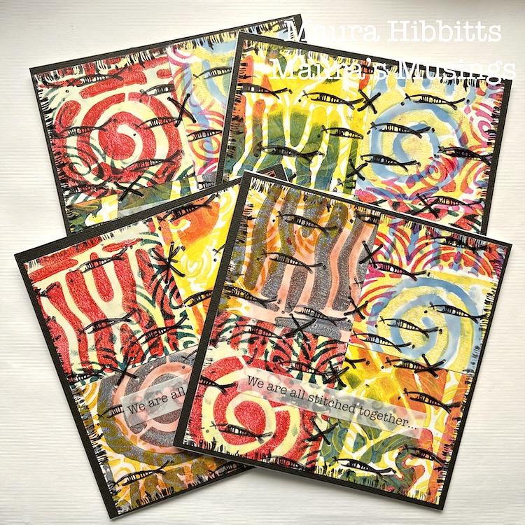
I started my project by cutting the 12 x 12 sheet of Grafix Craft Plastic into four sec-tions. (6 x 6), then stamped three of them with a single paint color of yellow, red, or blue with Nat’s ArtFoamie Batik 2 stamp. I find it easy to roll out some paint on a gel plate, and press the ArtFoamie into that, to get a clean image.
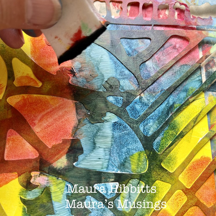
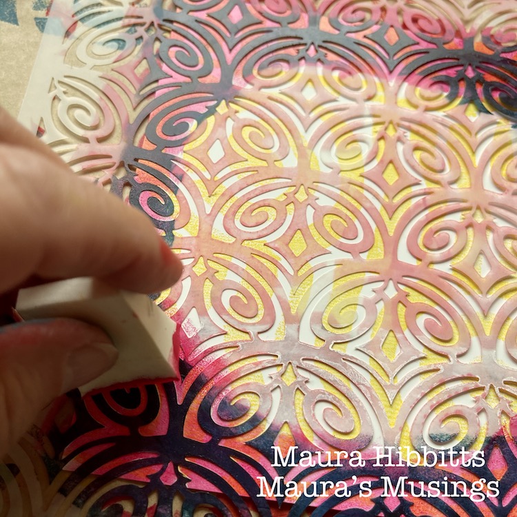
For the fourth section, I decided to use the Batik stencil (a favorite!), fluid acrylics in red, yellow, and blue, and dab in the color with a cosmetic sponge. I couldn’t resist a bit of blending here.
Next, I decided to go around each stamped piece with a contrasting color, using the Art Deco Fairview stencil. I just added the design around the edges, and left a circular open area on the plastic.
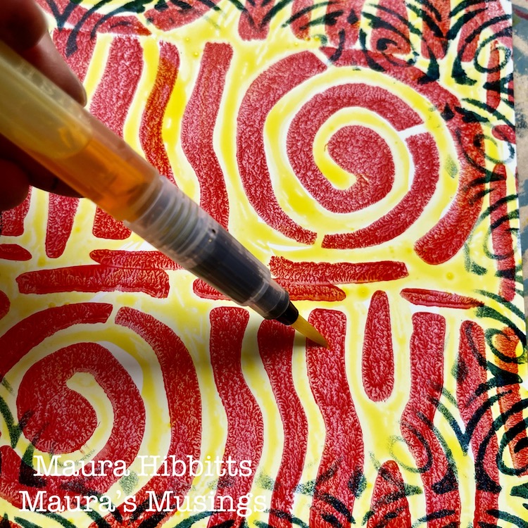
I found that acrylic paint works beautifully with the Grafix plastic, so I thought, why not try watercolor next? I painted watercolor onto each section with blue, red or yellow.
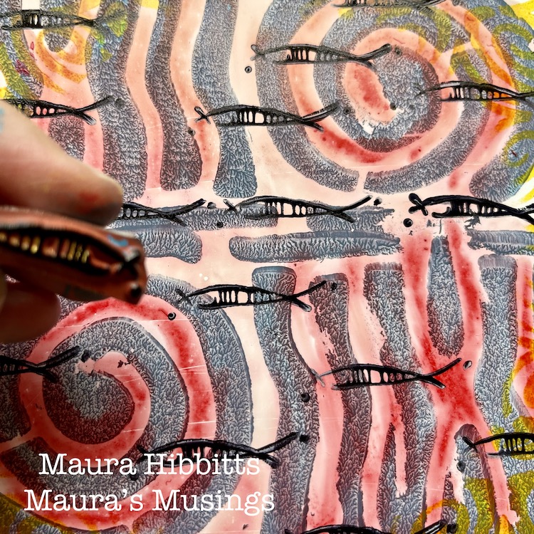
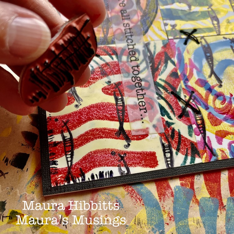
To create my “schools of fish”, I used the Neato rubber stamp with black archival ink, and repeatedly stamped the image across the pages.
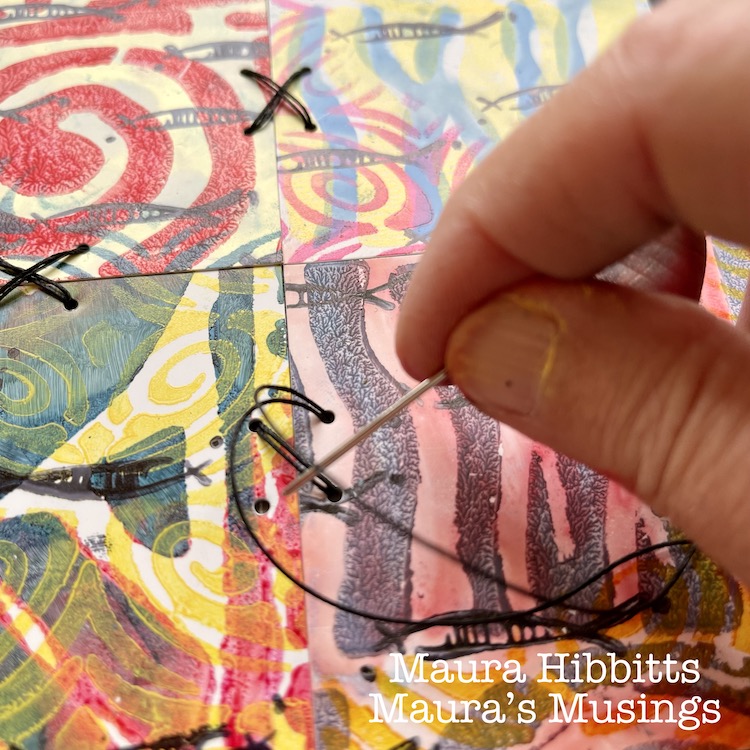
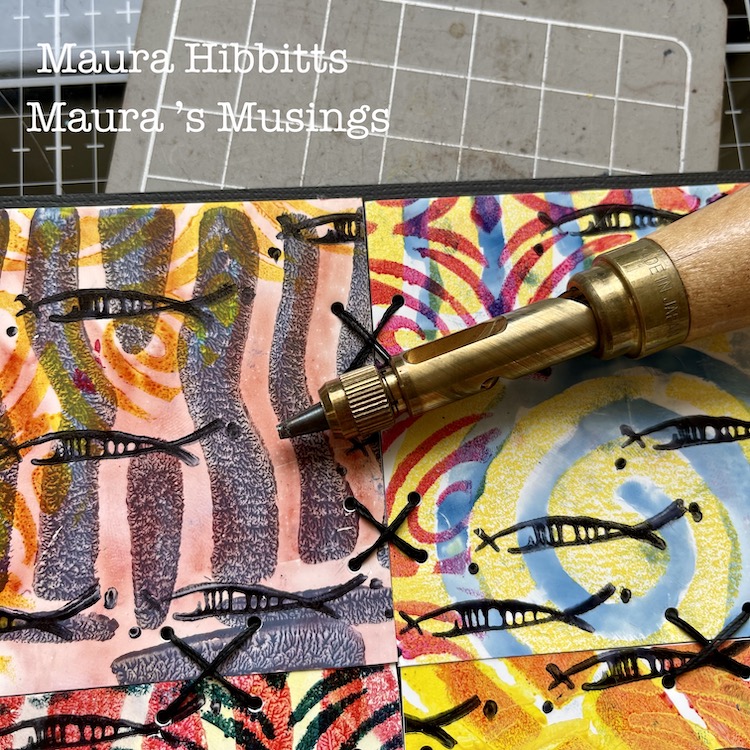
Then, I cut each section into fourths, just slightly smaller than 3” squares. I adhered four different squares to a backing. I cut a 12 x 12 black card stock into fourths for this base. Next, I punched holes to do some stitching, using a Japanese screw punch (or you could use an awl). I stitched X’s with heavy black thread onto the cards, tucking the ends onto the back and holding them in place with scotch tape.
To finish the card design, I framed it using the edge of the Far Out rubber stamp and black ink. I stamped the partial image around all edges.
As I was working, I started thinking of how we are all connected, and came up with the quote to put on my cards “We are all stitched together…” I typed up my words, and printed them onto the Grafix Computer Matte film using an inkjet printer. I adhered these to the card fronts using a clear adhesive, so the design underneath would be visible.
Then, the final step was to adhere my card tops. I cut 12 x 12 card stock in half, scored it and folded it into a 6 x 6 card. One reason I decided to not work directly on the card itself was the stitching. It shows through the back, and by doing it separately, I end up with a nice, neat card. Hint: remember, if you mail square cards, the postage is a bit higher…or you can put it into a kraft mailer.
It’s the common threads that pull us all together, like color – yes, primary colors too, which are connected to all colors. Other threads that bind us are music, art, words, friendships, family, and so many more. Remember, we are all stitched together…
I wish you joy in searching for the stitches and threads in your life, Maura
Thank you Maura – loved how you shared your thought process along with such clear step by step instructions. These cards are so meaningful AND beautiful!!!
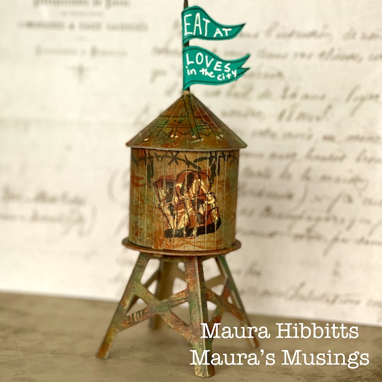
Hello from my Creative Squad! Today we have a really fun project from Maura Hibbitts using some of my rubber stamps and the Water Tower mini cardboard model. This month’s theme is: In the City – Although we aren’t traveling much these days, let’s reminisce about a time we traveled to another town or city. Think about the flavor of the place and let that guide your color and design choices.
I will admit, I am a country girl…I love the mountains and forests and wide open spaces…but every once in awhile I head to the city. I may have an appointment, or go to a museum or a show, but it seems there is always something that draws me there from time to time. I live in an area with small cities, and these have a lot to offer too, that’s where I go to the Asian and Indian markets, to Trader Joe’s, the art store, to the co-op to get the roasted coffee beans I love, to photograph buildings and people and rusty structures. I am a train ride and a few hours away from New York City, and have taken 150 middle school students to explore the city (yep, a few gray hairs from those trips), met my sister for a few days on her business trip and explored Central Park, attended and presented at conferences for education, enjoyed a wonderful high tea with my sisters at a ritzy hotel…truly memories that will be with me forever. No matter if the city near you is small, or a metropolis, go out and explore and see what it has to offer.
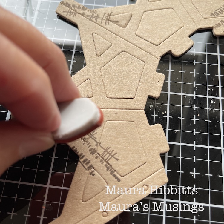
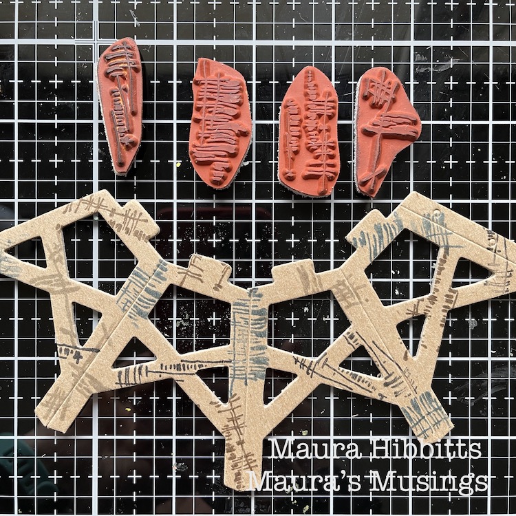
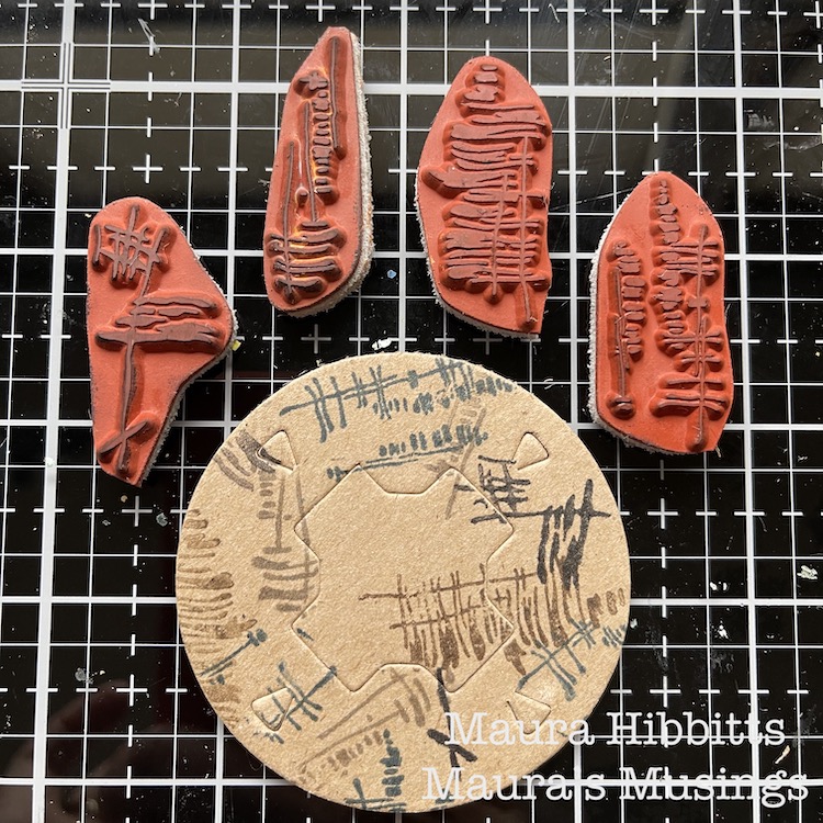
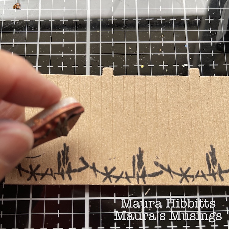
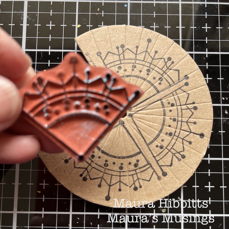
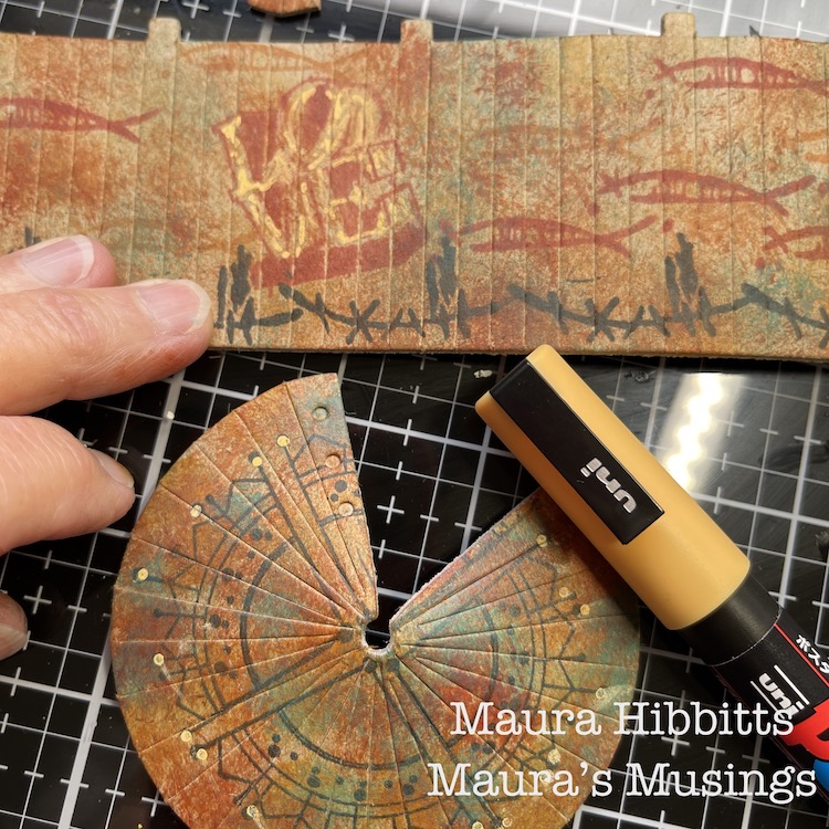
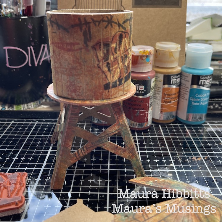
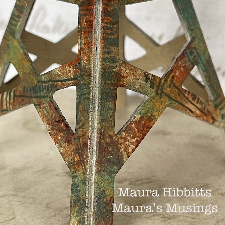
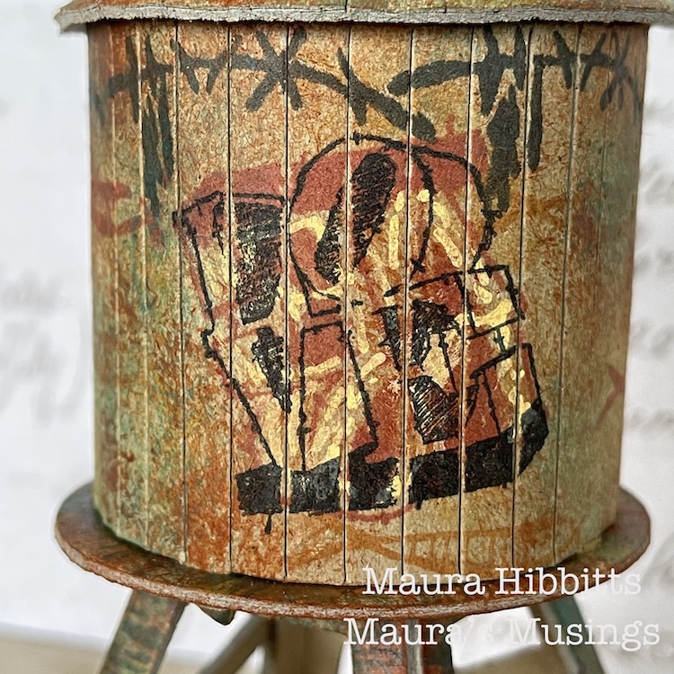
We received these cool models from Nat for this month’s project from a company called Boundless Brooklyn, and mine is a replica of real water tower in the city…I may just have to visit and try to find it. I took everything out of the folder, laid it out, and thought of ideas. I wanted a grungy look, so I started by stamping the bases with the Wabi Sabi stamps – gnarly, funky, jazzed, and far out, and a variety of archival inks in brown, black, grey and blue. I kept the pieces flat for the stamping.
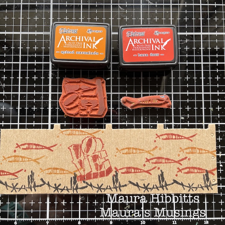
I stamped the walls using the Wabi Sabi stamps, groovy and neato, using archival red, black and orange inks. I also wanted to add a graffiti-like image, so added the Love stamp. I was happy with my design, it looked like fish swimming around the tank.
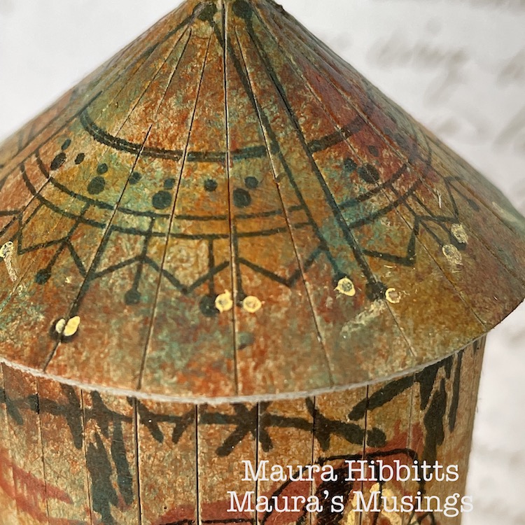
I decided to pretty up the roof too, after all if you were looking down from a higher building, it would be nice to see. I stamped around the piece using the Jugendstil stamp from the Mini Motifs set and black ink.
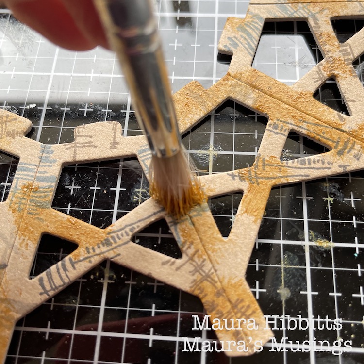
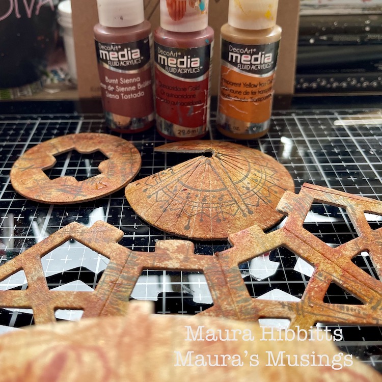
Now, it’s time to add the paint. I used fluid acrylics so that my stamped images would show through. I started with Transparent Yellow Ochre and an old brush, and pounced the paint randomly onto the pieces. I repeated this step with Burnt Sienna and Quinacridone Gold. It created a rusty appearance to age the water tower.
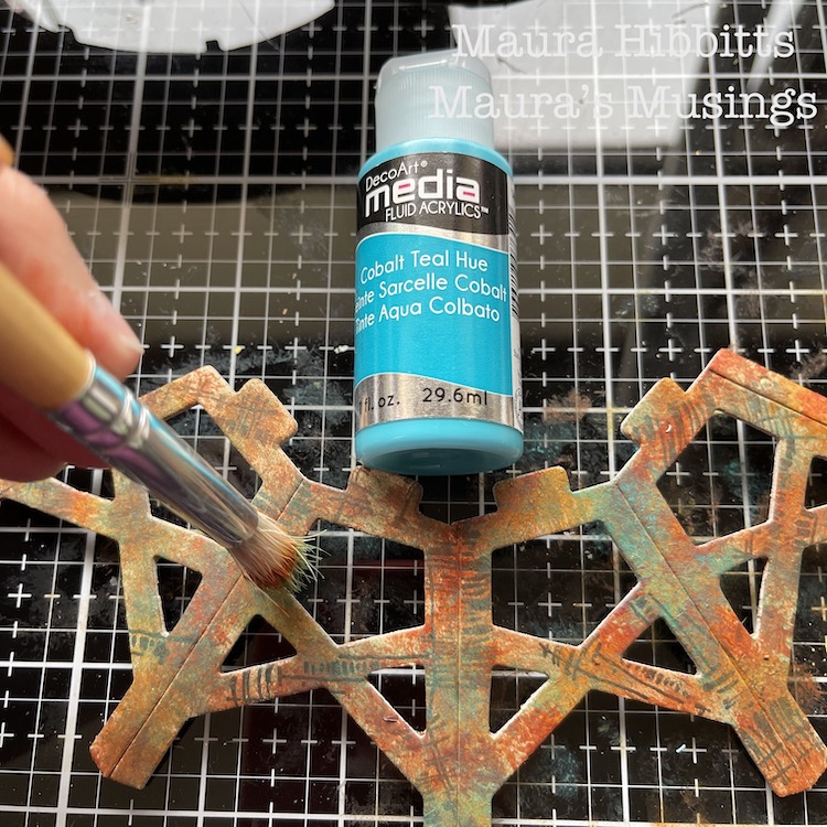
To add more depth to the painting of the tower and a patina effect, I went in and pounced on Cobalt Teal Hue. I felt this would allude to the water tower being constructed of metal.
I added a bit of detail to the Love stamp and roof with a light orange Posca pen.
Then I just followed the kit’s directions to assemble the water tower…and that is when I discovered I had stamped the walls upside down…darn it! I thought I was being so careful in laying out all the pieces before I began. So, in order to save my idea, I stamped Love again, upside-down over the first one. Luckily, I had stamped the first one in red, so the second one in black took over.
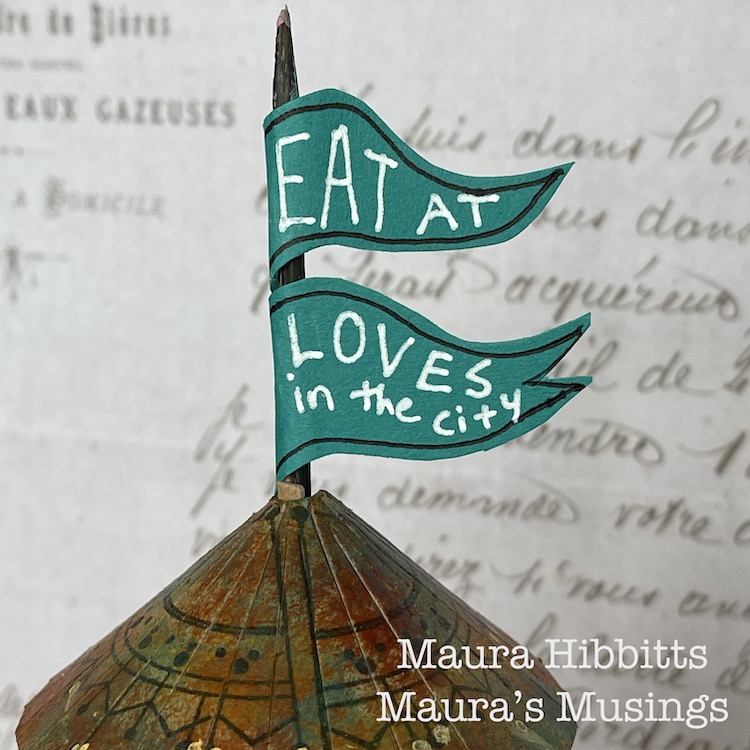
I thought about how structures in the city often advertise businesses in the area, so I made a flag using a skewer and teal paper and added “Eat at Loves in the city”.
What a great little model, and so fun to alter and assemble! You can create a lot of texture and age with stamped images and the right paint colors. I admit, I do love finding rusty structures and photographing them, and the city is a great place to find them.
Find out what makes the city near you unique and different, and go explore. I learned the small cities in my area are known historically for glove making, horse racing, and carpets. I found a small local railway line, which is now a bike path. I’ve learned about the role the Erie Canal played in developing my region. Discover who first settled the city and learn about them, like I found out how many areas near me were settled by the Dutch, and when you look closely, you can find the clues in place names and architecture. Enjoy learning about your city! – Maura
Thanks Maura – love the feeling of age and patina that you were able to create with rubber stamps and paint – this really looks like you could find it in real life. Now… I wonder how the menu is at Love’s :)
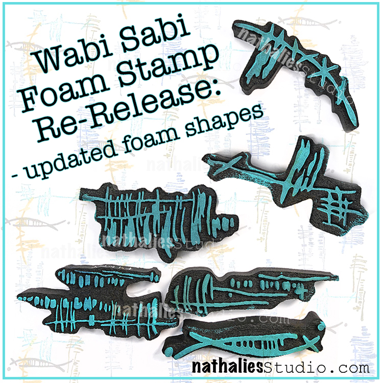
We’ve updated our Wabi Sabi foam stamps and wanted to share the news with you :) You may recall that before the foam surround was just rectangular – well now it’s cut to mirror the design. I find them easier to identify when I’m going through my stamp stash and also – the backsides are now funky abstract shapes that are worthy of stamping too!
Here are some of the stamps in action:
I love to use them for mark making and to add some random line elements to give a background extra interest.
They look great as bold marks too if that is your style…
…or as something more subtle. However you roll today!
Check out all my foam stamps in my online shop – lots have been restocked.
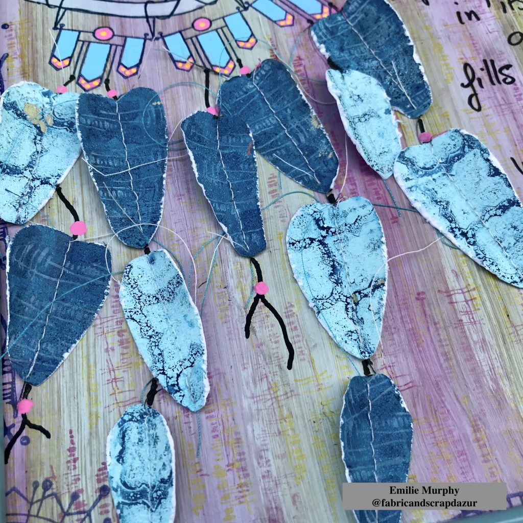
Hello from my Creative Squad! Today we are with Emilie Murphy and a page from her art journal, in hopes of ensuring sweet dreams. She is using my Mini Motifs and my Wabi Sabi stamp sets along with our theme: In My Dreams – A lot of folks are having crazy dreams these days. What visions do you see at night? Are you sleeping at all? Let us get a peek into your nocturnal adventures through your art.
Hi there! Hope you are doing well.
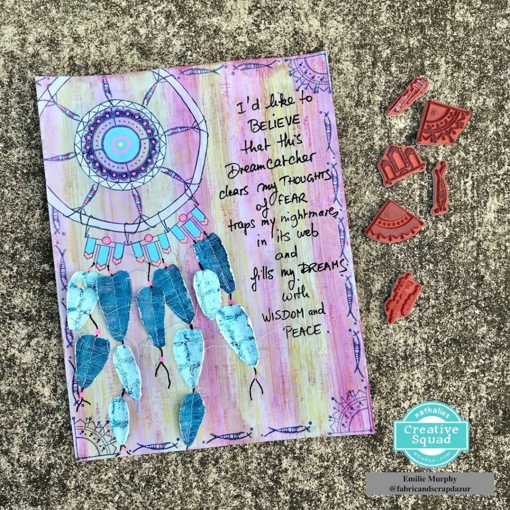
I was wondering how l could talk to you about what’s in my dreams. The first idea I had was to let you enter in to my dreams through a Dreamcatcher. In Native American culture, Dreamcatchers symbolize the entry point of dreams. It’s believed that they trap nightmares in their web. I just love this idea. I have few at my home where one is hanging on my bedroom door nob.
In this tumultuous time where we are currently living in, I think, that symbols and other culture referrals can ease our fear if we simply dare to get interested in them.
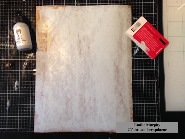
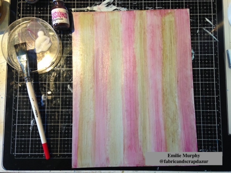
Let me guide you through my process about how I made this art journal page and let you in to my dreams. For this project, I decided to work on a piece of 8.5 x 11 inches cardboard (Kraft color). I like to reuse some material I get when I order art supplies. Since it’s a journal page, you can work on whatever surface you like.
I first applied a coat of “mineral” acrylic paint in order to get a non-porous surface. I chose an off-white color because I didn’t want something too bright. I also wanted more of a vintage look. I let it dry completely.
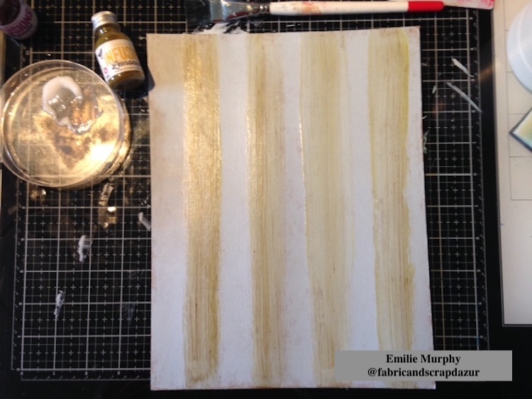
Then, I used some infusion pigment powders to color my background. I sprinkled a little powder on the top of my cardboard and brushed the powder from top to bottom with gel medium to make some strips. I started with “Lemoncello” infusion powder.
I did the same thing with “Magenta” infusion powder.
The reason why I used gel medium is because it avoids smearing the color or moving it again and makes this layer permanent.
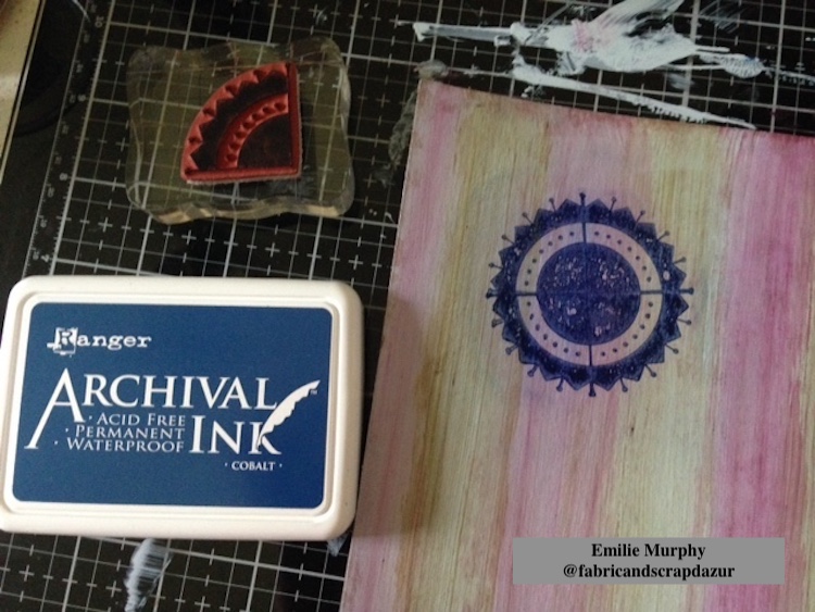
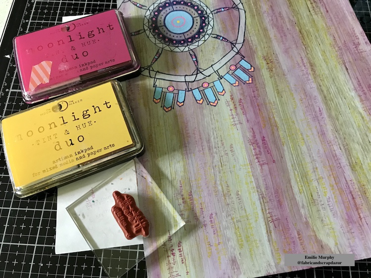
I started to build my Dreamcatcher by stamping the center with the Arts & Craft Mini Motif stamp with “cobalt blue”archival ink.
Tip: I used a gridded acrylic block to be able to stamp the motif and make an even circle. I first practiced on simple printer paper. If you are not satisfied with your stamping, you can wipe it off with some alcohol as I used gel medium that makes the surface non-porous and protects your layer background.
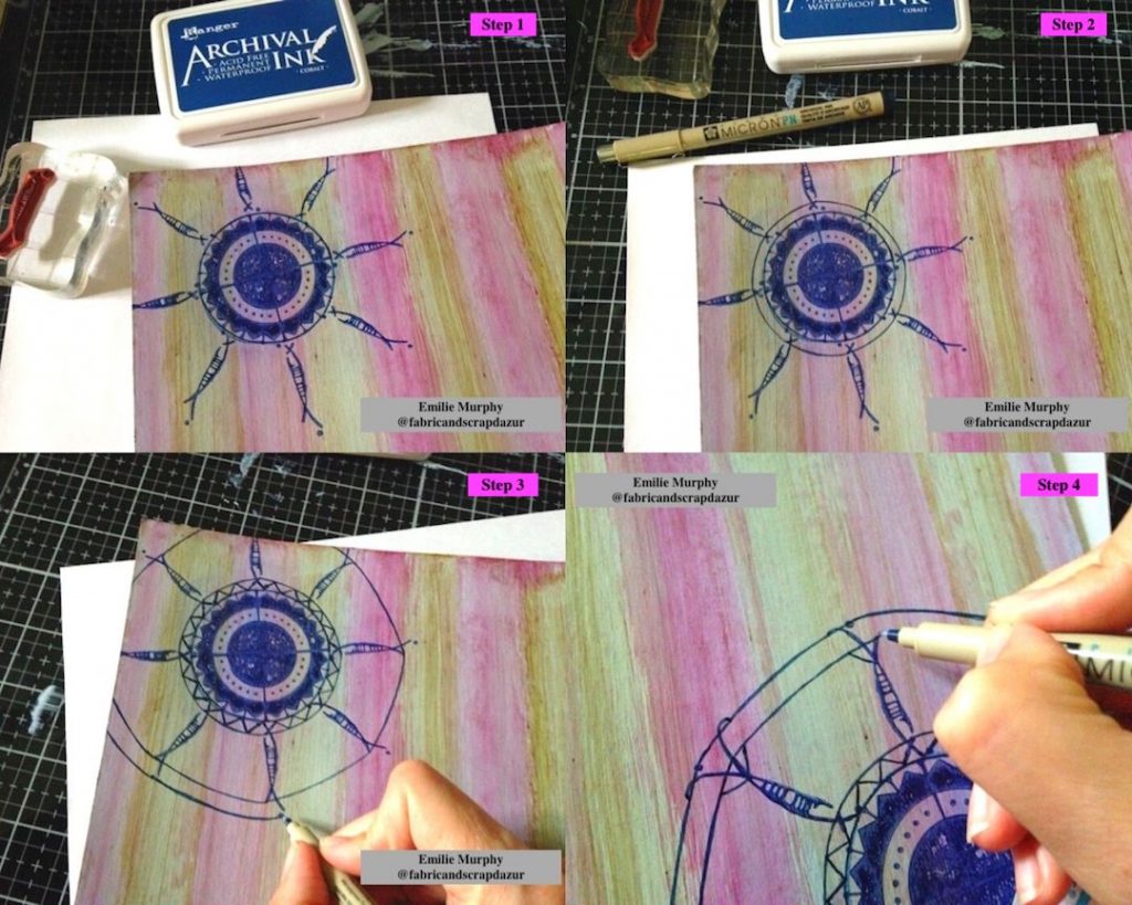
The next two pictures are showing you the step-by-step instructions on how I built my Dreamcatcher.
Step 2: I drew another circle to join the Neato stamping and made an inner ring.
Step 3: I doodled a zigzag inside the inner ring and drew an outer ring joining the opposite side of the Neato stamping.
Step 4: I drew some loops to look like “thread or string.”
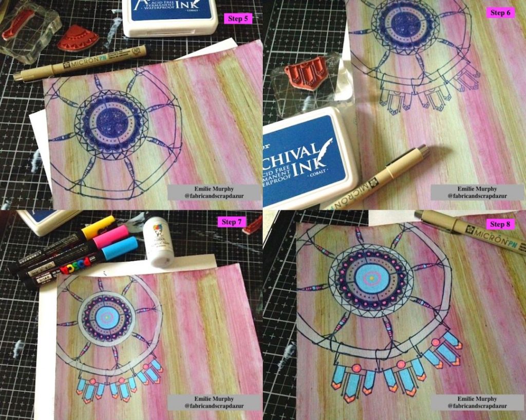
Step 5: I finished the web of the Dreamcatcher
Step 6: I had some outside embellishment stamping with the Craftsman Mini Motif stamp and drew some loops to attach them to the outer ring.
Step 7: I painted the inner and outer rings with some “minerals” acrylic paint (same I used for the background). I colored my dreamcatcher with some posca pens.
Step 8: I traced again the lines that faded away with my micron pen over the paint.
The structure of Dreamcatcher is now done.
At that point, the background needed some texture. I stamped the Funky stamp from the Wabi Sabi set with “Sunshine Yellow” and “Milky Way Magenta” inks to match the colors of the infusions powders. As you can see, the stamping is not bright and crisp because I wanted a subtle effect. To achieve this, I first stamped on some scrap paper and then I stamped on the background with the rest of the ink remaining on my stamp.
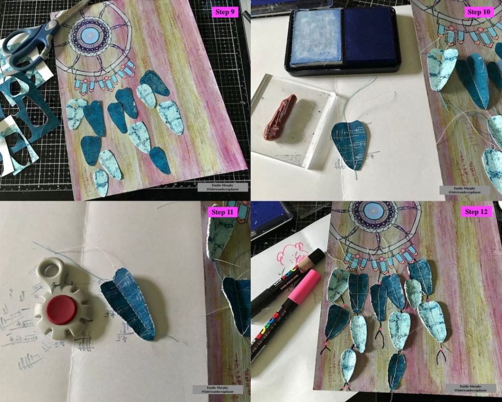
The next steps show you how I made the feathers.
Step 9: I used some pieces of scrap paper I had made for my cards project in June to cut some kind of “feather” shapes.
Step 10: I stitched the center of each feather with my sewing machine. This step is optional. You can also just draw a line with a marker. Then I stamped with the white portion ink of my Moonlight duo inkpad, the Gnarly stamp from the Wabi Sabi set, to add a design to my feathers.
Step 11: I used a Paper Distresser tool to give texture to the edges of the feathers.
Step 12: I drew some lines and dots between the feathers with a posca pen to represent strings and beads.
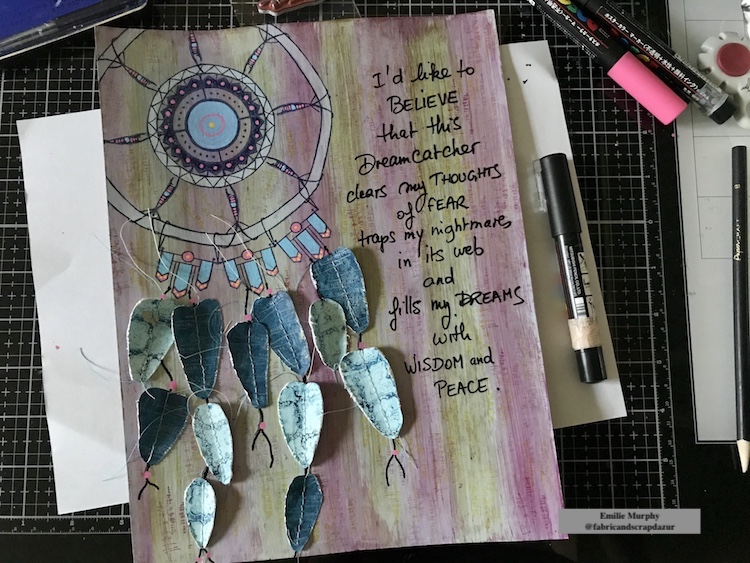
My Dreamcatcher is finally done!
Next, I wrote down my quote.
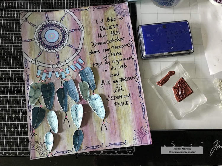
To finish up my page, I first stamped the corners with the Jugendstil Mini Motif stamp. I then created a border by stamping all around the edges with the Neato stamp with “Deep Space Blue” Moonlight Duo Ink pad.
Below are some close up pictures.
I hope you have enjoyed this tutorial and got inspired to create your own Dreamcatcher.
Personally, I had a lot of fun playing with Nat’s Mini Motif and Wabi Sabi stamps sets. It shows you how versatile these stamps sets can be. Just let your imagination and creativity go!
Have a great rest of the week! See you next month! – Emilie
Thank you Emilie! I love the idea of dreamcatchers and what a great art journal page with so many subtle details in there. Beautiful!!!
Give it a try: you can find all my Rubber Stamps in my Online Shop and here are some of the other supplies Emilie used:
Play along with our monthly themes and weekly projects! Working on something yourself that you’d like to share? Email or tag me #natkalbach how you used my stencils and stamps – I would love to share your projects in my next “n*Spiration From Around the Globe“.
Hello from my Creative Squad and one final post from the super talented Nicole Watson! Nicole has been with us for a year now, sharing her gorgeous painterly style of art journaling with us each month and usually including a beautiful video too. We’ve loved seeing her step by step artistry in action and we can’t wait to continue following her online now too in all her creative adventures. For her final post, Nicole is recreating a dream using my Wabi Sabi and Mini Motifs rubber stamps and this month’s theme: In My Dreams – A lot of folks are having crazy dreams these days. What visions do you see at night? Are you sleeping at all? Let us get a peek into your nocturnal adventures through your art.
Shortly after receiving our September assignment, I had a pretty crazy dream. I don’t often remember a lot of details of my dreams as they are layered with complications, but you’ll understand in a few sentences why I remembered this one!
I’m going on almost two years of being unsettled. From packing to move, moving into a new house, unpacking, and wanting nothing more than to finish unpacking so we can finally feel settled again! What stands in my way is waiting on warranty fixes on our new construction home. Then, I can finally hire painters to turn my walls from plain white to a lovely shade of gray with some crazy, fun accent walls. My husband and I painted 90% of our last home. We had to hire someone to paint the tall stairs area, but the accent walls and main walls were all painted by us. This allowed us to realize that picking “mushroom mist” for our bedroom was a huge mistake. For this reason, it’s making me super nervous to pick the right colors and release total painting control to someone else. (Not to mention being an artist and a bit picky about quality cut-ins and straight lines!)
These painters showed up in my dream recently. I can’t tell you all the events and play by play, but I can tell you that when the painting was completed, I was furious! They were so proud of their work as they opened the doors to show us their designs. Room upon room were full of crazy, painted designs. The only one I vividly remember was fish in the guest bath and lots of sparkly gold. I couldn’t understand where they had gotten all the colors until I saw my empty Golden paint bottles in my studio room.
Nightmare, right?
Since the only specifics I could remember were the fish, and I didn’t really want to paint fish, I chose to create a page reflecting the crazy nature of my dreams.
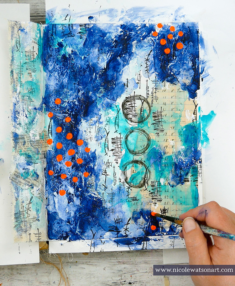
Here is a video I made:
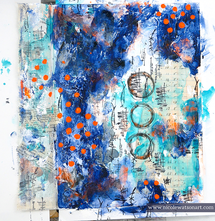
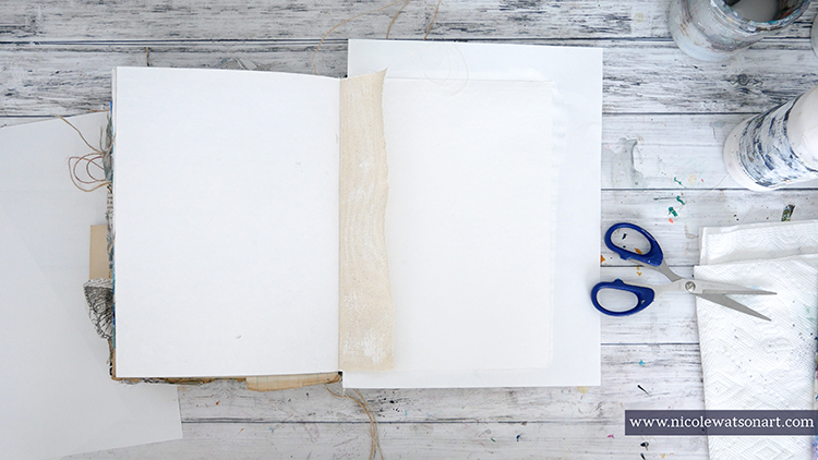
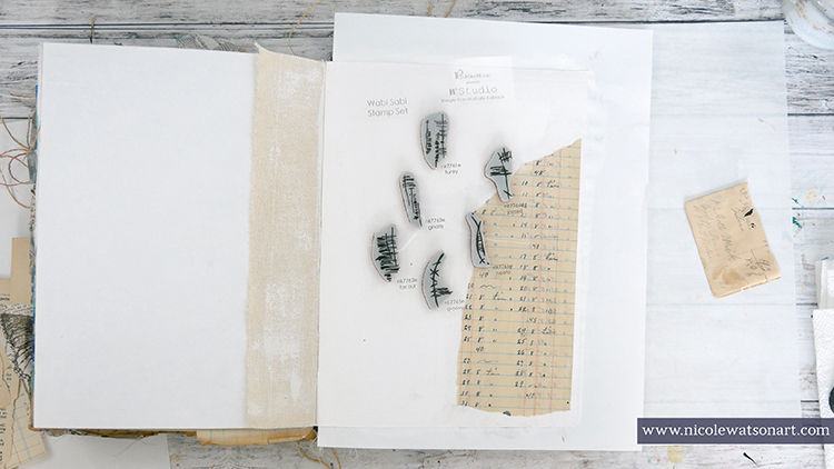
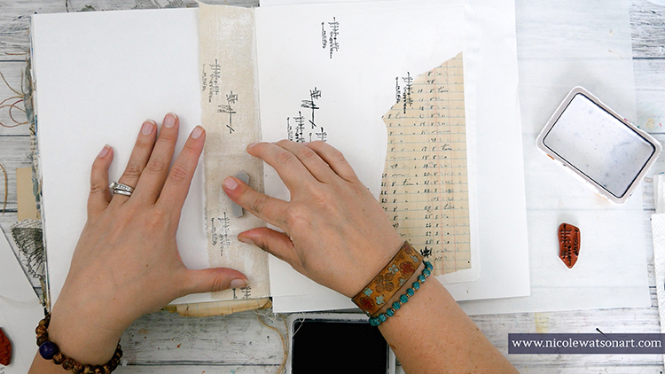
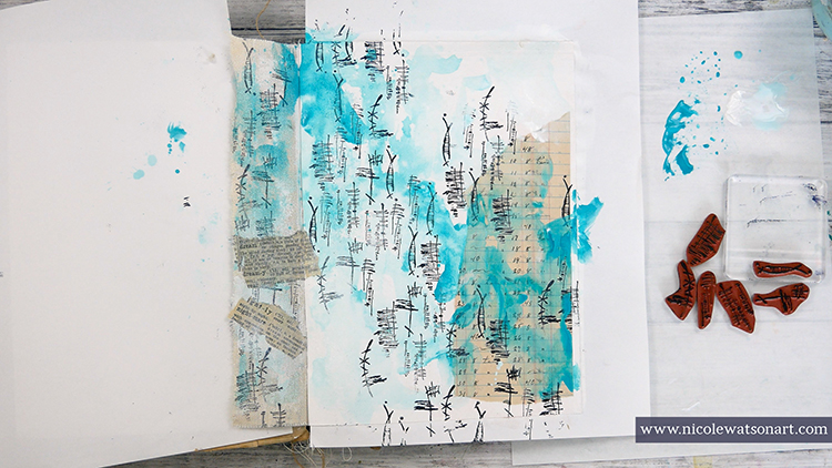
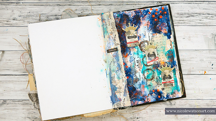
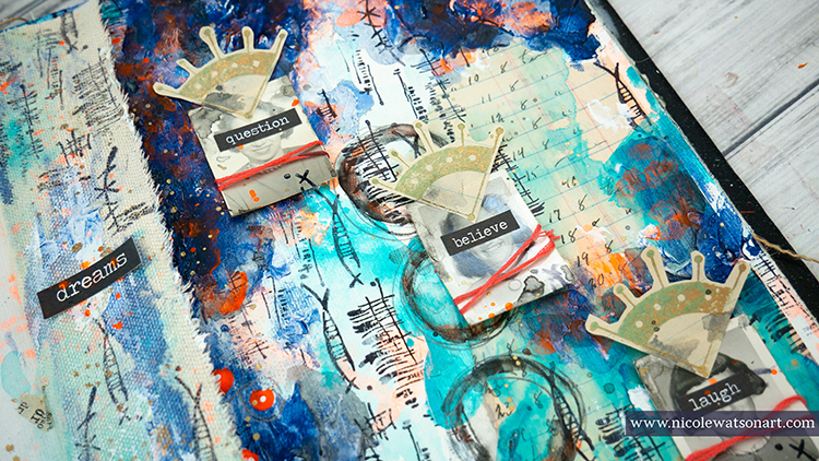
I grabbed my Dina Wakley Media journal and ripped part of a canvas page for a small cover flap. After gessoing the main page and wiping some on the canvas flap, I adhered a ripped ledger page. I was also going to add some dictionary pages, but was side tracked finding “dream” and “nightmare” in the dictionary (which I later adhere to the canvas flap).
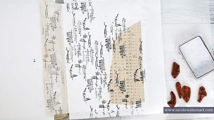
Next, I picked up Nat’s Wabi Sabi stamp set for another layer of my dreams. I liked the meaning of these symbols from funky to neato and far out… those sure describe dreams! I stamped these word symbols on the canvas flap and the journal page to create texture.
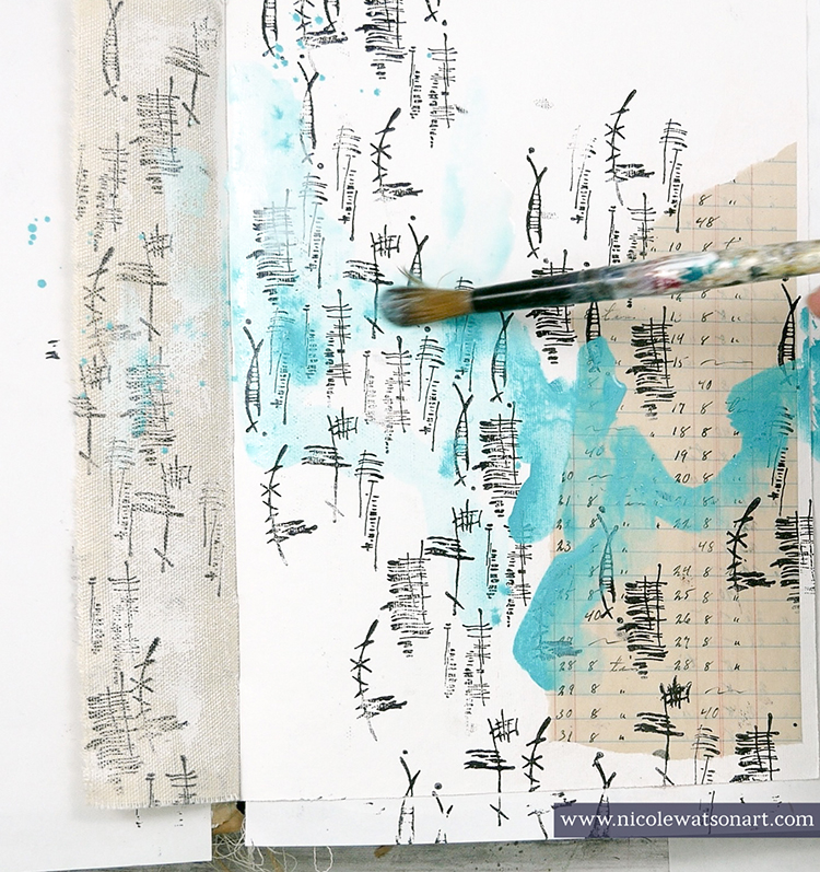
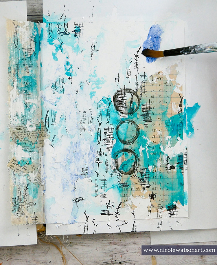
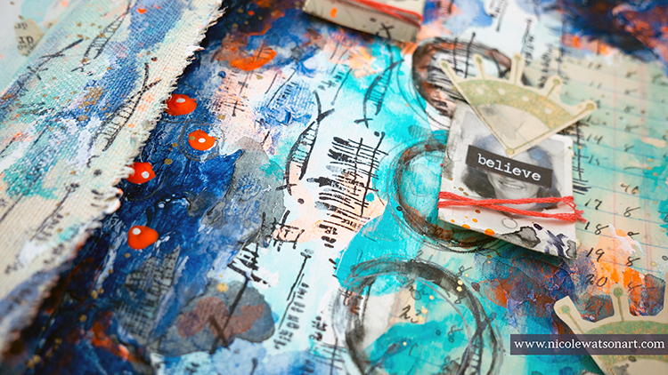
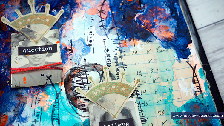
I added a layer of color with teal and gesso on the page and the canvas flap. To tie in the stamped images and the piece of ledger paper, I sketched three circles with stabilo all and then activated them with water.
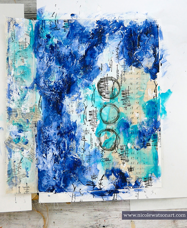
My next idea was to hide the symbols and color with a layer of dark, foggy color to obscure the dreams. I started this layer with super heavy gesso. After it dried, I added darkness to it with Paynes gray. I couldn’t figure out how to get the effect I wanted so I used a paint brush, foam applicator, baby wipes, and my fingers. It was a process!
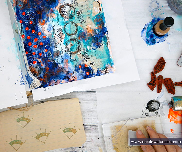
Because dreams don’t always make sense and to add contrast, I grabbed fluorescent orange to make some dots on the page. The Paynes gray wasn’t moody enough, so I made a stabilo all puddle (scribble stabilo on palette paper and activate with water) to shade the Paynes gray. I like the shadowy, grungy effect the stabilo puddle has. I also added some watered-down florescent orange to different areas. I especially concentrated the orange on the textured spots from that super heavy gesso. Then, I added some small white dots on the orange ones with my fineliner bottle.
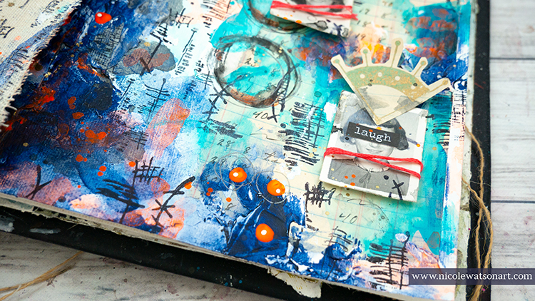
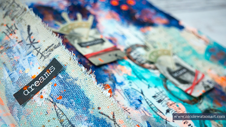
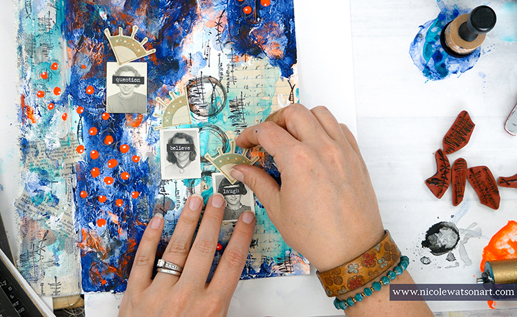
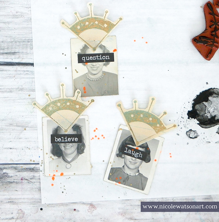
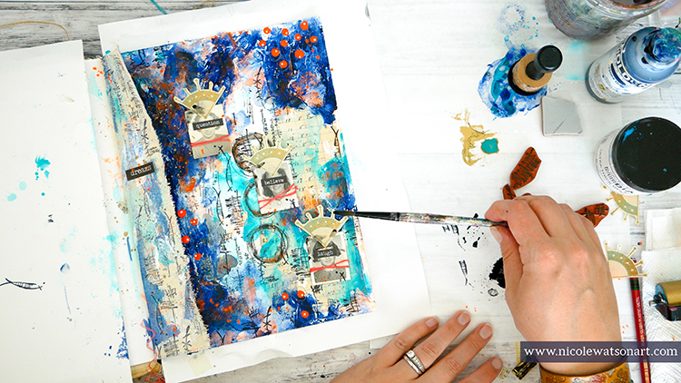
Five-hundred ideas were floating in my head of where to go next. I searched my pile of old photos for some interesting ones, and in the end decided on three old school pictures. I decorated these photos with crowns from Nat’s Mission Motif stamped in bronze paint on a gel plate, words, embroidery floss, a small stamp from the Wabi Sabi stamps, and some splatters of paint. I topped the canvas flap with the word “dream” and called it done after splattering some bronze paint on the page (to represent that gold, glittery paint).
A fun page to remember the crazy dream I had. Speaking of fun…it’s been an incredibly fun year as a member of Nathalie’s Creative Squad. The challenges each month caused me to think about how to apply them to the stamps and stencils she designed. Most importantly, they pushed me into my studio to create and inspire you. Thank you so much Nat!
Thank you Nicole for all of your contributions this year and for sharing this final peek into your dreams!
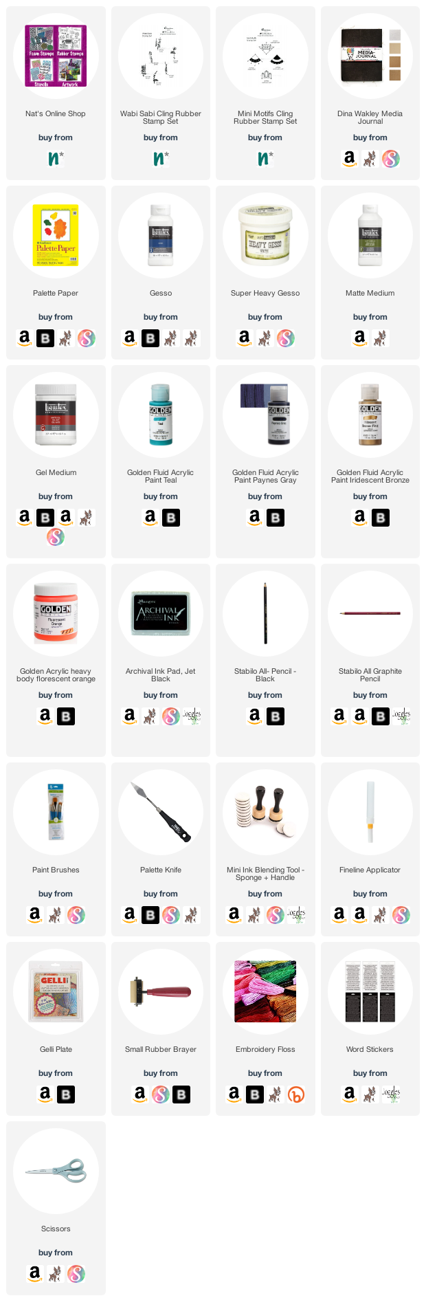
Give it a try: you can find all my Rubber Stamps in my Online Shop and in addition to ephemera, here are some of the other supplies Nicole used:
Feel inspired? Working on something yourself that you’d like to share? I love to see how you interpret our monthly themes. Email me how you used my stencils and stamps with the theme and email me an image – I would love to share your projects in my next “n*Spiration From Around the Globe“.
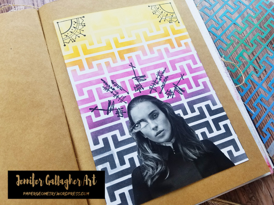
Hello from my Creative Squad! Today we have one last project and post from the amazing Jennifer Gallagher. We have loved having Jennifer on the Squad now for 2 years and have always enjoyed her colorful and fresh style. This month Jennifer says goodbye with an art journal page that is both personal and powerful. She is using my Hamburg stencil, my Mini Motifs rubber stamps, and my Wabi Sabi rubber stamps along with our new theme for this month: In My Dreams – A lot of folks are having crazy dreams these days. What visions do you see at night? Are you sleeping at all? Let us get a peek into your nocturnal adventures through your art.
This month the Creative Squad is talking about dreams. With all the stress of the last several months, my dreams aren’t memorable so much for their content, but the way I wake up feeling – and that is tense. So, I’ve created this art journal spread to express that tension and chaos.
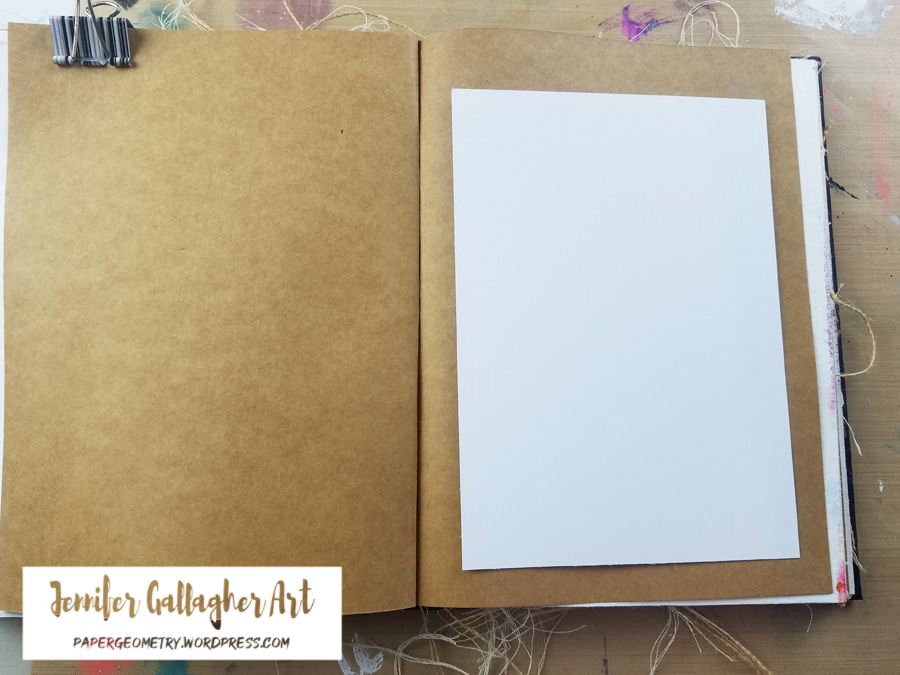
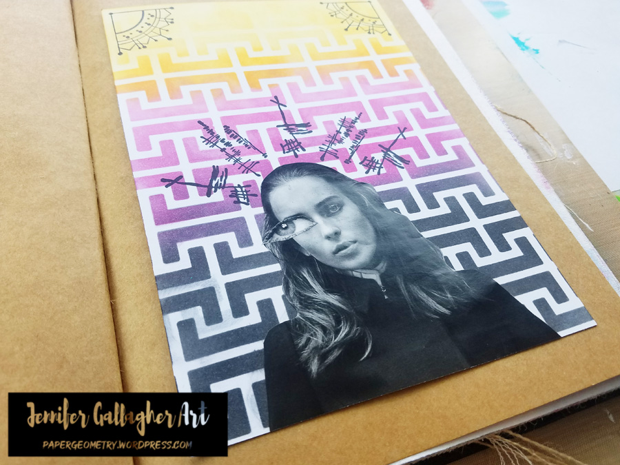
I decided I would attach a piece of A5 cardstock to my kraft page in a Dina Wakley Media journal. I will create my design on the cardstock and then attach it once it is complete.
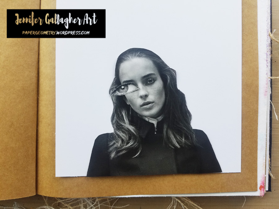
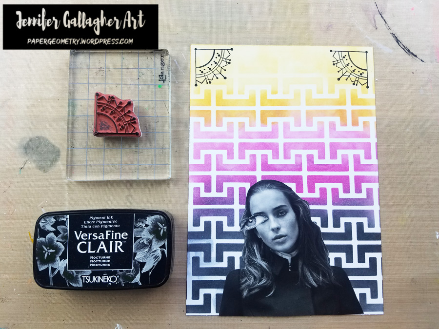
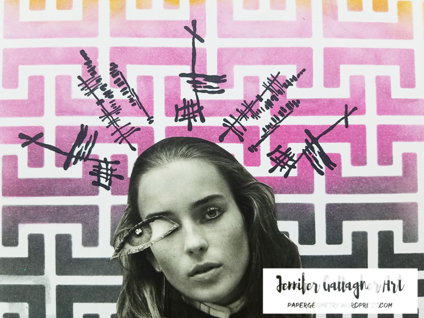
I have cut a face and an eye (larger than the eyes originally on the face) out of a magazine and picked a spot where it will go. I’m not attaching it yet so I can stencil the background.
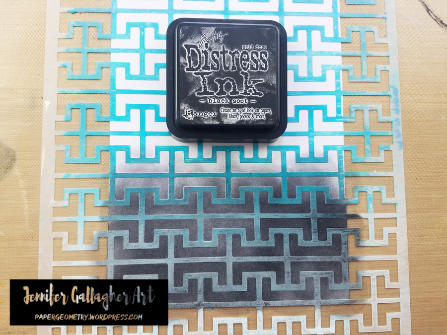
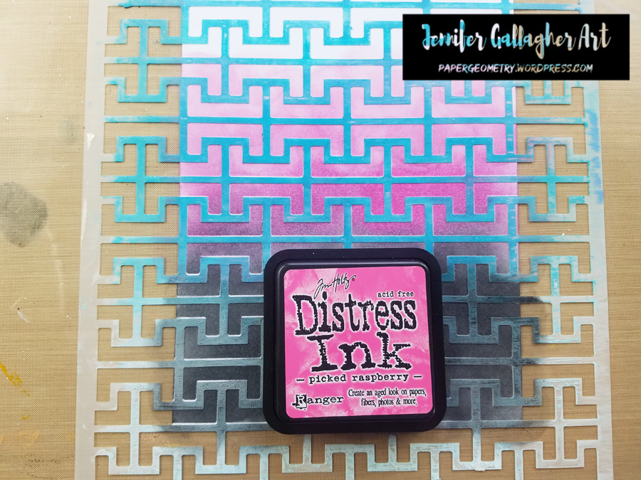
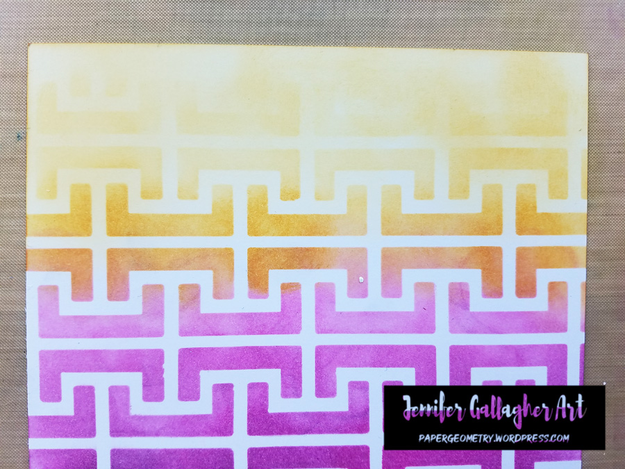
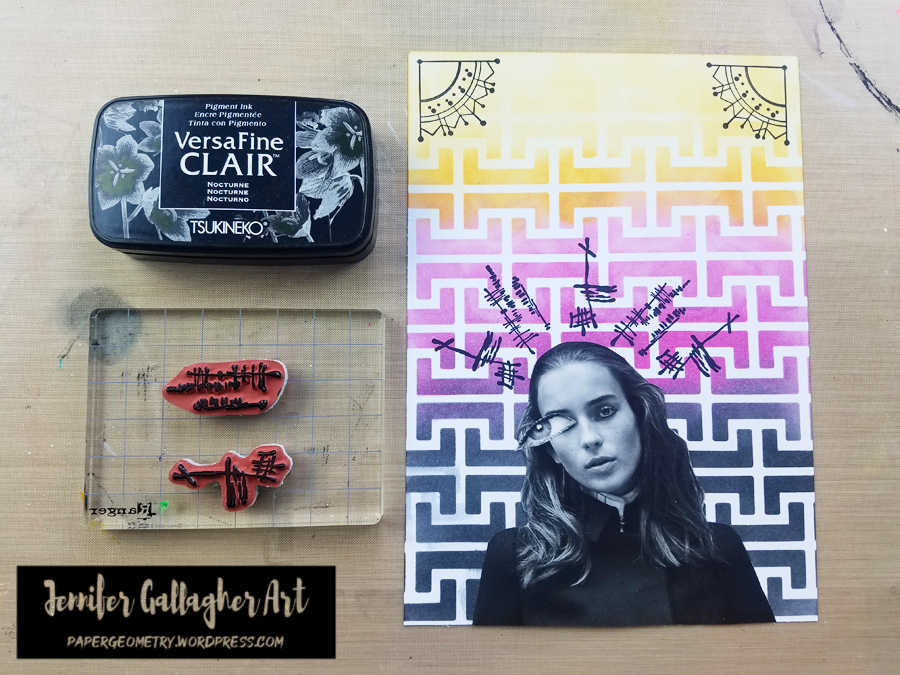
I laid Nat’s Hamburg stencil over the A5 piece of cardstock and starting at the bottom applied three colors of Distress Ink. First, I placed Black Soot, then Raspberry Preserves, and finally Wild Honey. Notice that at the top I blended a little wild honey over the white space to give a different look.
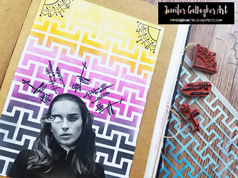
Next, I stamped Nat’s Jugendstil Motif stamp onto the top two corners using Versafine Clair in Nocturne.
I stamped Nat’s Jazzed and Funky stamps above the figure to represent tension and chaotic thoughts. These were also stamped in Versafine Clair in Nocturne.
I used a generic glue stick to attach the face and eye to the cardstock. Then I applied scor-tape to the back of the A5 sheet and attached it to a kraft page in my Dina Wakley Media journal.
I hope you have enjoyed this tutorial. I really loved creating this page. Also, this is my last tutorial as a member of Nat’s Creative Squad. I have loved sharing my art and creative projects with you these last two years. Happy Creating! xoxo – Jennifer
Thank you Jennifer! We will definitely be sad to see you go!!! But we of course will continue to follow you online to see what other creative magic you are up to :)
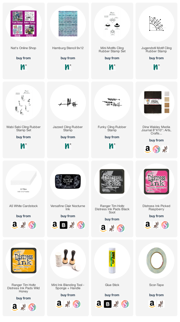
Give it a try: you can find all my Stencils and Rubber Stamps in my Online Shop and here are some of the other supplies Jennifer used:
Feel inspired? Working on something yourself that you’d like to share? I love to see how you interpret our monthly themes. Email me how you used my stencils and stamps with the theme and email me an image – I would love to share your projects in my next “n*Spiration From Around the Globe“.


Maura, I love the color that you created. It looks so real.
Reply