Creative Squad

Opposites Attract – Cheiron Brandon

CS Opposites Attract logo

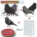
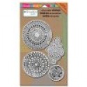
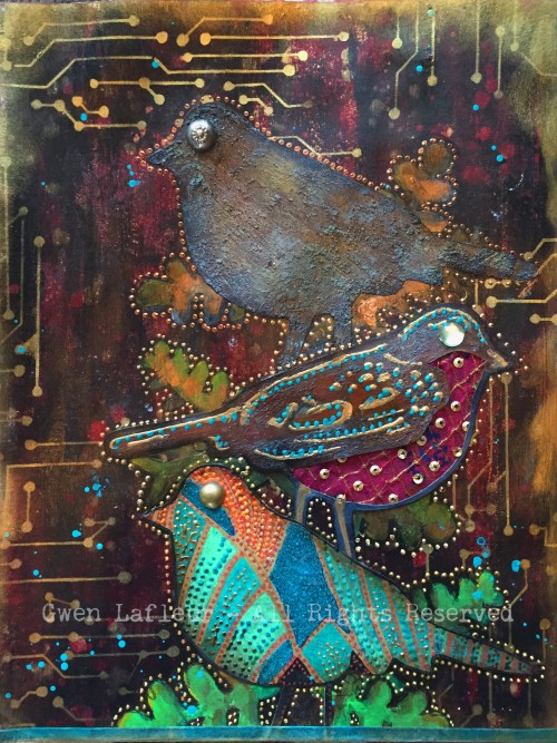
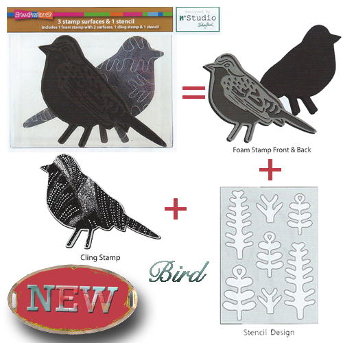
It is another Tuesday and therefore time for my Creative Squad to show you a fun project. The theme for March is Opposites Attract and the team will use my new Bird Foam Stamp, Rubber Stamp and Stencil Set. Just as opposite colors on a color wheel highlight one another, or yin and yang fit together so comfortably, sometimes the best is brought out when we celebrate extreme differences!

So here is the gorgeous Cheiron Brandon with her beautiful interpretation of the theme in form of an art journal page

—————————————————————————————————–

Cheiron March Headshot

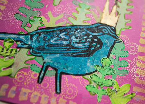
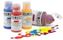
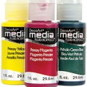
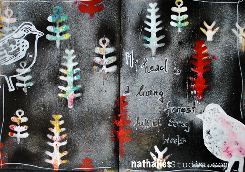
I had all kinds of thoughts when I heard the theme “opposites attract”.  I decided that since I love bright rainbow colors so much, I would try to mix up some paints that were a bit of a different palette this month for my art journal page. So for me my opposite was to start out with colors I would not normally use.  I mixed up a bunch of pastel greens, yellows and pink and just went with it!
cheiron thoughts fly by page
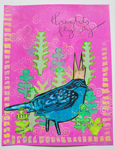
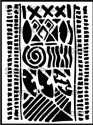
I created the pink background with a brayer, then used a stamp from the Kaffee Klatsch stamp set along with some yellow paint to create some texture on the background. I gave my page a border using the Batik stencil.
cheiron thoughts fly by 1_
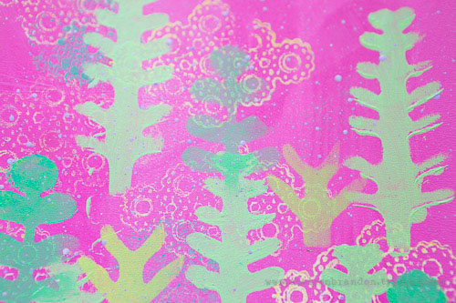
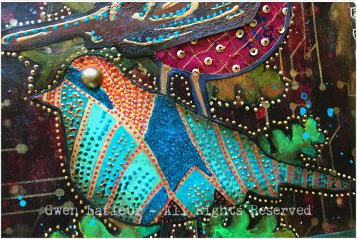
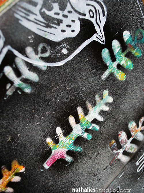
I wanted to create a scene for my bird so I used the stencil included in the Bird Foam stamp set to create a little garden. I layered the “trees” in different greens and then painted around them with acrylic ink to make them pop a bit. To create the bird I painted some blues onto a separate piece of paper and once it was dry, I stamped over it with the outline bird from the Bird Foam stamp set that I “inked” up with black paint using a foam tool.
cheiron thoughts fly by 2
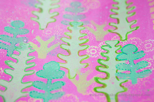
Once I created my bird, I added some more trees to ground him to the page. Once he was all done, I added a tiny crown, some lavender splatter and a few words to complete the page.
Not my normal color palette, but in the end I love how the colors look!  It’s always great to try something new :)
cheiron thoughts fly by 3
———————————————————————————————————
 I hope you enjoy Cheiron’s project as much as I do. I love how she stamped the patterned bird side of the foam stamp on a pre-painted piece of paper and then cut it out, as well as her layering of the stencil shapes in the background and in the foreground. And the crown…too cute!
Besides the supplies listed below, Cheiron also used acrylic paints, music sheet paper and a pencil to create this art journal page:
SuppliesCJS


Maybe you will even play along -we would love to see how you interpret the theme – email me how you used my stencils and stamps with the theme and email me an image – I would love to share what you did at the beginning of next month!

See you next Tuesday for the another project with the theme ‘Opposites Attact’.

Comments (6)

  • Karen Petitt

    |

    I love how you have used this new bird, in fact checking back through the posts I have been completely and utterly inspired by all of the DT! The way you have used colour and the paints really works for me because it feels like it’s something I too could achieve! Many thanks for the blog hop, the fabulous inspiration and for sharing your art with us Karen x

    Reply

  • Joi@RR

    |

    Bright, springish, and fun Cheiron. You made a lovely world for Nat darling bird! j.

    Reply

  • Gwen L.

    |

    Great page Cheiron! I love the way you used the stencils to create a scene… and the little crown on the bird! Great idea to use colors that are the opposite of your usual palette – I love that idea!

    Reply

  • Michelle LaPoint Rydell

    |

    This is such a beautiful page Cheiron! I LOVE the colors you used, and the way you created a scene with the stamps and stencils – the stamps in the background make awesome clouds! Cute crown too!

    Reply

  • Miriam Prantner

    |

    Wonderful page! I love the bright pink with the greens and how that cool blue of the bird contrasts.

    Reply

Leave a comment

Opposites Attract – Gwen Lafleur

CS Opposites Attract logo

I am so excited as this is the first Tuesday for my Creative Squad to show you a fun project. The theme for March is Opposites Attract and the team will use my new Bird Foam Stamp, Rubber Stamp and Stencil Set. Just as opposite colors on a color wheel highlight one another, or yin and yang fit together so comfortably, sometimes the best is brought out when we celebrate extreme differences!

So here is the wonderful Gwen Lafleur with her amazing and stunning interpretation of the theme in form of an art journal page

—————————————————————————————————–

Gwen March Headshot

For the this month’s theme of “opposites attract,” I decided to interpret it in two ways. You can see lots of complementary colors used throughout the piece, but the main way I created “opposites” was by contrasting bright / shiny / new with old / rusty / brown. I tend to use this type of contrast in a lot in my work, so I thought it would be fun to really emphasize it for this piece.

Opposites - Bird Stamp Art Journal Page - Gwen Lafleur

To make the page, I created a background with black gesso and layered some color on top to create a kind of distressed look, but using a mix of bright and dark colors. To add more old / new contrast, I used the Circuit stencil with gold ink. For the birds, I stamped each side of the foam stamp plus the rubber stamp on cardstock, then decorated each of them separately.
 Opposites-Bird-Stamp-Art-Journal-Page-Close-ups2-Gwen-Lafleur-e1456529458962
The bottom bird used the rubber stamp, and he’s all about bright colors, beads, gloss and shine. The middle bird used the detailed side of the foam stamp and he’s a fun little hybrid. I made the top look rusty, but layered shiny dimensional paints on top. I cut out a section from the bottom following the lines of the stamp and added some fabric – it’s vintage sari fabric, but it has shiny sequins on it. The top bird is from the solid side of the foam stamp and is all old and rusty with no shine or bright colors. I used acrylic paints, texture paste, and Viva Rusty paint and patina to make it look like a piece of rusted metal, then added a vintage metal button for his eye.
Opposites-Bird-Stamp-Art-Journal-Page-Close-ups1-Gwen-Lafleur-e1456529458962
To finish, I positioned each of the birds on the page and then used the leaf stencil that comes with the stamps and stenciled the base of the leaves where I wanted them. I kept the same pattern as I added the leaves – brighter green at the bottom moving to brown and dark leaves at the top.
It was so much fun to work with these stamps and stencils – they’re so versatile! Plus, this month’s theme was challenging yet enjoyable, and I really love how it turned out!
———————————————————————————————————-
Wow – I hope you enjoyed Gwen’s project as much as I did. I love how she used all three bird stamp surfaces and created them differently yet cohesive and the texture and detail in this page is stunning!
Besides the supplies listed below, Gwen also used several dimensional paints, misc fabric, jewel and metal buttons to create this art journal page:

SuppliesCJS


And maybe you will even play along -we would love to see how you interpret the theme – email me how you used my stencils and stamps with the theme and email me an image – I would love to share what you did at the beginning of next month!

See you next Tuesday for the another project with the theme ‘Opposites Attact’.

Comments (16)

  • Dee Ann O'Brien

    |

    Wonderful birds- inspiring. Great technique directions!

    Reply

    • gwenlafleur

      |

      Thank you so much! So glad you liked it :)

      Reply

  • Karen Petitt

    |

    Oh no and dang! I now have to change what new stamps and stencils I had planned to purchase in May. This is just dang! For me it was an OMGee when I hopped over, I love the rich deep colour which is so perfectly opposite yet matches the rusted layer. I own one of Natalie’s stamp and stencils sets and I knew when I could I was going to purchase more of her tools. Today’s post has reminded me not to plan ahead so much because I need these new stamps and stencils so very much! Just as I thought it couldn’t get better this month you guys release these beautiful products.
    Thank you so much for the blog hop, the awesome inspiration and for sharing your gorgeous art with us Karen x

    Reply

    • gwenlafleur

      |

      Thanks so much Karen! I have to admit, this is a pretty fun stamp set… plus it’s 3 stamps and one stencil in one! You really kind of have to have it ;)

      Reply

  • VikiB

    |

    That is an awesome piece! I love the contrast and the addition of the circuit looks so cool.

    Reply

    • gwenlafleur

      |

      Thank you so much! I couldn’t resist adding the circuit stencil as part of the opposites theme – so glad you like it!

      Reply

  • alisa

    |

    Love the creative team! Great ideas

    Reply

    • gwenlafleur

      |

      Thanks Alisa! I’m thrilled to be included in such fantastic company :)

      Reply

  • cheiron

    |

    Amazing page Gwen. I am loving the colors and texture!

    Reply

    • gwenlafleur

      |

      Thanks Cheiron! I can’t wait to see what you did for this challenge :D

      Reply

  • Martha Richardson

    |

    I’m so glad to see a Creative Squad! Love the project and tutorial ;)

    Reply

    • gwenlafleur

      |

      Me too Martha! And thank you! It was fun to work with this month’s stamp set :)

      Reply

  • Michelle LaPoint Rydell

    |

    Gorgeous page Gwen! I love how you combined the rusty elements with the bright colors – it really pops!

    Reply

    • gwenlafleur

      |

      Thanks Michelle! I really like the contrast of old and new… glad I’m not the only one!

      Reply

  • Sue Clarke

    |

    I love how you used the Circuit stencil Gwen!
    Makes it seem like branches. Nice job.

    Reply

    • Gwen L.

      |

      Thanks Sue! I thought that was a fun stencil to use for this – it felt like it fit, but still added some cool (to me!) contrast :)

      Reply

Leave a comment

Song Bird or… In My Art Journal Today

NatkalbachSongbirds01

Free after E. E. Cummings “My head is a living forest full of song birds.”

I made this page based on a background that to be honest was really really bad. The colors were just awful on the spread, so I used some gesso here and there to tone it down and then I layered my new frond masks which are part of my new Bird StampSet on top of the background. You can pop the fronds out of the plastic and that gives you a stencil and masks in one :)

Bird

I then used Carbon Black and Parchment Spray Paint and sprayed over the masks, which revealed after lifting them, the really cool colors and designs. I used a brayer to layer some white paint on top of the foam stamp and the patterned and the solid side to stamp the birds onto the spread.

NatkalbachSongbirds02

An easy way to make something nice out of a really ugly beginning :) And a great way to start the day with a little art journaling warm up.

Thank you all for your wonderful comments about the new stamp sets- I am so excited! They are being shipped right now to the Brick-and-Mortar stores and they are already available at some Online Stores. I will list the stores as soon as I have an update from the Stores. I will also have them soon available on my website for you to purchase direct if you cannot buy them locally. I cannot wait to see what you are doing with them and I am also excited to share some more projects and tutorials with them soon :)

SuppliesCJS


Hope you have a wonderful day- with or without song birds in your head ;)

hugs

Comments (5)

  • colourfly

    |

    Liebe Nat, Ich finde deine neuen Stempel so supertoll…. Kann eskaum erwarten diese zu kaufen!!! Ich hoffe, dass sie auch in good old Germany zu haben sind?!
    Die Journal Seite ist super!
    Ganz liebe Grüße, Sabine

    Reply

    • nathalie-kalbach

      |

      vielen Dank Sabine! Ja- in Deutschland sollte es sie auch geben – ich poste sobald ich weiß, welcher Shop in Deutschland sie führt :) Liebe GRüße in die Heimat :)

      Reply

  • Jenny Petricek

    |

    Love this spread, Nathalie! I love the dark background and the colorful fronds that pop out in front of it!

    I appreciate that you explained the process of how you arrived at this particular background. Sometimes the most delightful surprises come from adding to and covering things that we weren’t happy with originally!

    Reply

  • gloz

    |

    Hi Nathalie, Thanks so much for leaving a comment on my blog. I am really enjoying my Creative Jumpstart 2016 and I have decided to use it as a new diet ploy for myself! I tend to nibble all night long in the winter, there-by gaining weight. But of I am doing art projects between 8 and midnight, I can’t eat at the same time!

    Reply

Leave a comment