There is this special thing about the Prima Products that I love – they are sometimes so feminine and yet give me the possibilty to give them the little grungey edge and make them a bit more me.
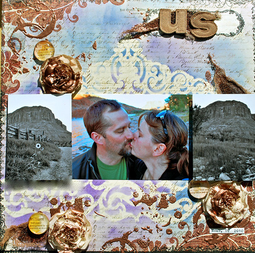
For this layout I used the Scribe Paper from the Reflections Collections and then placed some of the beautiful Prima Masks onto the background. I used two different colors of Ranger’s Distress Ink and wiped them over the masks .

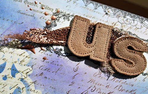
For the title I used Canvas letters which I sprayed with Tattered Angels Bronze Glimmer Mist. For the background then I aslo used some cheesecloth which I also sprayed with the Bronze Glimmer Mist and then attached it with Gel Medim. I stamped the background with Distress Stamp and Versamark and added some Bronze Utee on top of the stamped images and on the still wet Gel Medium of the cheesecloth and heated it up for a nice texture.
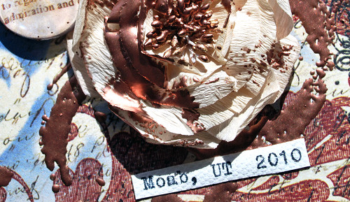
Next I used a Scrapbook Adhesives by 3L Adhesive sheet to just add a little bit of adhesive here and there to the beautiful Lady time Flowers. On top of that I also sprinkled Bronze Utee and heatset it so that the flowers wold match the rest of the layout and unify the look.
Then I mounted the photos left and right on Scrapbook Adhesives by 3L Foampads and glued down the Prima Definition Pebbles which had saved for years since I love those so much.
And there it is a romantic, still a bit grungey layout that fits the photo and the beautiful rough scenery in Moab, UT where my hubs and I spent some wonderful days last years.
Prima Products: Reflections Coll. Scribe, Prima Masks, Definition Pebbles, Lady Time Flowers
Others: Distress Inks, UTEE, Cheesecloth, Stamps, Canvas Fabric, Scrapbook Adhesives by 3L
Have a gorgeous day :)
Nat

 #
#
Comments (4)
Jenny Petricek
| #
I am so inspired by your use of masks…I’ve never tried to use a mask before, and I think I will need to try this soon!
Reply
Sue Clarke
| #
Love the grunge with the mountain photos. Those canvas letters are cool!
Reply
marie-anne raeman
| #
i like this ;-)
Reply
Kim Sonksen
| #
Love he grungy feel and the textures
Reply