Creative Squad

Creative Squad: Wish You Were Here – Maura Hibbitts

Hello from my Creative Squad! Today we have a lovely art journal spread from Maura Hibbitts using my Cape Cod, Mini Motifs, Tread, and Adirondack Chairs rubber stamps and our latest theme: Wish You Were Here – This time let’s think about those old travel postcards, or someone you are missing or haven’t seen in a while, or maybe a place that you are missing. The message is loud and clear: Wish you were here!


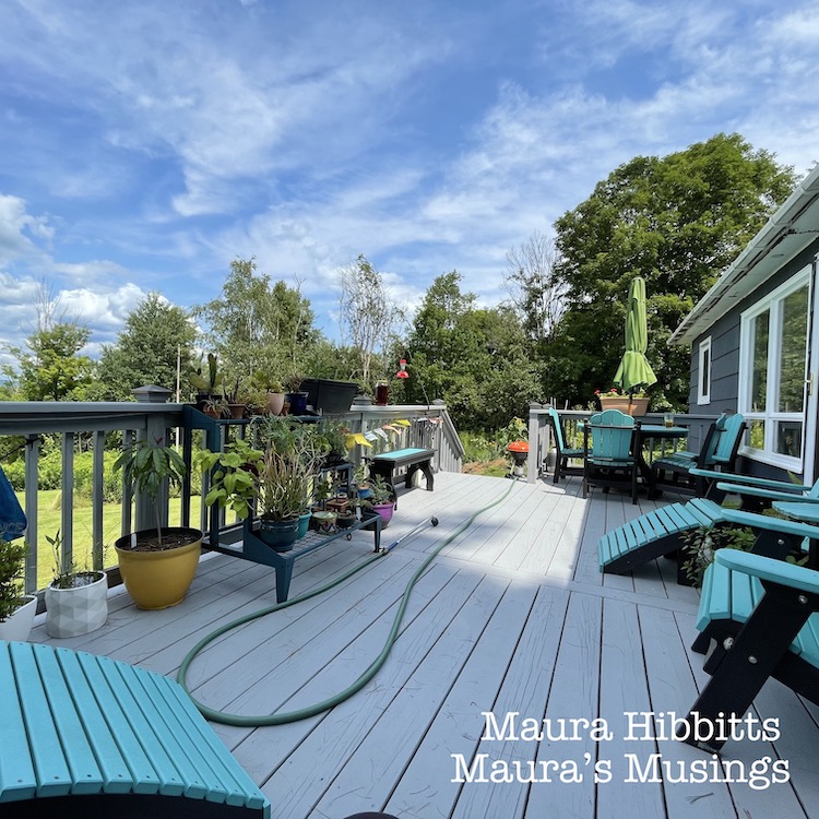
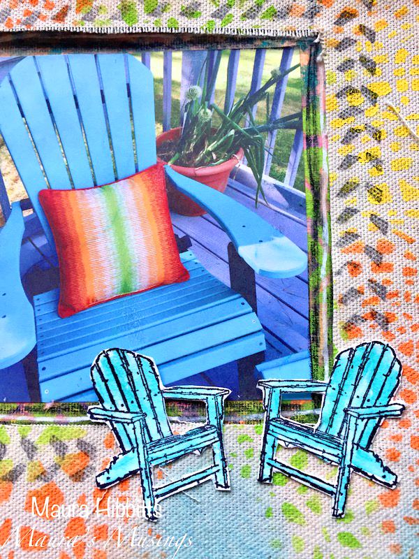
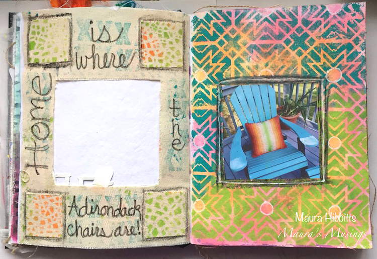
One of my favorite places in the world is right here at my home…I love my deck! I have a beautiful view of the Adirondack Mountains that I enjoy every day. The warm months let us move outside to enjoy relaxing in the Adirondack chairs and eating outdoors. My son Dan has the green thumb and adds his touch to the deck with a variety of plants: this year it’s a lot of rhododendrons, cacti, herbs and more. It’s the perfect place to gather, and I wish you were here with me.

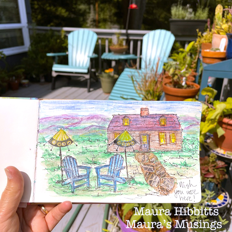
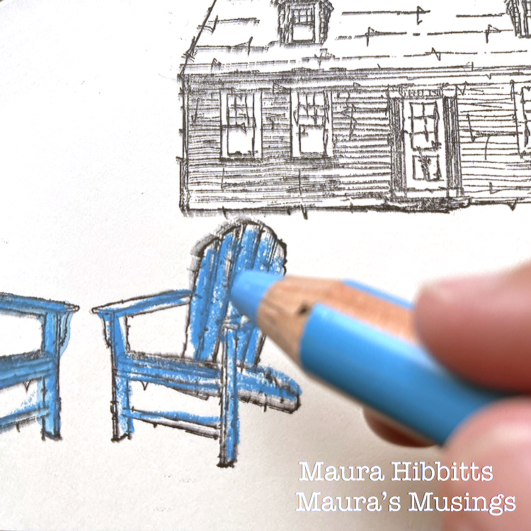
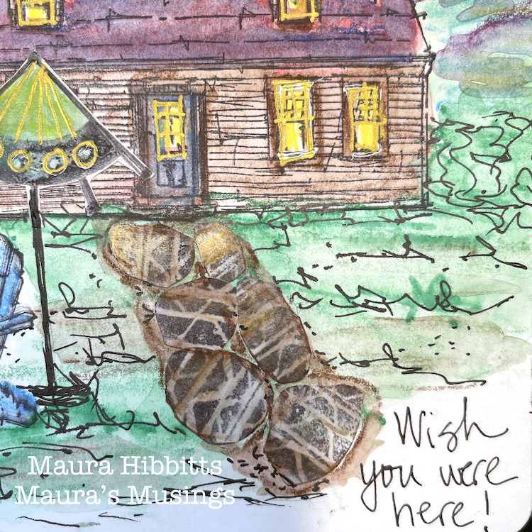
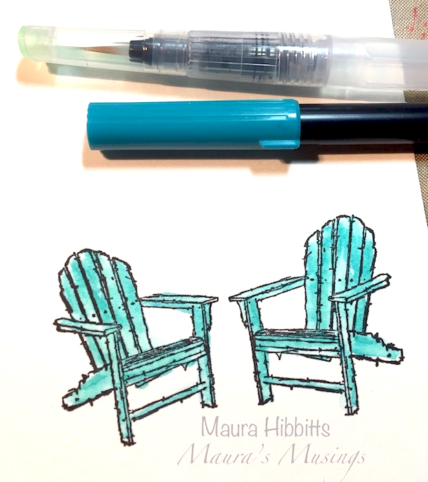
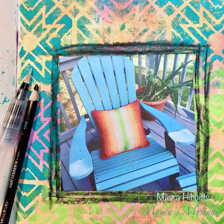
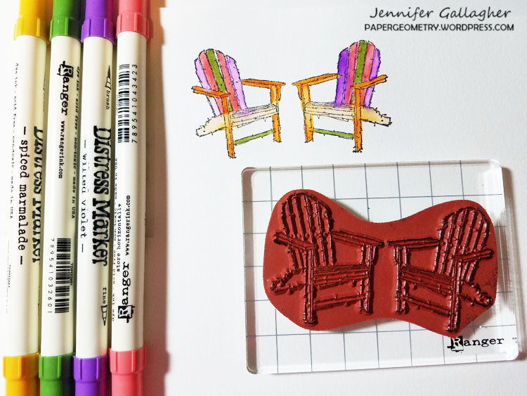
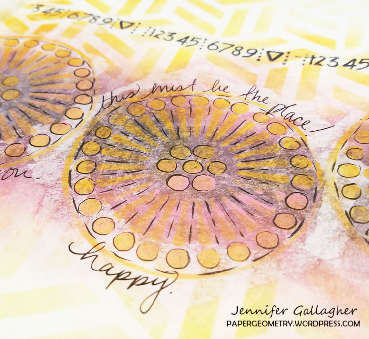
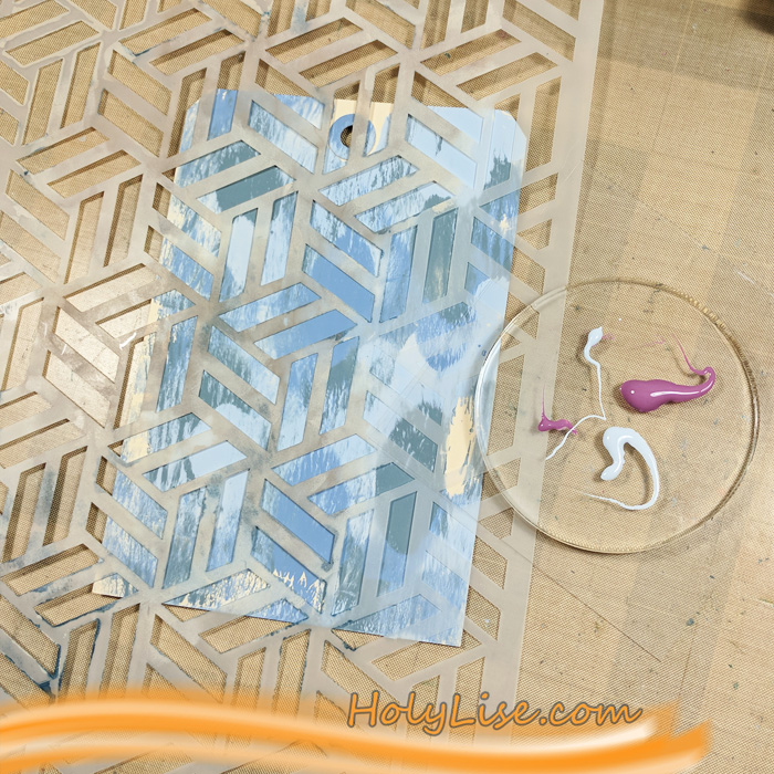
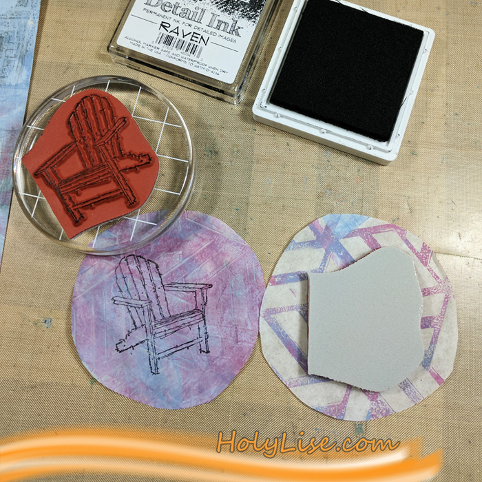
I’m working in one of my art journals, and began the project by stamping a scene with black ink, onto the page using Nat’s Cape Cod, Adirondack Chairs, and Mission Motif stamps.

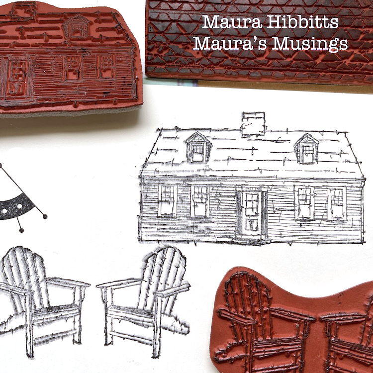
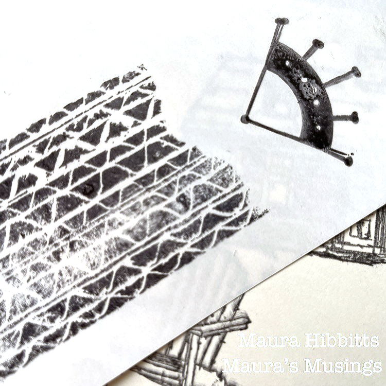
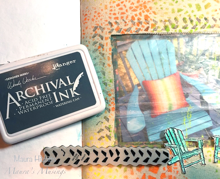
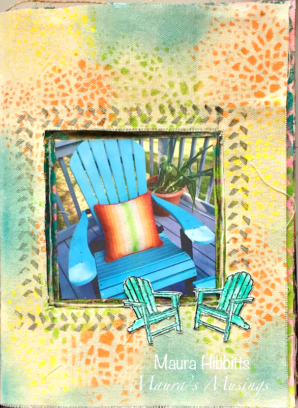
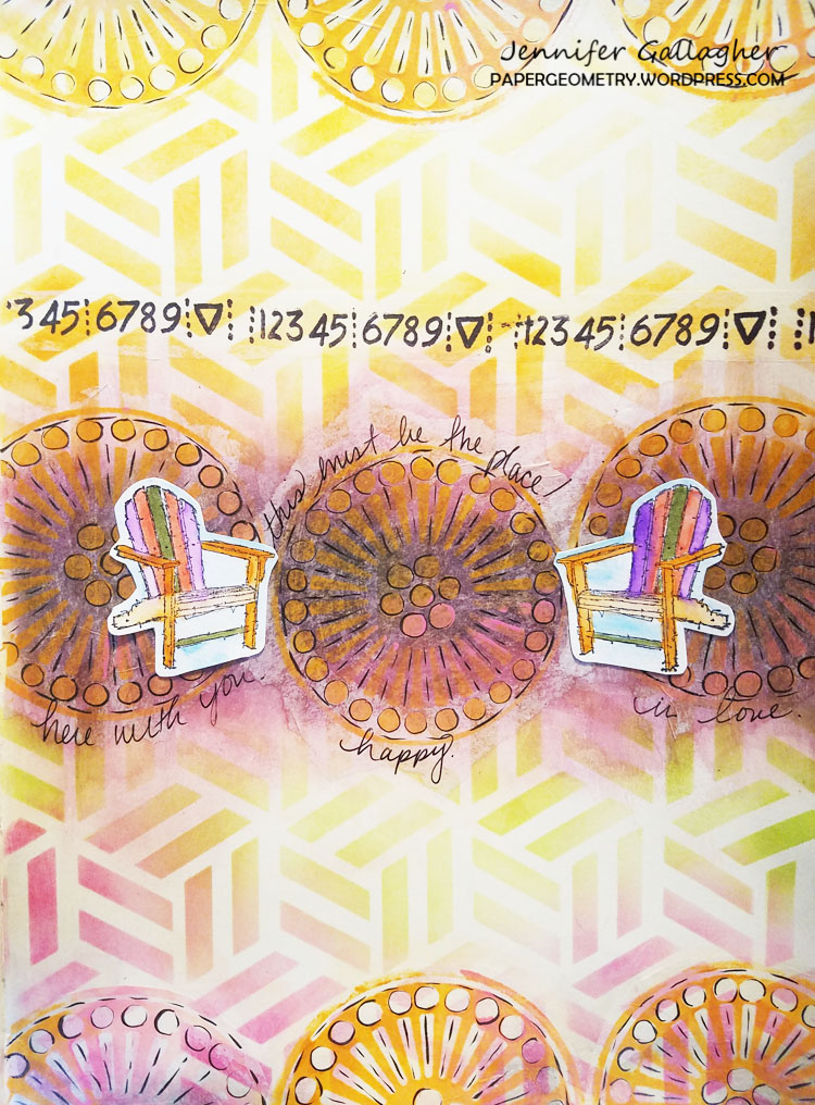
I also stamped some images onto Grafix Doubletack paper. I used Nat’s Tread and Mission Motif stamps. Be sure to let these dry completely.

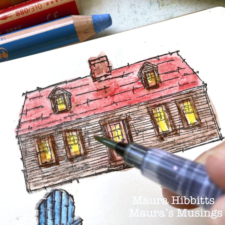
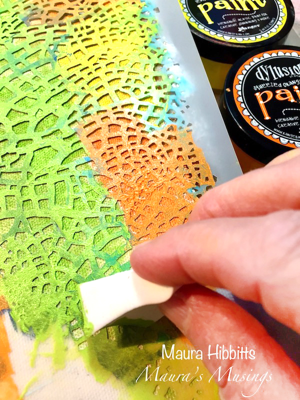
Now comes the fun part! Color the images in the art journal and on the Grafix sheet with Woody pencils (or any water soluble pencil).

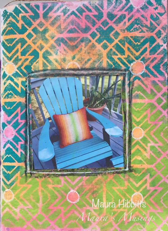
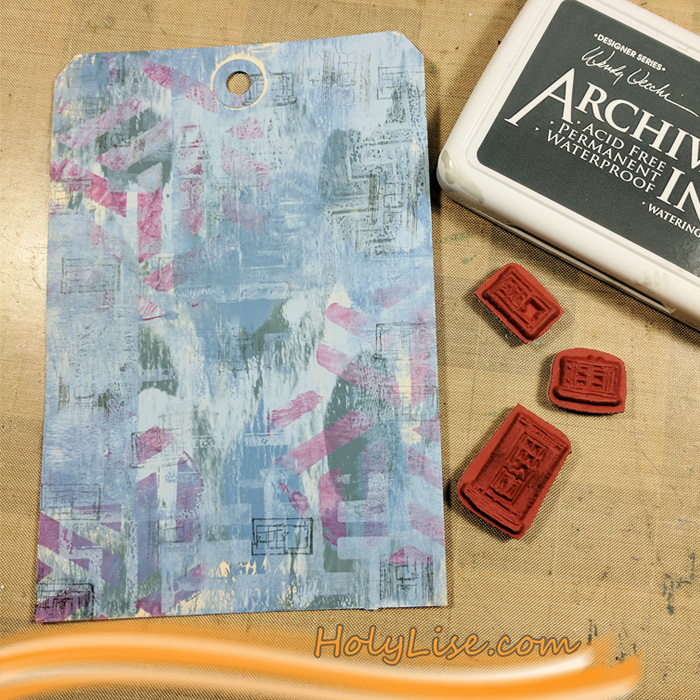
Use a water brush to spread the color from the Woody coloring. You will note later that I changed my mind on the roof color. This was easy enough to do – once the page was dry, go over the area with another color and blend again.

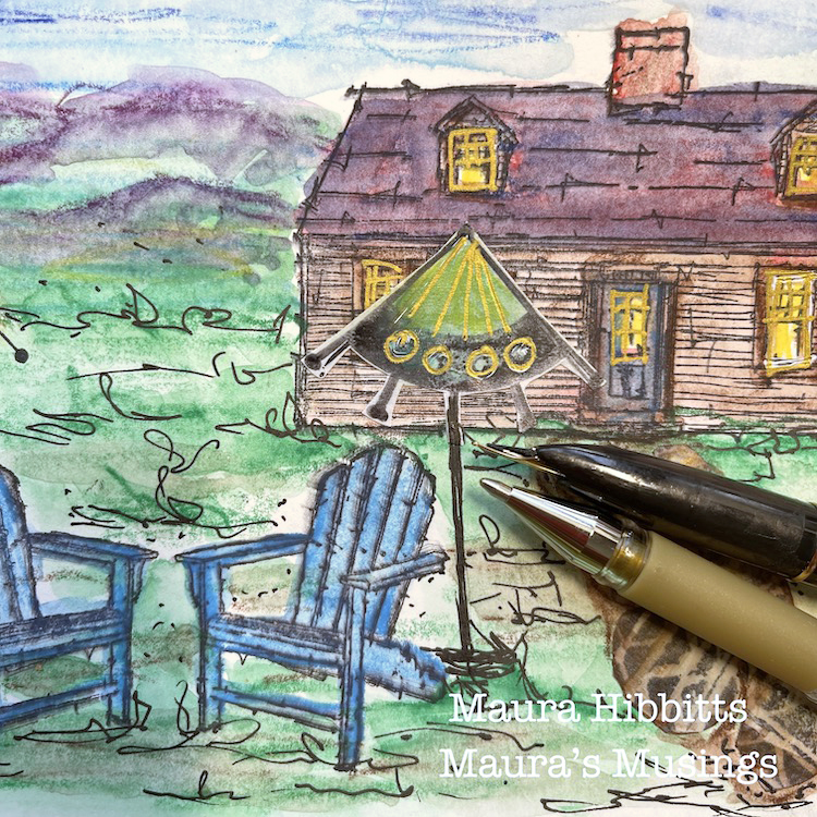
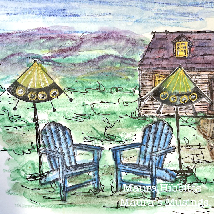
Cut out the second “umbrella” and cobblestones from the Grafix paper and adhere to page. Color and blend in a background with the Woody pencils and water brush. Let dry completely, then add detail with a gold pen and waterproof black pen. Add “Wish you were here” and your page is done!

I do love to travel and have many places I carry in my heart, from the ocean to the mountains, villages to cities. Each place has its own unique beauty. But, it is always good to come home and enjoy what is right here on my doorstep. I have been so grateful to have this special place in recent times, and to share it with family and friends. Where is your special place? Let us know in the comments! – Maura


Thank you Maura! We love seeing your beautiful backyard oasis and how it inspires you!

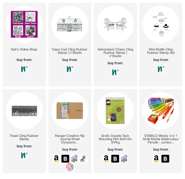
Give it a try: you can find all my Rubber Stamps in my Online Shop and here are some of the supplies Maura used:

Looking for more inspiration from the Creative Squad? Follow them on Instagram here.

Leave a comment

This Must Be the Place – Maura Hibbitts


Hi from the Creative Squad! This week we have a sweet 3-page art journal spread from Maura Hibbitts who shares a peek into her local scenery :) Maura uses my Toledo and Crackle stencils, my Marks stamp set, and my Adirondack Chairs stamp to set the scene, and drew inspiration from this month’s theme: This Must Be the Place –We’re all on a journey to somewhere or something. Sometimes we’re just making preparations for simple things like dinner or weekend plans. Other times we’re aiming for bigger goals, bigger places. Whether it’s a location or a state of mind, you’ll know when you get there. Where are you headed?


When I saw this month’s theme, I immediately thought of my Turquoise Adirondack chairs on our deck. I am so lucky to have a wonderful view in my work area looking out on our deck, and the Adirondack Mountains. I printed up a photo I had taken in summer of one of our chairs with it’s bright pillow, and used these colors as my inspiration in my art journal. I started off thinking I would create a frame for the photo, but as often happens, my Muse took me on a slightly different path with three pages instead.

I’m using a Dina Wakley Media Journal which has a mix of pages in it, including canvas. I started by using the Crackle stencil and bright orange, yellow and green paints. I use cosmetic sponges to dab my paint into the stencil. (Tip – you can reuse these when they dry, just cut off the colored end, and you have a fresh sponge)

Next, I sponged on some Peacock Feathers Distress ink with a mini blender in the areas without a stencil design.

While the paint was drying on the canvas, I stamped the Adirondack Chairs onto watercolor paper, using archival ink. Once the ink was dry, I went in and added some color with a Tombow marker and went over the color with a water brush.

The next page in the journal was a watercolor page, and I used mini blenders and Distress Oxide inks in pink and orange to cover the background. Next, I spritzed it with water, and dabbed it dry.

I laid the Toledo Stencil over the inked page, and using a cosmetic sponge, I dabbed on the turquoise and lime paints.

I glued the photo of my Adirondack chair onto this page, then went around it with a Stabilo graphite pencil and then a water brush to make a frame. Once that dried, I added a bit of white highlights on the page with a Posca white paint pen.

For my final steps, I went back to the canvas and cut out the center for the photo to show through. Since I had printed my photo from the computer, I used the copy paper I had cut it out from as a template for cutting, and made a few more snips as needed. On the back of the canvas, I cut the square in four and glued these to the corners, and wrote around the opening with a Pitt pen “ Home is where the Adirondack chairs are”. I used the Marks stamps and went around the frame on both sides of the canvas.

Nathalie’s Adirondack chair stamps were the perfect match to my chairs, and I had fun coloring them turquoise just like mine! When I was looking for pillows for my chairs, I found these which have wonderful contrasting colors that I took as my inspiration for the pages. Truly, home IS where my Adirondack chairs are!


Thank you Maura! Love the idea of making window openings in my art journal! Here are some of the supplies that Maura used:


Play along with us too: I love to see how you interpret our monthly themes. Email me how you used my stencils and stamps with the theme and email me an image – I would love to share your projects in my next  “n*Spiration From Around the Globe“.

SaveSaveSaveSave

SaveSave

SaveSave

Comments (2)

  • Sue Clarke

    |

    I just love this Maura and Adirondack chairs hold a special place in my heart.
    We go on vacation by the lake and there are always these special chairs for me to sit on as I relax/read/and sip on my soy chai latte.
    Thanks for this project!

    Reply

    • maura

      |

      Thanks so much Sue! I love your story about the Adirondack Chairs. There is a big lake in our area, but it’s a few miles away from me, I know it’s out there. I love spending time in my chairs when the weather is good – summer will find me on the deck. Thanks for your sweet comment! Maura

      Reply

Leave a comment

This Must Be the Place – Jennifer Gallagher


Happy Tuesday from the Creative Squad! Today we have a beautiful and certainly inspirational art journal page from Jennifer Gallagher using my Grove Street ArtFoamies, my Kassel stencil, and my Adirondack Chairs and Numerals rubber stamps along with our monthly theme: This Must Be the Place –We’re all on a journey to somewhere or something. Sometimes we’re just making preparations for simple things like dinner or weekend plans. Other times we’re aiming for bigger goals, bigger places. Whether it’s a location or a state of mind, you’ll know when you get there. Where are you headed?


This month the Creative Squad is asking, “Where are you headed?” I am not exactly sure. I focus more on my state of mind and how I feel about my current state of being, rather than worrying over individual goals. Yes, I have goals I want to achieve, but I am more concerned with finding happiness in my personal life, family, and art than I am anything else. And so this month I am saying, “This must be the place.” There is a great amount of peace that comes with loving your life in this moment in time.

So, this month I want to share with you an entry in my art journal. I wanted this page to reflect the happiness I feel at this moment in my life. You will see this reflected in content and color. Starting off I chose Nat’s Kassel stencil. It’s the perfect design for a fun background. I went with an ink-blended background using my distress inks in twisted citron, carved pumpkin, wild honey, and picked raspberry. This is a very easy technique using your mini-blending tool.

Then, using seedless preserves and black soot, I blended in a dark section in the very center of the page.

I raided some of my gift wrapping supplies and pulled out a large sheet of plain white tissue paper. I applied some heavy body acrylic paint onto my Grove Street negative and positive ArtFoamies and pressed the designs onto my tissue paper.

While those were drying, I stamped Nat’s Adirondack Chairs stamp onto some watercolor paper and colored it in with my distress markers.

I chose a few of my Grove Street circles to fit across the center of my page (across the dark stripe). For my journal, I only needed three. Tear or cut the excess tissue paper from around the edges so they don’t overlap. Then using matte medium, fix the circles to your page. If you prefer not to have the dark background behind these circles you can skip that earlier step.

While the matte medium dries, stamp Nat’s Numerals stamp onto white tissue paper in a line.

Cut this strip out. Also, cut out some more of your grove street circles to apply to the top and bottom of the page. Use your matte medium once again to fix these down. Once the matte medium is dry, I used my Sakura gelly roll black pen to add doodling to the circles.

When I placed the stamped Adirondack image onto the page I really felt like the chairs needed to be separated. So I cut the stamped image in two. I added just a touch of handwritten journaling and glued down the chairs. I hope this page inspires you today. No matter your plans, or where you are headed, remember to enjoy your life now. Enjoy each moment.


Thank you Jennifer! I love the page and the idea of focusing on the happiness that we have at this moment :) Here are some of the supplies that Jennifer used:


Play along with us too: I love to see how you interpret our monthly themes. Email me how you used my stencils and stamps with the theme and email me an image – I would love to share your projects in my next  “n*Spiration From Around the Globe“.

Leave a comment

This Must Be the Place – Josefine Fouarge


Hello from my Creative Squad! Today Josefine Fouarge is showing us how just playing around can loosen up your creativity and yield some beautiful results. Her tag uses stamps from my My Home is My Castle set, including the Adirondack Chairs and Windows and Door stamps, along with our February theme: This Must Be the Place –We’re all on a journey to somewhere or something. Sometimes we’re just making preparations for simple things like dinner or weekend plans. Other times we’re aiming for bigger goals, bigger places. Whether it’s a location or a state of mind, you’ll know when you get there. Where are you headed?


Even small pieces of art can tell a big story. I love working on tags and playing with the smaller real estate. This one was the perfect size to create some dimension without it looking too busy.

Do you want to hear the story of this tag? Then read till the end ;)

I started with a mono printed background. I used a 5×7 Gel Press and added several colors of PaperArtsy paint on top. The second layer uses the same technique, but in a slightly different way. This time I used one of the Petite Gel Press plates and added the paint through Nat’s Kassel and the Hamburg stencils. First the round one and then again with a square plate. While I was at it, I created a few more backgrounds on sandwich paper, some of them which I used for this project later on.

So far, I was “just playing around”. That’s what I like about mono printing – you don’t need a goal. But here I started to see what I wanted my project to look like. I was envisioning a porch with other houses and a scenery in the background. I didn’t want to stamp actual houses, so I created the idea of them by stamping the Windows and Door from the My Home is My Castle set.

I needed something in the background though. After looking at all the houses and buildings from Nathalie’s stamp sets, I picked Lady Liberty. I stamped her with black ink and colored her lightly with Pitt pens in grey and green.

Then I cut out a few circles from the other backgrounds and stamped Nat’s Adirondack Chairs on two of them. I adhered both to the bottom of the tag and colored the chairs with Liquitex Paint pens.

I added some shadows around the chairs and the circles and scribbled a love poem from Shakespeare around the circles as well.

Now that I had my porch with the two Adirondack chairs I needed a sentiment. I imagined an old couple sitting on that porch, enjoying their lives together. They have seen everything they wanted and are now spending the rest of their days together, just the two of them. “This must be the place.” Yes, the Love sentiment was the perfect finishing touch.

Here is the finished project. Can you see them sitting there, smiling?

Thanks for stopping by. See you next month  :)


Thank you Josefine – your story made us feel very warm and fuzzy! Josefine used the following supplies in her project:


Play along with us too: I love to see how you interpret our monthly themes. Email me how you used my stencils and stamps with the theme and email me an image – I would love to share your projects in my next  “n*Spiration From Around the Globe“.

Follow our new Creative Squad page on Instagram @NatsCreativeSquad and see even more projects from our awesome team of artists!

Comments (7)

  • Seth

    |

    Thanks for choosing my colors here Josefine. The tag looks mighty fine!

    Reply

  • maura

    |

    Great tag and love the story you wove in to it Josefine! Maura

    Reply

  • Clavell

    |

    I love the ‘story’ you wove into this tag…very sweet and very clever!♥

    Reply

    • Josefine Fouarge

      |

      Thanks :) that’s what I imagined while creating the tag ;)

      Reply

  • Sue Clarke

    |

    LOVE these colors together Josefine!

    Reply

Leave a comment