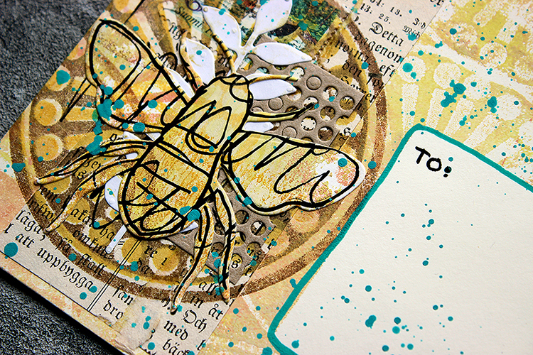
Hello from my Creative Squad! Today we have a post and video from Riikka Kovasin who is sharing her project for our new monthly theme: A Tale of Two Colors – Think about two different colors, one you love using and one you find more of a challenge to work with. Use them together in a project and see what happens. Riikka is using my Grove Street foam stamps in her project today.
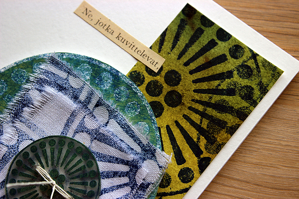
Those, Who Imagine
Hello there! It’s Riikka here today with my take on the month’s theme about colours. My current favourite was an easy task, but the other colour took me by surprise!
My “go-to” colour scheme is and has probably always been blues, teals, and turquoises. Those warmer blue tones, like summer sea. When I’m taking a class, I usually tend to use those colours as they are my safe zone. I used to dislike pink a lot but since my two girls were born, it started appearing to my projects and has stayed since then. Well, I did dress them in pale blue or other colours as babies, but when they were old enough to make their own choices, the colour started to please my eyes, too. Teals and turquoises are my usual “go-to”, like I said earlier, but lately I’ve been using more and more of a sapphire blue colour. Partly because of that, and partly to give myself a bit more challenge, I picked that as my current favourite.
When I was thinking about what colour I don’t use, I would have normally said bright red or yellow, but this year has been a bit strange as I’ve done projects using both! So, to see what colour I haven’t been using lately, I took to Instagram. By skimming through my profile, I realized that at least a yellow green, a lime colour was missing. So, I picked that for the other colour and like that I had my combo chosen!
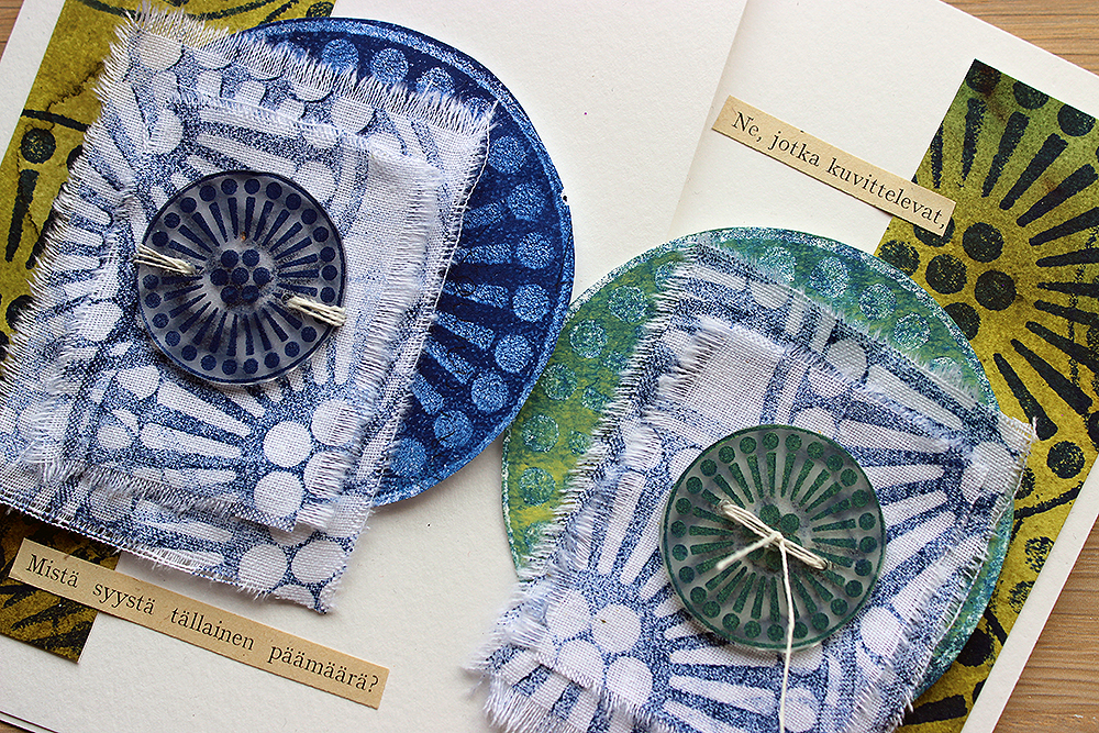
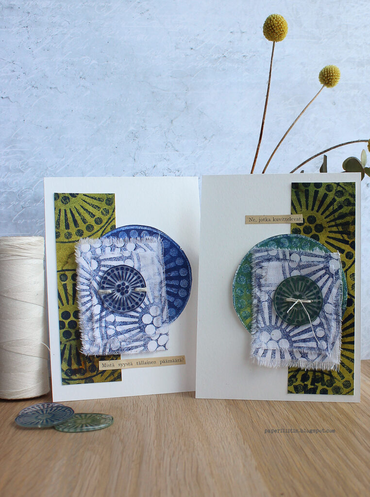
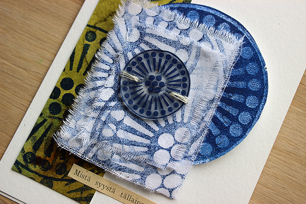
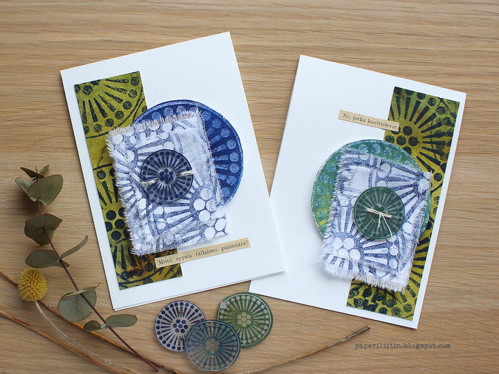
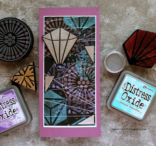
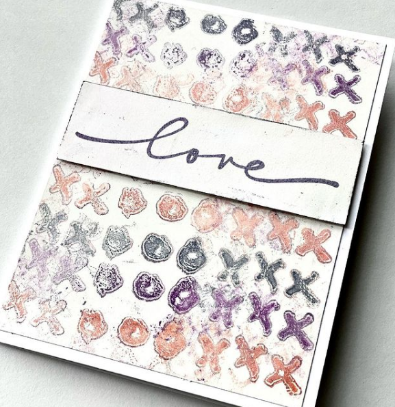
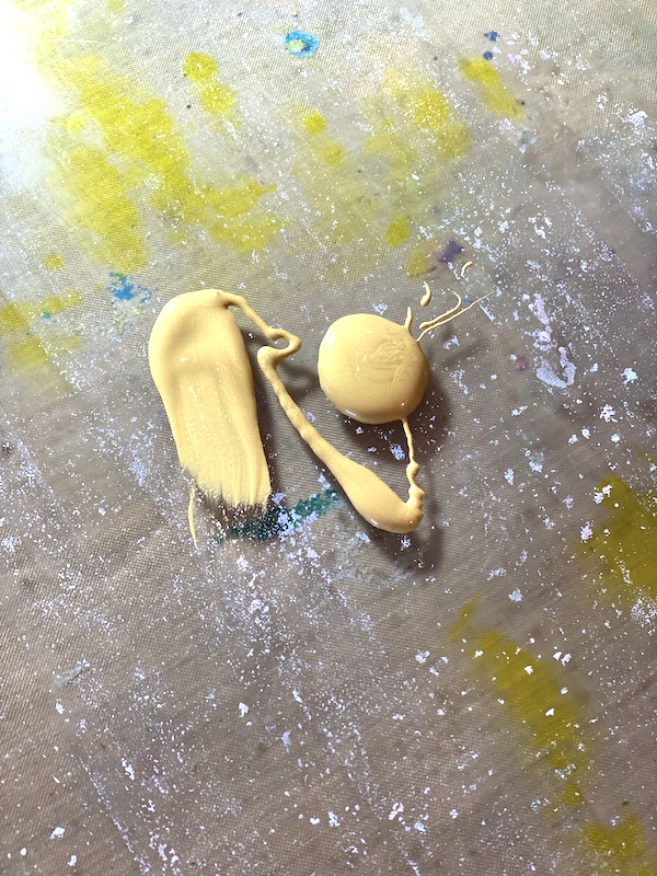
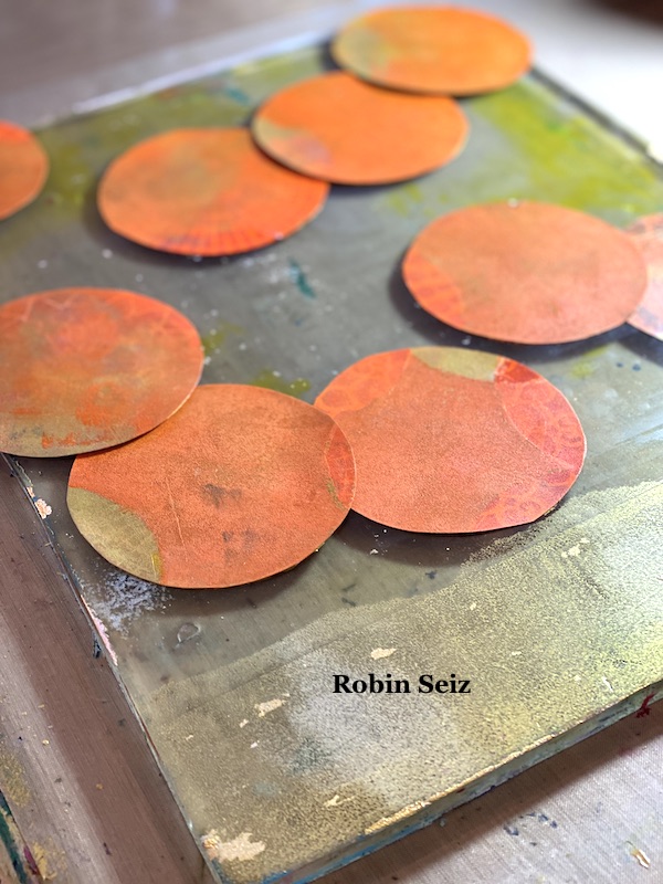
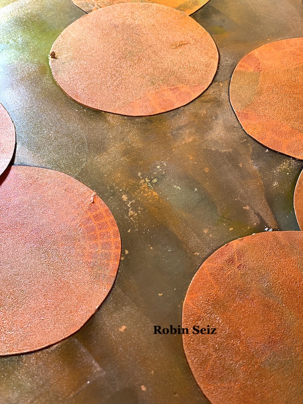
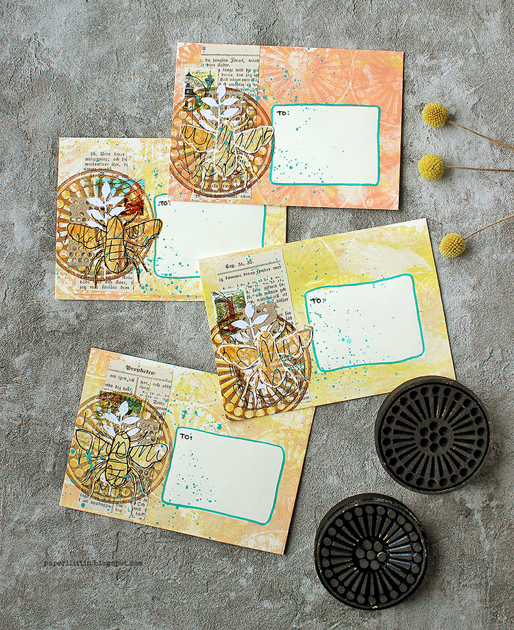
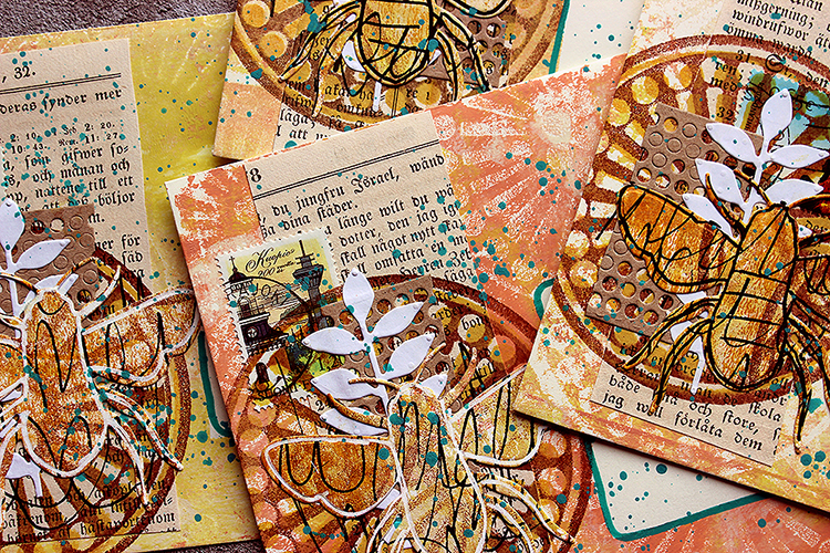
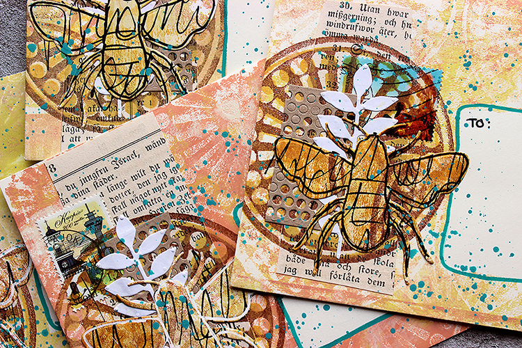
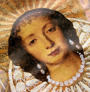
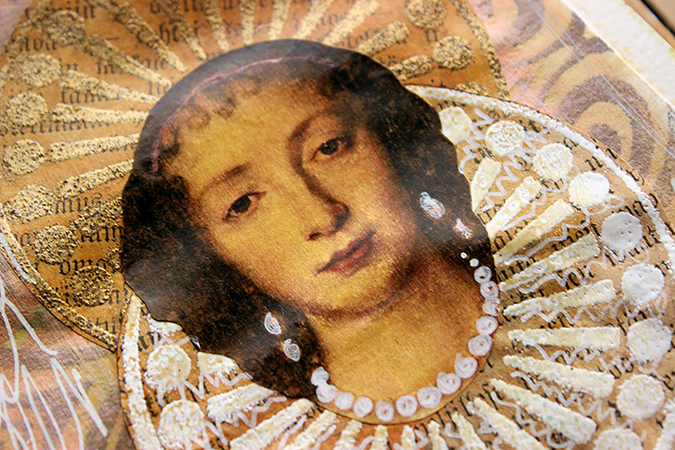
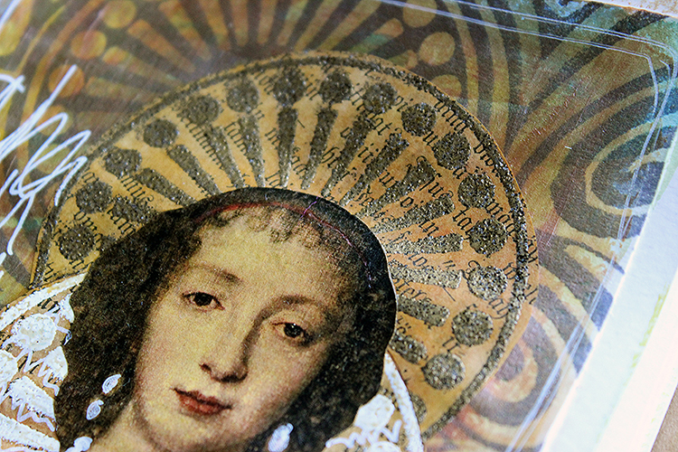
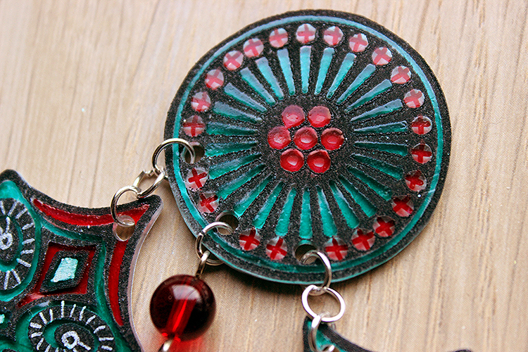
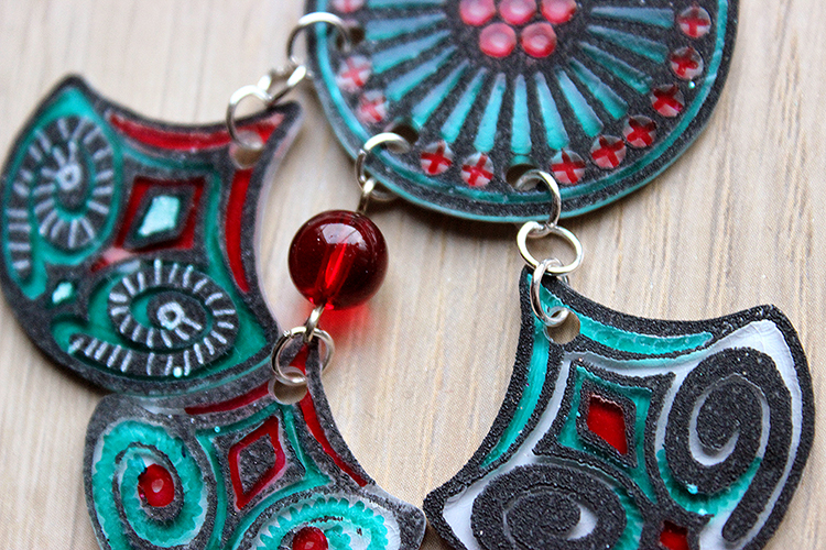
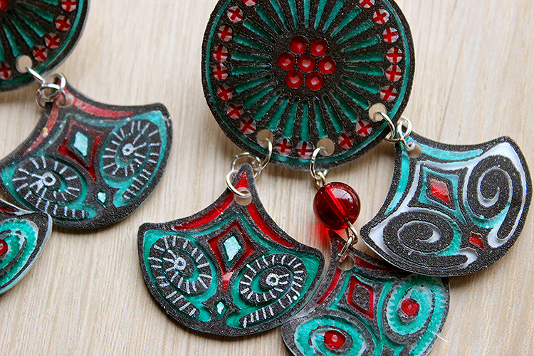
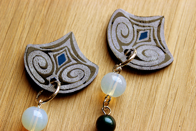
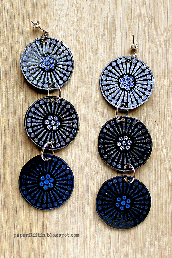
I’m not actually totally sure how the idea of the pair of cards was born. Probably I was pondering what to do with the colour combo and Nat’s Grove Street foam stamps. But I actually draw a little sketch of the card for myself at some point. At that stage I was thinking of using an old button as the focal point, picked from my inherited stash, but when I then pulled the other materials to the work table, I realized I could make my own buttons!
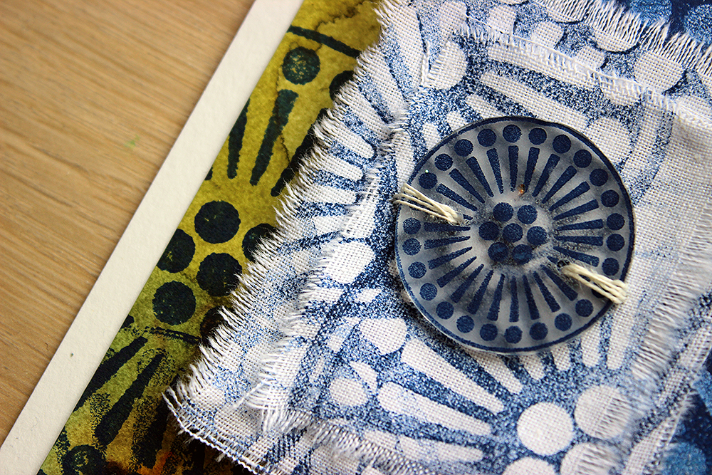
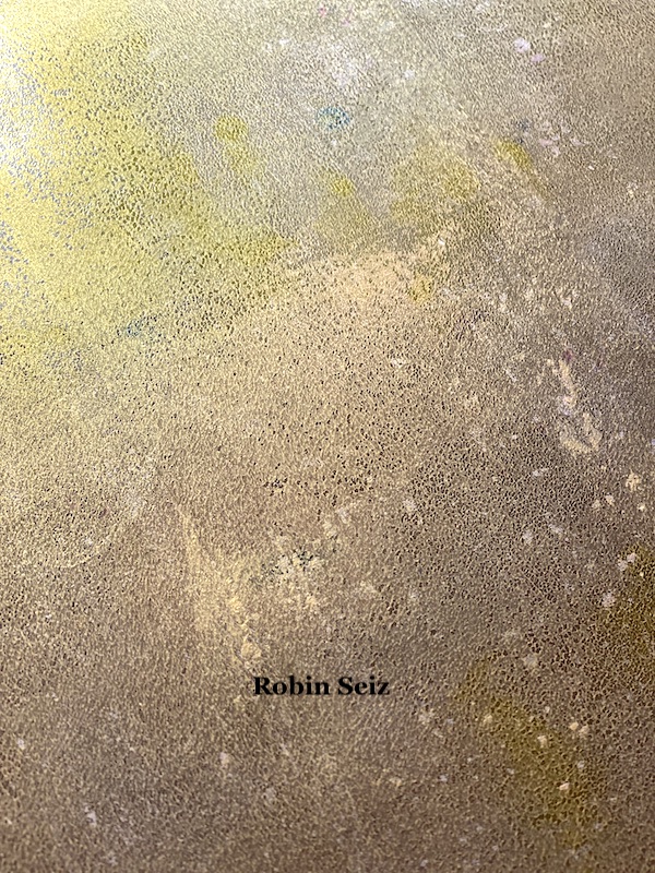
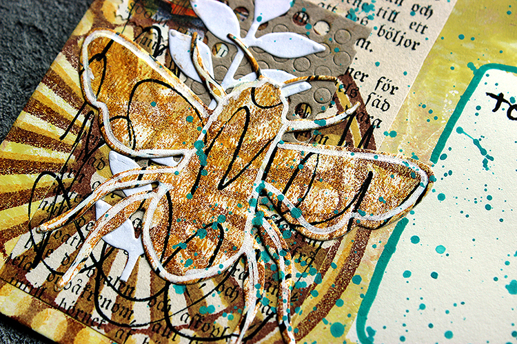
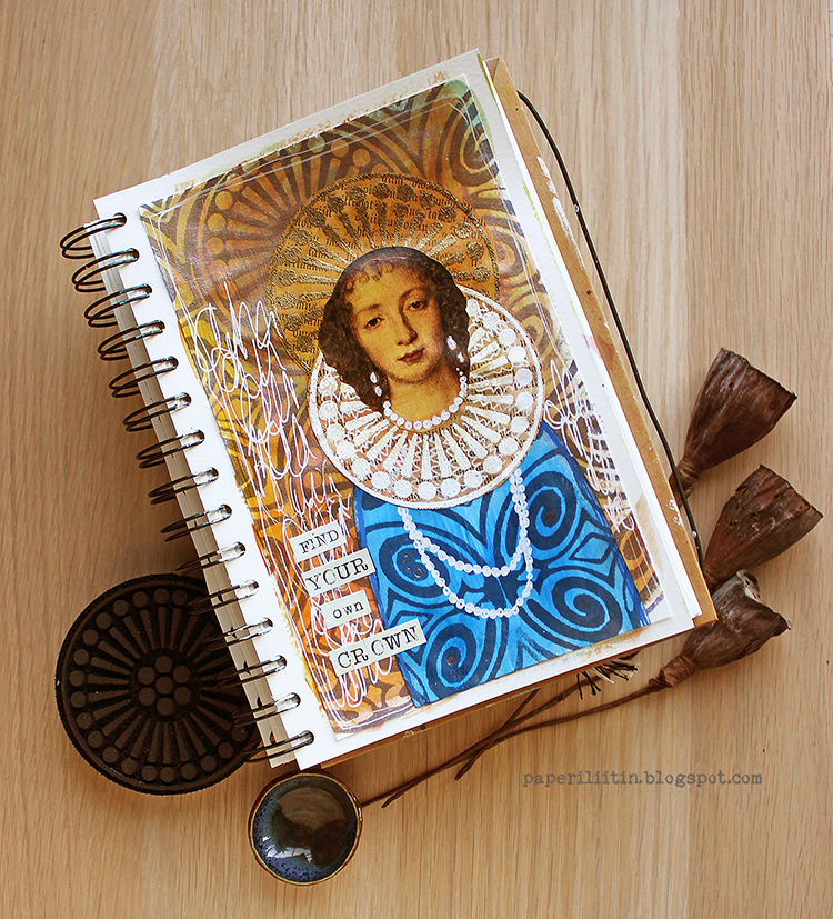
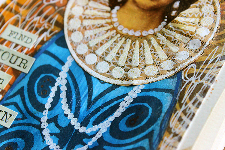
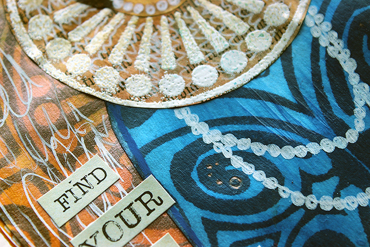
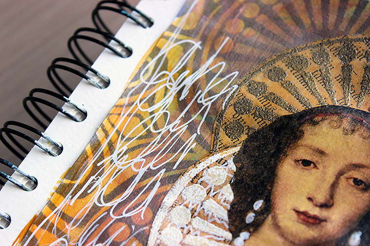
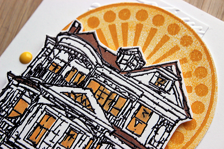
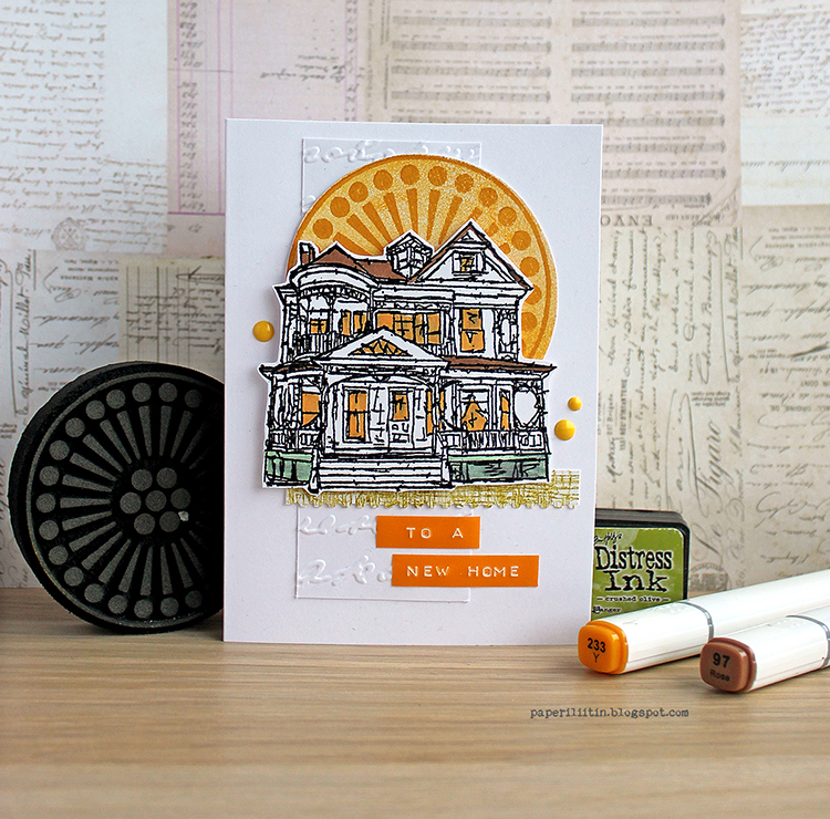
This project was so much fun as I’d never have picked this colour combo otherwise! I did use quite a lot of white to make the end project airy as the colour combo is quite intense. I also wanted to use the stamps on different surfaces, to bring extra interest to the project with just two colours, so that’s why I picked not only paper for this project but also white cotton. For the buttons I used the shrink plastic as I could then use the Grove Street foam stamp in two sizes in a way. If you want to see how I made the cards, please see the video below.
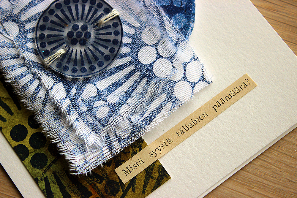
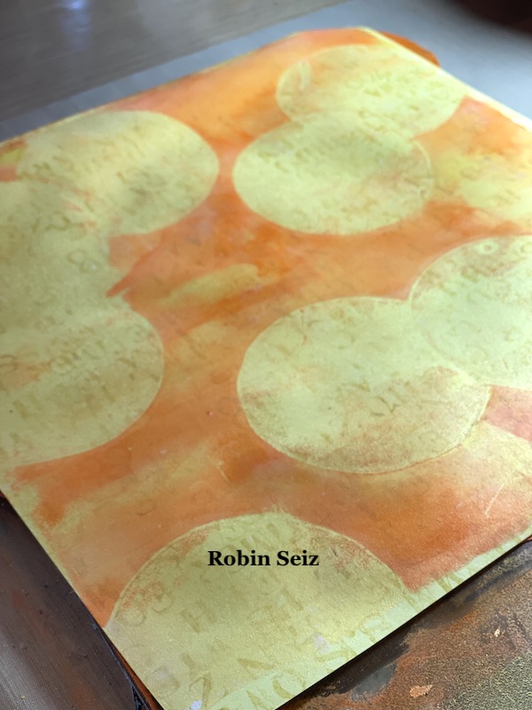
I had more materials made but ended up doing just two cards – kind of mirror images of each other. The “left-overs” I then put in my stash and can use those later for a journal or another card project. So, don’t be surprised if you see a button like this in another project or a piece of that green and blue patterned piece I created as the first step! I often make more collage material than I use in the project I created it for. That makes creating another project then faster as I have the mixed media papers and embellishments already done!
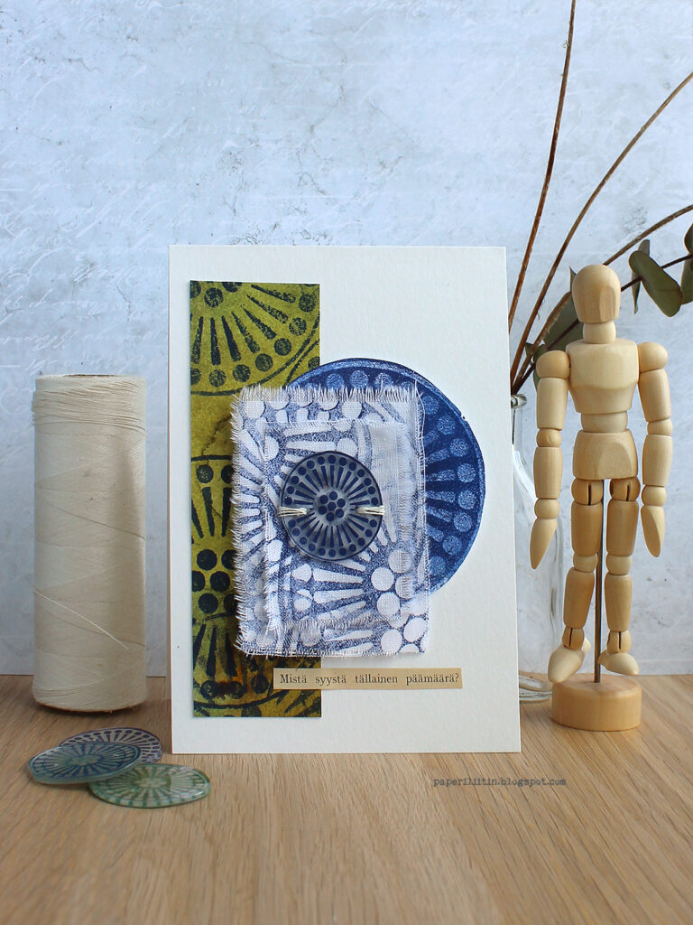
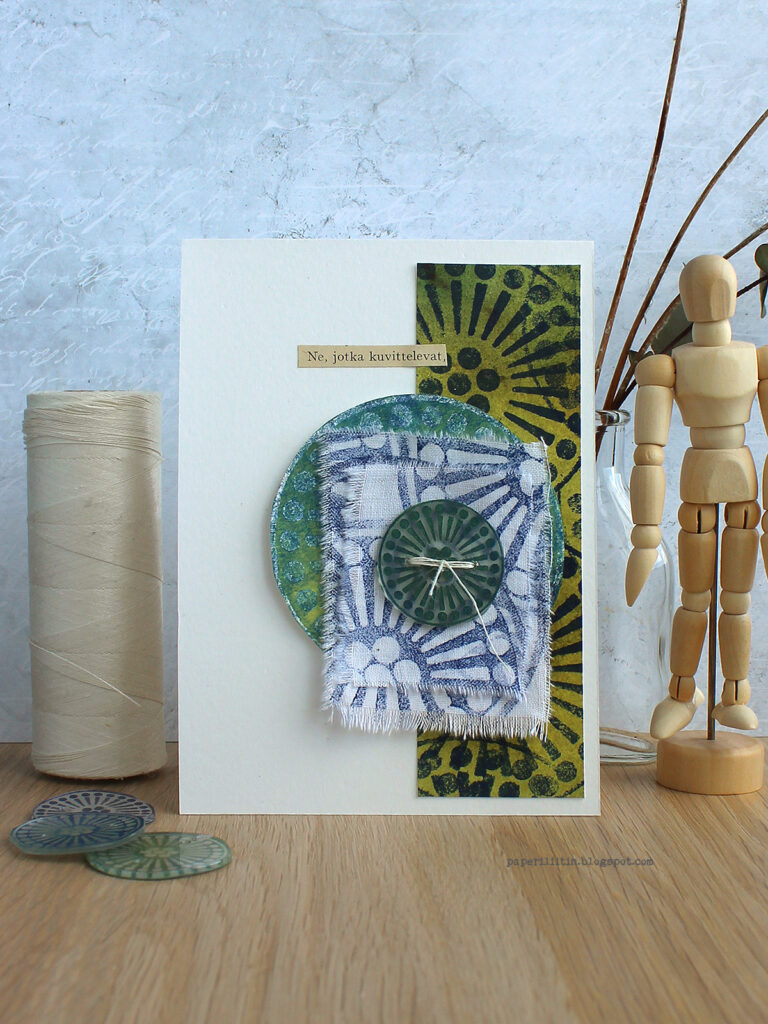
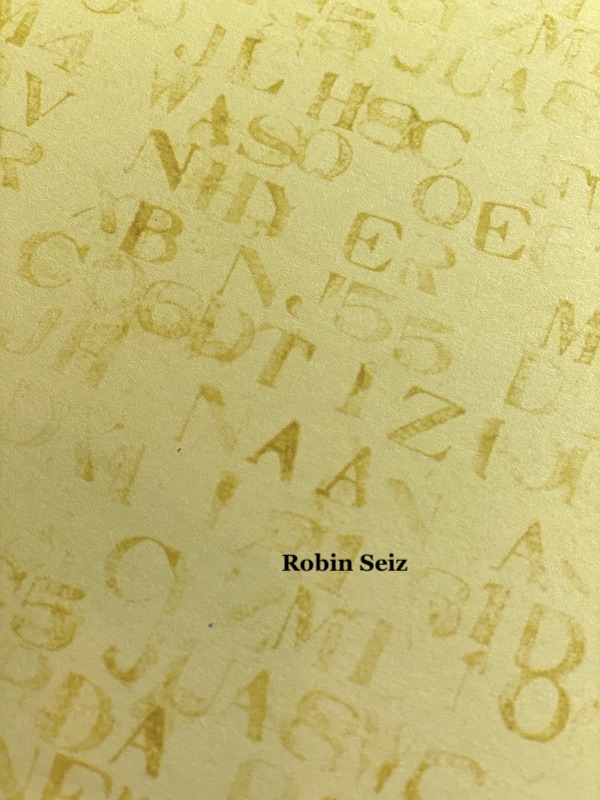
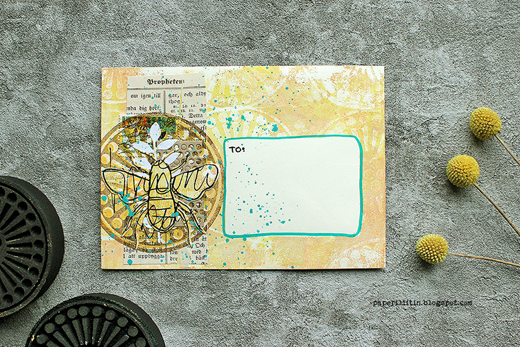
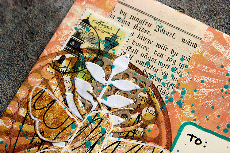
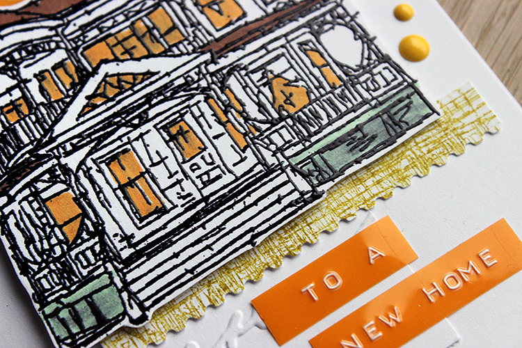
As you could see from the video, I finished the cards with lines from an old book. This does bring a new color to the mix, but I thought it to be so neutral and such a small detail, that it’s ok. And it goes nicely to the warm green. I often do my projects in English, but I’ve been using more of my mother tongue lately. The other card reads “What’s the reason for this cause” or “Why such a goal” and the other “Those, who imagine”. I picked the latter also for the title of the video, because we all need to imagine to create.
Thank you for stopping by today! Wishing you a sweet May! Xoxo Riikka
Thank you Riikka – such a sophisticated combination of colors and I love how you repeated the Grove Street stamps in different ways.
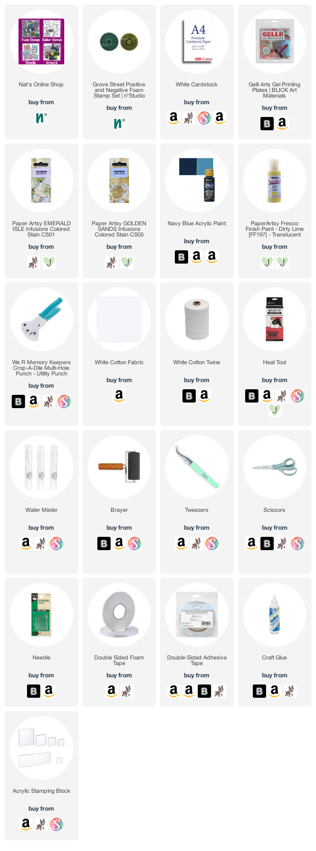
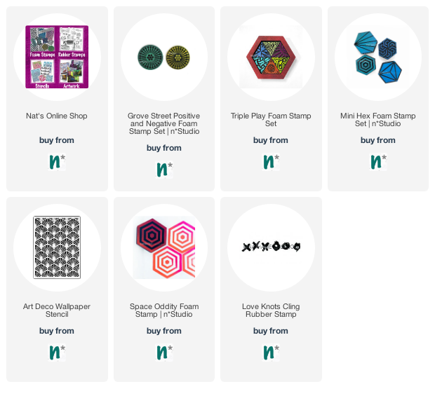
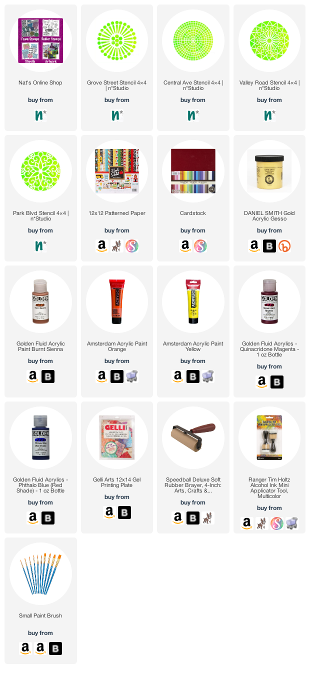
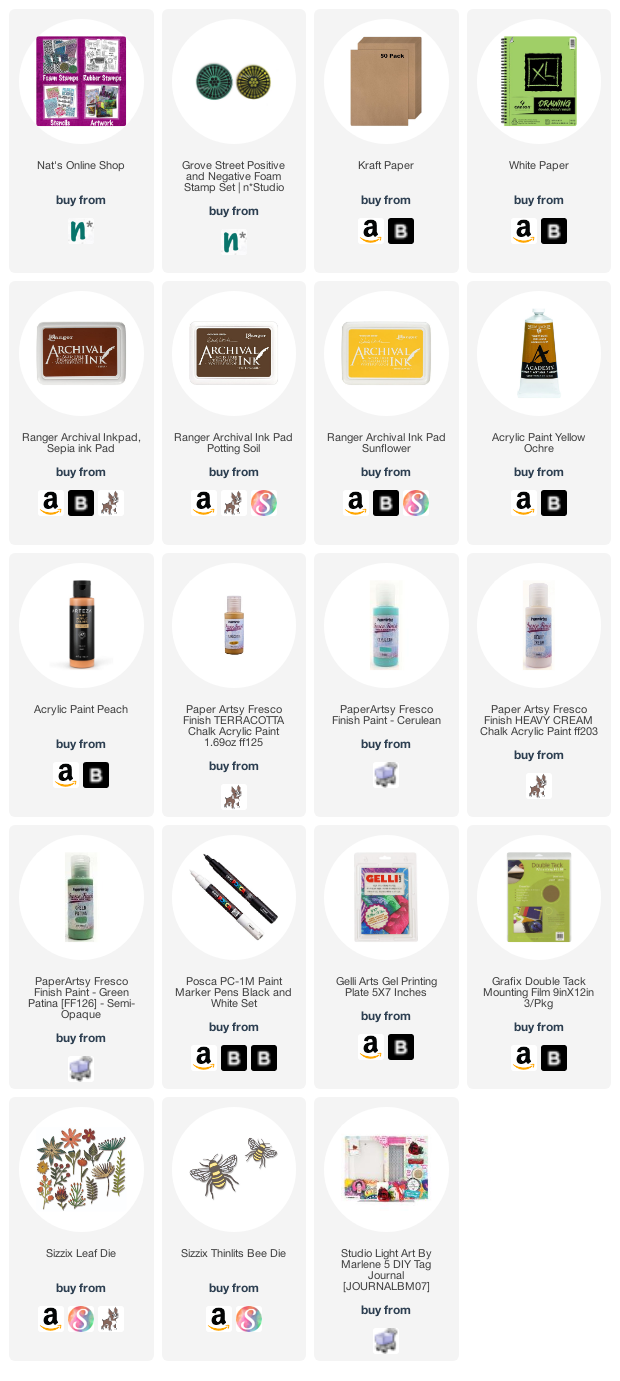
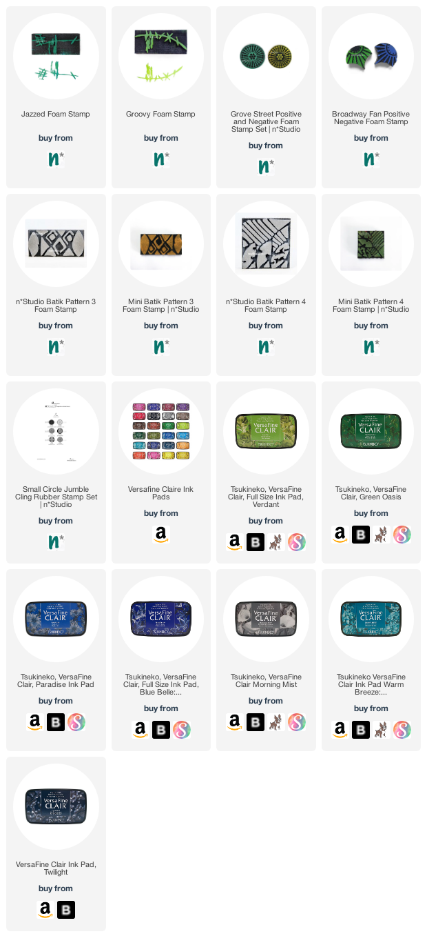
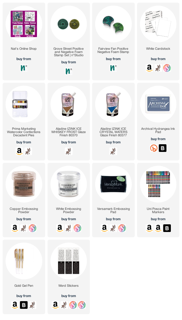
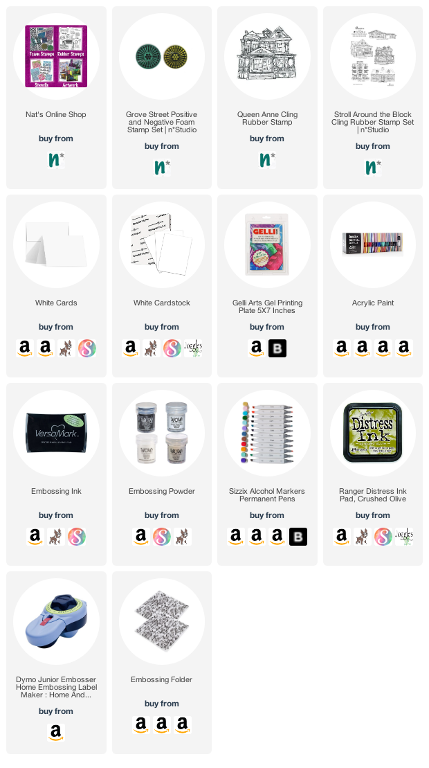
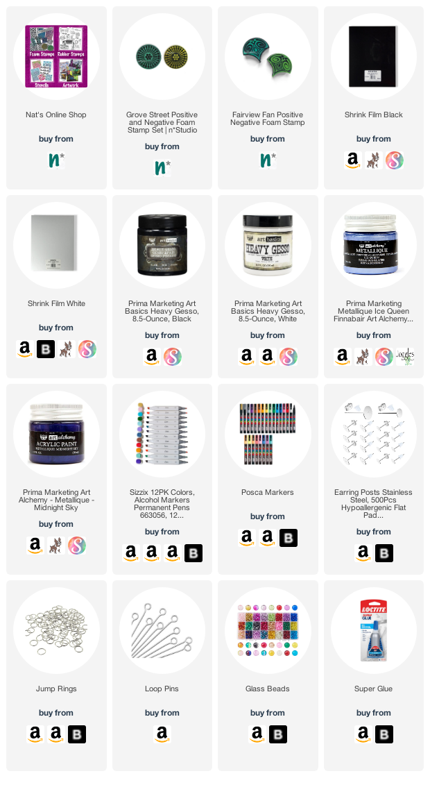
Give it a try: you can find all my Foam Stamps in my Online Shop and in addition to old book pages, here are some of the supplies Riikka used:
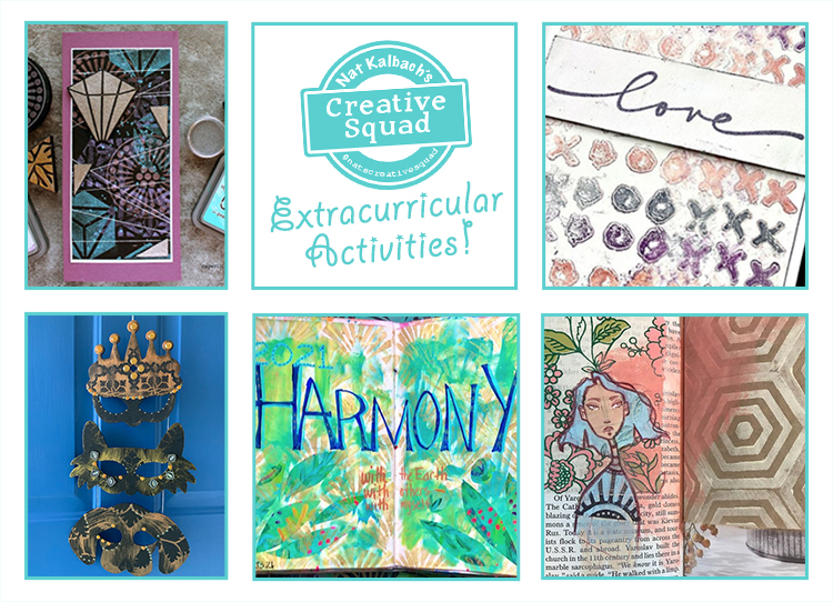
Looking for more projects? Follow the Creative Squad on Instagram


Thanks for featuring this Nat! Your stencils and stamps are a pleasure to work with; such great designs!
Reply