Hello from my Creative Squad! Today we have a beautiful art journal page celebrating the beginning of Spring from Jennifer Gallagher who is using my Kassel and Broadway 4×4 stencils. The theme this month is: Weather Report – Let’s talk about the weather! Do you love thunderstorms? The crisp air of Autumn? A good snowstorm? Are you a fan of endless sunshine? Create something inspired by that go-to topic of small talk – the weather!
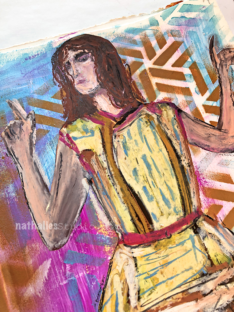
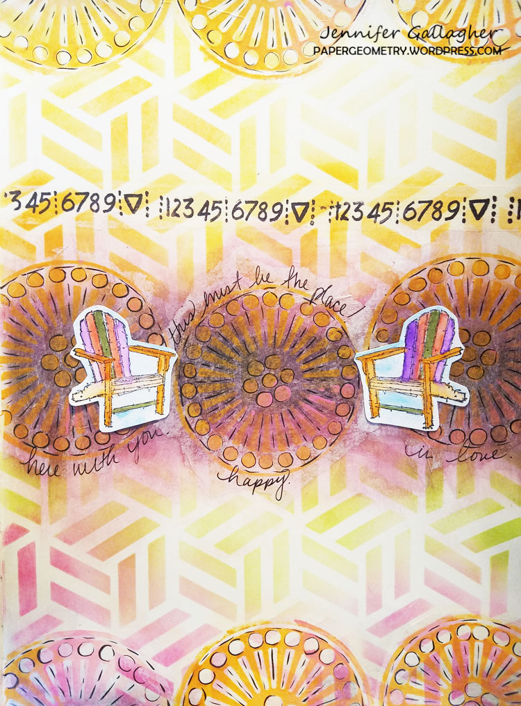
Jennifer here again this month with the weather report. Spring has officially sprung. The cold, snowy days of Winter have begun to give way to birds chirping, spring rain showers, and the beginnings of green busting through the soil. It almost feels like we are drudging along in the dreary winter and then all of a sudden that first little sign of spring comes out of nowhere. I love Spring! There is something so hopeful about the awakening of the Earth and the budding of new plants. We could all use that hopefulness now. With that in mind, I have created a very simple art journal page that is a visual representation of that burst of color and life amidst the darkness of winter. Let’s get started.
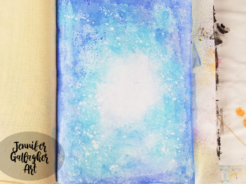
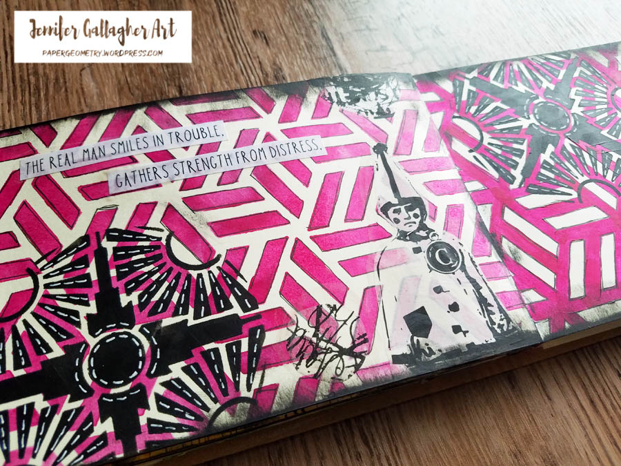
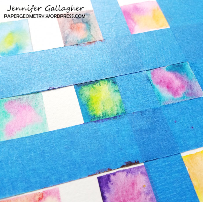
I began by putting a coat of clear gesso down to prepare my page. I am working on the cotton rag paper in my Dina Wakley Media Journal. After the gesso dried, using a large flat brush, I brushed on a thin amount of water across the page, leaving a small circle in the center totally dry. Then I dipped my brush into Marabu Aqua Ink in ultramarine blue. I applied the color and blotted here and there with a towel.
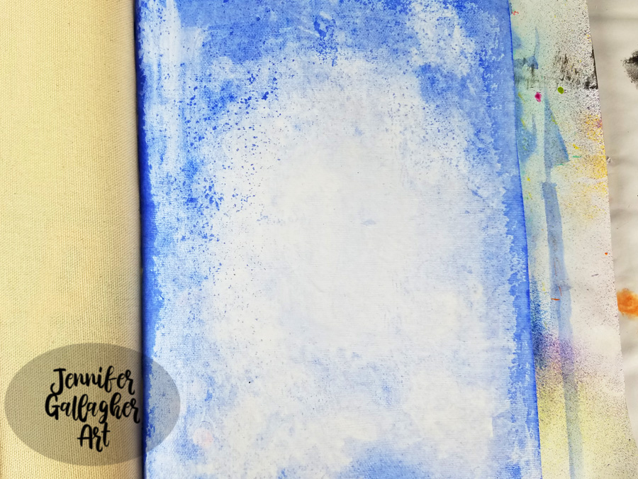
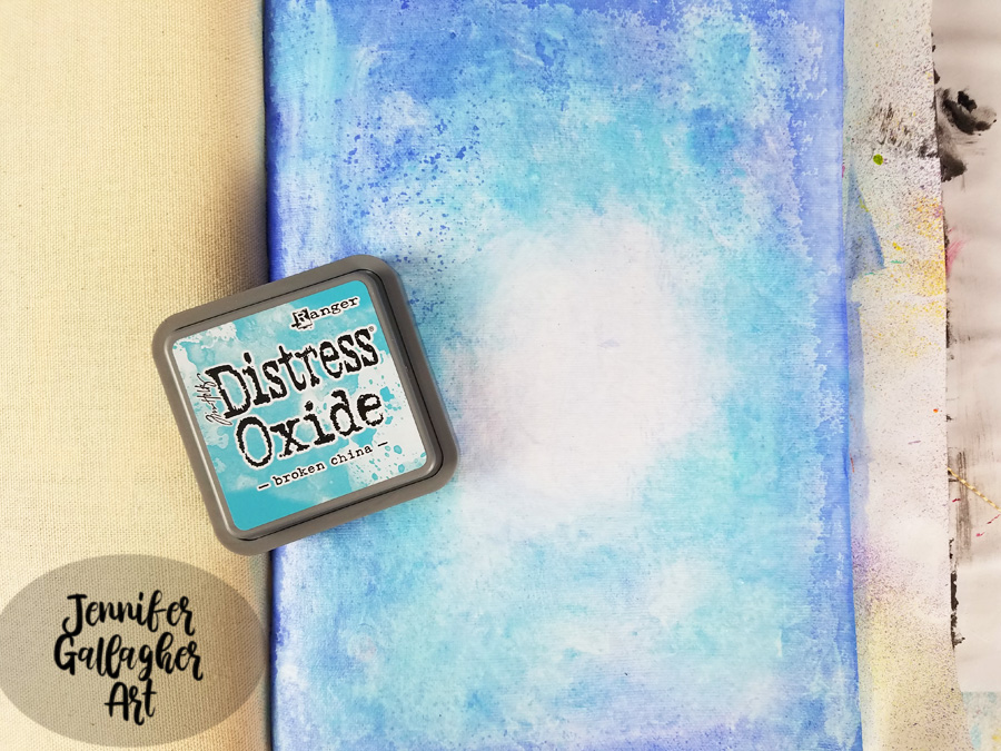
With a mini-blending tool, I applied Distress Oxide in mermaid lagoon around in the same places, leaving the center center alone.
I spritzed a fine mist of water across the page, let it sit for a few seconds, and then dabbed it up with a paper towel.
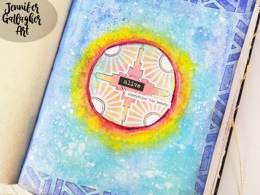
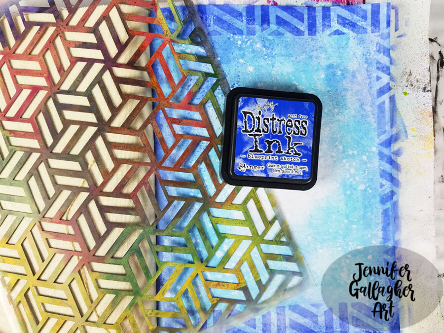
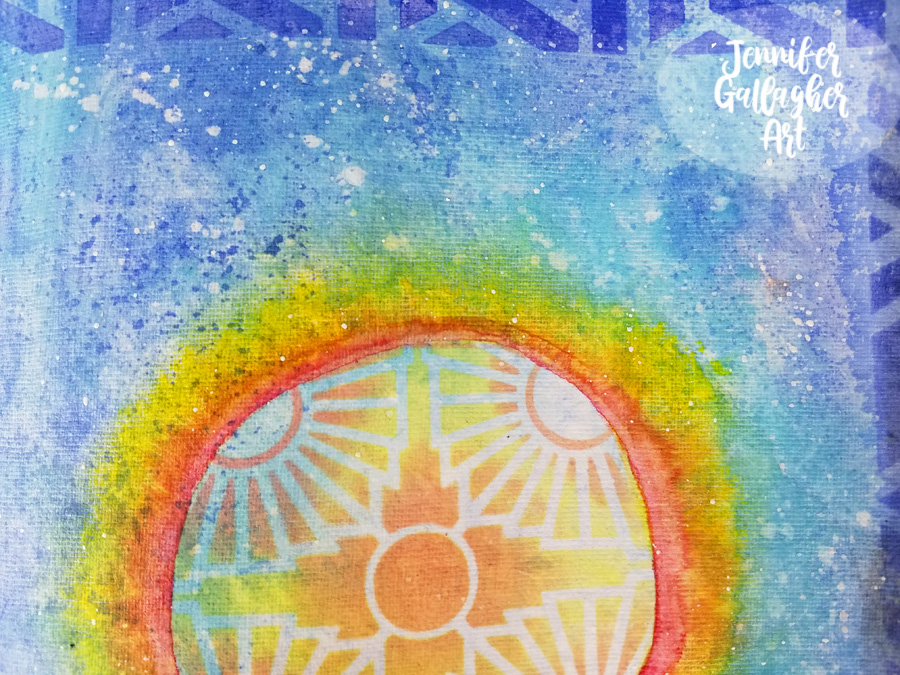
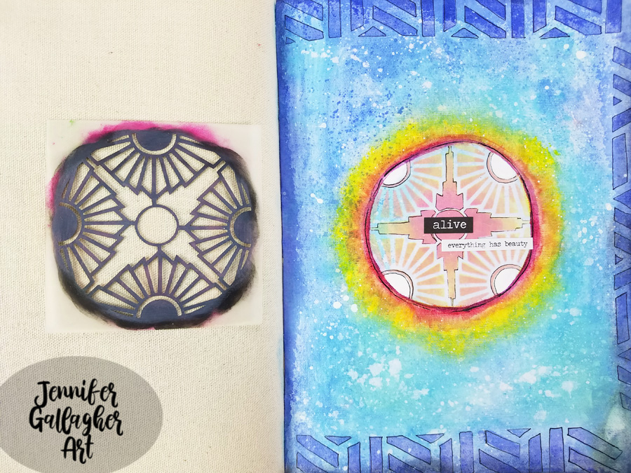
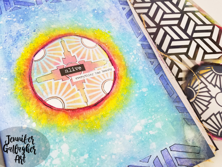
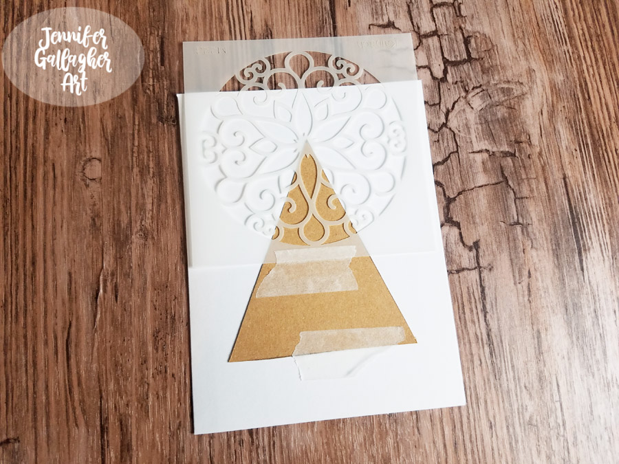
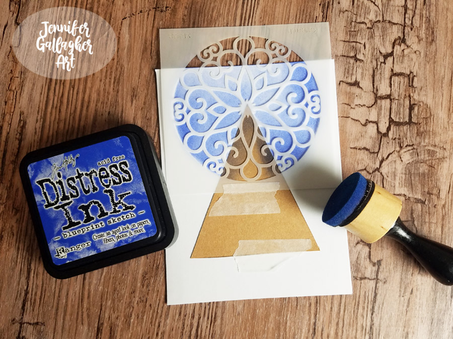
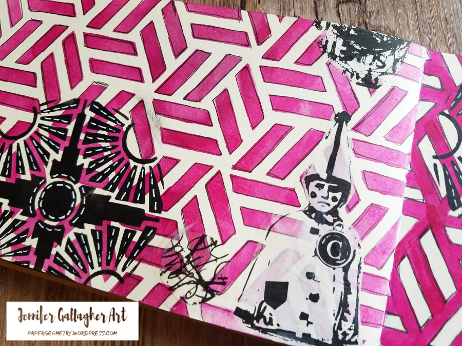
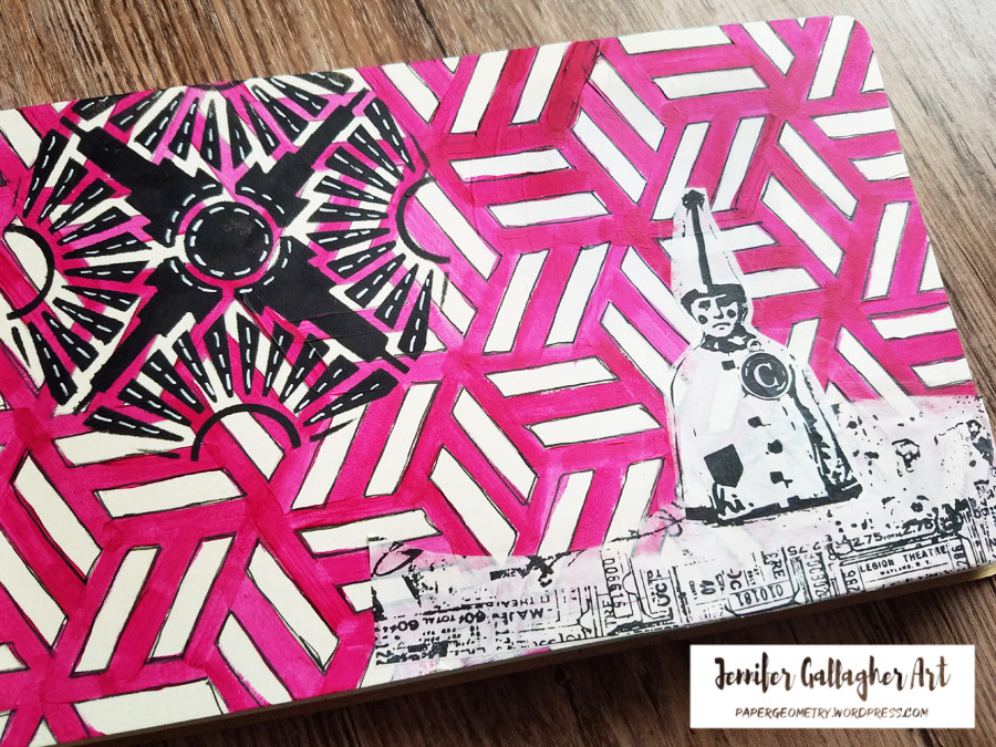
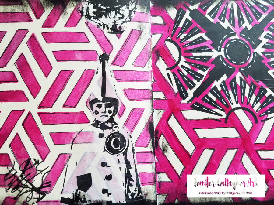
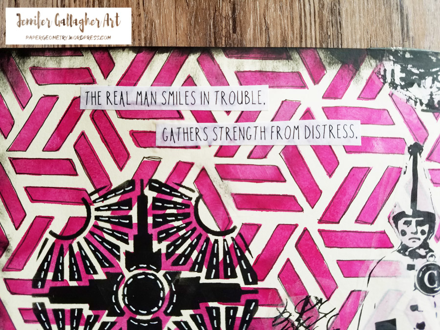
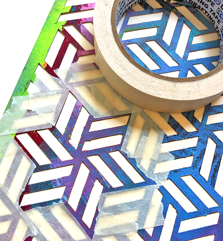
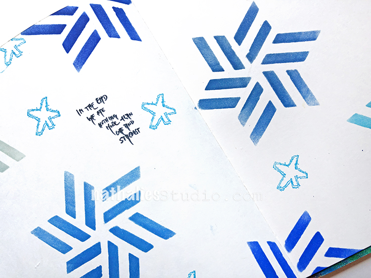
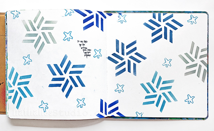
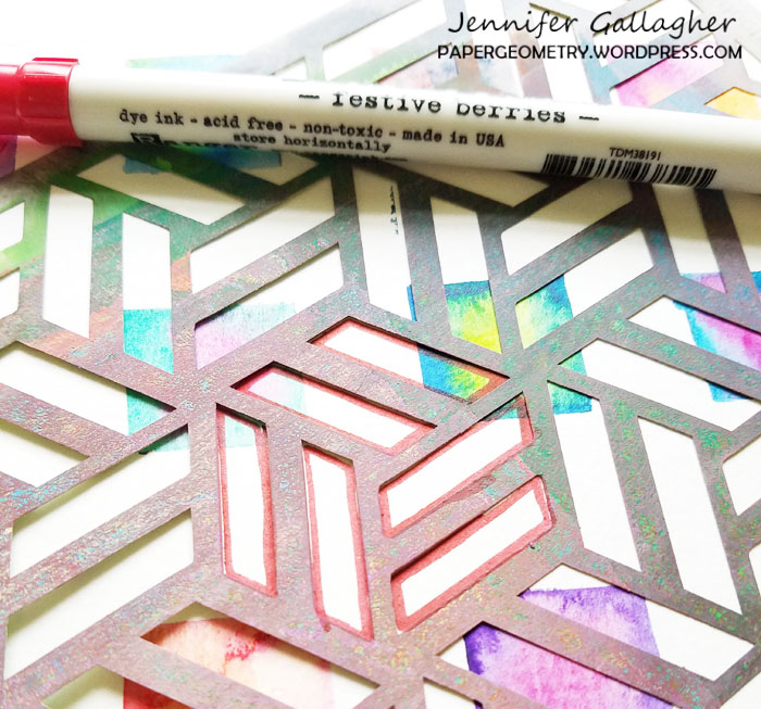
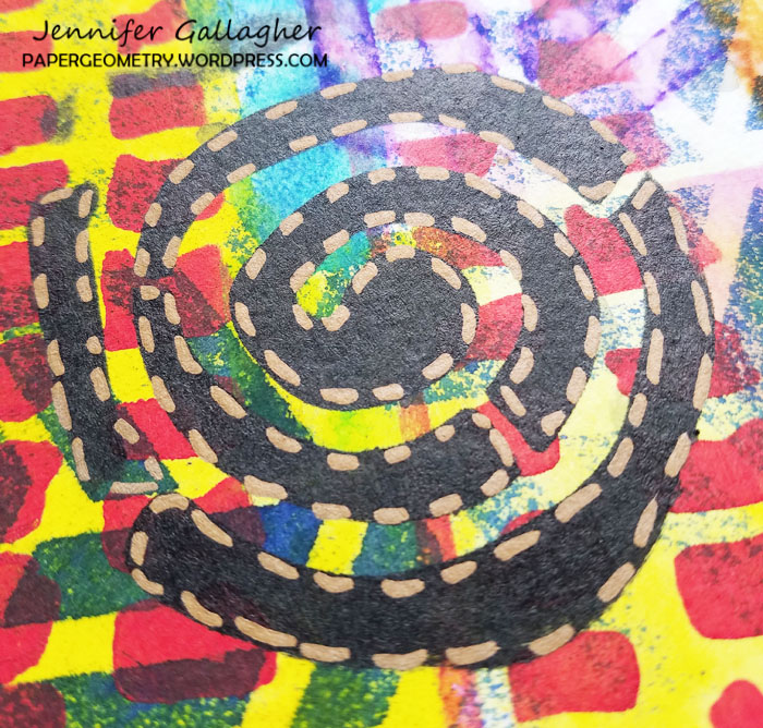
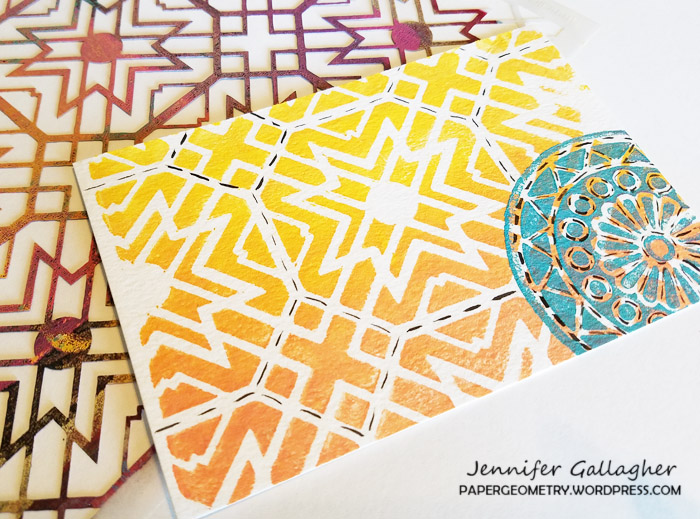
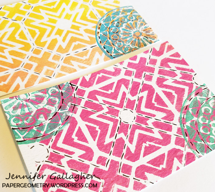
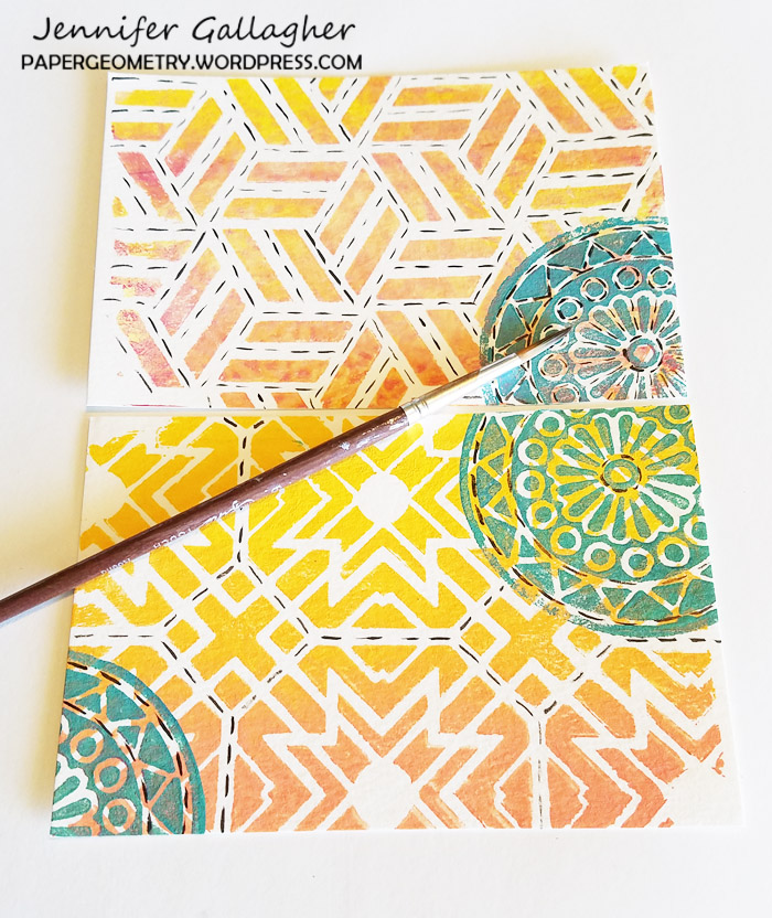
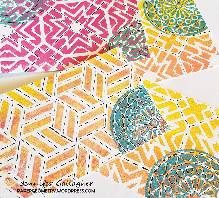
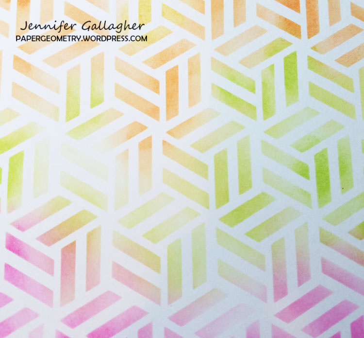
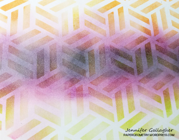
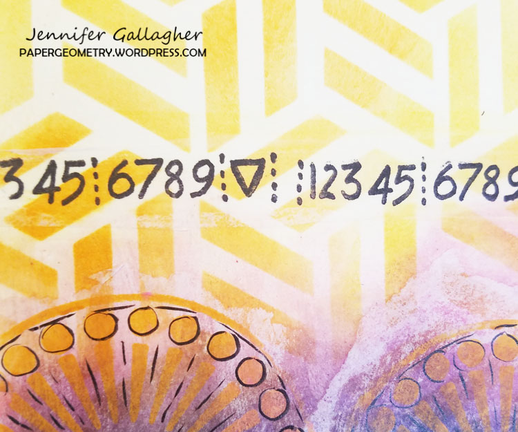
Next, I laid Nat’s Kassel stencil down and applied Distress Ink in blueprint sketch through it to create a border on three sides.
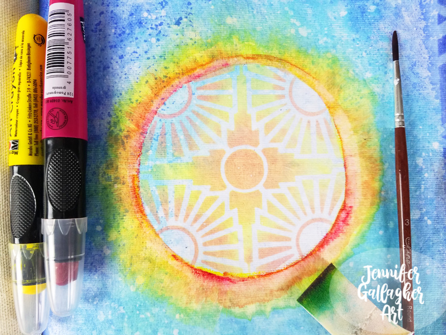
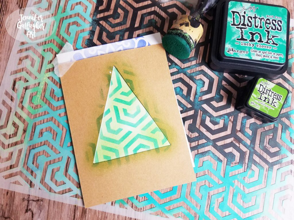
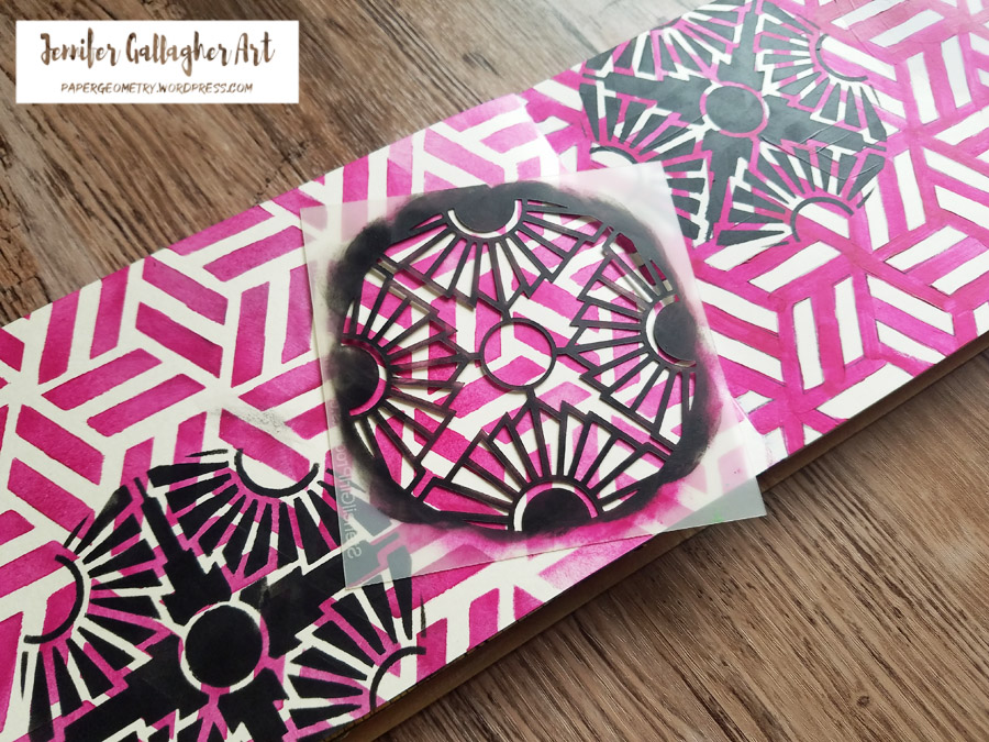
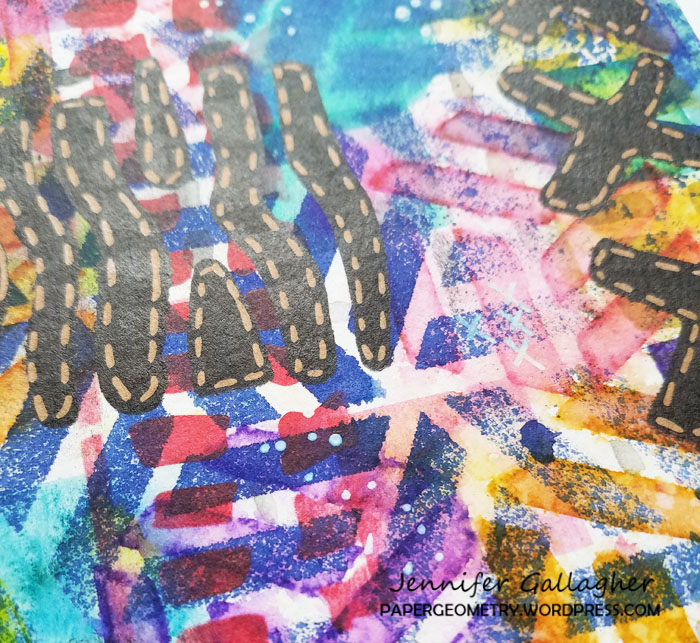
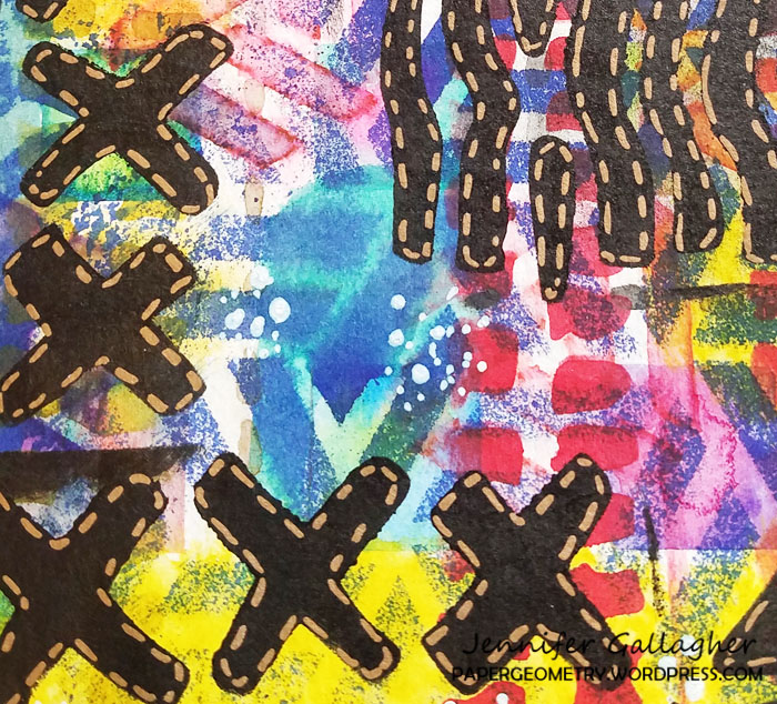
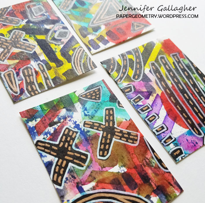
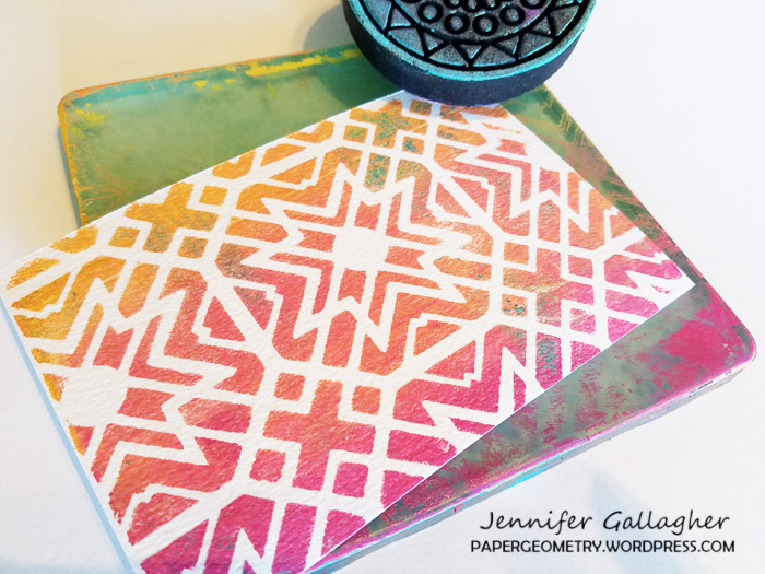
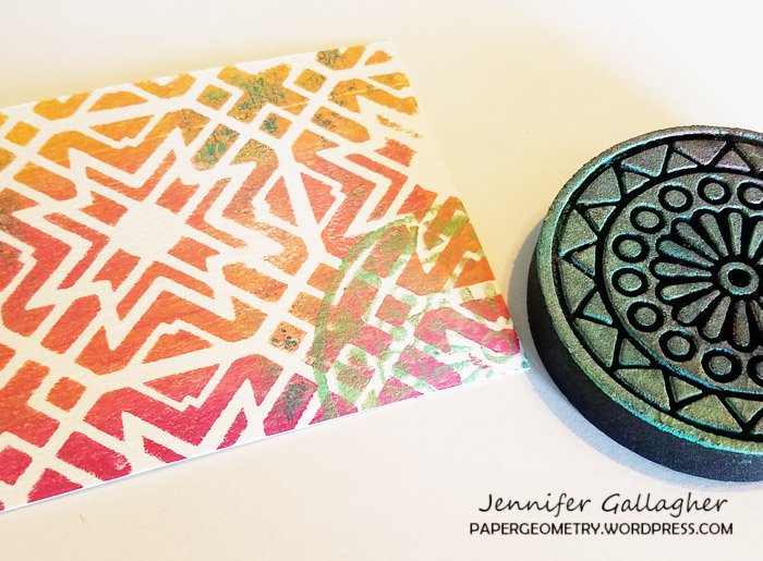
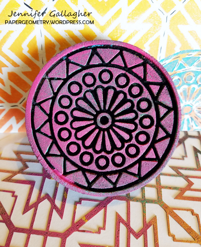
After placing Nat’s Broadway 4×4 stencil in the center of the page, I applied Distress Oxides in twisted citron and worn lipstick through it.
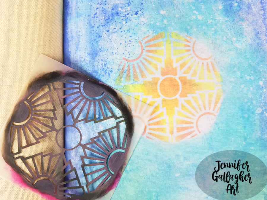
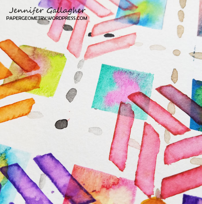
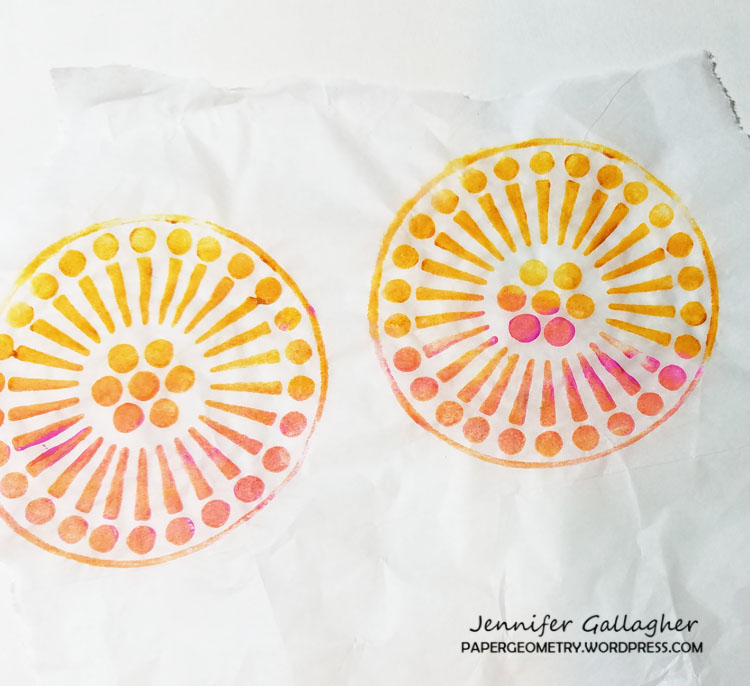
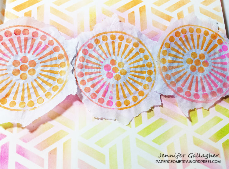
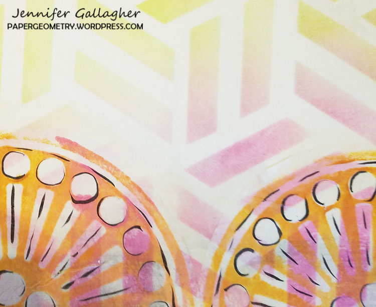
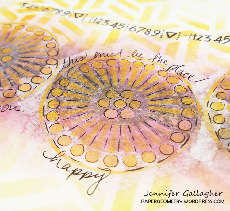
Holding the Marabu art crayon in sunshine yellow like a pencil, I drew a thin line of color around the outside of the circle. I dipped a very small brush into water, ran the brush across that line, and then took a dry cosmetic sponge and with a gentle touch pulled the color in a downward motion. I would pick up the sponge and move to the next section and pull. I repeated this motion all across the circle. Then I repeated the process with the pomegranate art crayon. You can go back and add as much as you like.
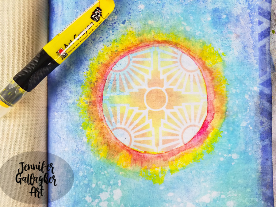
I unscrewed the top off of my Distress Spray Stain in picket fence and dipped a small paintbrush into the liquid. I used it to create white splatter on my page.
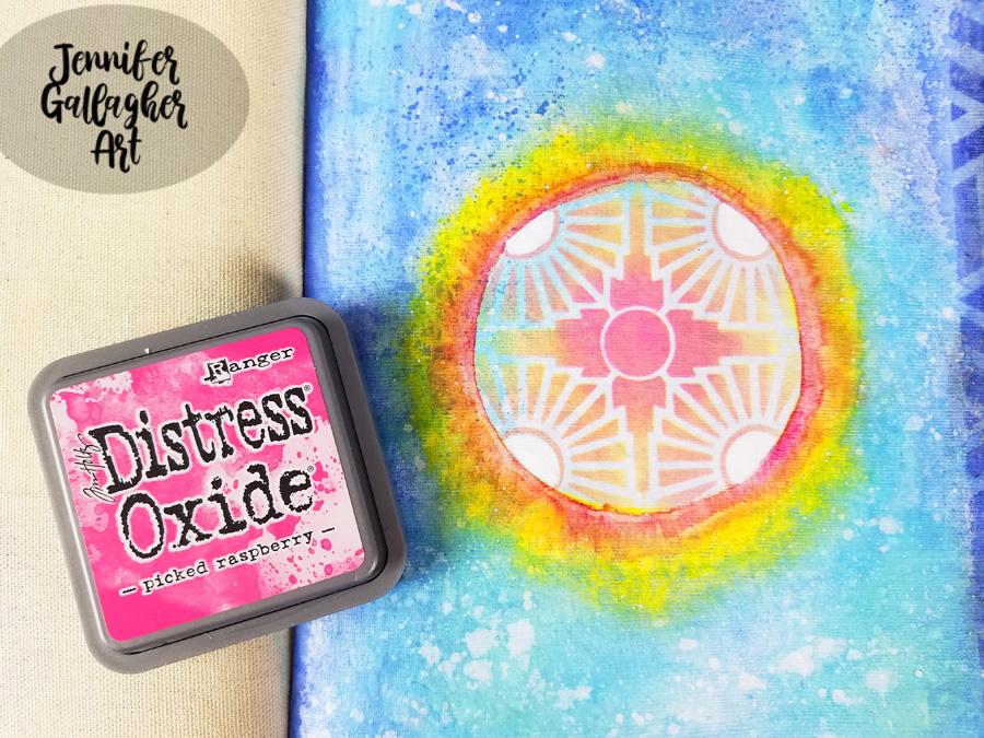
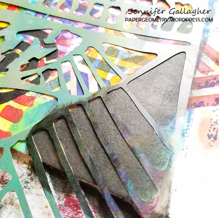
I laid the stencil back down and added Distress Oxide in picked raspberry into the center of the stencil to brighten the center.
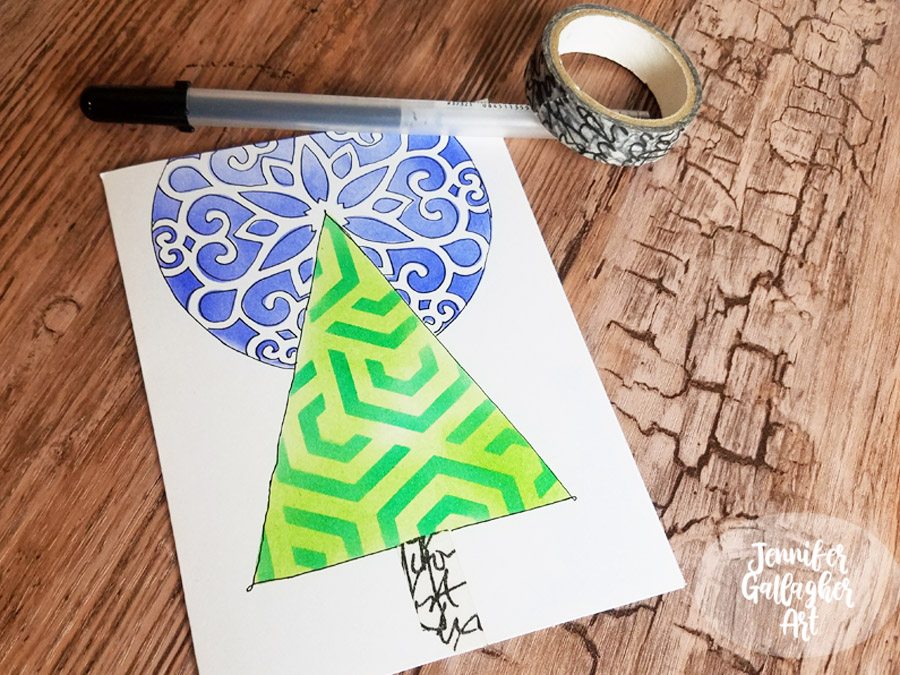
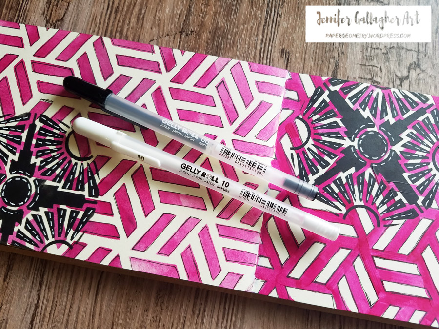
Using a black gelly roll pen, I doodled around all of the stenciled designs. I also lightened the four circular areas with a white posca pen.
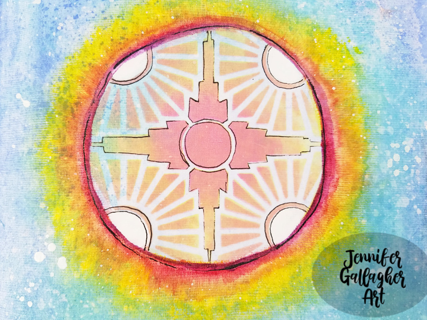
I added some word stickers from Tim Holtz Big Chat and Small Talk sets. I added “alive” and “everything has beauty”.
I hope you have enjoyed this tutorial. Art can be a great way to keep ourselves busy during difficult times. I am wishing the best for you, your families, and your communities. If you get the chance to try this tutorial, please share your creations with us.
Thank you Jennifer for such an uplifting page!
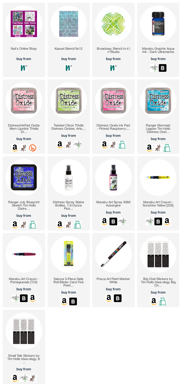
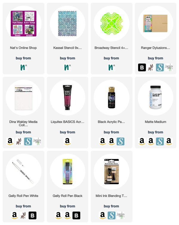
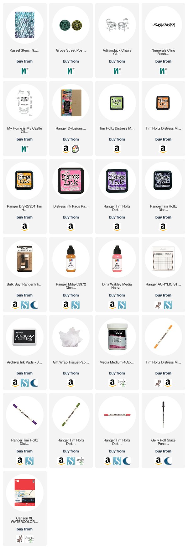
Give it a try: you can find all my Stencils in my Online Shop and here are some of the other supplies Jennifer used:
Feel inspired? Working on something yourself that you’d like to share? I love to see how you interpret our monthly themes. Email me how you used my stencils and stamps with the theme and email me an image – I would love to share your projects in my next “n*Spiration From Around the Globe“.


Beautiful pages! Love the way you mirrored and mixed the other elements. The color combo is perfect❤️
Reply