Art Stroll

Art Stroll – MoMA Collection

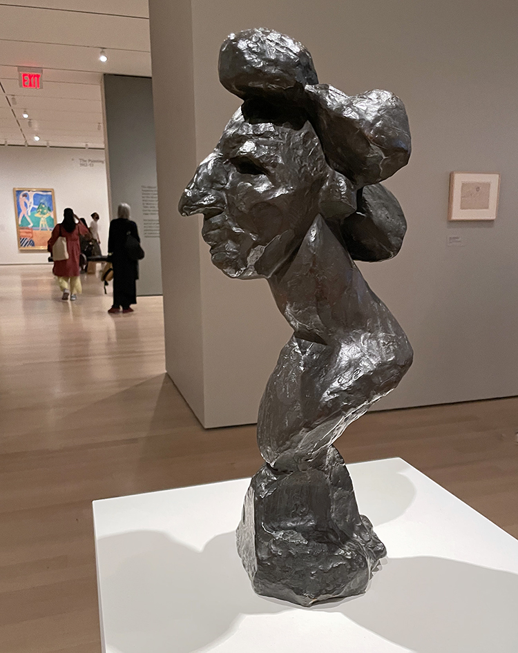
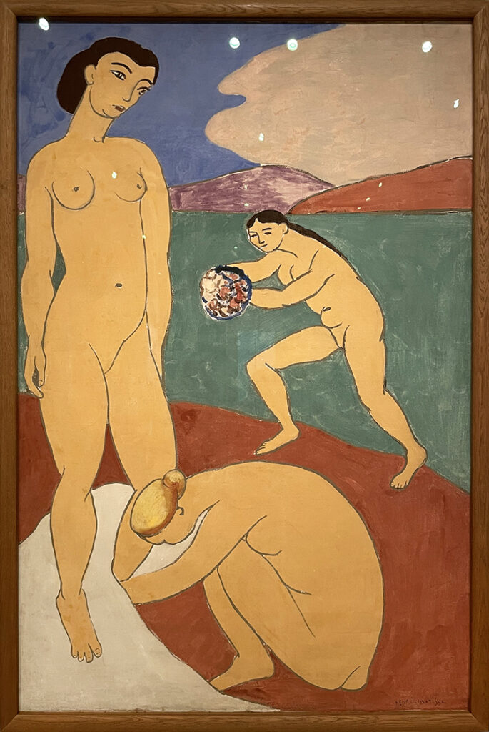
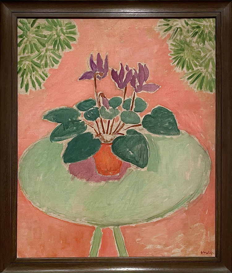
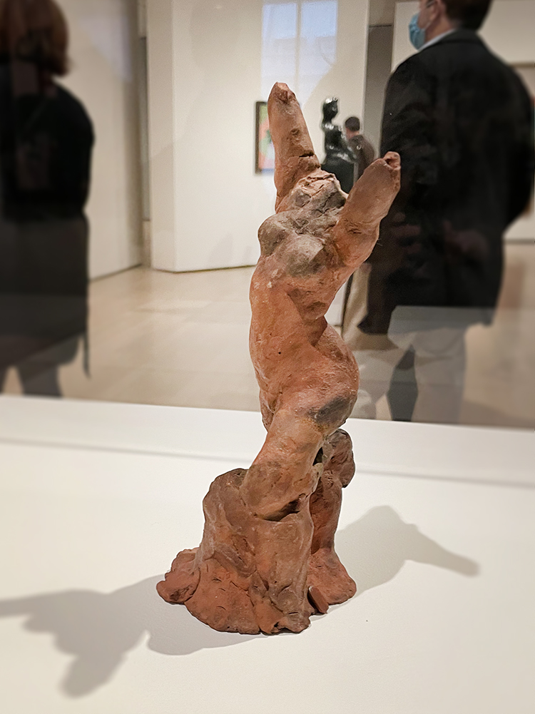
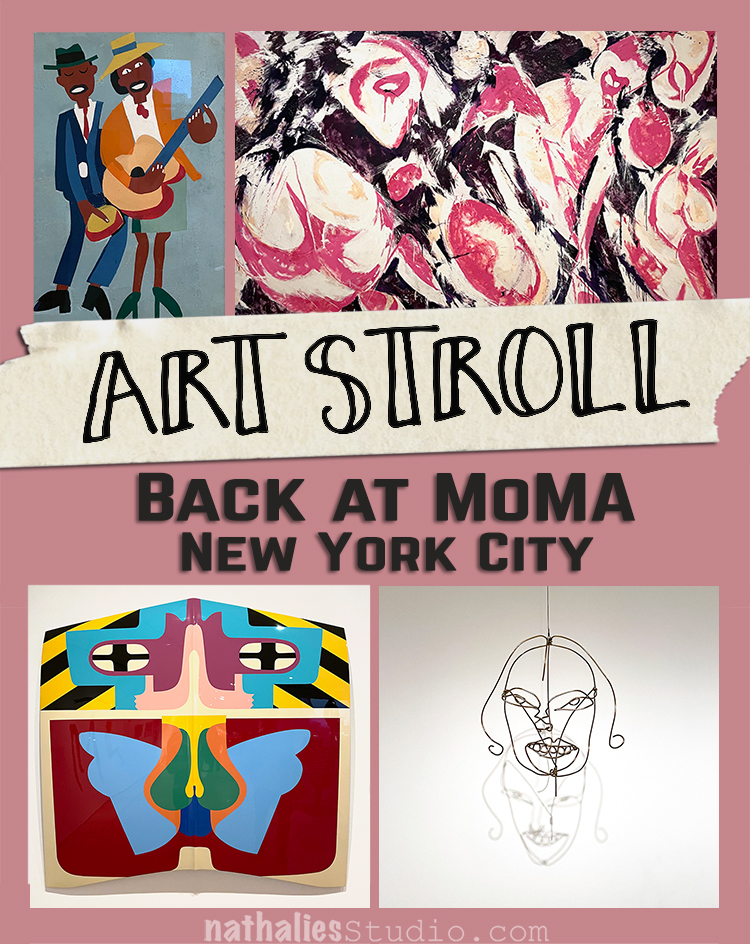
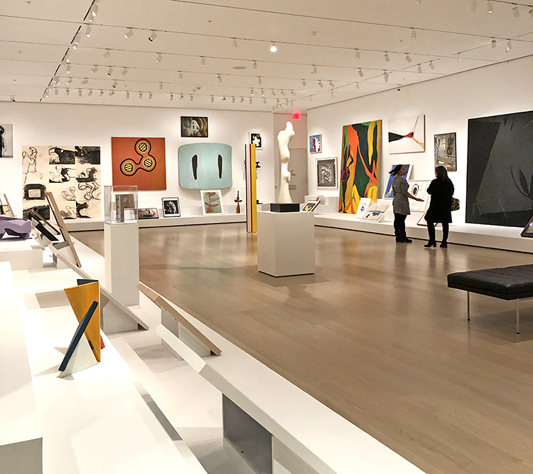
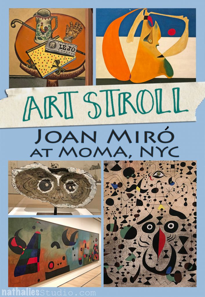
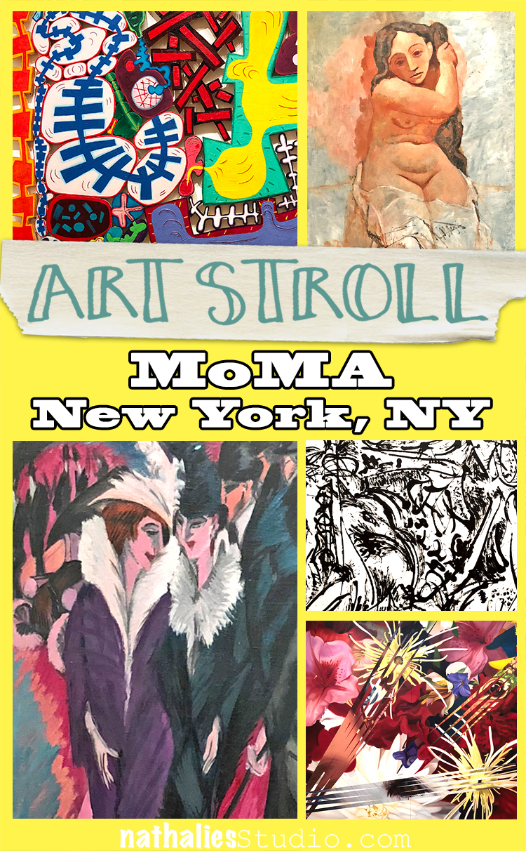
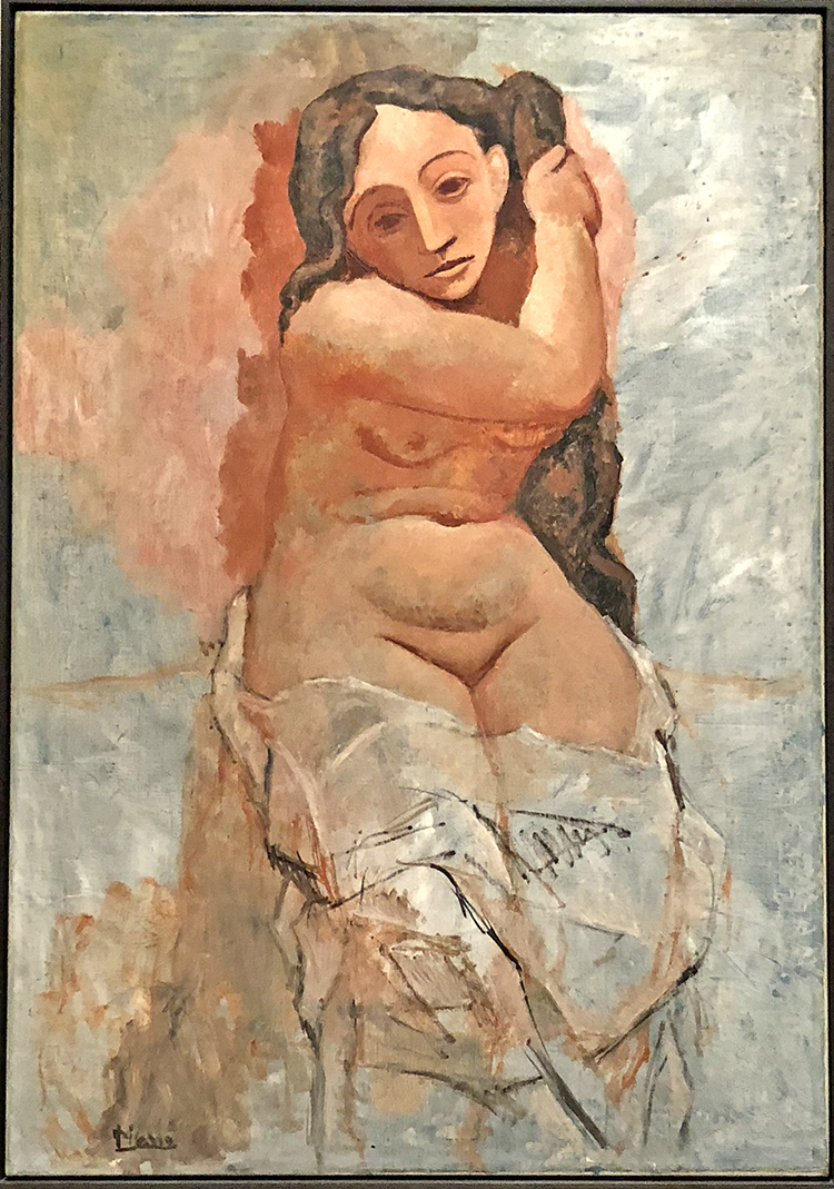
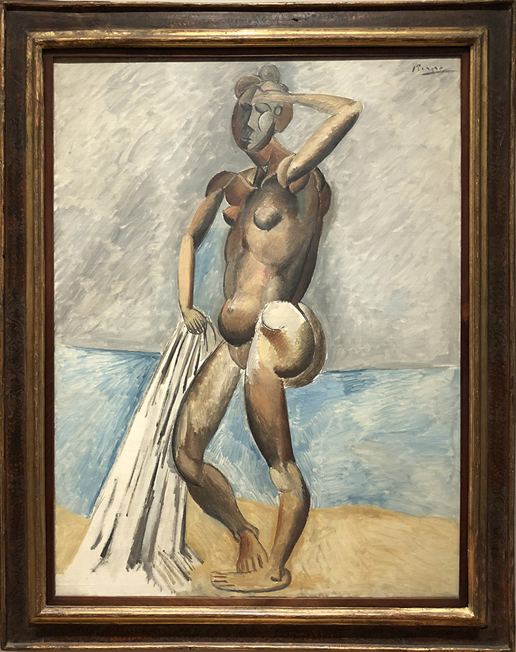
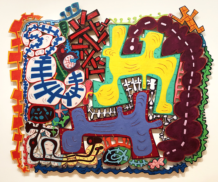
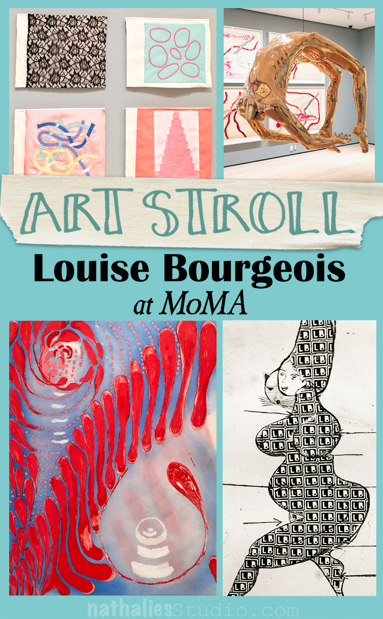
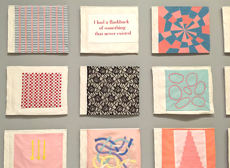
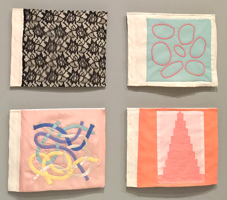
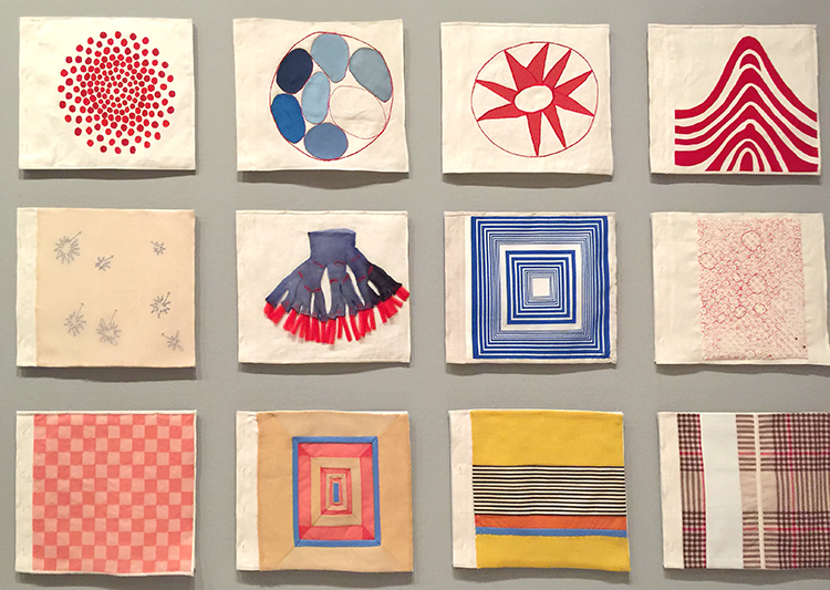
Always love to stroll through MoMA and see what catches my eye in the collection.

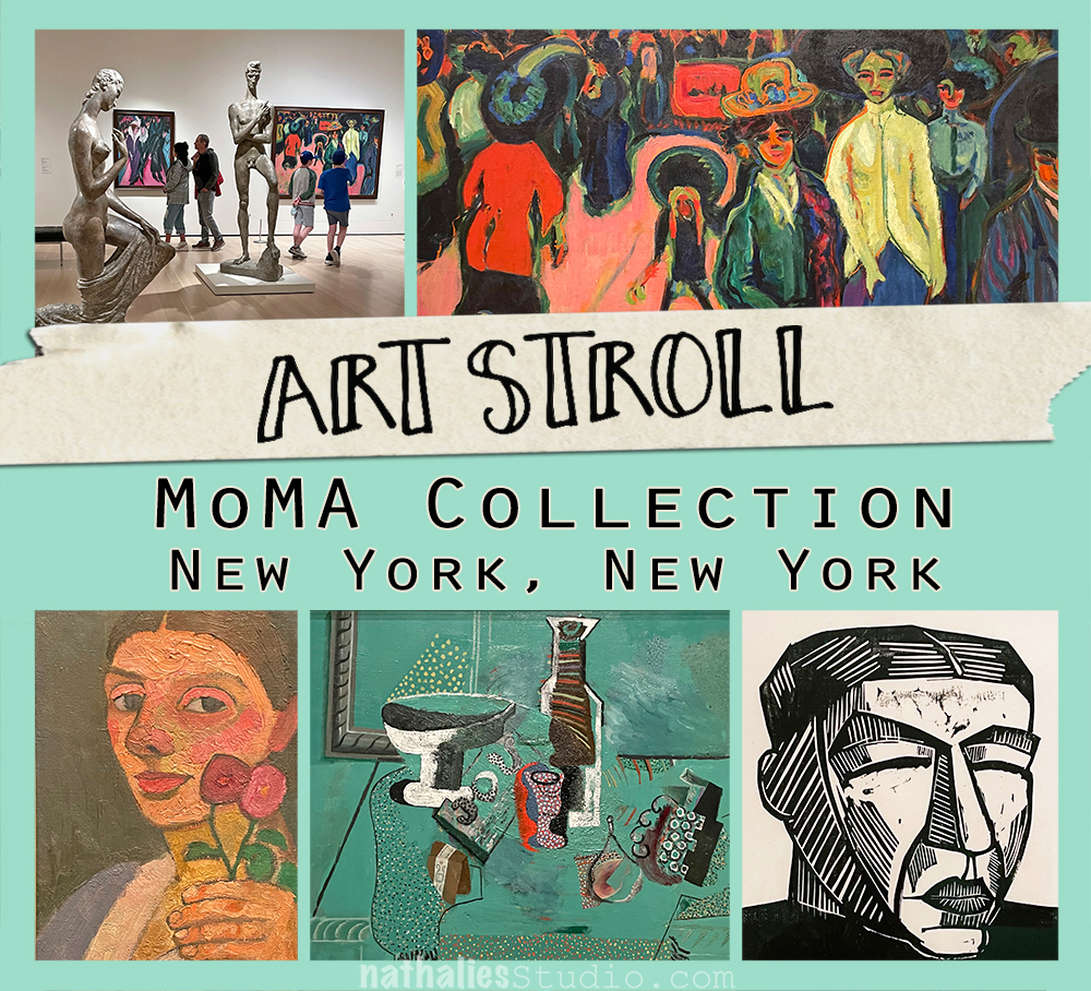
Giacomo Balla “Lampada” Street Light 1909 – Oil on Canvas

Wow- this was so vibrant and what a cool way to depict a street light!

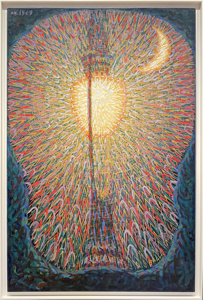
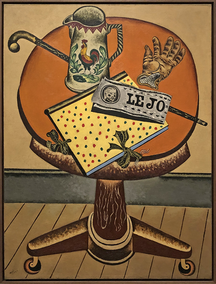
Pablo Picasso “Green Still Life” 1914

I love the texture, the little different dots and circles- it is a beautiful painting!

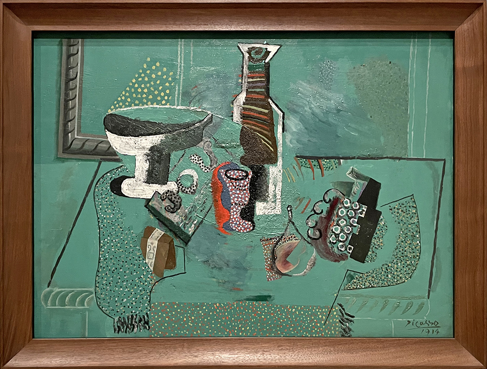
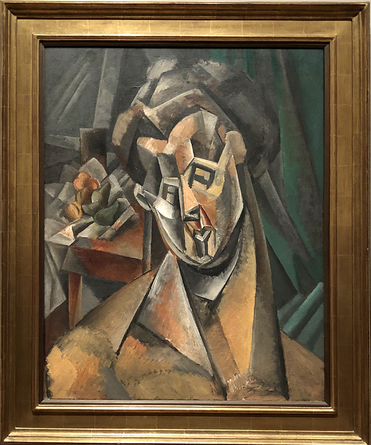
Pablo Picasso “Fruit Dish” 1908-1909

what a great perspective …and also …the green again…I wouldn’t mind having those two in my living room …how about you?

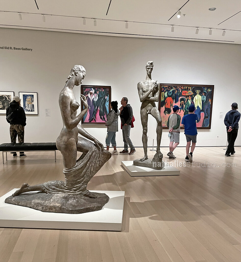
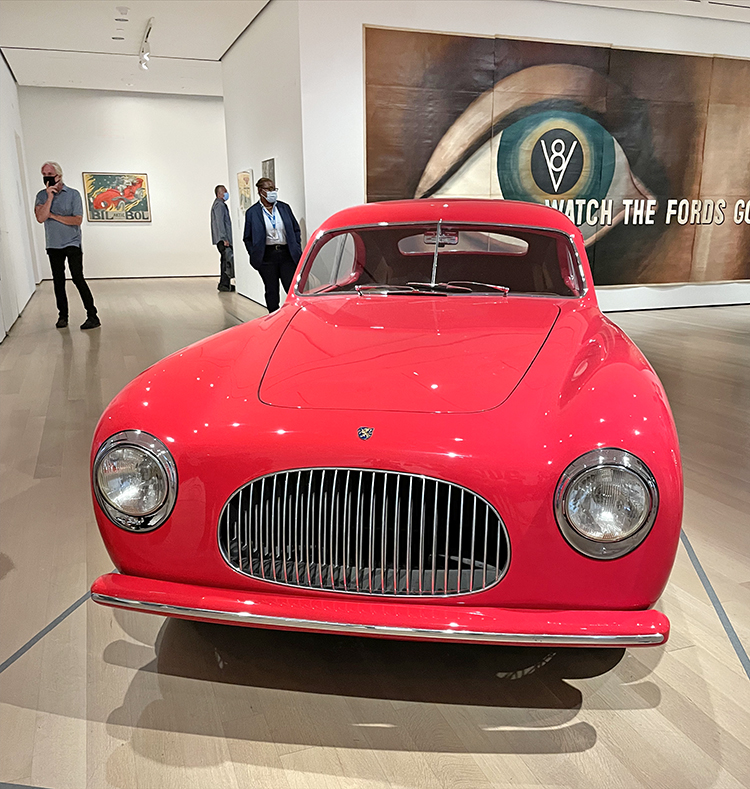
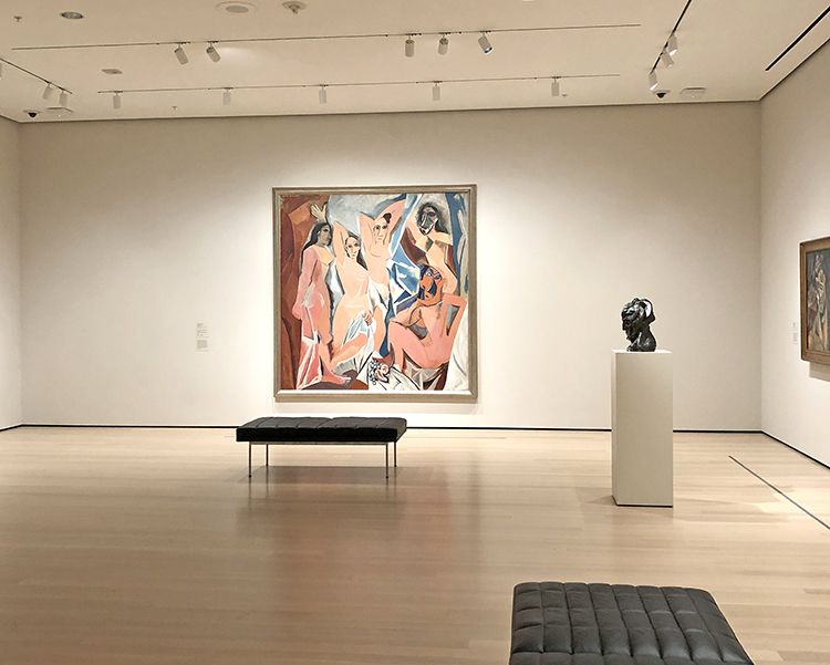
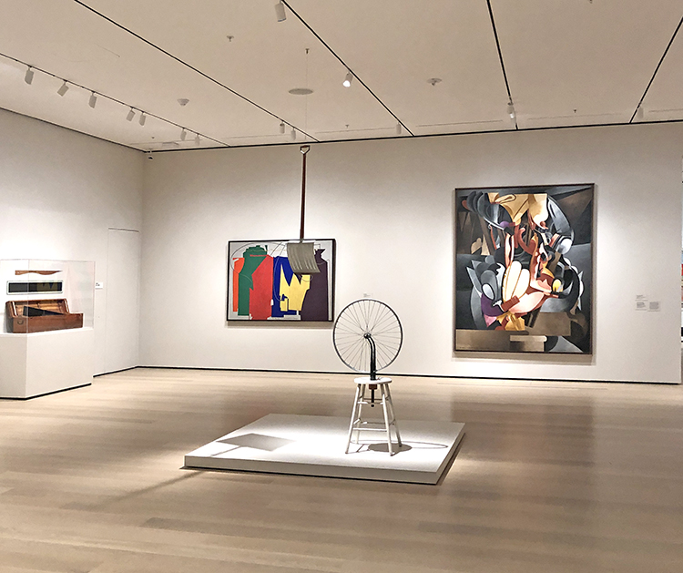
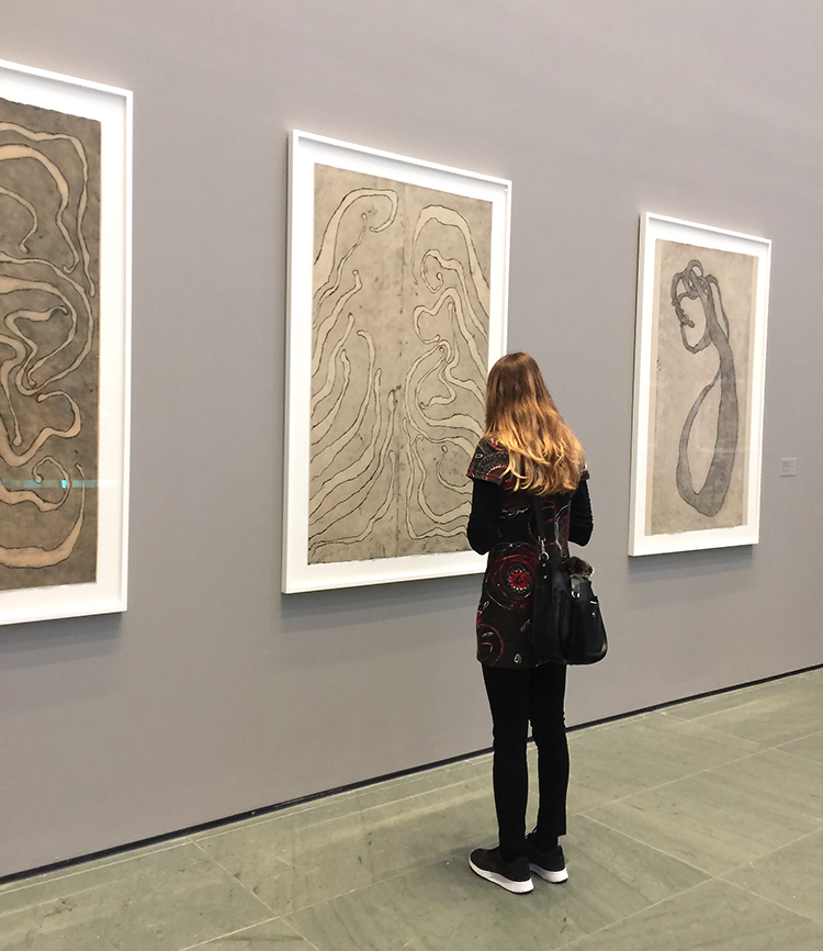
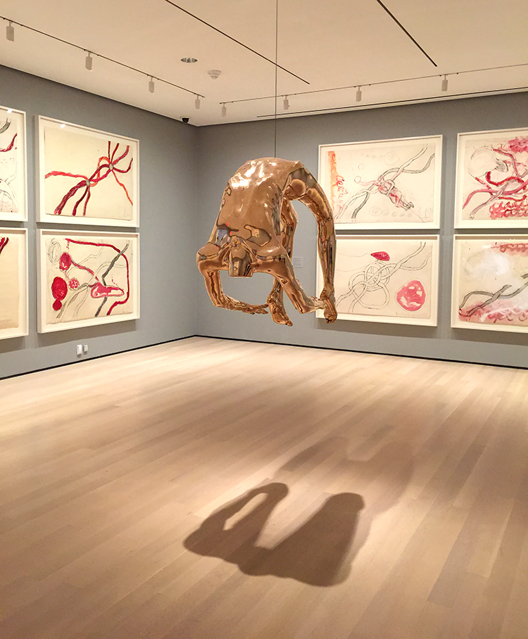
given that we went to MoMA on a Saturday afternoon it was pretty surprising that the museum was not as crowded as pre-pandemic levels. I am not sure if that can be also attributed to the fact that MoMA is now also way way bigger. In any event, it was a pleasant browsing through the galleries with a lot of possibility to park oneself in front of the paintings.

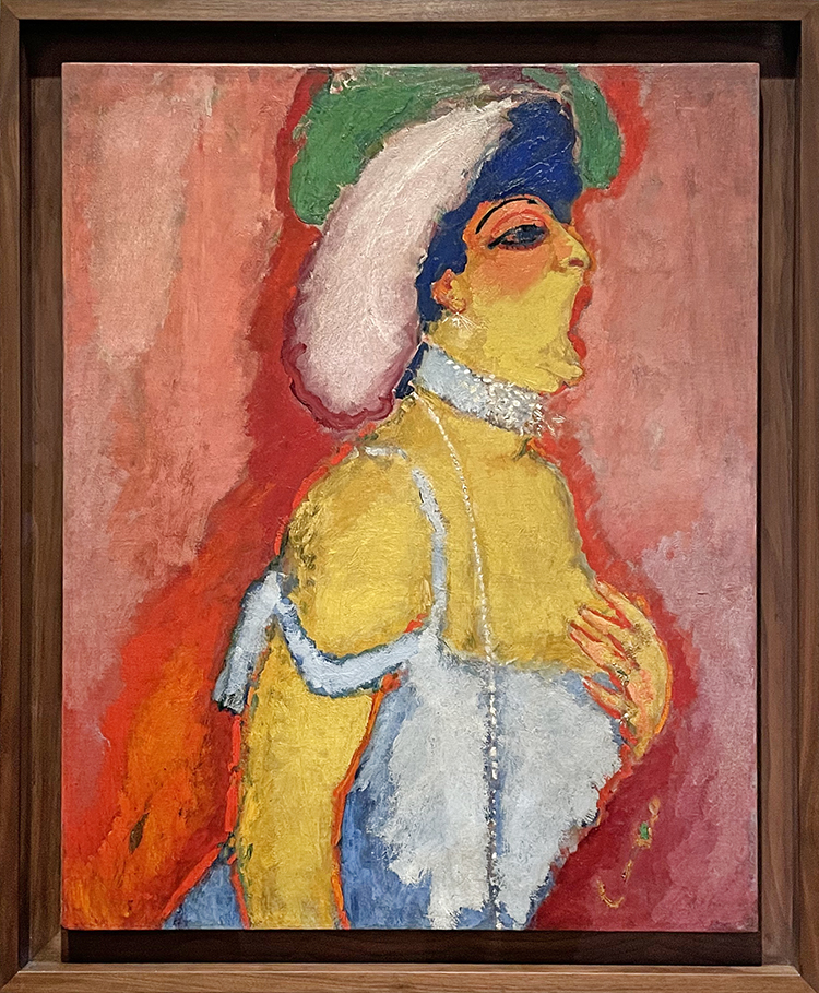
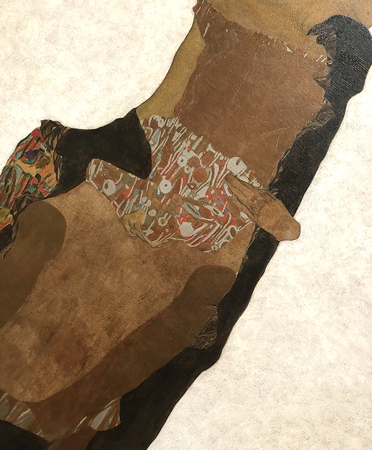
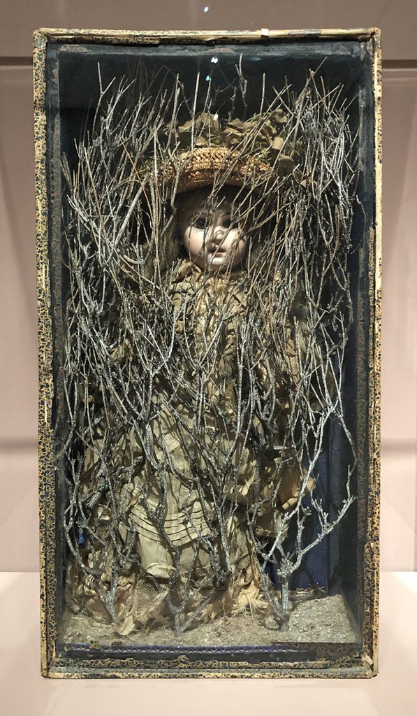
Kees van Dongen …I didn’t note the title so I am going to make one up “Lady who received unexpected visitors” …1908

What title would you give this one? And yes of course I could search for it on google but hey… little fun is ok ;)

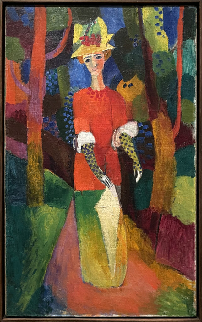
August Macke “Lady in a park” 1914 – Oil on Canvas. Another gorgeous painting- I love the shapes and colors and it is even though not realistic exactly what one sees …a lady in a park. Fantastic

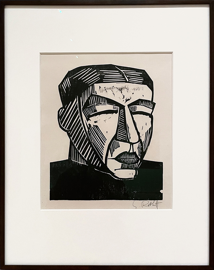
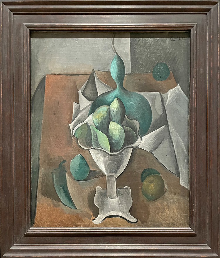
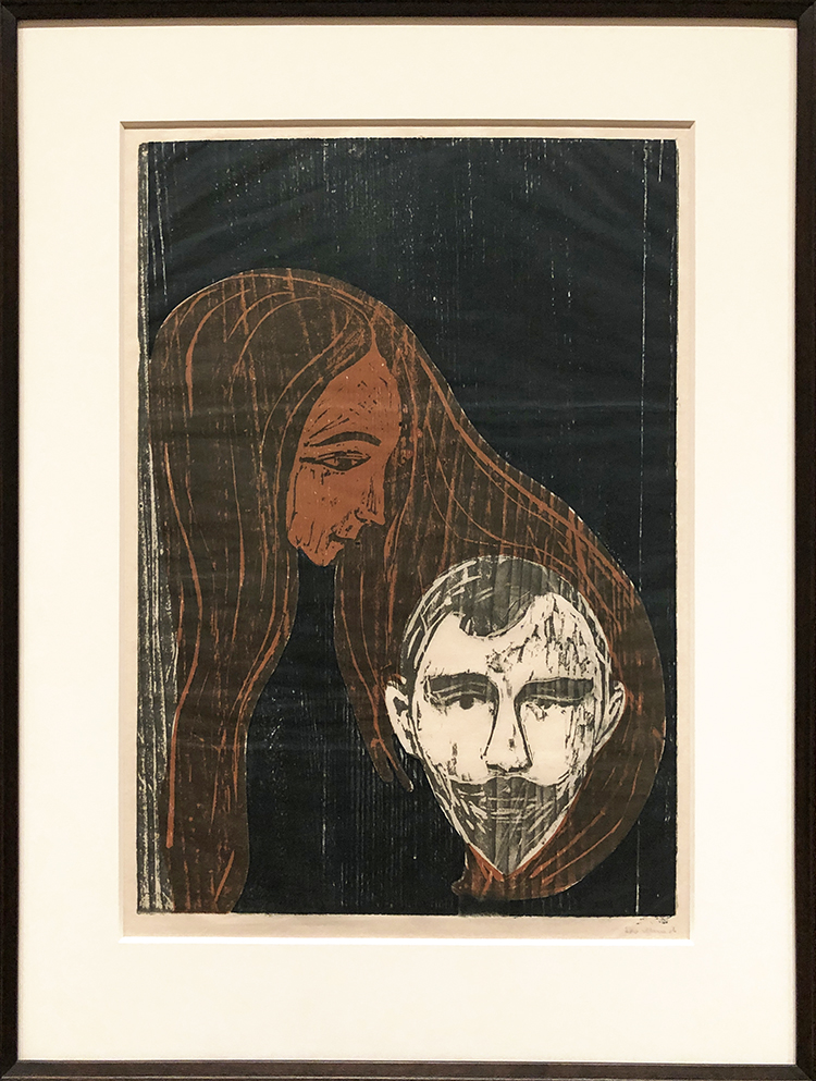
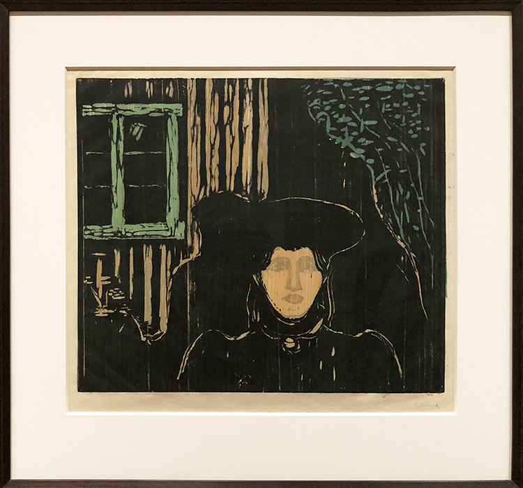
Karl Schmidt-Rottluff – Woodcut 1916 . So beautiful. And also …you see there is a German Artist theme going on …

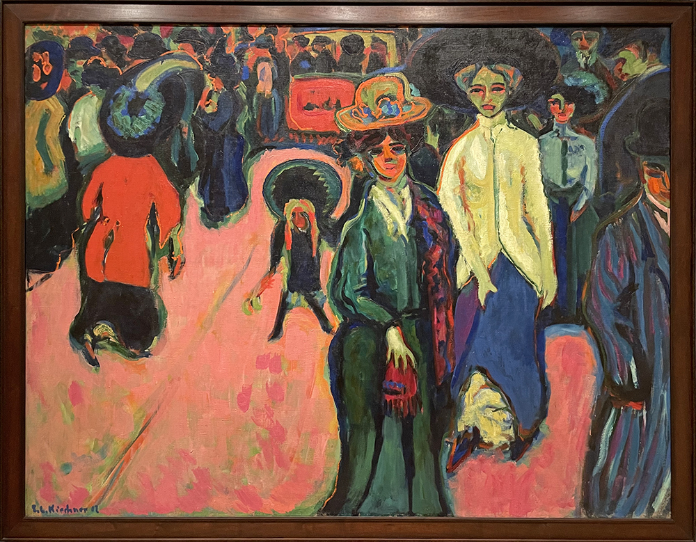
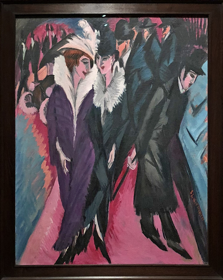
Ludwig Kirchner “Street Dresden” 1908 . I always imagine the little girl in the middle shouting ” WHATSSSS HAPPENING???”

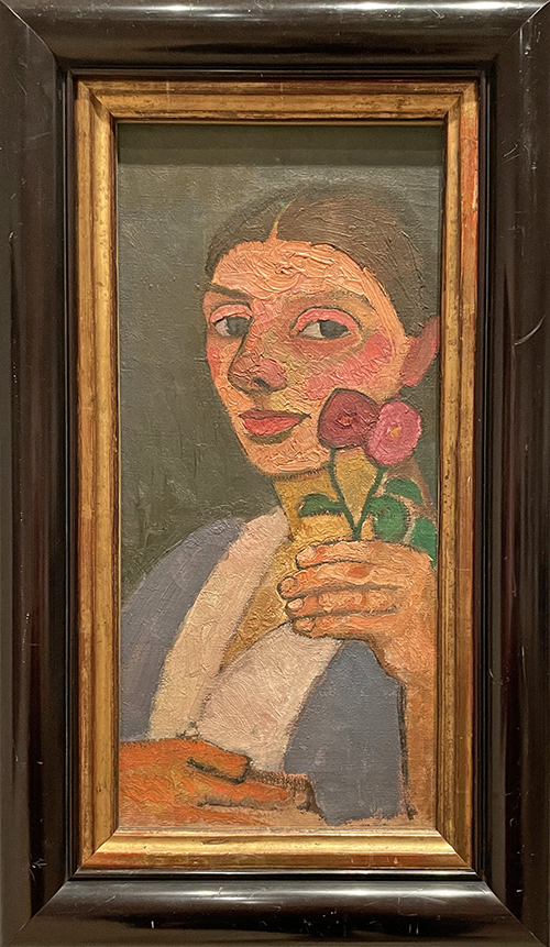
Paula Modersohn-Becker “Self Portrait with Two Flowers in her left hand” 1907

In this self portrait the pregnant artist looks at us and one of her hands rests protectively on her belly. Modersohn-Becker is believed to be the first woman to paint herself while pregnant.

This is so beautiful!

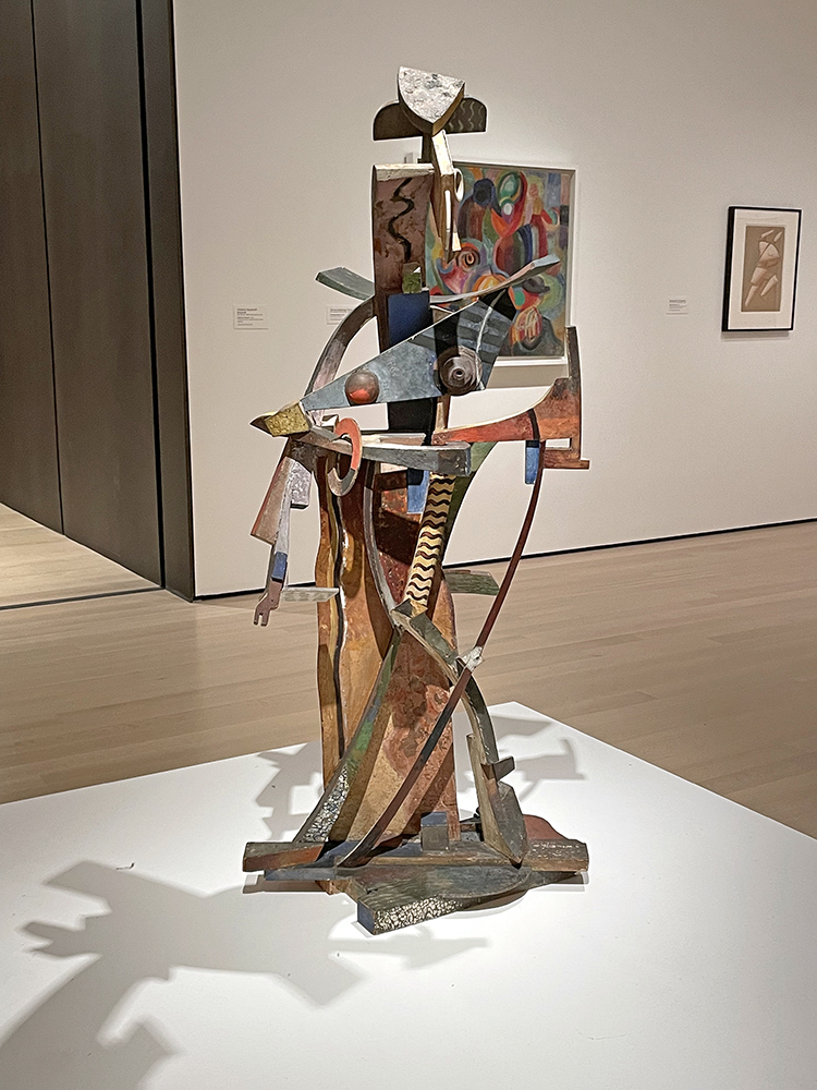
The next room was dedicated to Ukrainian Artists

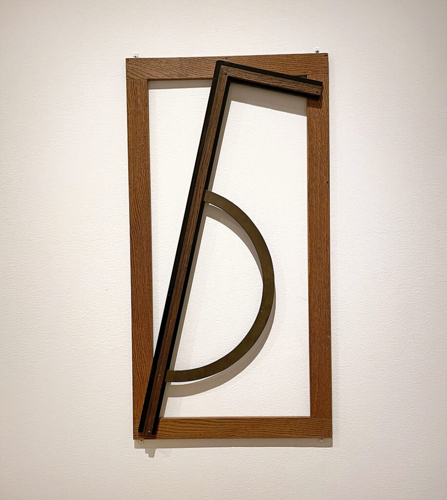
Vasyl Yermilov (from Kharkiv) “Composition Number 3” 1923 – Wood , brass, varnish and paint

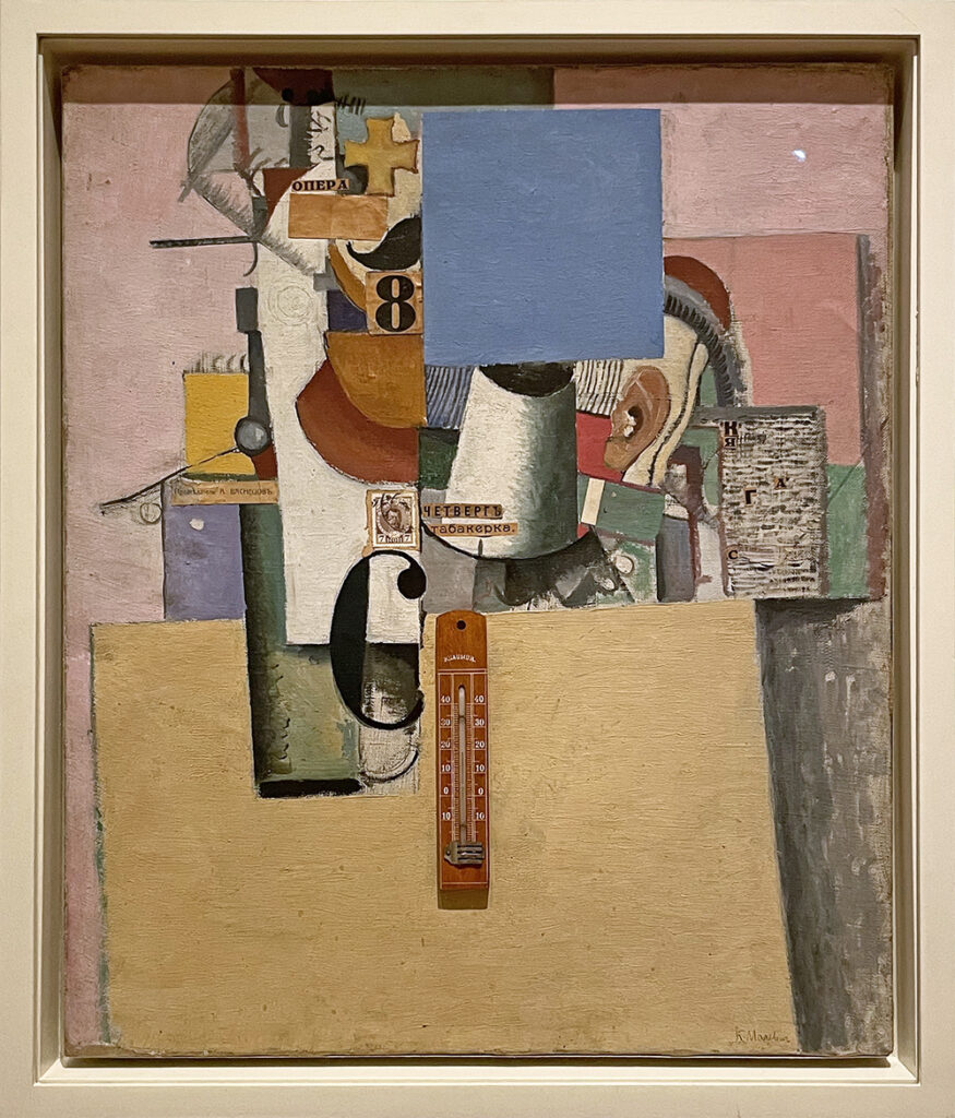
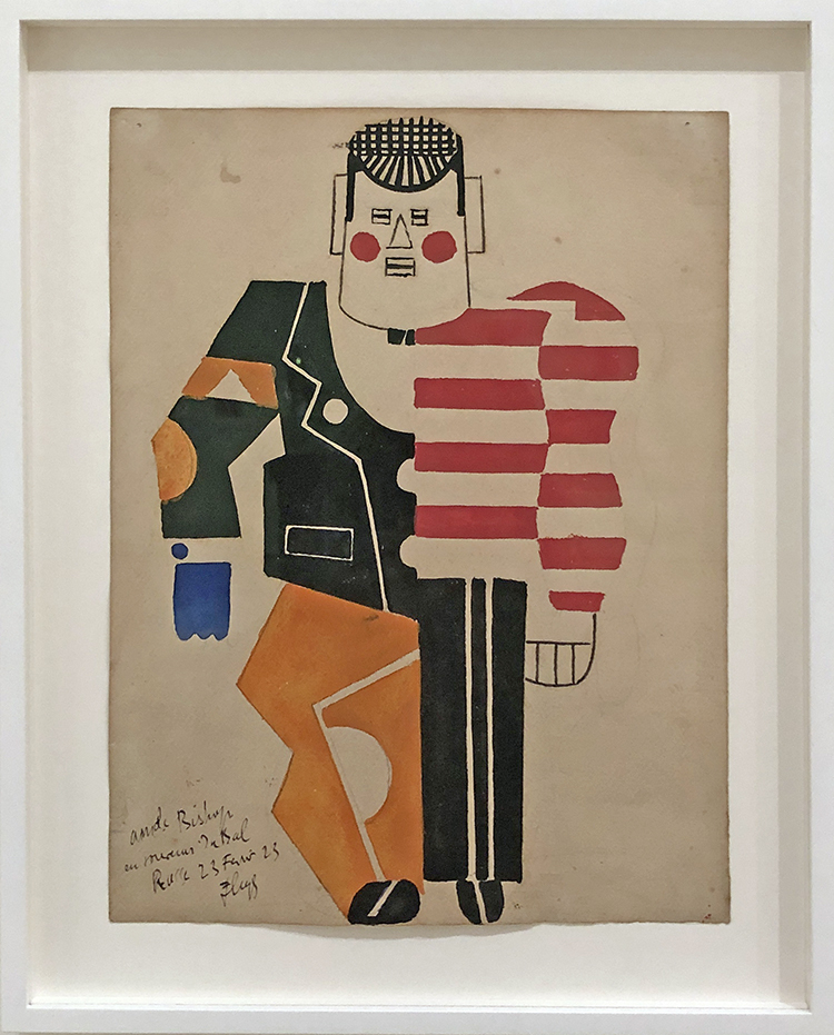
Kazimir Malevich (born in Kyiv – died in St. Petersburgh) “Reservist of the First Division” 1914 – Oil on canvas with collage of printed paper, postage stamp , and a thermometer

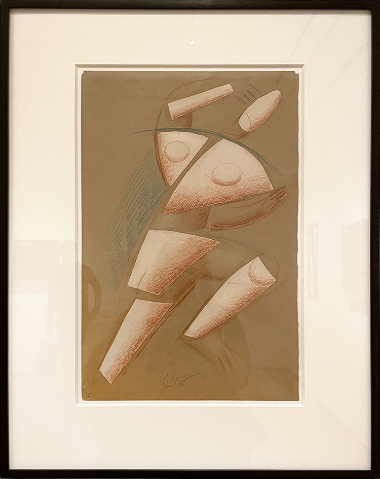
Alexander Archipenko (born in Kyiv) “Figure in Moment” 1913 – Cut-and-pasted painted paper, conte crayon, and colored pencil on colored paper

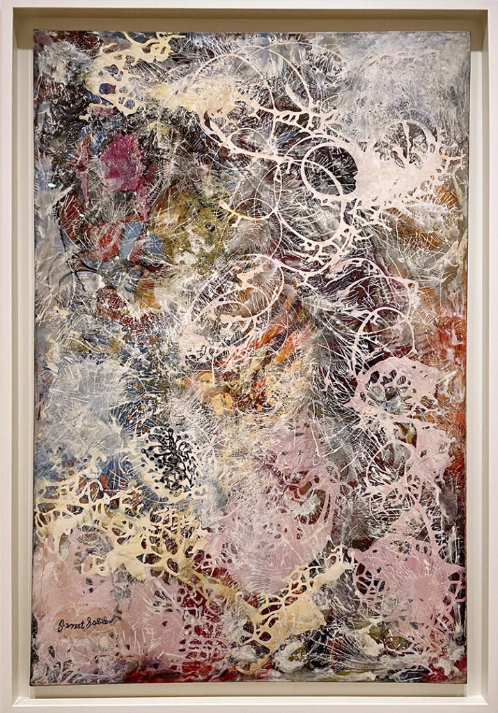
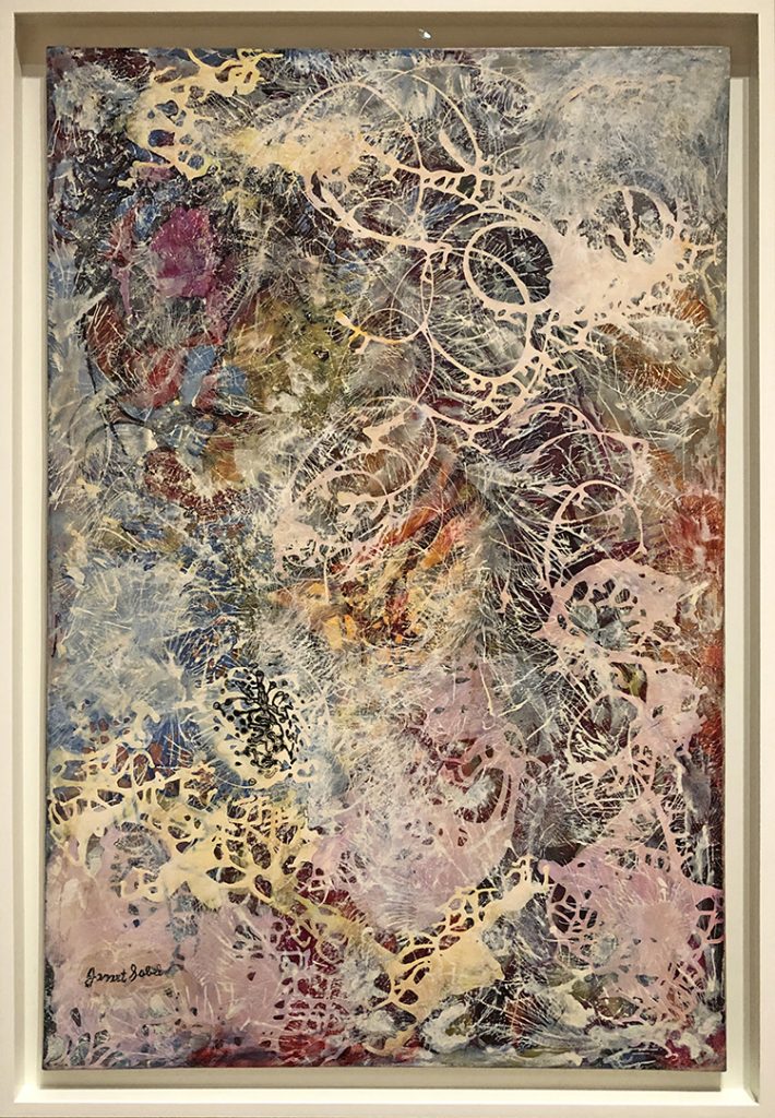
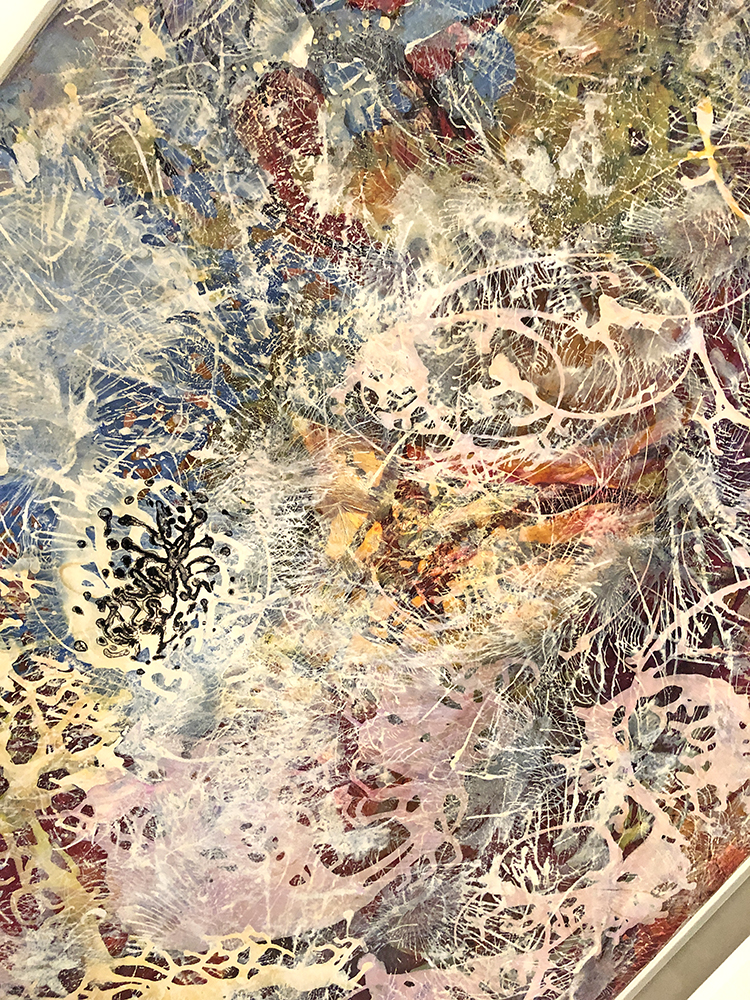
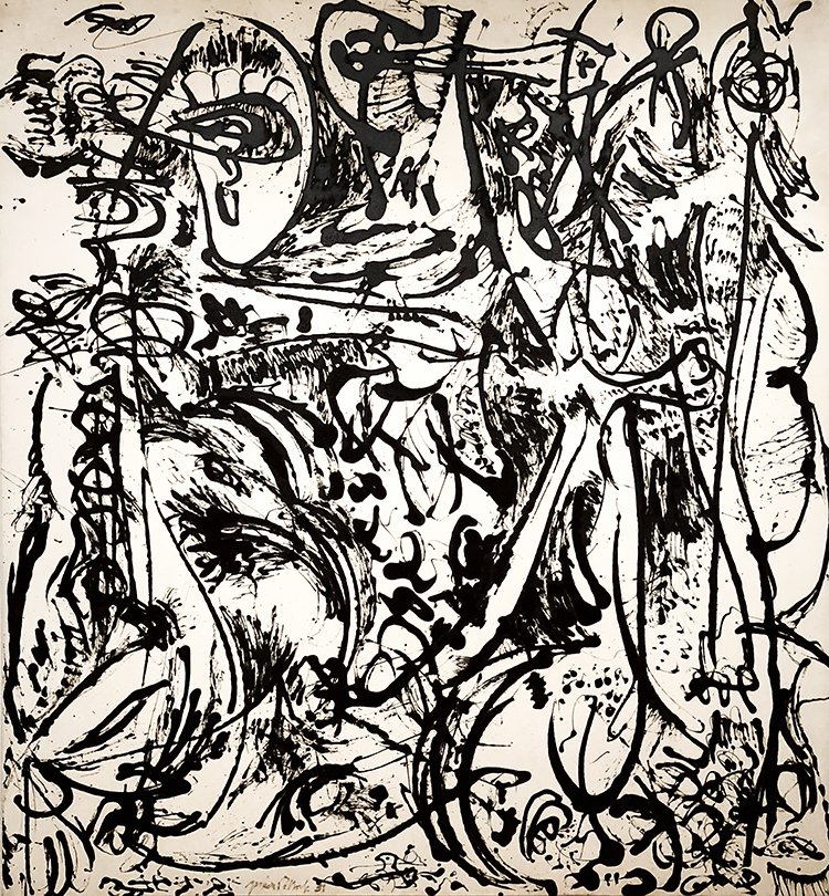
Janet Sobel (born in Katerynoslav, died in Plainfield, NJ) “Milky Way” 1945 Enamel on Canvas

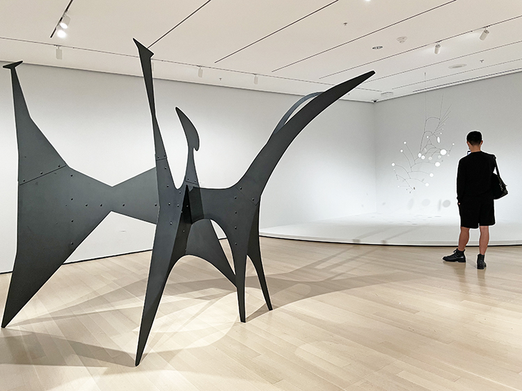
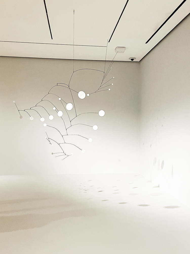
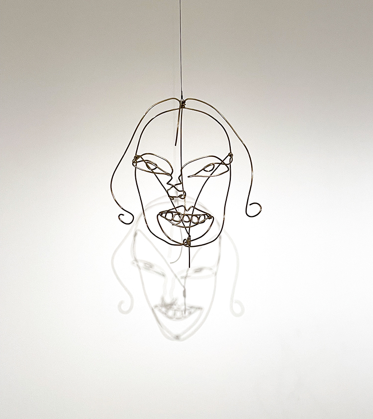
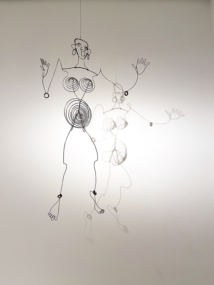
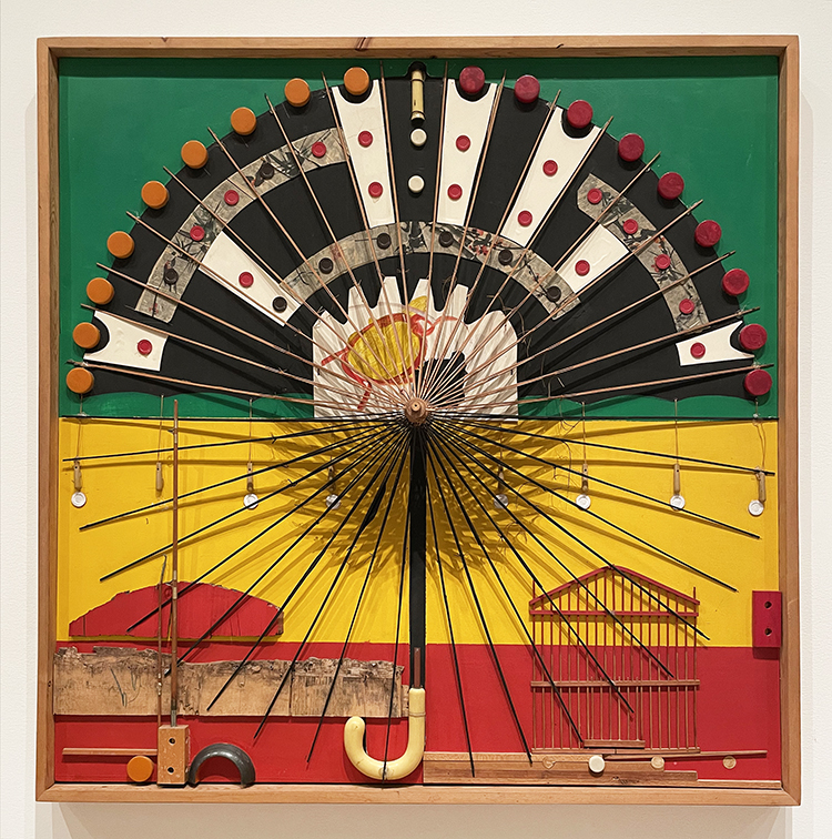
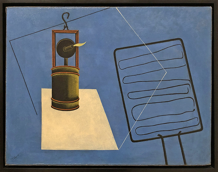
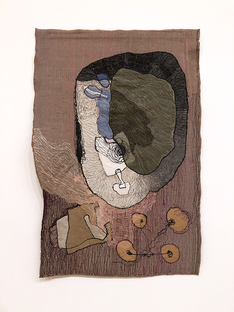
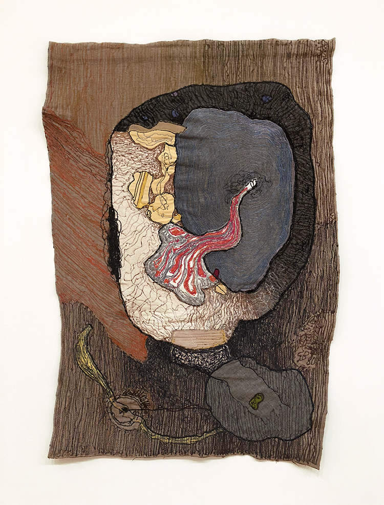
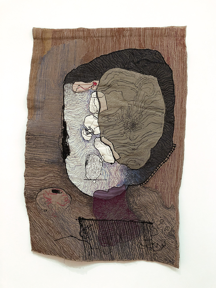
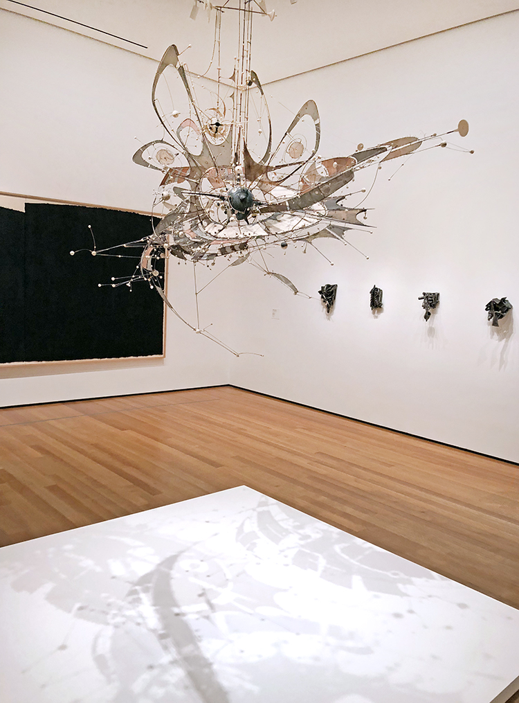
Next up was a wonderful room with those pieces:

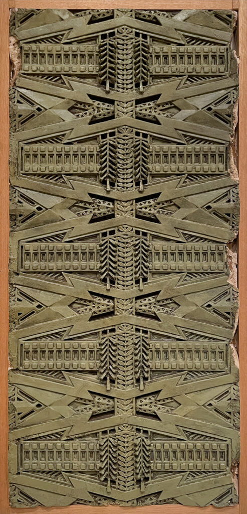
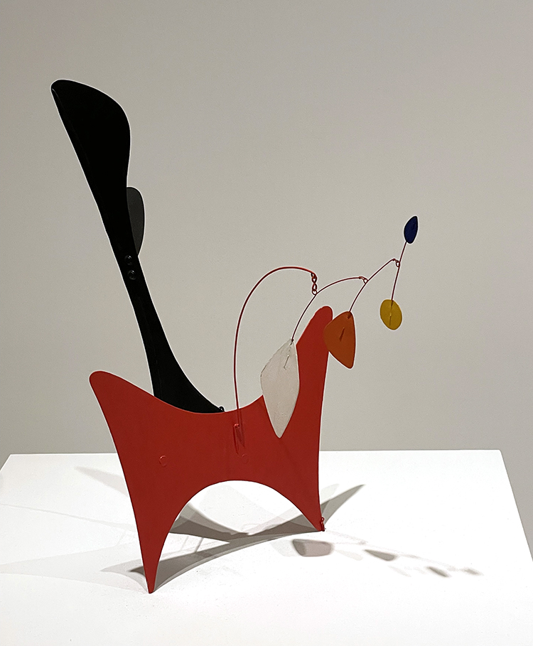
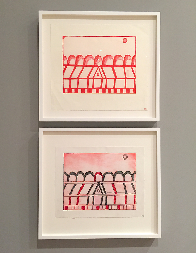
this is the cast of a frieze- stunning – from the Susan Lawrence Dana House in Springfield, Illinois – 1902-1904

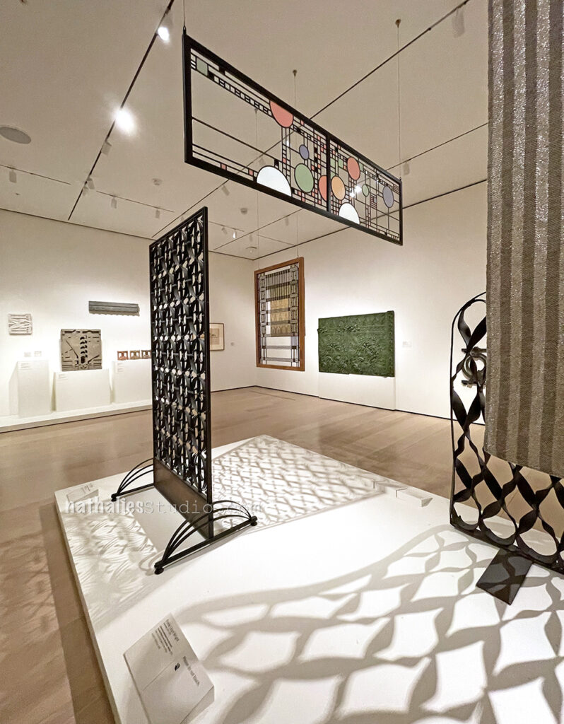
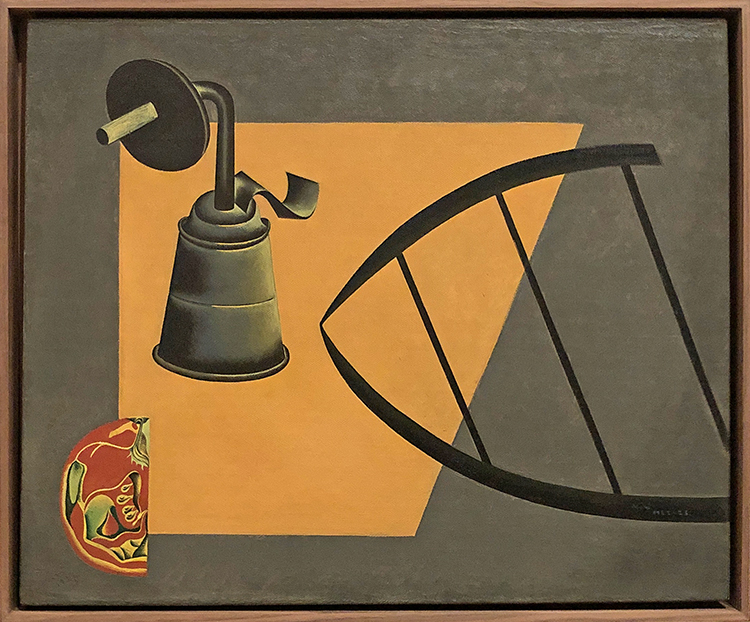
Stunning shadows …I would take some of those as well, please!!!

I hope you enjoyed this little art stroll- until the next one!

Comments (2)

  • Jenny Sawyer

    |

    “Milky Way” is definitely my favourite and I like the woodcut too – very strong face.
    NAT, thanks very much for this stroll, and all your others too. It’s a wonderful resource to gain some inspiration from.

    Reply

  • Sue Clarke

    |

    “Milky Way” is one that I would hang up in my family room!
    I can’t really share my first impression of the “untitled” here…sorry, my mind goes to the gutter. LOL
    I always love your art strolls as I do not go to museums often.
    Thanks for sharing Nat.

    Reply

Leave a comment

Art Stroll: Matisse Red Studio, MoMA

Two weeks ago I had a lovely day in the city and it was the perfect day to visit the new Matisse Red Studio exhibition at MoMA. What a treat!!! The exhibition is small-ish – which is good – and has kind of two big rooms. We decided to keep the one with the main treasure namely the Red Studio for last and that was a perfect decision.

“Studio under the Eaves” 1903 – Matisse painted his studio and parts of it several times and that makes so much sense given that an artist studio is also an artist’s world. In this work the studio looks a little sad – while the look out of the window provides a look at a much more vibrant and fun world. Maybe this is in part because Matisse in his early career had soem personal and financial troubles and as we see…the artist world def. improved to a more vivid space later.

“Still Life with Geraniums” 1910 – in this painting we see some of the paintings – in his studio – but just peaks of it.

“The Blue Window” 1913 is actually a view out of his bedroom window onto his studio.

Nasturtiums with the Painting “Dance” I , 1912 – The flowers in the vase are the same as in the Painting of Red Studio – the leg of the table on which the vase stands seem to be connected with his painting in the background.

“Studio, Quai Saint-Michel” 1916

So brilliant ..the depiction of the model in his studio…as a painting.

“Large Red Interior” 1948

This connects to the Red Studio – the star of this exhibition to which we go next- from 1911 . This painting is actually his last finished oil painting.

OK- moving to the main star(s)

“The Red Studio” 1911

Matisse is said to have made his studio subject of his paintings whenever he wanted to explore about where he was in that particular moment of time with his art and life. The red studio didn’t start out as a red studio. The floor was pink, the wall was blue and the furniture was yellow. But after a month he made the decision and coated the surface excluding his artwork and objects of inspiration with Venetian Red. He said about his painting that he likes it but that he doesn’t understand his painting.

Gathered in the room are the artworks as far as they could be retrieved that are in the painting.

“Le Luxe II” 1907 –

I loved this painting which hasn’t been on display since the 60s.

“Upright Nude with Arched Back,” 1906-1907

“Female Nude” 1907 – Matisse worked for a year with a ceramicist and he loved the work. He was very interested in decorative art.

“Young Sailor II” 1906 –

“Nude with White Scarf” 1909

“Corsica, The Old Mill” 1898 – This painting was made when he was first married and he and his wife spend about six months in Corsica. Matisse would talk about the time in Corsica as being really transformative.

One painting that couldn’t be borrowed for the exhibition was the Large Nude because Matisse had asked that it would be destroyed after his death. Why we do not know. This is one of several studies of the painting.

It was a wonderful exhibition – what a beautiful idea to gather all those works, to also show other works with his studio as the subject – it was a great glimpse into his world. Makes me want to paint my studio as well :) Hope you liked this art stroll. If you have a chance to see this exhibition in person- go!!!

Leave a comment

Art Stroll: Back at MoMA

It felt so good to be back at MoMA last month – since I haven’t been there for 18 months. On our anniversary we went for a nice day in the city and a fantastic dinner – and so MoMA was a big part of the nice day.

I am not obsessed with cars, in fact most of you probably do not even know that I never had a driver’s license- yep …true city kid here – but …if you would give me this car..I would def. get one LOL. What a beauty!

Love this painted car hood by Judy Chicago. Judy Chicago actually enrolled at an auto body school in order to learn spray painting after she completed her masters of arts.

Wonderful Alexander Calder exhibition – Modern from the Start – a bit different from the one a while ago at the Whitney.

I did love this mobile – I forgot the name but it was something with snow …which makes sense. If it wasn’t something with snow..well, I am sticking to it …it should be ;)

I have never seen his pieces made out of steel wire- they were so cool – the movement and shadows!

So fun!

I would take this little marquette- it makes me so happy and it would fit perfectly into my studio ;)

The other big exhibition at this time was Cézanne’s Drawings – a gazillion sketches and studies by him. I have to admit I wasn’t really taken by this exhibition. Although I do love to see sketches and studies and where they are going, it felt just so repetitive to me and it felt more like a sketch dump to me than really a curated exhibition. But then …what do I know …I also didn’t do the work to read anything about the show to see if that then would make more sense. But I loved the Study of Trees above.

As well as this sketch and the drawings below

because they were so different and I would have loved to actually see if they resulted in something else

Love how Cèzanne painted the pattern on the curtain!

In the permanent collection some changes- loved to see this piece by Roberto Matta “Here, Sir Fire, Eat!” from 1942 . There is a lot to see in this painting and I am still not sure what alludes to this title!

This painting by Sonja Sekula “The Town of the Poor” 1951 – oil on canvas- was just stunning. the blue and yellow washes – the lines depicting the view from her downtown NYC studio which she sahred with John Cage and Merce Cunningham.

Now to pieces by William H. Johnson – Jitterbuggs II above and below Blind Singer.

Both pieces are Screenprints with hand additions.

Norman Lewis, Untitled 1949 …it is funny sometimes I am cool with no title and sometimes I think “lazy Dude” LOL.

And then you have titles like this “Five Feet of Colorful Tools” by Jim Dine …stating the obvious but nonetheless pretty cool :)

The Family by Marisol Escobar – paint and graphite on wood, sneakers, tinted plaster, door knob and plate. Marisols sculptures made primarily with blocks of wood combine painting and figurative drawing with found objects. “In the beginning, I drew on a piece of wood because I was going to carve it, and then I noticed that I didn’t have to carve it, because it looked as if it was carved already”

Tom Wesselmann – Still LIfe #57 – speaking of lazy titles LOL.

And in this potpourri of artwork – my favorite of that stroll – Noah Purifoy – Unknown 1967 – painted wood with parasol armature and handle, found wood, pasted papers, backgammon and poker chips, fishing pole, wire, birdcage parts and other materials.

“As a young artist in Los Angeles, Purifoy was profoundly influenced by the 1965 Watts Rebellion, six days of civil unrest by residents of Watts and other predominantly African American neighborhoods of the city in response to decades of racial injustice. In the event’s aftermath, the artist collected charred debris form the streets and assembled it into a series of sculptures, a technique that would define his practice for years to come. Unknown, though more joyful and playful than other of his works, is a rare surviving example of his early assemblages. With its easily identifiable castoff objects, it suggests a question central to Purifoy’s practice “How …you tie the art process in with existence.” (MoMA wall plaque)

Hope you enjoyed this Back at MoMA ArtStroll!

Comments (1)

  • Sue Clarke

    |

    “Here, Sir Fire, Eat!” really calls out to me!
    I so enjoy these posts Nat. Almost like I went myself.

    Reply

Leave a comment

Art Stroll: MoMA Collection Galleries

In December on a snowy afternoon my husband and I went to a member evening with Jazz and open galleries and I guess because it was snowing the museum was almost empty. It was a total treat to walk almost alone through the galleries. 

Funky!

Seeing this in an empty room …RARE

Swoon – This piece by Giuseppe Lignano, – Foladable 1 – 2016 – Laser Cut Cardboard with Inkjet print and Enamel Paint inspired me to those pieces.

Laura Owens, Untitled, 2013 – I love this so much -the stenciled newspaper – the thick impasto flowers .

More empty gallery bliss.

Gorgeous wood cut prints by Edvard Munch!

Picasso’s Ladies on their own

Egon Schiele, Nude with Violet Stockings and Black Hair (Akt mit violetten Strümpfen und schwarzem Haar)

Egon Schiele, Portrait of Gerti Schiele, 1909 – I love this and I love how you can see how influenced Schiele was in in his style by Gustav Klimt.

Vanessa Bell, Composition – 1914 Gouache, watercolor, and colored paper on cut-and-pasted paper

YESS – I really love that MoMA finally makes an effort to show more female artists

Sonia Delaunay-Terk, La Prose du Transsibérien et de la Petite Jehanne de France (Prose of the Trans-Siberian and of Little Joan of France) 1913

Delaunay-Terk and Cendrars transformed the traditional book format from a handheld volume that is read sequentially from page to page into an object that unfolds accordion-style—a dazzlingly colorful, nearly seven-foot-long sheet on which text and illustration can be apprehended all at once. While Cendrars’s poem appears on the right, in various typefaces and colors, Delaunay-Terk’s geometries cascade down the left, and the blank spaces around the text have been stenciled with color as well.

Sonia Delaunay-Terk , 1923 Tristan Tzara with Monocle

Florine Stettheimer, Euridice and the Snake – 1912 – Costume design – Oil, beads, and metal lace on canvas

Florine Stettheimer, Gorgette, 1912 – Costume design

Stettheimer wrote the libretto and designed the costumes for this unrealized ballet.

Florine Stettheimer, Family Portrait II, 1933

An artist, playwright, set designer, and poet, Stettheimer led a Manhattan salon where she entertained, exhibited her work, and shared her poems with her favored circle of artists. In Family Portrait, II, she combines images of herself, her sisters (who ran the salon with her), and her mother with symbolic elements wittily representing their individual personality traits. Among those she chose for herself are the RCA building (30 Rockefeller Center, known today as the GE Building) and Radio City Music Hall, each identifiable by the text the artist has inscribed on it. In focusing on her family, the painting typifies Stettheimer’s concern with the personal, which seems to have endlessly inspired her. Her attention to detail extended to choosing the frames that would best set off her vibrant paintings—in this case an unusual construction of white wicker.

Francis Stark, Chorus Line 2008 – Cut-and-pasted printed and colored papers on paper.

Baroness Elsa von Freytag-Loringhoven – 1923-1926 Dada Portrait of Bernice Abbott, Gouache, metallic paint, and tinted lacquer with varnish, metal foil, celluloid, fiberglass, glass beads, metal objects, cut-and-pasted painted paper, gesso and cloth on paperboard.

Fernand Legér, 1922 – costume desing for the ballet Skating Rink

People??? just kidding ;)

Joseph Cornell, Untitled (Bébé Marie) 1940s, Papered and painted wood box with painted corrugated cardboard bottom, containing doll in cloth dress and straw hat with cloth flowers, dried flowers and twigs, flecked with paint.

Rufino Tamayo, Animals 1941

Graham Sutherland, Thorn Head 1945 – Gouache, chalk and ink on paper on board

Janet Sobel, Milky Way 1945 – Enamel on Canvas

Leave a comment

Art Stroll: MoMA Betye Saar

During the holiday season my husband and I want to a MoMA evening with Jazz for members. There is nothing better than the word Jazz to get the man out – LOL- just kidding ;) I think because of some snow right before we went the museum was empty- it was awesome. We finally also saw the Betye Saar exhibition. Betye Saar is known for her assemblage and collage work. Saar explores both the realities of African-American oppression and the mysticism of symbols through the combination of everyday objects. “I’m the kind of person who recycles materials but I also recycle emotions and feelings,” the artist has explained. “And I had a great deal of anger about the segregation and the racism in this country.”

The Wounded Wilderness, 1962 – Etching with relief printing.

She became interested in printmaking when she was studying design. It became her segue from design to fine art.

In the Dell, 1960 – Etching.

Her pieces were fascinating!

The Quick & the Dead, 1964 – Etching and collagraph with hand addtions and embossing with stamped ink

Mystic Window for Leo, Assemblage, etching

Saar found this window and used images of the leo and sky charts as this is an important symbol for her. I loved this so much!

Black Girl’s Window, 1969, wooden window fram with paint, cut-and-pasted printed and painted papers, daguerreotype, lenticular print and plastic figurine.

A silhouette of her head with floating moons and stars; an etching (her own) of a lion, her birth sign; a tintype of a woman who could be her Irish grandmother; and, at the center, a novelty shop Halloween skeleton alluding to her father’s death when she was a child, a loss she says she still lives with.

“Even at the time, I knew it was autobiographical”, Saar said of her now -iconic assemblage Black Girl’s Window. “It is like a diary of my life”

Saars printing materials – it was so interesting to see those and then try to find them again in her various prints.

Phrenology Man Digs Sol y Luna1966, Etching with relief-printed found objects

“Phrenology, a pseudoscience that has been definitively debunked, links portions of the human brain to different character traits and capacities. It gained popularity in the nineteenth century and was cited by proponents of slavery and segregation as proof of the inferiority of African Americans. That a black woman adopted this motif in her work may seem subversive, but according to Saar, she was attracted to phrenology as a map of the unknown, in keeping with her interest in astrology and palmistry. Her own Phrenology Man, who appears in this print and several others, has the words “SEX” and “HATE” tumbling through his mind, together with animals, flowers, and astrological signs.”

The Phrenologer’s Window II, 1966 – Wooden Window frame with cut-and-pasted printed paper, acrylic paint, and found objects on board

“You can make art out of anything.” Betye Saar

The Palmist Window, 1967 wooden window frame with cut-and-pasted printed paper and fabric with charcoal and acrylic paint

Comments (1)

  • chrissie

    |

    loved this

    Reply

Leave a comment

Art Stroll: Joan Miró at MoMA, NYC

A couple weeks Kim and I went to the city to see the Joan Miró exhibition at MoMA.

It was a real treat – and left me in a very good mood. It started out with these interesting still lifes from 1922-23

The one above is a still life with lamp, sliced tomato and an iron stand. I just love the way he painted the tomato – yes I am a weirdo LOL.

One of the striking things in the early work for me was seeing the colors but also the similarities to some work that I recently saw at the af Klint exhibition. Amazing!

The Hunter (Catalan Landscape) 1923

I always loved Miró’s quirky little shapes and pictographs – do you see the fish sticking it’s tongue to catch the mosquito?

This painting called Dutch Interior I from 1928 is based on this 17th century painting depicting a lute player in a domestic interior.

Miró had bought this postcard reproduction of the work by Hendrick Martensz Sorgh at the Rijksmuseum in Amsterdam and then mapped out his version below.

It makes me itch doing something fun like this as well :)

In a way some of his paintings are like painted collages.

“Birth of the World” 1925

Joan Miró said that The Birth of the World depicts “a sort of genesis”—the amorphous beginnings of life. To make this work, Miró poured, brushed, and flung paint on an unevenly primed canvas so that the paint soaked in some areas and rested on top in others. Atop this relatively uncontrolled application of paint, he added lines and shapes he had previously planned in studies. The bird or kite, shooting star, balloon, and figure with white head may all seem somehow familiar, yet their association is illogical.

Describing his method, Miró said, “Rather than setting out to paint something I began painting and as I paint the picture begins to assert itself, or suggest itself under my brush.… The first stage is free, unconscious. But, he continued, “The second stage is carefully calculated.”  The Birth of the World reflects this blend of spontaneity and deliberation.

This painting was way ahead of it’s time and received more love in the 50s when artists like Pollock and Frankenthaler would fling paint and wash raw canvases.

Relief Construction – 1930. Oil on wood, nails, staples, and metal on wood panel. In the summer of 1930 Miró moved away from painting to explore the possibilities of relief sculpture. Made from pieces of wood and metal that could easily have been found at a carpentry shop Relief Construction combines organic shapes. Miró identified the vertical metal spike as the neck and the head of the curved white toros like form. The red disk covered with sharp nails, he said was the sun.

how fun are those? I loved especially Miró’s book illustrations

Woman – Opera Singer- 1934 – Pastel and Pencil on flocked paper

“Painting” 1933 – do you see the cat?

Eyes – looking at you out of his paintings ….

and this and the next and actually EYES everywhere!

I love this one so much!!!

So striking with the red and black !

Interesting assemblage using rope.

Still life with a shoe – 1937 was kind of a shocker- I mean doesn’t that looks like something ultra modern and not from that time with the colors used?


And this sculpture- I mean seriously LOVE

It fascinated me how he very lightly used color – like a wash on the background and then painted so bold and with black and bold colors on the top.

Mirò said once in an interview: “I always have my feet on the ground and my eyes on the stars”

Another gorgeous sculpture.

Portrait of a Man in a Late Nineteenth-Century – Frame – 1950 – Oil on canvas – is one of my favorite paintings in MoMA’s permanent collection. According to Miró his childhood friend Joan Prats came upon an ostentatiously framed, pompous portrait by an unknown painter and sent it to him as a joke. The sitter’s pose and costume, his upturned gaze of inspiration, the devotional medal and ribbon on his table, and the rose garden outside his window typify the bourgeois taste and assuredness of the late 19th century. Within this orderly, rational and humorless world, Miró mischievously inserted his own creatures and signs. As if tot suggest the man’s puzzlement at this unexpected interruption , he punctuated his forehead with a small swirling form.

Hope you enjoyed this little Art Stroll. Kim and I did for sure and I cannot wait to head out to a museum soon again :)

Comments (2)

  • joan

    |

    Thank you for sharing, awesome work. I like the Hunter and the one that has what i think looks like a tiger face.

    Reply

  • Pam Hansen

    |

    Thanks for sharing, I really enjoyed this.

    Reply

Leave a comment

Art Stroll: Bodys Isek Kingelez at MoMA

A couple weeks ago my friends and I went to the opening of Bodys Isek Kingelez – City Dreams at MoMA.

Bodys Isek Kingelez (1948 – March 14, 2015) was a sculptor and artist from the Democratic Republic of Congo, mostly known for his models of fantastic cities made of cardboard and packaging.

This exhibition is the first solo retrospective the institution has ever organized for a black African artist. Wow …hey MoMA what took you so long?

Kingelez started to build his city sculptures in the beginning of the 80s.

To make a living he worked as a restorer at the Institut des Musées Nationaux du Zaïre. He got the job after he took one of his maquettes to the museum. The staff there found the sculpture so sophisticated that they accused him of stealing it and demanded that he’d create another one in front of them, so they could proof he was lying. Kingelez created a piece in front of them and the institution offered him a position.

Though the cities and buildings he created were fictional, they were built as an optimistic view of architecture’s power to change a city’s circumstance.

The curator Sarah Suzuki said ” He saw himself as able to help people understand how to live in a more harmonious, peaceful, beautiful, lively, world, one with candy-colored, translucent structures that constitute a proposal for how to live better.”

He once said, “A building without color is like a naked person.”

there is a lot to take in with this show

First the details as you zoom in

then all the different materials used

then the recognition of known or unknown architectural structures

and lastly more complex the search for meaning.

Going with my friends was as always wonderful – it is always fun to see what your friends point out and see.

The exhibition runs until the end of January and I will for sure come back.

It just spoke to me in a joyful way- exploring and figuring out what he used and how it works.

I wouldn’t want to live in a city like this in real live- thinking of it in a real way actually seems oppressive.

I hope you enjoyed this little art stroll :) What did you think about it?


Comments (3)

  • Curtis

    |

    Lovely article Nat. I appreciate your take on this exhibit, and your insightful detail photos. I especially appreciate the shot of the twin-cone building.

    Reply

  • Sue Clarke

    |

    Funny, the first thing that I thought of while looking at your photos was when I went to Legoland in FLA and saw the cities that took years to create. So much detail!

    Reply

Leave a comment

Art Stroll: MoMA NYC

A couple weeks ago I went on an Art Stroll at MoMA – I love how there are always pieces exchanged in the permanent collection

James Ensor, Masks Confronting Death – 1988 – Oil on Canvas

I love the visual texture in this painting …yet the death masks are a bit disconcerting.

Pablo Picasso Woman Plaiting Her Hair – 1906

I love those three Picasso’s – it shows the development into cubism so well.

Pablo Picasso Bather 1908-09

Pablo Picasso Woman with Pears 1909

Ernst Ludwig Kirchner Street, Berlin 1913

Kirchner’s colors are always make my heart swoon!

Henri Matisse The Blue Window 1913 

so beautiful !

Henri Matisse The Morrocans 195-16

Matisse developed this painting of what he described as “the terrace of the little cafe of the casbah” in the years following two visits to Morocco in 1912 and 1913.

Paul Klee, Mask of Fear, 1932 Oil on Burlap

Jackson Pollock, Echo 25 – 1951

Jackson Pollock Easter and the Totem 1953

After 1952 dripping and pouring paint were no longer the primary means of expression for Pollock. The bright colors and expansive spaces anchored by large swaths of black suggest the influence of Henri Matisse, who was the subject of a large retrospective that Pollock would have seen at MoMA the previous year.

Robert Gober, Intaglio Print 2001

The Long Run was an exhibition I found very interesting. Innovation in art is often characterized as a singular event- a bolt of lightning that strikes once and forever changes the course of what follows. But artists are continual experimenting  longer after their breakthrough moments. Invention results from sustained critical thinking, persistent observation and countless hours in the studio. The exhibition shows artworks from the later years of certain well known artists.

Philip Guston – Edge of Town – 1969

“When the 1960s came along I was feeling split, schizophrenic, the war that was happening in America, the brutality of the world. What kind of a man am I, sitting at home, reading magazines, going into a frustrated fury about everything – and then going into my studio to adjust a red to a blue.” In 1968 Gaston emphatically embraced figuration and his new paintings were scathing and satirical, often implicitly addressing current events.

Willem de Kooning, Untitled III 1982

I could not believe how different this painting by Kooning was from everything I knew from him.

Elizabeth Murray, Do the Dance 2005 – Oil on canvas on Wood

A very interesting part of this exhibition was how many women were included in this exhibition …it makes you wonder why there are not more artwork of the exact same artists from earlier years are included in the permanent collection ..hey MoMA …you could step your game up a bit and then it would make this exhibition round !

Ed Clark – Untitled 2009

Cy Twombly always makes me swoon


Cy Twombly – the four seasons – 1993 -1994

swoon

Roy Lichtenstein – Study for Interior with Mobile – 1992 –

I was really sure how this was really different from the former work of Lichtenstein.

Andy Warhol – The last Supper –

James Rosenquist – Lady Dog Lizard – 1985


Frank Stella, Giufa, la luna, i ladri e le guardie 1984 – synthetic polymer paint, oil, urethane, enamel, fluorescent alkyd and printing ink on canvas and etched magnesium, aluminum and fiberglass

I love how Stella how was so minimalistic and colorless in the past embraced color late in his life.

Geta Brătescu Medea’s Hypostases VI – 1980

Geta Brătescu Medea’s Hypostases III – 1980

Geta Brătescu Medea’s Hypostases II – 1980

Again a women that I do not know much about ..but I do love those fabric pieces.

Lee Bontecou Untitled 1980-98

It was a fun and inspiring visit – it reminded me that you always have to keep going, exploring and being curious.

Hope you enjoyed the Art Stroll :)

Leave a comment

Art Stroll: Louise Bourgeois at MoMA

A couple of weeks ago Kim and I went to see Max Ernst at MoMA and while we were at it we also went to see the Louise Bourgeois exhibition. Louise Bourgeois was born in 1911 in France and died in 2010 in NYC.

“Spider” (1997), steel, tapestry, wood, glass, fabric, rubber, silver, gold, and bone

Now the reason why I say that in a kind of “well guess we have to”-manner is, that I mostly associated Louise Bourgeois so far with her spider sculptures and well…I am not a particularly big fan of spiders ;)

But I am happy to say I was pleasantly surprised and happy I went to the exhibition! I came to like her work a lot.

Soft Ground and Drypoint etching techniques were a big part of the exhibition.  – and I found her studies of lines very interesting

so did Kim ;)

These prints were actually made in her last two decades of her life and the end of the show in the atrium of MoMA but we started there and it pulled us in to go to the exhibition rooms.

Funny enough a day after we saw the exhibition I got an email from my friend Bruno Nadalin offering a Drypoint Etching Class and needless to say- I signed up – I cannot wait :)

I was fascinated by her organic shapes, the color choices and also the repetition of themes. But when I saw the first piece with fabric I was super intrigued.

Her wood sculptures are beautiful

she also incorporated a lot of architectural symbols in her work

this one is called the Happy House 2001-2003 Drypoint with selective wiping – on the bottom with added pencil and crayons

She also did a series of room- like sculptures called cells in 1991 – about sixty of them. Some are filled with a haunting mix of her personal belonging. She often used the color blue for its serene and calming effect.

Side by Side – Etching with watercolor and gouache addition

more drypoint etching

This is so beautiful until you really explore the shapes and then the Lullaby – as this work is called is starting to be scary!

“You can …remember your life by the shape, the weight, the color, the smell of clothes in your closet” Louise Bourgeois

Although Bourgeois was raised in a family of tapestry restorers, she introduced fabric in her art only when she reached her 80s.

She made prints on fabric napkins, hand towels and even shirt cuffs. She enjoyed the tactile qualities of the surfaces and the ways they absorbed ink.

She also created fabric books, filling the pages with abstract designs fashioned from bits of old garments, stains, scorches and cigarette burns testify to their histories.

Hours of the Day, 2006 – Fabric illustrated book with 25 digital prints

Bourgeois took advantage of digital printing for the ease fo printing on fabric. Every spread has it’s own text as the hour on the clock advances. She was already in her mid nineties when she made this book!

The patterns and colors are just so striking and soothing – I love this and thought of all the fabric pieces that I saved from me great aunt -(an apron, a dress, handkerchiefs) and I thought it would be really cool to make a book out of those pieces – I will chew on it – since my fabric- sewing- skills are …ahem….you know ;)

Stamp of Memories- 1993 – drypoint, with metal stamp additions –

Oh man- I love this so so so much- I cannot even begin to tell you – LOL

Arch of Hysteria, 1993

“My early work is the fear of falling. Later on, it became the art of falling. How to fall without hurting yourself. Later on, it is the art of hanging in there.”

Amazing – I am in awe and I am so glad we went in. It was a very inspiring exhibition making me want to learn more about Louise and her life! Have you been surprised lately by an artist you thought first to be not quite your taste and then starting to be inspired by her/him?

Comments (6)

  • pjayhansen

    |

    Thank you for sharing, it is delightful to see the exhibits and experience the artists works being shown. If it were not for your posts, I would miss the opportunity to see them. ❤️

    Reply

    • nathalie-kalbach

      |

      Wow that was interesting Elizabeth- thank you for sharing.

      Reply

  • friedaquikter

    |

    Thanks so much for posting this, Nathalie. I don’t often comment on your posts but always read them, specially the ones abour your museum trips. In this case you inspired me so much that I just had to get the book that accompanies this exhibit. Just wish MOMA was on my doorstep!

    Reply

    • nathalie-kalbach

      |

      Thank you so much Frieda! Oh I love that you got the book- I hope you get lots of inspiration out of it. My favorite was really how she used her own clothing to create fabric books- so amazing. Cannot wait to see your magic inspired by it :)

      Reply

Leave a comment